Background
Render.bar is an international archviz company that implements large-scale projects worldwide. The team possesses extensive experience in the field and an excellent knowledge of the software, and they decided to share all of this with those who are starting a career in archviz or want to improve their skills
Research
There is an incredible number of educational courses about everything in the world. Therefore, to thoroughly understand the market and consumer learning practices, we started our research.
We began with Render.bar itself. We conducted several sessions to understand the demand better and learn about the team’s strategic goals.
Next, we researched competitors: positioning, content of educational programs, duration, cost, etc. This stage helped us gain deeper insights into the market context and identify differentiation points.
After that, we conducted in-depth interviews with the target audience and identified initial insights. It was then decided to proceed with quantitative research to confirm or refute these findings. We conducted a quantitative study, surveying 205 representatives of the target audience. As a result, we obtained precise information about:
The optimal duration, cost, and format of the course;
The main reasons why people drop out before completing their studies;
The key incentives for learning and their hierarchy;
What inspires people to complete courses;
Criteria for selecting courses, and more.
Now we had a complete picture, but most importantly, we had a confirmed consumer insight:
“I don’t want to learn how to press buttons in a program”;
“there’s plenty of free information about that online. I want to be taken behind the scenes of the profession and shown how everything really works: from project initiation and briefing to presenting to clients and building a portfolio”.
Slogan
Make your career clear
Visual Metaphor
With the visual aspect of the brand, we wanted to reinforce and vividly reflect the insight.
Our main inspiration was the scratch-off coating that hides important information beneath it.
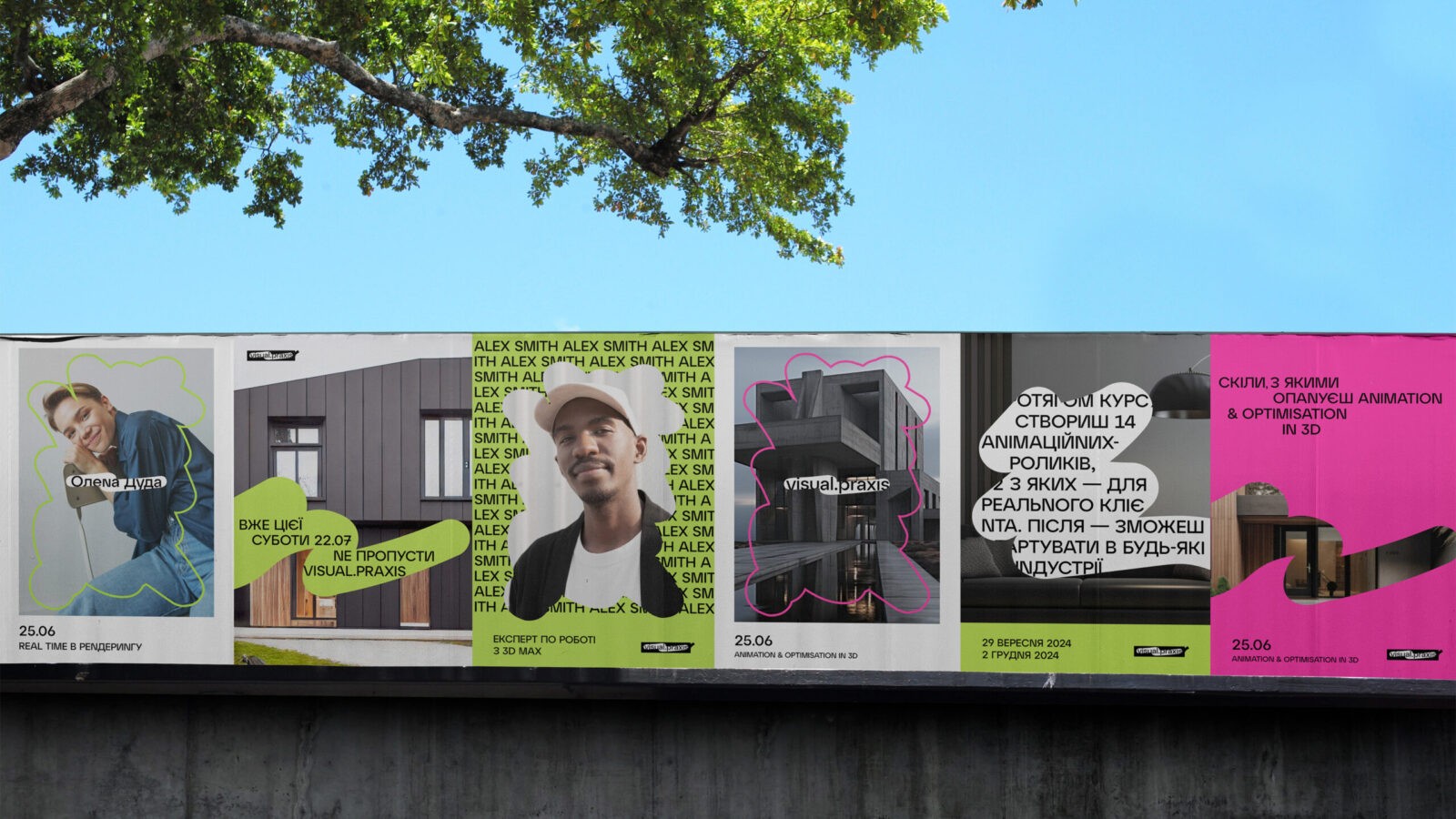
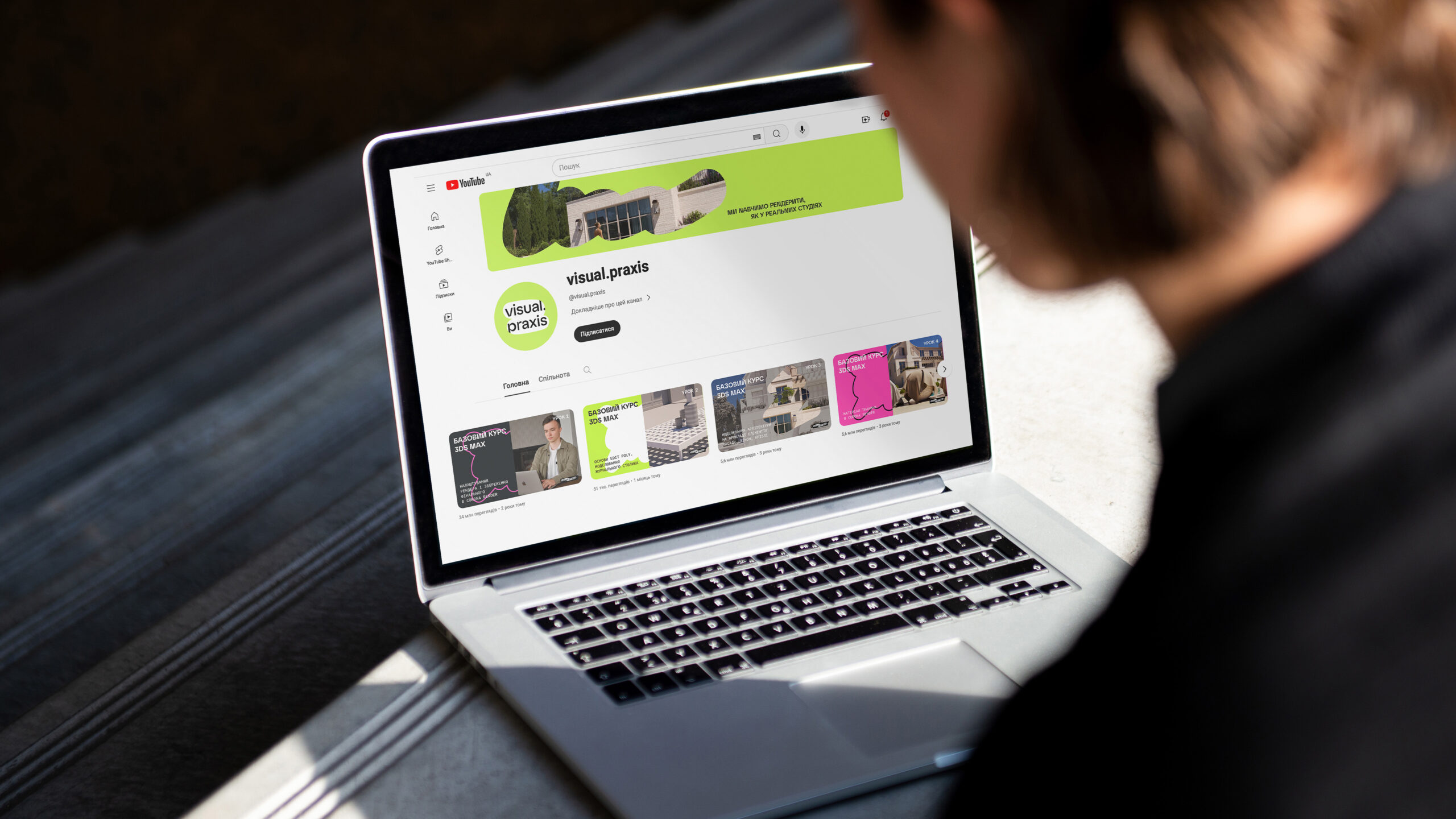
Through visual language, we convey that through our training, students can erase the layer of the unknown and peek inside the profession. That’s why we use multilayered visuals and elements of “scratched-off” surfaces.
Logo
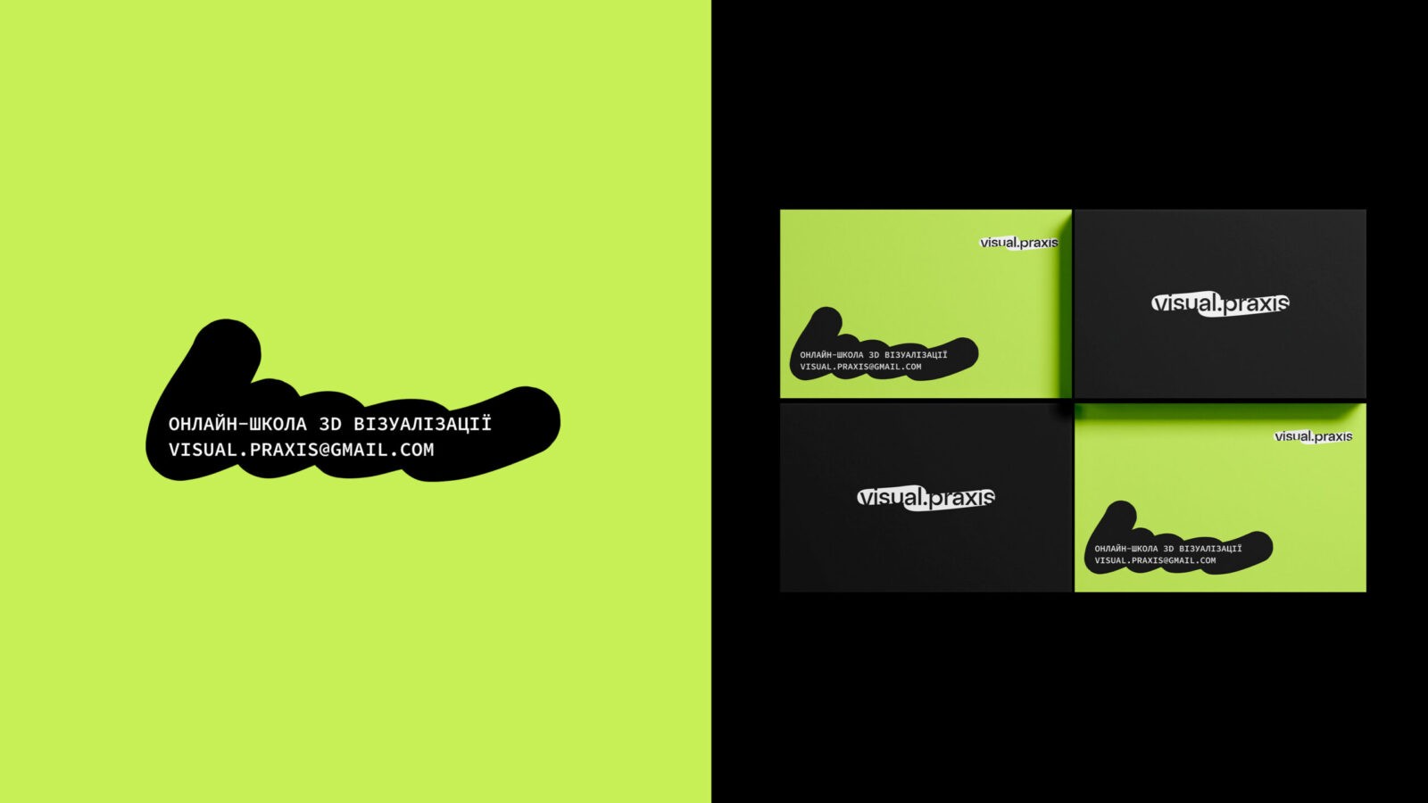
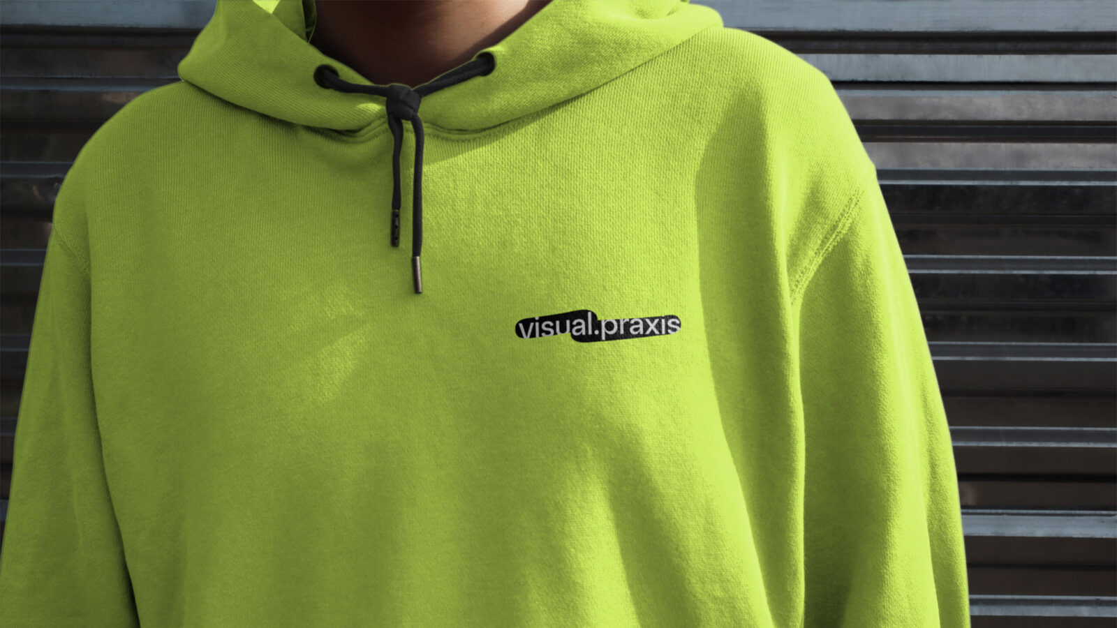
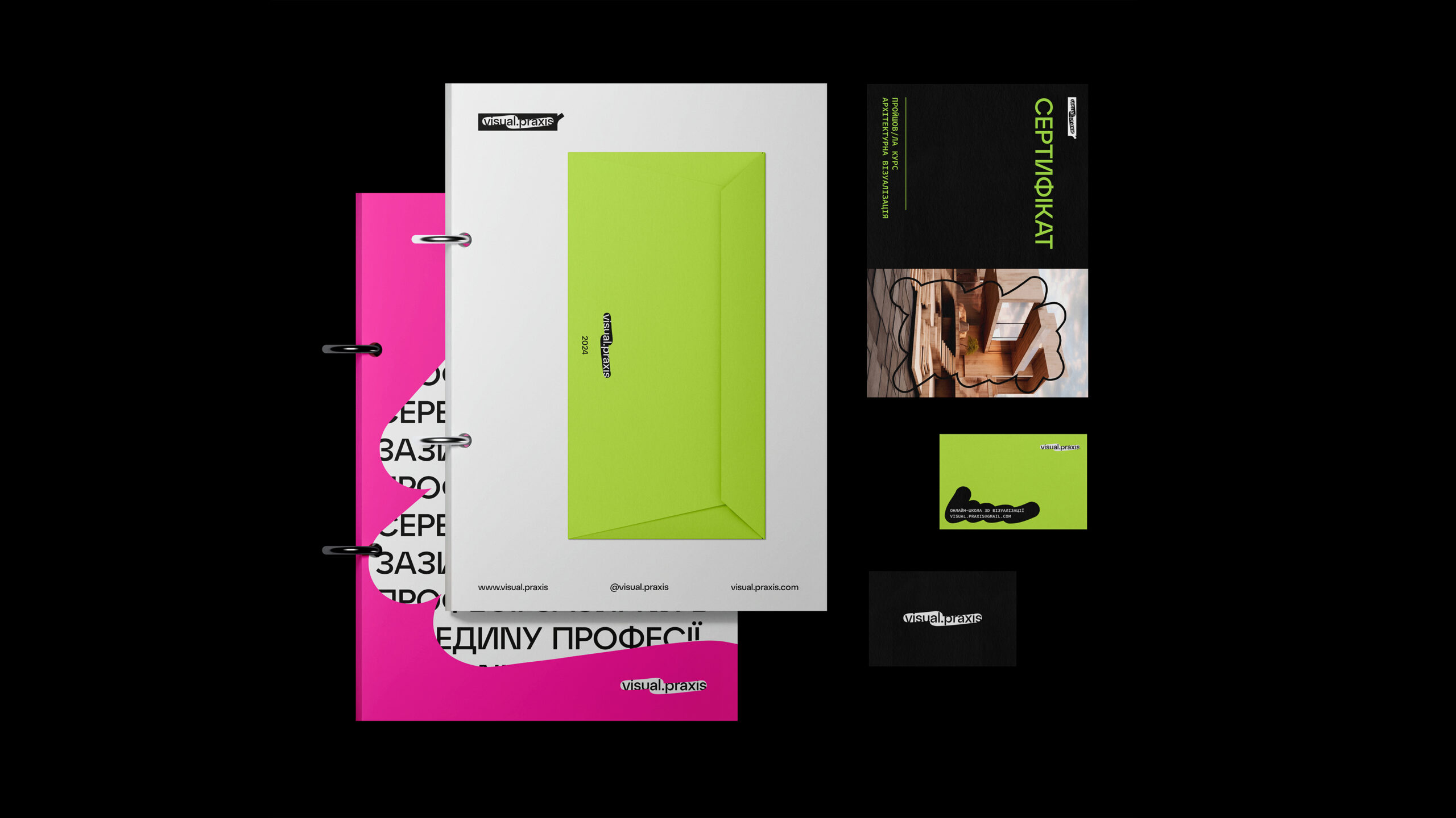
We decided to base our design on the existing company logo and simply added an element of the visual metaphor – a scratched-off surface revealing the brand name beneath it.
Brand Colors
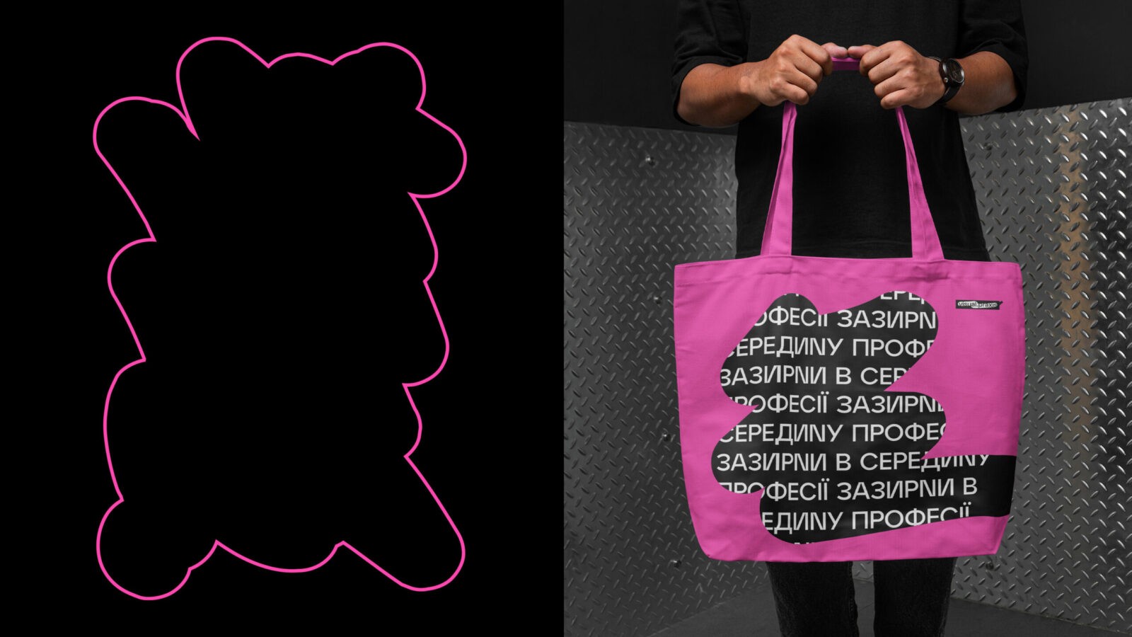
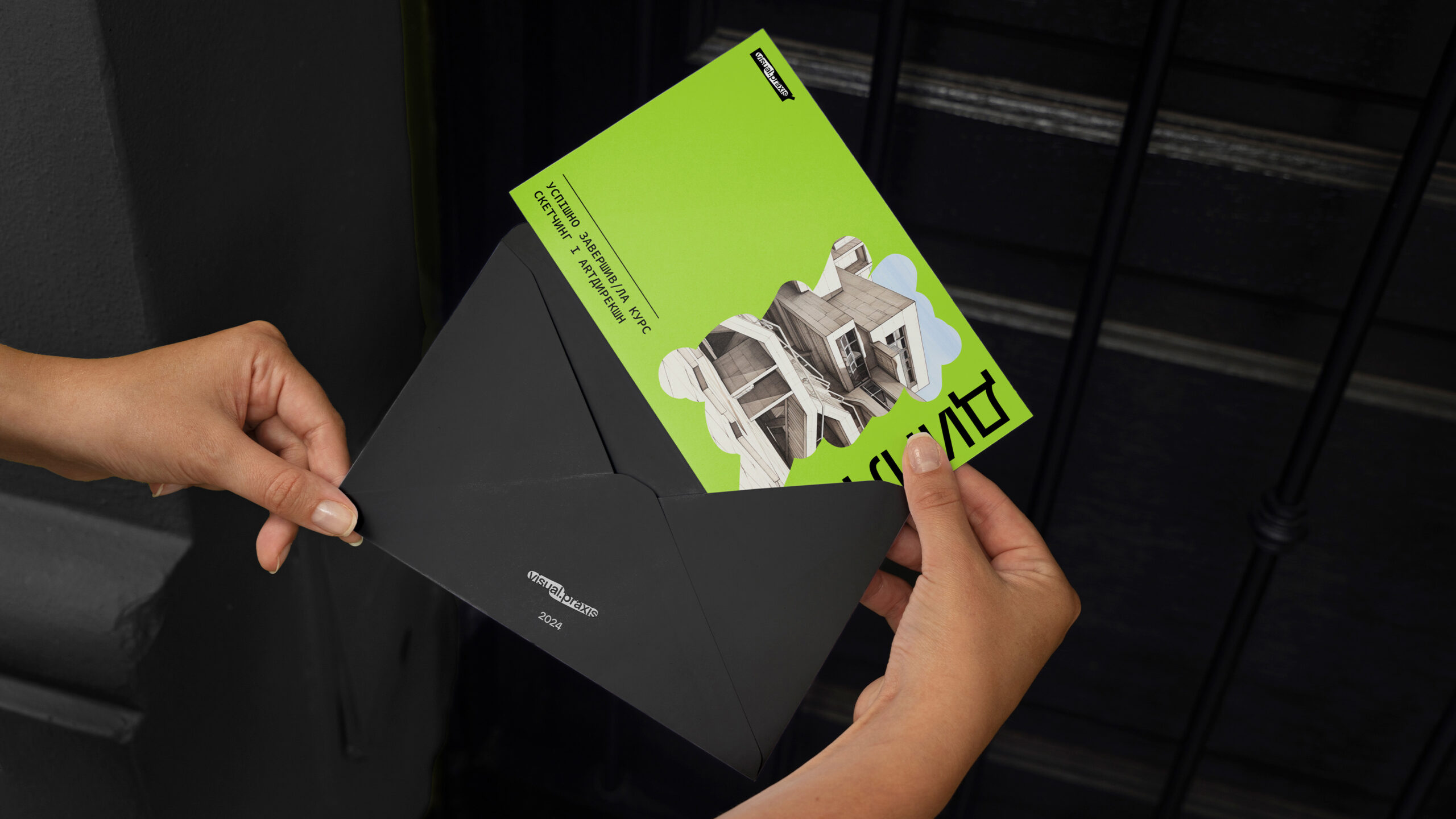
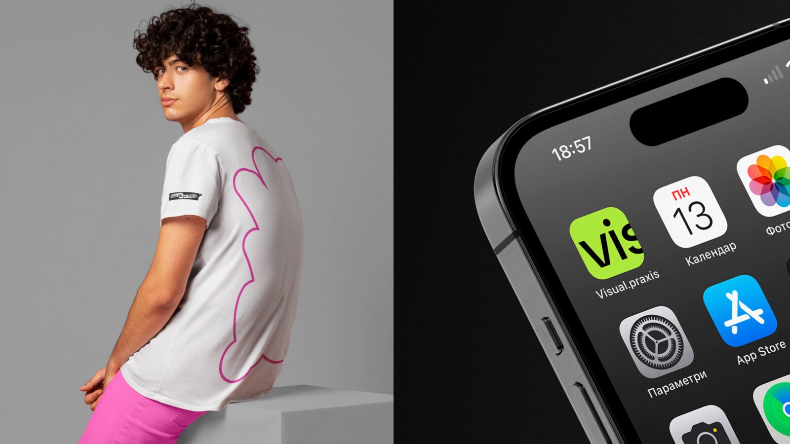
We chose bright, almost neon shades (magenta and lime green) to differentiate ourselves from technical and restrained courses. Additionally, we wanted to reflect on emotional aspect of learning, the discovery of something new, and to add excitement and inspiration.
Neutral white and black colors harmonize the overall picture.
Brand Identity
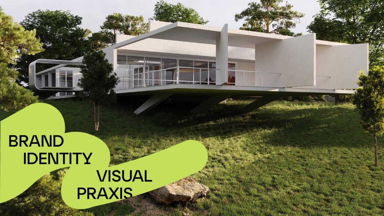
We created several types of scratch designs to conveniently use the brand identity. A wide scratch is used for highlighting short messages, and a mask within the plane for images where the photo or visualization plays the main role.
The identity is built on clear geometric shapes that form the typographic part, while rounded linear scratches soften the overall composition.
CREDIT
- Agency/Creative: Bloom Büro
- Article Title: visual.praxis Brand Design Creation by Bloom Büro
- Organisation/Entity: Agency
- Project Status: Published
- Agency/Creative Country: Ukraine
- Agency/Creative City: Lviv
- Market Region: Ukraine
- Project Deliverables: Brand Creation, Brand Design, Brand Identity
- Industry: Education, Service
- Keywords: WBDS Agency Design Awards 2024/25
- Keywords: WBDS Agency Design Awards 2024/25


