Structural and graphic Packaging Design Launch for a manufacturer of smart heating systems – with best brand match, reduced material and bundle solutions.
tado° is a German premium manufacturer of smart heating systems, inspired by the Japanese greeting “tadaima” (“I’m home again”) and “okaeri” (“welcome back”). Their networked products can be controlled via smartphone and enable customized and ecologically optimized settings. A new packaging solution should be developed that reflects the brand’s digital expertise on the graphical side and also supports the user experience.
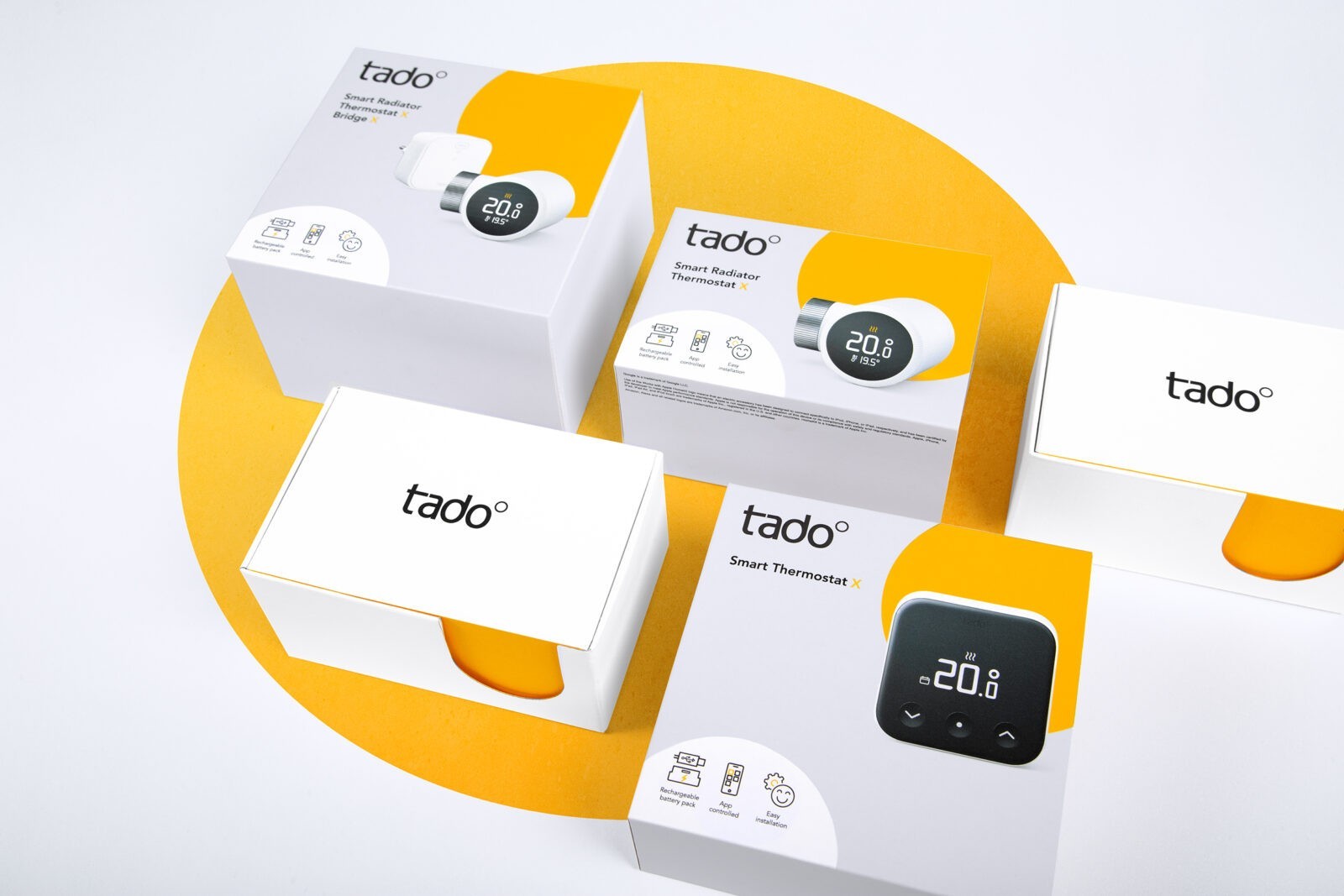
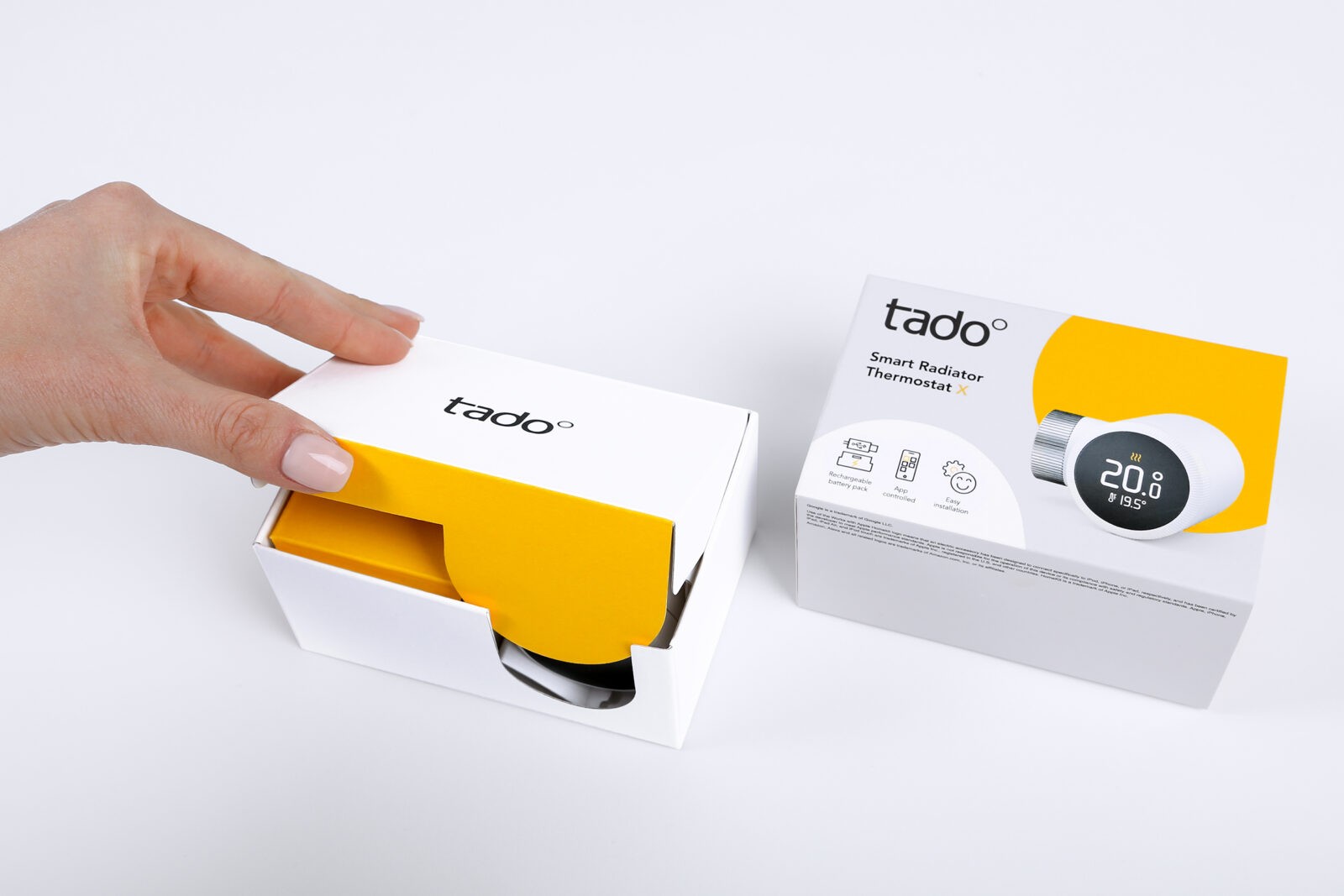
On the structural design side ecological optimization and a flexible bundling system was the main focus. The result was a smart folding box system with a yellow circle – the symbolized tado° degree sign – as a concise brand element. This brand element shows up at all brand touchpoints and was also subtly integrated into the packaging as a cut-out and handle element. The unboxing experience is thus directly linked to the brand experience.
The uncluttered design makes the packaging emotionally accessible and conveys a high-quality impression. It generates a striking impression in retail and conveys clear brand and product communication in ecommerce. The packaging size was extremely reduced to minimize unused space on shipping pallets. The neutrality of the primary packaging enables efficient and ecologically optimized logistics, as returns can be processed in a more resource-efficient manner. Together with the elimination of film, the overall ecological footprint has been significantly improved.
Use of materials: The main driver of sustainability in this project is the reduction in packaging. By rearranging the products and cleverly optimizing the product layout, the external dimensions of the primary and secondary could be significantly reduced. This means that less overall material is used.
Modular common parts system: the multifunctional use of the primary boxes means that production waste can be reduced and production surpluses avoided.
Harmonisation: Packaging sizes have been harmonized to house different products in order to reduce the general amount of packagings in use.
Bundle: Thanks to the cleverly balanced definition of the dimensions, several primary packagings can be combined into various compact bundle packages without packing additional air. In the modular system, the individual folding boxes of the primary packs are no longer needed in the bundle.
Dimensions: The reduced dimensions result in a 38% improvement in pallet utilisation. This improves the possible product quantity for transportation and therefore the CO2 footprint of logistics.
Choice of material: For the launch, the previously used laminated film was eliminated and cardboard without additional finishings (such as hot foil etc.) was used.
Recycling: Thanks to the elimination of plastic elements, all cardboard packaging can now be easily fed into the paper recycling cycle.
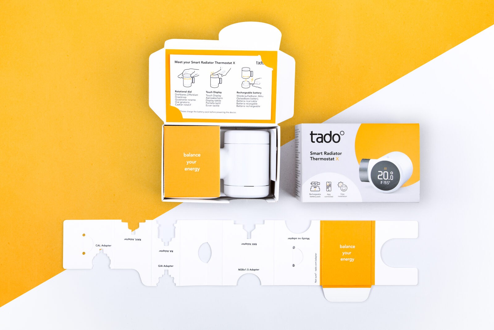
Two in one: The folded inlay for holding the product is also an assembly aid when unfolded. This saves an additional element and reduces the amount of material used.
Printing colour: The primary packaging was only printed with the logo and a brand field. All the necessary information was placed on the secondary packaging. This reduces the amount of ink used.


CREDIT
- Agency/Creative: brandpack gmbh
- Article Title: Brandpack Agency Creates Structural and Graphic Packaging Design for tado’s Smart Home
- Organisation/Entity: Agency
- Project Status: Published
- Agency/Creative Country: Germany
- Agency/Creative City: 22761 Hamburg
- Project Deliverables: Graphic Design, Packaging Design, Structural Design
- Industry: Retail
- Keywords: WBDS Agency Design Awards 2024/25
- Keywords: WBDS Agency Design Awards 2024/25
-
Credits:
Creative Direction: Arne Fehlhaber
Technical Direction: Andreas Schabert
Program Management: Christine Salzbrunn
Graphic Design: Mirja Berck
Structural Design: Florian Schaake
Engineering: May-Britt Kube


