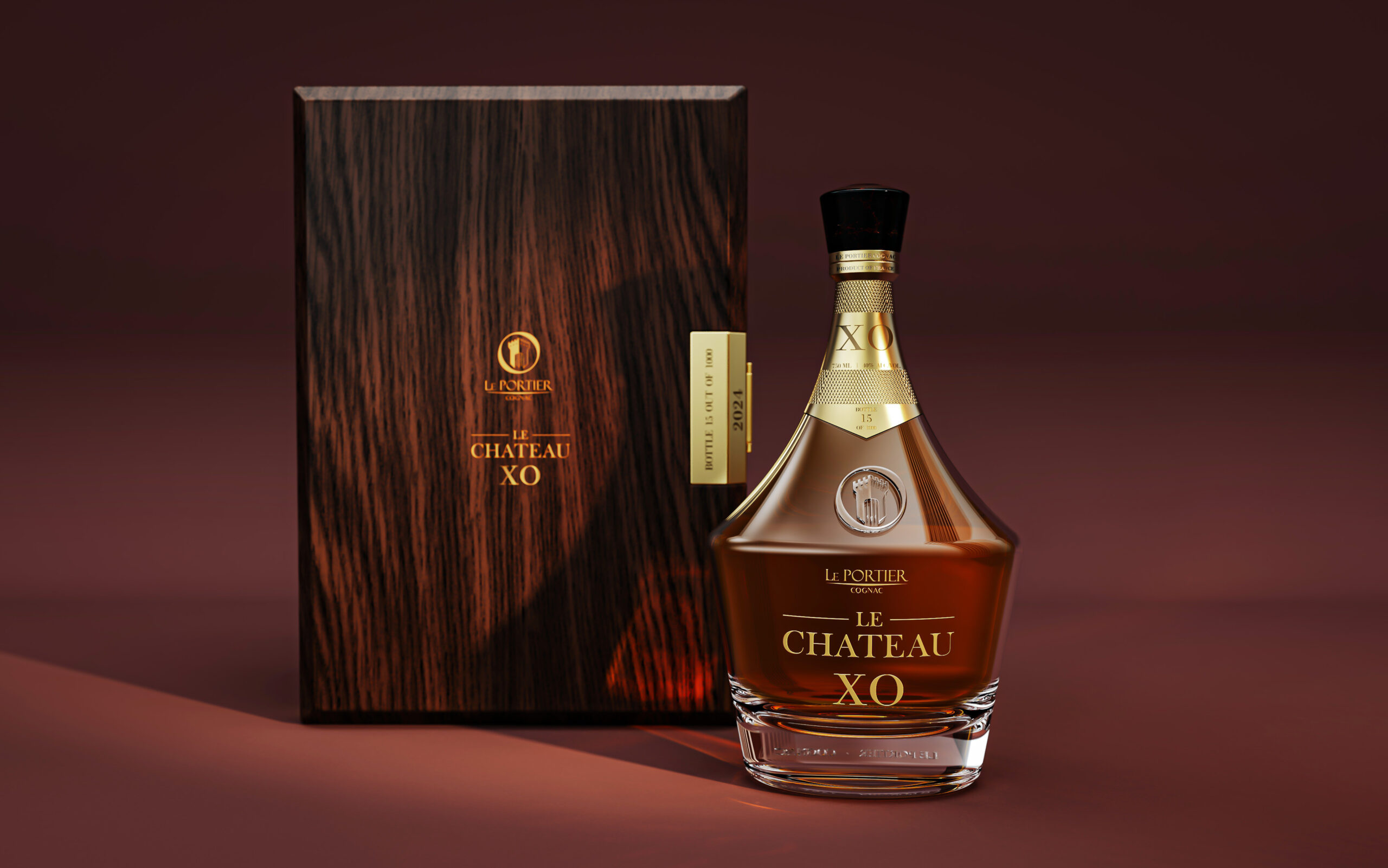
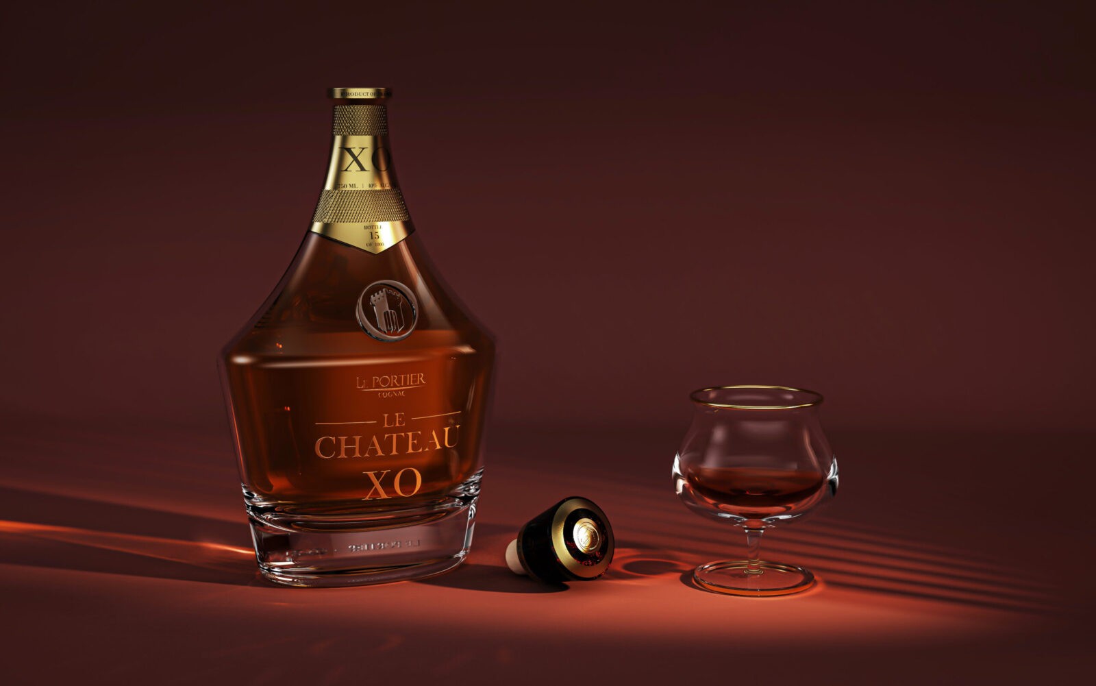
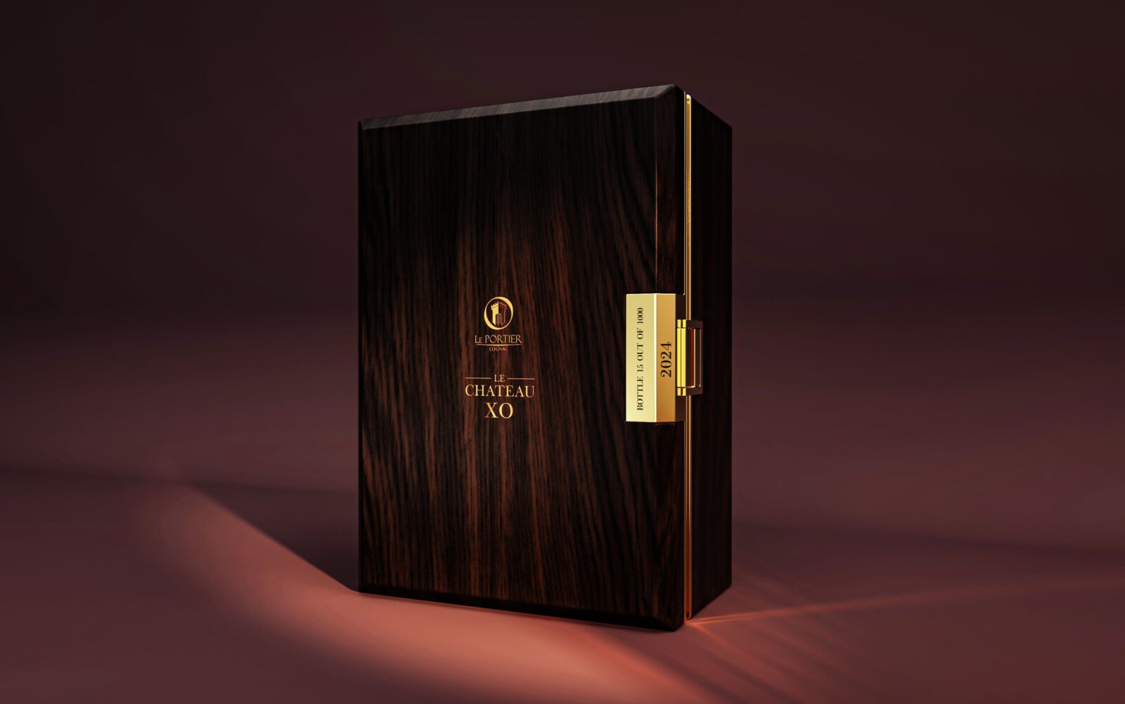
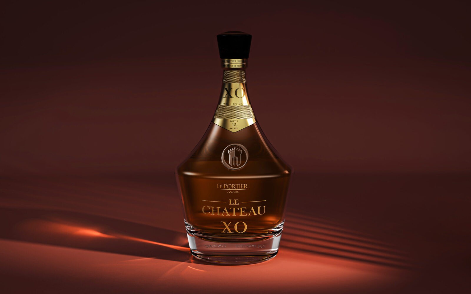
The second launch for Le Portier Cognac, Le Chateau XO follows the success and heritage of the entry-level Shay VSOP cognac. Tailored to a more premium market, with a more aged spirit, the brand’s second iteration focuses on a less organic approach than its predecessor. Sharpened curves and a straightened base with a thicker ice allow for a bolder, striking presence of the bottle alone, where the experience box combines cream suede and fine gold detailing with a reach dark tinted oak outside.
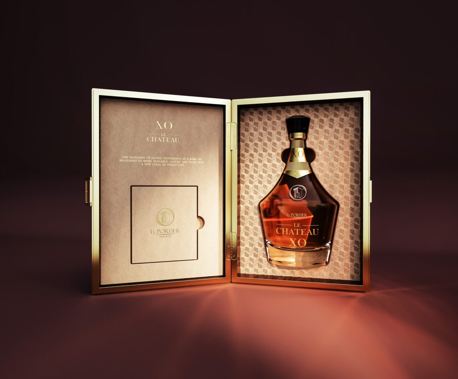
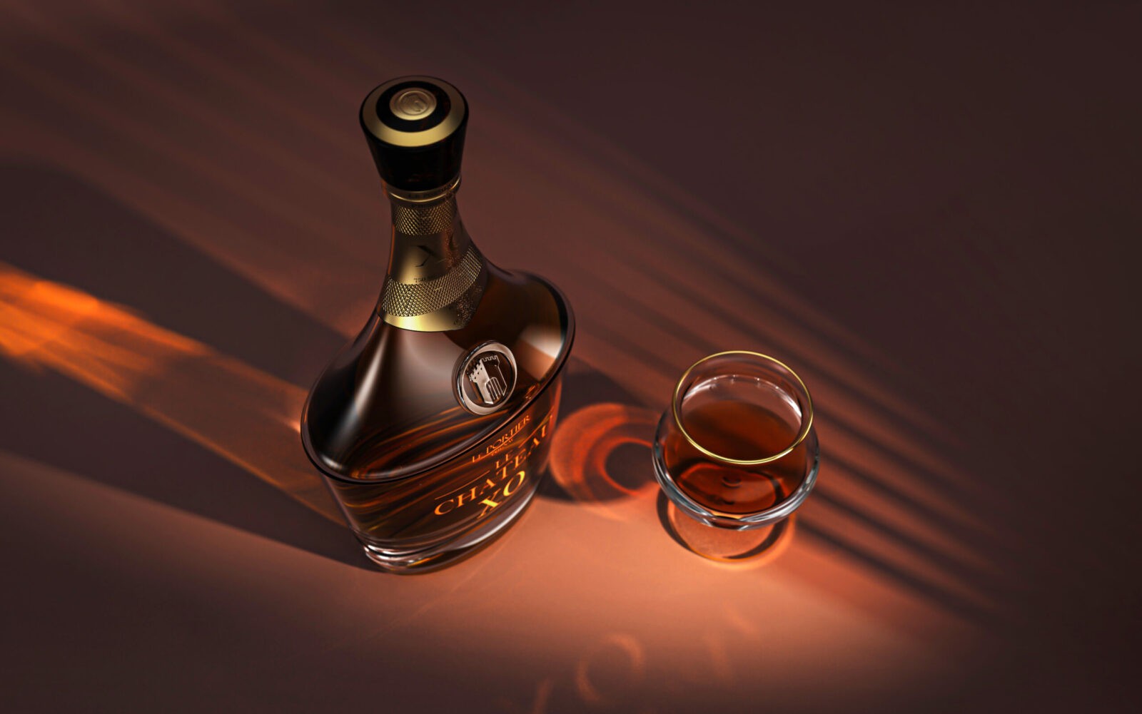
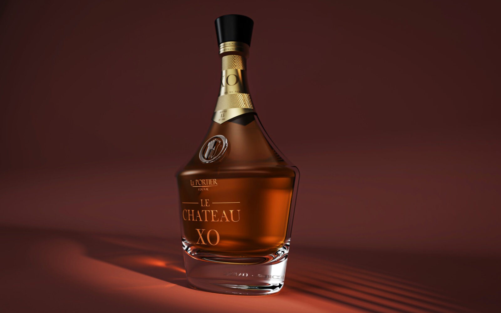
An evolution of the brand’s portfolio, Le Chateau XO brings a more premium, striking and luxurious approach to Le Portier Cognac. The bottle’s harsh geometric lines associated with a flattened profile allows for an optimal grip, with the bottle’s base assisting in the gravity balance for pouring. The packaging further enhances the senses, with a soft suede texture cladding bottle and booklet, separated by a finely crafted gold trim from the rich wood shades that pay tribute to the cognac casks.
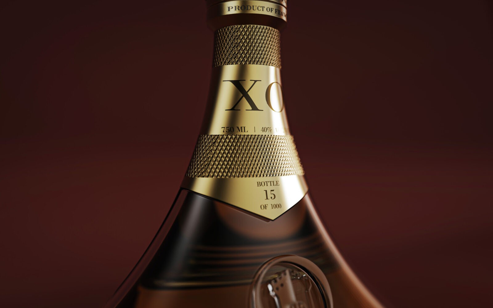
Le Chateau XO’s bottle neck receives a gold metallic profile all the way around, engraved and knurled to bring additional texture and grip to the elongated neck. Above, a dark obsidian closure with metal trims top the luxurious feel of the bottle, with the harsh, cold materials contrasting with the cognac’s natural colour and the softness of the box interiors. Printed, embossed and foiled suede bring an immersive, highly sensorial texture to the box, culminating in the deep wood grain outside.
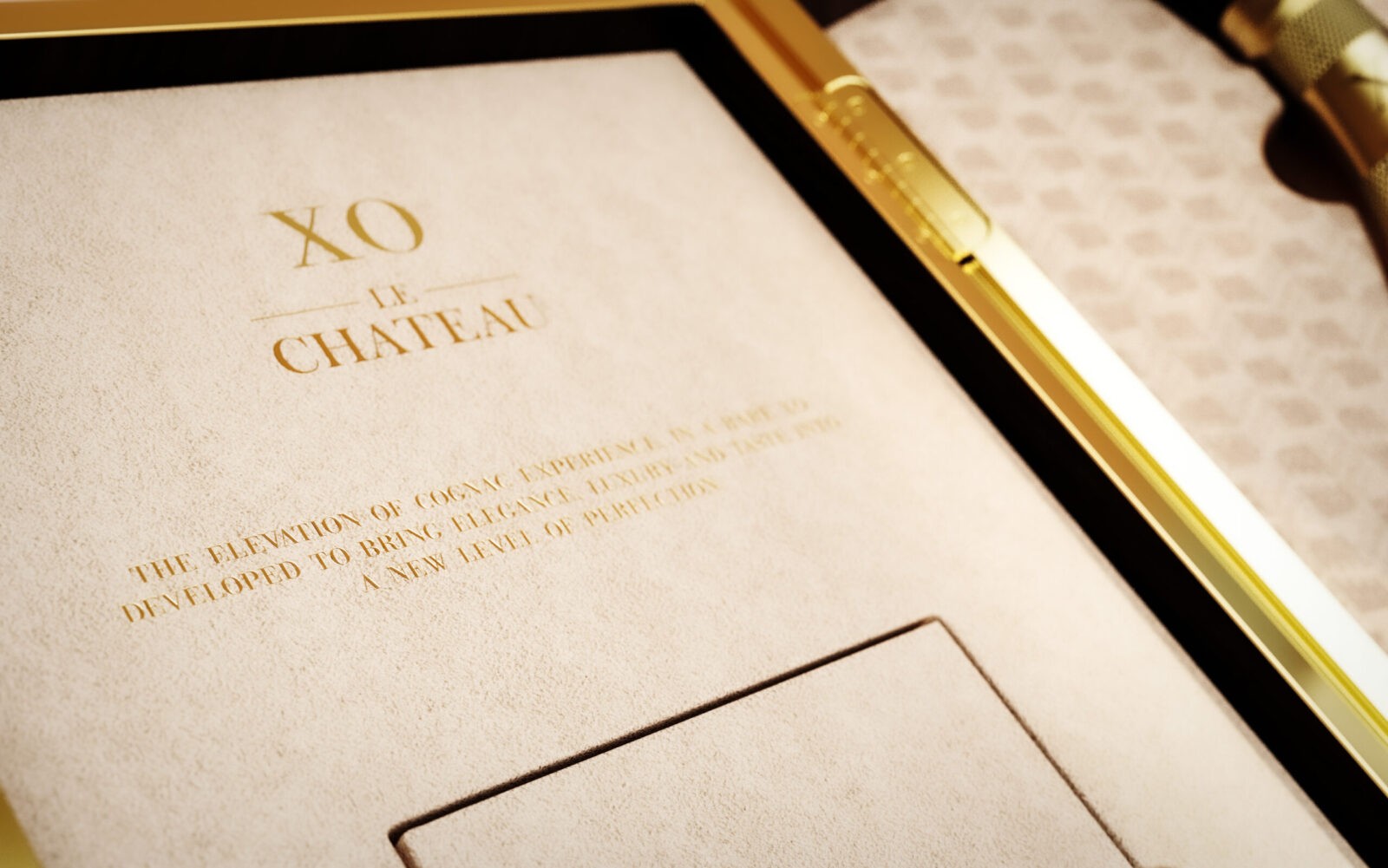
Knurls, grooves, embossing and engraving define the intricacies of Le Chateau XO. With clean aesthetics, without organic ornament, the glass vessel focuses on minimalist artwork, where textures add a layer of intensity to the touch, which is enhanced and translated into the box itself. Embossed and engraved layers add additional complexity to the suede, with a metal trim shadow gap generating depth to the outer box, Le Chateau XO is an immersive sensorial journey.
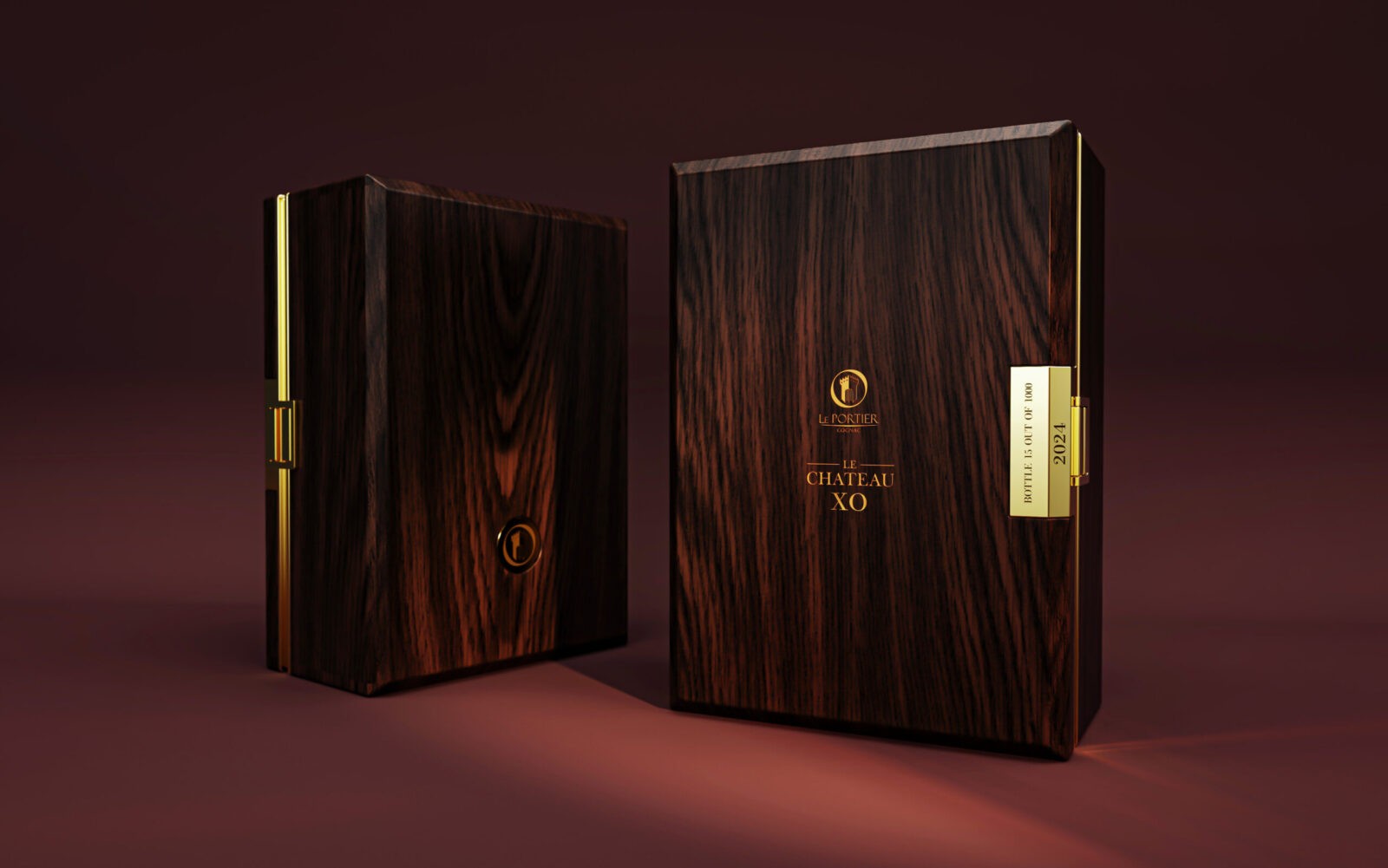
Open the box through the side clasp, whilst contemplating the dark satin wood tones and gold detailing. Inside, the dark tones are contrasted by a light cream suede wrapping the whole interior of the box. On the left side, educational information is foiled onto the fabric, with a booklet allocated in the same finish. On the right, a low opacity pattern is applied to the inlay where the bottle sits, creating further depth and intensity to the reflections across the glass vessel and metallic trim.
As a direct successor of Shay VSOP, Le Chateau XO design process came naturally in the following months that followed the arrival of the VSOP version onto the market and its immediate nationwide success. The bottle, completely reinvented and the gold details on both vessel and packaging, such as the profiles that lead to the clasp or the medallion on the back, have been perfected over time to ensure the ultimate luxurious finish that combines excellence, boldness and elegance to this product.
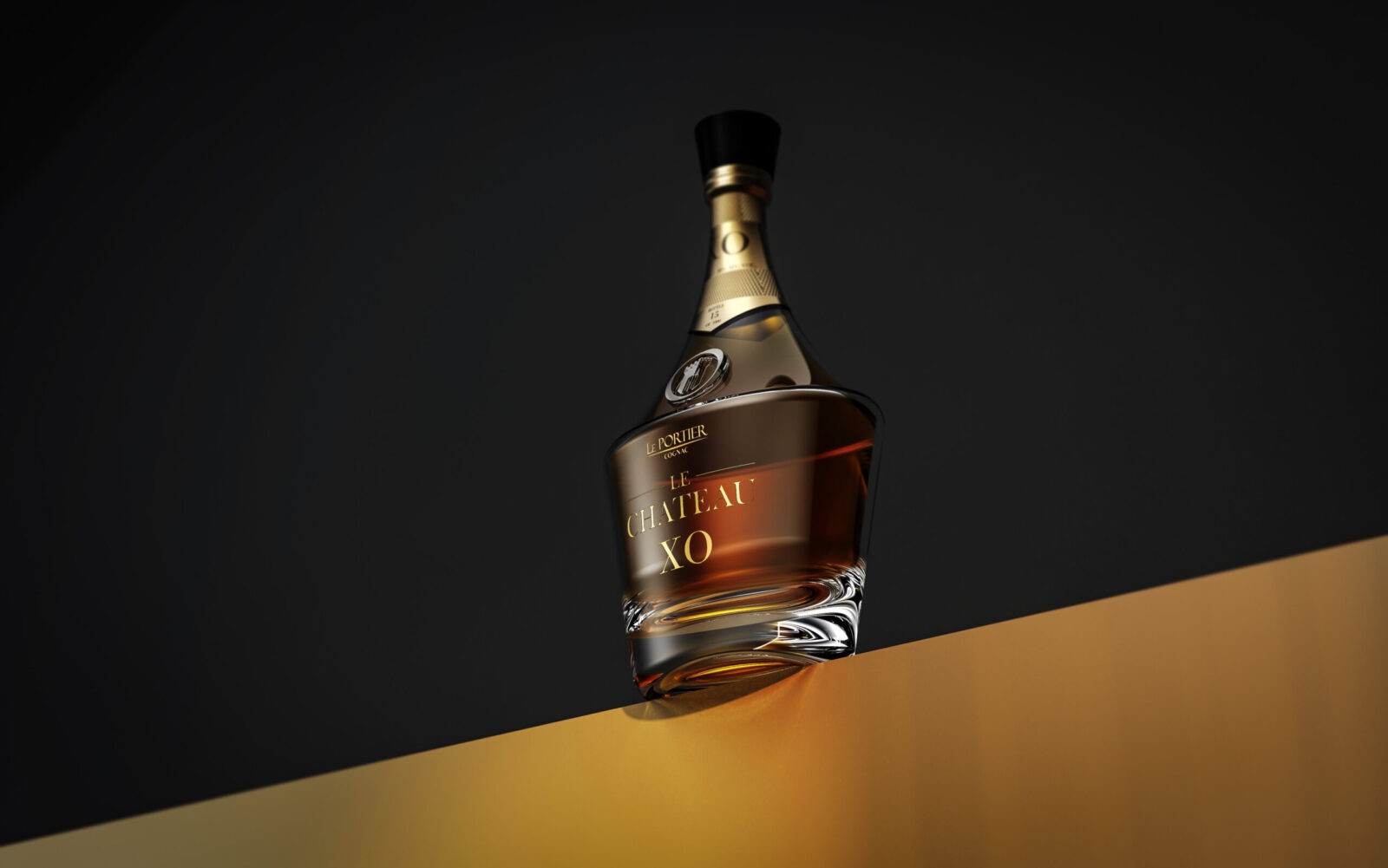
With a direct focus on the history of Shannon Sharpe and Mary Porter that is a reflection of the brand heritage, Le Chateau XO aims to intense visual assets, to the delicate luxurious elegance that highlights the product’s shaping, the cognac itself, and becomes, on its own, a striking presence across any shelf. A stand-out design, in a bottle that brings attention to itself whilst highlighting the natural colours of the cognac, elevating the experience throughout box and vessel altogether.
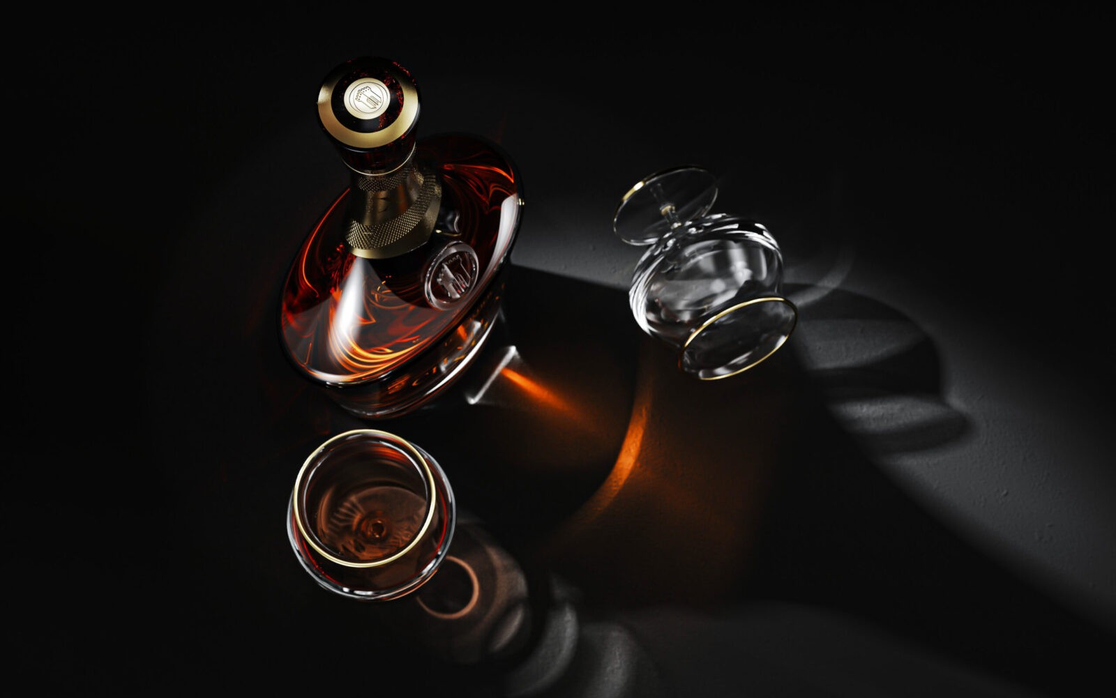
The XO cognac product language is one of elegance and elevation. Across the market, it is often seen utterly different approaches, but usually with the tendency to attach an organic shaping towards this type of product and vessel. For Le Chateau XO, design process focused on a completely different language, disruptive, luxurious, yet approachable. Clean, strikingly linear aesthetics are balanced with elongated curvatures and thick glass, providing the ultimate presence to this product.
CREDIT
- Agency/Creative: Le Portier Cognac
- Article Title: Le Chateau XO Luxurious Cognac Packaging Design by Le Portier In-House Team
- Organisation/Entity: In-House
- Project Status: Published
- Agency/Creative Country: Portugal
- Agency/Creative City: Oeiras
- Project Deliverables: Packaging Design, Product Design
- Keywords: WBDS In-House Design Awards 2024/25
- Keywords: WBDS In-House Design Awards 2024/25
-
Credits:
Chief Design Officer: Tiago Russo
Design Director: Katia Martins


