The Challenge: A small IT consultancy firm with big dreams and even bigger potential. Diforma came to me because they knew they were sitting on something special — they just weren’t showing it. Their brand was doing that classic tech company thing: playing it safe, blending in, and honestly? Underselling their incredible expertise and unique approach to consulting.
The Solution: We rolled up our sleeves and dove in with a series of dynamic workshops to uncover what makes Diforma tick. No corporate fluff – just honest conversations about who they really are and where they want to go.
Here’s what we discovered: Diforma isn’t just another IT consultancy firm. They’re a safe harbour for brilliant tech professionals who want to escape the corporate hamster wheel without sacrificing success. (Spoiler alert: You actually can have both.)
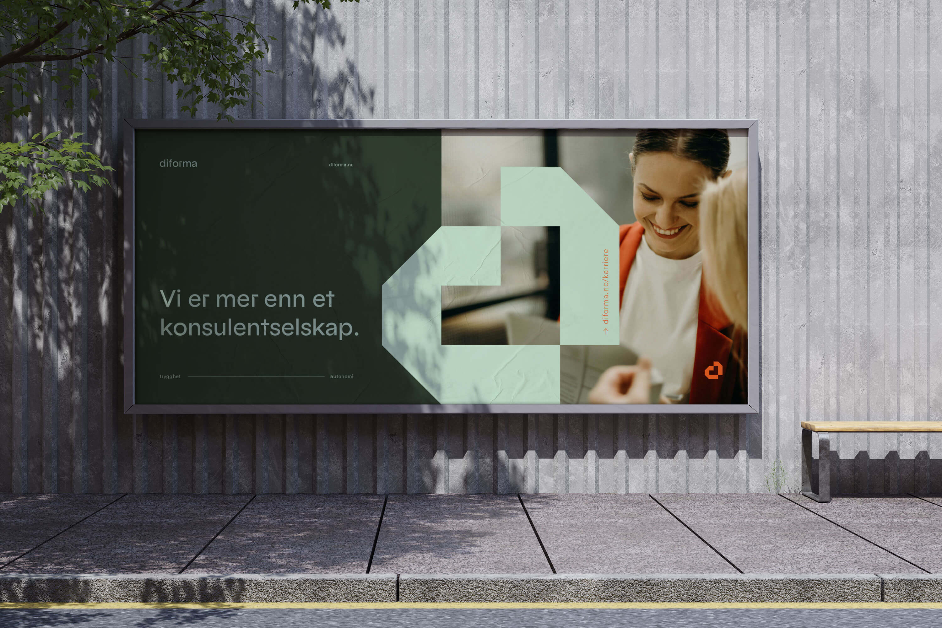
This led me to their core concept: “More than […]” — a versatile messaging framework that perfectly captures their position as more than just another consultancy, offering both security and autonomy to their team members. Simple? Yes. Powerful? Absolutely.
I then translated these strategic insights into a complete visual identity redesign:
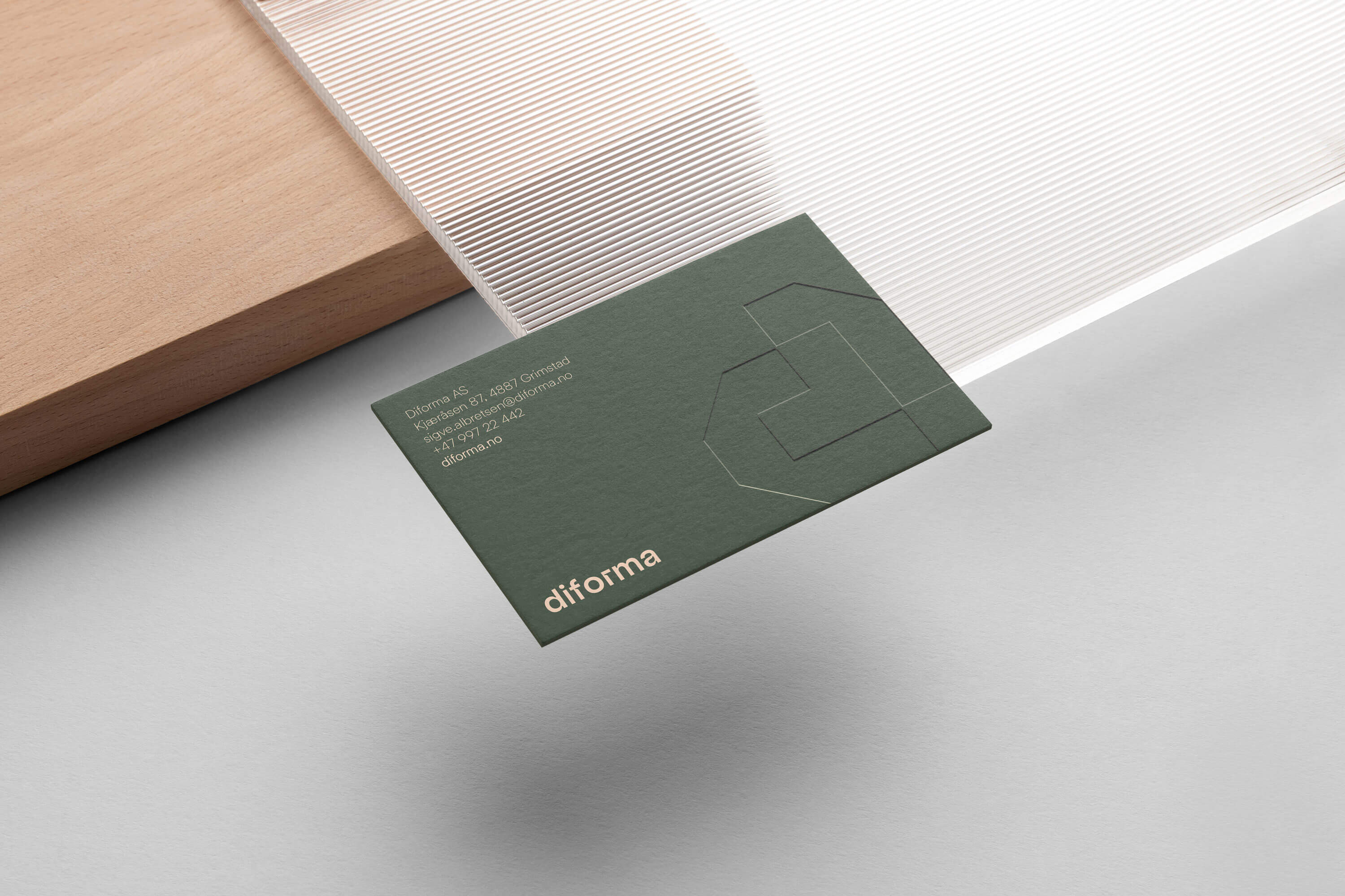
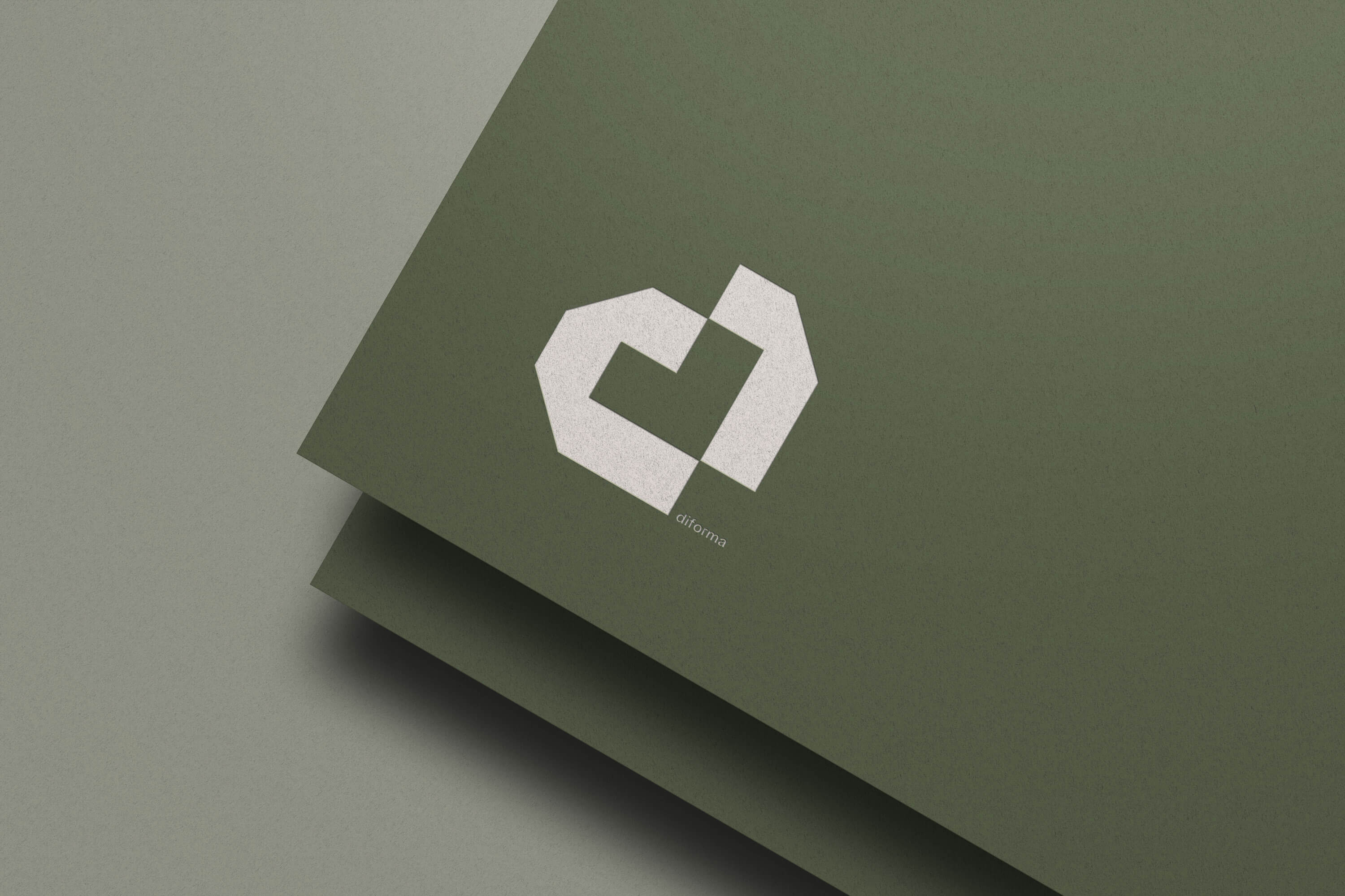
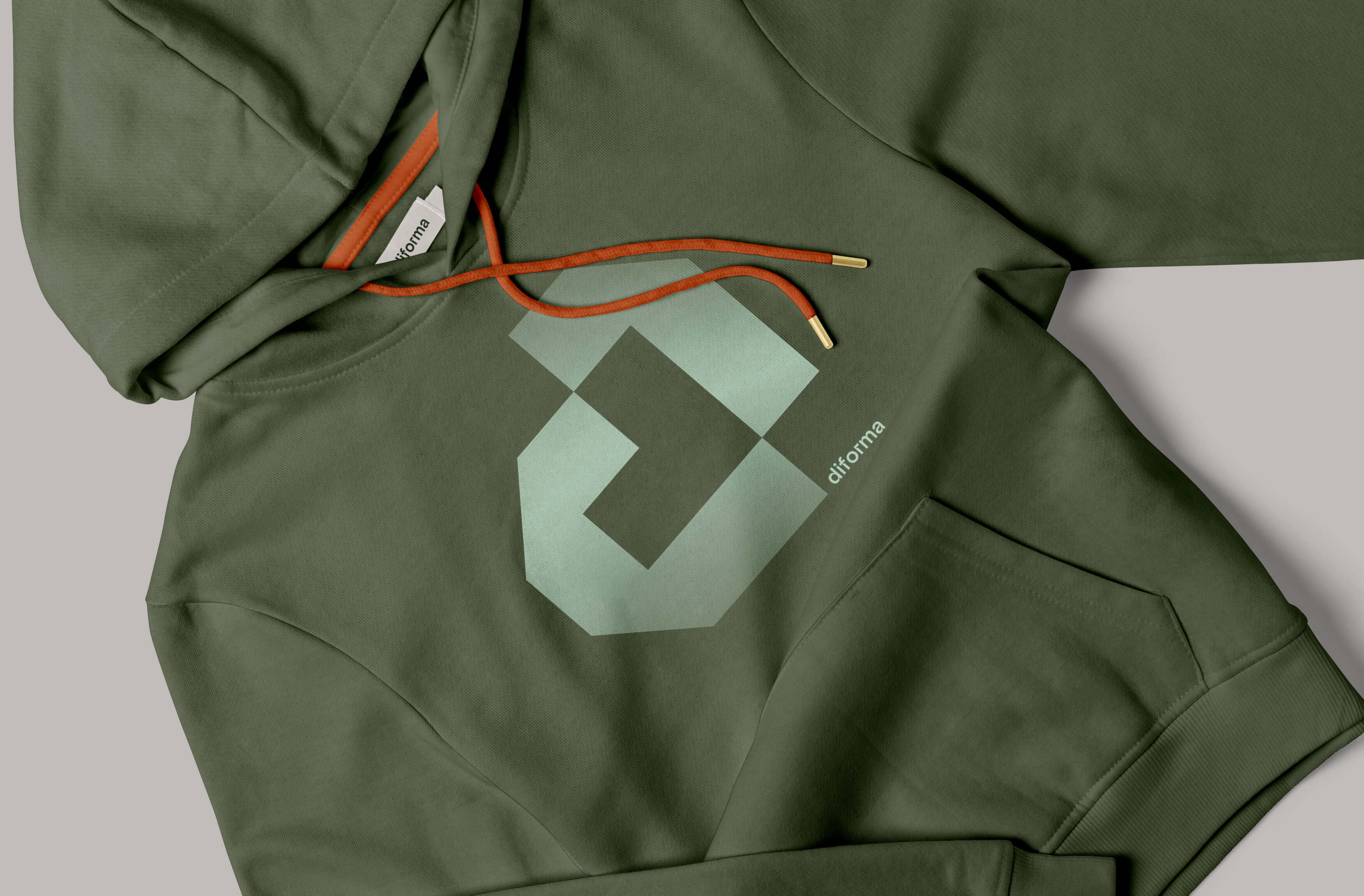
The new logo merges technological precision with human warmth through a cleverly constructed pixel-based design. A stylised ‘d’ incorporates the outline of a heart, while the assembled squares represent community and collaborative building.
This semi-abstract, minimalist approach ensures high recognition while maintaining visual flexibility across applications.
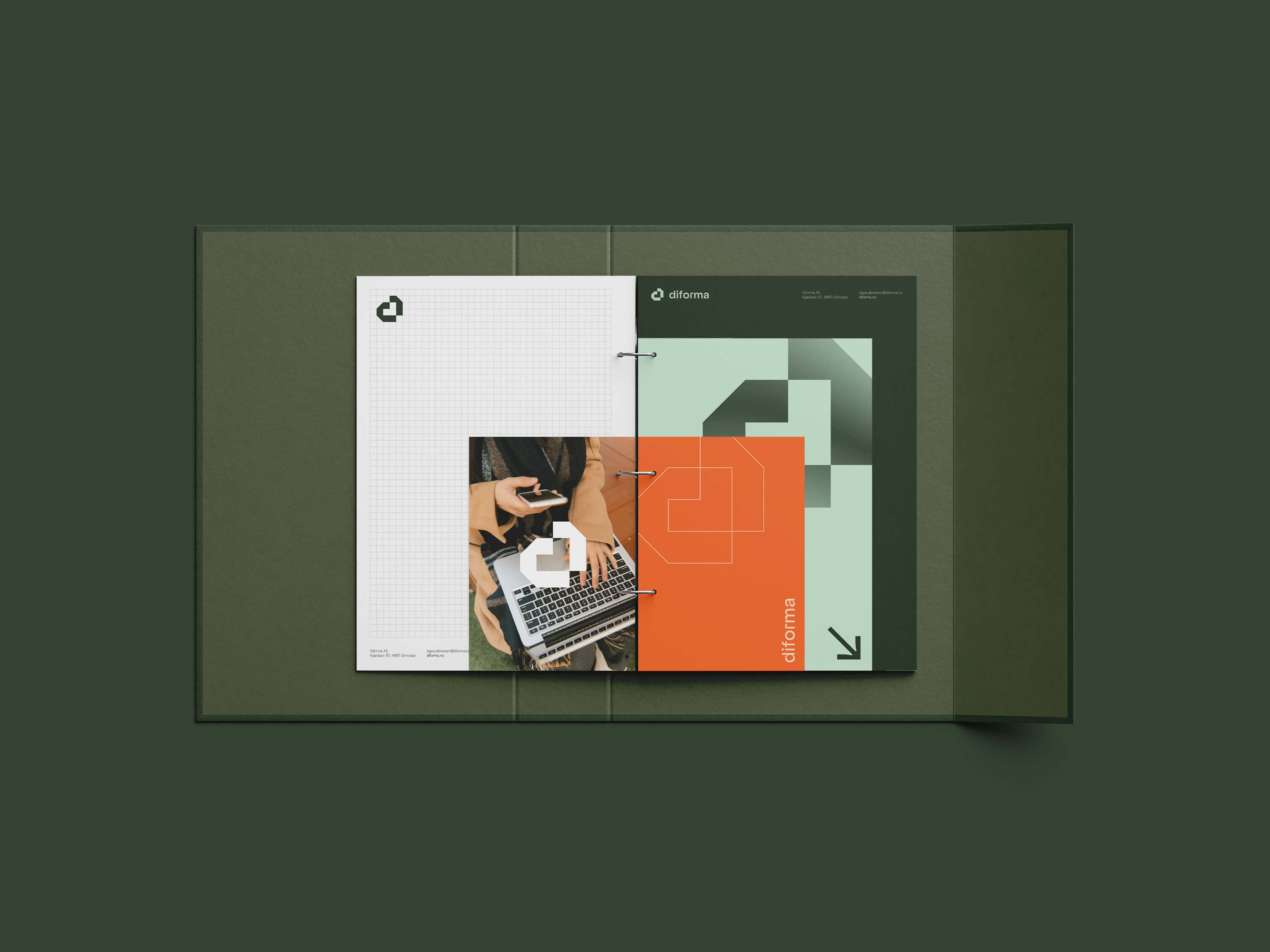
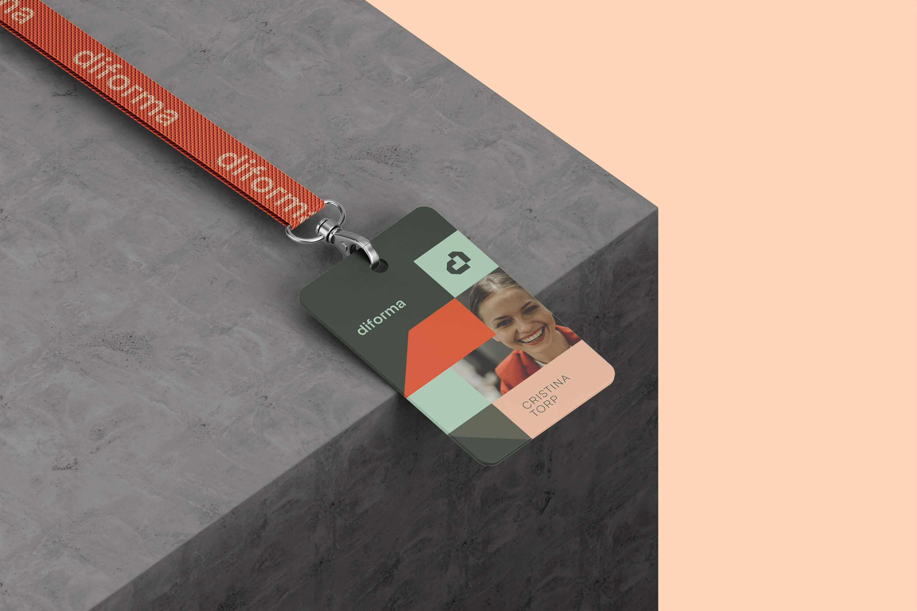
The pixel grid that forms the logo isn’t just a one-hit wonder — it’s the foundation for an entire visual language. I developed a suite of iconography and patterns that play with the same geometric DNA, creating endless possibilities. Think modular surface patterns that can flex from subtle backgrounds to bold statement pieces, and icons that break complex tech concepts into friendly, pixel-perfect symbols.
It’s like LEGO for grown-up tech professionals: structured enough to feel credible, playful enough to spark joy.
For the brand’s typography, I paired two fonts that complement each other like a dream:
Radix — think Bauhaus meets modern tech; geometric, clean, but with enough quirky details to keep it interesting, and Helixa — the smooth operator of the duo; contemporary, clean, and bringing balance to the whole show.
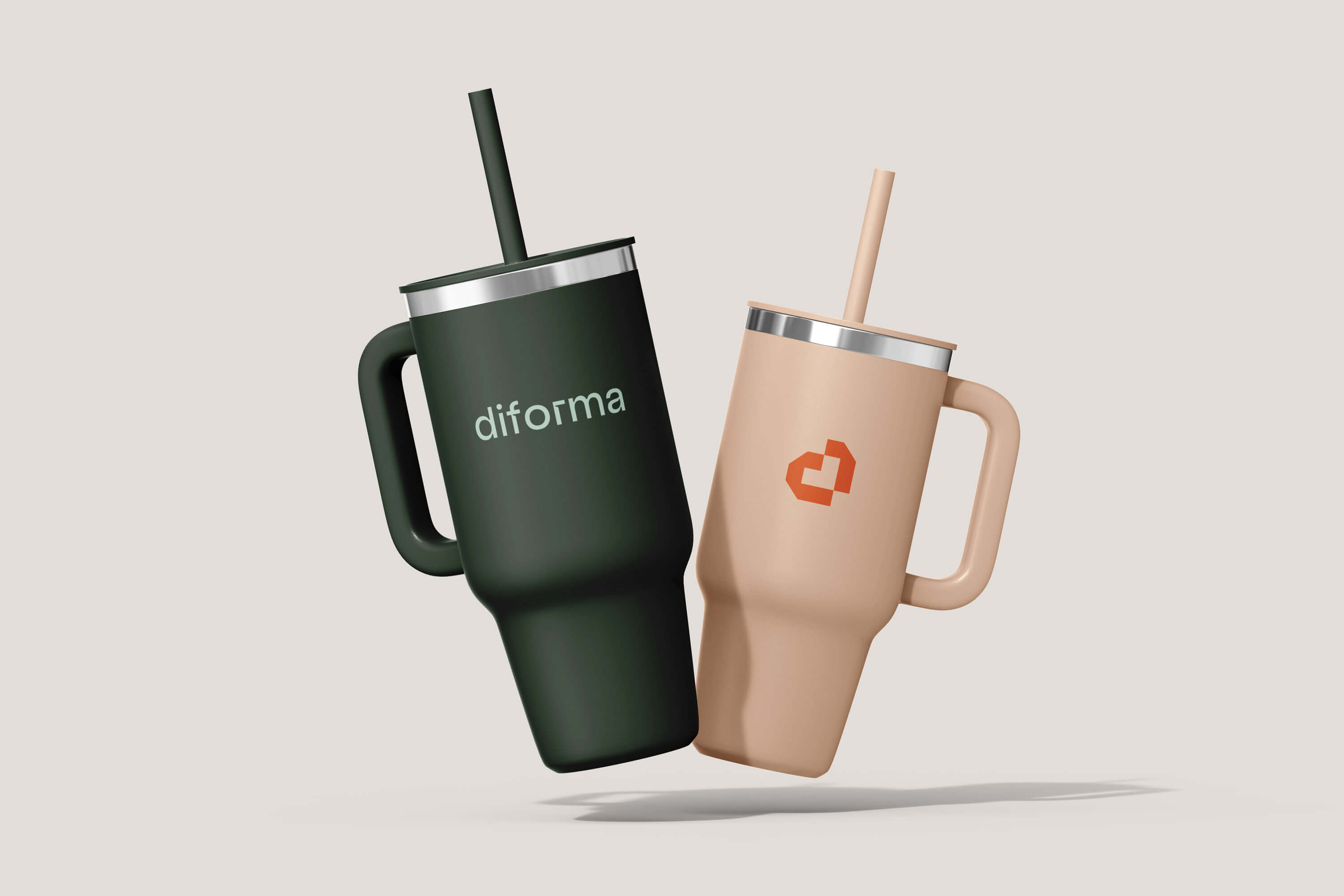
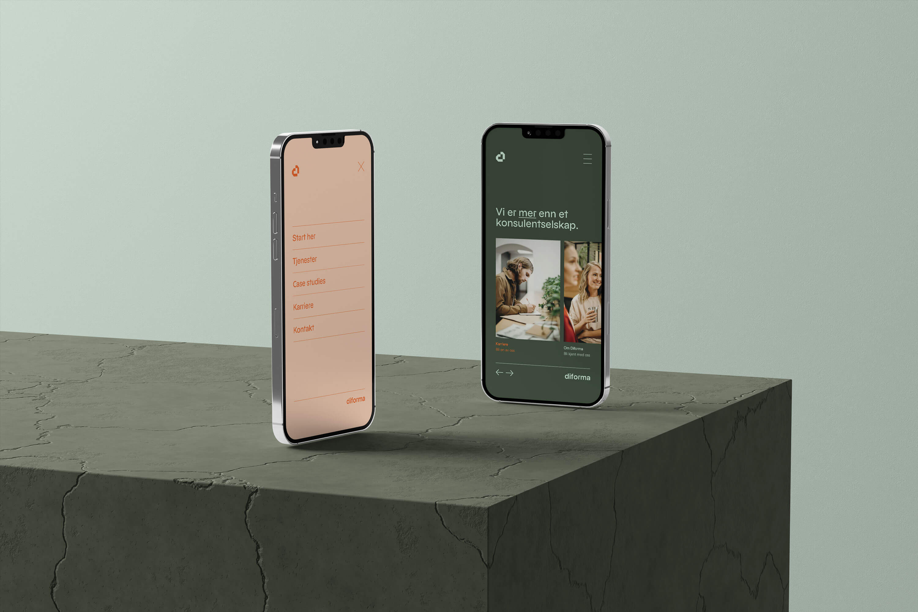
Colour wise, there are no boring corporate blues here. I went for: Deep, confident greens that say “we know our stuff”, pops of orange for when you need to make some noise, and soft mint and apricot tones to keep things fresh.
The Impact: A new brand identity that isn’t just pretty (though it definitely is that too) — it’s a powerful tool that’s helping Diforma: Stand out in a sea of sameness, Attract the kind of talent that makes great things happen, Tell their story with confidence and clarity and Build something bigger than themselves

CREDIT
- Agency/Creative: Petchy
- Article Title: From “safe” Bland to Bold Brand: Diforma Gets a Strategic Rebrand by Petchy
- Organisation/Entity: Freelance
- Project Type: Identity
- Project Status: Published
- Agency/Creative Country: Norway
- Agency/Creative City: Frei
- Market Region: Europe
- Project Deliverables: Brand Creation, Brand Design, Brand Guidelines, Brand Identity, Brand Strategy, Branding
- Industry: Technology
- Keywords: branding, brand identity, brand strategy, IT, tech, founder, technology, developer
-
Credits:
Strategic Brand Consultant & Creative Director: Solveig Petch


