Lumina Sparkling Water: Spark Your Life
Widarto Impact collaborated with Lumina to create a distinctive identity and packaging design for their sparkling water line, aimed at a generation that values simplicity and authenticity. The goal was clear: to build a brand that stands out on shelves, appealing to health-conscious consumers with a clean, minimalist aesthetic.
Challenge
With a growing number of sparkling water brands in the market, Lumina needed to differentiate itself through more than just flavors. The brand presence needed to convey purity, freshness, and modernity while being memorable and relatable to today’s consumers. The design had to reflect these core values without overwhelming the consumer, ensuring seamless adaptability across both physical and digital platforms.
Solution
We began by developing the brand name, Lumina, inspired by the concepts of “light” and “vitality,” aligning perfectly with the refreshing, uplifting nature of sparkling water. The name communicates brightness and energy, encapsulating the essence of a revitalizing beverage.
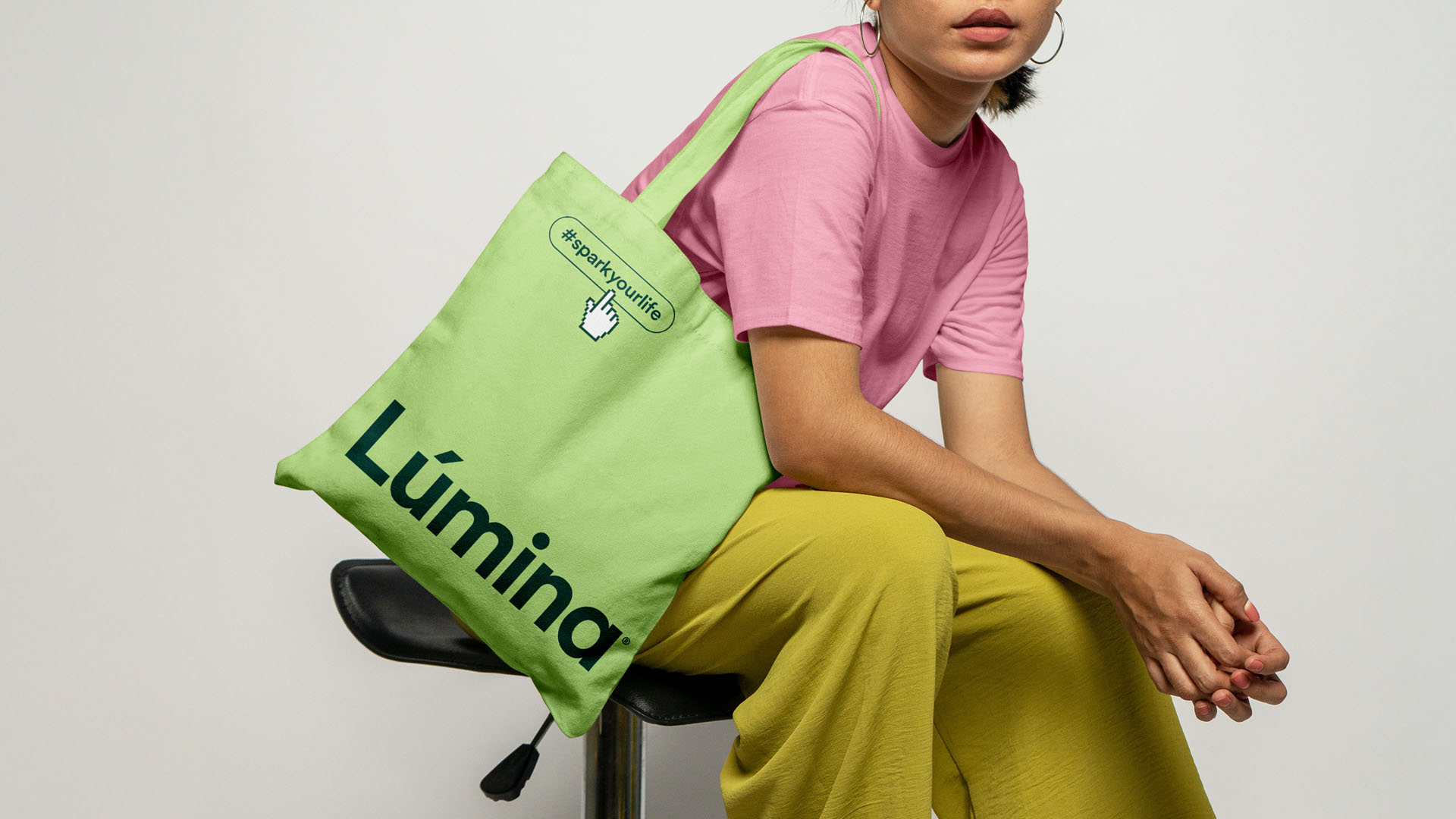
For the visual identity, we chose a clean, bold logotype that embodies modernity and confidence. The minimalist logotype paired with a neutral typeface lends elegance and sophistication, appealing to Gen Z and Millennials who favor simplicity in design.
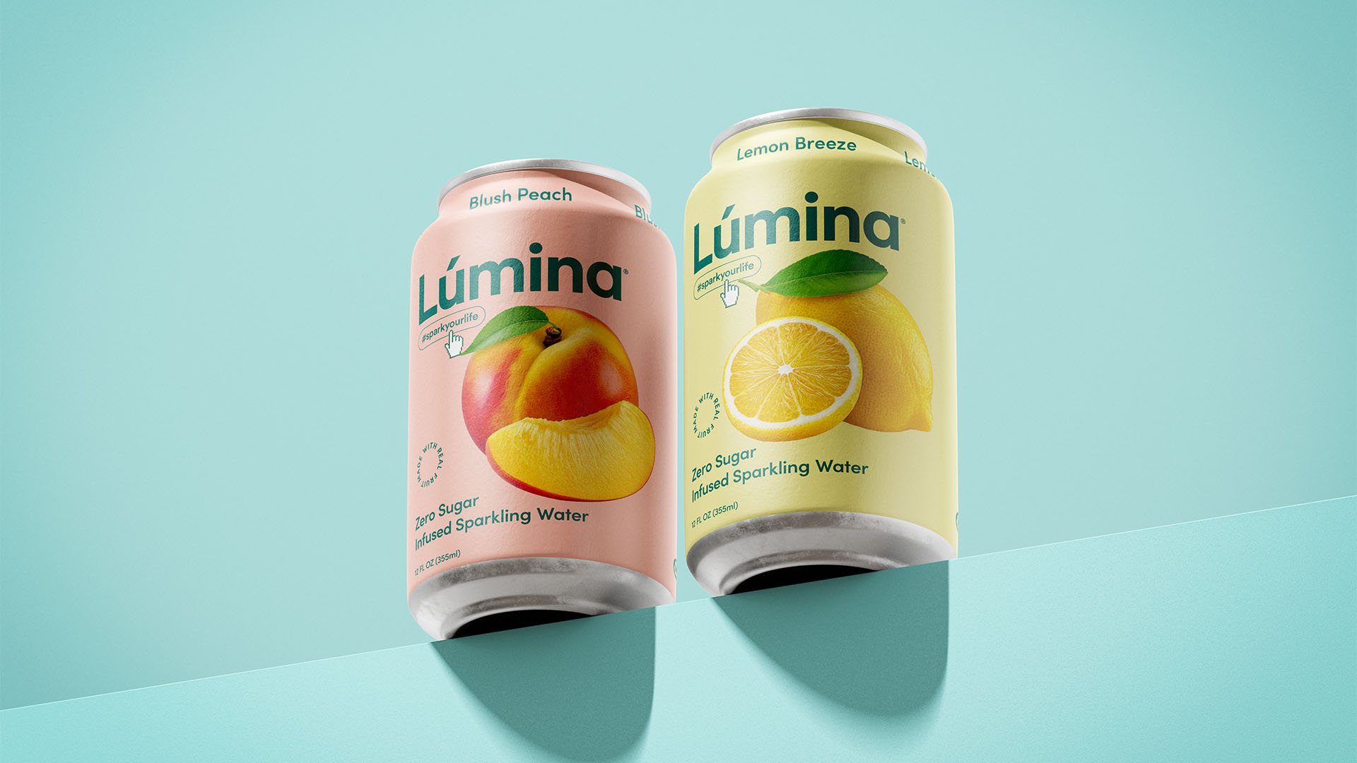
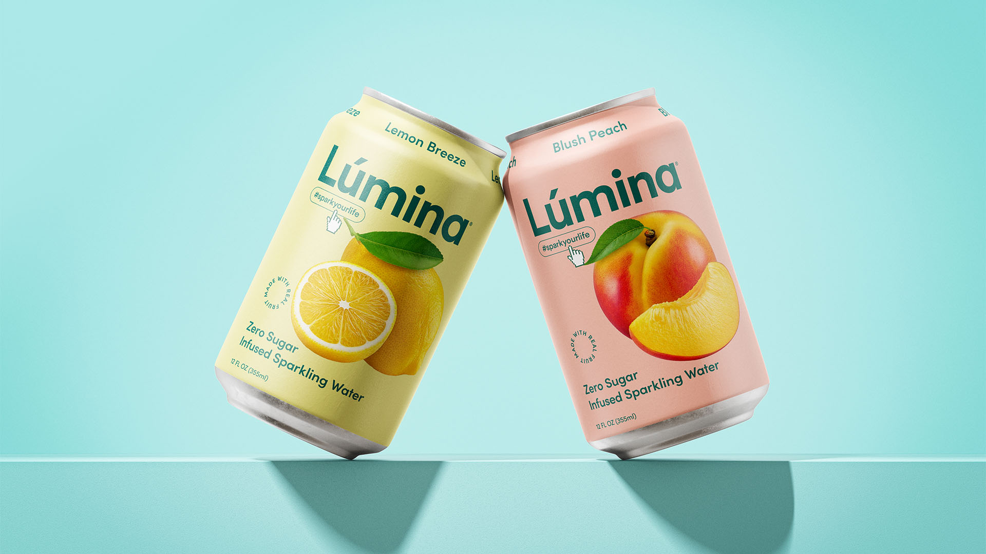
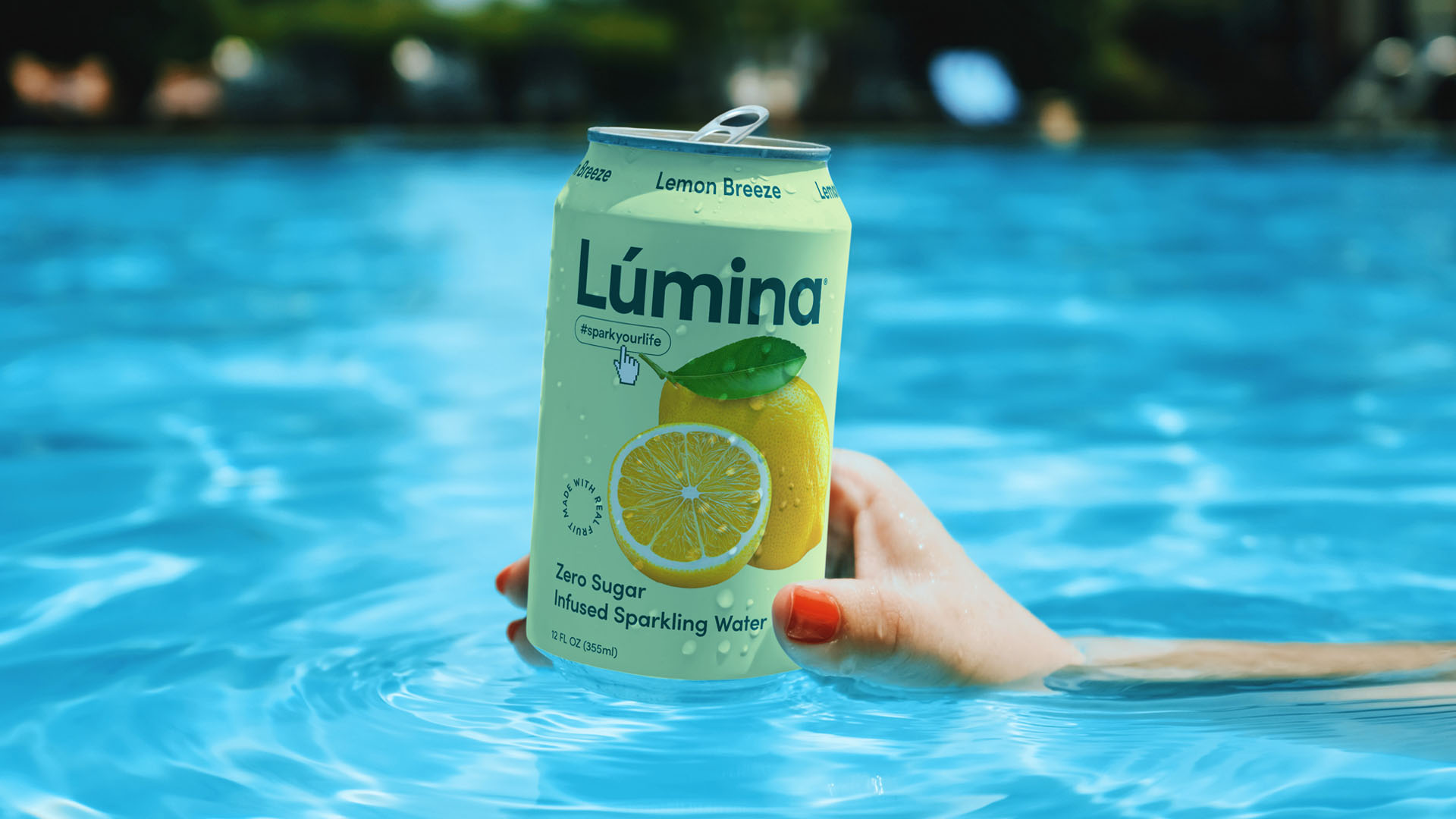
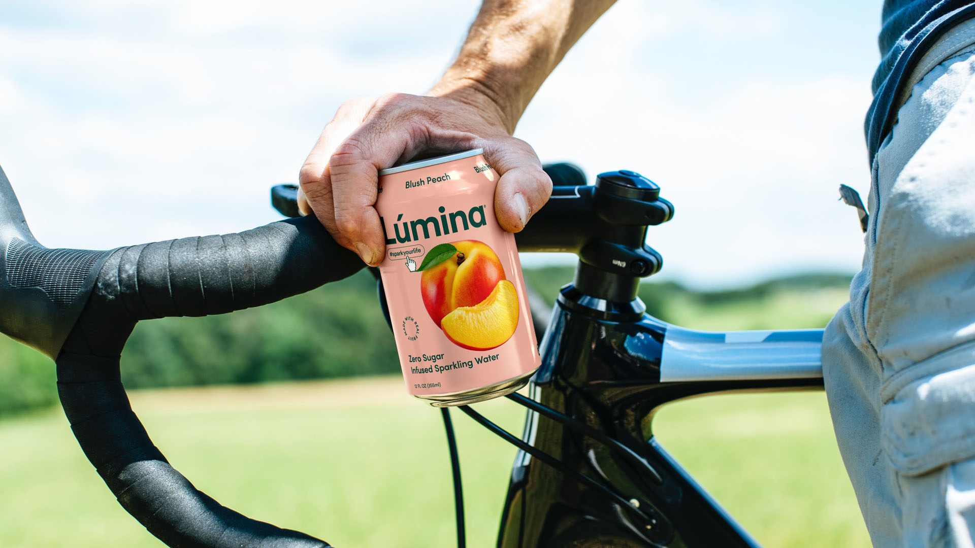
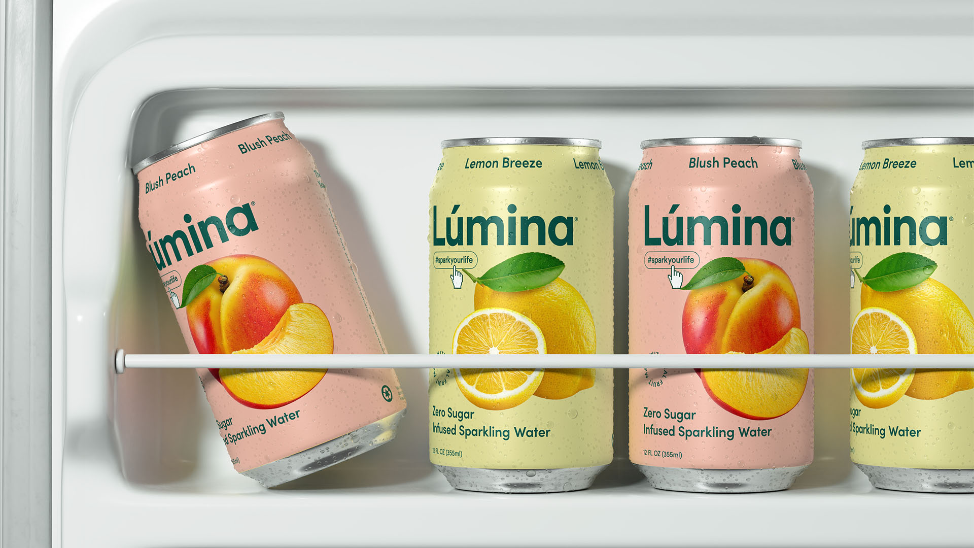
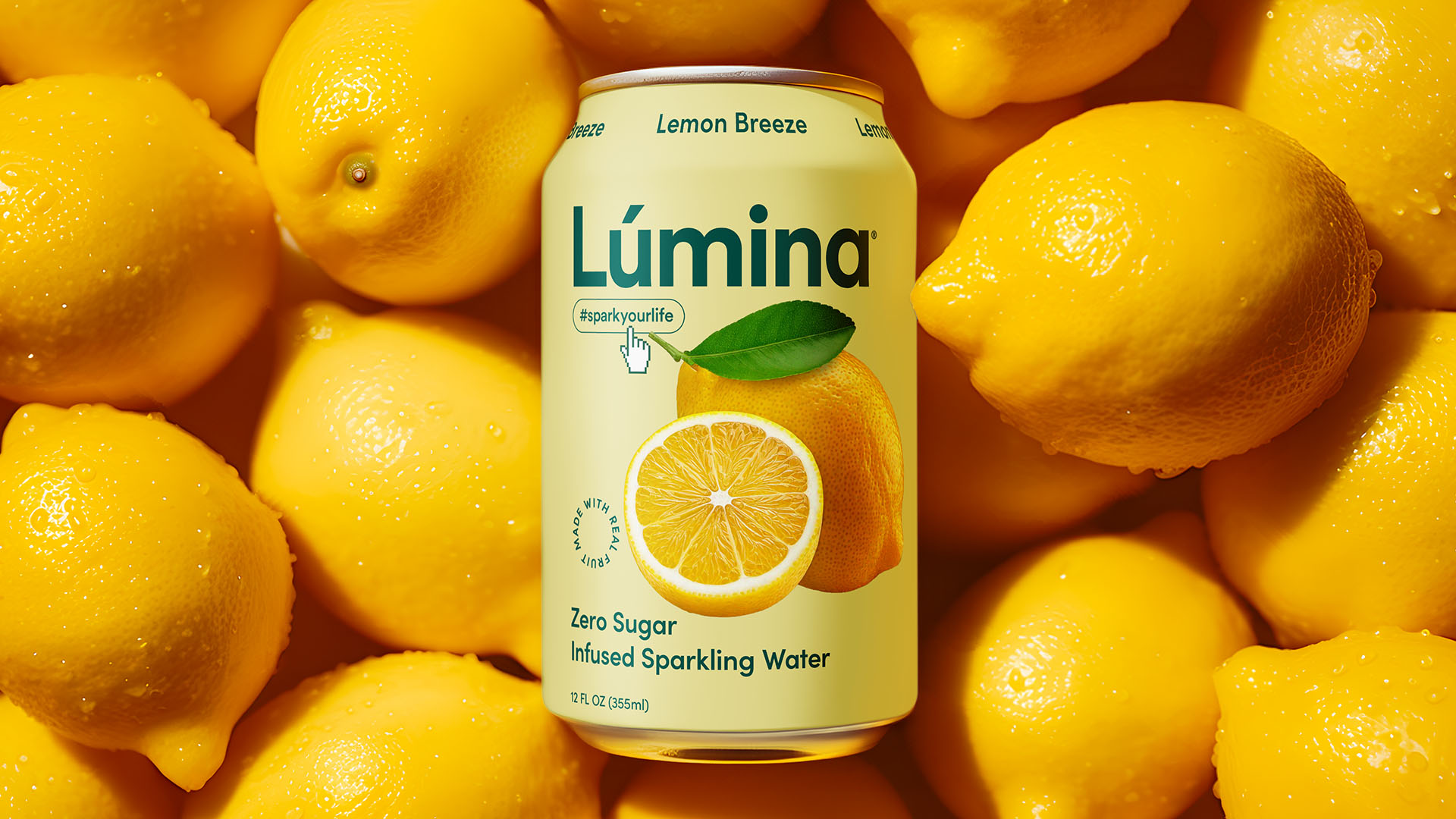
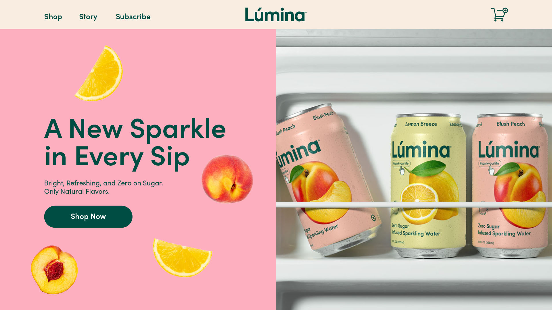
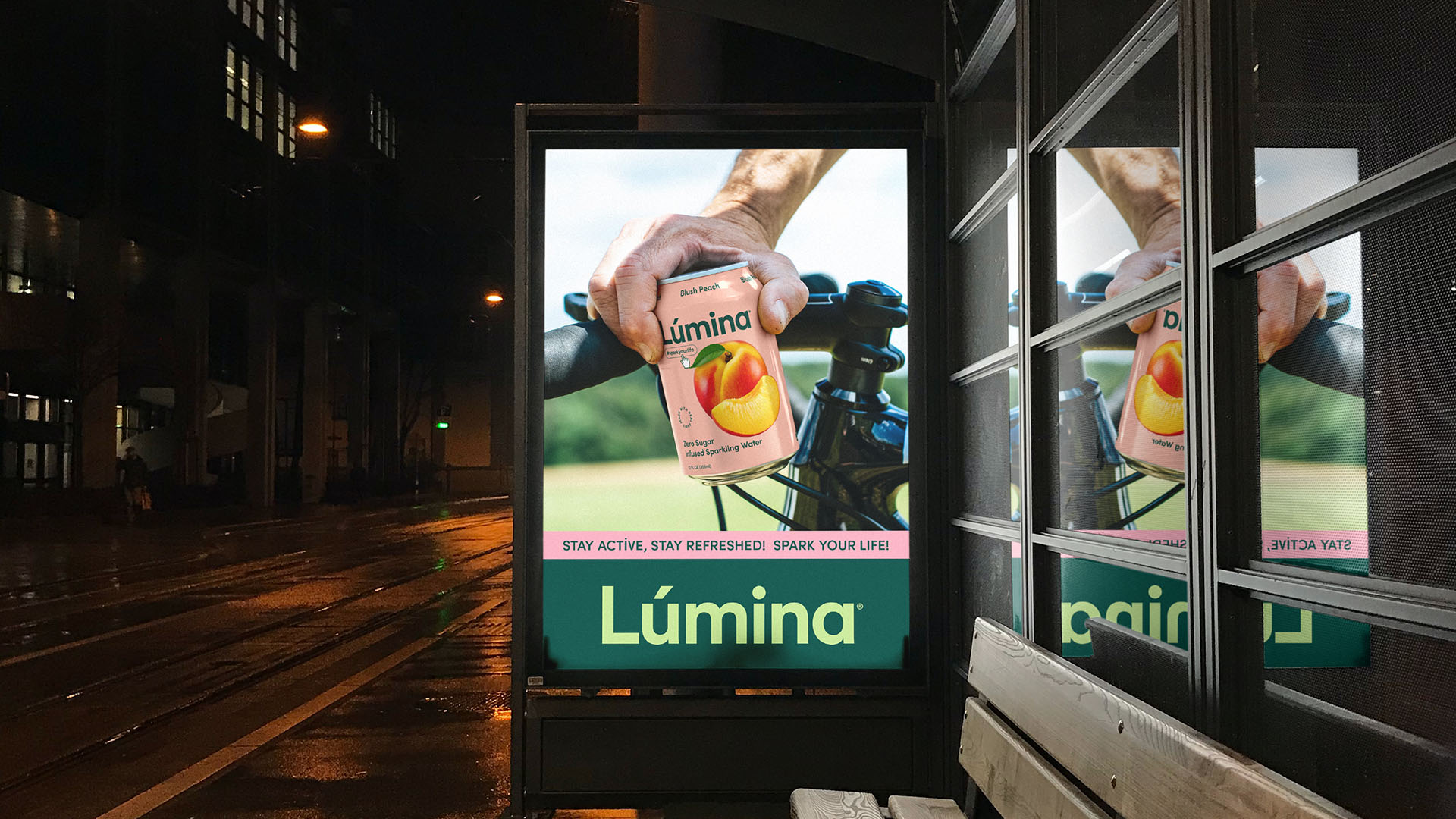
In terms of packaging, our focus was to maintain a minimalistic look while highlighting the natural fruit essence. For the Blush Peach flavor, we used a realistic fruit illustration to connect consumers directly with the main ingredient: fresh peach. The vibrant peach color complements the fruit, creating an organic, unprocessed feel. We followed a similar approach with the Lemon Breeze variant, using a zesty lemon graphic and a bright yellow background to emphasize the refreshing quality of the product.
By avoiding unnecessary elements and visual clutter, Lumina’s packaging cuts through the noise, offering a clean, refined look that reinforces the product’s purity. The realistic fruit imagery allows consumers to instantly identify the flavor, while the bold colors create shelf impact and visual clarity.
Execution
The packaging design for both flavors was executed with digital-first principles, ensuring that Lumina’s identity transitions smoothly across platforms. Whether viewed on store shelves or digital environments, the product’s clean design and bold logotype ensure it remains instantly recognizable. The choice of recyclable aluminum cans reflects Lumina’s commitment to sustainability and eco-friendly practices, appealing to today’s environmentally-conscious consumers.
Digital Approach and Hashtag Strategy
To enhance the digital presence, we incorporated the hashtag #sparkyourlife on the packaging, inviting consumers to engage with the brand and share their experiences online. This approach not only creates a memorable digital identity but also helps Lumina build a community centered on health, freshness, and vibrant living.
Result
By balancing modern simplicity with bold, natural imagery, Lumina Sparkling Water effectively communicates its core brand values: clean ingredients, authentic taste, and a refreshing experience. The packaging ensures shelf impact and clarity in a highly competitive market.
Services Provided
• Brand Naming: Creation of the name Lumina, embodying brightness and vitality.
• Visual Identity: Development of a minimalist logotype and harmonious color palette.
• Packaging Design: Design of clean, impactful packaging with a focus on real fruit and flavor clarity.
• Digital-First Integration: Ensuring seamless adaptation of the brand identity across digital platforms with strategic hashtag integration.
CREDIT
- Agency/Creative: Widarto Impact
- Article Title: Widarto Impact Create Brand Identity and Packaging Design for Lumina Sparkling Water
- Organisation/Entity: Agency
- Project Type: Packaging
- Project Status: Published
- Agency/Creative Country: Indonesia
- Agency/Creative City: Trenggalek
- Market Region: Europe, Middle East
- Project Deliverables: Brand Design, Brand Guidelines, Brand Identity, Brand Naming, Brand Strategy, Packaging Design, User Experience, Web Design
- Format: Can
- Industry: Food/Beverage
- Keywords: Branding for FMCG Markets, Global Design Expertise, Strategic Brand Design, Asia & Europe Brand Design, London Branding Agency, Texas Branding Agency, San Diego Branding Agency, Jakarta Branding Agency, Surabaya Branding Agency, Jeddah Branding Agency
-
Credits:
Creative Director: Eko Widarto


