Awaken – Your ultimate Wake up call!
The product;
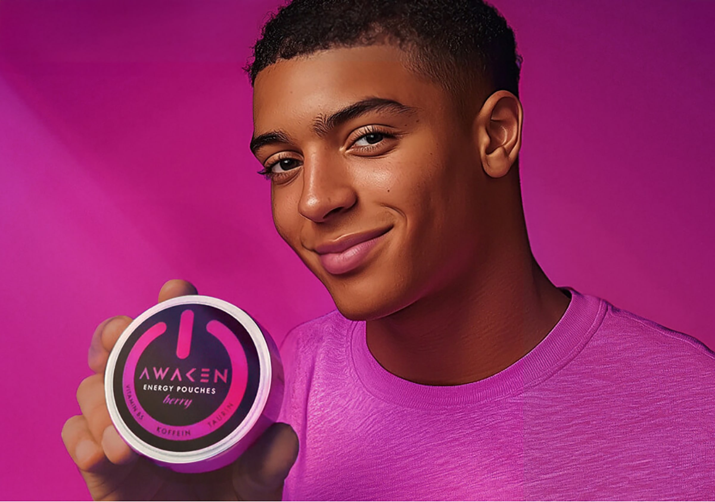
For the new product and brand Awaken we were asked to design the packaging and branding. Awaken is a completely new product, so it’s always exiting to get involved from scratch and think about how the packaging, naming, logo can all come together to explain the consumer what the product is all about.
Awaken is a vegan, caffeine-containing dietary supplement in the form of pouches. It offers a quick and easy way to boost your energy without resorting to energy drinks, which can be handy if you don’t want to go to the toilet all the time. So, it is ideal for night owls, students, gamers, shift workers, long meetings and anyone looking for an alternative to energy drinks.
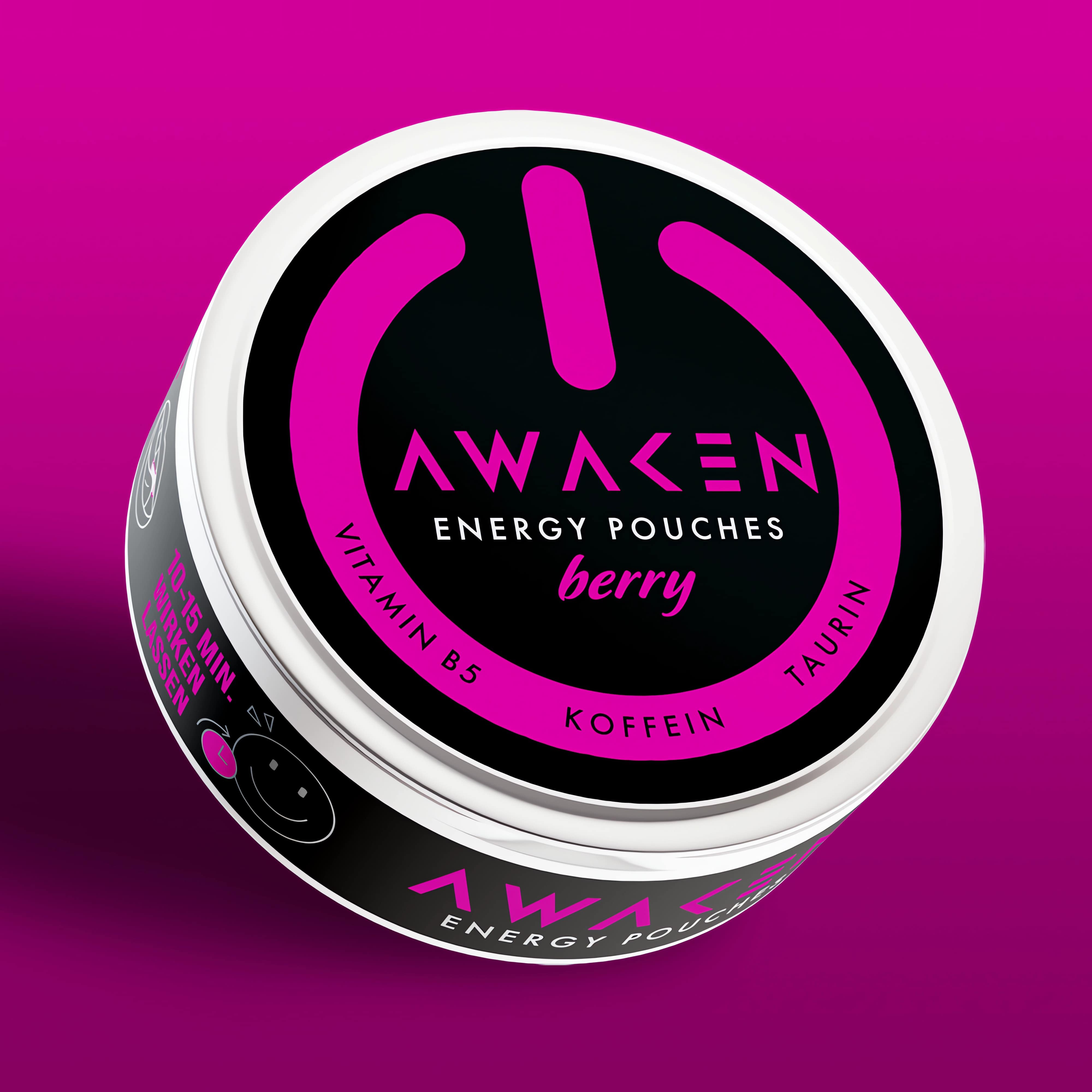
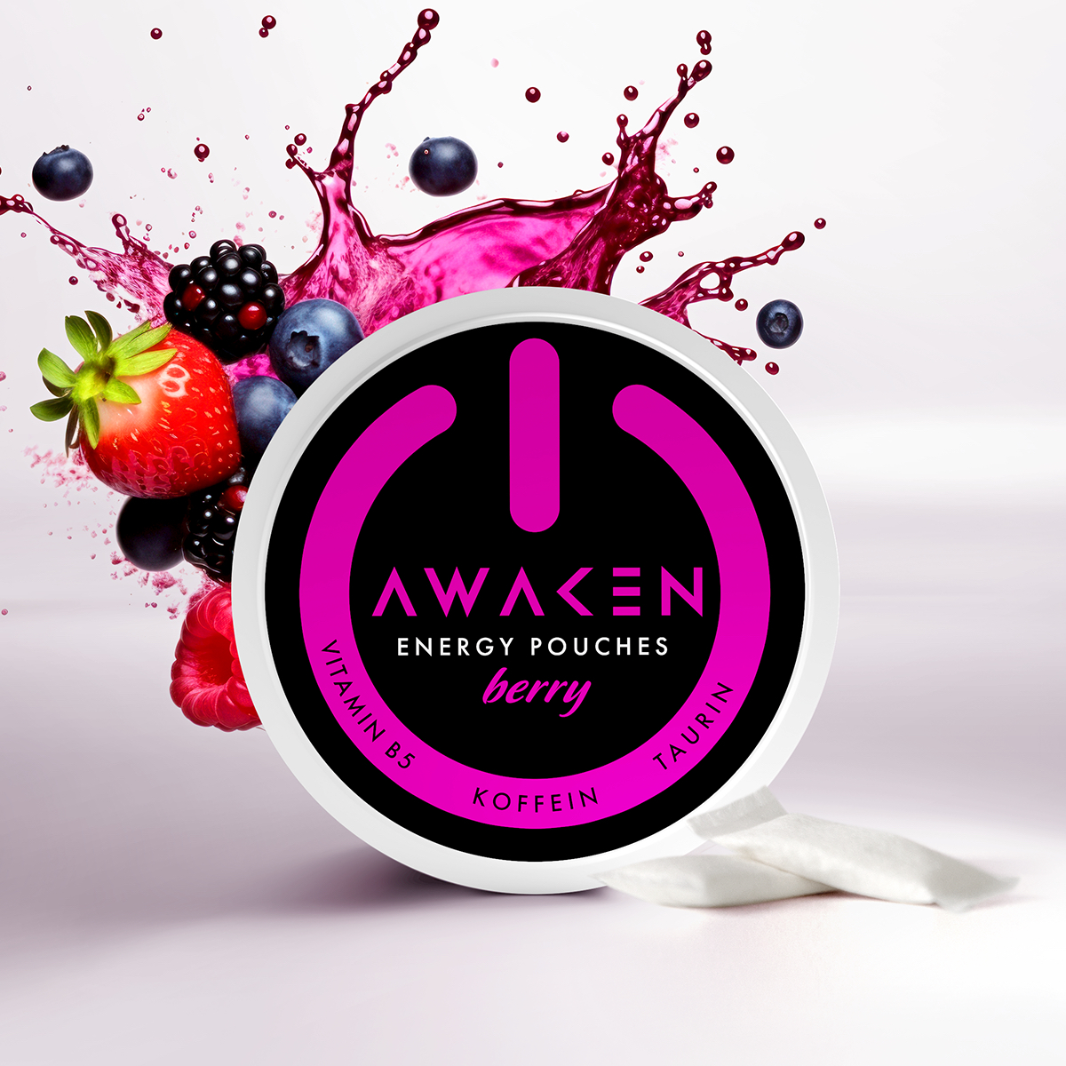
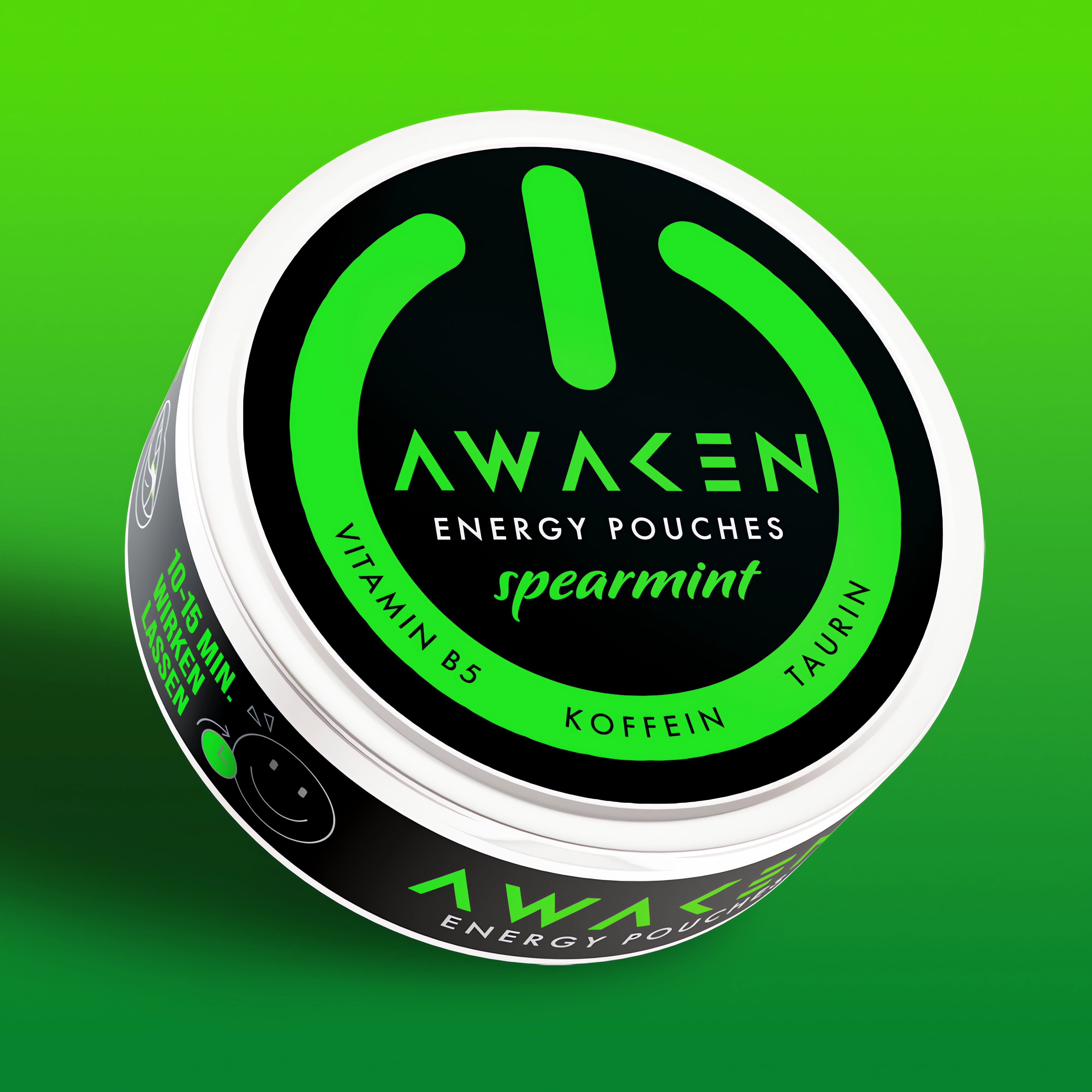
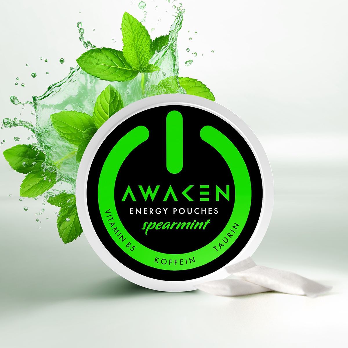
Not only are they vegan and sugar-free, but they also contain vitamin B5 and taurine! And with 80 mg of caffeine per gram, they’re the pick-me-up you’ve been waiting for. It’s available in Berry, Spearmint and Cola flavors.
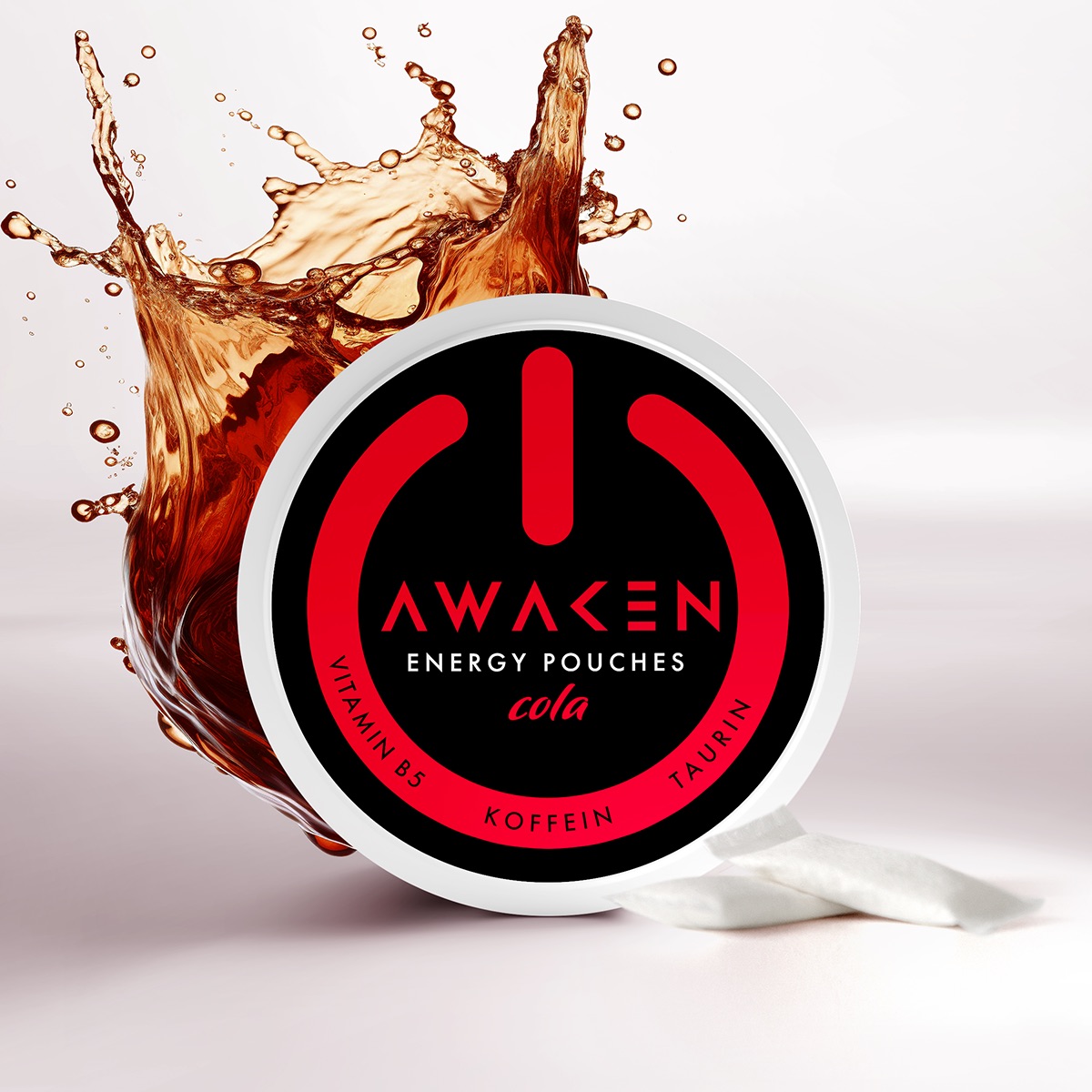
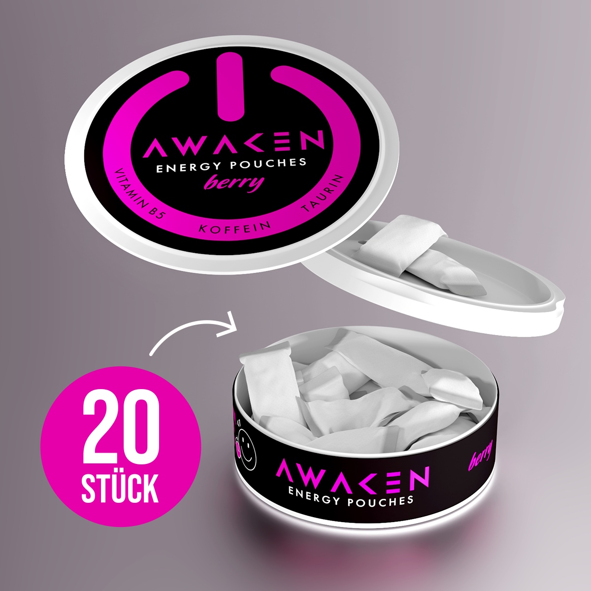
To use the product, you place the pouch on your tongue and moisten it slightly. Then place the pouch under your upper lip and just Leave it there to work for 10-15 minutes. After that time, you can throw it away. Or even better… Place it back in the packaging since there is a special compartment for it.
The Design;
The energy design market is already big and intense, with tablets. There is a big range of design styles out there. Big red bulls, lighting bolds, muscular figures etc. So, we wanted to be different and keep it simple but still more powerful than all the designs out there. Our brainstorms took us back to the very simple question… what does it do? Also, since it is based on caffeine, what does the first cup of coffee do with you in the morning. It wakes you up, it turns you on… and BOOM the rest was history and only needed to be worked out.
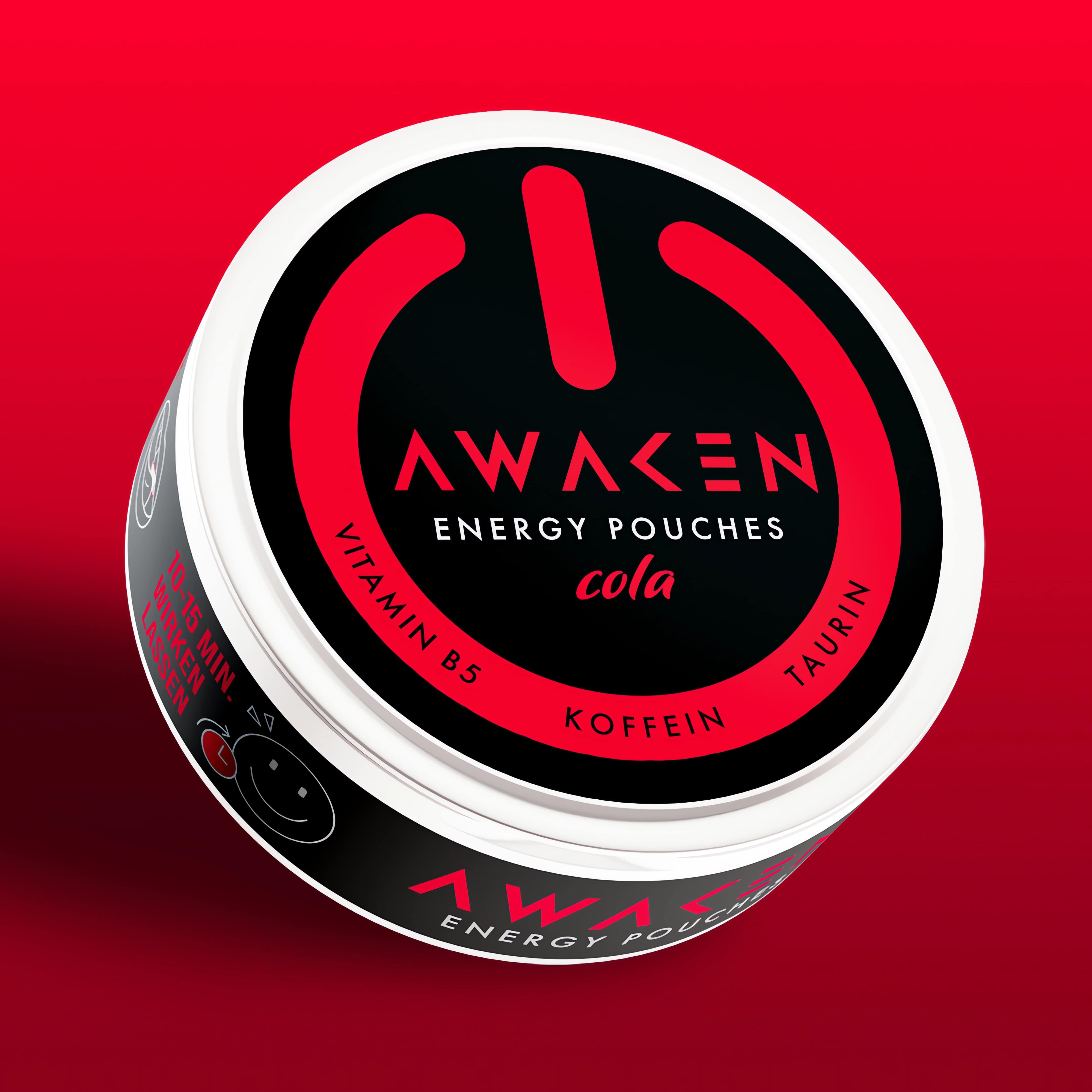
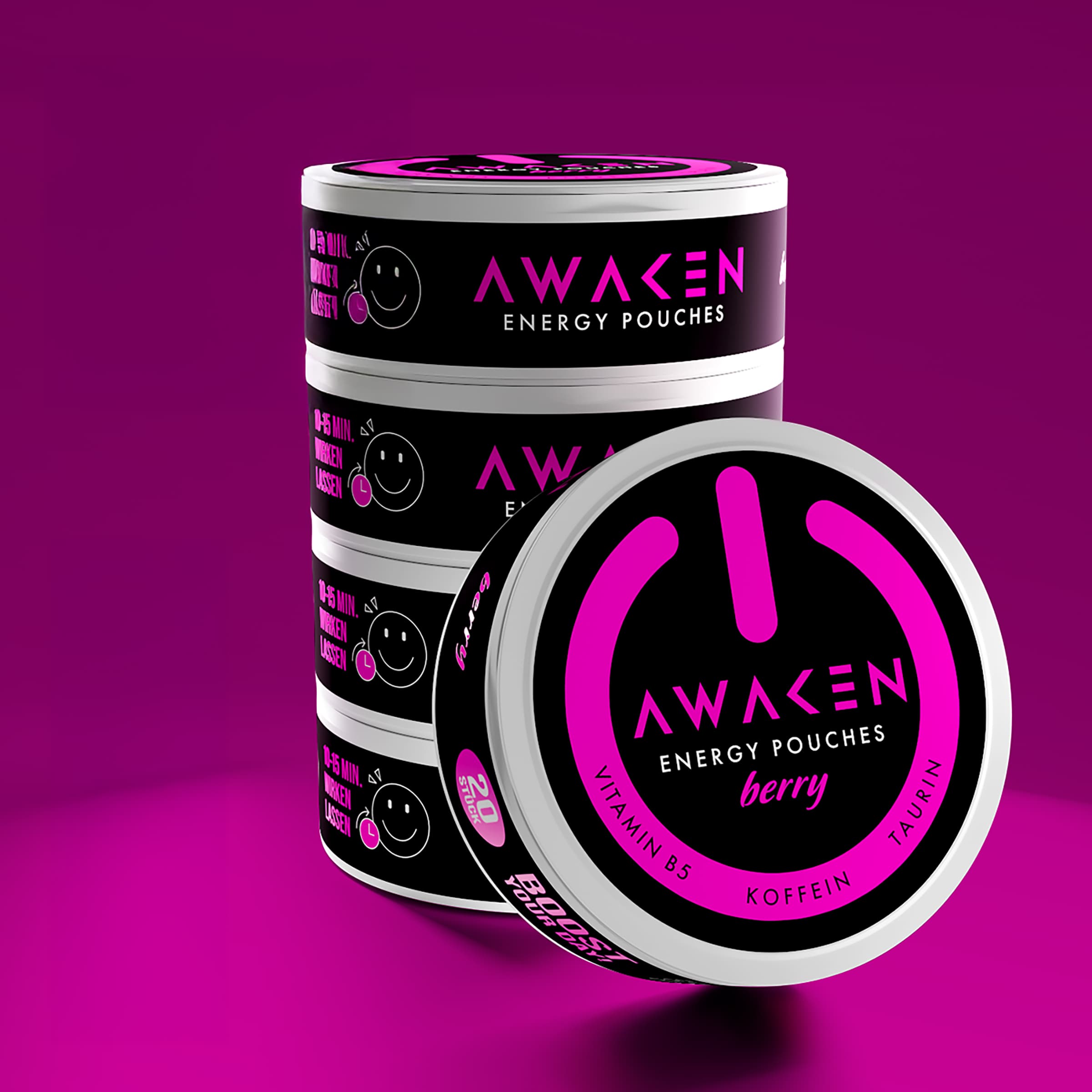
The packaging design is literally a “turn on” button, in shape as well as in graphical design. We used eye-catching bold colors, that separate the different flavor SKU’s. Withing the “on”-sign on top of the packaging we kept the communication as minimum as possible to have a strong visual storytelling. We used the sides to display in a fun way, how to use the product. The packaging shape is meant to be the 3D button itself. It is constructed in a smart way, so you have a fresh compartment and a separate one for the used pouches, making sure that the streets will not be littered like you see happening with gum for example.
CREDIT
- Agency/Creative: Van Heertum Design VHD
- Article Title: Van Heertum Design VHD Creates Awaken Packaging and Brand Design
- Organisation/Entity: Agency
- Project Type: Packaging
- Project Status: Published
- Agency/Creative Country: Netherlands
- Agency/Creative City: Tilburg
- Market Region: Europe
- Project Deliverables: 2D Design, 3D Design, Art Direction, Brand Creation, Graphic Design, Packaging Design
- Format: Case
- Industry: Energy
- Keywords: pouch, enery, packaging design, branding, logo design
-
Credits:
Strategy Director: Rob van Heertum


