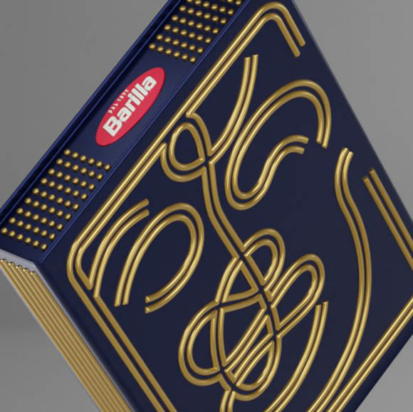
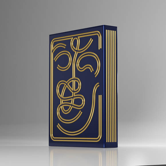
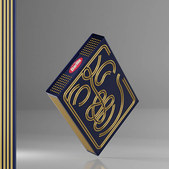
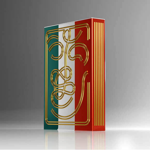
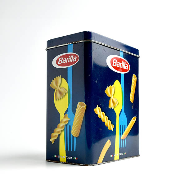
Idea/Challenge: Pasta lovers always have a container with this food product at home, and it always has to be within reach! Since I have one, it was from this Barilla packaging that I set out, as a designer, to create a sustainable and long-lasting alternative which was also appealing and decorative. The basic idea is the face of an organic and fun human figure drawn with spaghetti.
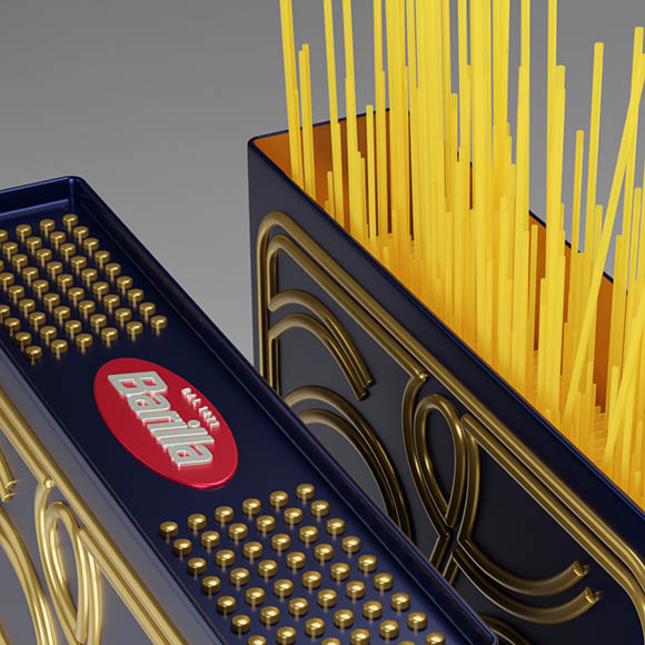
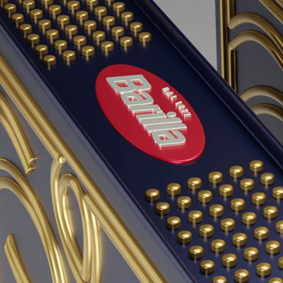
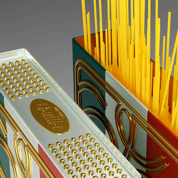
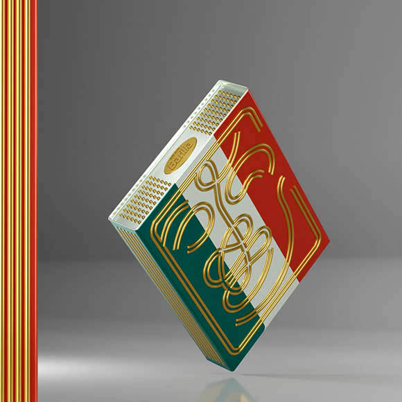
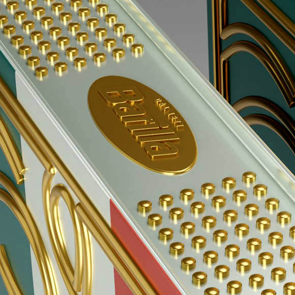
Project. The project resulted in two proposals with the same shape (parallelepiped) and the same basic design (the figure). One of the packages is entirely made up of the graphic codes of the brand’s branding, where “Barilla blue” and the (recently changed) red and white logo prevail; the other proposal is dedicated to Italy, with the body of the package decorated in the colours of the Italian flag and also featuring the same figure in gold, this version reinforces the message used by the brand as being “(… Barilla as the) world’s leading brand of intensely Italian pasta”.
The design and colours of both packages are worked with a semi-gloss finish (offset printing) and tinplate-embossed main elements, giving them a metallic appearance that is very appealing and distinctive in the style of the Barilla brand. The inside of the package with a gold finishing (yellow on tinplate) corresponds to the varnish that allows it to come into contact with food and reinforces the feeling of comfort due to the luminosity provided by the gold.
Objective: In addition to satisfying pasta lovers, this packaging will be eye-catching on the shelf and decorative at our homes. As it is refillable, it is more environmentally friendly.
The spaghetti man (l’uomo spaghetti) concept is intended to be a replicable idea for all other types of Barilla pasta, thus creating a Barilla collectible packaging set.
CREDIT
- Agency/Creative: MPFXDESIGN
- Article Title: “l’uomo Spaghetti” Barilla Spaghetti Packaging Design Concept
- Organisation/Entity: Agency
- Project Type: Packaging
- Project Status: Non Published
- Agency/Creative Country: Portugal
- Agency/Creative City: Porto
- Market Region: Europe
- Project Deliverables: Creative Direction, Graphic Design, Packaging Design
- Format: Can, Tin
- Industry: Food/Beverage
- Keywords: packaging design spaghetti
-
Credits:
Art Director / Designer: Miguel Pinto Félix


