In Russia, coffee sales have doubled over the past ten years.And despite the fact that HORECA buys only 13% of the coffee consumed in Russia, this market segment is also actively growing. In 2023, the number of coffee shops in million-plus cities totals more than 15,000 outlets, according to Kommersant.
According to Knight Frank, in recent years, consumers in Russia have become better versed in coffee, and establishments have begun to adapt to this demand. New large chains are developing in the country, as well as author coffee shops are opening en masse.
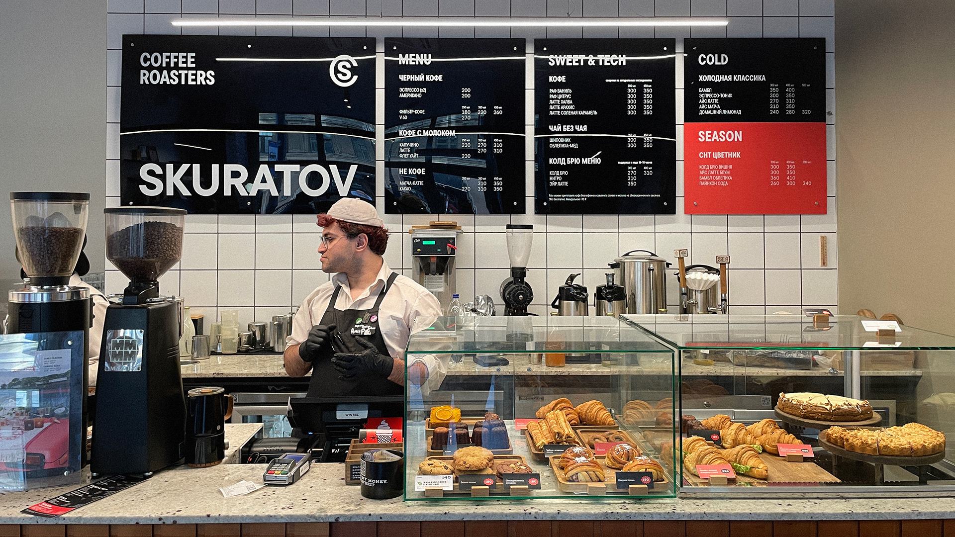
Skuratov Coffee, also known as Skuratov Coffee Roasters, is a Russian coffee chain founded by Siberian entrepreneur Viktor Skuratov in 2013. It is known for its own roasting of coffee beans, as well as the introduction of cold brew coffee—based beverages (cold brew) – nitro coffee and air latte.
Now there are 58 coffee shops in seven cities of Russia and two roasting shops in the network. And this is one of the leading federal coffee chains of the so-called Third Wave, when local consumers began to set new standards for establishments.
The core of the audience:
– managers who have a coffee shop near work or on the way; with the opportunity to take coffee with them or organize a business meeting or work at the coffee shop;
– Woman and young mothers taking coffee with them for a walk, a snack, to meet a friend;
– a creative class to get a new experience, experiment with the flavors of drinks.
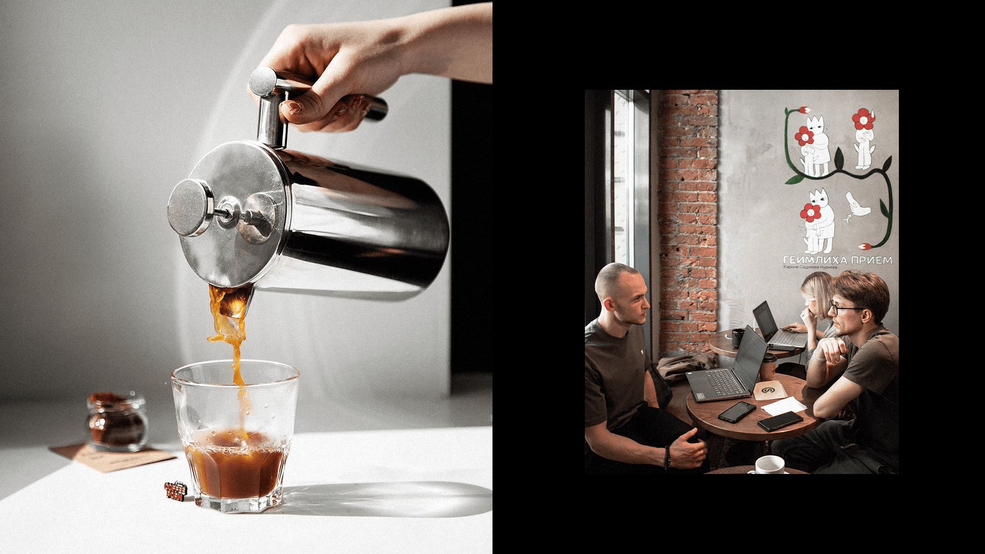
The uniqueness of the Skuratov brand lies in the community formed over 10 years of employees and customers, active young people participating in various activities for the development of cities of presence.
The Skuratov Coffee team approached our agency with the task of developing a complete visual image both in the media space for system communication with customers, as well as in the packaging of products and the visual identity of coffee shops. Regulations were also important for optimizing the development of design materials, since each time the process of inventing a new medium was started anew.
The basis of the brand platform was the idea of Skuratov People — a subculture and the community belonging to it — from employees to customers. The purpose of which is to create that correct, already familiar atmosphere when you can go to any “Skuratov” in any city and feel yourself among your own, feel support, recharge from each other. Coffee becomes a connecting link, and the community expands and goes beyond coffee shops, further changing the world around them.
Skuratov, as a cultural institution, supports local authors, creates collaborations and helps artists and photographers promote their work. Coffee shops can become an improvised exhibition space, arrange lectures. The basis of the design system was the logo frame, created from an updated version of the existing logo. “Skuratov” becomes the frame that frames events and unites people within itself, and the sign (S) is a sign of citation, authorship in art and literature.
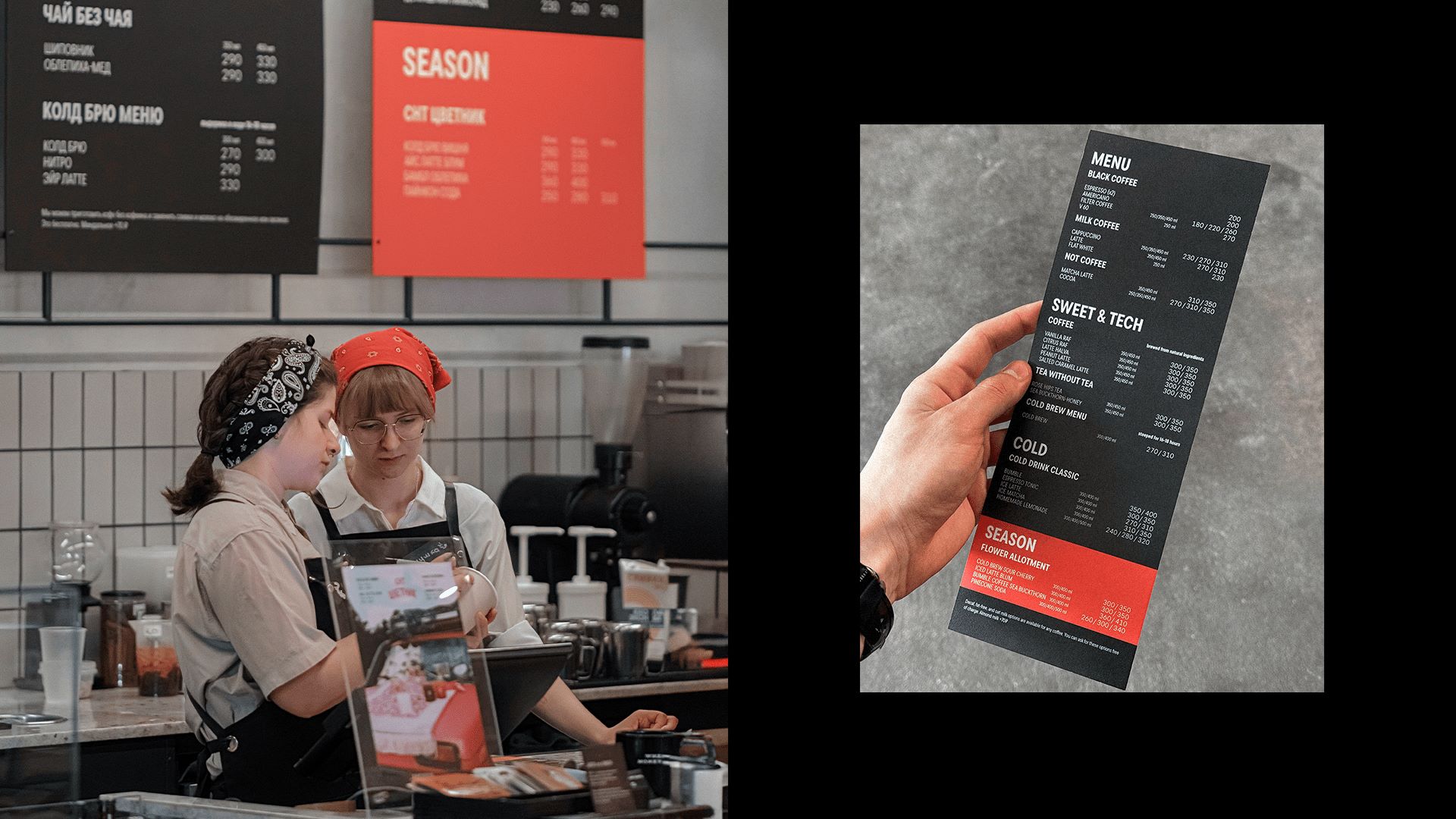
We have divided all the design needs of Skuratov into two large parts, Base and Art. Base has become the language of communication on behalf of the coffee shop itself: menus, technical plates, price tags, packages of basic items of coffee beans and drips, This part is made in monochrome (white, black and medium gray), mainly solved by means of typography, sometimes supplemented by drawings of employees with a black marker. All creative manifestations got into Art: limited edition packaging, collaborations, small lots of grain, posters, art objects in the interior, Heimlich’s reception. These objects can be of any colorfulness, change more flexibly, but always remain within the boundaries of the logo-frame.
The new positioning was immediately adopted and is actively used in the company’s communications both for the HR brand and with coffee shop visitors. The new style is being implemented, several new coffee shops with a new style have already been opened, the implementation has been significantly simplified and accelerated. Skuratov receives positive feedback from its regular visitors about the identity update.


CREDIT
- Agency/Creative: Ohmybrand
- Article Title: Skuratov People: Rebranding of the Federal Coffee Chain Skuratov Coffee
- Organisation/Entity: Agency
- Project Type: Packaging
- Project Status: Published
- Agency/Creative Country: Russia
- Agency/Creative City: Ohmybrand / Moscow
- Market Region: Europe
- Project Deliverables: Brand Design
- Format: Cup
- Industry: Food/Beverage
- Keywords: Branding, Cafe Branding, Rebranding, Strategy
-
Credits:
Creative Director: Nadezhda Parshina
Art Director: Alexandra Pershina
Designer: Egorova Maria
Designer: Panarina Anastasia
Designer: Galimskaya Daria Ioanna
Project Manager: Marina Tikhonova
Strategy: Vadim Bogdan
Consultation: Evgeniy Kashirin
3D: Volozhanin Danil
Animation: Nikitin Evgeniy


