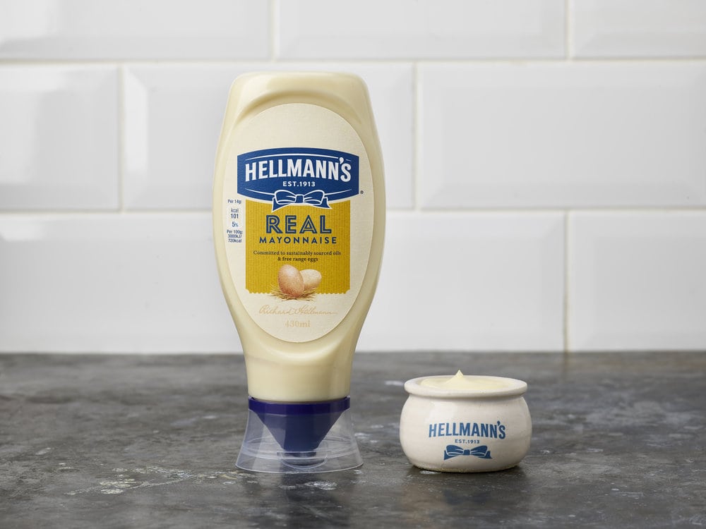
” Independent brand design agency Design Bridge are excited to reveal details of their landmark work for Hellmann’s, creating new branding and packaging for their entire portfolio. The new designs are a bold departure for Hellmann’s, inspired by the brand’s beginnings in a traditional New York deli and celebrating their commitment to sustainably sourced ingredients. The packaging will be rolled out globally across Hellmann’s range of products including the original mayonnaise, ketchup, dressings, mustards, vegan and organic products.Mike Stride, creative director at Design Bridge commented, “Our challenge was twofold: to broaden people’s perceptions of Hellmann’s as being so much more than just a mayonnaise brand, and to move Hellmann’s away from its existing bright, synthetic branding to a more natural aesthetic rooted in their belief in real food, made with real, simple ingredients.”Design Bridge began by delving into the history of Hellmann’s to discover its delicious past, which began over 100 years ago when the enterprising Richard Hellmann opened his deli on Columbus Avenue, Manhattan. It was here that he and his wife Margaret worked on perfecting the very best and tastiest mayonnaise recipes, filling jars to the brim with delicious blends of ingredients to create the ultimate creamy texture and taste. Proud of his product, he tied his signature blue ribbon around the best-selling recipe as a symbol of the finest quality, which went on to become the mayonnaise we know today. It’s these honest and authentic beginnings that Design Bridge have steered the brand back towards, developing the overarching idea of ‘Born in the Deli’ to communicate Hellmann’s enduring passion for bringing out the best in real, pleasurable food moments.”

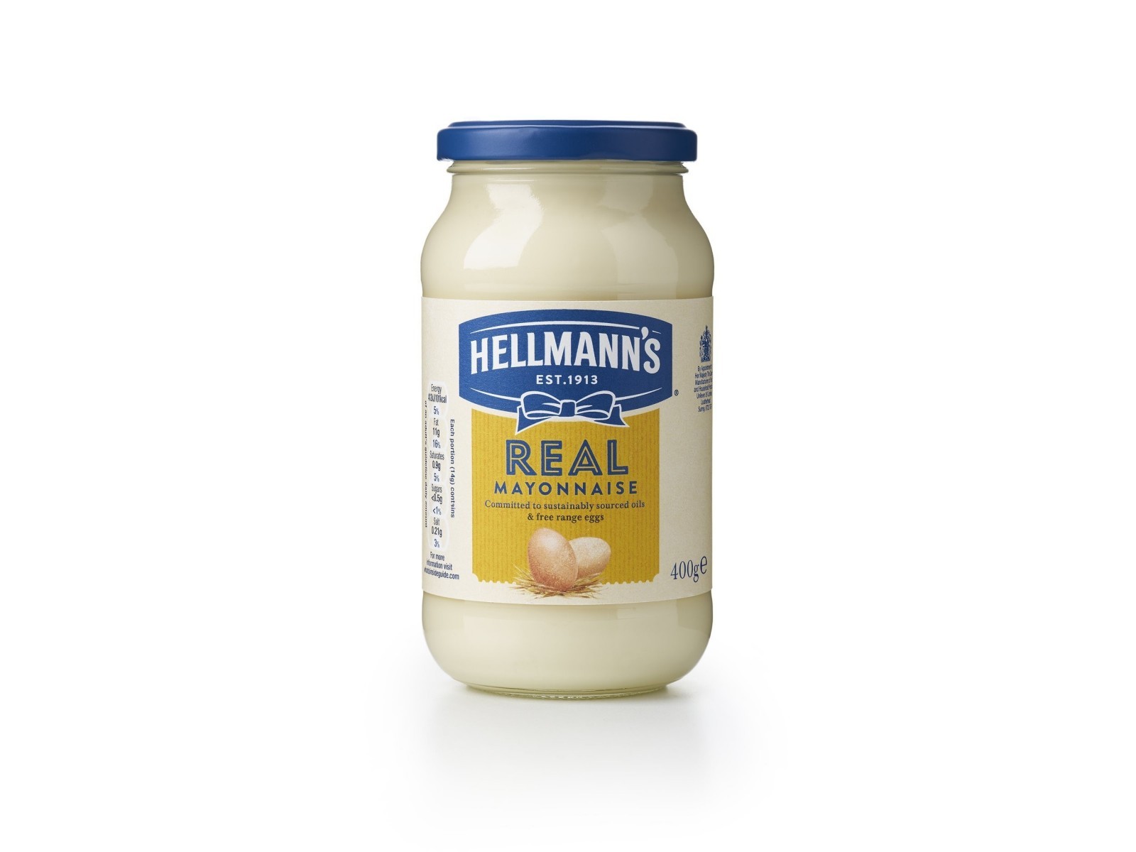
“Mike Stride from Design Bridge continued, “Our designs take people on a trip back to the first Hellmann’s deli where products are made instead of manufactured. We’ve replaced the synthetic blue and yellow branding with neutral, natural ‘colours with soul’, along with textures inspired by a welcoming deli interior: wood, brown paper, ceramics. Our new, hand-drawn illustration style brings warmth and personality to the packaging, depicting the real, raw ingredients that go into the products, instead of using hyper-realistic photography. We’ve also created a new suite of typography and fonts based on original deli signage.”The backdrop of each label takes its cue from deli counter tickets and varies in colour depending on the product type, bringing consistency to the portfolio, while the blue-ribbon logo has been simplified with a one-colour treatment and the lids of the jars given a more muted, matt finish instead of gloss. Design Bridge’s brand language team have also brought the spirit of a neighbourhood deli to life through the copywriting and tone of voice on pack, which now feels as if it’s been written by your favourite deli worker: passionate about food and always smiling.”

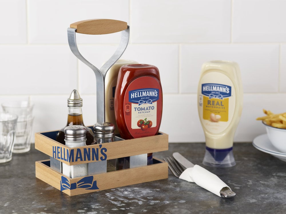
“Design Bridge have continued the ‘Born in the deli’ aesthetic beyond the packaging designs, creating condiment caddies for restaurants inspired by traditional wooden food crates, as well as porcelain ramekins to hold sachets of Hellmann’s sauces. Designs for signage at point of sale feature brown paper textures and the signature blue ribbon as a symbol for the very best quality. Design Bridge have even developed concepts for a pop-up style Hellmann’s café-deli, bringing the deli aesthetic into new branded environments.Joanna Allen, Global Brand VP, Hellmann’s, commented “It’s been a fantastic experience working with Design Bridge to craft this next chapter in Hellmann’s history. The natural, simple aesthetics of the new brand design system not only reflects our original New York deli beginnings with a bold serving of our passion for great tasting food, but also our continued commitment to using real and sustainably sourced ingredients.” “
CREDIT
- Agency/Creative: Design Bridge
- Article Title: Design Bridge – Hellmann’s
- Project Type: Packaging
- Format: Jar
- Substrate: Glass


