Brand Design Concept
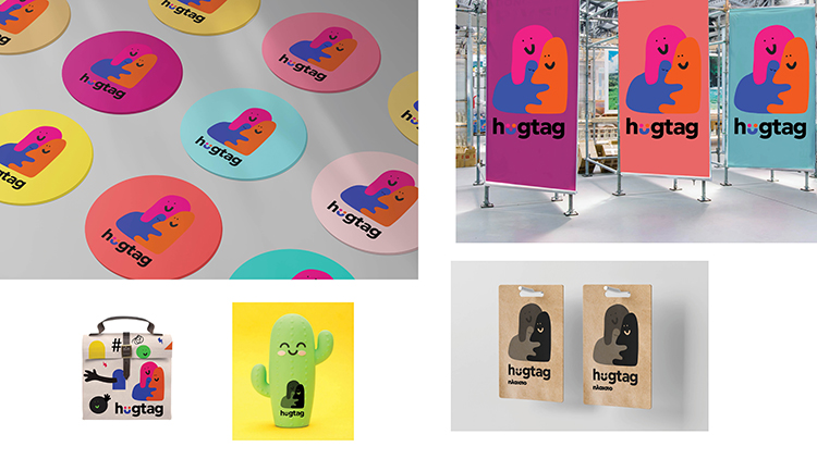
The new branding I created for Plaisio is a refresh of the company’s visual identity, centered around the development of commercial products such as calendars, notebooks, mugs, thermos bottles, pencils, pens, and lunch boxes. Each of these products carries a symbolic meaning, as they represent a “hug.” These “hugs” are transformed into donations to the organizations “Mazi gia to Paidi” and the Prolepsis Institute, supporting their charitable work. The goal was to create a brand that not only stands out visually but also communicates a sense of solidarity and contribution to a good cause.
Hugtag and Symbolism
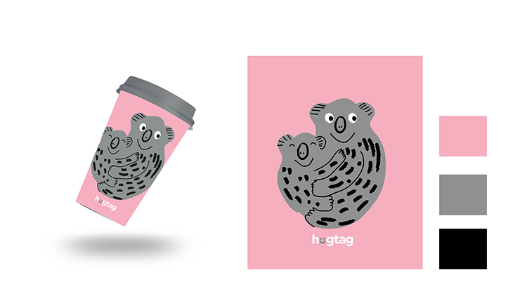
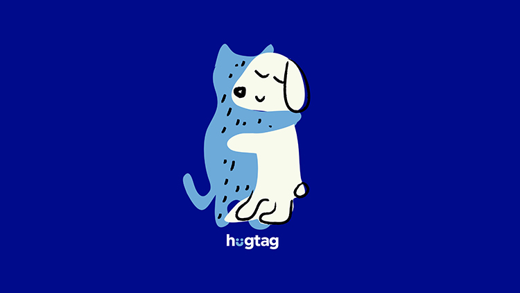
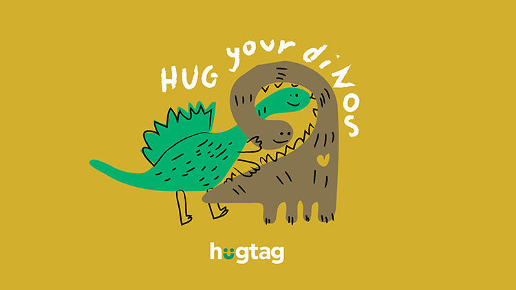
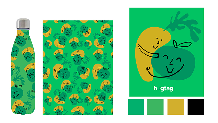
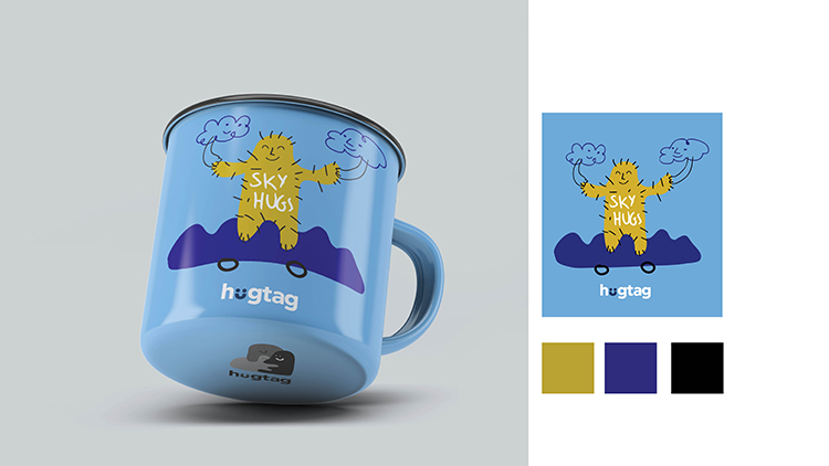
Originally introduced in 2015 as part of Plaisio’s CSR initiative, the hugtag has made a dynamic return. It reconnects the company with the broader public and promotes a sense of unity and empathy. The design for hugtag was inspired by the idea of giving, with the name encapsulating both the act of a hug and its commercial potential. To visually represent this concept, I illustrated animals, fruits, and natural elements hugging each other across all products. This consistent design approach helped reinforce the brand’s identity, making the act of purchasing feel like an extension of this symbolic hug.
Packaging and Visual Integration
These products are more than just items on the shelf; they symbolize an act of giving and compassion. To align the hugtag with Plaisio’s overall brand identity, I used the company’s existing color palette and font. This design decision ensured seamless integration with the corporate branding, creating a cohesive visual experience. It also maintained consistency in communication while enhancing the brand’s recognizability as part of Plaisio’s broader identity. The visual unity across products helped emphasize the impact of each purchase, reinforcing the connection between the brand and the charitable cause.
Logo and Key Visuals
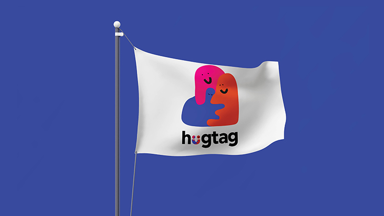
The logo design reflects feelings of joy, contribution, and a symbolic hug. In place of the letter “u” in the logo, I designed a smile or two abstract human figures embracing, symbolizing unity and support for a good cause. The brand’s visual identity was further strengthened through the use of three amorphous, clay-like figures known as HAGS. These figures represent Plaisio and the two NGOs involved in the project, and their changing colors reflect the packaging variations. The key visual element – a strong hug – will be featured across all packaging, ensuring that consumers recognize the brand’s message of giving and solidarity at first glance.



CREDIT
- Agency/Creative: Stella Dimitrakopoulou
- Article Title: Hugtag New Branding Promotes Giving and Solidarity
- Organisation/Entity: Freelance
- Project Type: Identity
- Project Status: Non Published
- Agency/Creative Country: Greece
- Agency/Creative City: ATHENS
- Market Region: Europe
- Project Deliverables: Brand Identity
- Industry: Retail
- Keywords: hugtag
-
Credits:
Concept-Design-Implementation: Stella Dimitrakopoulou


