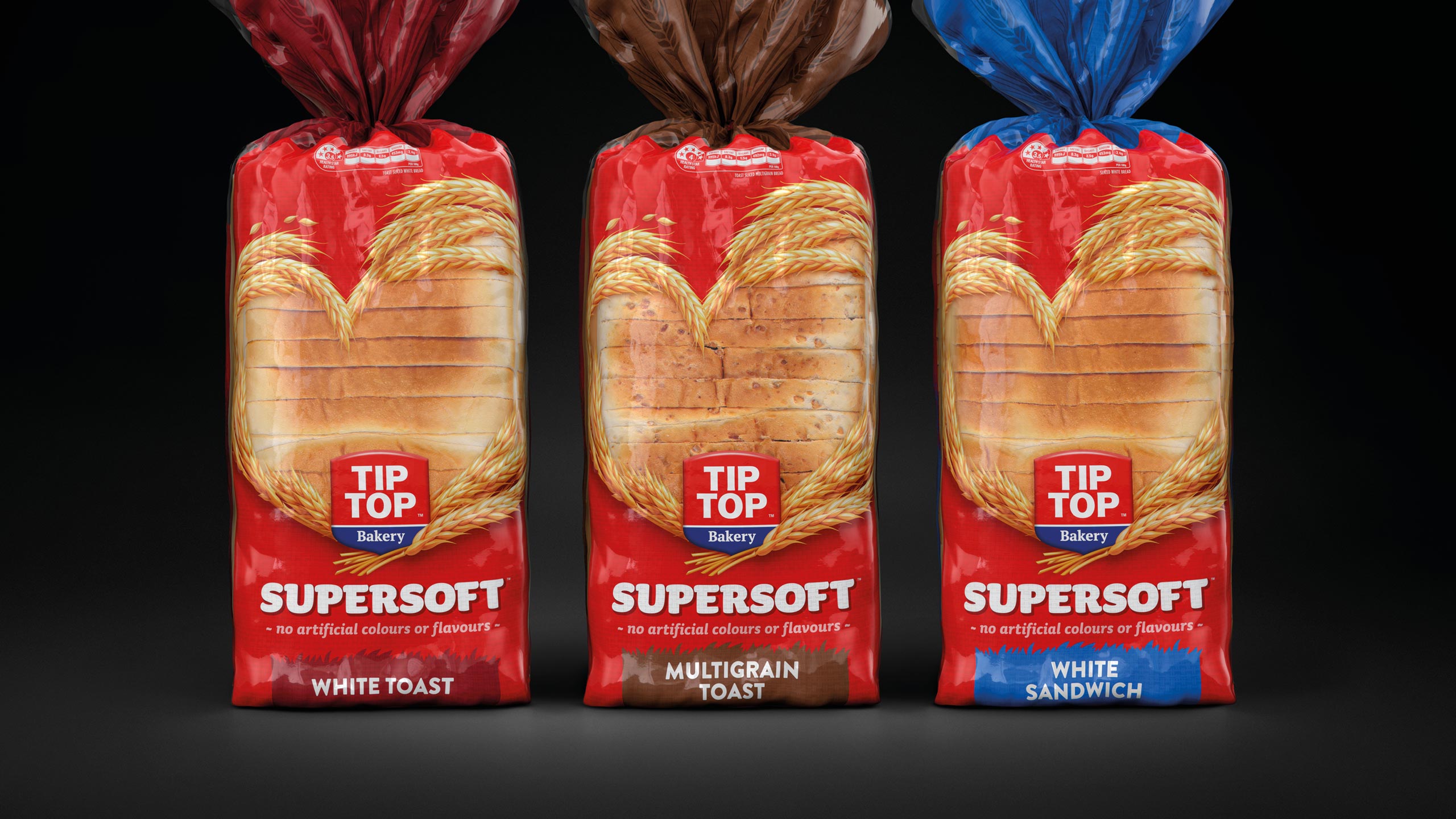
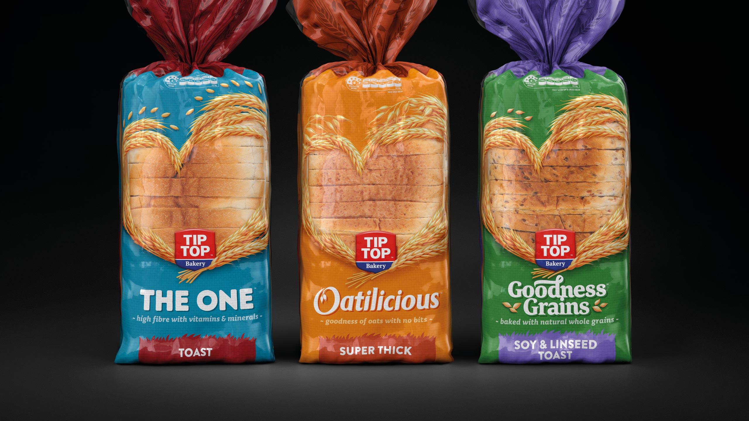
Tip Top is the largest and most recognisable brand within the bread aisle, dominating the category with its strong presence. The existing portfolio was made up of 36 SKUs, but over time it had become fragmented and confusing for consumers. The messaging hierarchy was inconsistent, and the naming conventions lacked clarity, leading to a disjointed customer experience. Our challenge was to streamline the range, improving its cut-through at shelf and making it easier to shop by creating a coherent portfolio architecture that would resonate with the target audience and feel like a unified family of products.
Our vision was to inspire New Zealanders to rediscover their love for quality bread by redefining the role of bakery products in their daily lives, especially for modern Kiwi families. Bread is more than just a staple – it’s part of everyday moments. Through our extensive research, we identified red as a key brand asset, one that was highly ownable and recognisable, giving Tip Top a commanding presence on the shelf. We needed to bring the brand positioning – ‘The bread with the love baked in’ – to life through a fresh, impactful packaging design that would highlight this message and create stronger emotional connections with consumers.
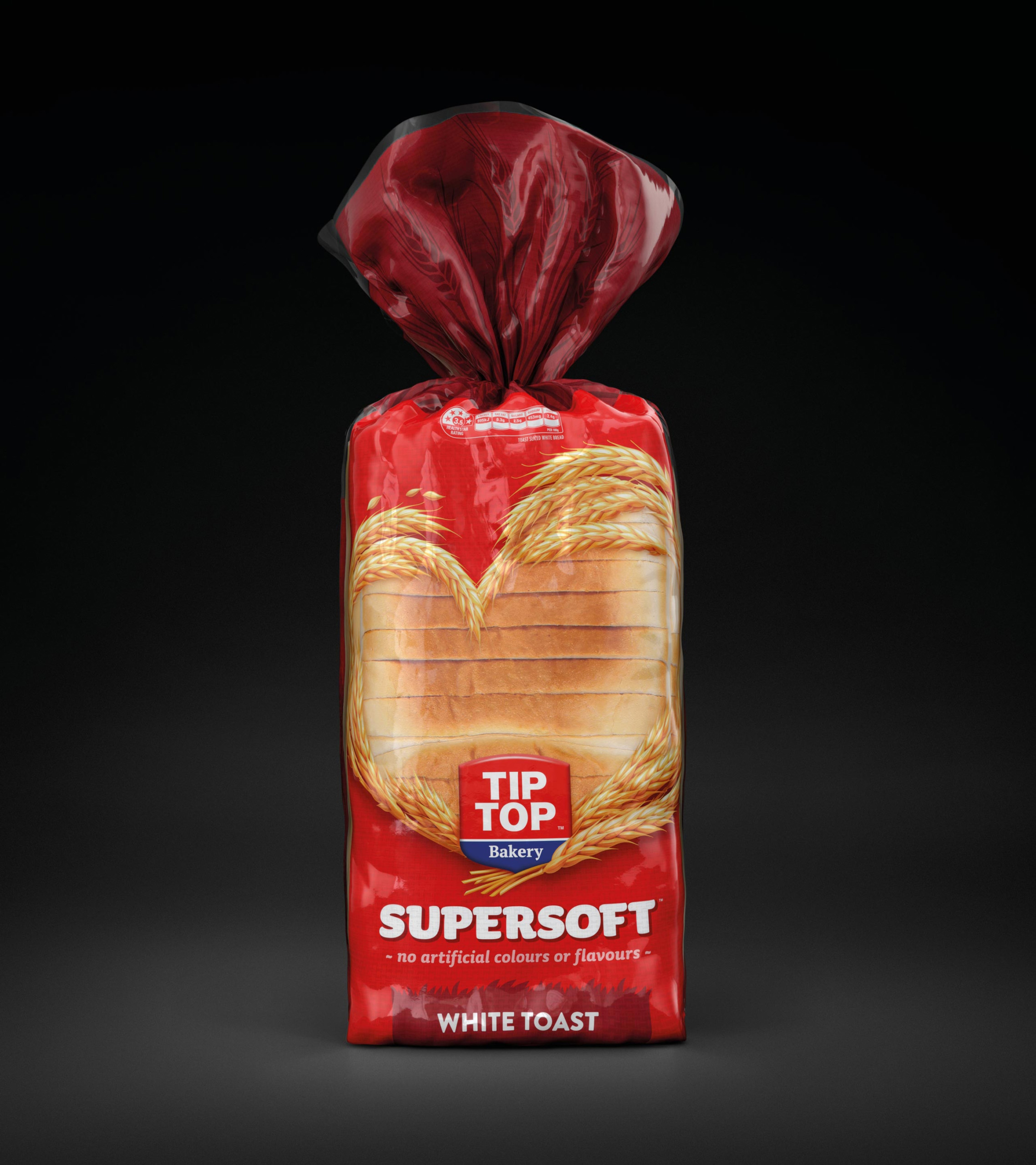
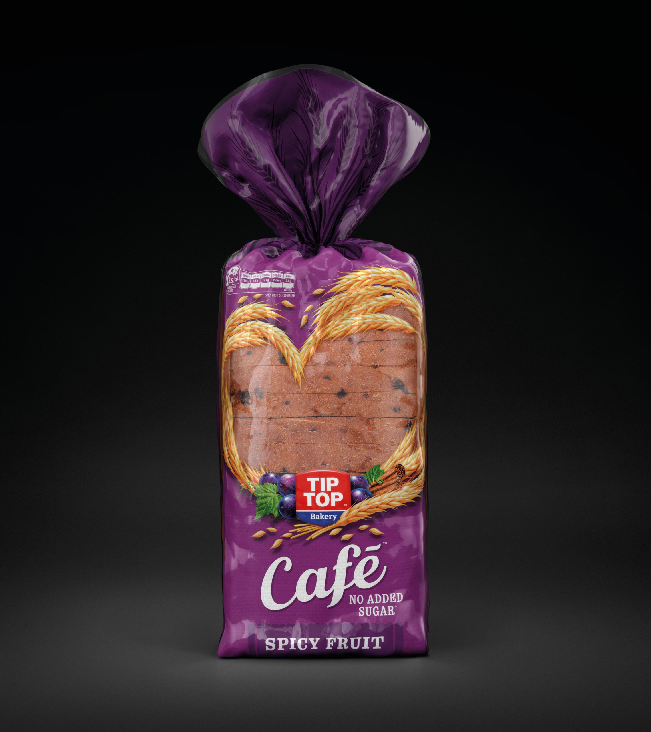
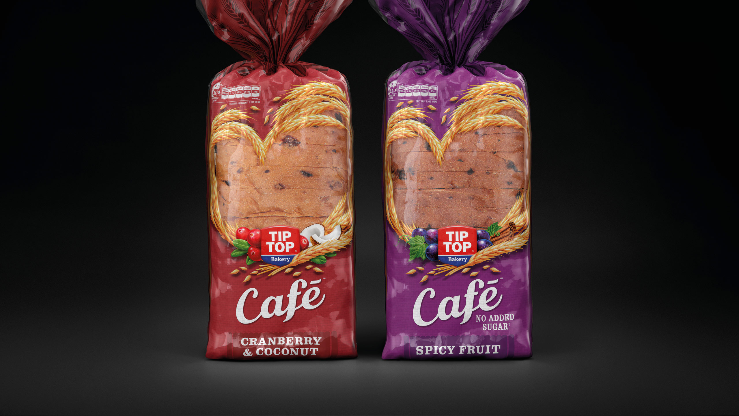
To achieve this, we revised the architecture of the range, moving from a fragmented sub-brand model to one that aligned more with the occasions in which consumers shop for and enjoy bread. This occasion-based model better reflected how people engage with the category, making it easier for them to find the right product for their needs. We also consolidated the design and messaging across the entire portfolio, ensuring a more cohesive and recognisable presence on-shelf. A key element in this evolution was the refinement of the iconic ‘heart’ graphic, which was given a more prominent role on the packaging, ensuring that the core brand message of love and care was front and centre.
One particular SKU, Goodness Grains, had been under threat of deletion due to poor performance. However, following the redesign and repositioning, it has become one of the brand’s most successful products, now receiving a 90% recommendation rate from consumers. Overall, sales across the Tip Top range have seen significant growth, with the revised brand architecture and design resonating well with shoppers and reinforcing the brand’s leadership within the category.

CREDIT
- Agency/Creative: Tried&True Design
- Article Title: Tip Top’s New Packaging Design Transformed the Bread Aisle Experience
- Organisation/Entity: Agency
- Project Type: Packaging
- Project Status: Published
- Agency/Creative Country: New Zealand
- Agency/Creative City: Auckland
- Market Region: Oceania
- Project Deliverables: Brand Design, Brand Guidelines, Brand Identity, Brand Redesign, Branding, Design, Graphic Design, Illustration, Logo Design, Packaging Design, Rebranding, Typography
- Format: Bag
- Industry: Food/Beverage
- Keywords: Bread, Toast, Bakery
-
Credits:
Creative Team: Tried&True Design


