


From Granny’s Garden is a company specialising in the production of premium, organic Armenian dried fruits. The brand’s packaging design plays a key role in connecting with consumers, blending simplicity with nostalgia to evoke warm memories of childhood. This case study explores the creative process behind the packaging design and how it reinforces the brand’s message of authenticity, tradition, and quality.
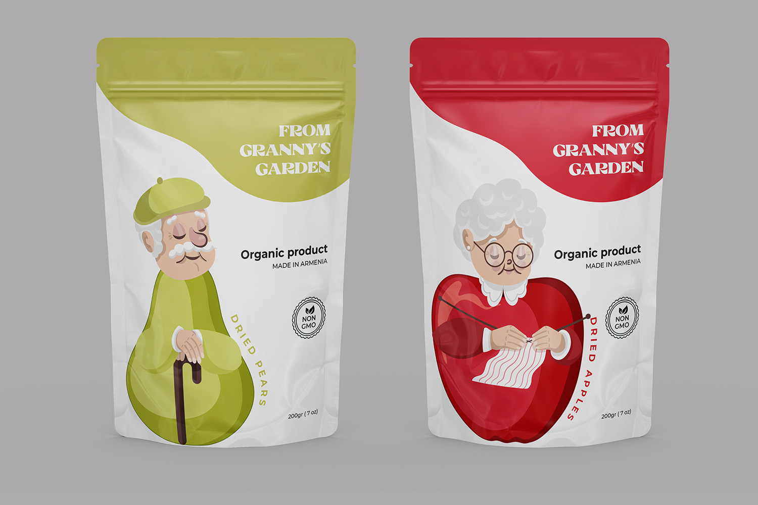
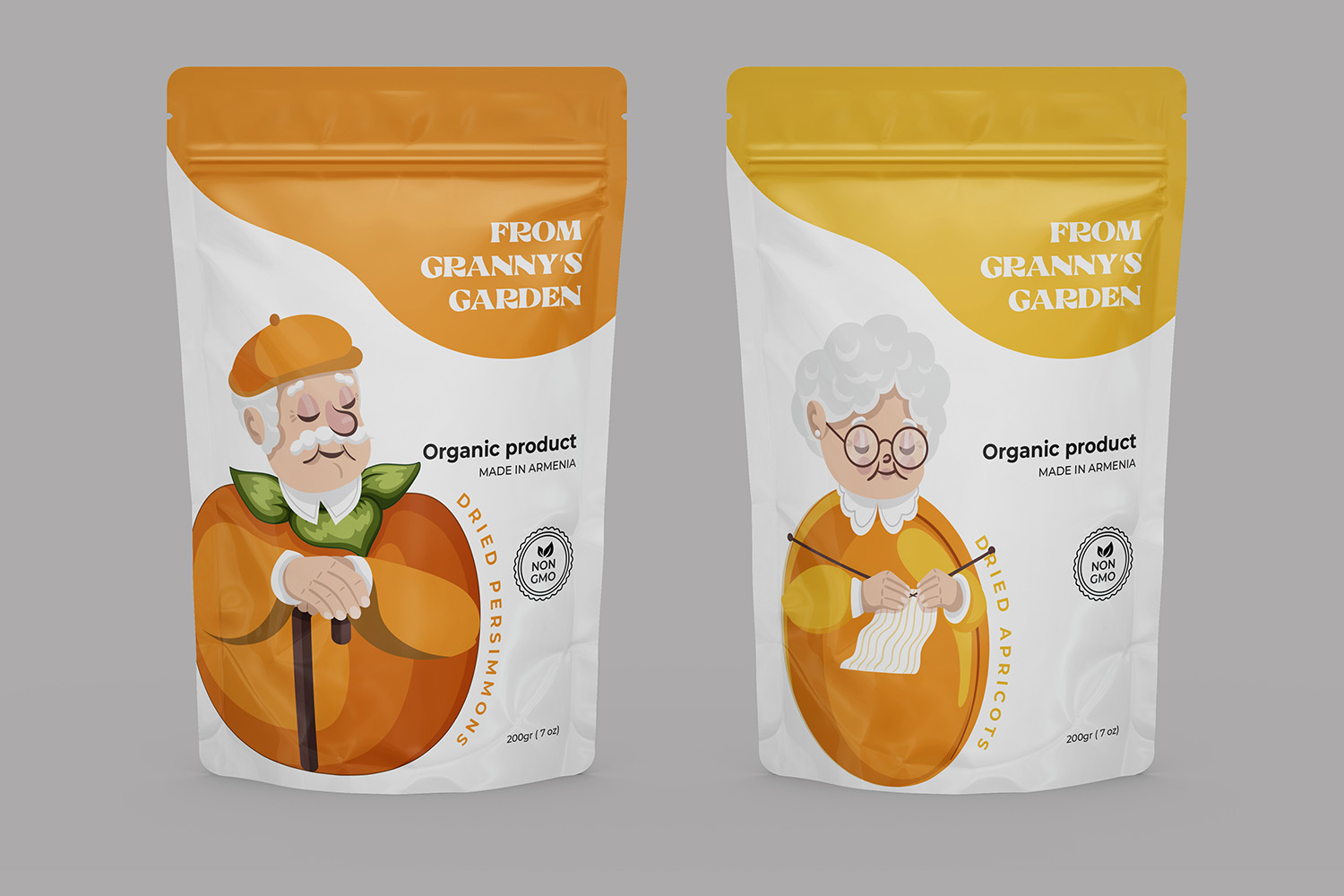
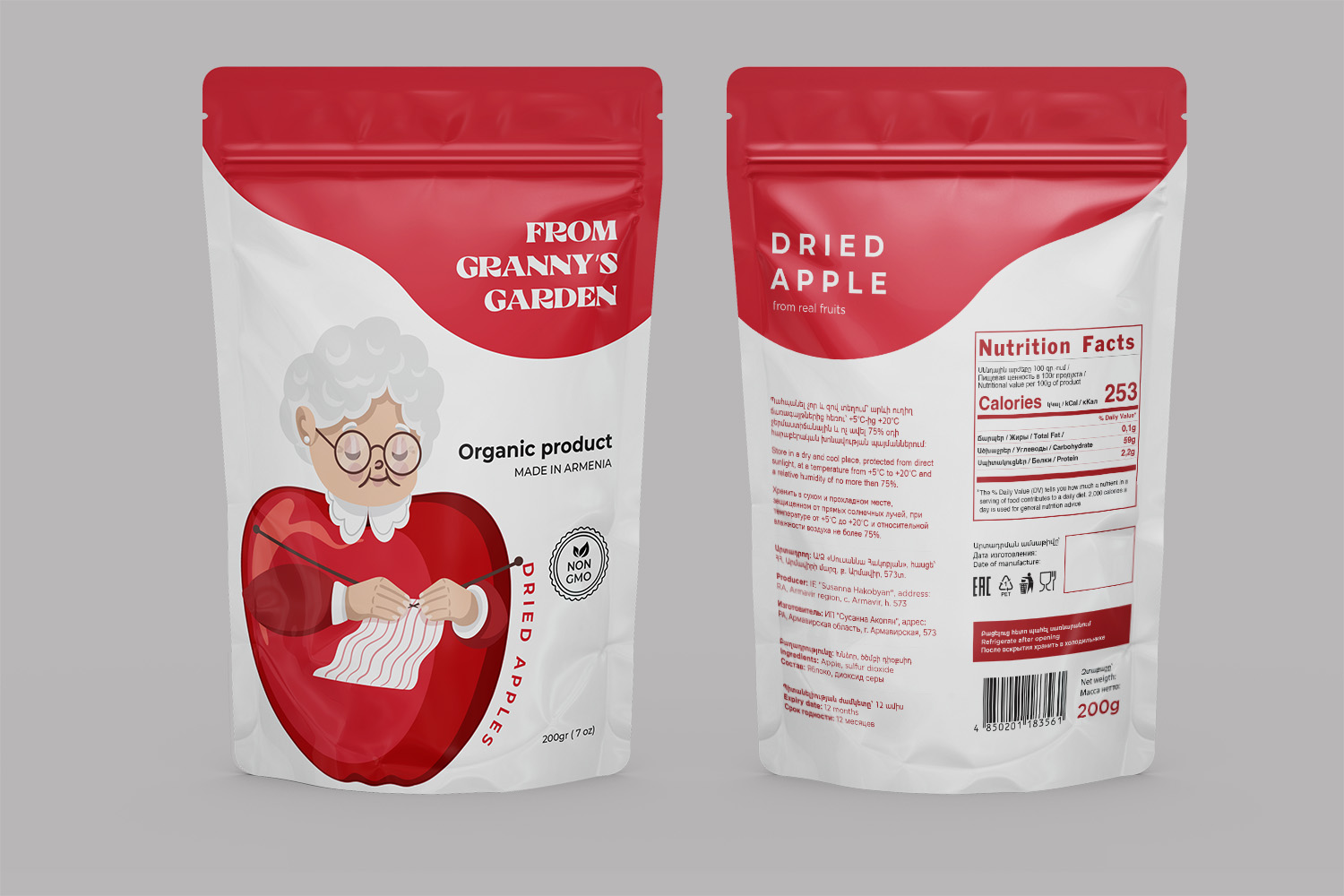
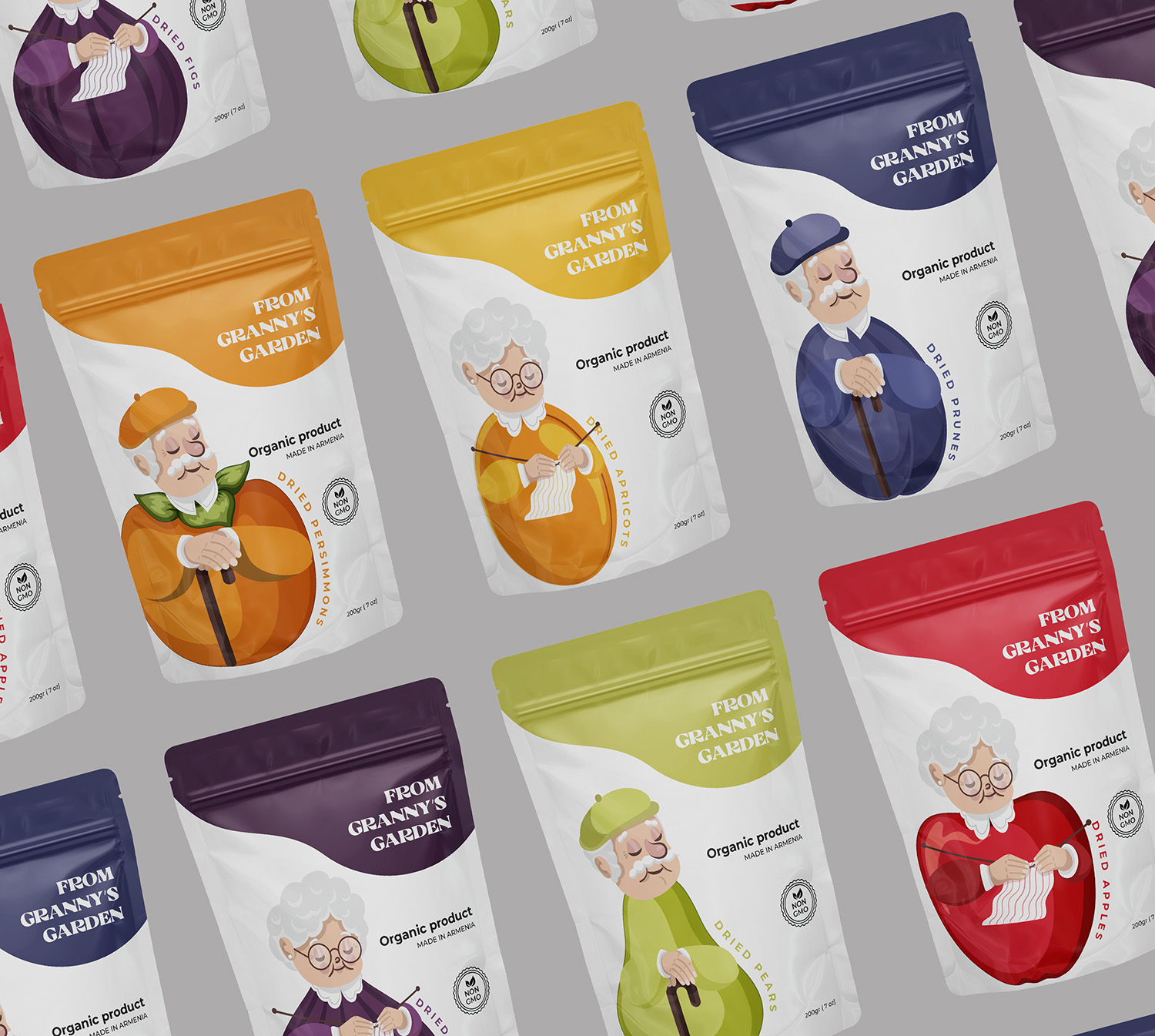
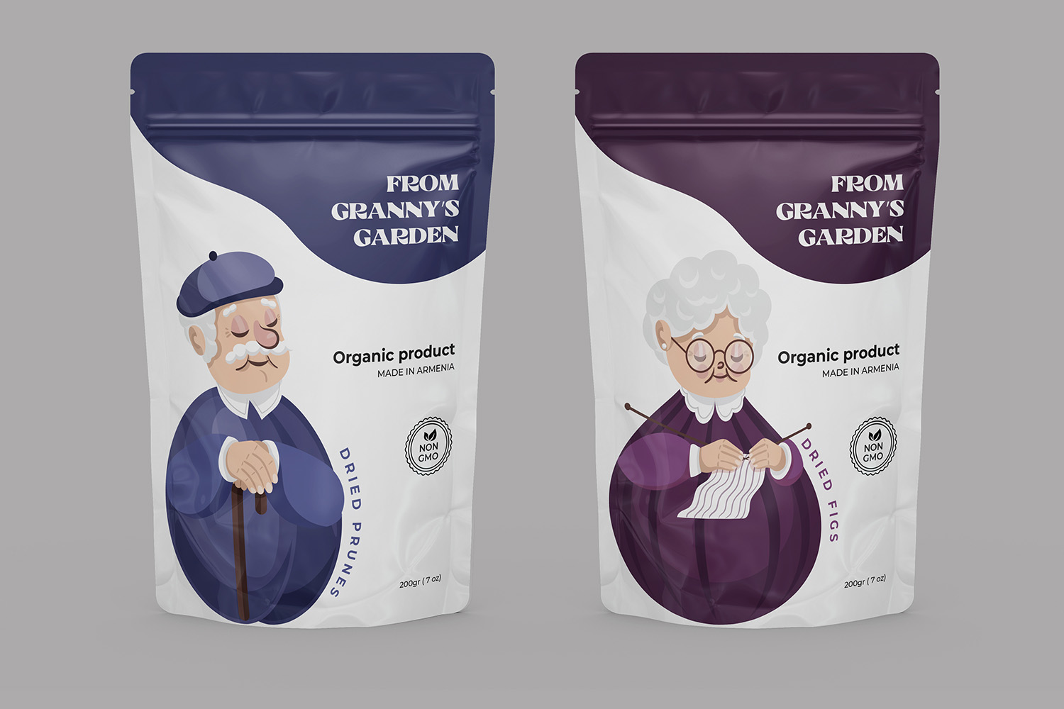
The packaging design centres around figures of grandparents dressed in “fruit clothes” to symbolise the type of dried fruit inside the package. While the grandparents’ figures remain consistent across different packaging, their clothing changes to reflect the specific fruit, creating a simple yet effective way to differentiate between products.
The overall design concept is rooted in childhood memories of a grandmother’s garden—a place where the sweetest fruits grew. The brand name, From Granny’s Garden, was inspired by this nostalgic feeling, reinforcing the message that the dried fruits are made from carefully selected, high-quality produce.
The packaging features several notable design elements. Firstly, the imagery of grandparents wearing clothes shaped like fruits serves as both a playful and practical visual cue. Each fruit’s corresponding design helps consumers easily identify the product type. The bright, vibrant colours dominate the packaging, reflecting the freshness and natural appeal of the dried fruits, evoking a sense of joy reminiscent of a carefree childhood spent in a garden. At the same time, the packaging maintains a clean, uncluttered look, with one compositional centre that draws immediate attention to the product.
The design aims to create an emotional bond with the consumer by drawing on nostalgic memories of warmth and love from grandparents. By prioritising an emotional response, the packaging not only attracts attention but also resonates deeply with buyers, encouraging them to choose the product.
The zip pouch packaging was selected for its practicality, keeping the product fresh while being easy to use. It reflects the modern consumer’s need for convenience and safety. The packaging clearly communicates that the product is 100% natural, organic, and free from chemicals. All essential information is prominently displayed, ensuring transparency and trust with the consumer.
The simplicity and clarity of the design set From Granny’s Garden apart from competitors. By focusing on a central design theme—grandparents in fruit clothes—the packaging provides a unique and memorable identity in the market. The bright colour palette and nostalgic concept also ensure the product stands out on shelves.
The packaging design for From Granny’s Garden successfully combines traditional values with modern simplicity, creating a product that not only appeals to the eye but also to the heart. By evoking memories of sweet childhood moments in a grandmother’s garden, the design draws consumers into an emotional narrative that enhances the product’s appeal. The use of minimalistic yet vibrant design ensures that the product stands out and conveys the premium, organic nature of the dried fruits. Ultimately, this design solution achieves the goal of engaging the emotional world of the buyer while delivering a clear and compelling message about the brand’s commitment to quality and tradition.
With its unique and nostalgic design, From Granny’s Garden not only offers a taste of premium Armenian dried fruits but also a chance to take a piece of cherished childhood memories home.
CREDIT
- Agency/Creative: Lilit Sivolenko
- Article Title: Granny’s Garden’s Fruit-Inspired Packaging
- Organisation/Entity: Freelance
- Project Type: Packaging
- Project Status: Non Published
- Agency/Creative Country: Armenia
- Agency/Creative City: Yerevan
- Market Region: Asia
- Project Deliverables: Brand Design, Graphic Design, Illustration, Packaging Design
- Format: Box
- Industry: Food/Beverage
- Keywords: packaging, dry fruits, design
-
Credits:
graphic designer: Lilit Sivolenko


