


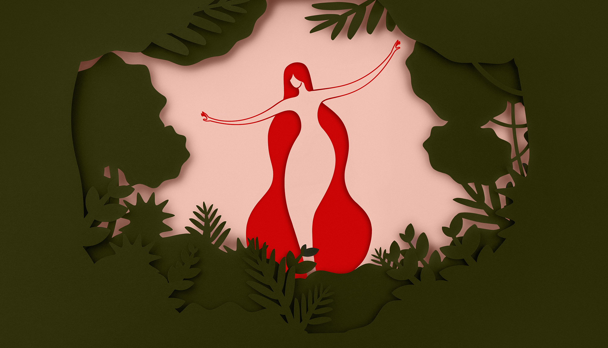
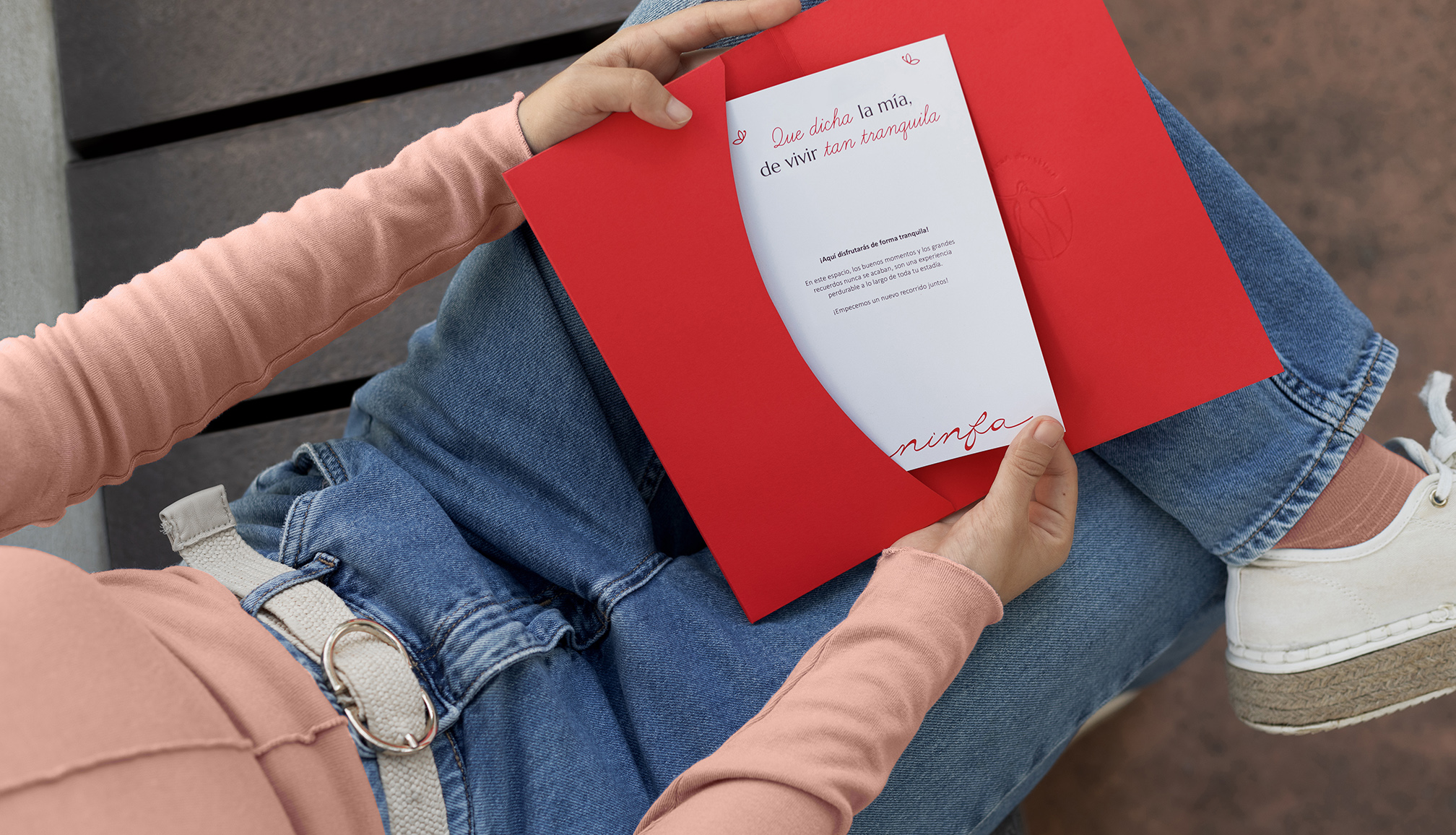
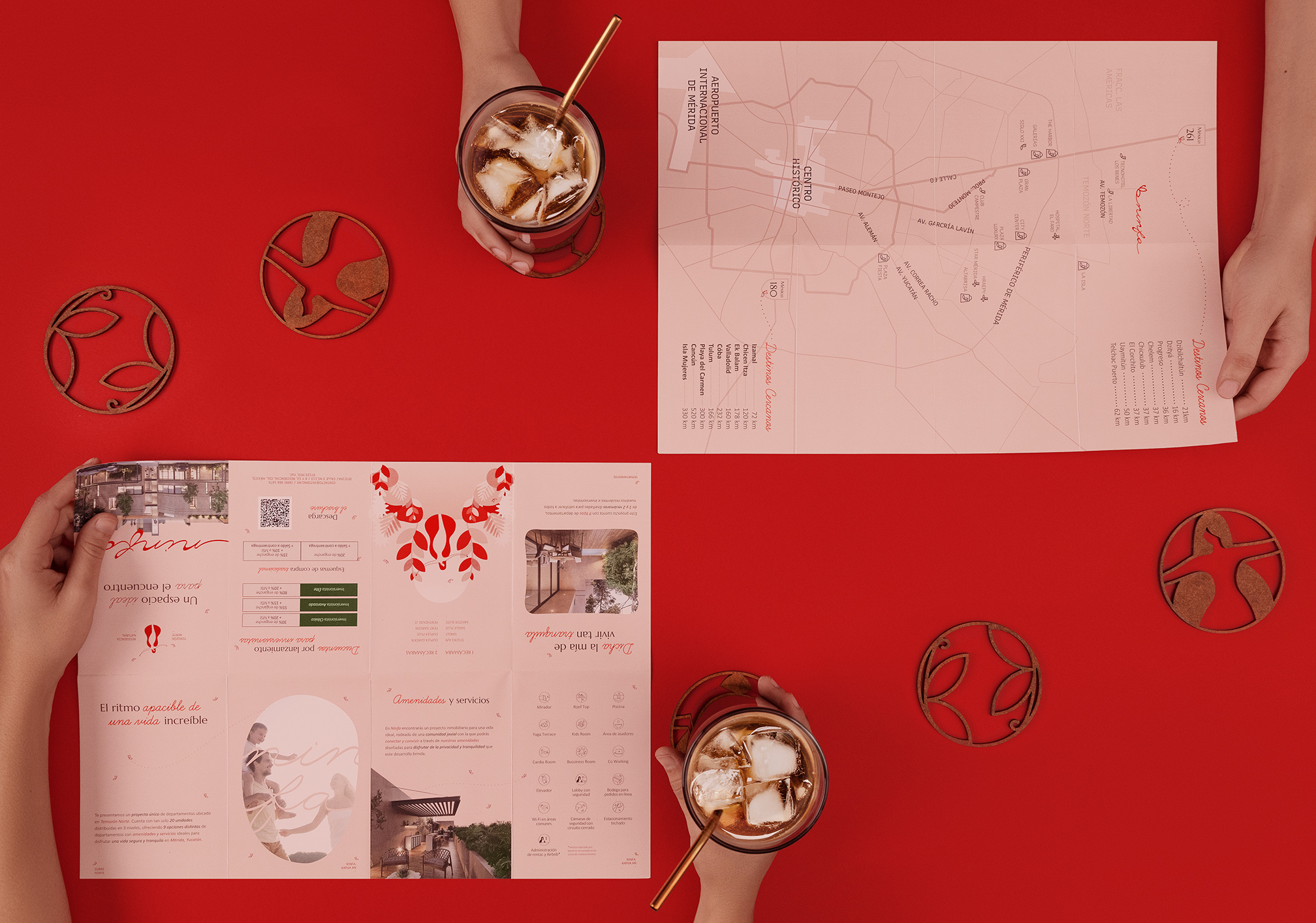
Ninfa is a modern departmental complex located in the peaceful north of Mérida, Yucatán. It stands out for its commitment to providing comfortable spaces where nature and architecture come together to create a harmonious living environment. Here, nature plays a vital role, acting as a connection to a tranquil community life. The atmosphere at Ninfa is designed to evoke a sense of calm and peace, offering residents a place where they can relax and enjoy a lifestyle rooted in serenity.
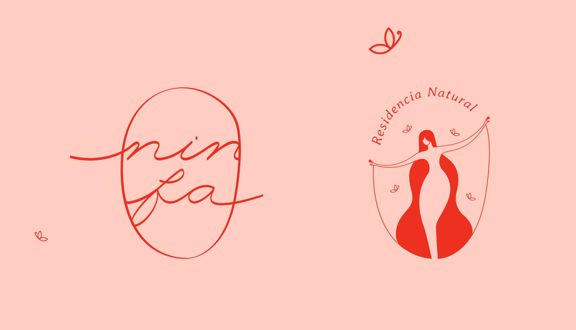
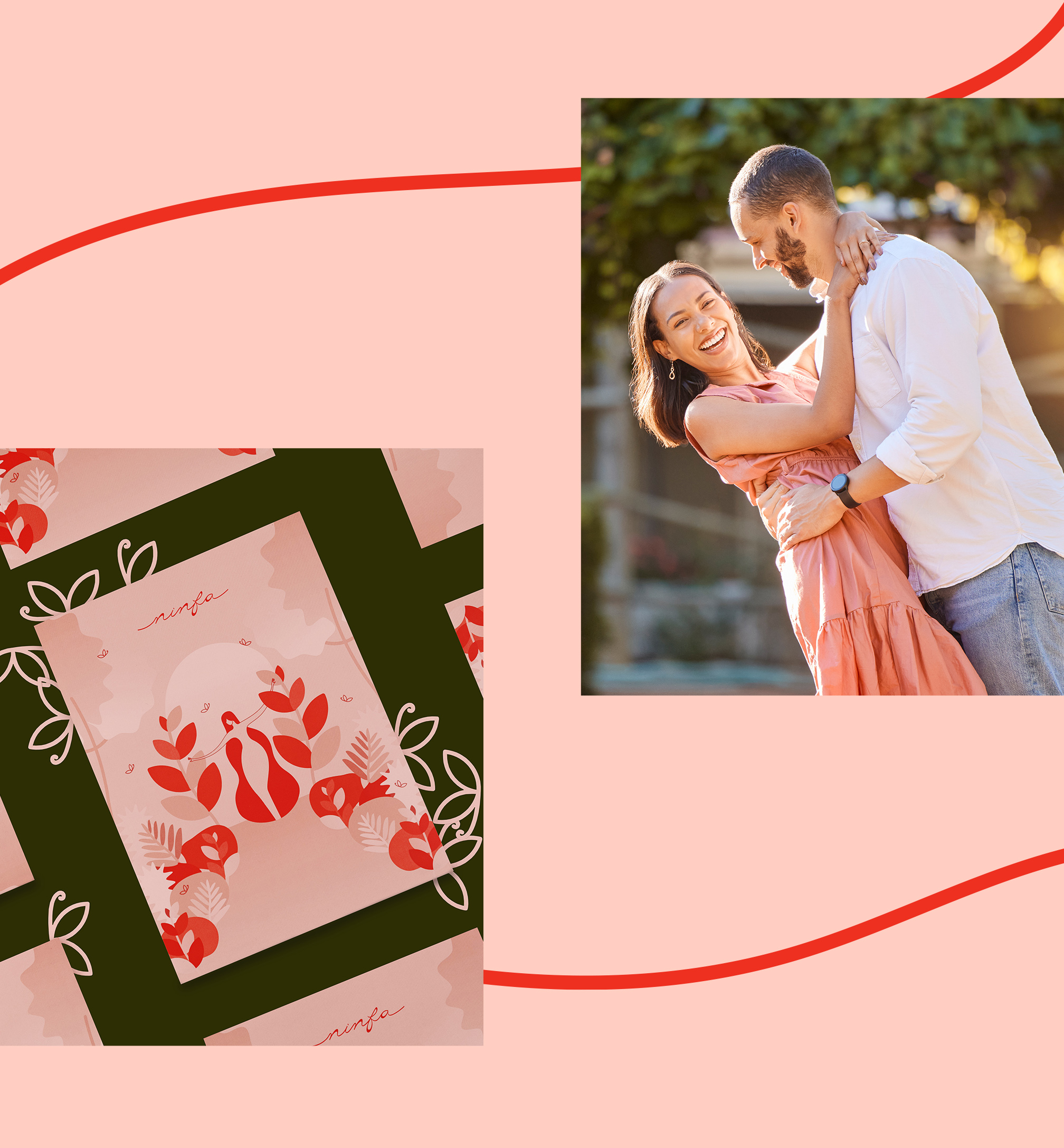
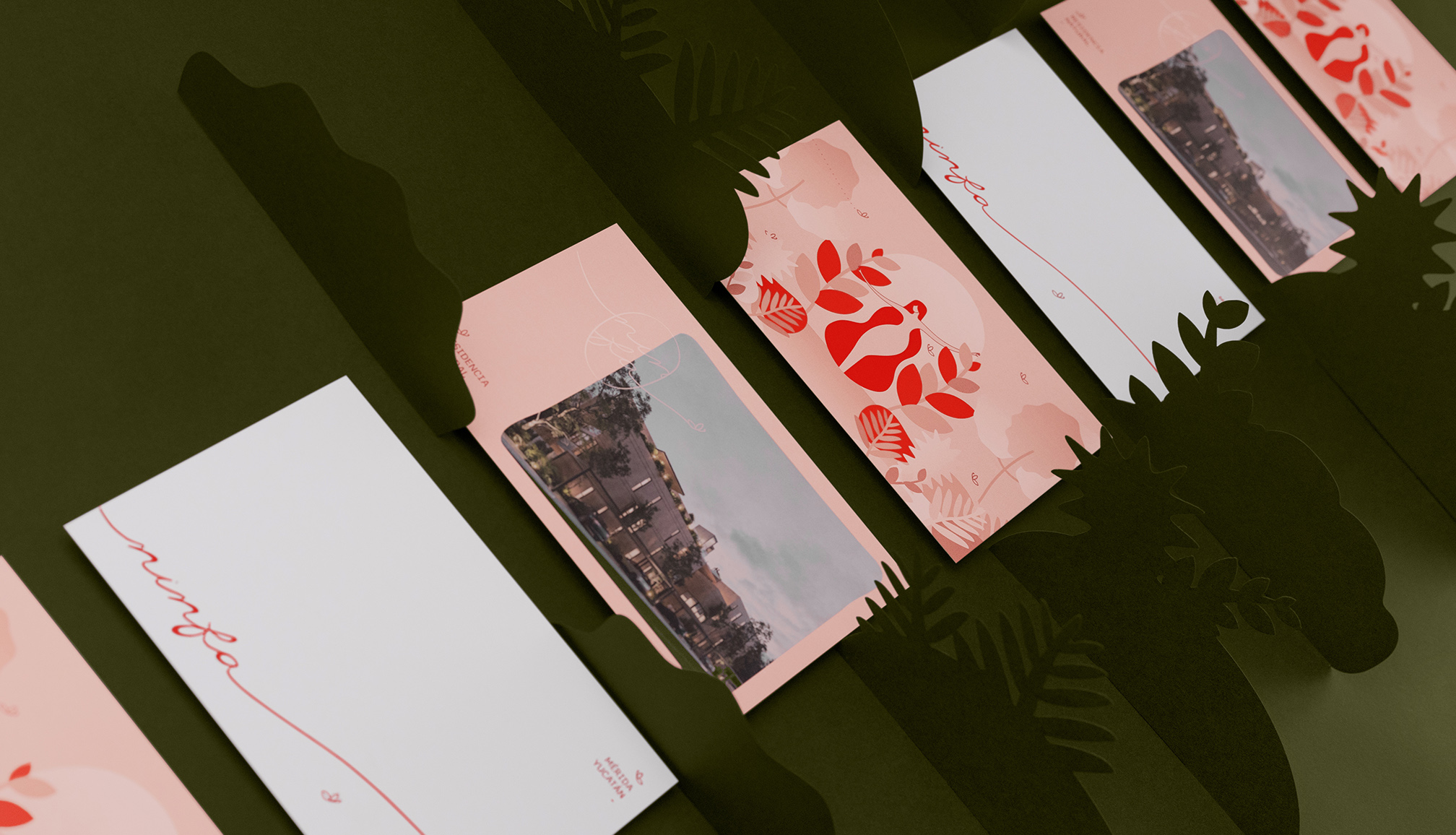
Inspired by the mythological figure of the nymph, the identity of the brand reflects a fresh, warm, and cheerful spirit. The Nymph in the isotype stands with open arms, symbolizing openness and welcoming. Additionally, the butterfly, an important symbol of the brand, represents freedom and lightness. This contrast between symbols of strength and freedom creates an image that is both dynamic and balanced.
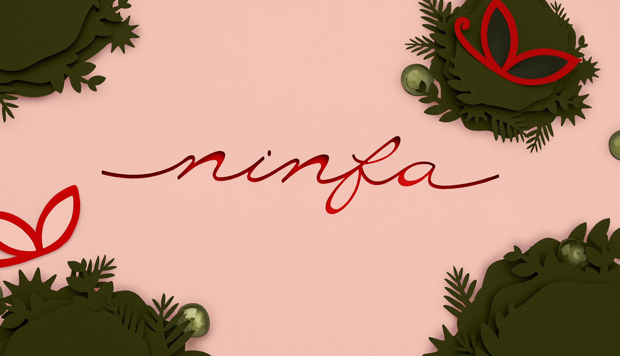
In creating Ninfa’s brand identity, we carefully balanced contrasting elements. The use of light colors helps evoke relaxation and calm, while the more intense tones add energy and depth. The interlaced letters in the logo represent the idea of community and unity. This harmony is reinforced by the script typography, which plays with various stroke thicknesses to give the brand strength and movement.
Ninfa offers more than just a place to live; it’s a space designed for human connection. Life here is about enjoying moments in good company, surrounded by a cheerful atmosphere that promotes relaxation. Ninfa’s voice is warm and approachable, speaking to its residents in a way that feels familiar and inviting, much like the friendly community it fosters.

CREDIT
- Agency/Creative: Mantra Studio
- Article Title: Ninfa’s Brand Identity by Mantra Studio
- Organisation/Entity: Agency
- Project Type: Identity
- Project Status: Published
- Agency/Creative Country: Mexico
- Agency/Creative City: Mérida
- Market Region: North America
- Project Deliverables: App Design, Brand Design, Brand Identity, Brand Tone of Voice
- Industry: Real Estate
- Keywords: Nature, Community, Harmony, Relaxation, Departments
-
Credits:
Sara Barragu00e1n: Graphic Designer
Guadalupe Caballero: Copywriter
Nubia Guillermo: Photography
Karen u00e1lvarez: Digital Retouch
Aura Barbachano: Set Designer


