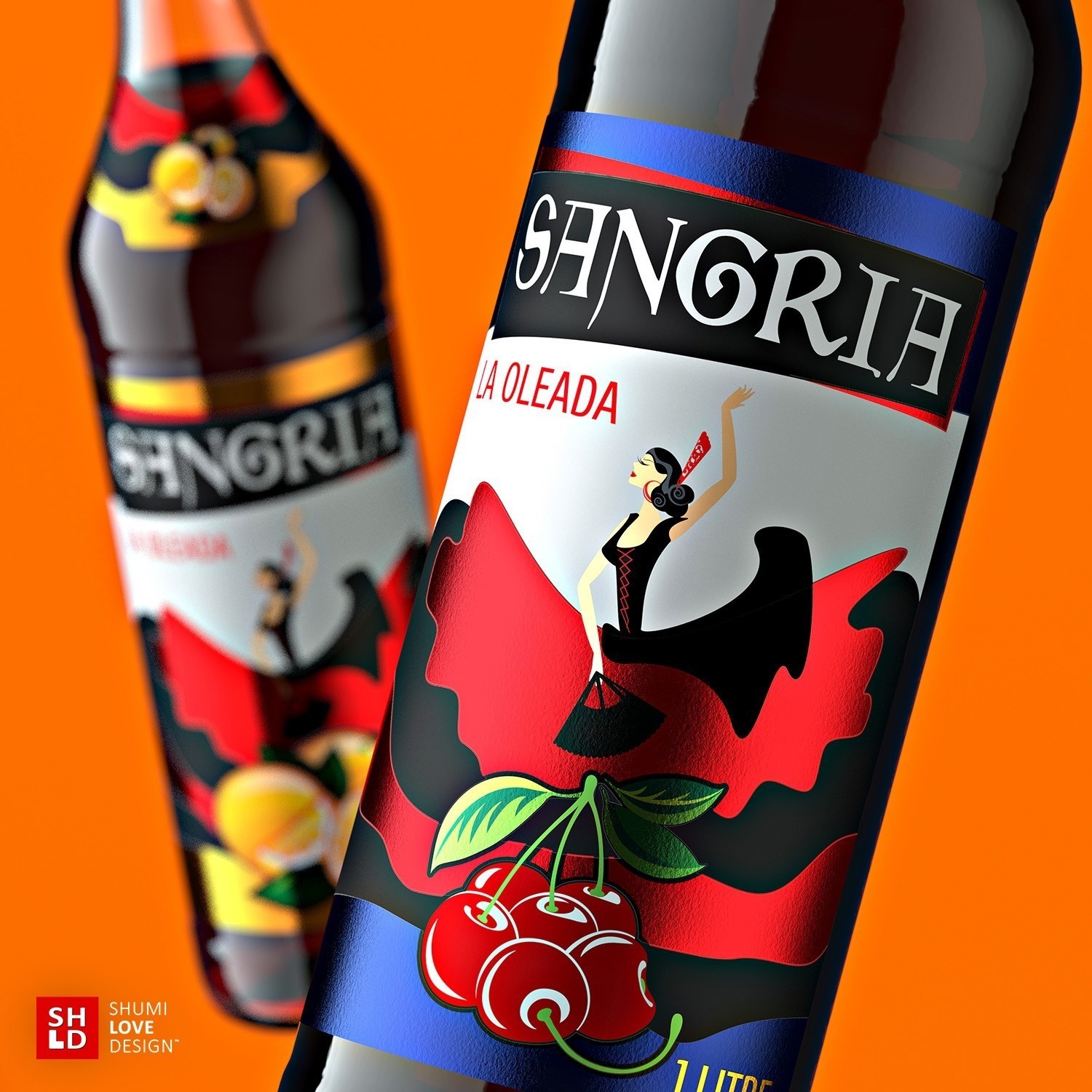
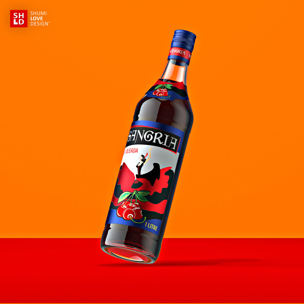
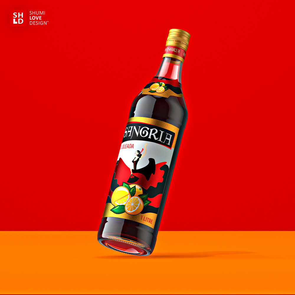
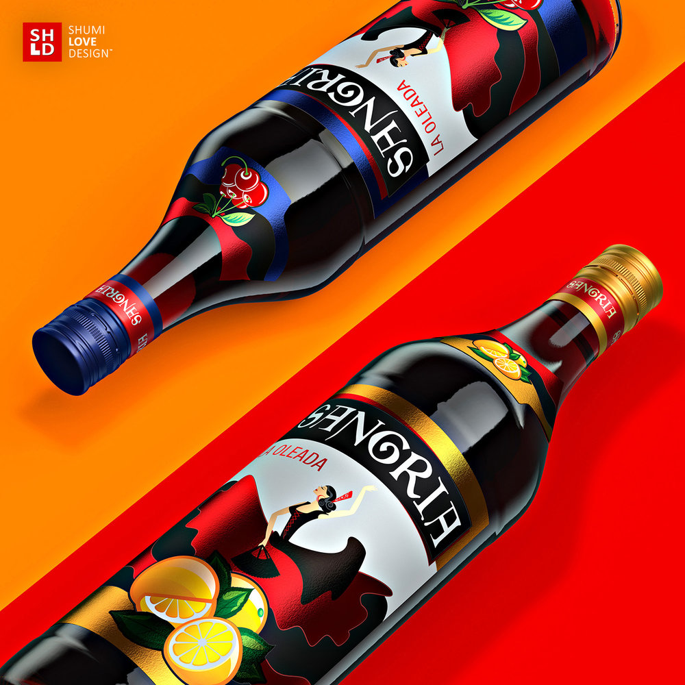
” Expressiveness, passion and a festive spirit – these were the notions that had to be reflected in the packaging design for the new line of Sangria wine drinks. That’s why the agency’s specialists have focused their efforts on creating a vivid and emotional image that would allow to communicate the character of the drink and reflect its geographical origin.
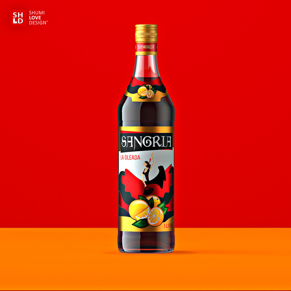
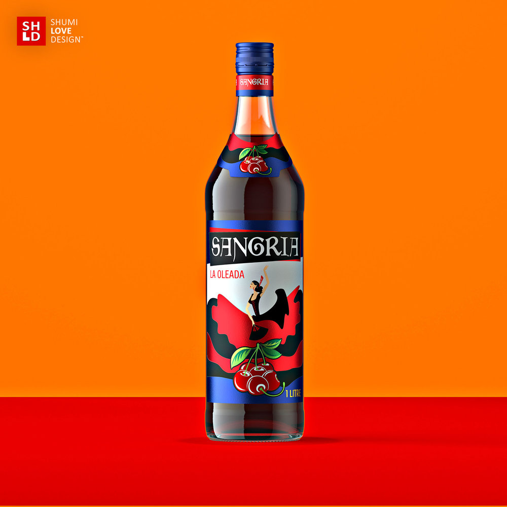
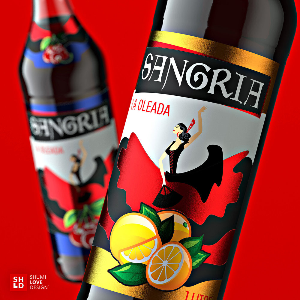
The bright nature of the drink becomes evident even at the first glance. Thanks to the saturated color scheme the potential consumer’s attention is instantly attracted to the product on the shelf. The central element of the composition is a stylized image of a Flamenco dancer in a traditional dress, the lower part of which flows out expressively through the entire label. The upper part features the name of the product, which provides a solid connection to the product’s region of origin. The differiantiation in the product line is carried out through the use of stylized ingredient illustrations as well as varying colors of certain elements. The label is printed on a special metalic paper, which makes the overall composition more vivid and attractive.”

CREDIT
- Article Title: ShumiLoveDesign – Sangria
- Project Type: Packaging
- Format: Bottle
- Substrate: Glass


