


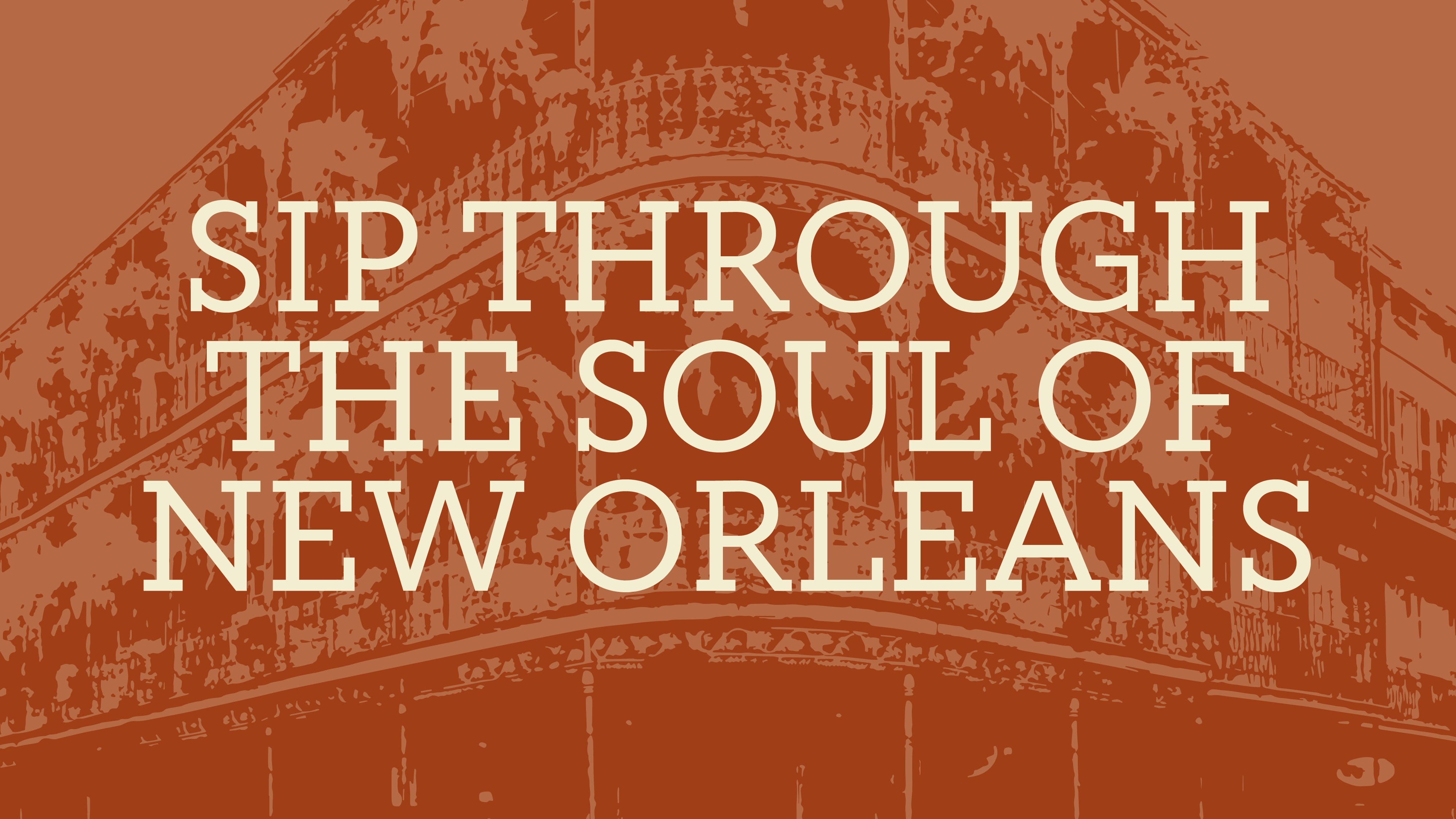
Background
Louis Prima is a bar of New Orleans’ Creole food and drink, live music and aesthetics. The bar is named in honor of Louis Prima, a legend of jazz, rock’n’roll, and 20th century lifestyle, who had a huge influence on American and world pop music of the 1930s and 40s. With his energy, good sense of humor, elegance and vibrant charisma, he made everyone fall in love with jazz. Inspired by the charm of the music, the character of Louis Prima and the party atmosphere in New Orleans, the founders of the bar decided to recreate this feeling nowadays.
Challenge
Initially, the founders of the bar had the interior design already projected. All that remained was to develop a logo and identity concept that would integrate perfectly into the interior of the bar, becoming its most charming part. But the actual design challenge was even more interesting: the logo and identity could not use associations with music and any tableware and bar symbolism, as well as obvious associations with the sphere.
What to do? Take inspiration from New Orleans and invent out-of-the-box solutions, such as an architectural logo, intoxicating infrastructure of color palettes and New Orleans vibes.
Architectural Logo
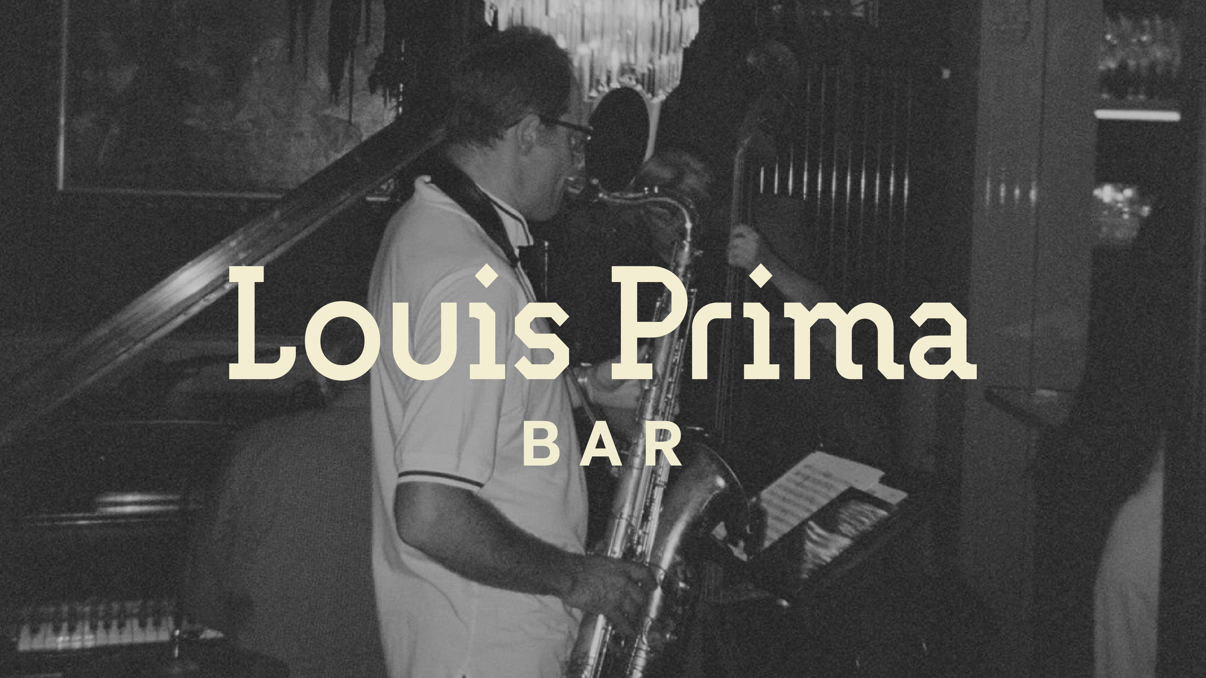
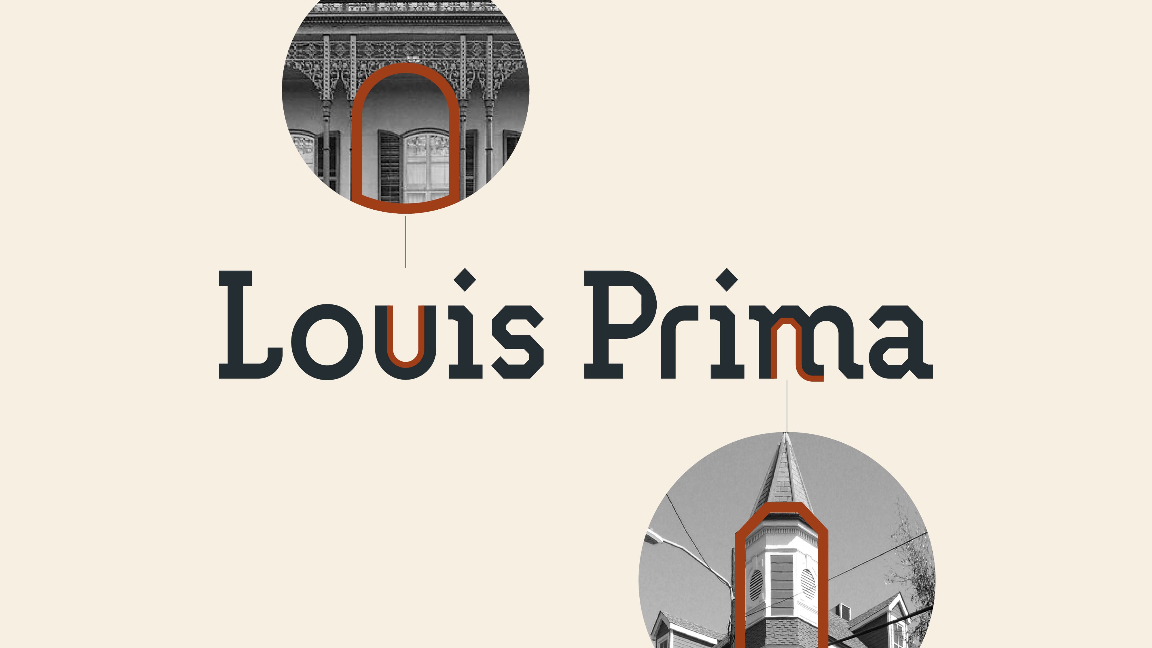
New Orleans was originally built using several styles: Art Deco, Art Nouveau, Arts and Crafts, and even today some buildings can’t be categorized as any of the styles. This variety of unique forms inspired us to create the most architectural logo in history, which was literally built in the image of the silhouettes of the iconic buildings of New Orleans.
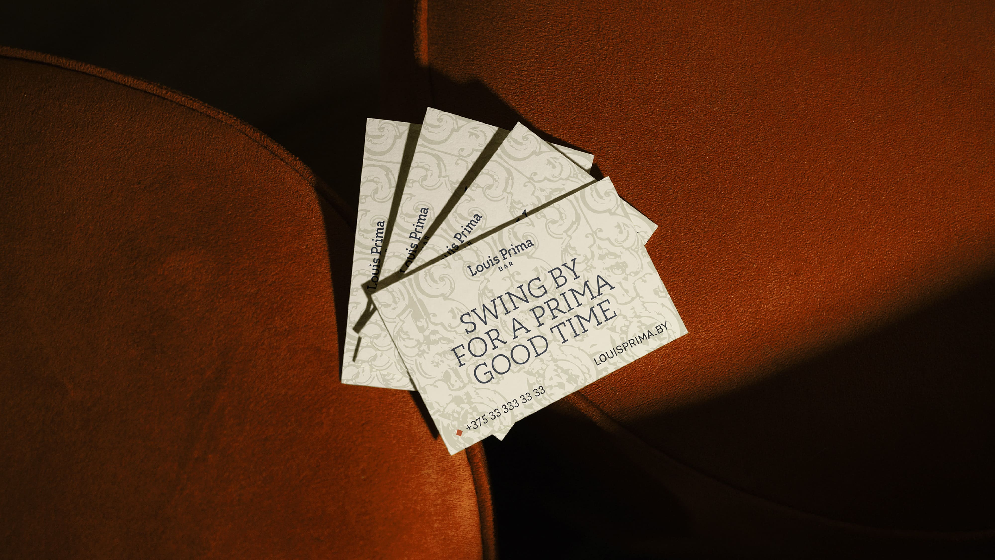
The logo has a textual form of execution to support the bar’s name. But in doing so, each letter was necessarily adapted to the silhouette of the buildings of New Orleans. Chopped letterforms, sharp-angled serif techniques, flowing serifs, and rounded letterforms were utilized for this effect.
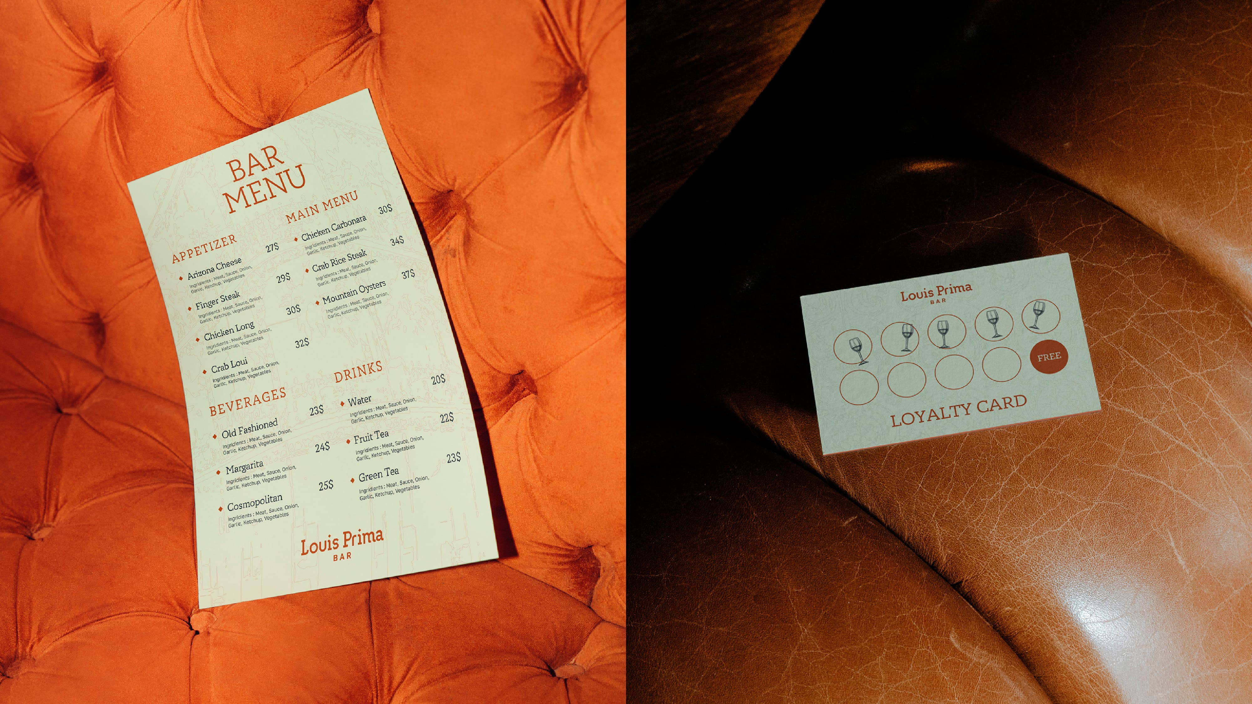
Readability, laconicity and uniqueness of the logo architecture opens huge opportunities for the bar to use the logo on corporate identity carriers of different texture and format. The client’s main task of making a unique logo without stereotypical bar or music elements was accomplished flawlessly.
Colour Infrastructure
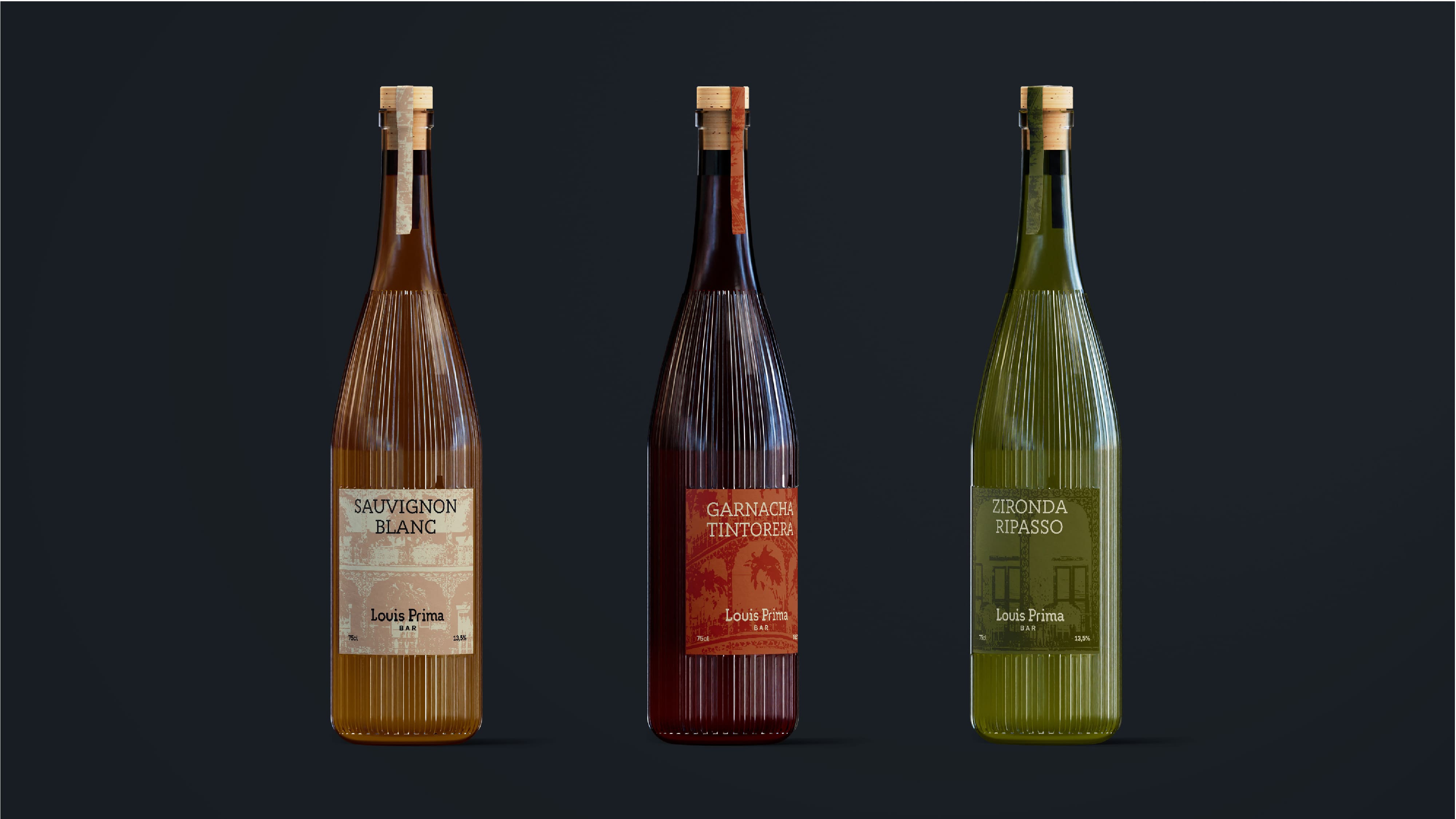
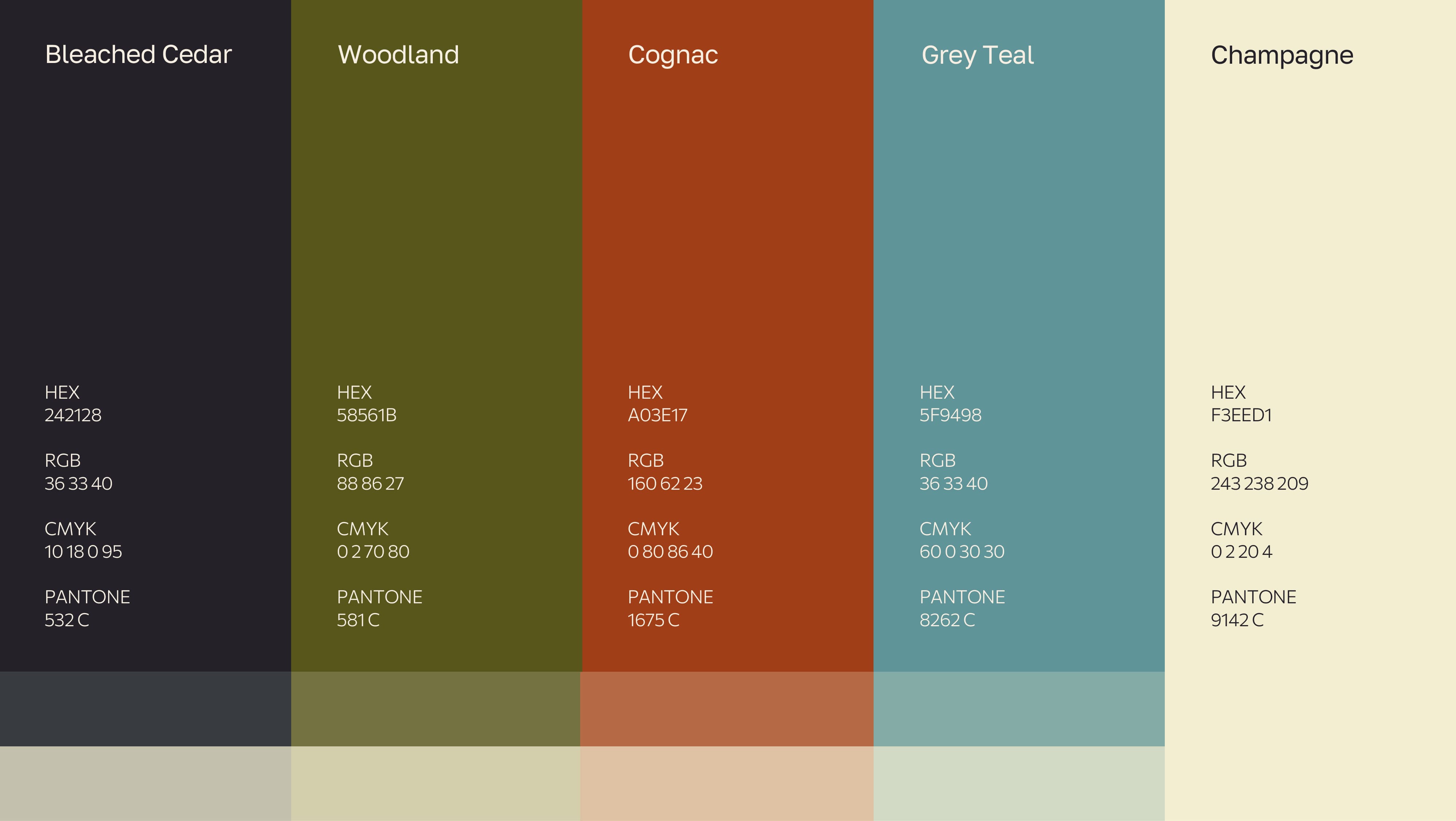
To convey the taste of New Orleans life, we built not just a system, but an entire infrastructure of expensive and tart colors. The palette turned out to be multifaceted in terms of meanings and associations, but at the same time harmoniously combines shades of colors, setting accents.
The main style-forming colors of the bar’s identity are Cognac and Champagne. In addition to the corresponding name, this combination of leading colors creates a visual association with drinks, soft chamber of a jazz bar in New Orleans, as well as the sunlight of the evening city, when residents gather in a bar with the best cuisine, cocktails, live music, interior and atmosphere.
Branded Graphics
Louis Prima Bar’s identity is based on key elements characteristic of the exterior and interior of New Orleans buildings: an image of the main building of New Orleans and a pattern inspired by heraldic ornamentation.
The key illustration is an image of the iconic Labranche House, rendered in the linocut style. It is a building with airy wrought iron galleries and a unique fencing pattern of oak leaves and acorns that is considered one of the finest examples of artistic forging in New Orleans. As early as the late 18th century, it became fashionable in this part of the city to adorn homes with wrought iron balconies and galleries. New Orleans jazz stars passed by this building, which became a kind of symbol of the city life and flow. The graceful metal structures have survived perfectly to this day despite the hot and humid climate.
That’s why we decided that the Labranche House would be a great example of Creole architecture and would organically fit into the historical and cultural center of the city. What is important, we are not limited in the variants of illustration application, combining shades of corporate colors in different ways. The more text is used on the corporate identity carrier, the lighter the “shadow” of the building becomes on the visual. For example, in cases where a large amount of text is intended to be used on the media, it is acceptable to apply a stroke to the illustration.
In choosing the key pattern, we were guided by logic and a sense of style. The interior of the bar is already filled with various authentic elements: from a vintage grand piano to antique lamps. The menu combines classic cocktails and dishes prepared according to traditional recipes from the southern states of the USA. In addition, every week talented musicians perform on the bar’s stage to the sounds of saxophone and swing rhythms.
All of this fills the bar from the inside out, forming a holistic picture of the Louis Prima brand. We did not want to overload the corporate style, but on the contrary to return the very lightness of New Orleans. Therefore, the most successful solution for the pattern was to use a drawing inspired by heraldic ornamentation, which is ubiquitous in New Orleans culture. This solution allowed to integrate graphic solutions into the lively interior of the bar, dilute the roughness of the textures and structure the perception of the brand image.
A wide variety of patterns of heraldic ornamentation made it possible to develop a system of patterns for different carriers of corporate identity. The use of shades gives the feeling of shadows and glare from the evening rays of the sun, which play whimsically on the facades of the buildings of New Orleans. The patterns are unique and each one emphasizes the texture and feel of the medium’s material, enhancing the tactility and depth of message perception.
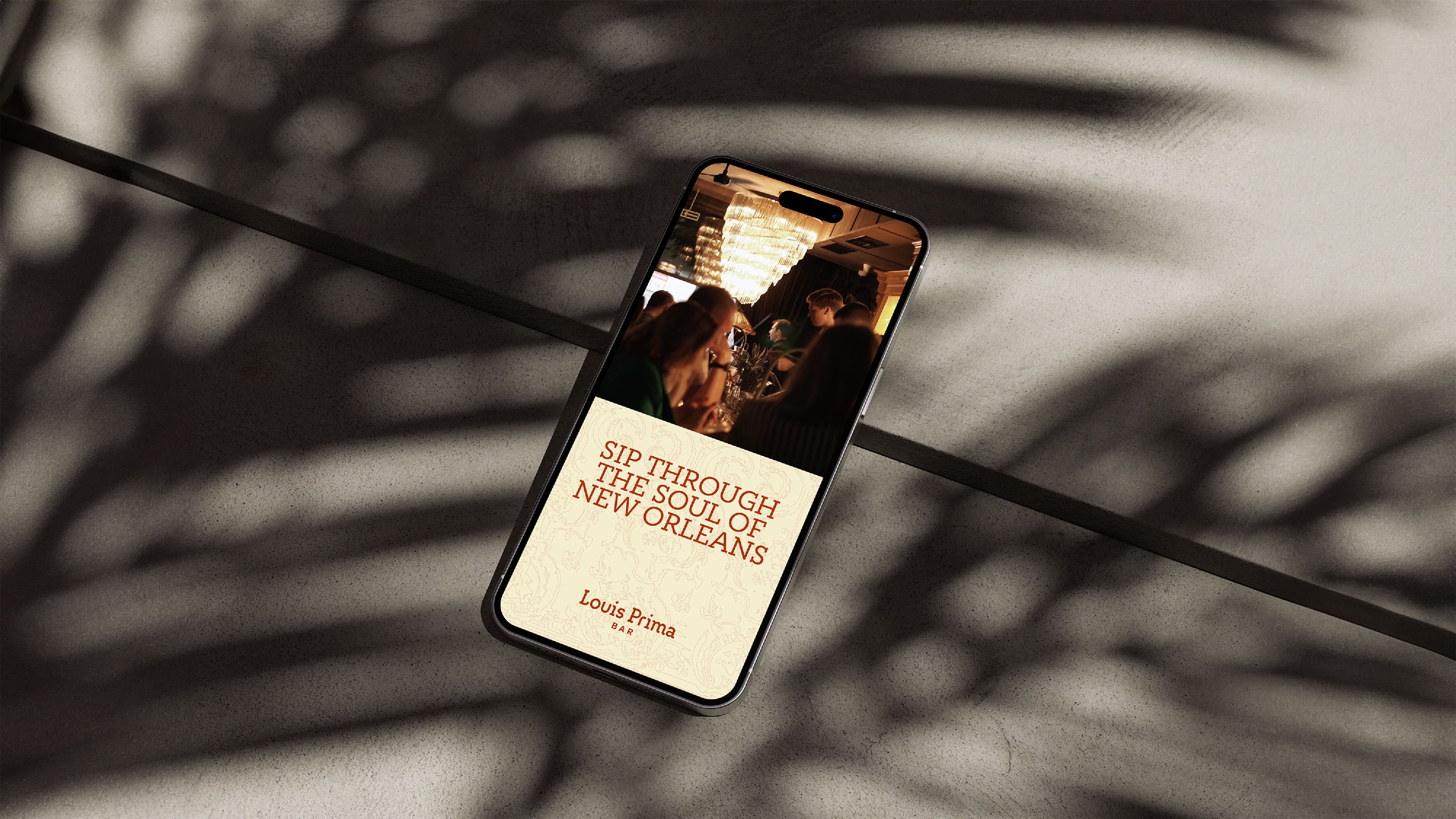
In the design of the communication channels, we used graphic visuals combined with branded illustrations and ornamentation, as well as photos and videos of the bar itself. Such collaboration facilitates the chamber image of the bar interior and allows communication without overlapping photo and video content with text blocks.
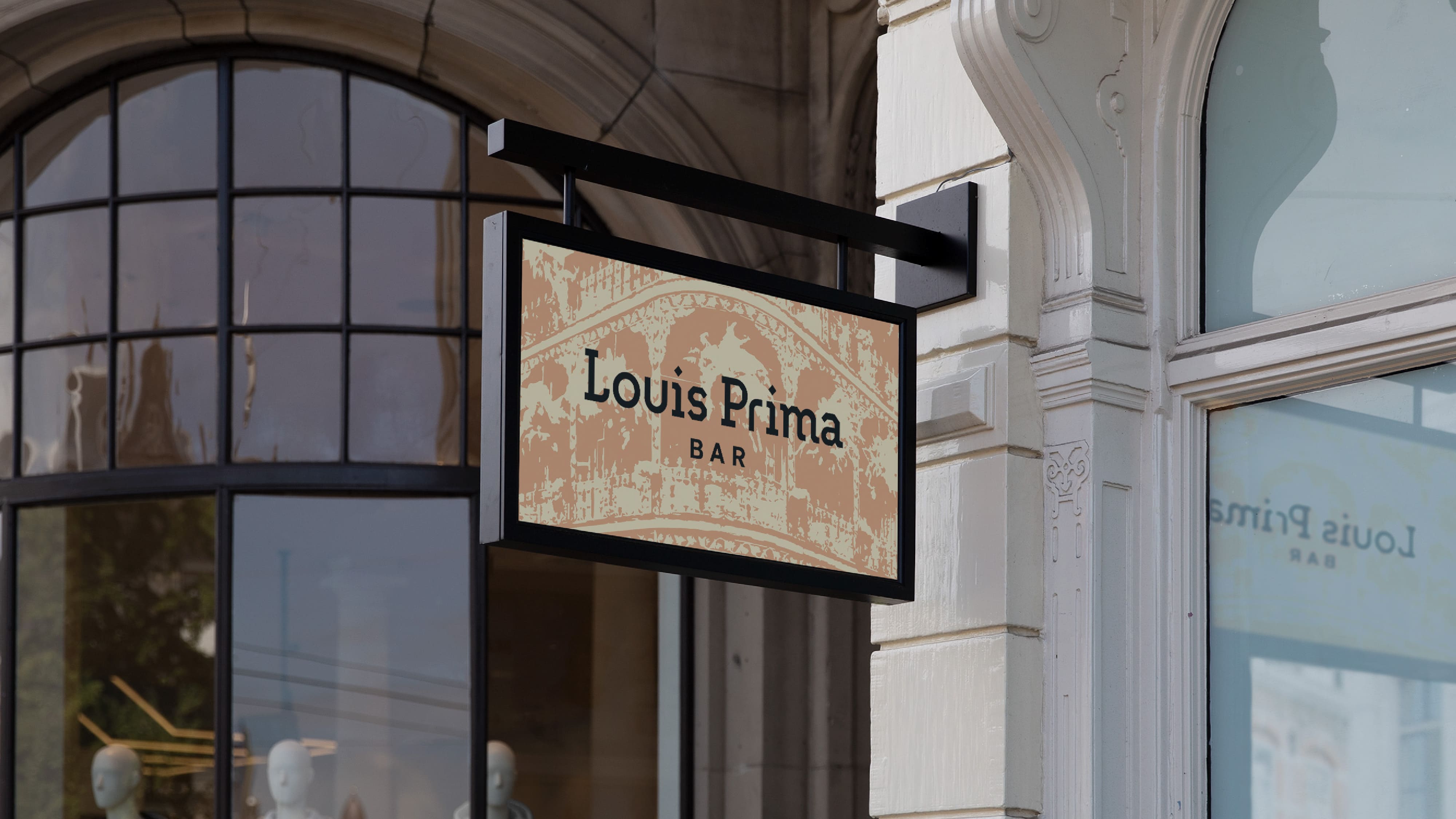
The identity allows for the creation of unique interior details as well as merch, showing the New Orleans style of the bar in all its glory. Each interior detail becomes an aesthetic and cultural phenomenon, transporting to the streets of New Orleans. The architectural logo is often laconically placed at the bottom of the main composition, becoming a doorway to the world of jazz, the best Creole food and drink, a sophisticated atmosphere and inspiring culture.
Louis Prima Bar & Moloko. Branding Sidekicks.
CREDIT
- Agency/Creative: Moloko. Branding Sidekicks
- Article Title: Architectural Identity for Louis Prima Bar by Moloko. Branding Sidekicks
- Organisation/Entity: Agency
- Project Type: Identity
- Project Status: Published
- Agency/Creative Country: Lithuania
- Agency/Creative City: Lithuania
- Market Region: Europe
- Project Deliverables: Brand Identity
- Industry: Entertainment
- Keywords: Brand Identity, logo design, branding
-
Credits:
Creative Director: Denis Misyulya
Designer: Maxim Baranov


