


Context: Today, cyberpunk is a stylistic trend in literature, cinema, clothing, interior design and other areas of modern life, based on the aesthetics of science fiction films, games, and ideas about the world of the future. This is a special form of behavior on social networks.
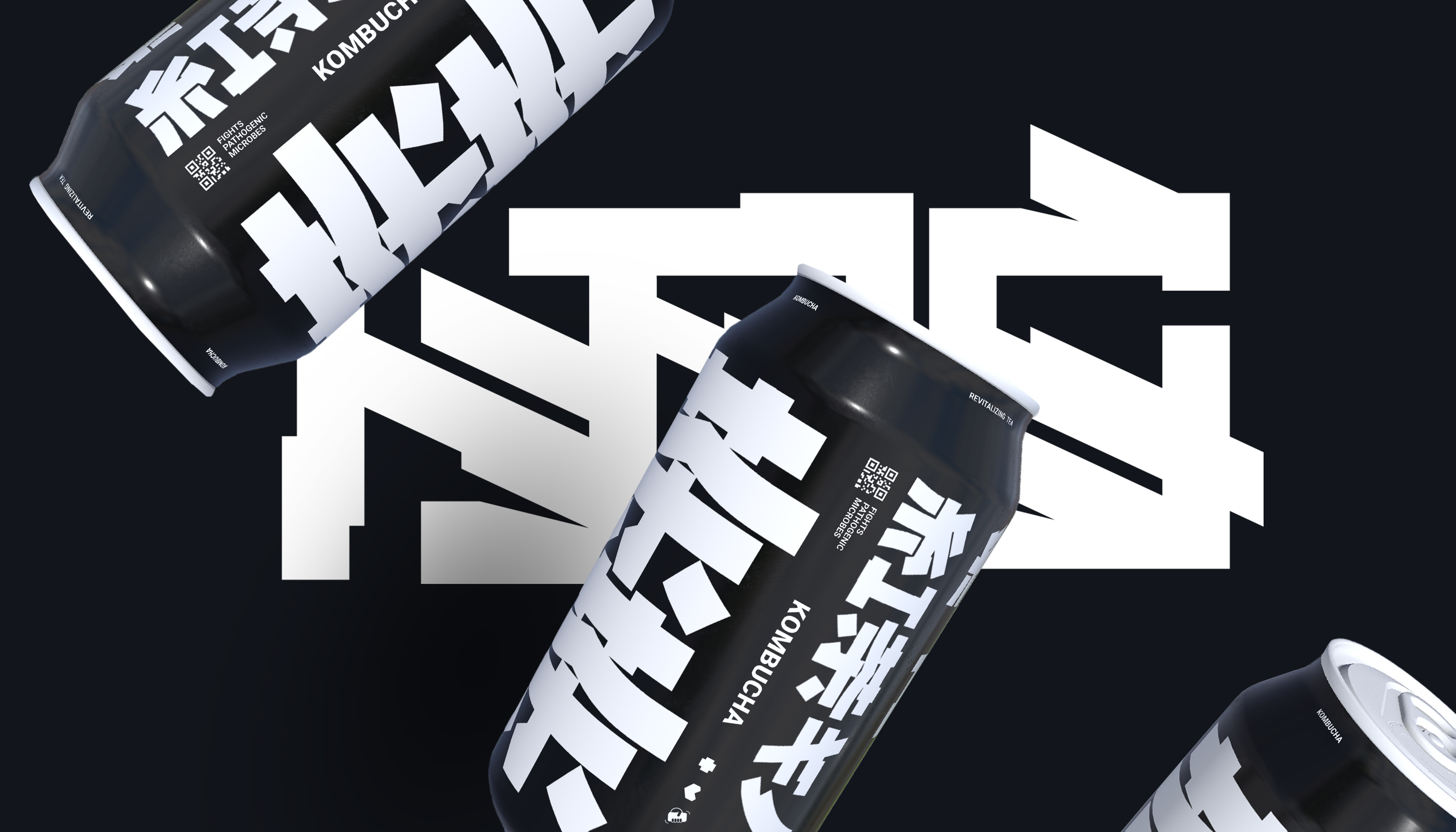
Concept: The idea of the packaging is a reflection of the world of cyberpunk and the gaming industry, where everyone is familiar with the taste of NPC tonic, just as in real life we are familiar with the taste of kombucha. The concept of the packaging is a synthesis of a fantasy world, a computer character and reality, like the symbiosis of bacteria and yeast when preparing kombucha. In the gaming cyberpunk NPC, kombucha is a healing drink that can restore your health or modify your character. In real life, kombucha is great for restoring after a run, going to the gym and other physical activities. It is a natural tea fermented by a colony of probiotics and fungal strains. It is completely natural, rich in probiotics, vitamins and antioxidants.
Audience: The product is aimed at a young target audience of zoomers who are passionate about computer games, an active lifestyle, reading mango and watching anime.
Task: The mission was to create a complete brand identity from scratch, which included the development of a logo, visual elements and packaging design. The main task was to comprehend and integrate the cyberpunk style into the packaging design of a healthy product. To create fun and attractiveness of the product, to form popularity among a young audience. To convey to the target audience that this drink is not only for gourmets and fans of a healthy lifestyle. Kombucha is useful to drink before bed after a fun evening spent with friends, or if you have to drive in the midst of that very fun evening with friends, kombucha is an excellent choice for you at the bar. Kombucha is a great way to start the day, preparing your body for breakfast.
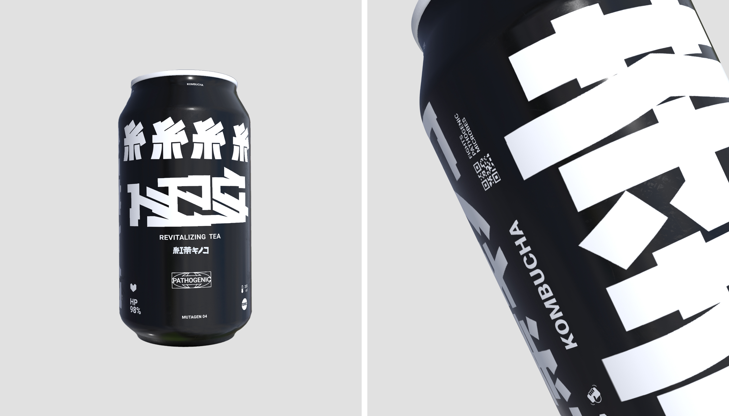
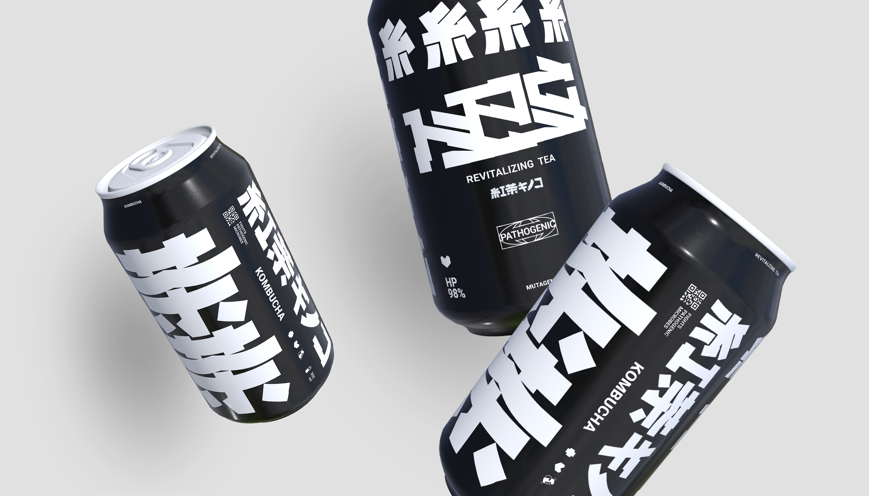
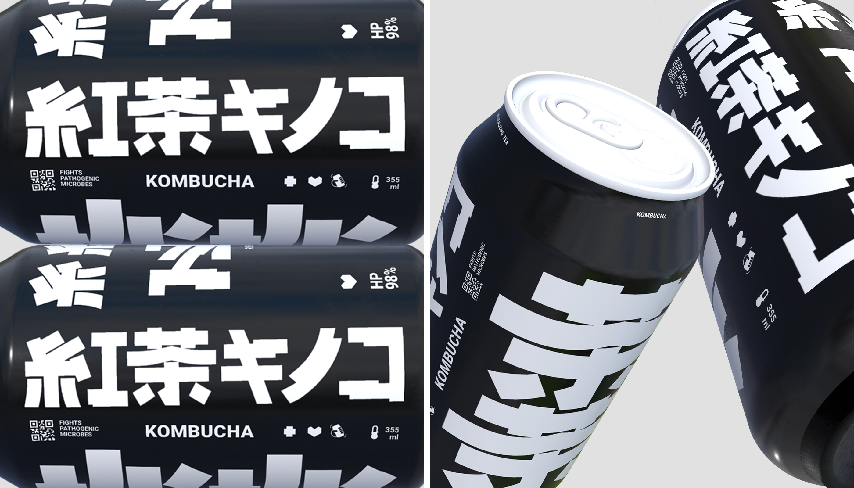
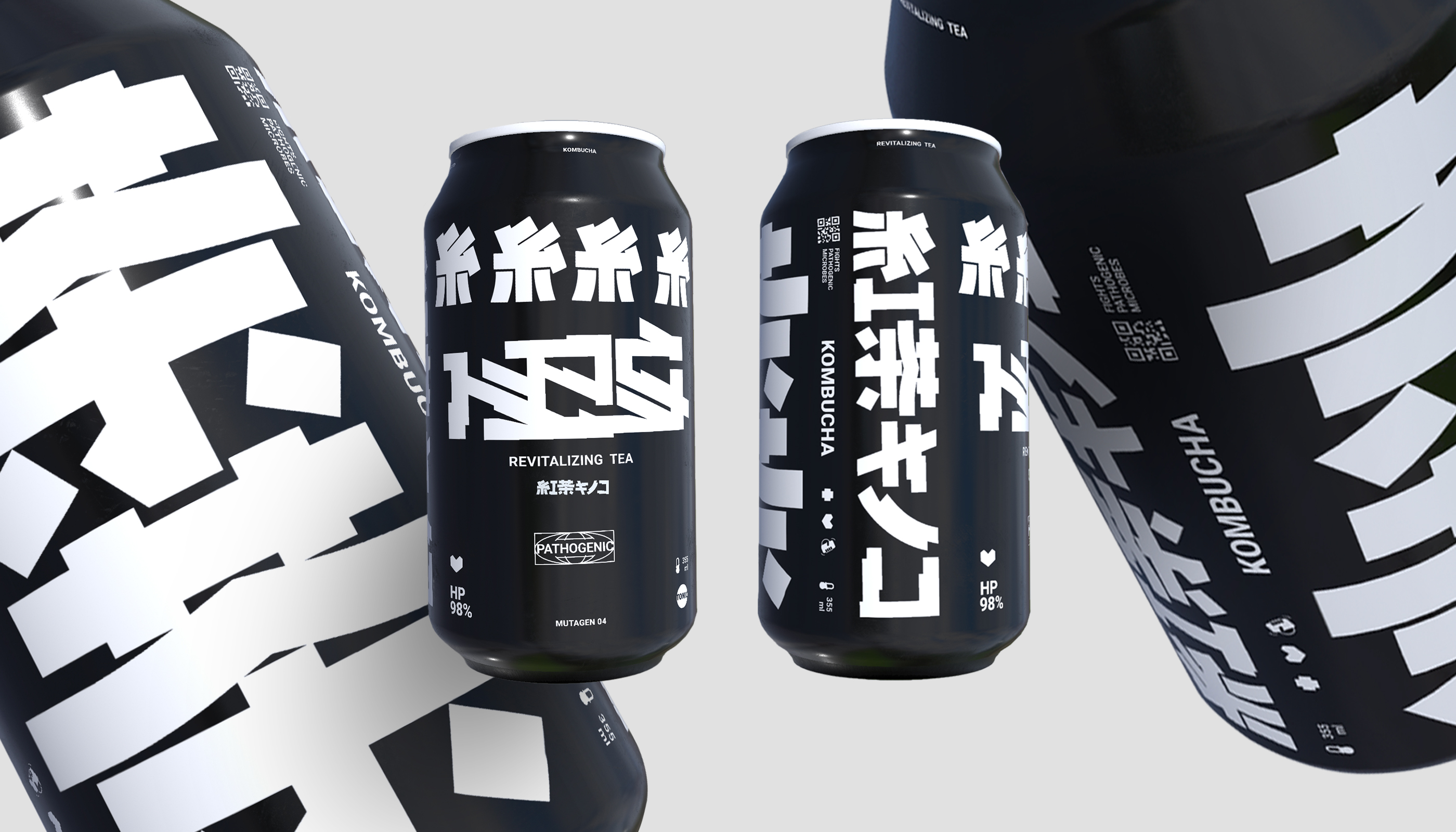
Packaging design: The minimalistic and practical design of the can has a typographic solution, combining hieroglyphs, Latin, Cyrillic and vector graphics in the form of icons. The typographic logo is inspired by Gothic colligraphy, hieroglyphs and is made with a flat pen. The color palette includes two main colors: black and white, which stylistically supports the cyberpunk direction and gives the product a clean and clear look. The matte surface of the can gives the product a tactile appeal. The visual accompaniment of the packaging is complemented by AR technology.
CREDIT
- Agency/Creative: Evgeniy Khizovets
- Article Title: Brand Identity for NPC Kombucha by Evgeniy Khizovets
- Organisation/Entity: In-House
- Project Type: Packaging
- Project Status: Published
- Agency/Creative Country: Belarus
- Agency/Creative City: Minsk
- Market Region: Europe
- Project Deliverables: 3D Design
- Format: Can
- Industry: Food/Beverage
- Keywords: #Kombucha #npc
-
Credits:
Art Director: Evgeniy Khizovets


