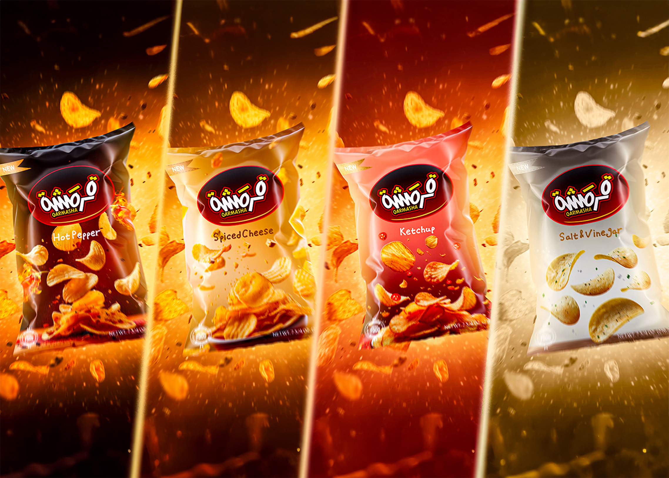
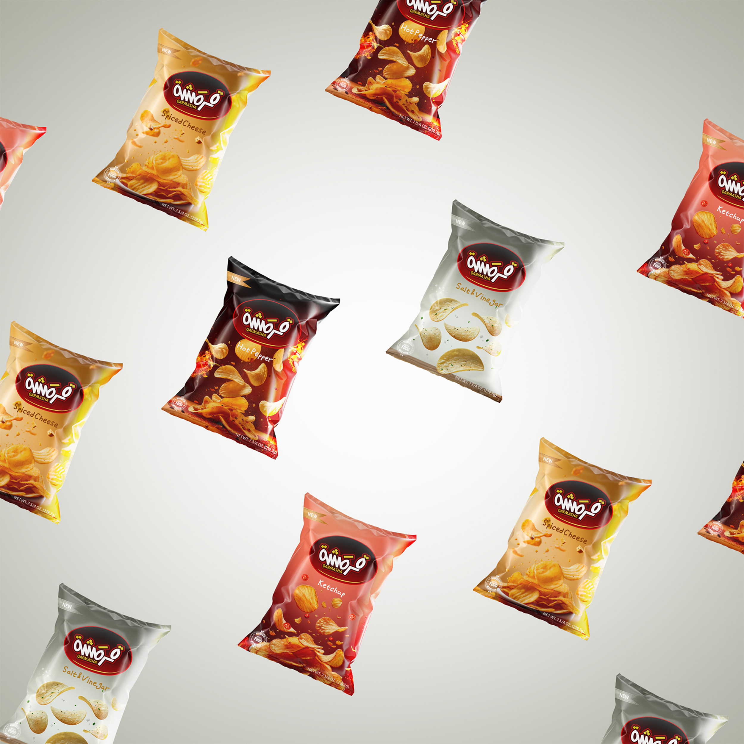
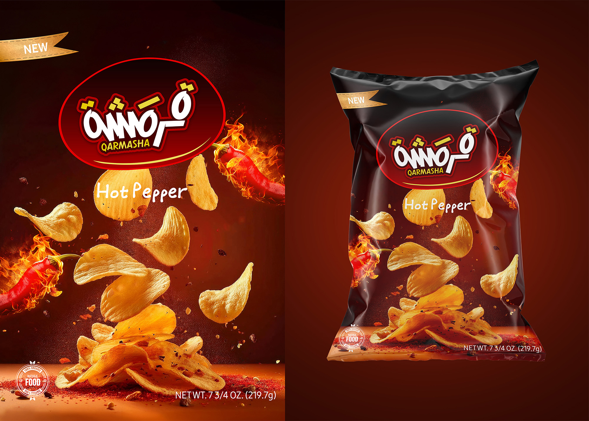
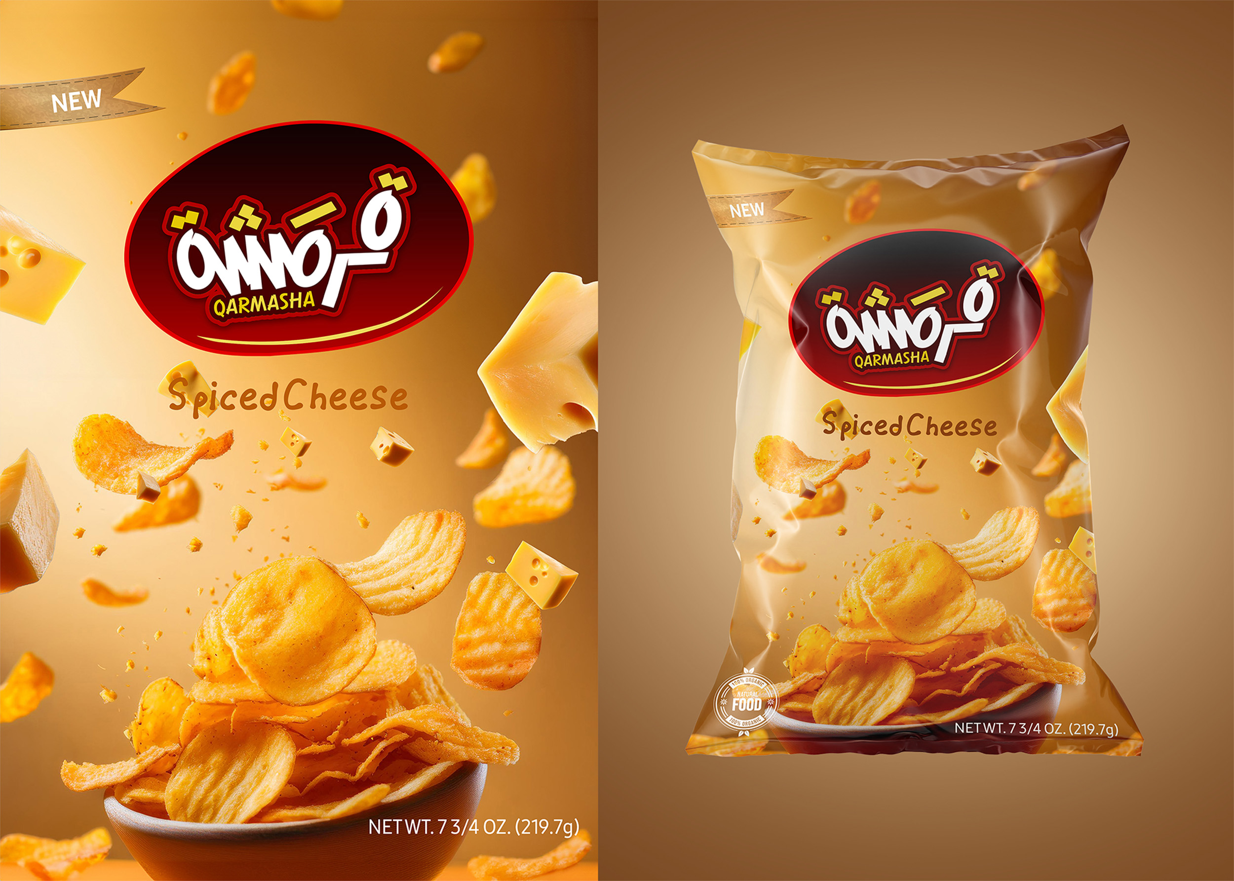
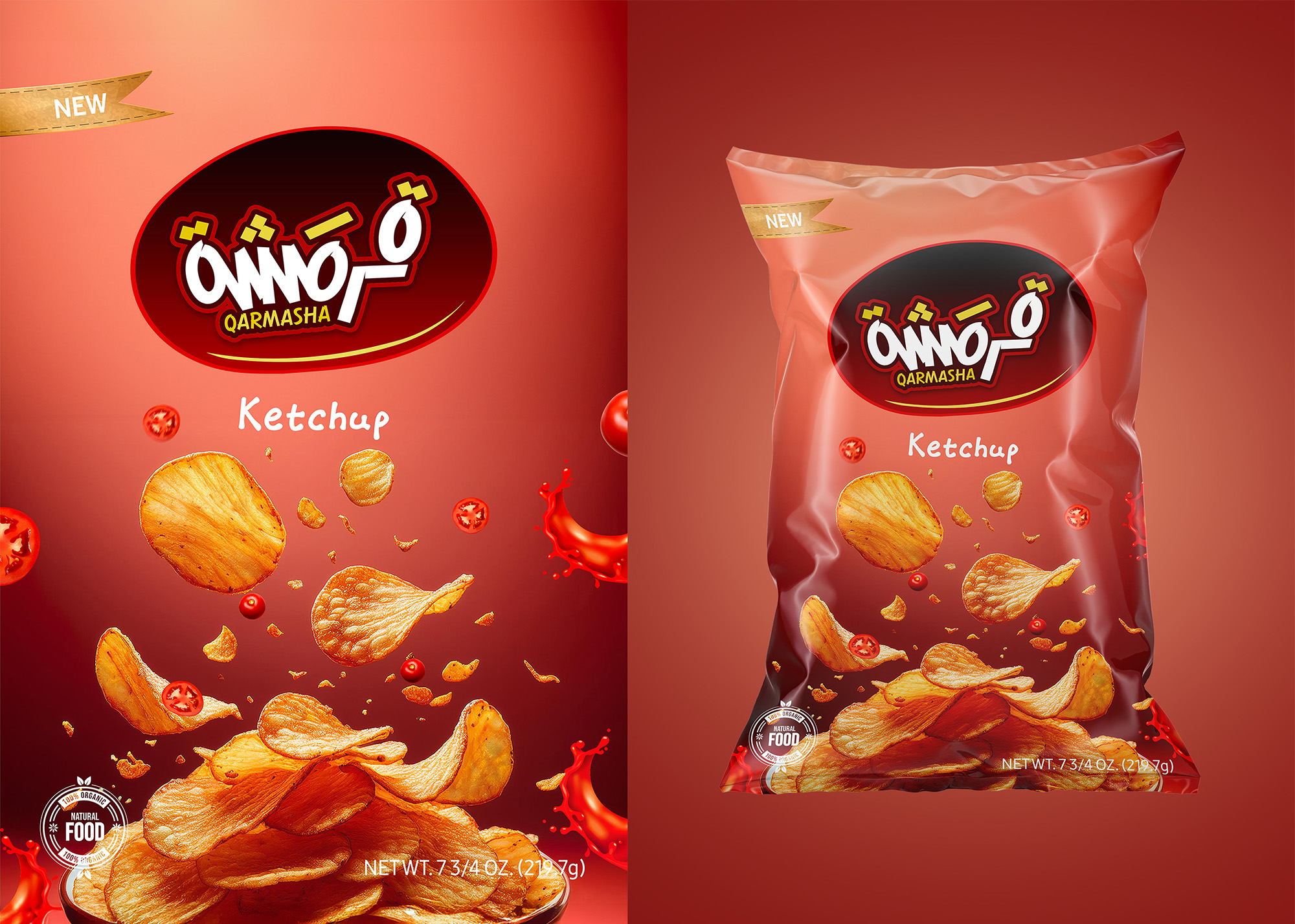
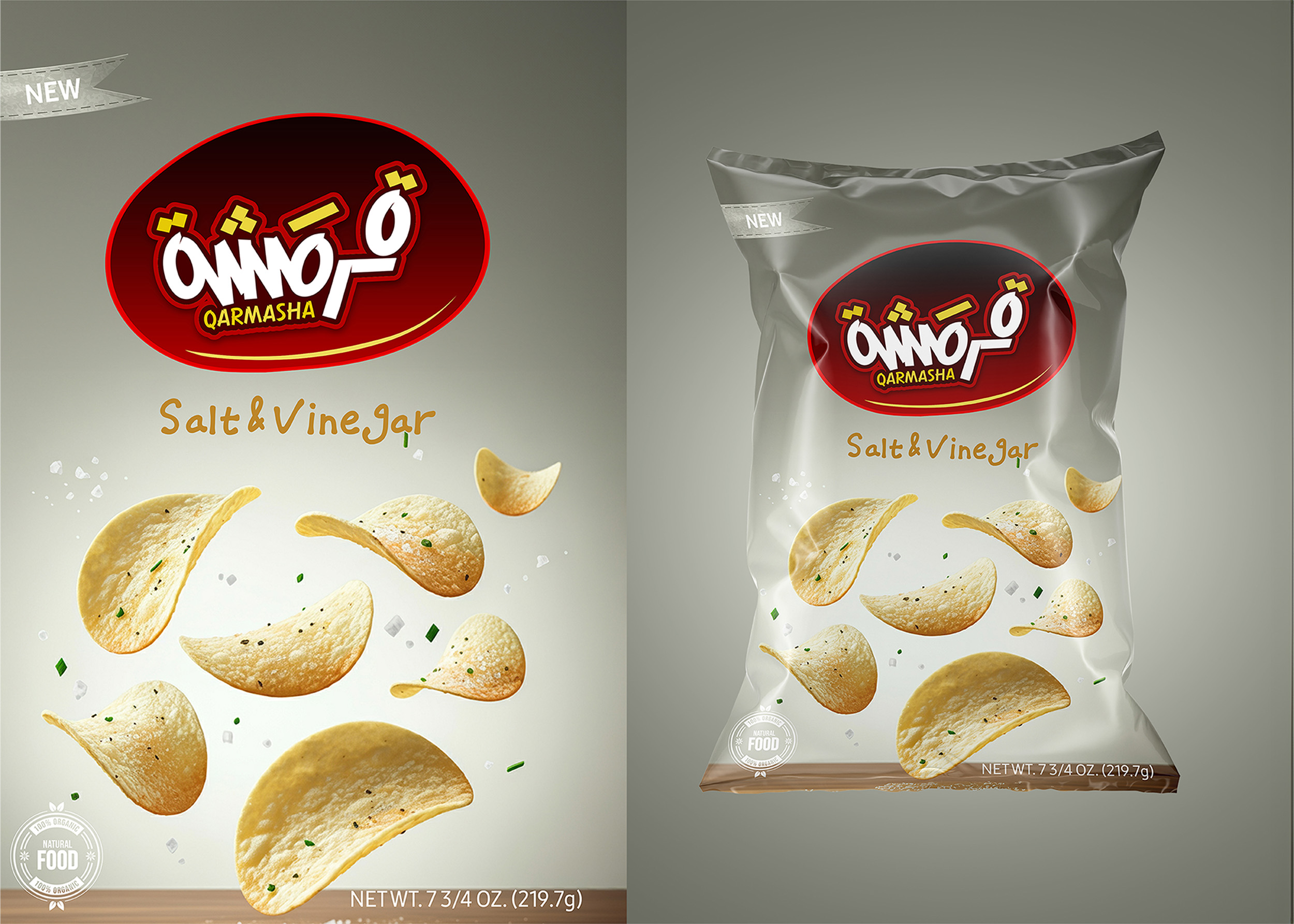
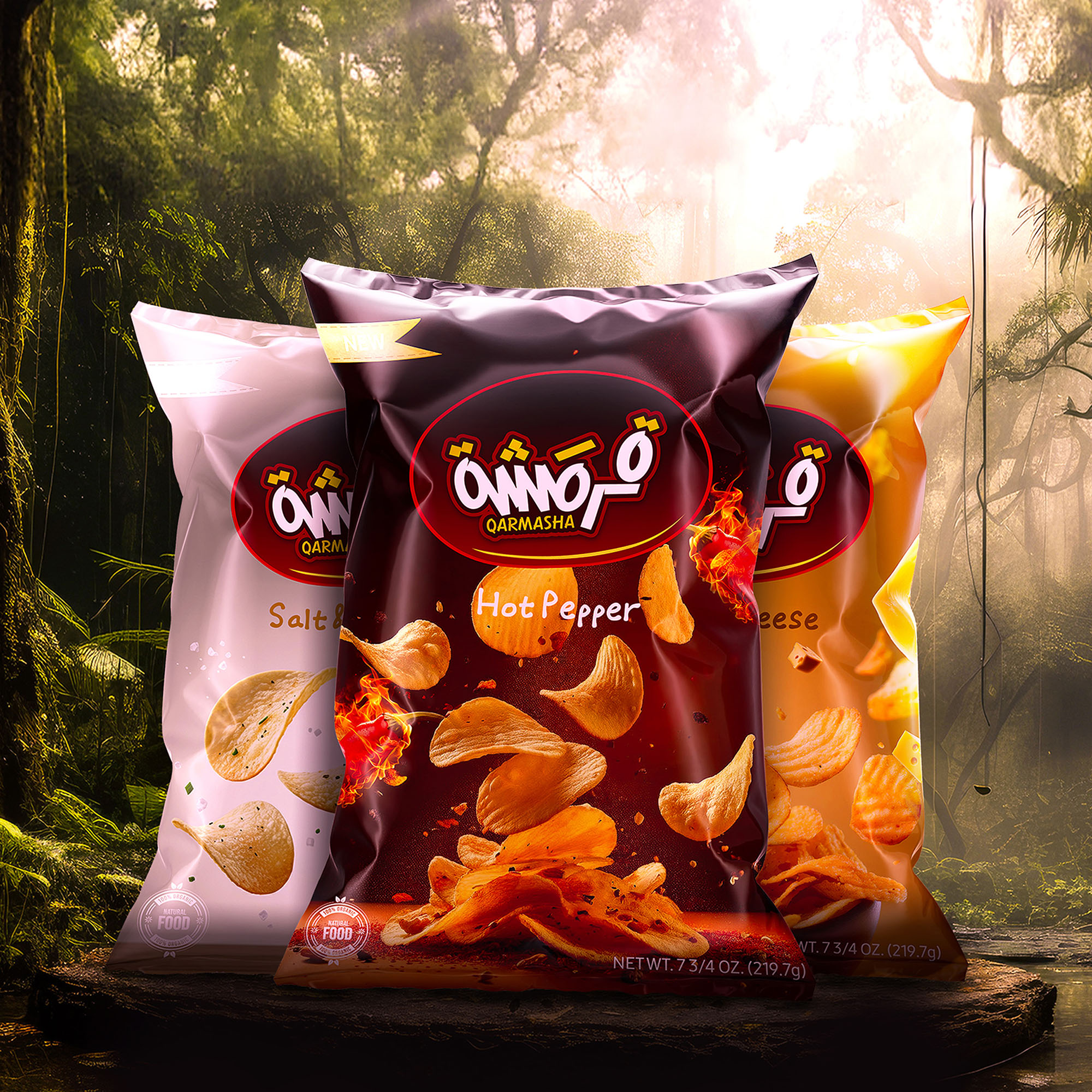
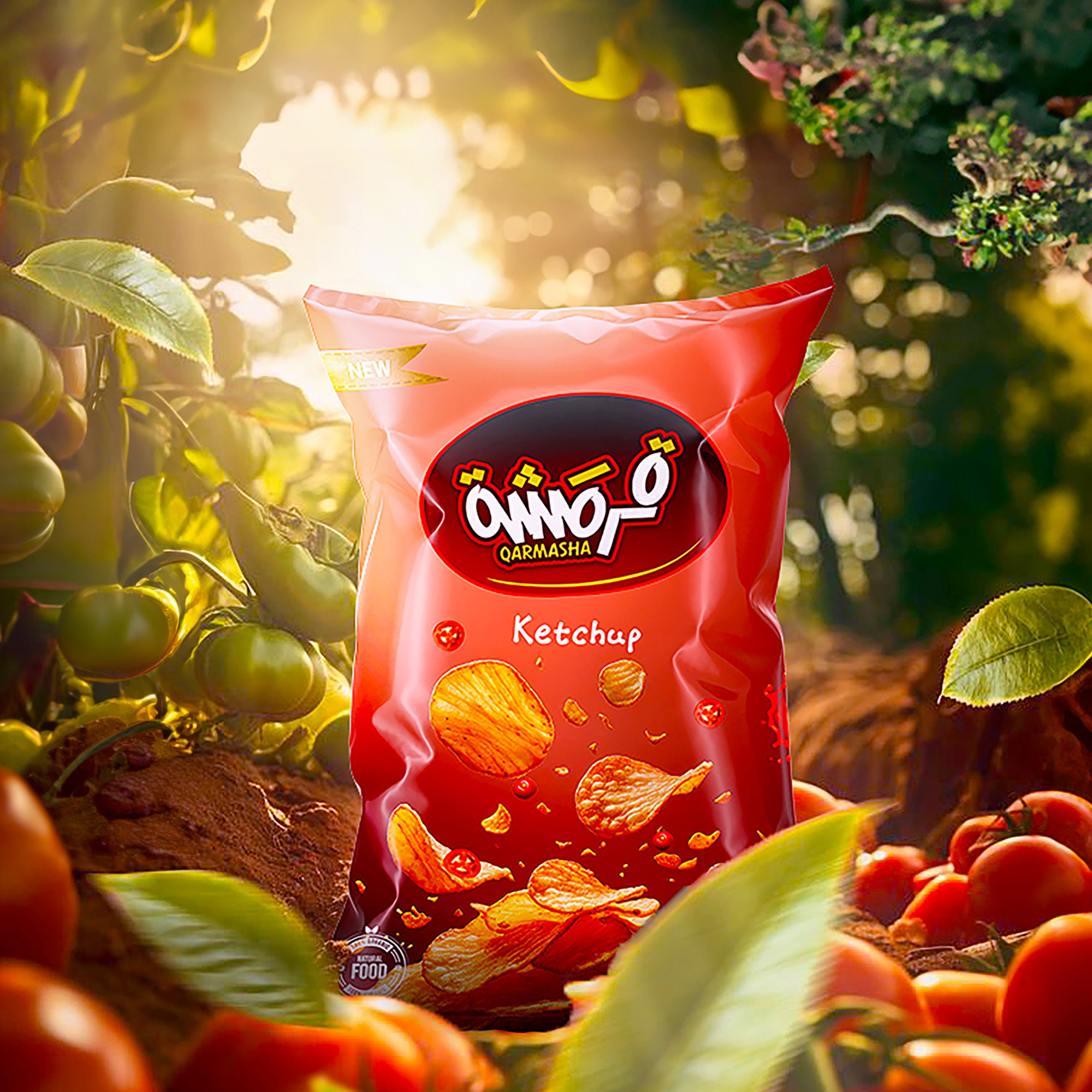
The “Visual Identity Chips” project focuses on developing a cohesive and visually impactful brand identity for a chips product. The aim of the project is to create a packaging and branding design that is not only eye-catching but also representative of the product’s quality and uniqueness. Through the use of bold colors, distinctive typography, and engaging visuals, the project seeks to enhance consumer appeal and differentiate the chips from competitors on store shelves.
The project encompasses several key aspects of branding, including the logo design, color palette, typography, and packaging layout. Each of these elements is carefully chosen to reflect the product’s personality, ensuring that it communicates the desired message to the target audience. The bold use of colors and shapes in the design gives the packaging a modern, vibrant feel that resonates with younger consumers who value visually stimulating and aesthetically pleasing products.
The choice of typography plays an important role in the overall visual identity, as it complements the dynamic design and helps to convey the product’s brand message effectively. The fonts selected are modern and clean, which align with the bold and contemporary style of the packaging design. Additionally, the use of creative illustrations and graphic elements further enhances the packaging, making it memorable and appealing.
The packaging design is not just about aesthetics, but also about functionality. The project ensures that the packaging is easy to handle, store, and transport, while also being environmentally friendly. This aligns with the growing consumer demand for sustainable packaging solutions in the food industry. The design process incorporates user-friendly features such as resealable bags and materials that are biodegradable or recyclable.
Beyond packaging, the project extends to promotional materials and digital marketing assets. This includes designing social media graphics, promotional banners, and in-store displays, all of which maintain a consistent visual language that strengthens brand recognition across different platforms. The overall goal is to create a strong, unified brand identity that is instantly recognizable and appealing to the target market.
In terms of market strategy, the project aims to position the chips as a premium product, highlighting both its taste and its high-quality ingredients. The design helps to communicate these values through sophisticated yet approachable branding. The visual identity also emphasizes the fun and enjoyable nature of consuming the product, creating an emotional connection with the consumer.
Ultimately, the “Visual Identity Chips” project is about creating a brand experience that goes beyond the product itself. By carefully considering every detail of the design, from packaging to marketing materials, the project aims to establish a lasting brand presence in the competitive snack industry.


CREDIT
- Agency/Creative: Abdullah Helwa
- Article Title: Visual Identity Chips – Crunch Redefined by Abdullah Helwa
- Organisation/Entity: Freelance
- Project Type: Packaging
- Project Status: Published
- Agency/Creative Country: Egypt
- Agency/Creative City: Sharqui
- Market Region: Middle East
- Project Deliverables: Brand Strategy, Branding, Packaging Design
- Format: Bag
- Industry: Food/Beverage
- Keywords: Visual Identity, Branding, Chips packaging, Modern design, Bold colors, Snack branding, Product design, Eye-catching graphics, Food packaging, Consumer appeal, Typography, Brand aesthetics, Creative packaging, Marketing strategy, FMCG (Fast Moving Consumer Goods).
-
Credits:
Graphic Design: Abdullah Sami Helwa


