In the modern marketplace, where trends change rapidly and consumer preferences shift just as quickly, it is vital for brands to stand out. However, in a sea of emerging and established brands, the key to success often lies not in chasing trends but in staying true to one’s roots. Tequila Socorro is a perfect example of this philosophy. When we set out to redesign the brand, our primary goal was to respect the original essence that had made Socorro a beloved name, while also infusing the visual identity with fresh, culturally resonant elements that spoke to the richness and depth of Mexican heritage. The result is a brand that not only remains true to its origins but also stands out as a symbol of authenticity in an increasingly cluttered market.
Honoring the Original Essence
Tequila Socorro has always been deeply intertwined with the cultural and historical fabric of Mexico. From the moment of its inception, the brand has prided itself on producing tequila that is handcrafted with precision and care, embodying the artisanal methods passed down through generations. This dedication to tradition is what has helped Socorro cultivate a loyal following. When we approached the redesign, we knew that any changes we made would have to honor this legacy. The objective was not to reinvent the brand from the ground up, but rather to refine it in a way that would amplify its core values and elevate its visual representation.
Respecting the original essence meant staying true to the fundamental principles that had always defined the brand: authenticity, craftsmanship, and a deep connection to Mexican culture. These elements had to be at the forefront of the redesign, acting as guiding lights throughout the entire process.
Incorporating Mexican Culture Through Textures
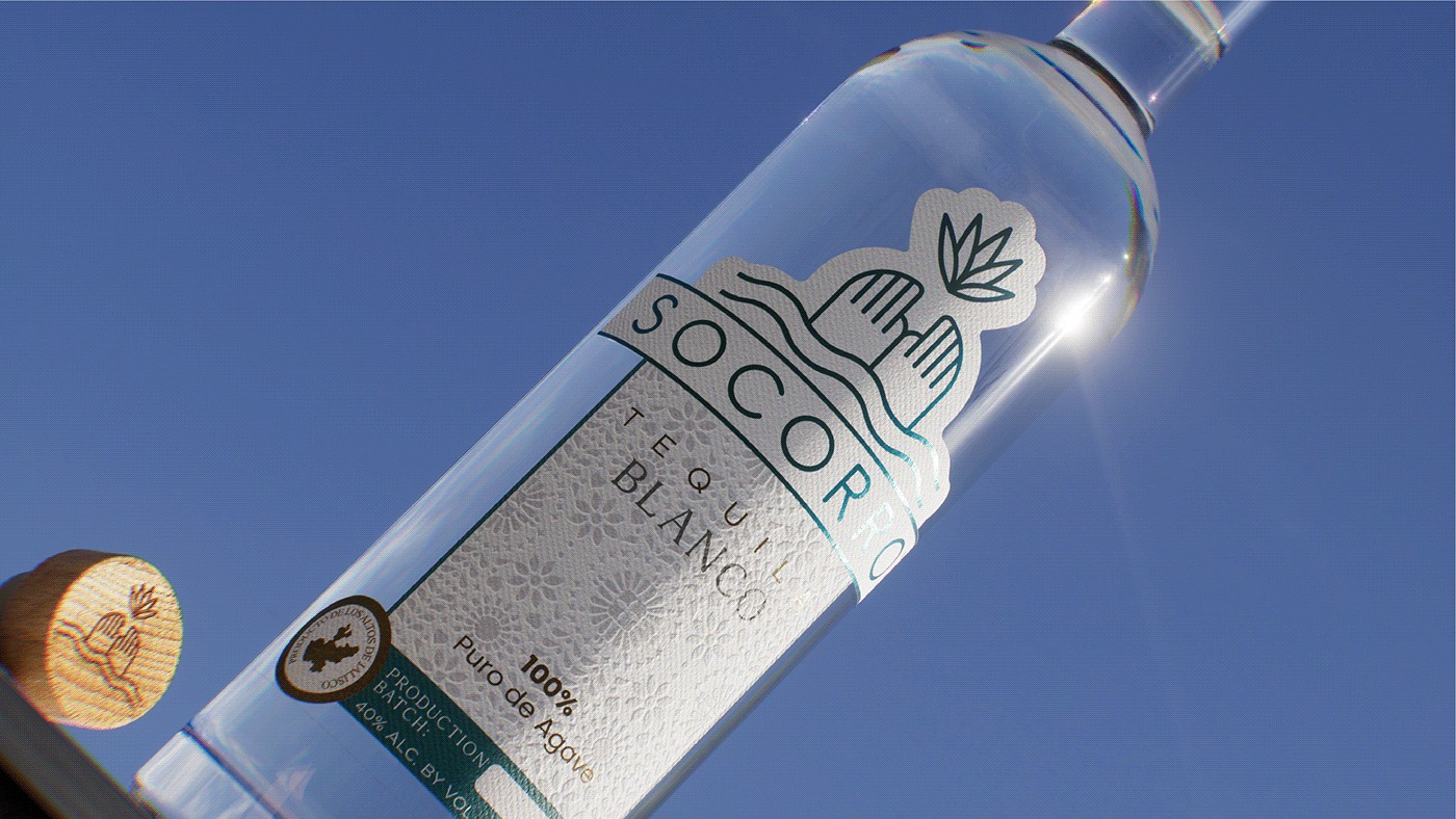
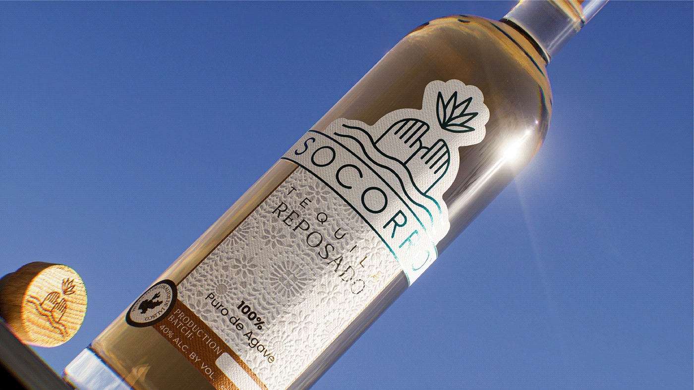
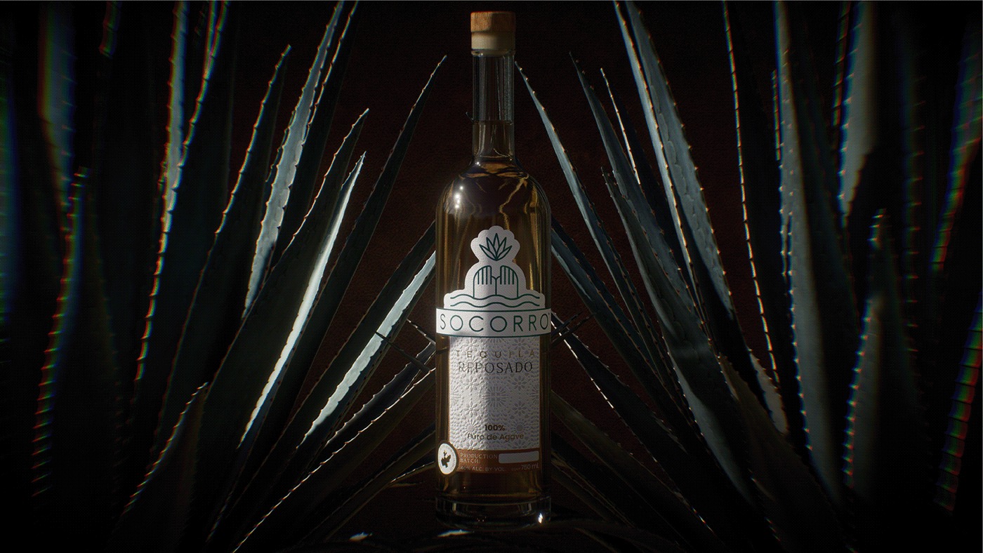
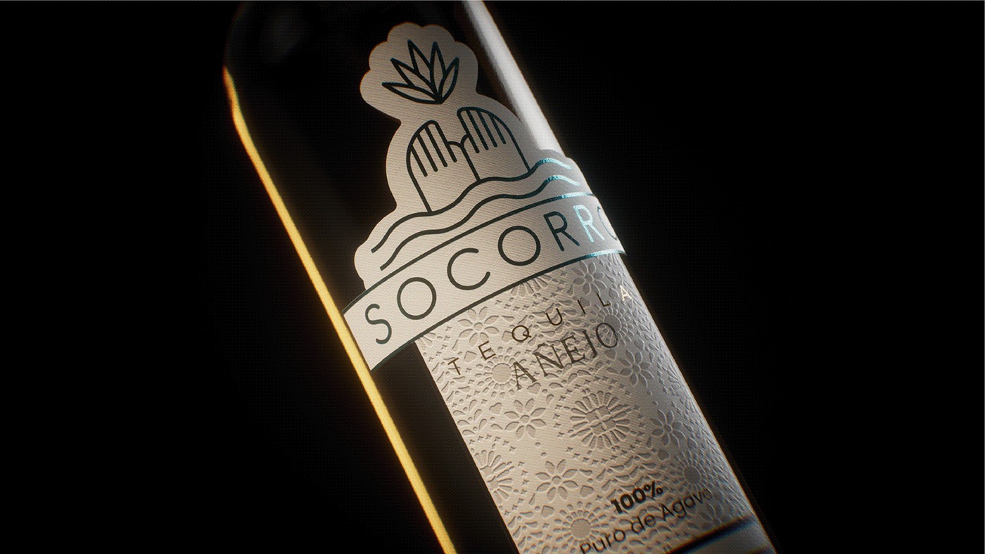
One of the most critical elements of the redesign was the decision to incorporate textures that drew inspiration from Mexico’s rich cultural landscape. Mexican culture is an incredible mosaic of history, art, and tradition, and we wanted to bring that to life in the visual identity of Tequila Socorro. To achieve this, we turned to the country’s vibrant artisan community, whose work reflects a deep understanding of materials, forms, and cultural symbolism.
The textures used in the redesign are inspired by traditional Mexican crafts, such as weaving, pottery, and embroidery, each of which carries its own unique significance. For instance, woven textures evoke the ancient art of textile-making, which has been practiced in Mexico for thousands of years. This connection to the past lends the brand a sense of timelessness, suggesting that, much like the craft of weaving, Tequila Socorro is rooted in history yet remains relevant in the present. Similarly, the earthy tones and organic patterns inspired by Mexican pottery bring to mind the raw, unrefined beauty of handcrafted objects, which parallels the artisanal nature of Socorro’s tequila production process.
Through these textures, we sought to create a tactile experience for consumers. When you hold a bottle of Tequila Socorro, you are not just holding a product—you are holding a piece of culture. Each texture tells a story, connecting the consumer to the artisans who have poured their hearts into preserving Mexican traditions. This sense of connection is essential in communicating the brand’s authenticity, as it speaks to a larger narrative about the value of handmade work in an increasingly industrialized world.
Emphasizing Craftsmanship and Handmade Work
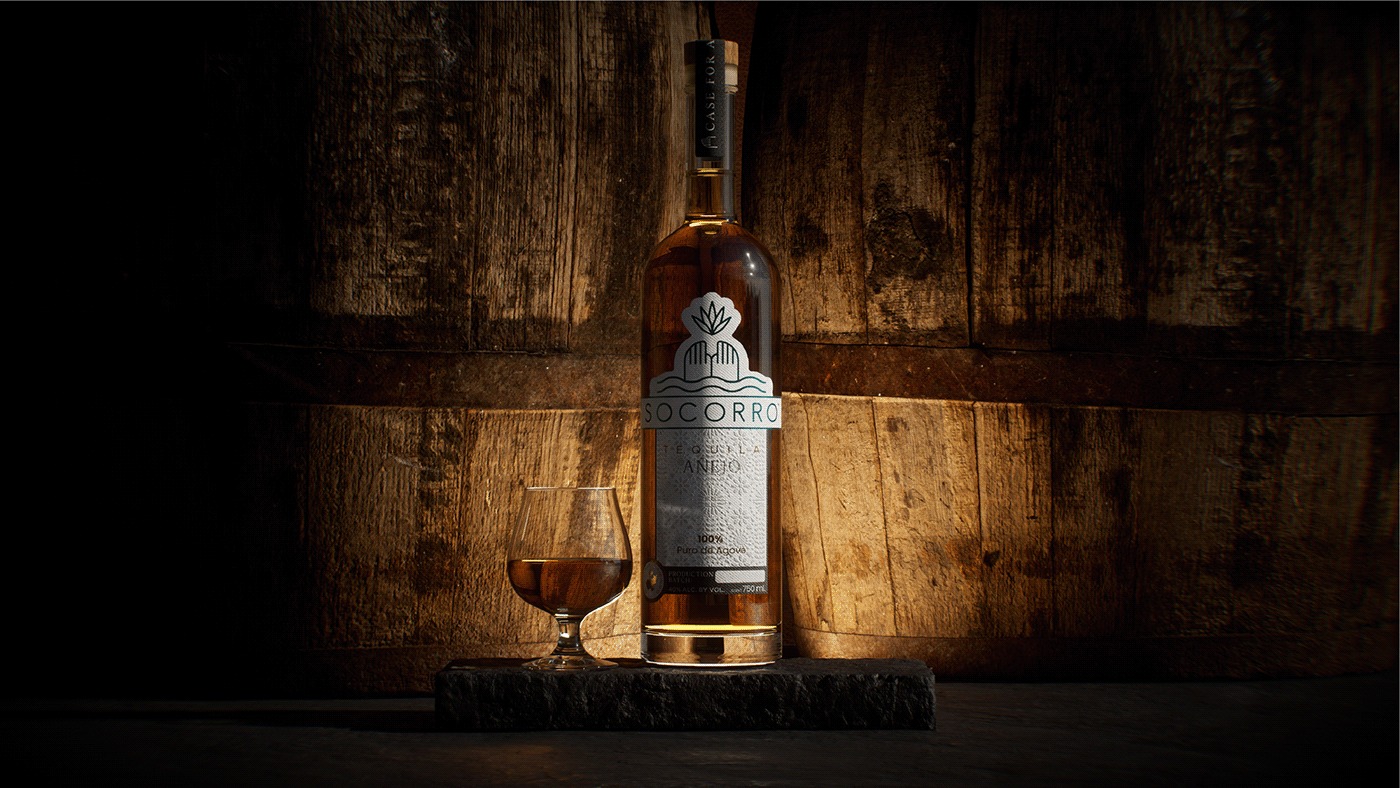
At the heart of the Tequila Socorro brand is the concept of craftsmanship. In a market saturated with mass-produced goods, the brand distinguishes itself by celebrating the meticulous, hands-on process of creating tequila. The production of tequila is itself an art form, one that requires patience, skill, and a deep understanding of the agave plant from which it is made. Every step of the process, from the harvesting of the agave to the fermentation and distillation, is done with care and precision. This is not a product that can be rushed or compromised, and the same goes for the design of its brand identity.
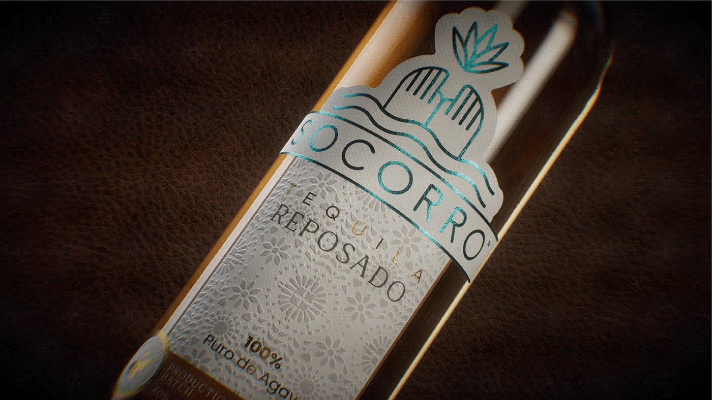
In the redesign, we wanted to highlight this dedication to craftsmanship by creating visuals that reflected the handmade nature of the product. The textures, color palette, and typography were all chosen to emphasize the idea that Tequila Socorro is a labor of love, produced by skilled hands rather than machines. The use of hand-drawn elements in the design further underscores this point, lending the brand an organic, personal touch that mass-produced designs often lack.
By focusing on craftsmanship, we are also tapping into a growing consumer desire for products that have meaning and authenticity behind them. In an age of instant gratification and disposable goods, more and more consumers are seeking out brands that value quality over quantity, and that take the time to create something truly special. Tequila Socorro speaks to this desire by offering a product that is not only delicious but also steeped in tradition and artisanal expertise.
Simplicity and Minimalism as a Design Approach
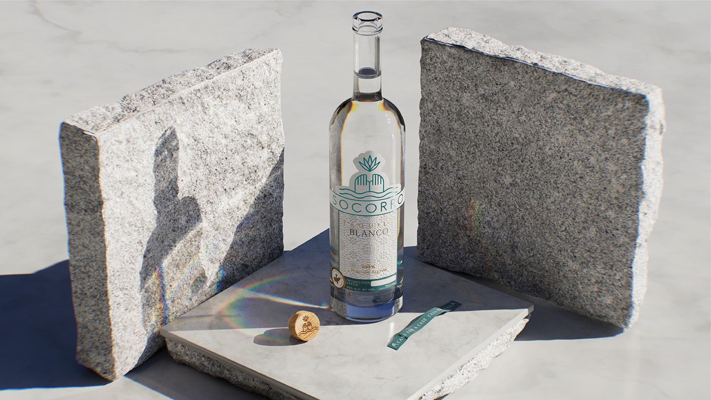
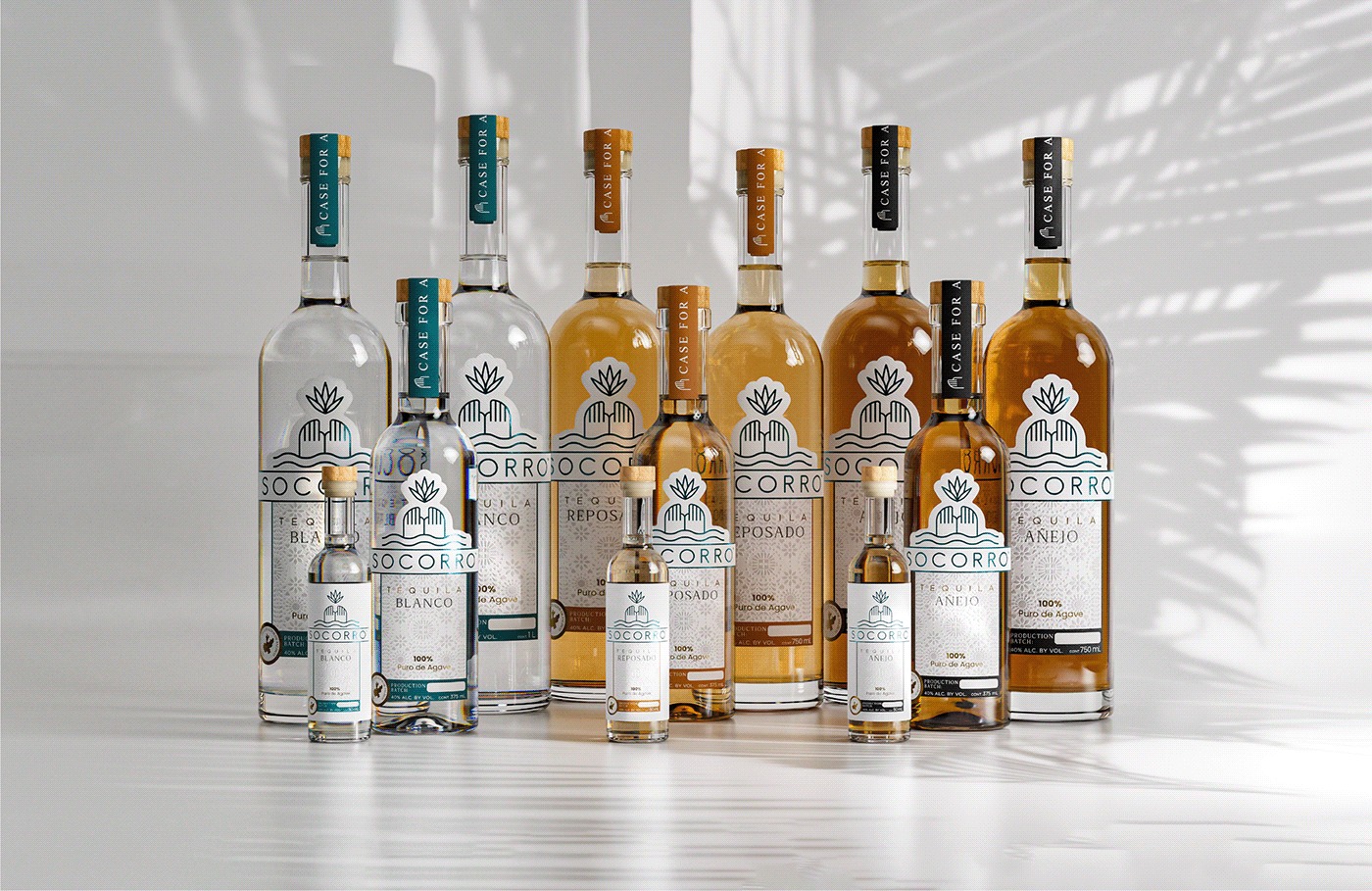
When it came to the overall design approach for Tequila Socorro, simplicity and minimalism were key guiding principles. In many ways, these concepts are reflective of the brand’s core values. Tequila Socorro is not a brand that relies on flashy gimmicks or over-the-top marketing; rather, it presents itself with humility and confidence, allowing the product to speak for itself. This quiet strength is what sets the brand apart from competitors, and we wanted the visual identity to reflect that.
Minimalism in design does not mean stripping away all visual elements to the point of sterility. Instead, it involves a careful curation of elements, ensuring that every component serves a purpose and contributes to the overall message. For Tequila Socorro, this meant paring down the design to its most essential elements, while still maintaining a sense of richness and depth through the use of textures and subtle details.
The decision to adopt a minimalist design was also a strategic one. In a crowded marketplace, where brands are constantly vying for attention, simplicity can be a powerful differentiator. By presenting a clean, uncluttered design, Tequila Socorro stands out precisely because it does not try too hard to grab attention. Instead, it invites consumers to take a closer look, to appreciate the nuances of the design, and to connect with the brand on a deeper level.
Authenticity as a Brand Differentiator
Perhaps the most important aspect of the Tequila Socorro redesign is the emphasis on authenticity. In today’s world, where consumers are becoming increasingly savvy and discerning, authenticity has become a crucial factor in brand success. People want to feel like they are buying something real, something that has a story and a purpose behind it. Tequila Socorro offers just that.
The brand’s authenticity comes from its deep connection to Mexican culture and its commitment to traditional methods of tequila production. This is not a brand that has been manufactured in a boardroom or constructed to fit a particular marketing trend. Instead, it is a brand that has grown organically out of a genuine passion for the craft of tequila-making and a desire to share that passion with the world.
In the redesign, we sought to amplify this sense of authenticity by stripping away any elements that felt inauthentic or superfluous. The result is a brand identity that feels honest, genuine, and true to its roots. Whether it’s the handcrafted textures, the minimalist design, or the celebration of artisanal work, every element of the redesign reinforces the idea that Tequila Socorro is a brand with integrity.
A Celebration of Cultural Roots and Artisanal Work
Ultimately, the Tequila Socorro redesign is a celebration of the brand’s cultural roots and the artisanal work that goes into creating each bottle. By drawing inspiration from Mexico’s rich history and traditions, we have created a brand identity that is not only visually striking but also deeply meaningful. This is a brand that tells a story—one of craftsmanship, authenticity, and a deep respect for the past.
As Tequila Socorro moves forward, it will continue to be a brand that honors its roots while embracing the future. With its redesigned visual identity, the brand is now better positioned to connect with a new generation of consumers who value authenticity, craftsmanship, and cultural heritage. And as the brand grows, it will remain, at its core, a celebration of the art of tequila-making and the rich cultural tapestry from which it was born.


CREDIT
- Agency/Creative: Hi! Estudio Multidisciplinario
- Article Title: Redesigning Tequila Socorro: A Journey of Craftsmanship, Authenticity, and Cultural Roots
- Organisation/Entity: Agency
- Project Type: Packaging
- Project Status: Published
- Agency/Creative Country: Mexico
- Agency/Creative City: tepatitlan
- Market Region: Global
- Project Deliverables: 3D Design, 3D Modelling, Brand Design, Packaging Design
- Format: Bottle
- Industry: Food/Beverage
- Keywords: hiestudio, hi, branding, designstudio, tepatitlan, tequila, spirits
-
Credits:
Designer: Hi! Estudio Multidisciplinario


