


Brief
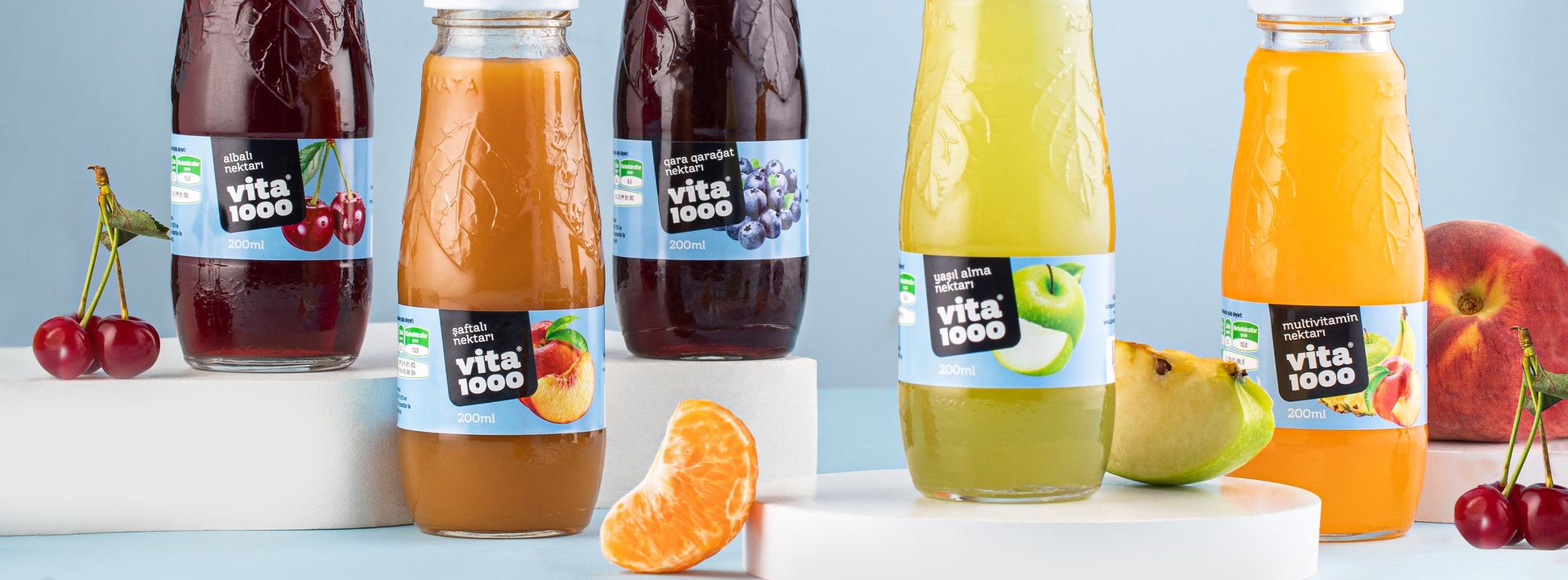
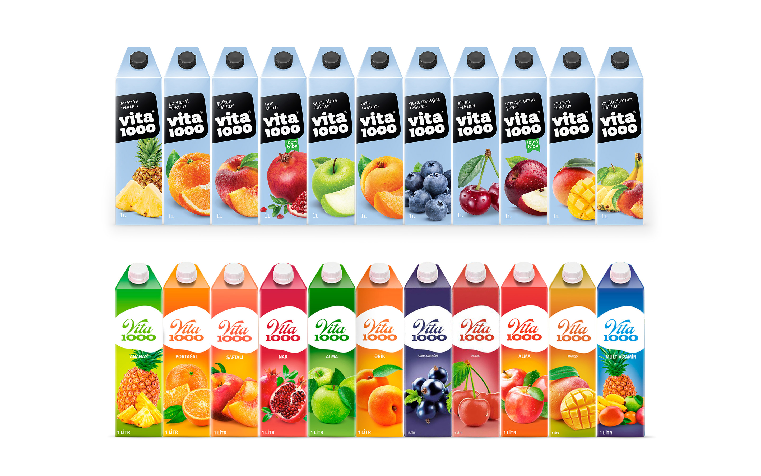
Vita1000 fruit juice is a huge brand in the Azerbaijani market. The brand has 11 varieties in the domestic market, and the products take a serious place among its competitors. But the brand had some problems. So, buyers do not believe in the naturalness and quality of the product. Buyers bought the product mainly because of the reasonable price. This risked the future of the brand and created conditions for the growth of competitors. One of the main problems was that the brand was not iconic and not embedded in people’s minds. The products were sold in 1-liter tetrapak, 1-liter glass bottles, and 200 ml, and the lack of iconicity of the design concept sometimes allowed the brand to be mistaken for competitors.
Research
During the research, we observed that having the same color in fruit juice varieties is a successful strategy. Mostly, the fruit juice shelf had quite a lot of mixed and similar colors. We found that having each variety in different colors hurt the brand. So it was quite difficult to find the products when standing at the juice display. Unattractive fruit images and the unavailability of information on the packaging were advantages for competitors. The fact that the logo could not be read from a distance of 2-3 meters and the gradient colors prevented the products from being imprinted on the minds.
Solution
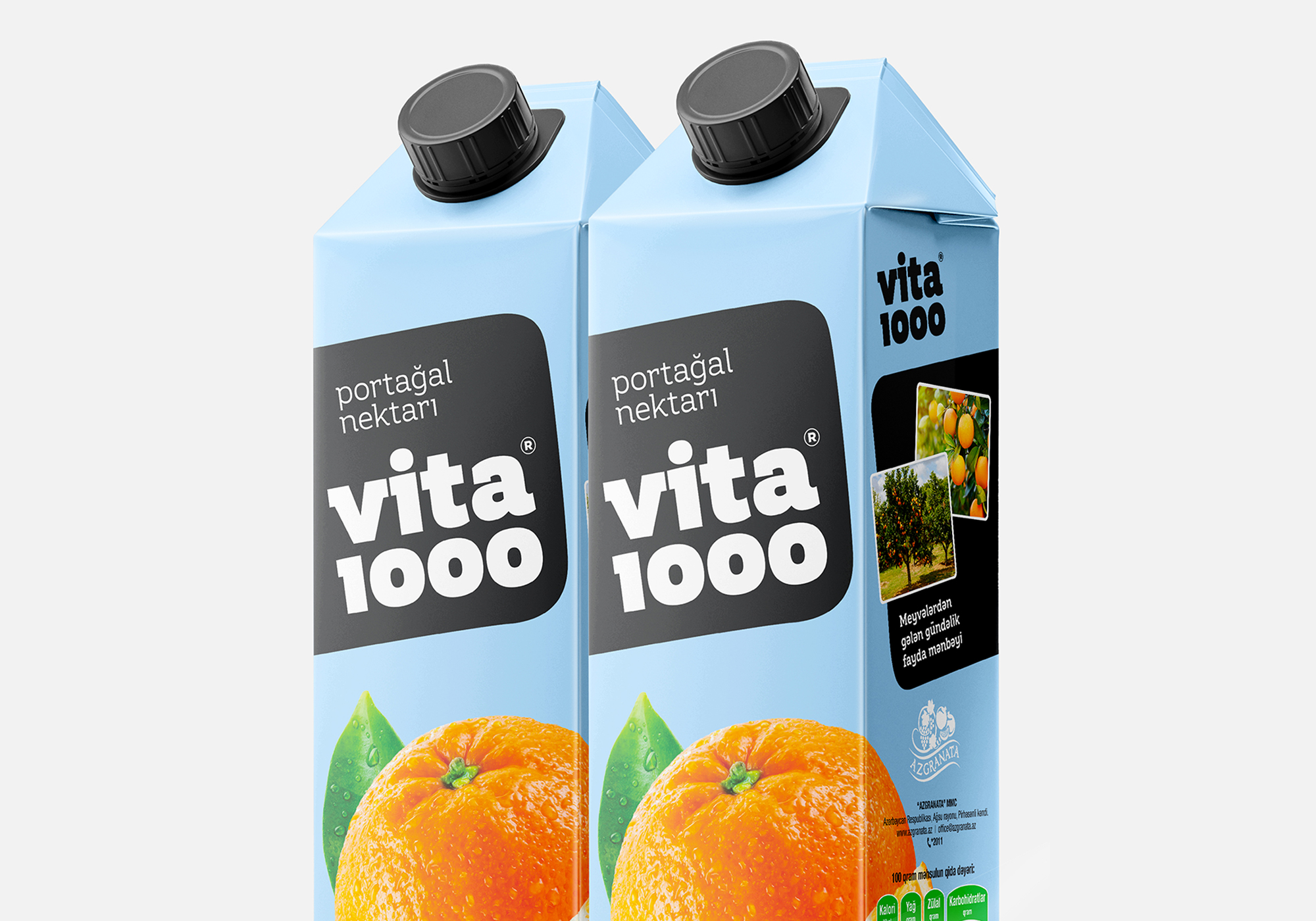
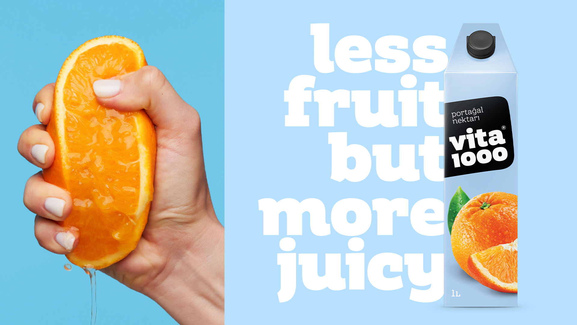
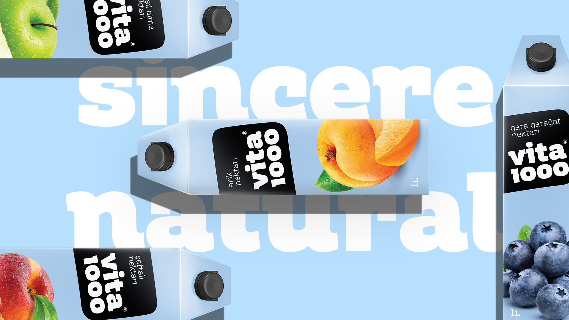
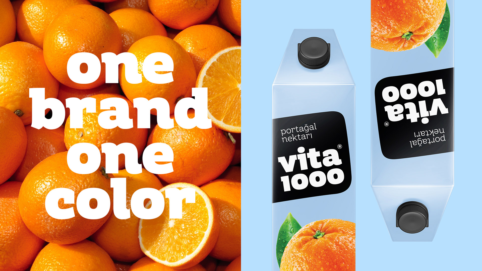
We chose a primary color that is not used in fruit juice as well as drinks and foods. By choosing this color, we created conditions to distinguish the product both on the shelf and from its competitors. We chose the 2nd color with the same logic and this color was rarely used in drinks and food. Thus, we gave 60% blue, 30% black, and 10% to the fruit’s color.
We have developed a new logo for clear and sharp contrast reading of the logo (brand name) from any distance. We changed the style and typography of the entire brand to be sharp and understated, but at the same time authoritative and pleasant.
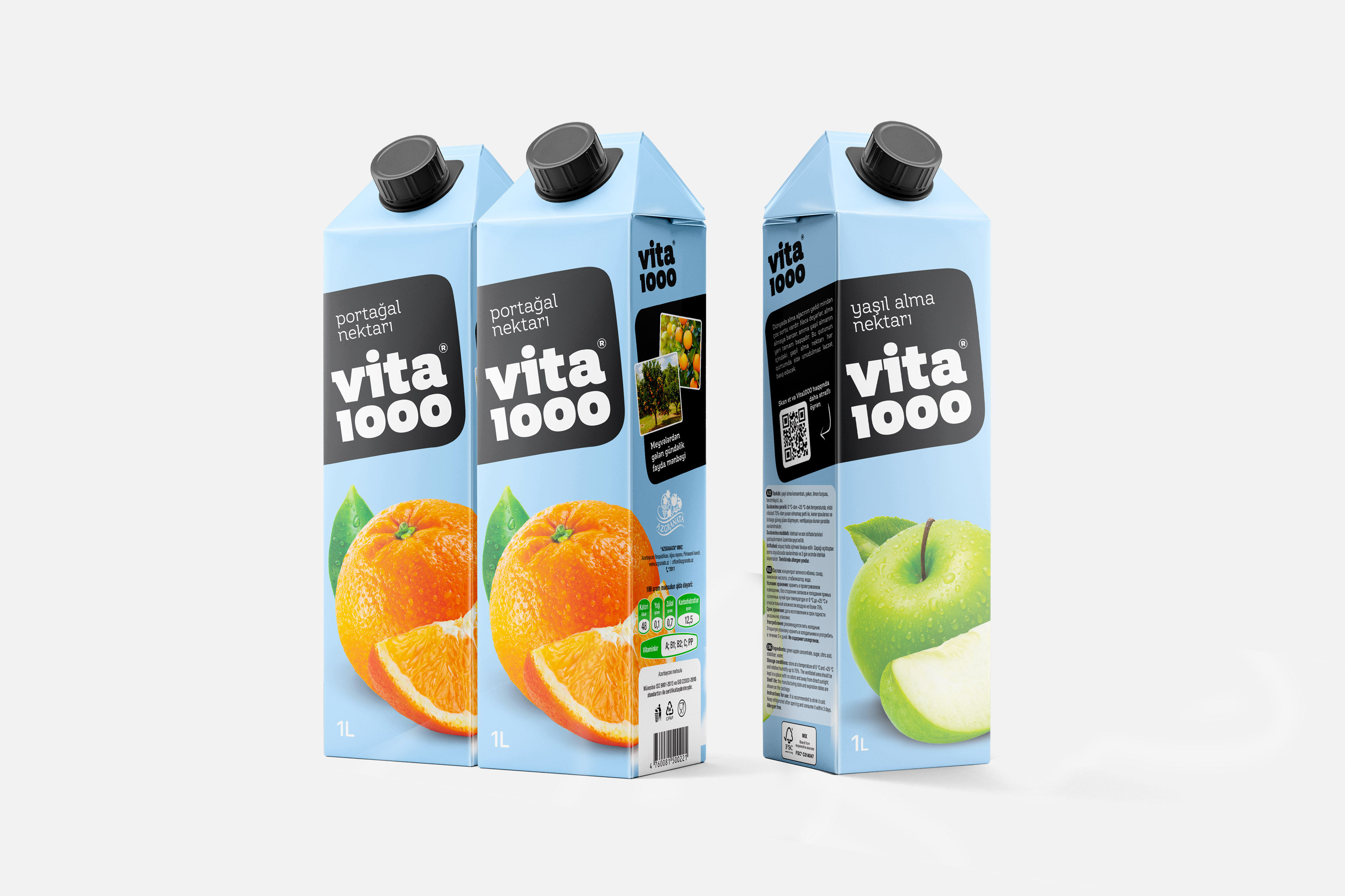
We made a sticker-style design to create naturalness in the design. We made the black part as if it was glued by hand, and it is relatively sincere and reminiscent of the stickers on the fruit.
Since red apples and pomegranates are completely natural and sugar-free products, we have added a small label on those varieties. With this, we created an honest image as a brand.
We’ve highlighted a few of the most sought-after information in the information section of the packaging. For example, calories, sugar, vitamins, protein, shelf life. With this, users found the information they were looking for more easily.
The packaging is designed 360 degrees and it is possible to easily recognize the product from any side. The reason we do this is that people sometimes mix up the packaging in the display case, putting it upside down or on its side. In this case, the products are not recognized.
We also placed real pictures of the orchards where the products are grown and the products on the side of the packaging so that people can visually perceive that the products are produced from real fruits. A QR code explaining the production process is placed on the packaging. This QR code video transparently shows the entire production process, starting with the collection of fruits.
The arrangement of products on the shelf is designed in such a way that even people with visual impairments can easily recognize the brand on the shelf.
Result
The new design proved successful in a short time. We observed the results of focus groups results in sales in the first months. A 35% increase in sales was observed in the 6 months. The new design made it possible to increase the price of the product by 20%. So, even though we are higher in price than the main competitors with the new design, our sales exceeded the competitors. Currently, the development line of the brand continues in an upward direction.
CREDIT
- Agency/Creative: Rahim Ismayil Design
- Article Title: vita1000 Fruit Juice Rebranding
- Organisation/Entity: Agency
- Project Type: Packaging
- Project Status: Published
- Agency/Creative Country: Azerbaijan
- Agency/Creative City: Baku
- Market Region: Asia, Europe
- Project Deliverables: Art Direction, Brand Experience, Branding, Creative Direction, Graphic Design, Label Design, Packaging Design, Rebranding
- Format: Bottle, Case
- Industry: Food/Beverage
- Keywords: Fruit juice
-
Credits:
Creative Director: Rahim Ismayil
Senior Art Director: Shahin Aliyev


