Introducing the branding of Here’n’now coffee shops. The philosophy of the chain is the best here and now. Enjoying the moment without looking back or making long-term plans. Future can wait.
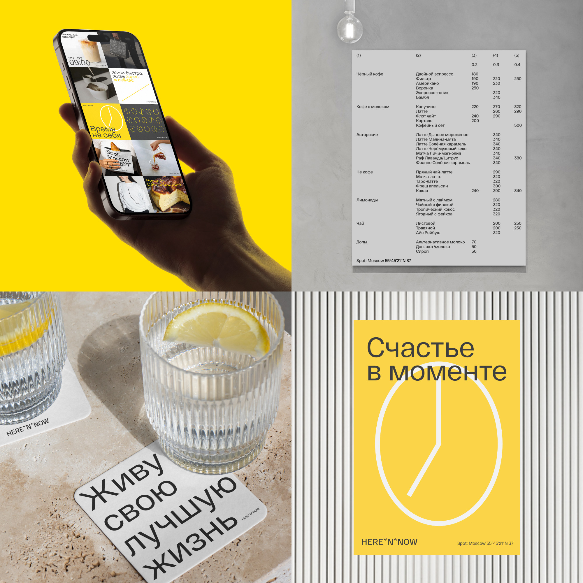
The coffee shop logo conveys the moment of the present between the past and the future. This is branding for the ever-hurrying residents of big cities, office workers, freelancers, people tired of visual noise. The pattern plays on the shape of a coffee bean and a dial.
The main colors are dark gray and white. Active yellow is present in measured doses and is used for accents. The typography is simple and refers to business aesthetics, fonts for the main text. The Here’n’now logo is light due to the good readability of the font and the visual subtlety of the letters.
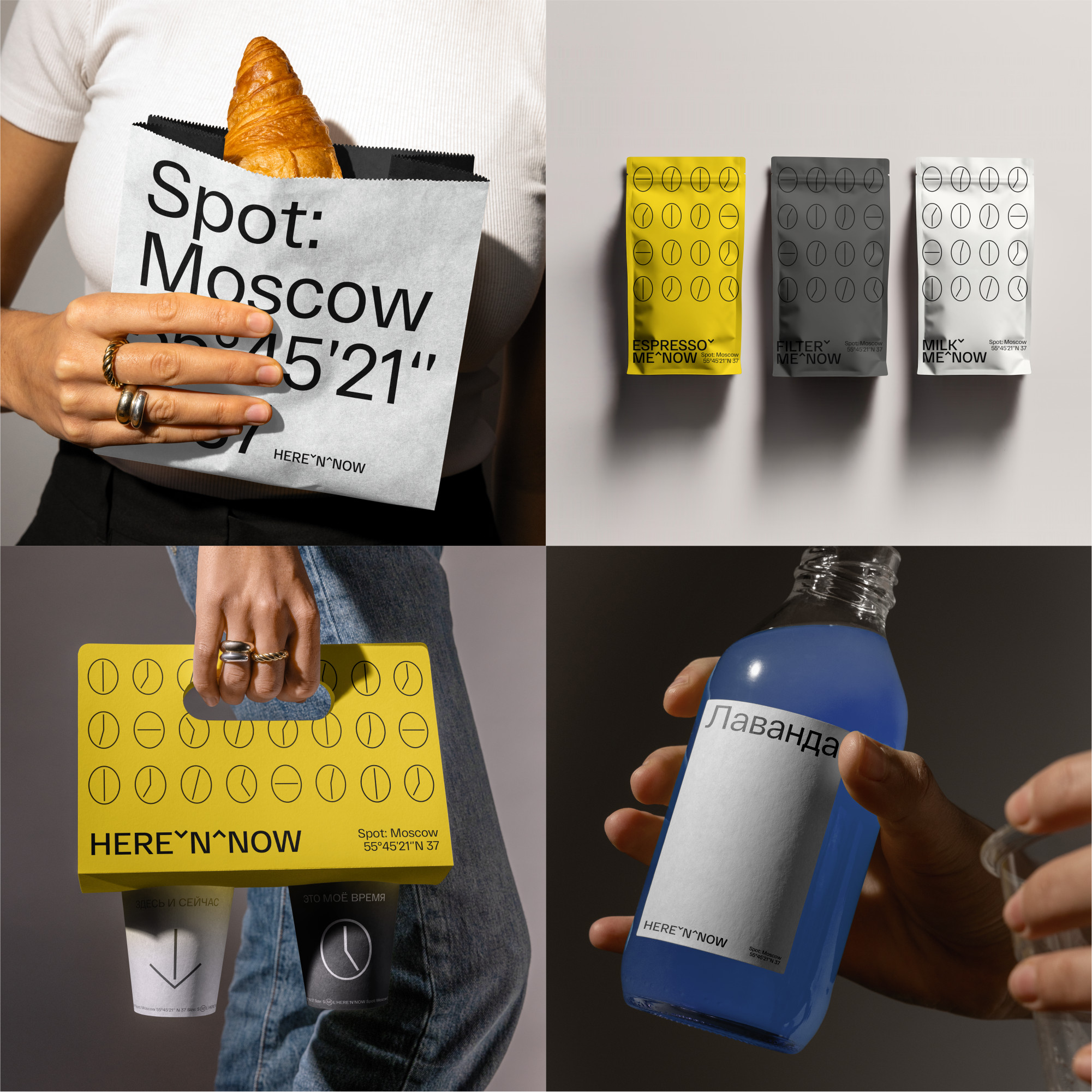
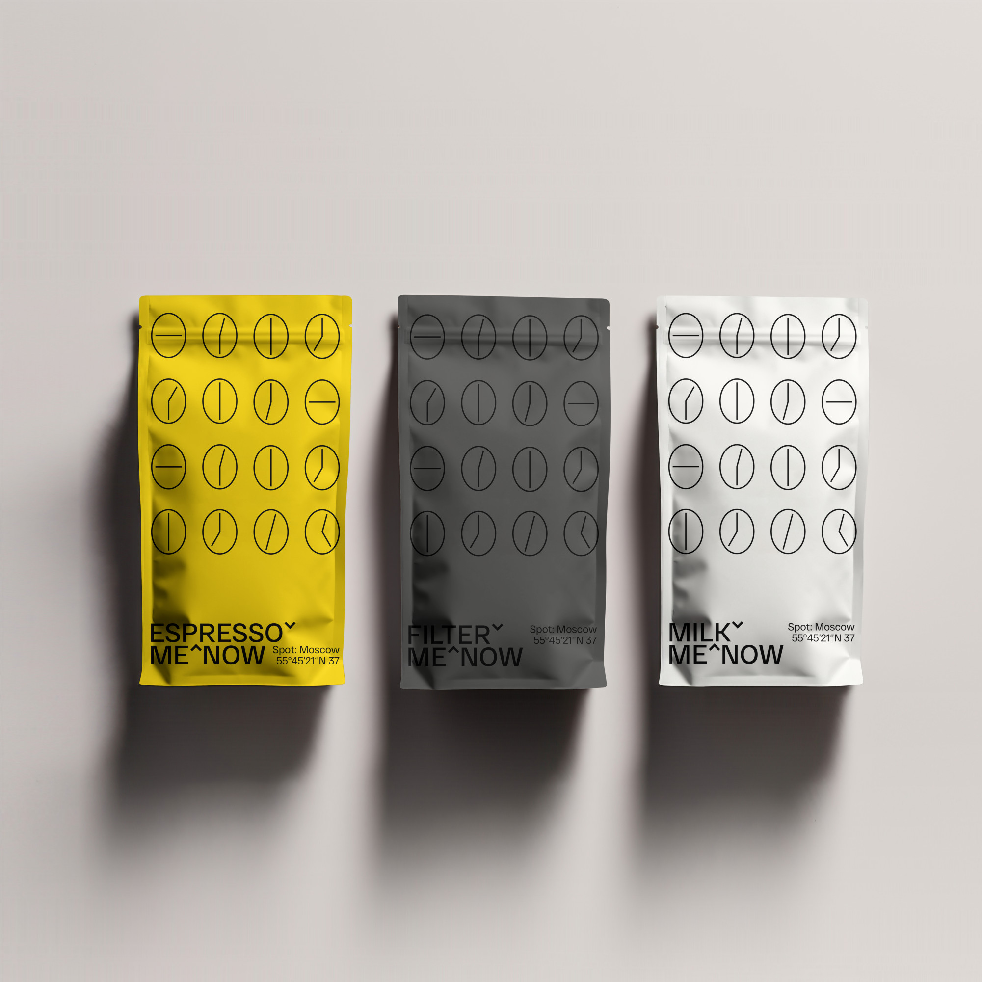
The coffee shop’s corporate colors are played up in the design of the coffee packaging. Active espresso is yellow, calm filter is gray, and coffee, which goes perfectly with milk, is predictably white. Each pack has a slogan-name in the style of the logo.
Relaxed “design without design” or “I can do it myself in Word” supports the theme of calm and living in the moment.
The design of the social network feed is based on the principles of contrast. Photo materials are balancedly alternated with text publications.
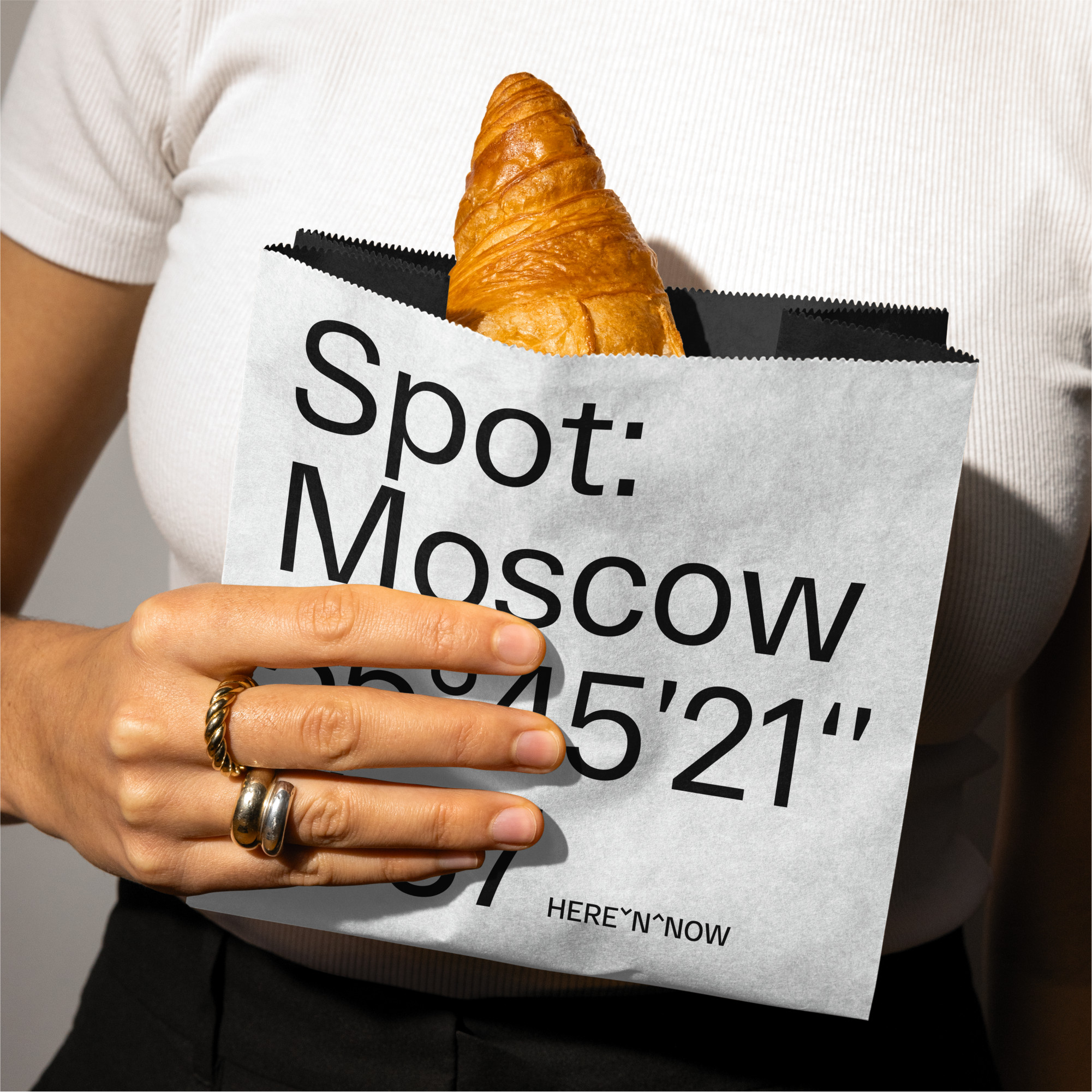
We try not to mechanically place the same pattern or design technique on all media, but approach the issue creatively. For example, the bakery packaging has the establishment’s coordinates. The packaging itself is made of double-sided paper, because the baked goods look especially impressive against a dark background.
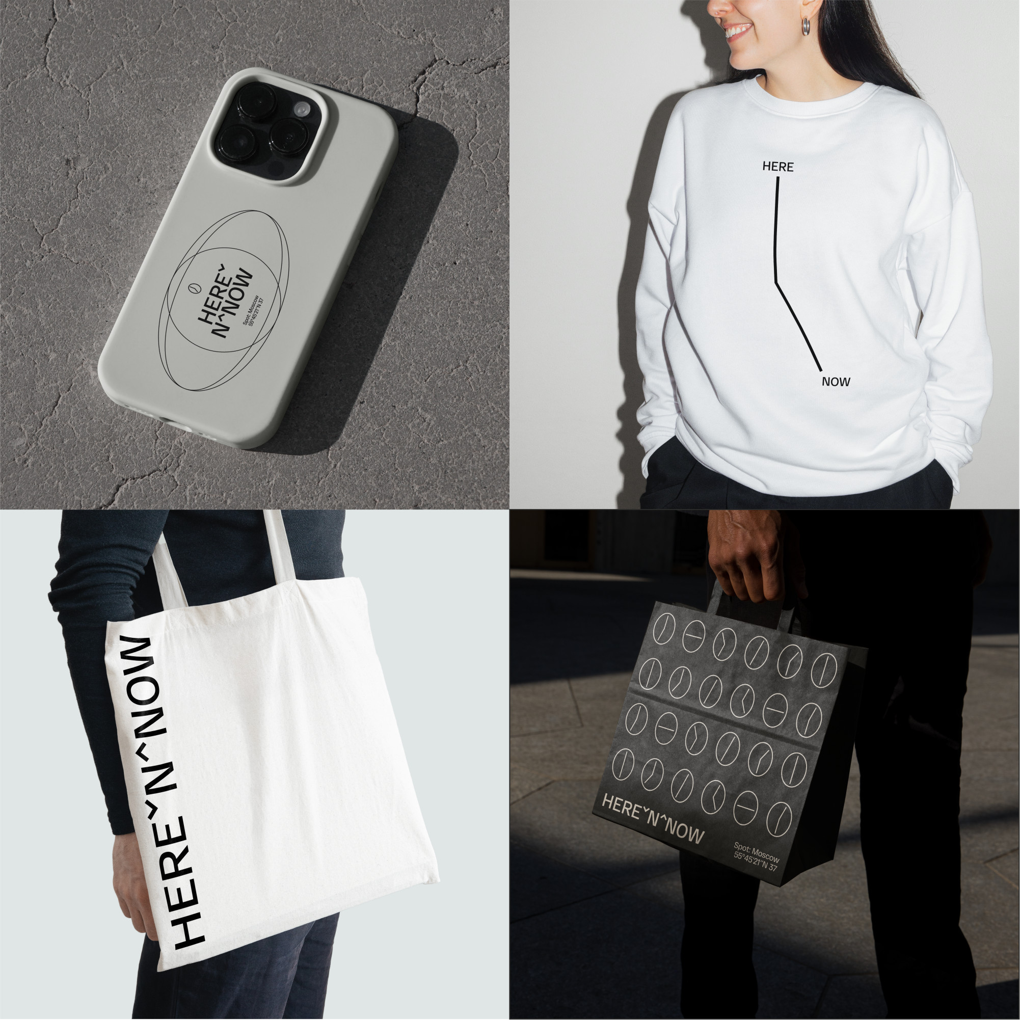
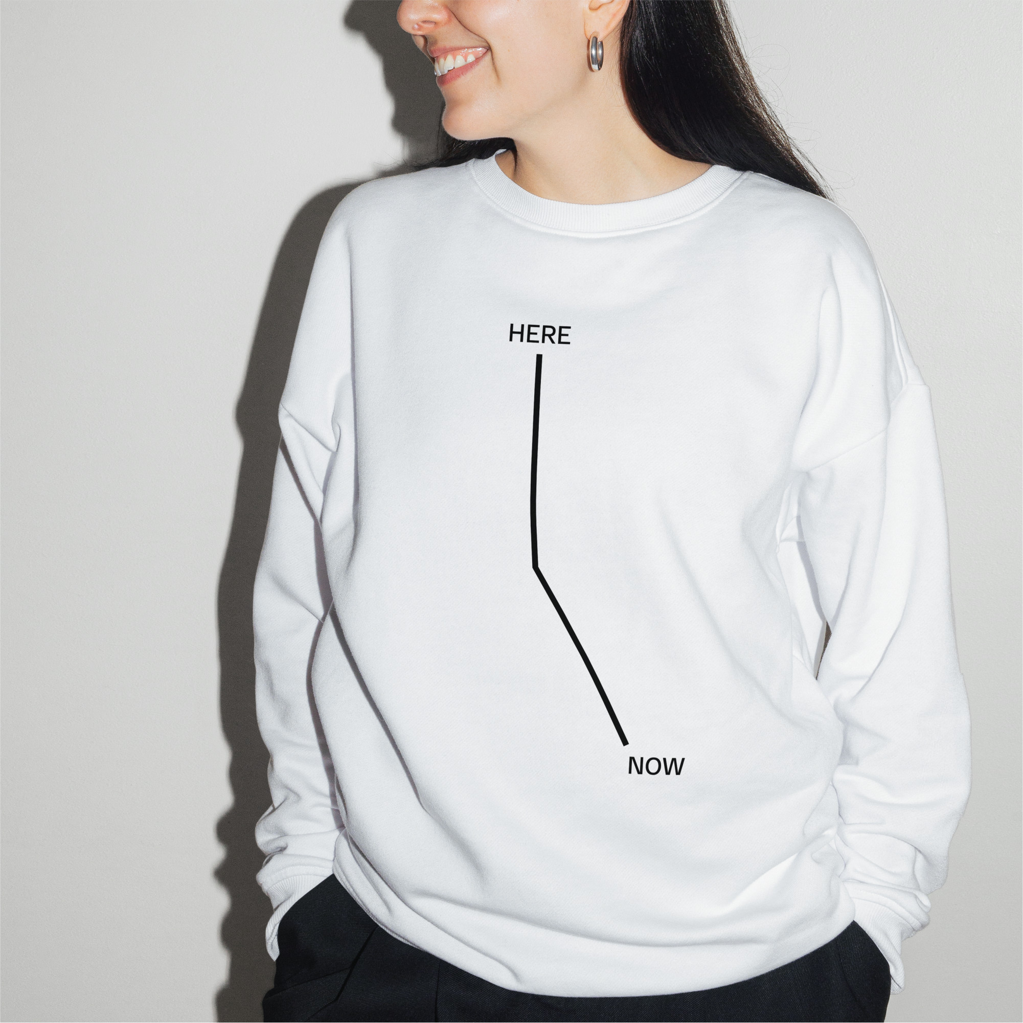
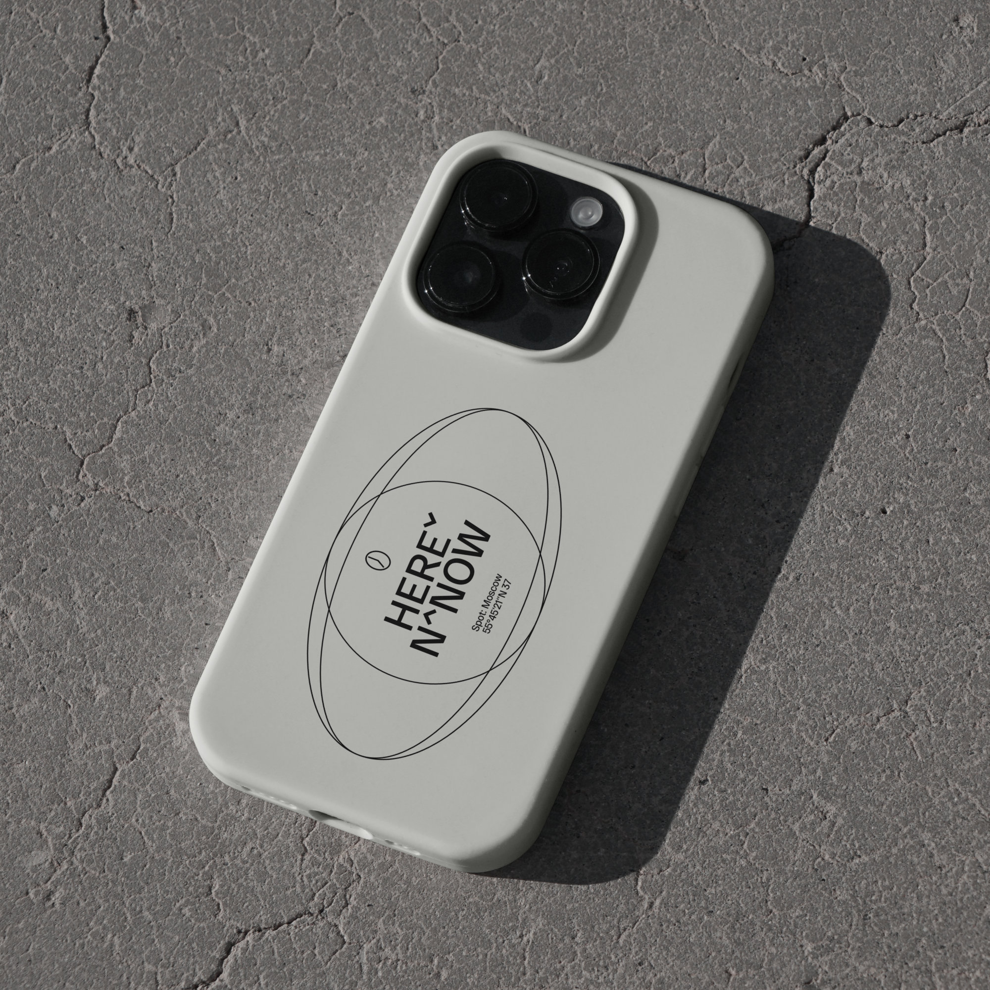
The coffee shop’s signature merch collection is distinctly strict and monochrome, which means it’s universal. Here’n’now merch is good in any place and time: in a restaurant, in the office, and your grandma won’t judge you.
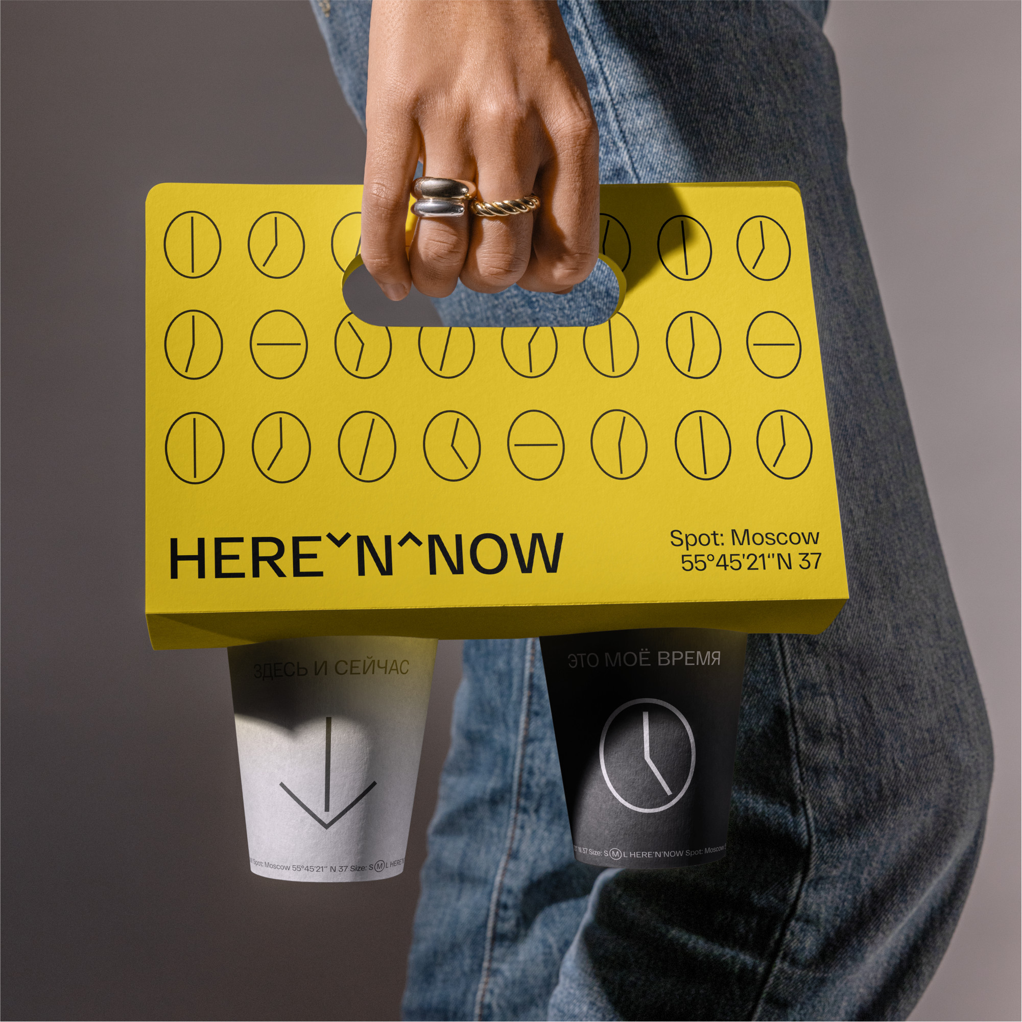
The cupholder makes a strong statement about the chain and is intentionally bright. Its immodest design is balanced by minimalist cups with slogans.
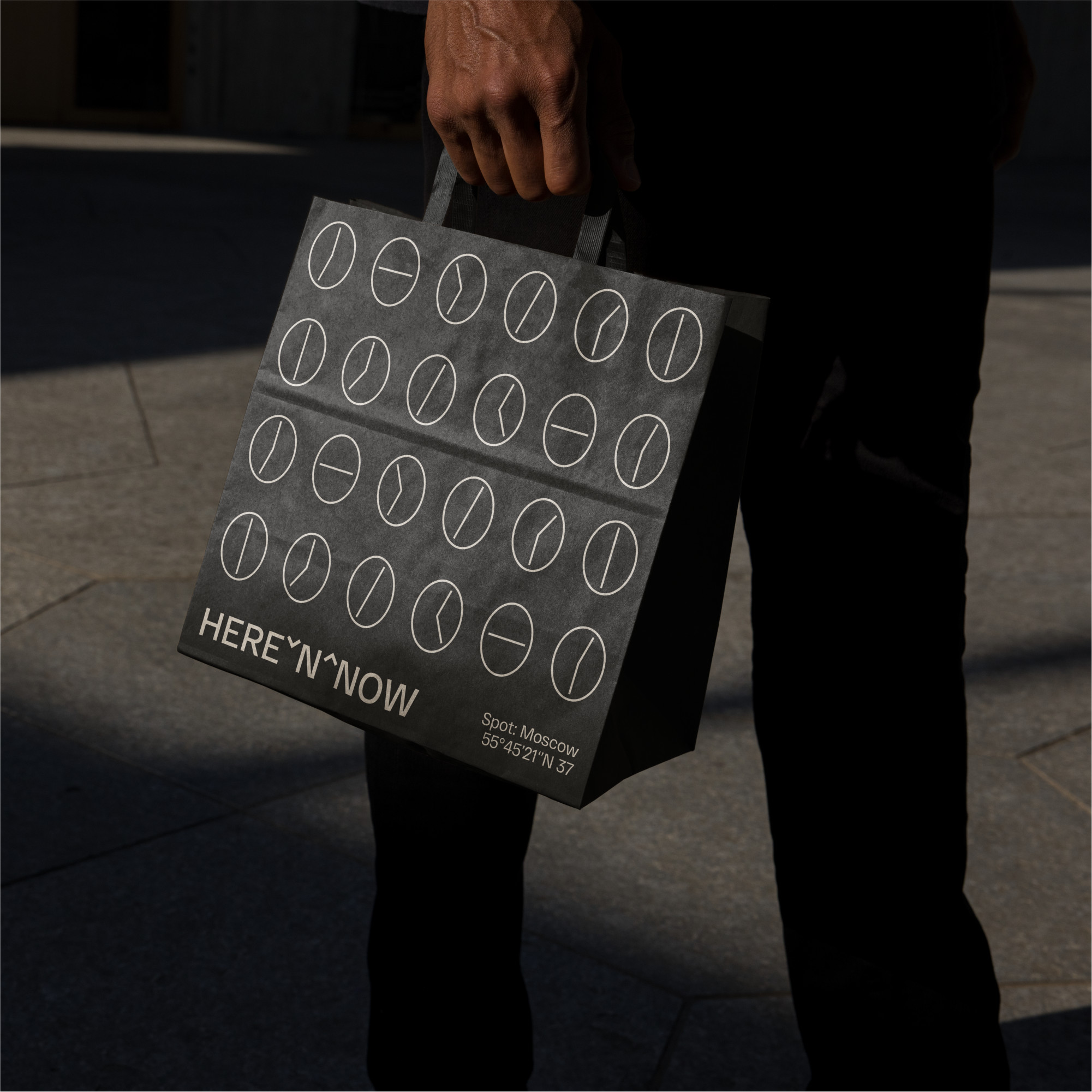
Design of a dark as ristretto bag for Here’n’now coffee shops with a signature pattern that plays on the theme of a dial and a coffee bean. The signature bag, cupholder, and baking packaging are made in different colors, forming a consistent design system.
The wall menu in the current style of “Excel layout” develops the theme of calm and a life without hassles.
The corporate style of the Here’n’now coffee shop is a solid design system, where each individual element is aesthetically pleasing in itself and reveals itself next to other branding media.

CREDIT
- Agency/Creative: nOne branding agency
- Article Title: Visual Identity of Here’n’now Coffee Shops that Capture City Life by nOne Branding Agency
- Organisation/Entity: Agency
- Project Type: Identity
- Project Status: Published
- Agency/Creative Country: Russia
- Agency/Creative City: Москва
- Market Region: Europe
- Project Deliverables: Branding
- Industry: Food/Beverage
- Keywords: coffee branding packaging digital
-
Credits:
Art director: Stanislav Efremov


