


Widarto Impact took on the unique challenge of rebranding Coffee World, a respected coffee roastery with deep roots, having been established in 1984 as the first roaster in Cambridge. Over the years, Coffee World has built a solid reputation, consistently delivering exceptional experiences to customers by launching new coffee businesses, managing supplies for national chains, and handling international wholesale shipments. However, despite this established presence, the brand encountered a growing challenge—reaching the newer generation of retail consumers, particularly Gen-Z and Millennials. Many in this younger demographic were unfamiliar with the Coffee World brand, contrasting sharply with its success in the well-established B2B market.
Recognizing this gap, Coffee World’s management made the strategic decision to completely overhaul their brand identity. They wanted to create a more modern, relatable, and easily recognizable image that would resonate with a younger audience while maintaining the trust and loyalty of their existing clientele. Widarto Impact, known for its strategic approach to design, was appointed to lead this rebranding initiative. Eko Widarto, Creative Director at Widarto Impact, explained that this project posed a unique challenge due to Coffee World’s long history and dedicated customer base. The task was to modernize the brand without losing the essence of what made it successful over the years.
The rebranding process began with a thorough analysis of the problem. Widarto Impact conducted in-depth research, market benchmarking, and an exploration of current marketing trends to determine the most effective strategy for revitalizing Coffee World’s image. The goal was to create a brand identity that was not only visually appealing but also adaptable to modern digital platforms, making it easier for Coffee World to connect with consumers globally, especially in the UK, where they had a growing presence.
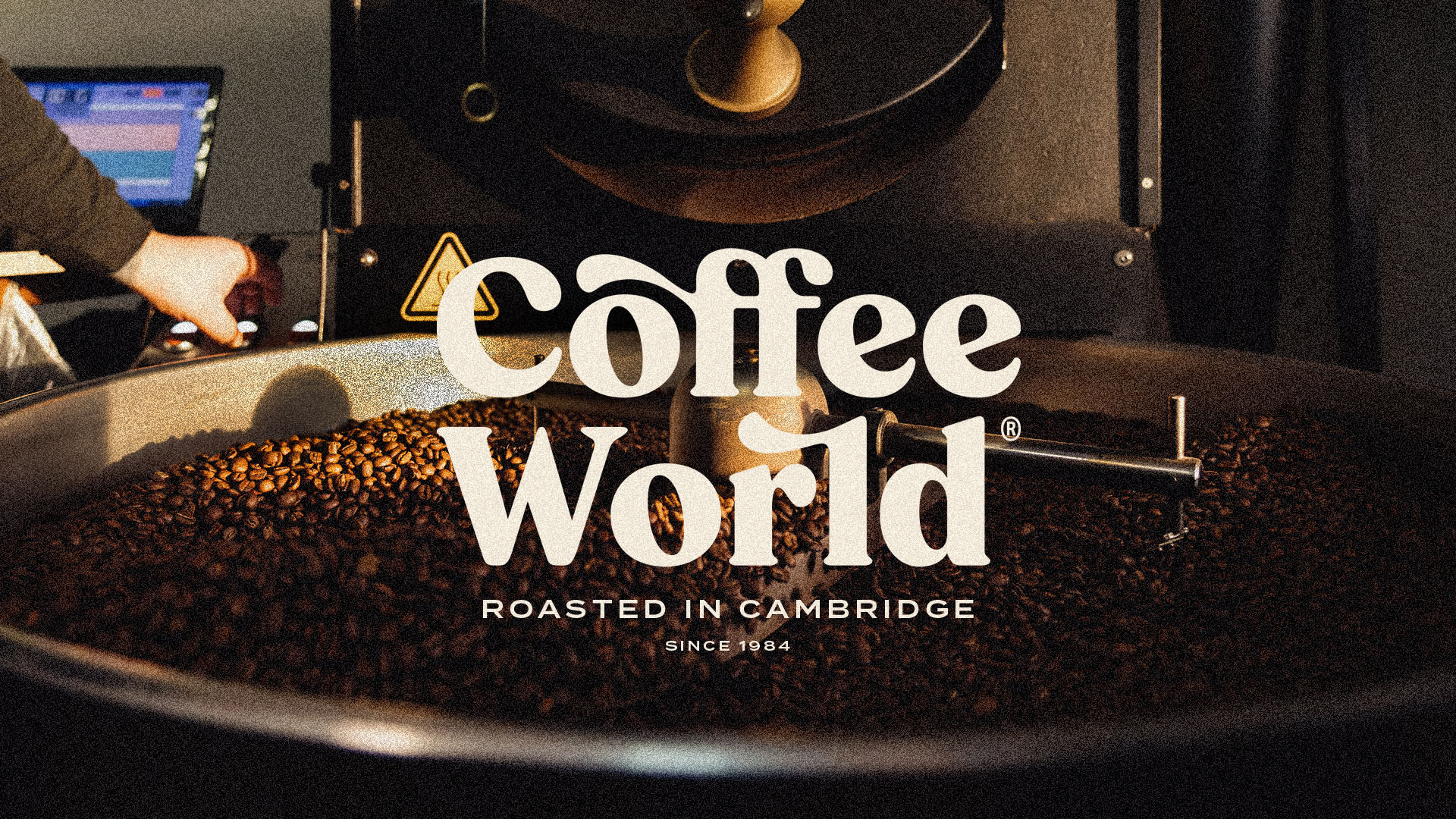
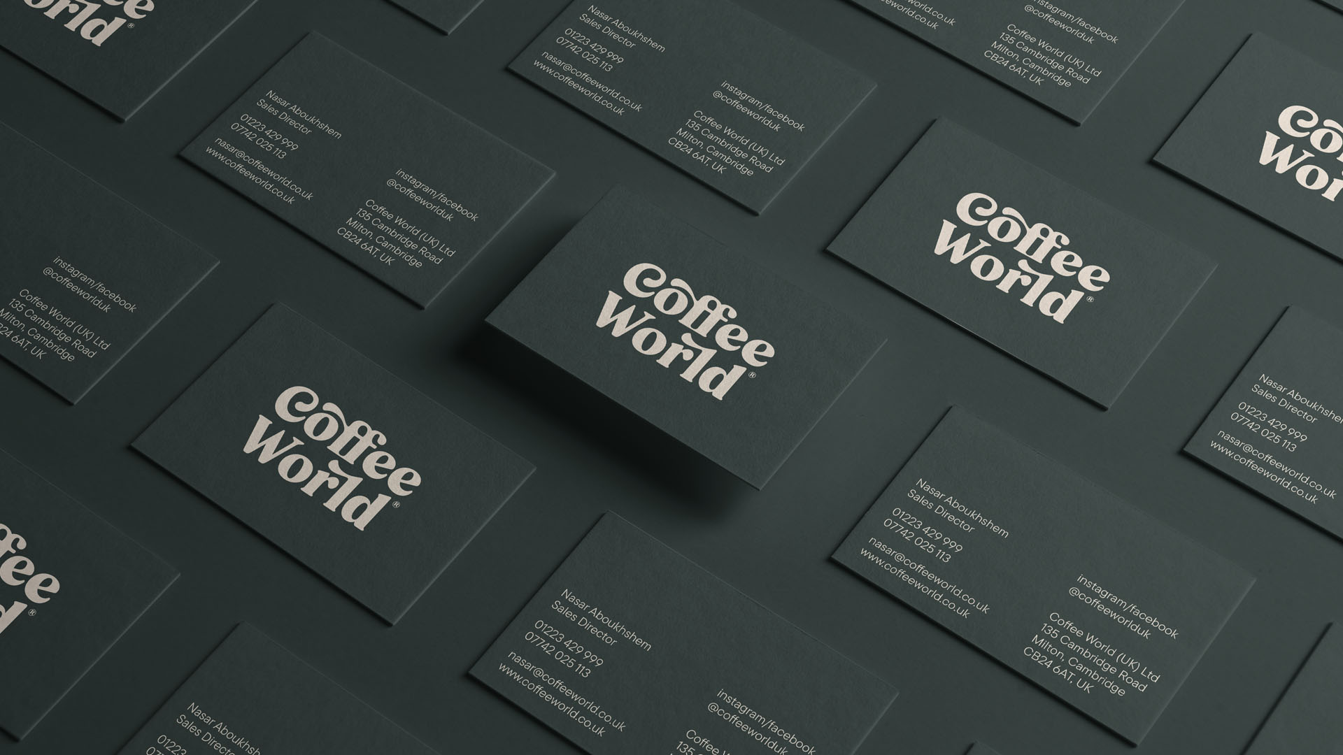
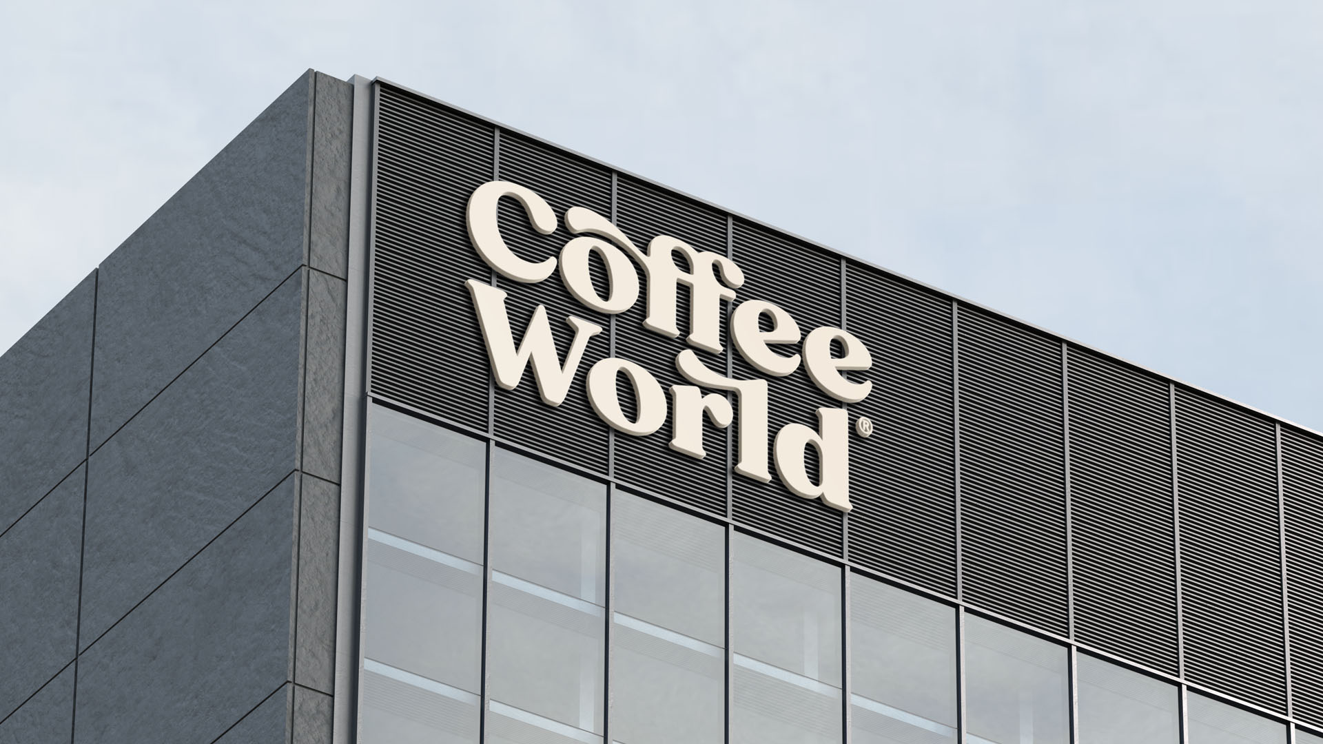
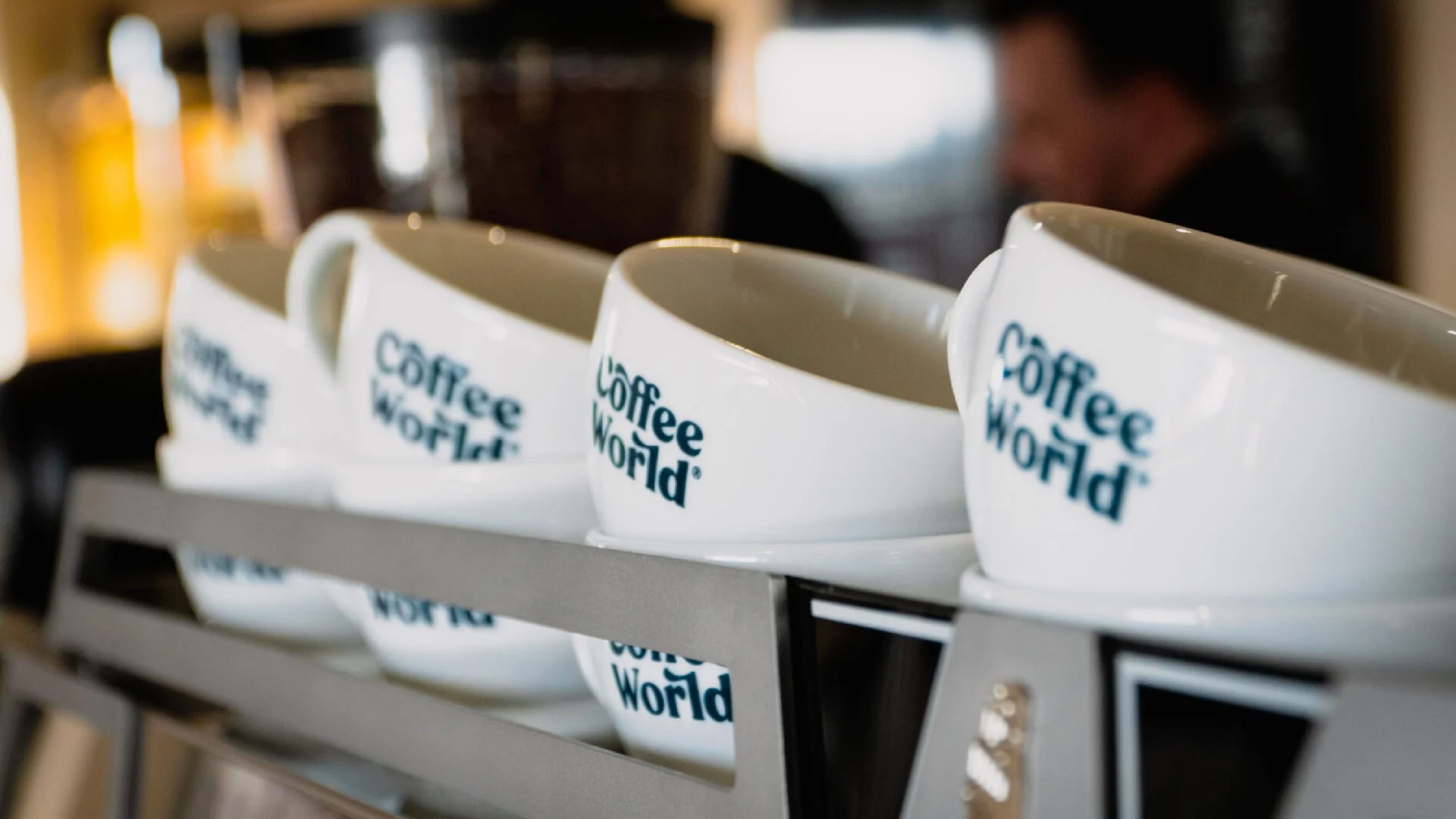
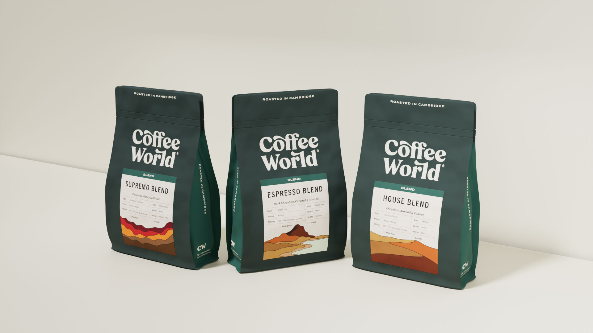
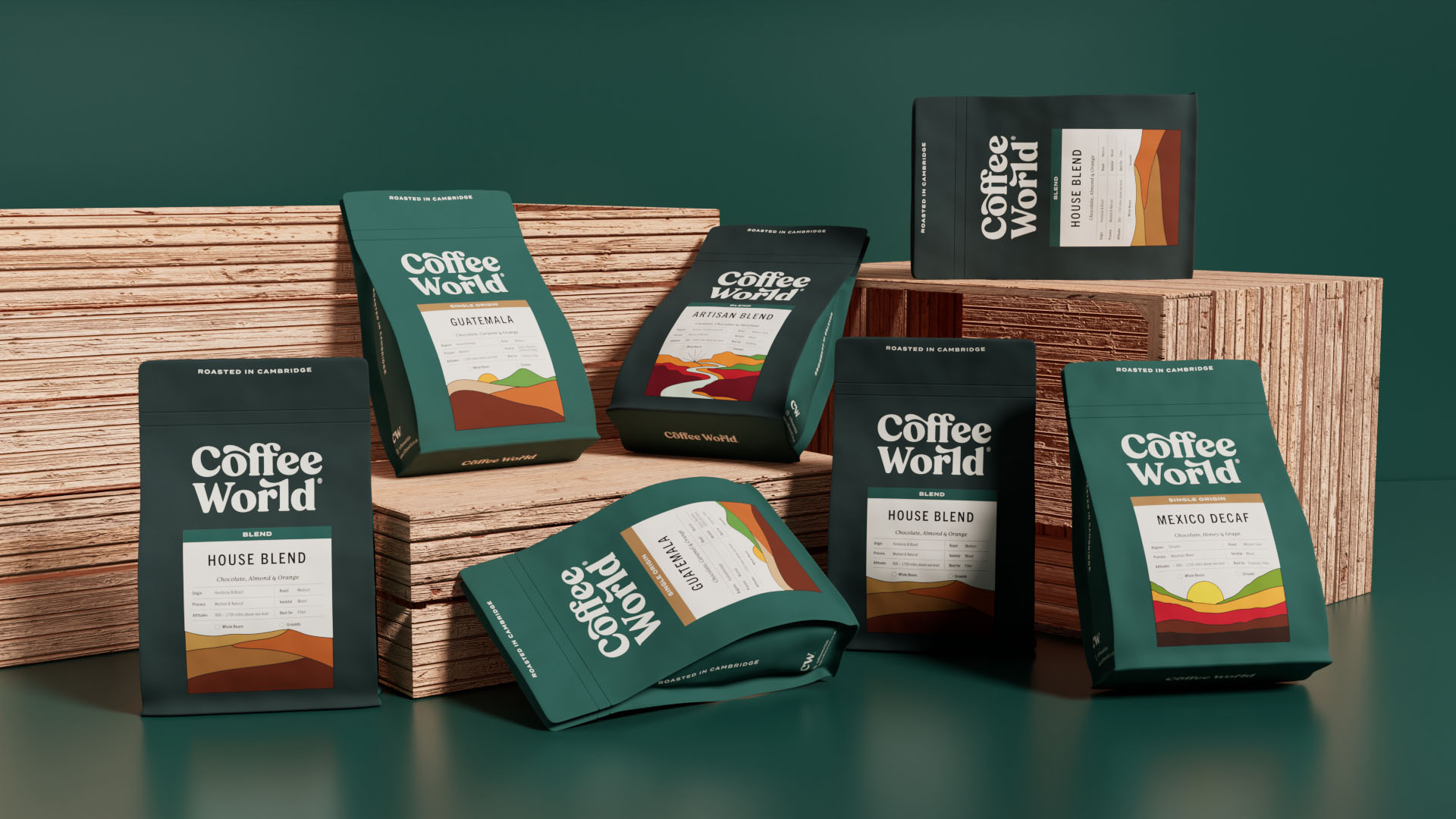
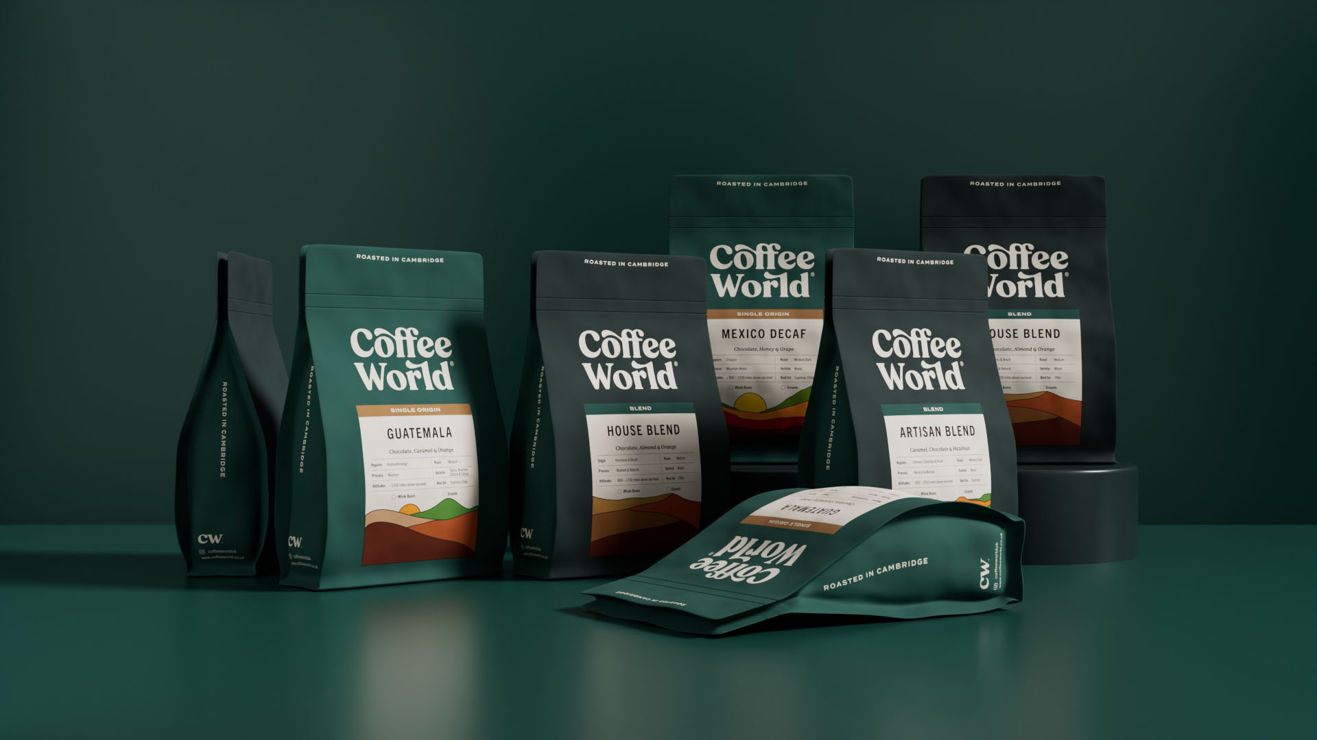
One of the key changes was simplifying the logo. The previous logo was modernized with bold serif display typography featuring curved variations to convey a balance of heritage and flexibility. This new logo, while paying homage to the company’s long-standing legacy, felt fresh and contemporary, allowing it to appeal to both the younger audience and existing customers. To ensure versatility across different platforms, the logotype was shortened to “CW” for use in applications requiring smaller sizes, such as favicons and social media profiles. This adaptation was essential in creating a consistent and recognizable brand across both digital and traditional media.
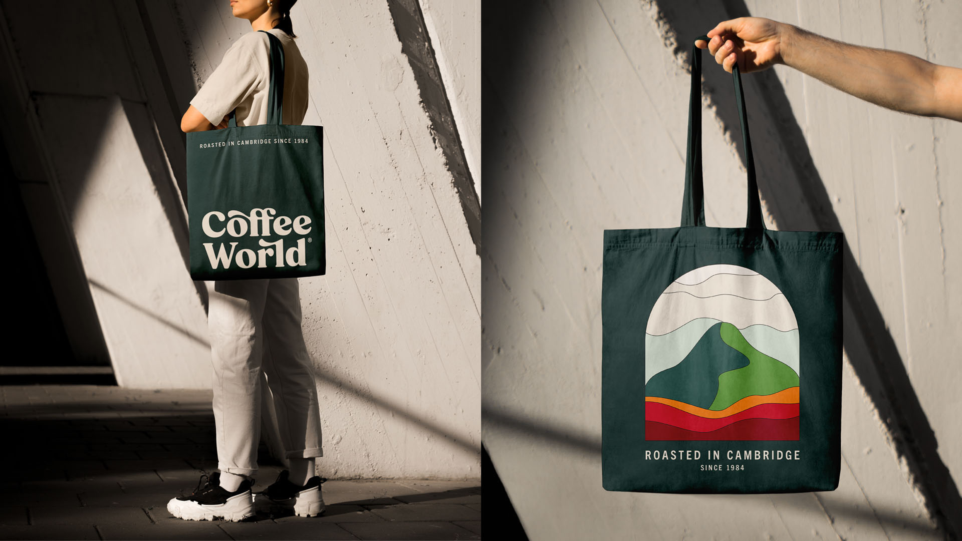
Color also played a critical role in the rebranding effort. Eko Widarto collaborated closely with Nasar, the owner of Coffee World, to select RAL 6012 as the primary brand color. This shade, a deep green, was chosen for its strong, earthy feel, which aligns with Coffee World’s roots as a traditional coffee roaster. To enhance the visual appeal and ensure harmony, Widarto Impact developed a monochromatic and complementary color scheme around the primary palette. This approach ensured that the brand’s color system would be versatile and effective across various marketing channels, from packaging to digital ads.
Typography was another important element of the redesign. For headlines, subheadings, and body copy, Widarto Impact selected a combination of Trade Gothic Next LT Pro, Termina, and P22 Mackinac Pro. These fonts were chosen for their flexibility and efficiency across different media. The sans serif fonts provided a modern, clean look that worked well in digital marketing, while the serif font added a touch of tradition, ensuring that the brand maintained its sense of heritage.
Packaging design was an area where Widarto Impact’s creativity truly shone. The design team created unique illustrations of coffee mountains, using colors from the secondary palette to distinguish between different product variants. Each illustration represented either a Blend or Single Origin coffee, offering visual variety across the product line. However, the illustrations were not intended to directly represent the geographical origin of the coffee beans, but rather to evoke the artisanal and crafted nature of the product.
Ultimately, Widarto Impact’s rebranding of Coffee World successfully modernized the brand while staying true to its core values. The new identity makes it easier for consumers to recognize and associate Coffee World as a provider of high-quality coffee services. It also reflects the brand’s professionalism, rooted in decades of experience, and its readiness to embrace new marketing trends and digital platforms. This transformation positions Coffee World to continue its growth, especially in the global market, with a particular focus on expanding its presence in the UK.


CREDIT
- Agency/Creative: Widarto Impact
- Article Title: Coffee World Roasters – Reviving a Rich Coffee Heritage by Widarto Impact
- Organisation/Entity: Agency
- Project Type: Identity
- Project Status: Published
- Agency/Creative Country: Indonesia
- Agency/Creative City: Trenggalek
- Market Region: Europe
- Project Deliverables: Brand Guidelines, Brand Identity, Brand Mark, Brand Redesign, Design, Identity System, Label Design, Logo Design, Packaging Design, Typography
- Industry: Food/Beverage
- Keywords: Coffee Branding, Coffee Packaging Design, Rebranding, FMCG Packaging, Premium Coffee Brand, Brand Identity, Logo Design, Product Design, UK Branding, UK Packaging Design, Creative Agency, Heritage Branding, Retail Packaging, Sustainable Packaging, Beverage Branding, Packaging Innovation, Food & Beverage Design, Modern Packaging, Artisan Coffee Branding, Consumer Goods Packaging
-
Credits:
Creative Director: Eko Widarto
Motion Graphics: Besta


