Depot WPF – KitKat® Senses®
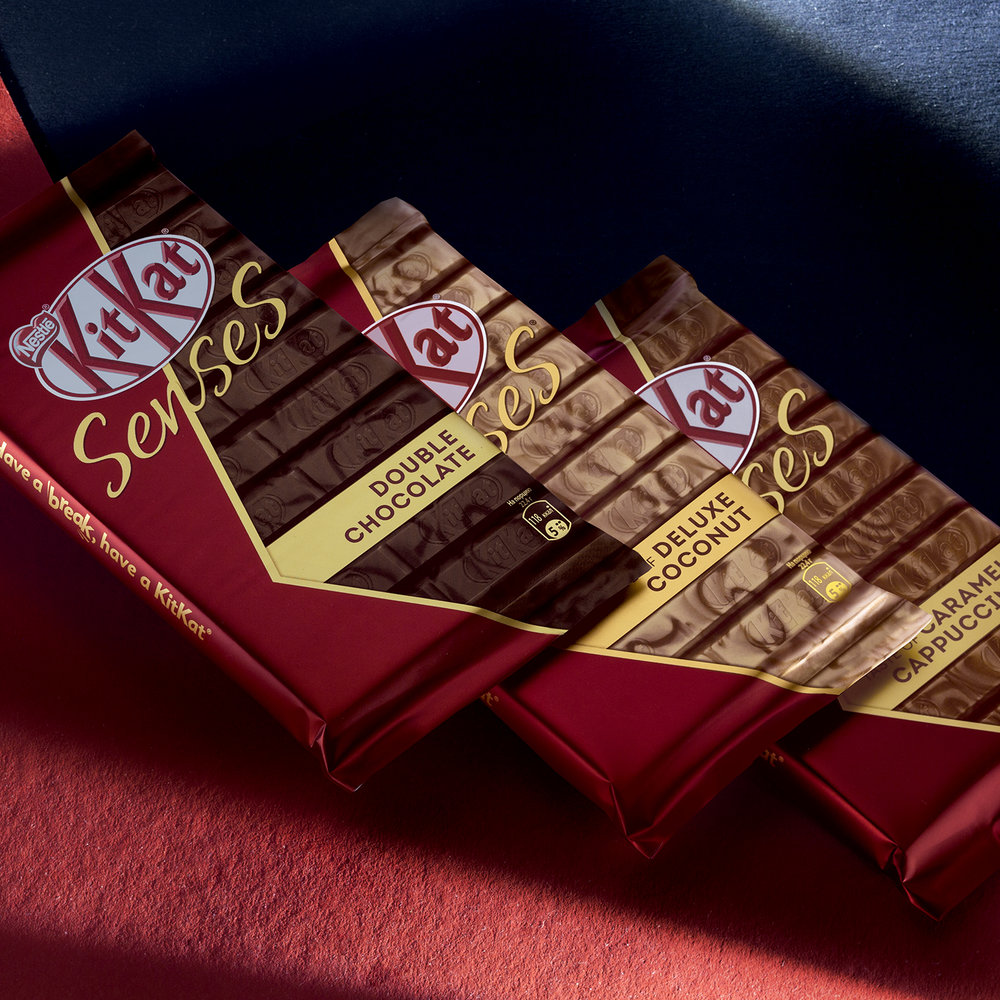
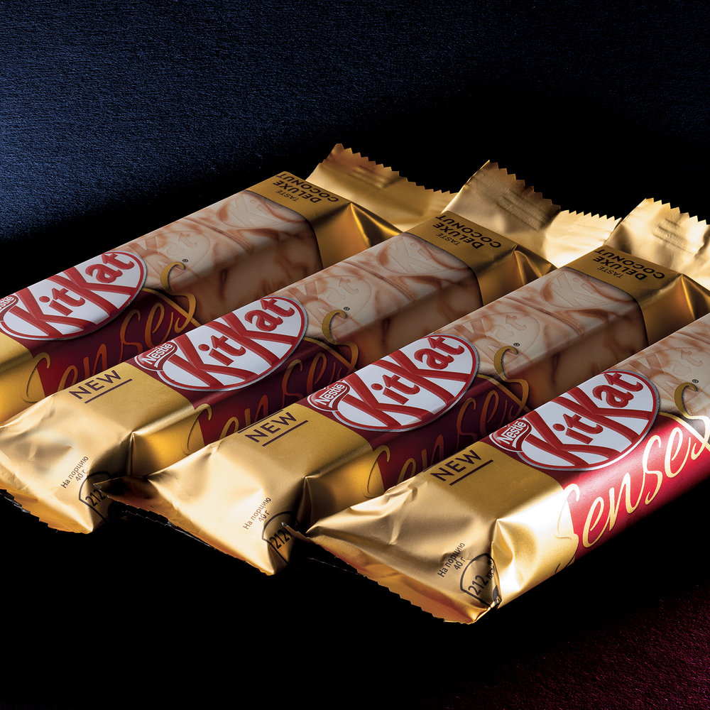
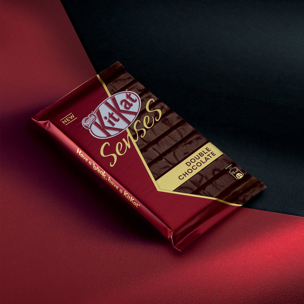
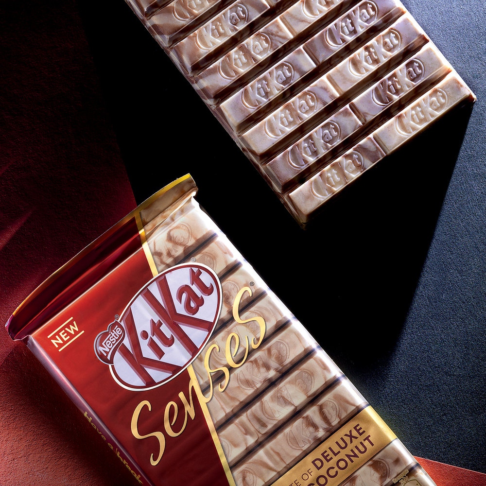
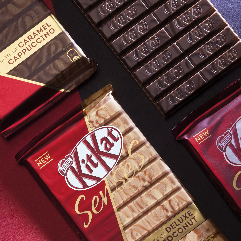
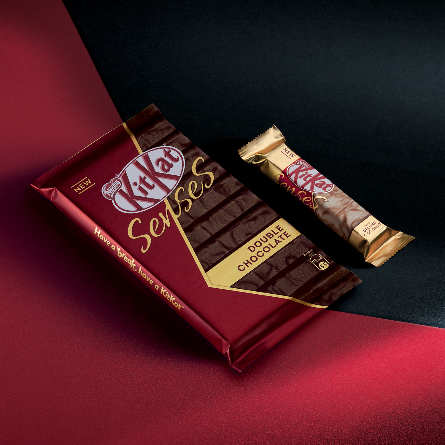
“KitKat® used to be positioned in the middle price segment and had nothing to do with luxury. The main challenge was to make a great change in brand perception following the strict guidelines which always come with every global brand.The first thing to change was the product itself. Instead of plain chocolate coating the bars got unique sophisticated chocolate patterns, randomly generated by the coating machine.Consequently, the design solution was to reveal the beauty of the product. To emphasize the indulgence highly executed food zones were accomplished with a touch of gold and delicate typography. The drastic change in perception should definitely add a lot to the brand assets. The specific recognizable form of the K letter in the logo was brought to the center of the attention and became the key element of the new packaging design.”
