


Welcome to Breuckelen’s Brooklyn
Founded in 2010 at 77 19th St in Brooklyn, Breuckelen Distilling was entering into a new era of ambition as it planned its first foray into blending. To take on established giants and young pretenders alike, the distillery needed a new brand that could win in its own backyard and beyond: by showing Breucklen’s Brooklyn to the world.
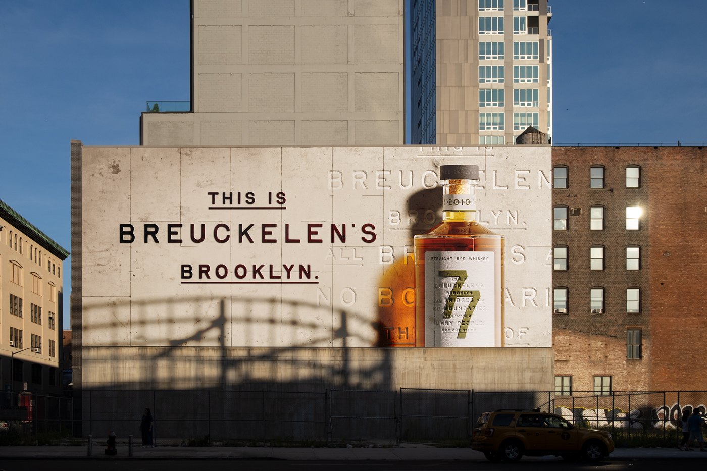
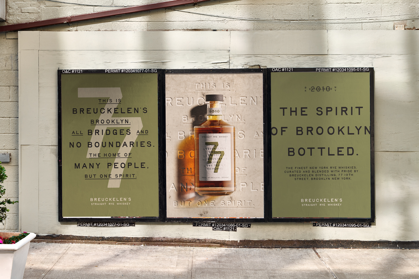
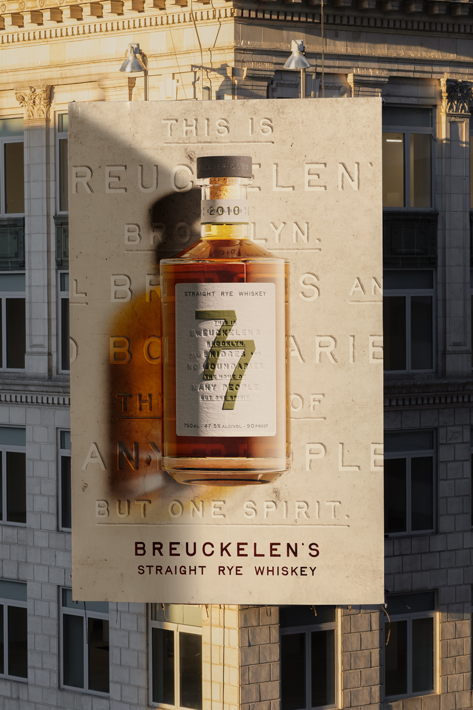
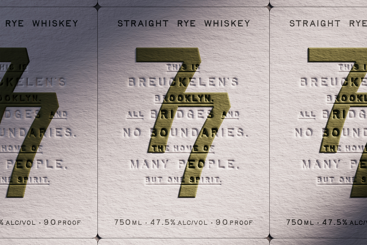
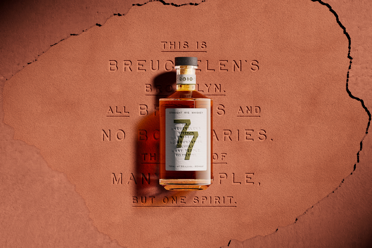
The name Brueckelen is the original Dutch spelling of what we all now know of as Brooklyn, a place where artists go to perfect their art, where makers flock to make their mark, and where each generation works together to inspire the next. It is a place that’s built on what has come before. Old foundations meeting fresh ideas. We used this as the launching pad for the new Brueckelen Distilling brand platform, bottling the beautiful duality that lives at the heart of its home. The ever-collaborative nature of the blend and its borough captured in a simple manifesto: All bridges and no boundaries.
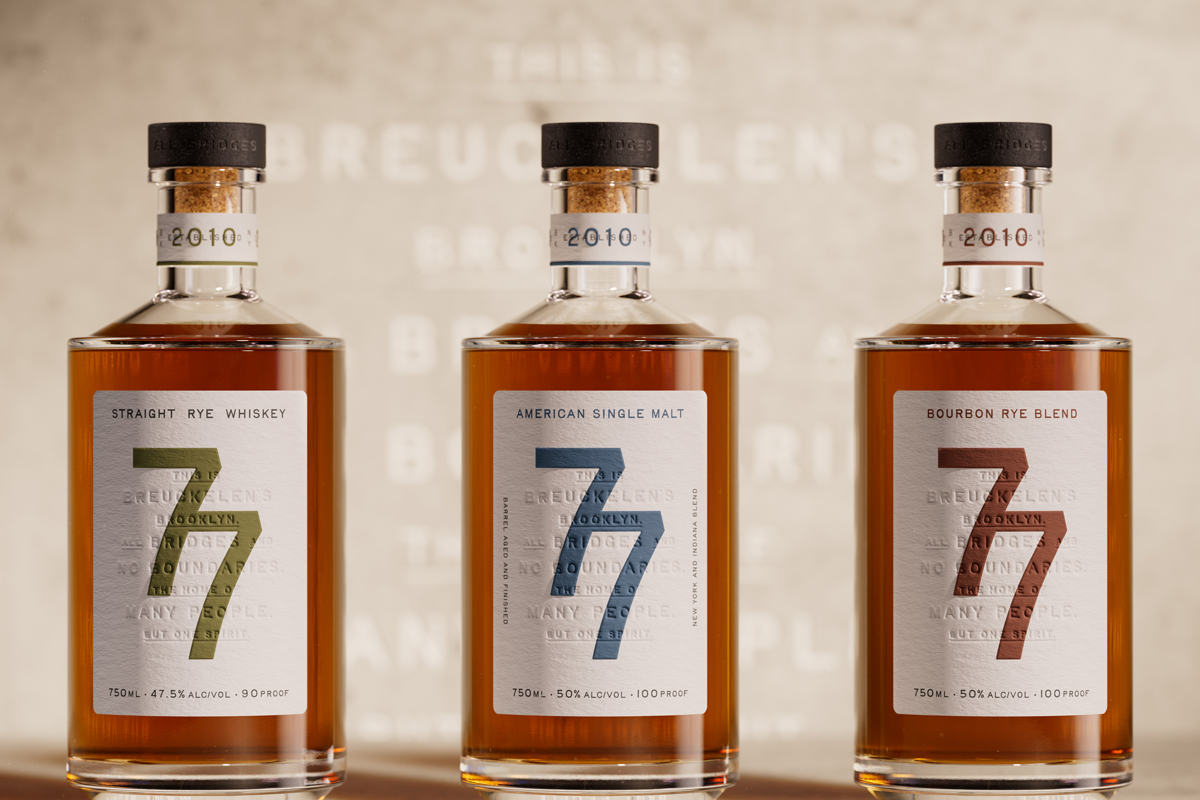
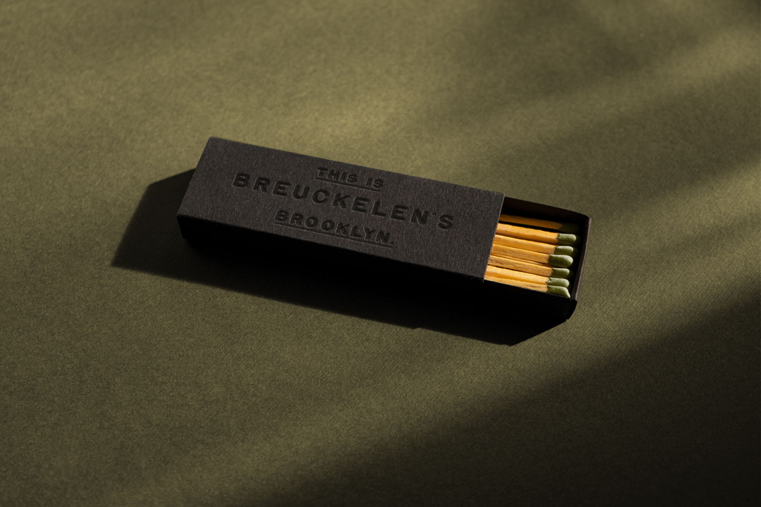
Since its founding in 1898, Brooklyn’s continual renaissance has informed every element of our design as we paired timeless and iconic features of Brooklyn with bold modernity. Inspired by the brass plaques emblazoned on the sides of the Brooklyn Bridge, we crafted a tactile, typographic approach that merges raw utility with refined craft, to create an elegant but industrial feel.
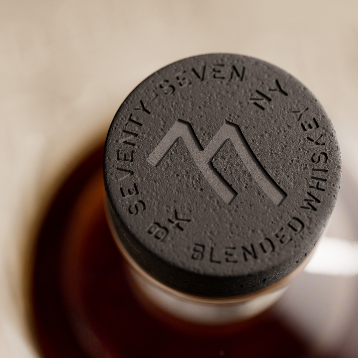
The bold numerical 77 creates a strong focal point with a clear bar call. Once in hand, the choice of stock and print finishes, from the use of heavy embossed and debossed sections to the rough texture on the stopper, all communicate Brooklyn’s hard-working spirit.
This marriage of regenerative, artisanal craft powerfully captures the vibe of the borough’s current creative hot spots, such as the Domino Sugar building, which became something of a muse for our thinking.
CREDIT
- Agency/Creative: Thirst
- Article Title: Thirst’s Innovative Brand and Packaging Design for Breuckelen Distilling Captures Brooklyn’s Blend of Tradition and Modern Style
- Organisation/Entity: Agency
- Project Type: Identity
- Project Status: Published
- Agency/Creative Country: United Kingdom
- Agency/Creative City: New York
- Market Region: North America
- Project Deliverables: Brand Design, Brand Identity, Brand Redesign, Packaging Design
- Industry: Food/Beverage
- Keywords: 77 whiskey, whiskey, breuckelen distillery, distillery, thirst
-
Credits:
Creative Director: Sam Cutler


