


Maison Port introduces a fresh visual identity for a modern real estate firm, merging innovation and professionalism. The identity is designed to highlight the company’s core values of precision, expertise, and client satisfaction, while embracing a sleek, contemporary aesthetic that reflects their forward-thinking approach.
A Refined Visual Identity for a Leading Real Estate Firm
Maison Port is known for providing tailored property solutions across urban and rural real estate sectors, with a commitment to delivering exceptional service. Their new visual identity marks a step forward, aiming to capture their professionalism, attention to detail, and dedication to innovation. This new identity ensures Maison Port remains at the forefront of the real estate industry, appealing to a wide audience, from first-time buyers to seasoned investors.
The visual elements of the new identity reflect the company’s client-focused ethos while giving it a modern edge. From the logotype to signage and website design, each element was crafted to showcase Maison Port’s expertise and reliability in a clean, approachable manner.
A Logo Embodying Precision and Expertise
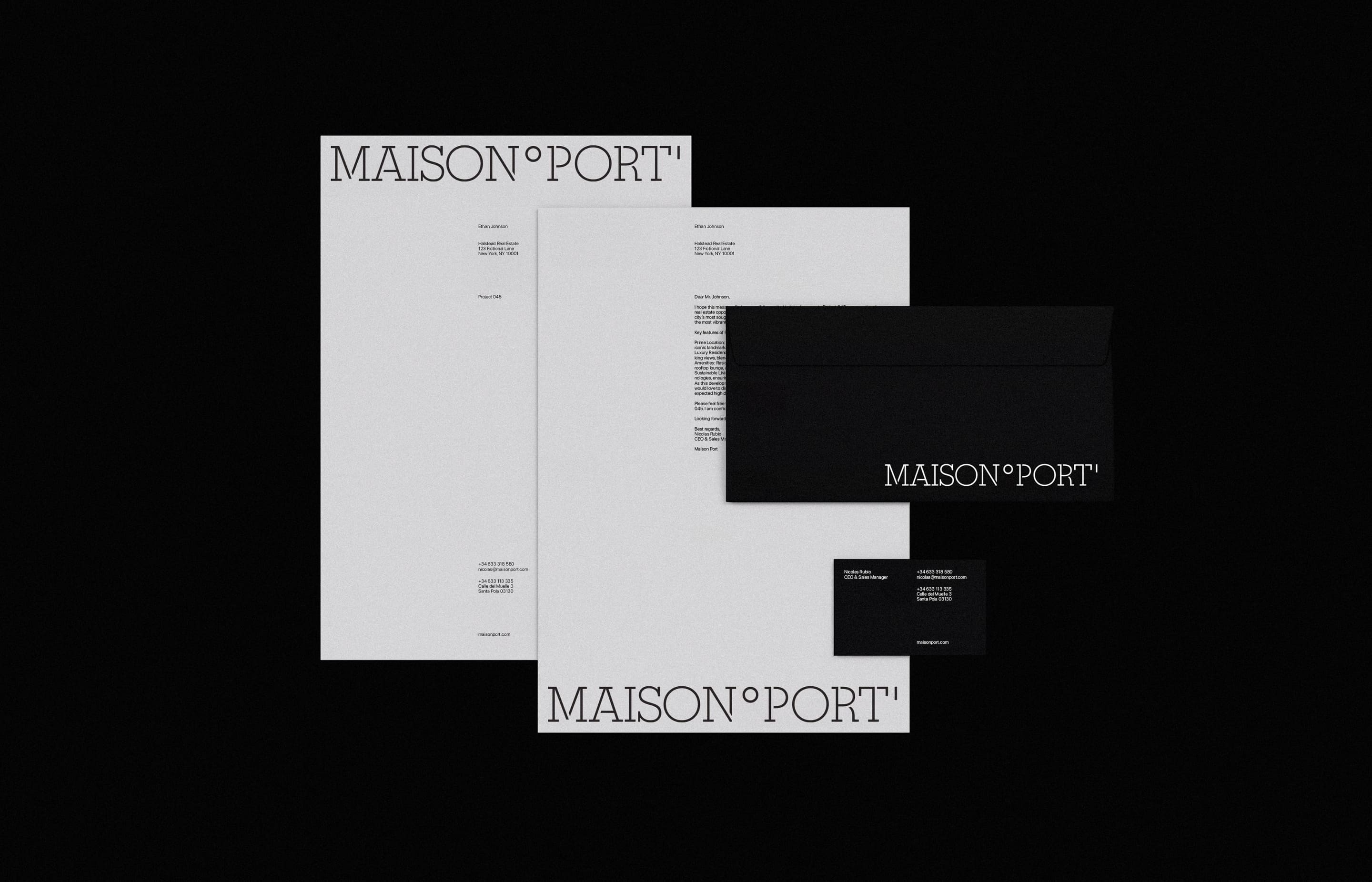
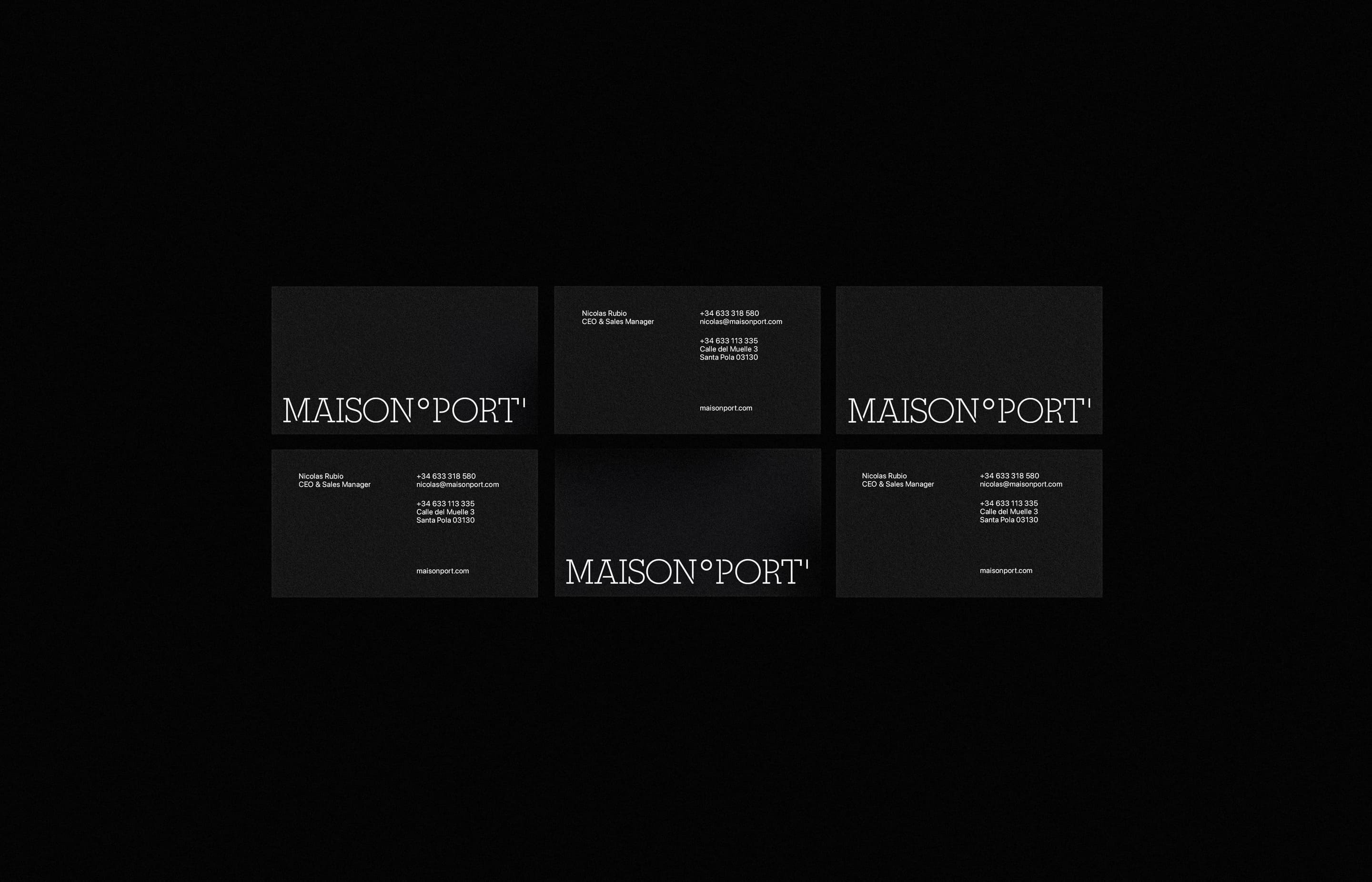
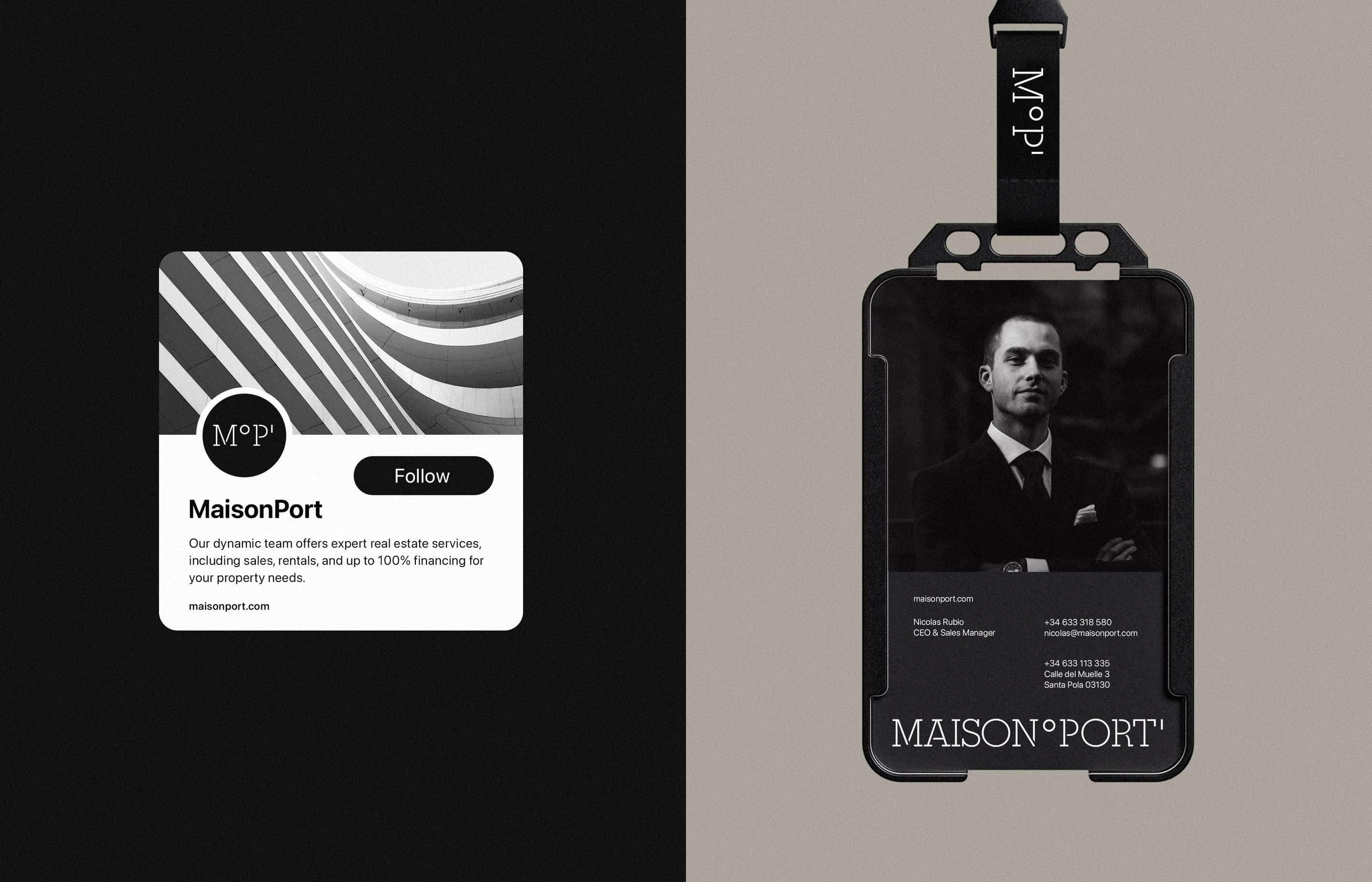
The centerpiece of Maison Port’s new visual identity is the logotype, which incorporates geographic longitude expressed in degrees (°) and minutes (‘). This symbolic use of coordinates represents the precision Maison Port brings to navigating the real estate market. It reflects the company’s role as a guide, helping clients find the perfect property with pinpoint accuracy.
The logo’s design emphasizes simplicity and professionalism, ensuring it resonates across all touchpoints. Its subtle, elegant details offer a visual representation of the brand’s expertise and authority in real estate, positioning Maison Port as a trusted partner in property transactions.
A Palette of Modernity and Sophistication
To reflect Maison Port’s professionalism and modern approach, the color palette was carefully selected to balance neutral tones with vibrant accents. The muted, elegant base colors convey trust and stability, essential traits for a company in the real estate industry. Vibrant accents are used sparingly, injecting a dynamic touch that symbolizes the brand’s adaptability and forward-thinking nature.
This refined color palette creates a sense of continuity across all of Maison Port’s branding, whether on physical signage or digital platforms, reinforcing brand recognition and enhancing their presence in a competitive market.
SF Pro Display: A Typeface for Clarity and Professionalism
For the typography, Maison Port chose SF Pro Display, a clean and modern typeface that aligns with the brand’s commitment to clarity and professionalism. This font, widely used for its legibility and sleek aesthetic, complements the overall visual identity by delivering a sophisticated and approachable look.
SF Pro Display’s sharp, well-defined characters enhance the brand’s communication, ensuring that both print and digital materials maintain a high level of readability and visual impact. This typographic choice reinforces Maison Port’s focus on transparent and seamless communication with clients.
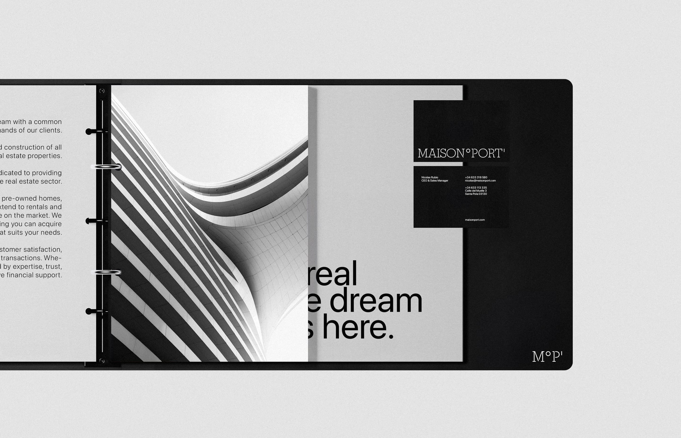
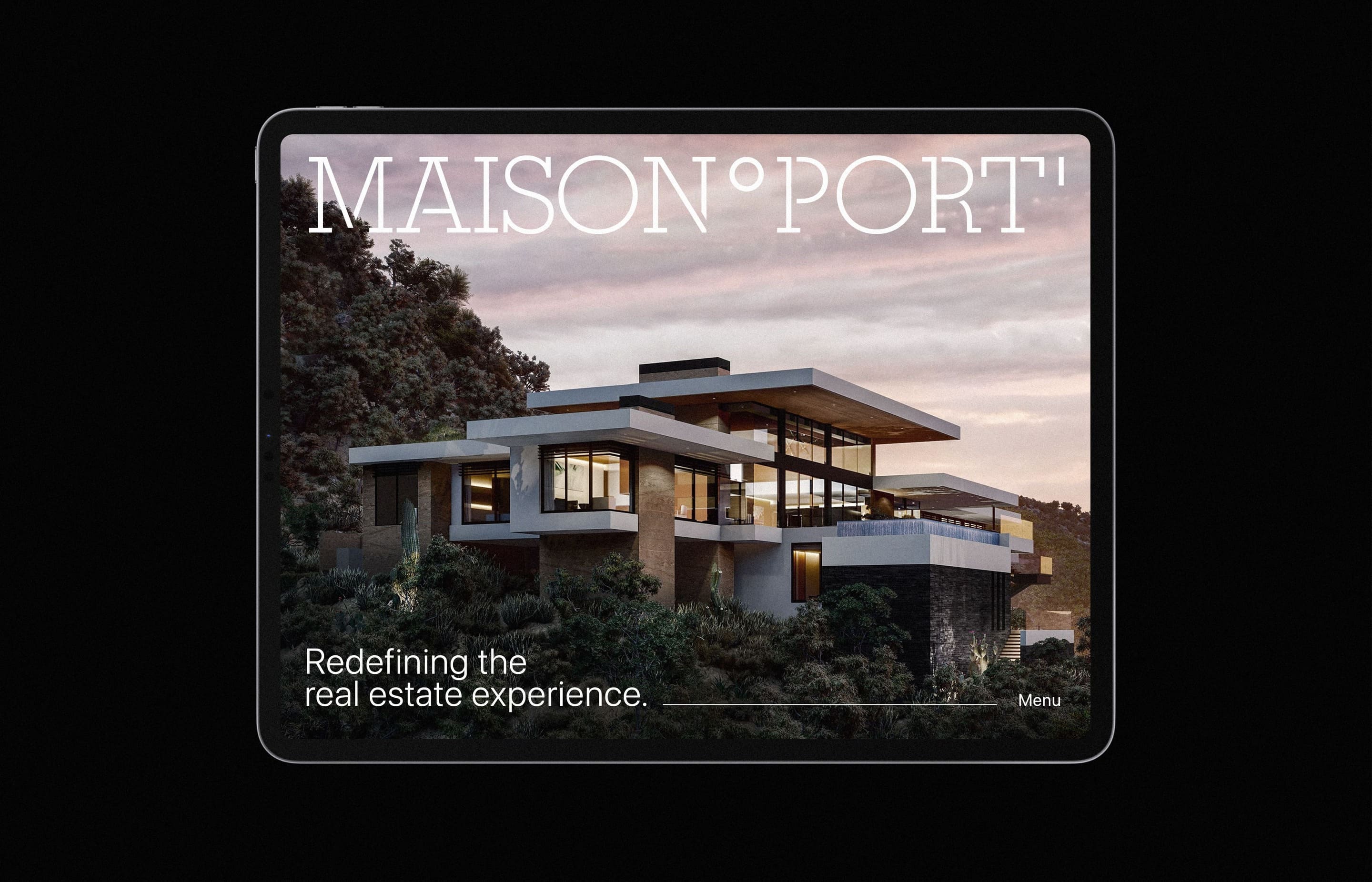
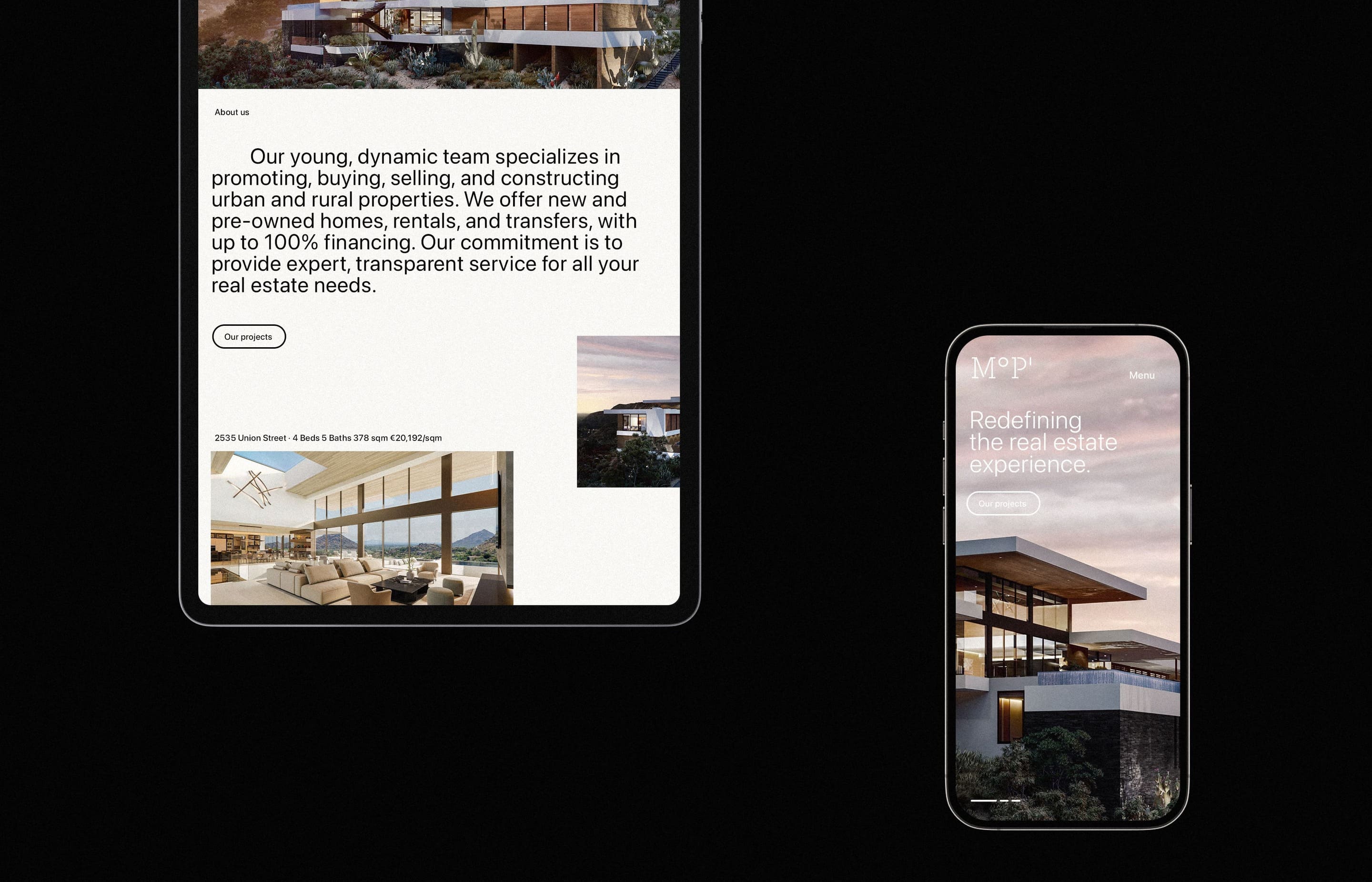
A Website that Elevates User Experience
The updated website design plays a crucial role in reinforcing Maison Port’s new visual identity. Designed to be clean and intuitive, the website delivers a seamless user experience, ensuring that clients can easily navigate through property listings, services, and resources. The layout prioritizes functionality, enabling potential buyers, sellers, and investors to quickly access the information they need.
High-quality photography throughout the website adds an elegant touch, showcasing properties in a visually appealing and professional manner. The responsive design ensures the website looks and functions well across all devices, from desktop to mobile, meeting the needs of today’s digital-savvy audience.
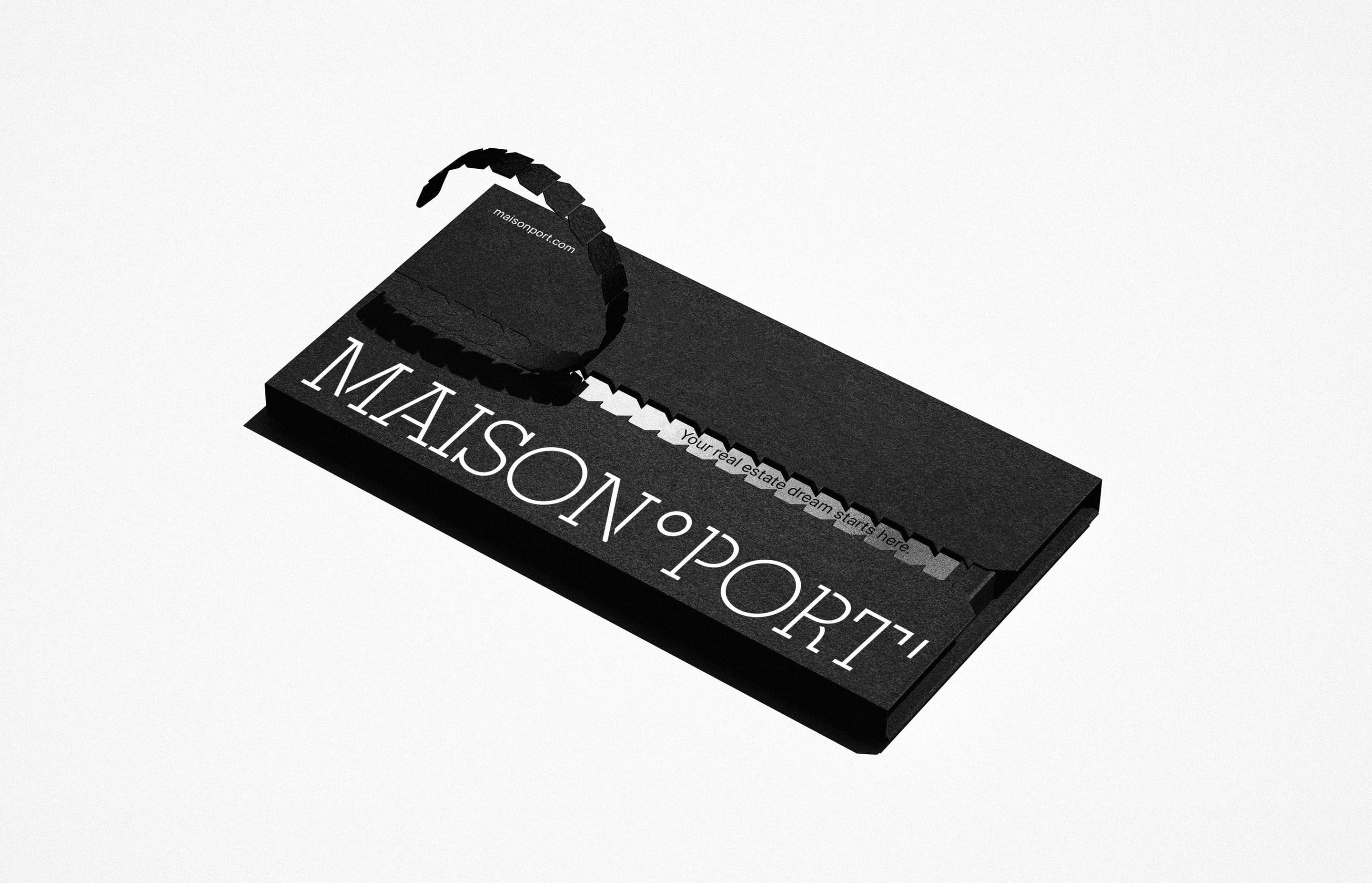
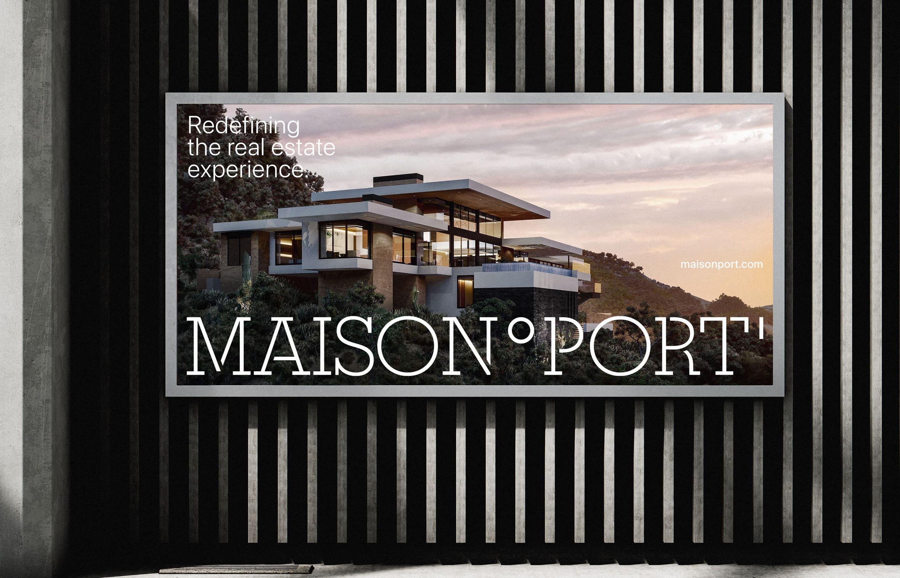
Signage That Stands Out in the Real World
Maison Port’s new identity is reflected in its physical signage, designed to be both visually striking and highly functional. Whether displayed at a property development site or a company office, the signage utilizes the brand’s modern color palette and sleek typography to create a lasting impression.
The signage was developed with simplicity and professionalism in mind, ensuring that it communicates Maison Port’s values while standing out in a crowded real estate market. This cohesive design approach ensures that the brand remains consistent across all physical and digital touchpoints.
A Visual Identity That Tells a Story
Every element of Maison Port’s new visual identity tells a story about the company’s values and mission. The logotype, with its use of geographic coordinates, symbolizes precision and navigation in the real estate market. The clean lines and simplicity of the design emphasize Maison Port’s dedication to professionalism and client satisfaction. The combination of a refined color palette and the choice of SF Pro Display as the primary typeface further solidifies the brand’s modern and approachable image.
Together, these elements form a cohesive and compelling visual identity that distinguishes Maison Port as a leader in the real estate industry.
Conclusion
Maison Port’s new visual identity reflects their evolution as a forward-thinking real estate firm while maintaining their core values of precision, professionalism, and client satisfaction. The logo, with its focus on geographic precision, paired with a clean color palette and modern typography, provides a visual identity that is both timeless and innovative.
This new identity positions Maison Port for continued success in an increasingly competitive market, ensuring they remain a trusted partner for clients seeking expert real estate solutions. Whether it’s navigating complex property transactions or offering tailored services, Maison Port’s brand now fully reflects their expertise and commitment to excellence in every aspect of their work.
CREDIT
- Agency/Creative: Alvaro Cabeza
- Article Title: Alvaro Cabeza Creates Maison Port Visual Identity
- Organisation/Entity: Freelance
- Project Type: Identity
- Project Status: Published
- Agency/Creative Country: Spain
- Agency/Creative City: Madrid
- Market Region: Europe
- Project Deliverables: Advertising, Art Direction, Brand Creation, Brand Design, Brand Guidelines, Brand Identity, Brand Naming, Branding, Creative Direction, Editorial Design, Graphic Design, Logo Design, Packaging Design, Poster Design, Web Design
- Industry: Real Estate
- Keywords: brand, branding, logo design, visual identity,
-
Credits:
Brand & Visual Identity: Alvaro Cabeza


