


About Brand:
La Vo Patisserie is a cake shop located in Park Lane, London. Specialized in creating unique and delicious desserts for all occasions.
Founded in 2022, it have been committed to serving delicious goodies to all of our customers in London. It believe that the experience of visiting our shop should include both enjoying your favourite desserts and trying out some new ones too.
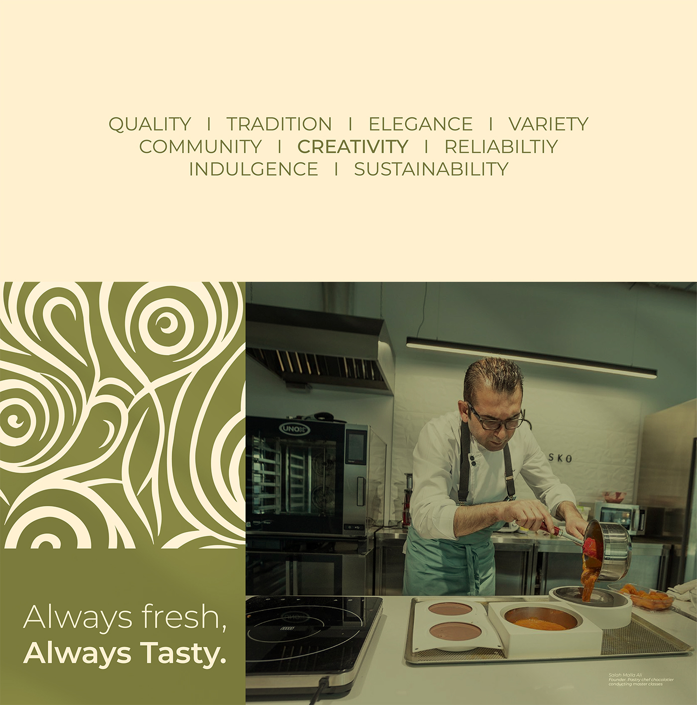
A team of professionals creates top-quality, imaginative and delicious treats, and makes sure to cater to the needs of each one of our customers. Whether you’re looking for a quick bite or something to bring home and share.
Mission and Challenge:
The biggest challenge was to reflect the refined and distinctive taste of La Vo’s sweets.
The obstacles that existed in the previous identity were that it did not reflect the strength of the brand and was not integrated through all its elements.
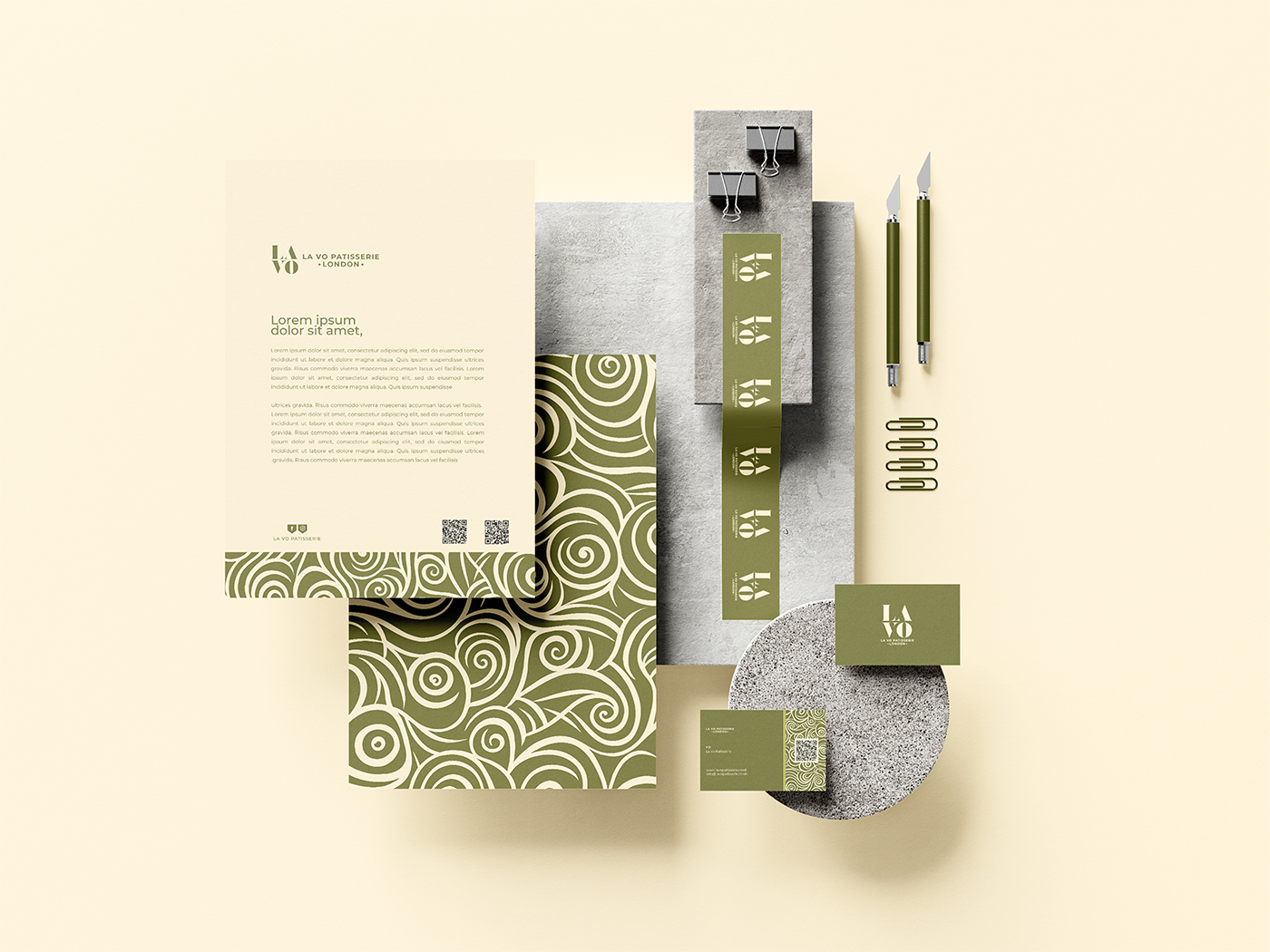
The beginning of the rebrand was in the design of the logo, which reflects the true identity and strategic direction of La Vo, as we adopted the text type using a luxurious font that includes the brand name La Vo.
Then we developed the color system, which was very limited in the past, so that we formed a distinctive color system that gives multiple usage options, which we will present through this presentation.
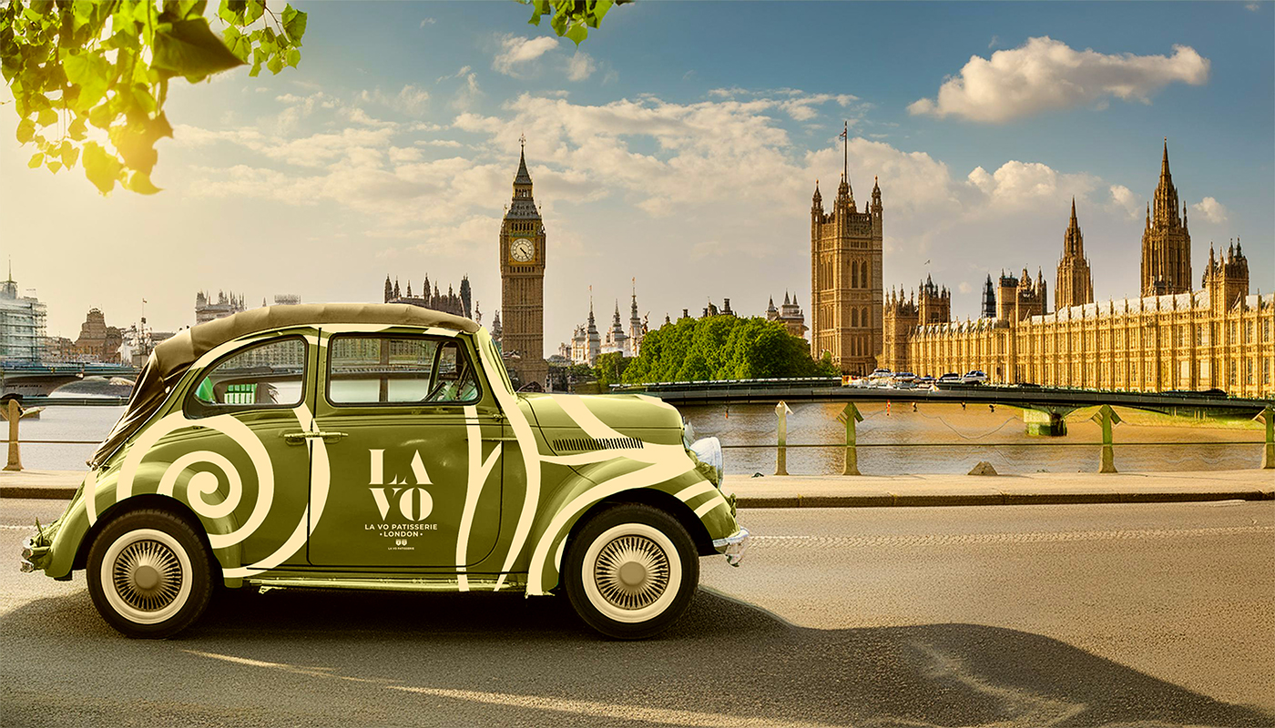
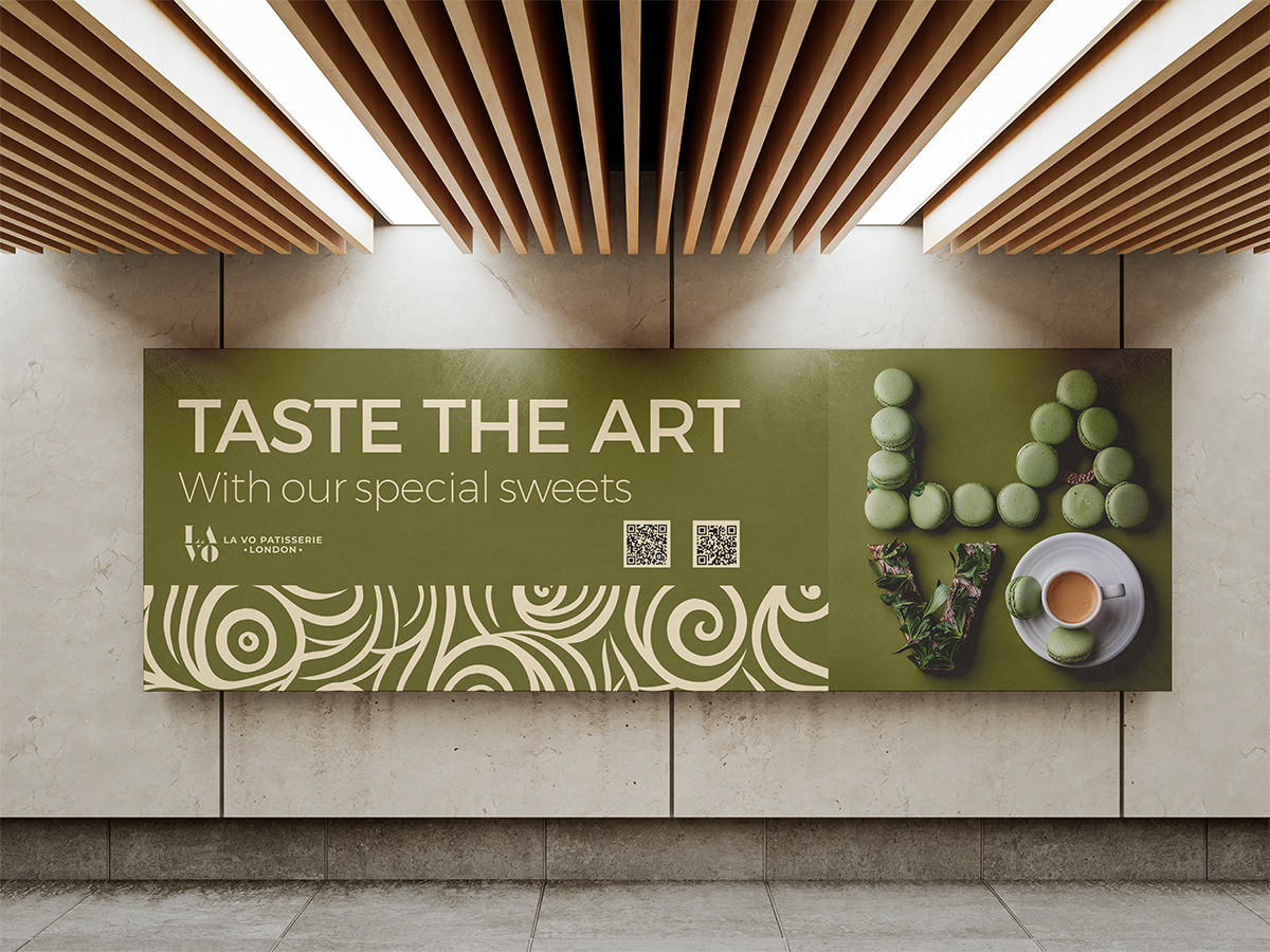
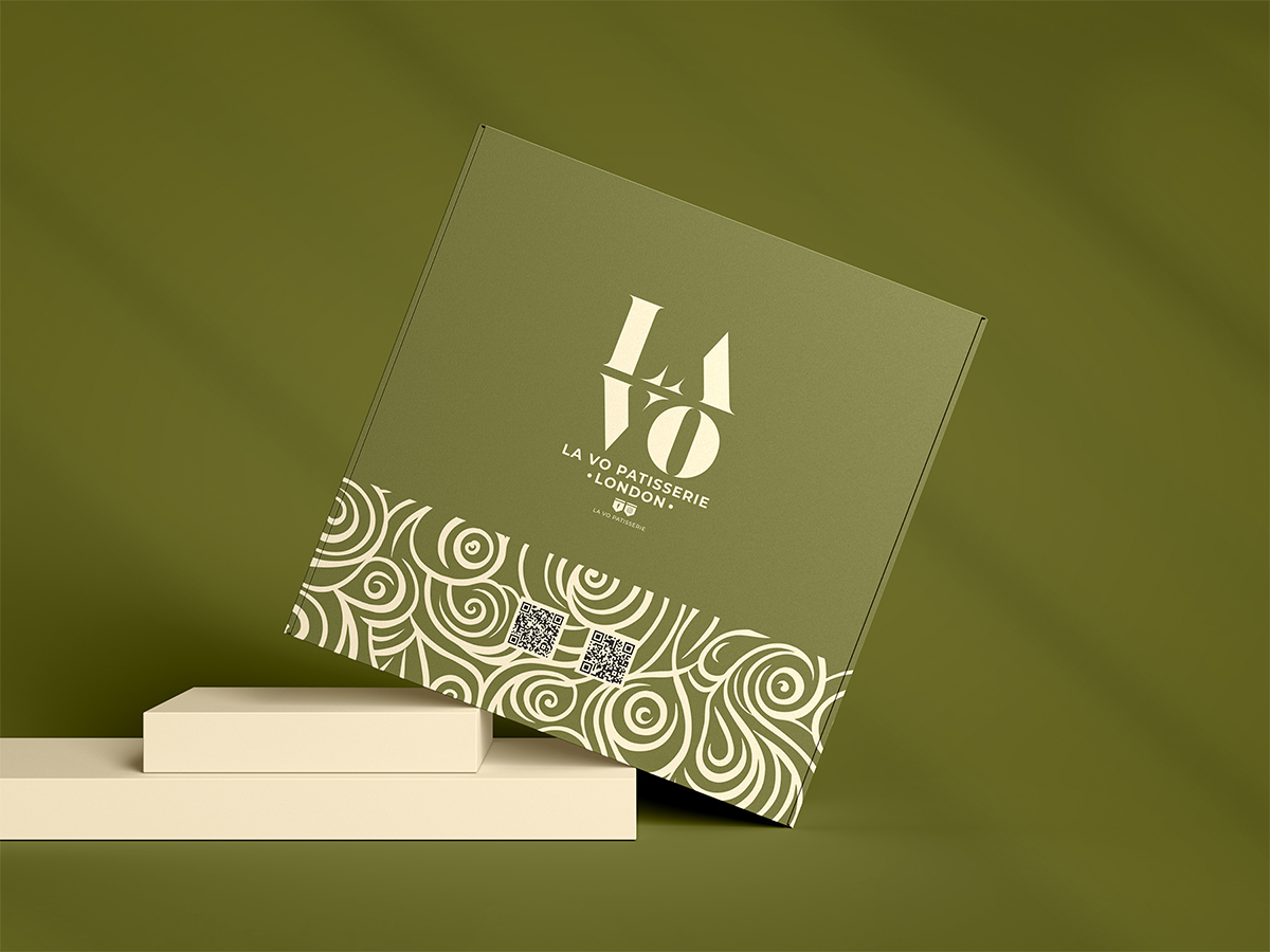
We also relied on a distinctive pattern that contributes to highlighting the aesthetics of the brand and the wonderful products it offers.
The challenge was inspiring and distinctive, especially since we included artificial intelligence in producing some of the main images for the display, and we reached a very satisfactory general result that contributed to achieving an important visual development that would comfortably achieve the strategic goals of the brand in the midst of a large competitive market in London.
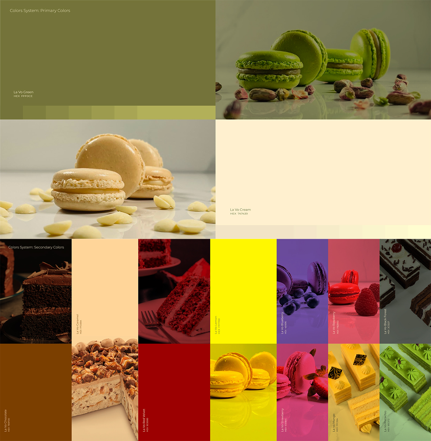
Color System:
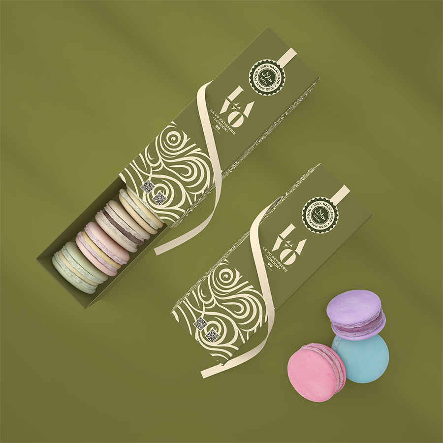
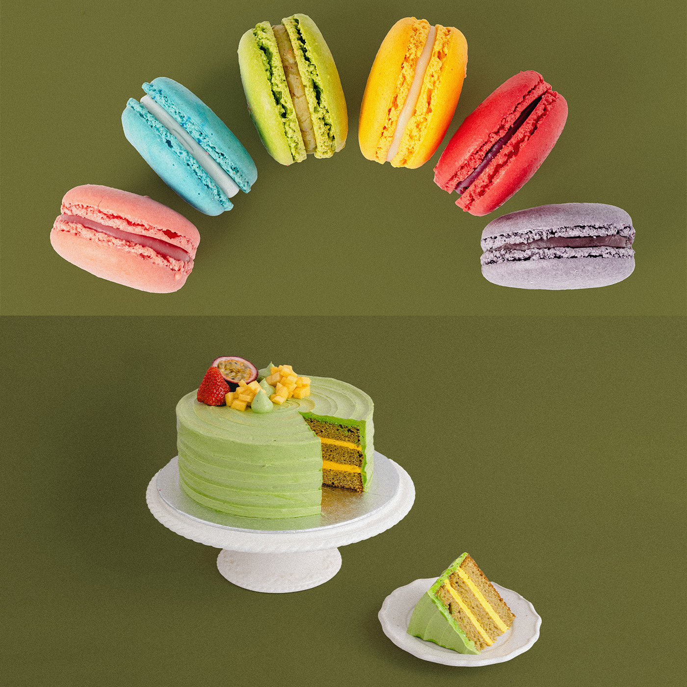
The color system was distinguished by its great diversity and widely used color options, as the primary and secondary colors were inspired by what the store produces from the formed ingredients for sweets and macarons.
So, every color used in the components of manufacturing sweets and macaroons was carefully taken into account to be part of the color system of the visual identity.
Pattern:
The spiral pattern reflects the magical mixtures that take place in secret to produce the most amazing types of macarons and cakes.
It was mainly relied upon in various visual identity elements, such as packaging, digital and print designs.
Typography:
Using Montserrat font for a cakes brand can effectively communicate a balance of modernity and approachability, appealing to contemporary consumers while maintaining a professional and reliable image.
Montserrat font can add much values for a Cakes Brand such as Modernity and Approachability, Versatility, Readability, Brand Personality, and Multilingual Support.
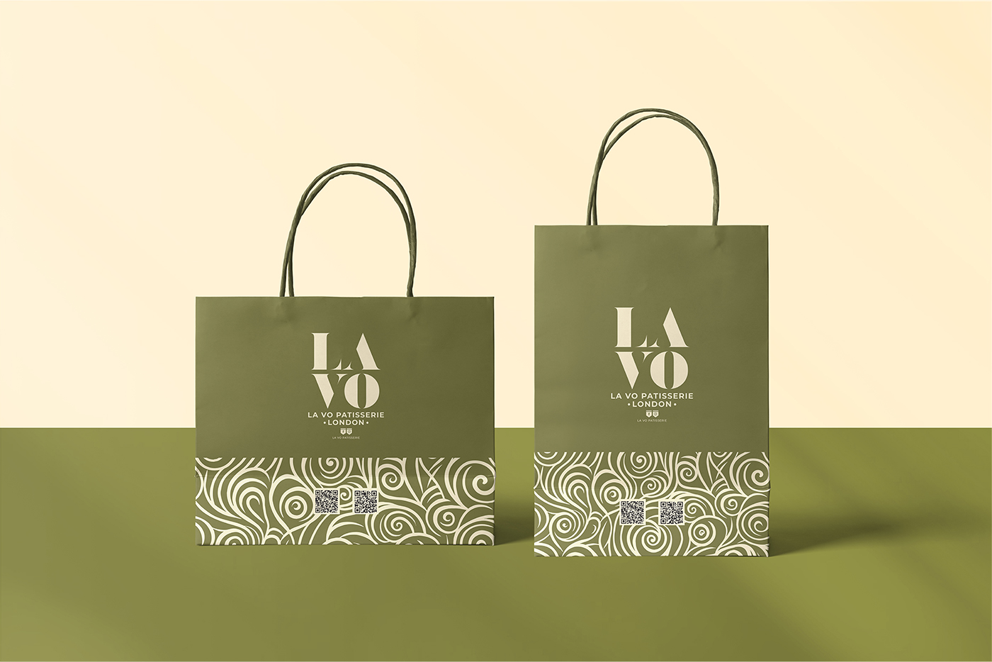
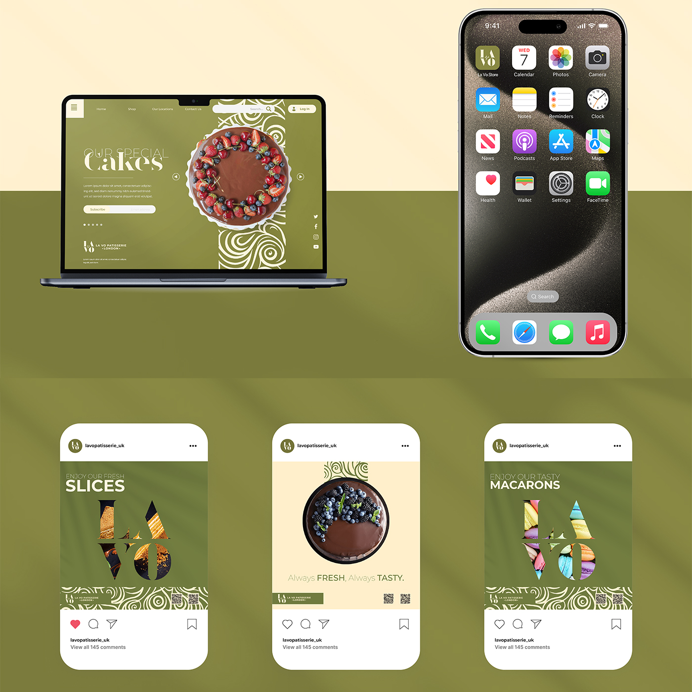
Packaging:
For packaging, we used the main brand colors of green, cream, and spiral pattern. The design was simple, unique and modern, reflecting the strategic direction of the brand.
The same design system has been standardized on all boxes, including macaron boxes, cakes, cake slices and paper bags.
Results & Outuputs:
The outputs and results were expected and impressive, as they received very high ratings from the client, and they also contributed to raising the value of the brand as a whole, which made it nominated as the best business activity in the United Kingdom for this year.
CREDIT
- Agency/Creative: Seyf Pub Design
- Article Title: La Vo Patisserie Brand Identity by Seyf Pub Design
- Organisation/Entity: Freelance
- Project Type: Identity
- Project Status: Published
- Agency/Creative Country: Algeria
- Agency/Creative City: Mostaganem
- Market Region: Asia, Europe, Middle East, Global
- Project Deliverables: 2D Design, Brand Guidelines, Brand Identity, Creative Direction, Design, Food Photography, Identity System, Illustration, Logo Design, Packaging Design, Packaging Guidelines, Pattern Design
- Industry: Food/Beverage
- Keywords: Bakery - Packaging Design - Brand Guidelines - Patisserie - London - Food - Brand Identity - Branding - Brand Design - Logo Design - Logo
-
Credits:
Creative Direction, Senior Graphic Designer: Seyf El Haq Menouer


