Conrad Group is a highly respected & successful brand in the marketing services industry, with a strong focus on the travel, tourism, & hospitality sectors, growing through both organic expansion & strategic acquisitions. Their mission is to acquire & invest in marketing agencies that make a real impact, fostering success for clients, employees, & stakeholders alike.
Fable&Co. set about to revitalise Conrad’s brand identity to better communicate its established reputation, creative approach, & growth ambitions.
The new brand identity needed to maintain the company’s core values of independence, trust, & results-driven operations, while emphasising its focus on innovation, collaboration, & creating lasting value for stakeholders.
The strategy behind Conrad’s new identity was to blend its history of success with a modern, sleek visual aesthetic that appeals to both new & existing brand audiences. The brand needed to convey a balance of professionalism, creativity, & experience. Projecting a bold yet minimalistic design to match the company’s forward-thinking approach & growth potential.
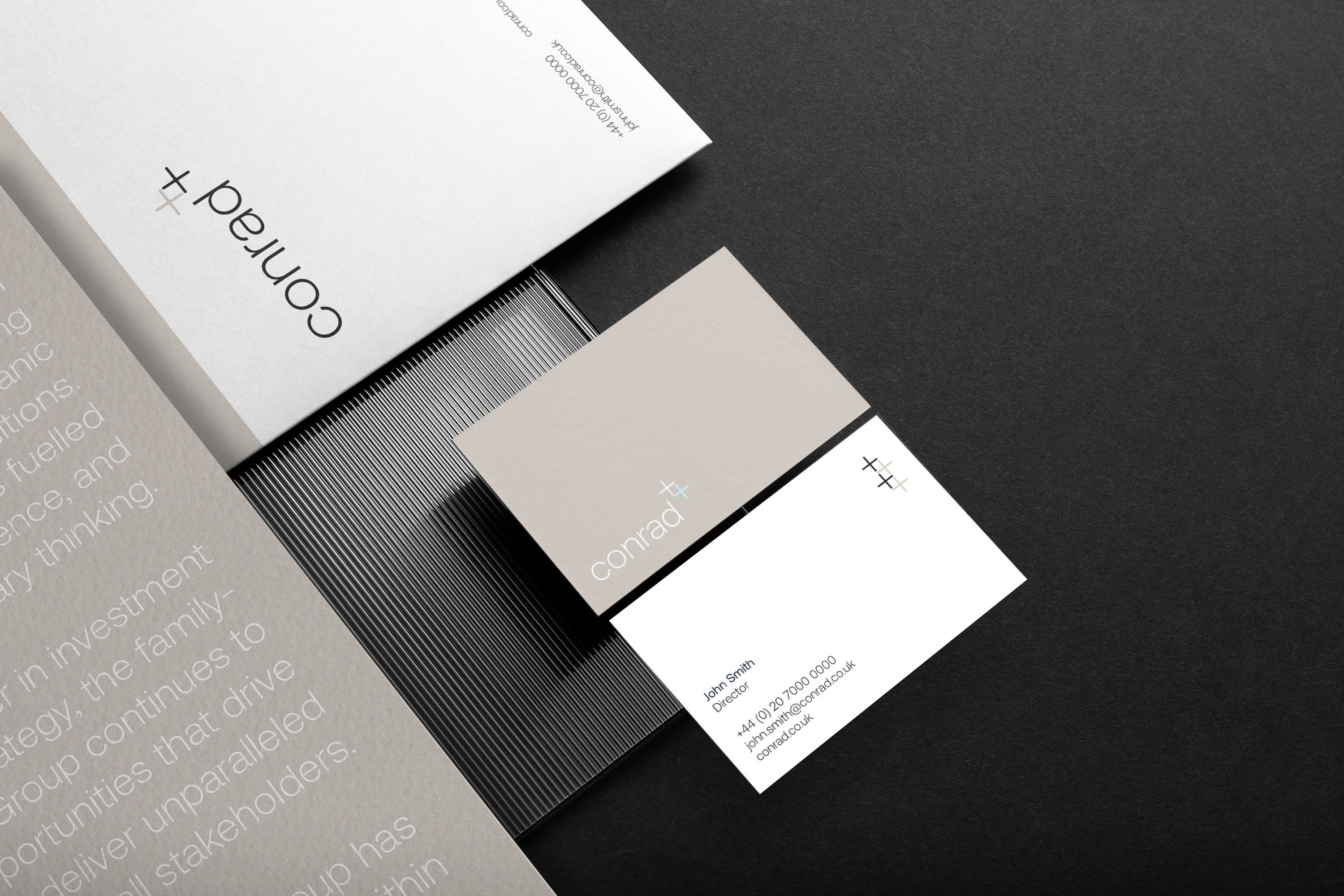
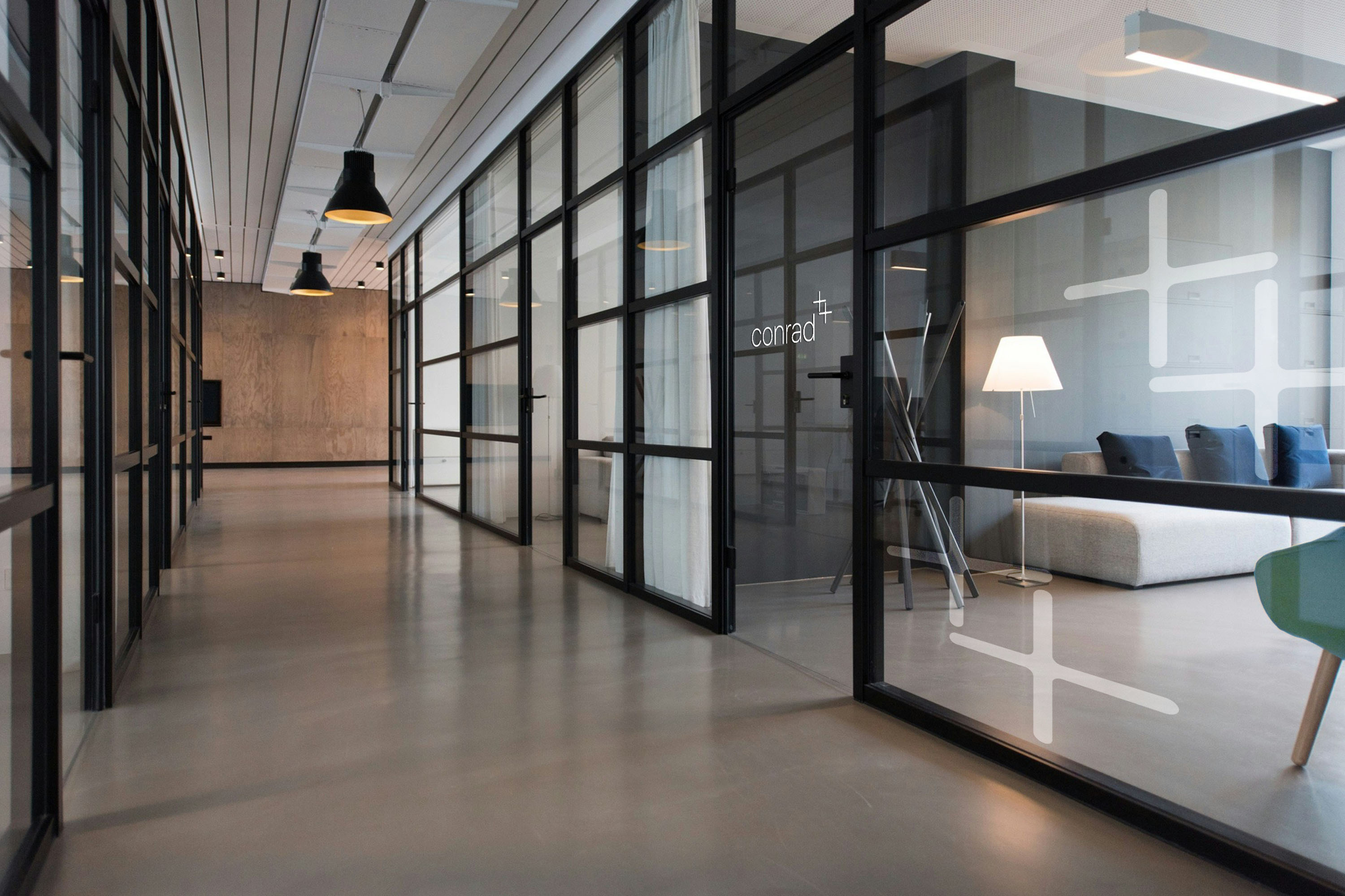
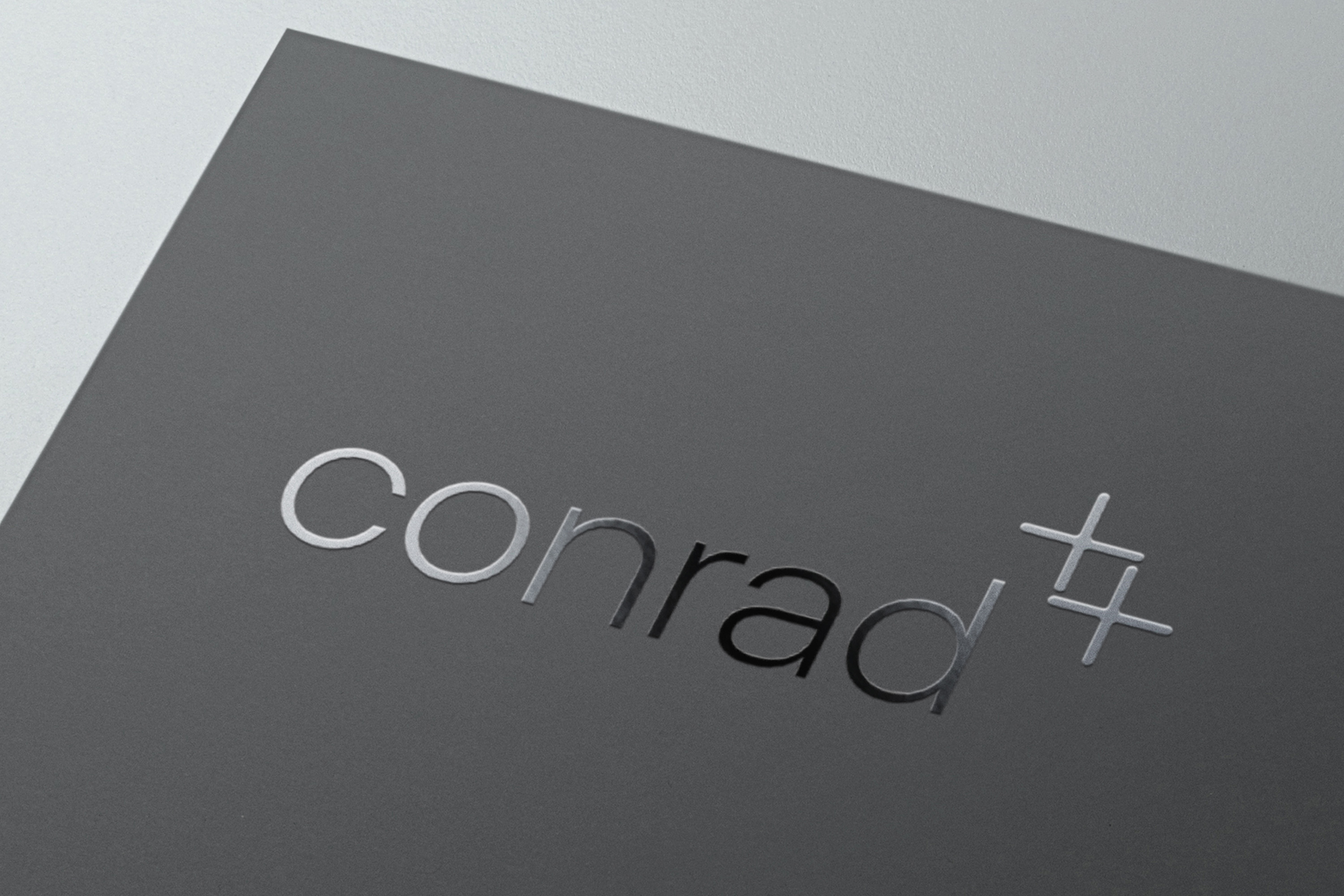
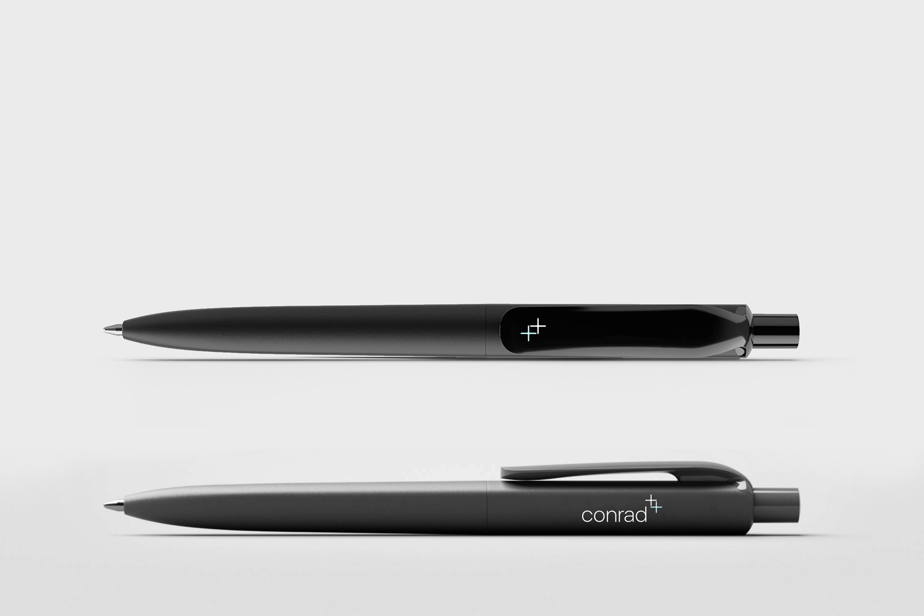
The Conrad logo was reimagined with a modern, clean typeface & subtle geometric elements. The “+” symbol in the logo reflects the company’s commitment to growth & partnership, serving as a visual metaphor for its strategy of building symbiotic relationships with clients & acquired businesses.
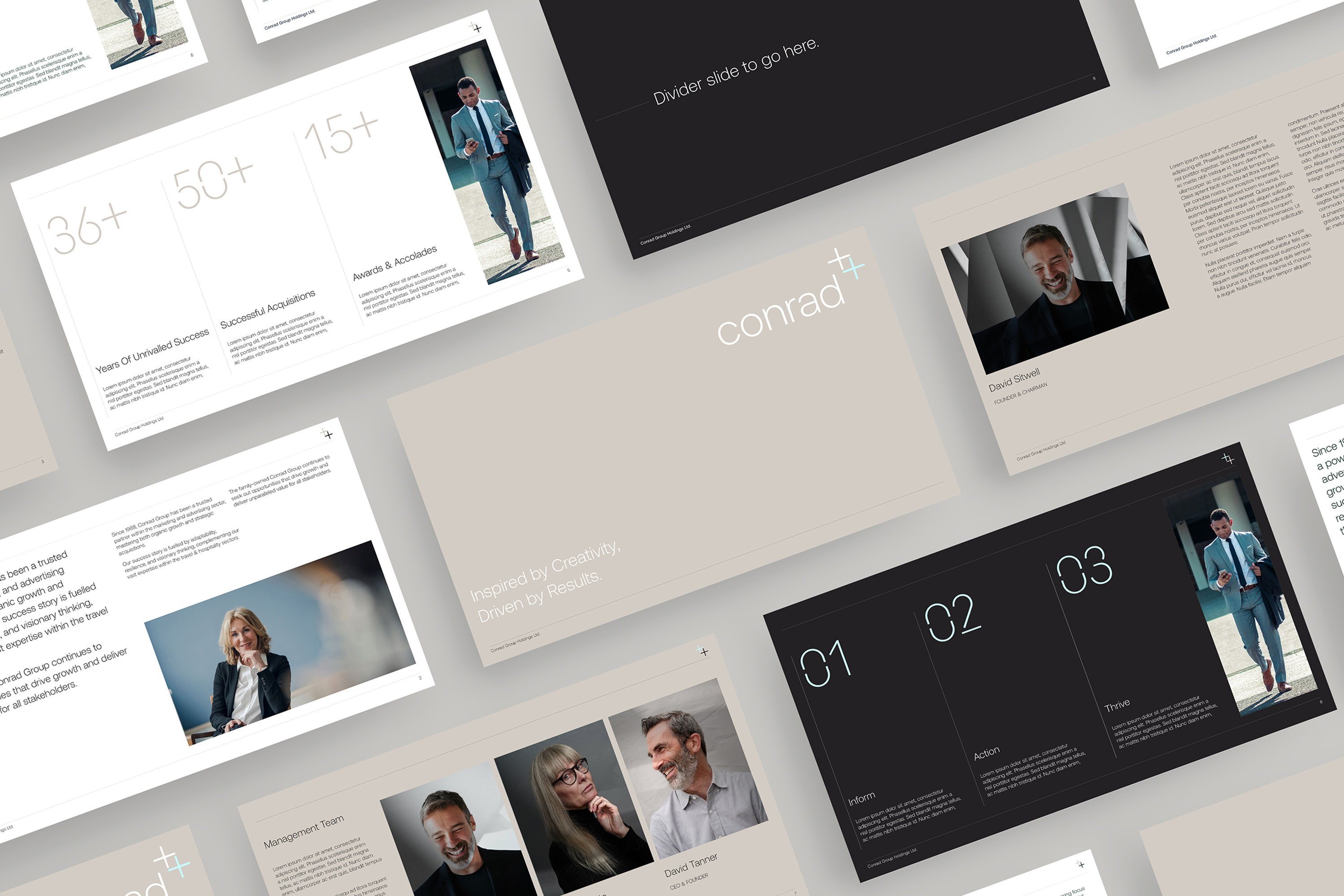
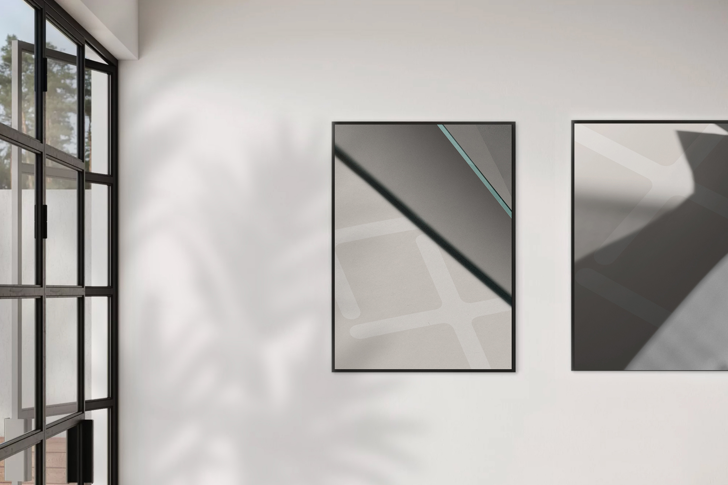
The colour palette incorporates neutral tones, primarily soft beiges & greys, which exude professionalism, stability, & warmth. The understated yet elegant tones are accented by minimal highlights of cool blue, evoking trust, calm, & future-focus.
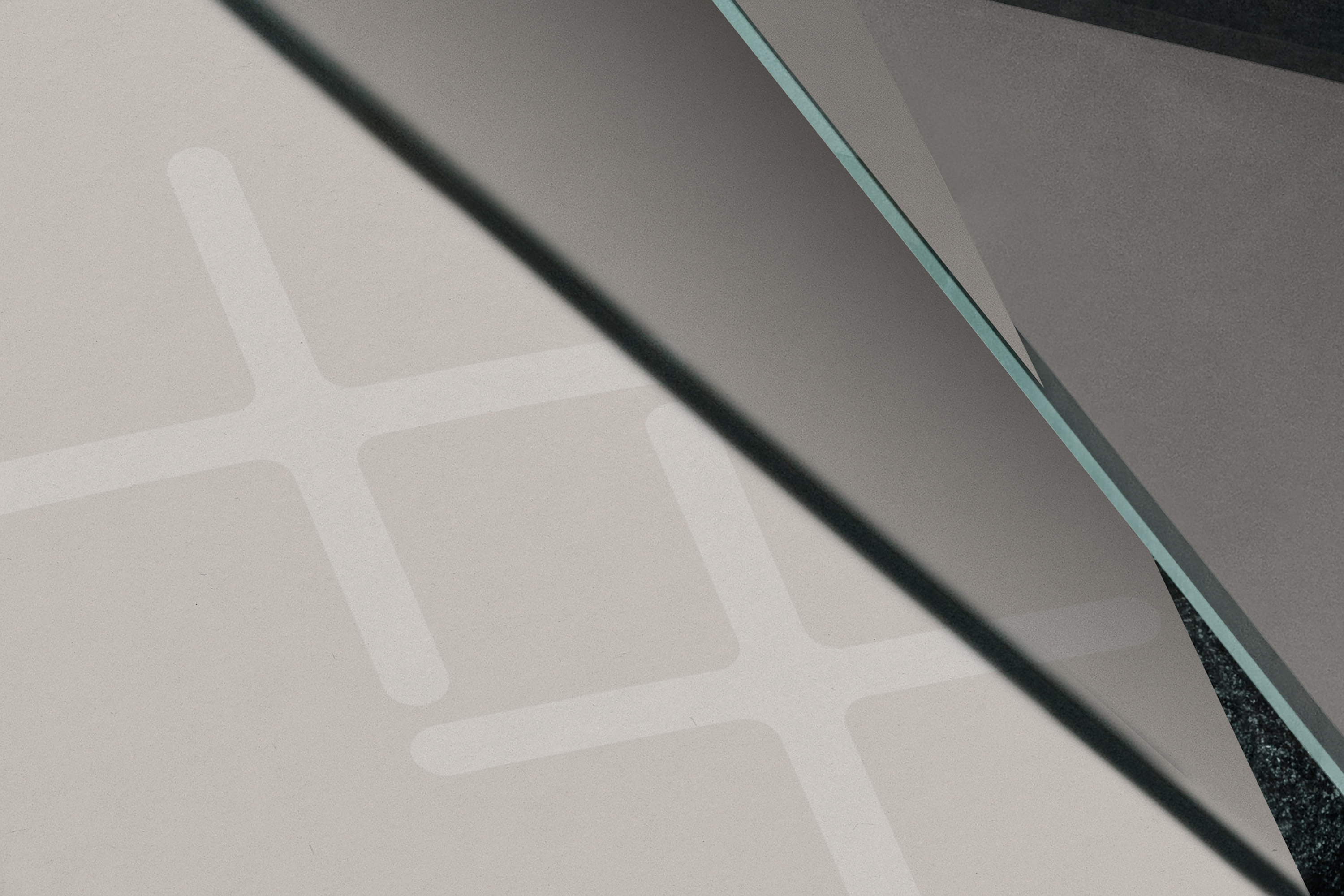
The brand visuals feature sleek, minimalistic layouts that use sharp lines & high-contrast design. Imagery of key team members further humanises the brand, emphasising Conrad’s approachable & transparent nature. This aesthetic is clean, inspiring confidence while communicating the brand’s values clearly & concisely.
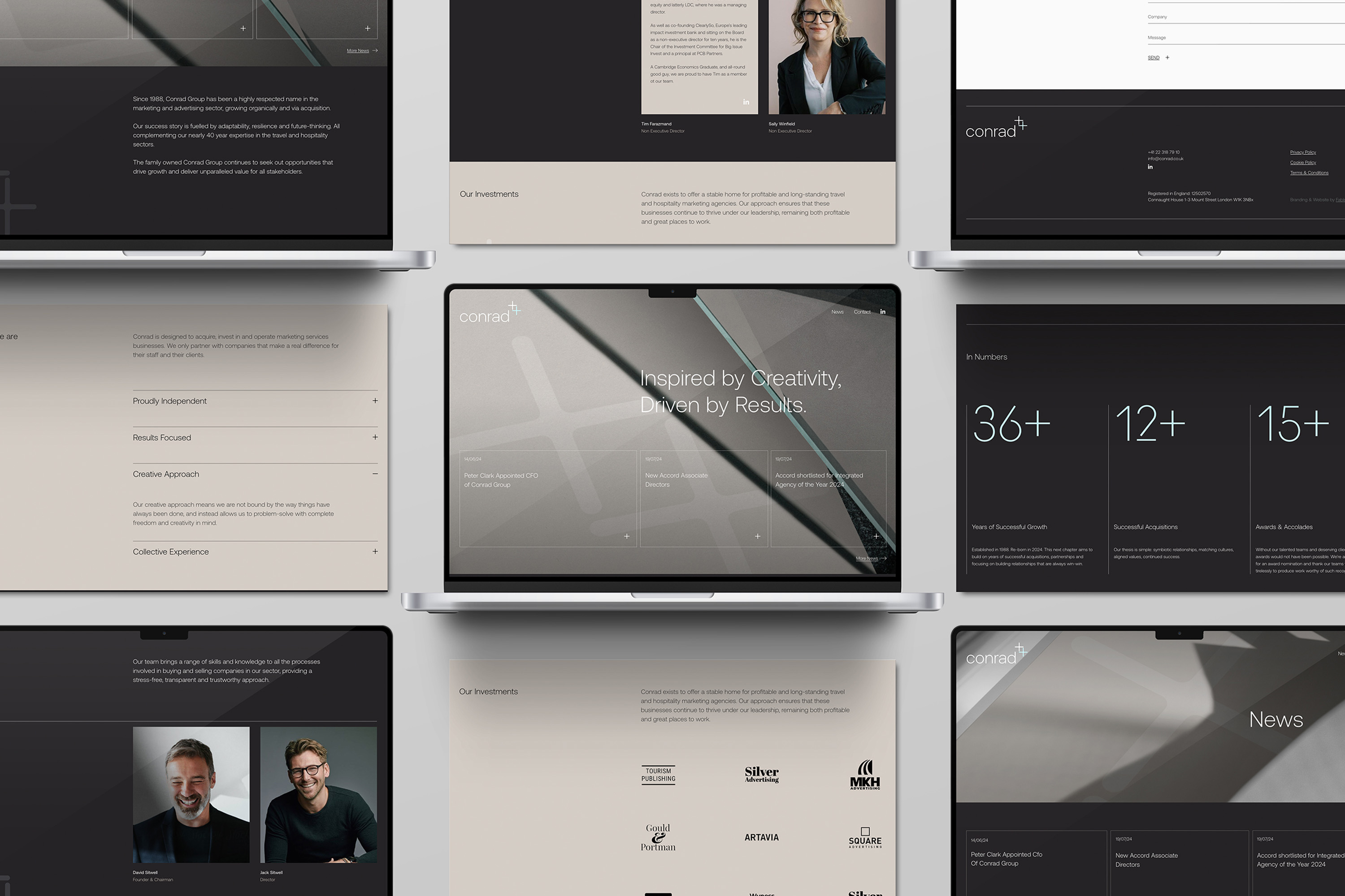
The website was overhauled with a modern, intuitive user interface. With a minimalist yet sophisticated layout, the website highlights Conrad’s 36+ years of expertise in travel, tourism, & hospitality marketing.
The design blends a modern monochrome palette with subtle accent colours, enhancing clarity & user navigation. Key features include bold typography, an intuitive layout that emphasises Conrads services, investment philosophy, & leadership team, while exuding a highly professional & innovative image.
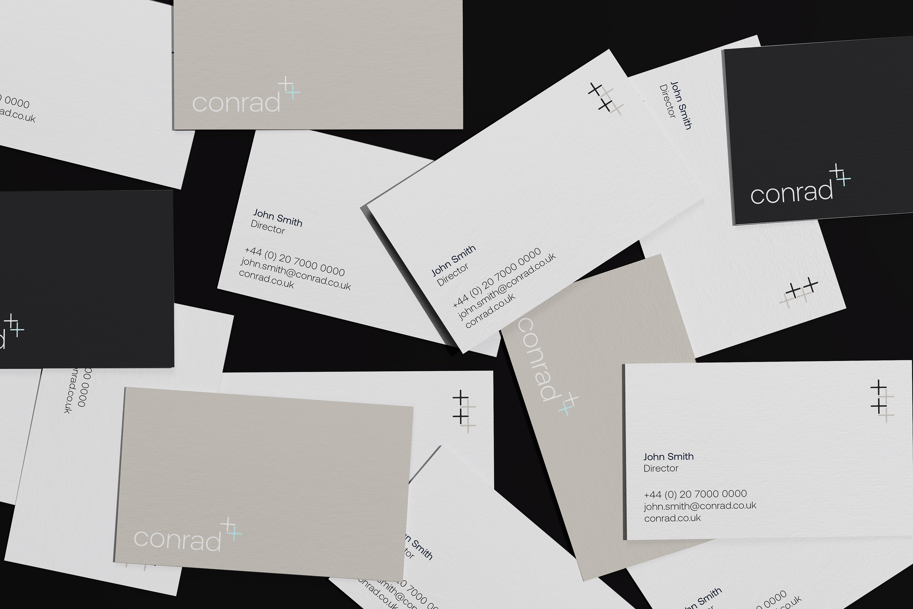
A suite of brand collateral was designed to maintain a high level of sophistication & consistency. Featuring the new branding, the business cards offer a tactile experience with high-quality materials & finishes to complement the minimalist design. The use of the “+” symbol in various branding materials reinforces Conrad’s theme of growth, collaboration, & excellence.
The rebrand has positioned Conrad as a modern, dynamic brand that builds on its legacy to meet future challenges.
Its new identity projects confidence, creativity, & integrity, helping to attract potential partners, clients, & acquisition prospects.
This refreshed branding creates a cohesive visual & verbal identity across all platforms, aligning the company’s image with its strategic goals of continued growth & stakeholder value creation.
The Conrad branding project successfully modernised the company’s image while remaining true to its heritage. By embracing a clean, contemporary design paired with a focused brand message, Conrad now presents itself visually as a trusted leader in the marketing services sector, ready for its next chapter of growth & success.

CREDIT
- Agency/Creative: Fable&Co
- Article Title: Fable&Co. Set About to Revitalise Conrad’s Brand Identity
- Organisation/Entity: Agency
- Project Type: Identity
- Project Status: Published
- Agency/Creative Country: United Kingdom
- Agency/Creative City: Brighton
- Market Region: Europe
- Project Deliverables: Brand Creation, Brand Design, Brand Experience, Brand Guidelines, Brand Identity, Brand Mark, Brand Rejuvenation, Brand Strategy, Brand Tone of Voice, Graphic Design, Icon Design, User Experience, Web Design
- Industry: Professional Services
- Keywords: brand identity
-
Credits:
Creative Director: Ross Davison
Director: Jack Archer
Design Director: Issy Hall


