


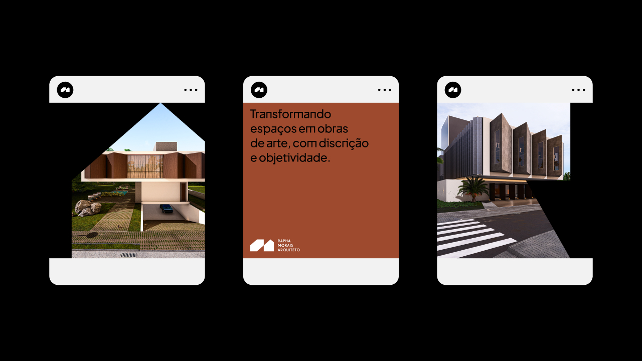
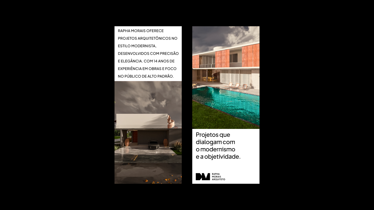
Rapha Morais is an architect based in Curitiba, recognized for developing modernist projects with precision, elegance, and a contemporary vision. His professional journey, spanning 14 years of experience in projects of varying scales, positions him as a specialist in architectural solutions that blend functionality and sophistication. Over these years, Rapha has established himself as an architect who offers more than just physical structures; he creates unique spaces, carefully designed to meet the most demanding needs and expectations.
Each project designed by Rapha Morais carries his visual signature: the balance between modernism and functionality. His attention to detail, clarity in form, and harmonious integration of architectural elements result in works that go beyond aesthetics, providing enriching spatial experiences. His projects are always shaped by a strong commitment to quality and refinement, essential characteristics for those seeking exclusivity and durability.
The main challenge in developing the visual identity for Rapha Morais’ brand was capturing this modernist essence in a way that connects directly with contemporary spirit. It was crucial to ensure that the modernist aesthetic, which defines his architecture, remained the focal point of communication, while also allowing the flexibility needed to meet different contexts and visual demands. The brand needed to be strong yet adaptable, maintaining sophistication in every detail.
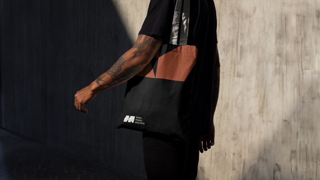
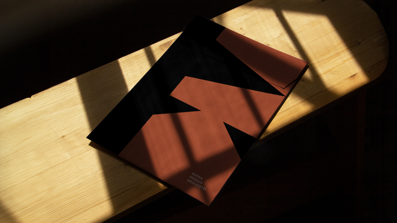
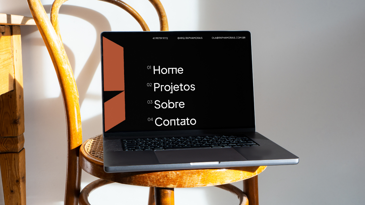
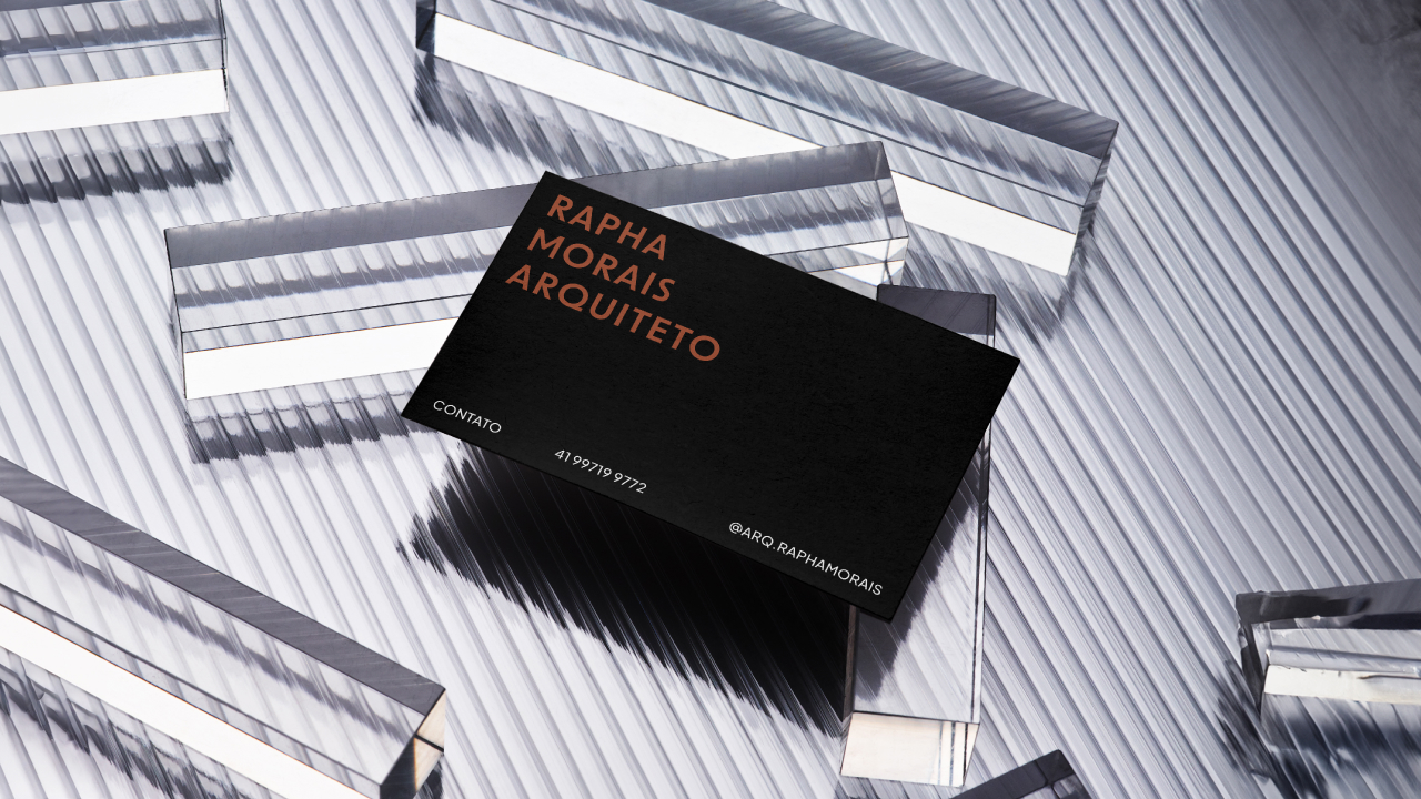
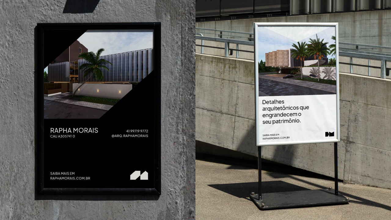
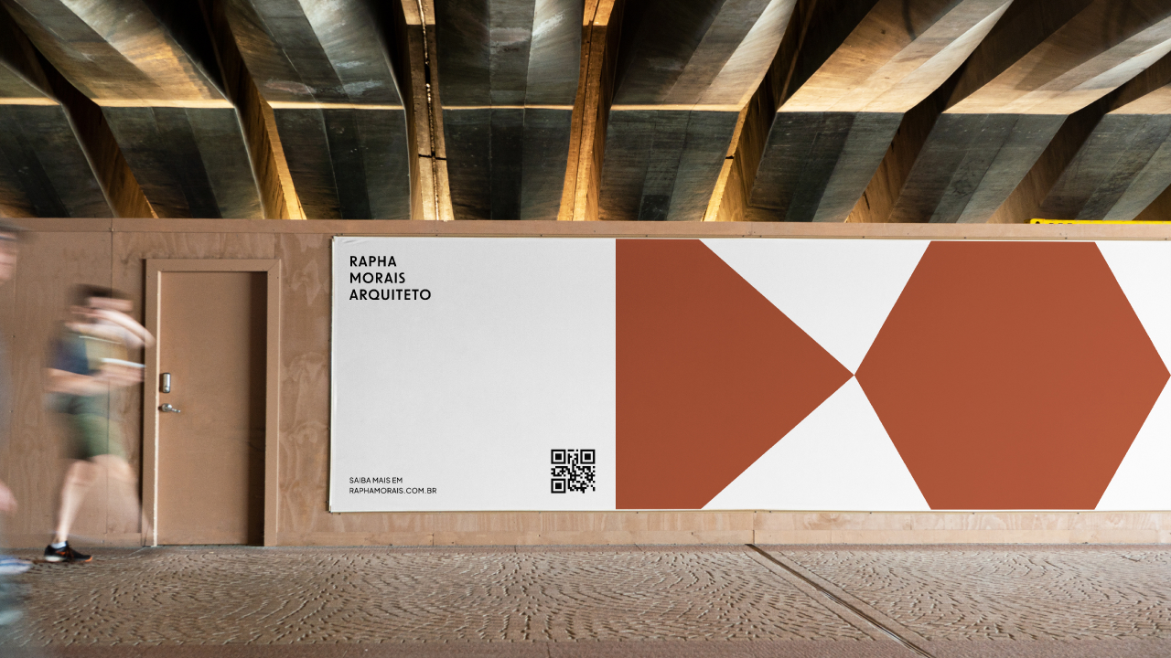
With this in mind, the visual identity was built around a color palette that emphasizes sobriety and elegance. Black and white serve as the foundation, representing the neutrality and timelessness of modernism, while copper was chosen as an accent color, adding a sense of exclusivity and warmth to the brand. This color combination reflects the union between the precision of architectural forms and the sophistication of the solutions proposed by Rapha.
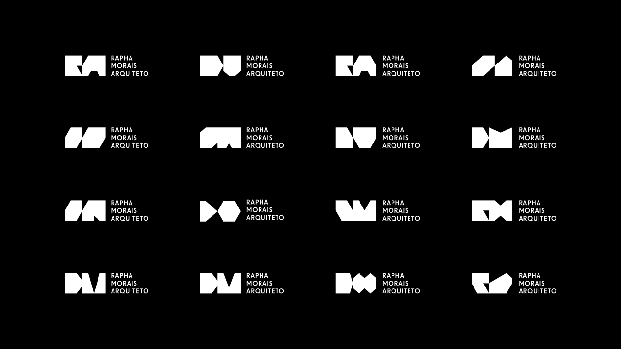
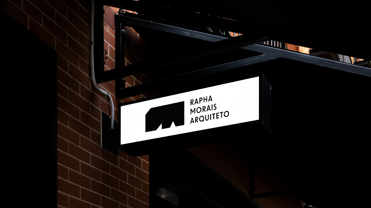
The brand’s logo was developed with a variable approach, meaning it can be applied in different ways depending on the visual context in which it will be used. This flexibility is supported by an intelligent modular system, allowing variation without losing the original identity. The result is a dynamic brand, capable of adapting to various platforms and formats, always maintaining visual integrity and strength.
In the end, the visual identity solution strikes a balance between modernism and innovation, accurately reflecting the essence of Rapha Morais’ work. The visual brand represents not only his technical expertise but also the architect’s creative vision, establishing a strong connection with the audience and clearly communicating the fundamental values that guide his architectural practice.
CREDIT
- Agency/Creative: Studio Gomesrosa
- Article Title: Exploring the Elegant Visual Identity of Rapha Morais’ Architectural Brand
- Organisation/Entity: Freelance
- Project Type: Identity
- Project Status: Published
- Agency/Creative Country: Brazil
- Agency/Creative City: Araranguá
- Market Region: South America
- Project Deliverables: Brand Creation
- Industry: Construction
- Keywords: Architecture, Branding, Modernism
-
Credits:
Designer: Will Gomes


