


Earthling Studio delivers a rebrand for Jaffa, the UK’s leading citrus brand focusing on freshness, quality and natural goodness, all while honoring the brands rich heritage.
A Juicy New Look for a Timeless Brand
Jaffa has been a recognised name in the citrus industry for decades, known for delivering the highest quality citrus, alongside more recent brand extensions such as grapes, melons and pineapples.
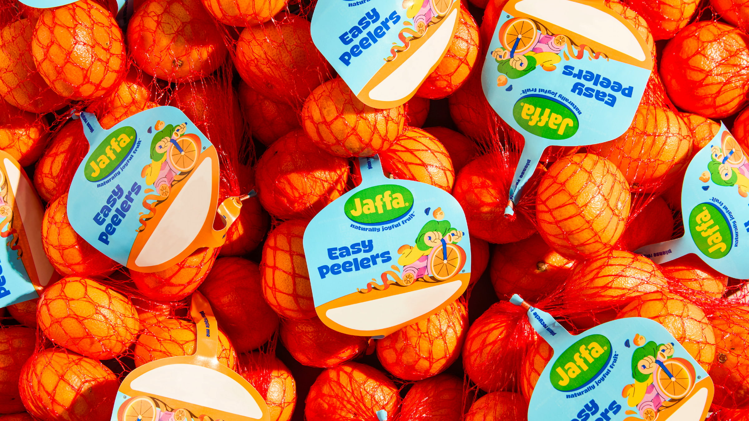
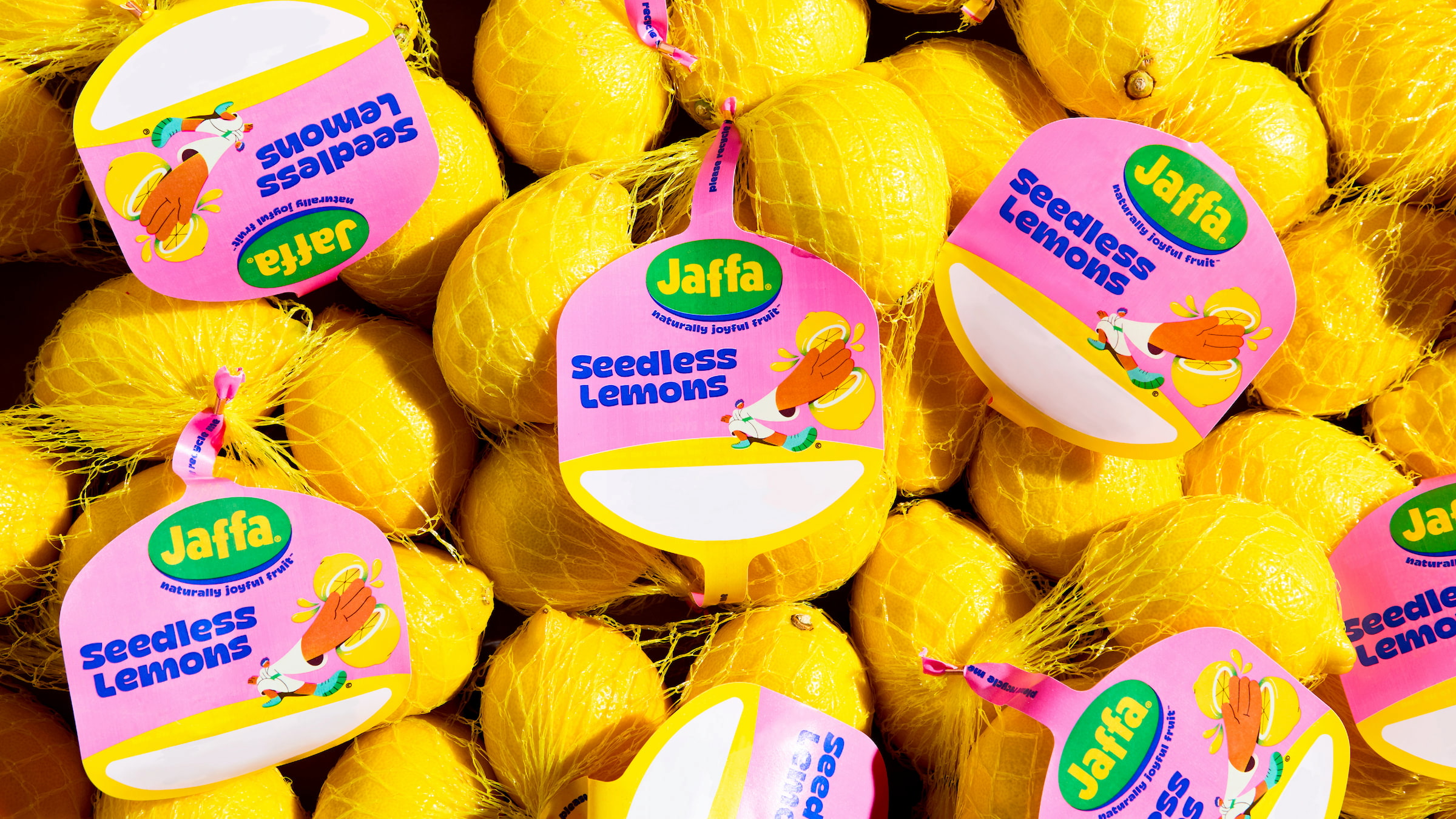
The rebrand represents a significant milestone in the company’s storied history. The new identity delivers moments of zesty joy, highlighting the freshness, quality, and natural goodness of Jaffa produce, whilst creating exceptional standout at fixture. Featuring an updated heritage logo reimagined for today, a fresh colour palette, joyful typography and a vibrant suite of illustrative characters, known as ‘The Juice Crew’, created in collaboration with Brooklyn based illustrator Spencer Gabor. The brand identity and packaging is designed to resonate with a new generation of consumers while honouring Jaffa’s rich heritage, reputation for excellence and commitment to innovation and sustainability.
A Logo Reimagined for Today
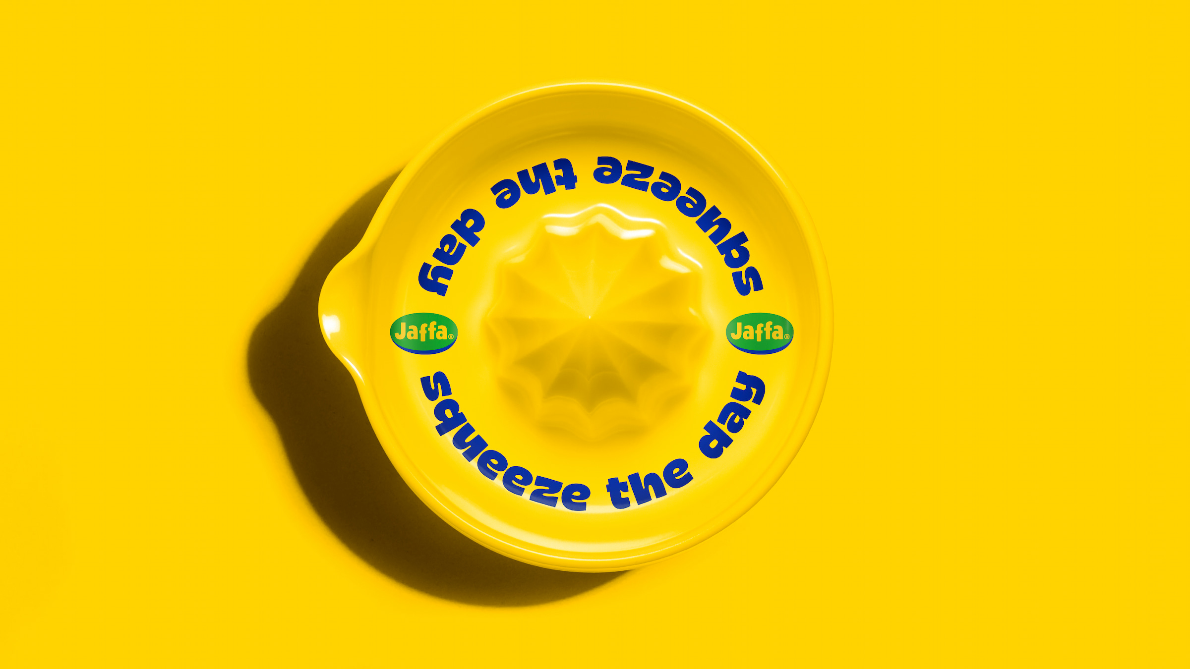
Jaffa has always been about delivering quality and everyday joyful moments and the current logo didn’t feel like it aligned with this. Earthling studio decided to delve into the brands rich heritage to unearth a timeless, simple and playful expression. The new logo reimagined is now dripping with humanity and provides greater standout on the shelves and in digital applications.
A Fresh New Palette
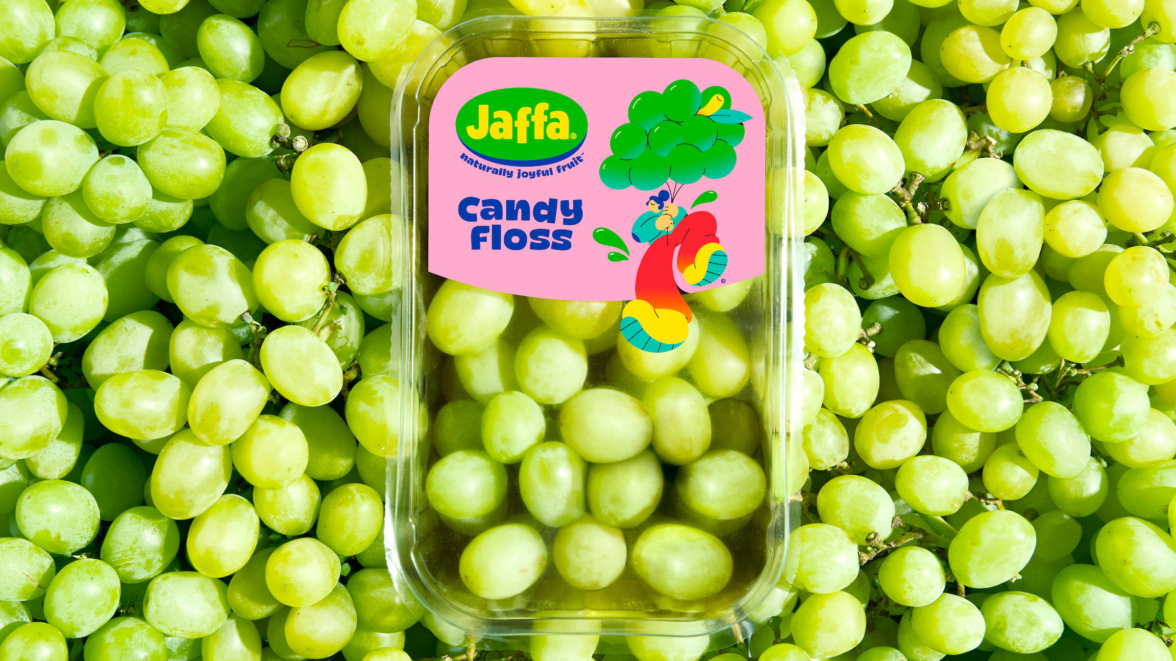
The current brand colours (yellow, green and blue) have been dusted off, amped up and given a new lease of life, to increase brand recognition and deliver a more contemporary expression. Earthling studio took the same approach to the portfolio, allowing the colour for each variety to light up the fixture and bring a slice of joy to Tesco’s shelves.
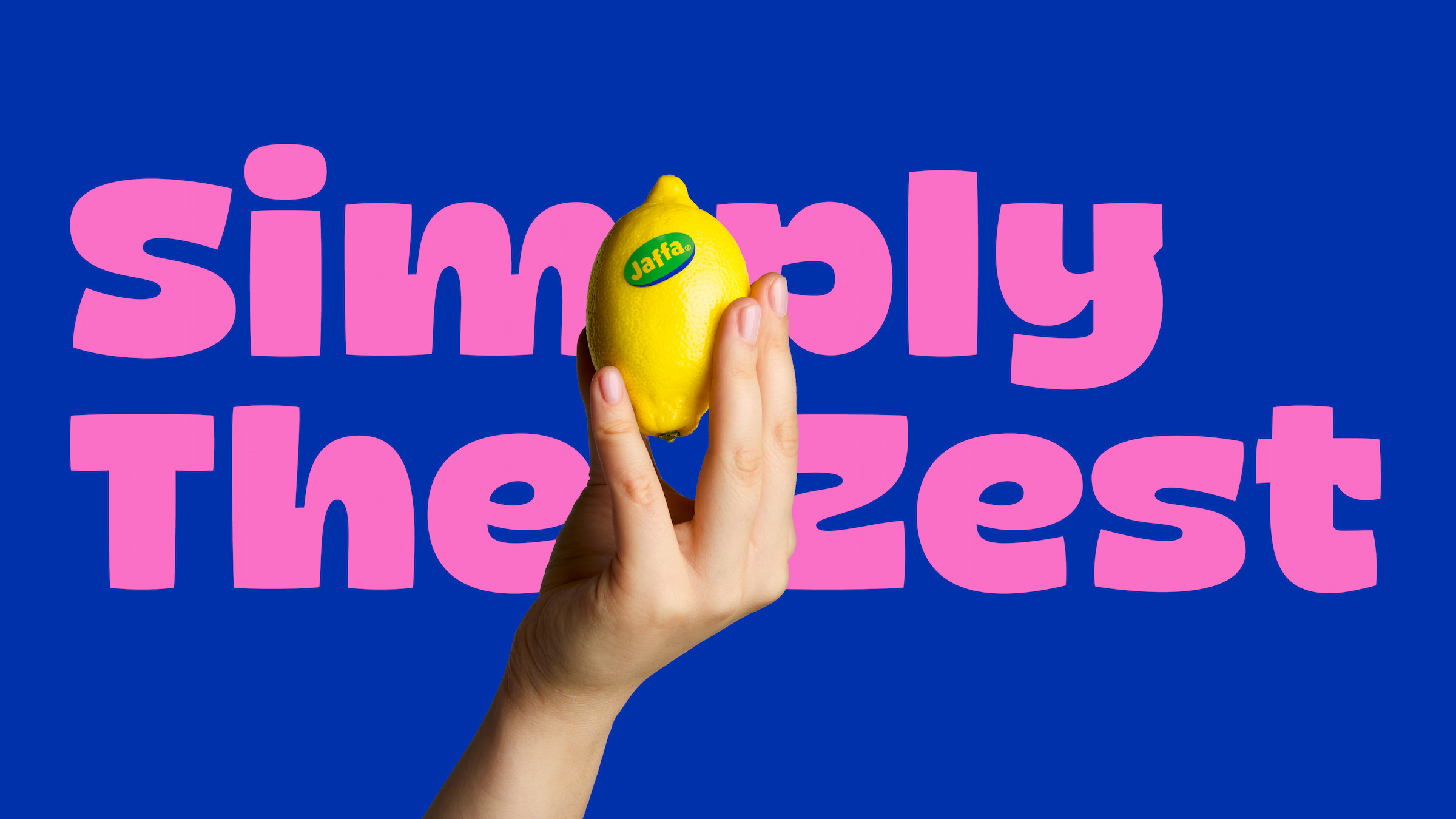
Fruity Fonts
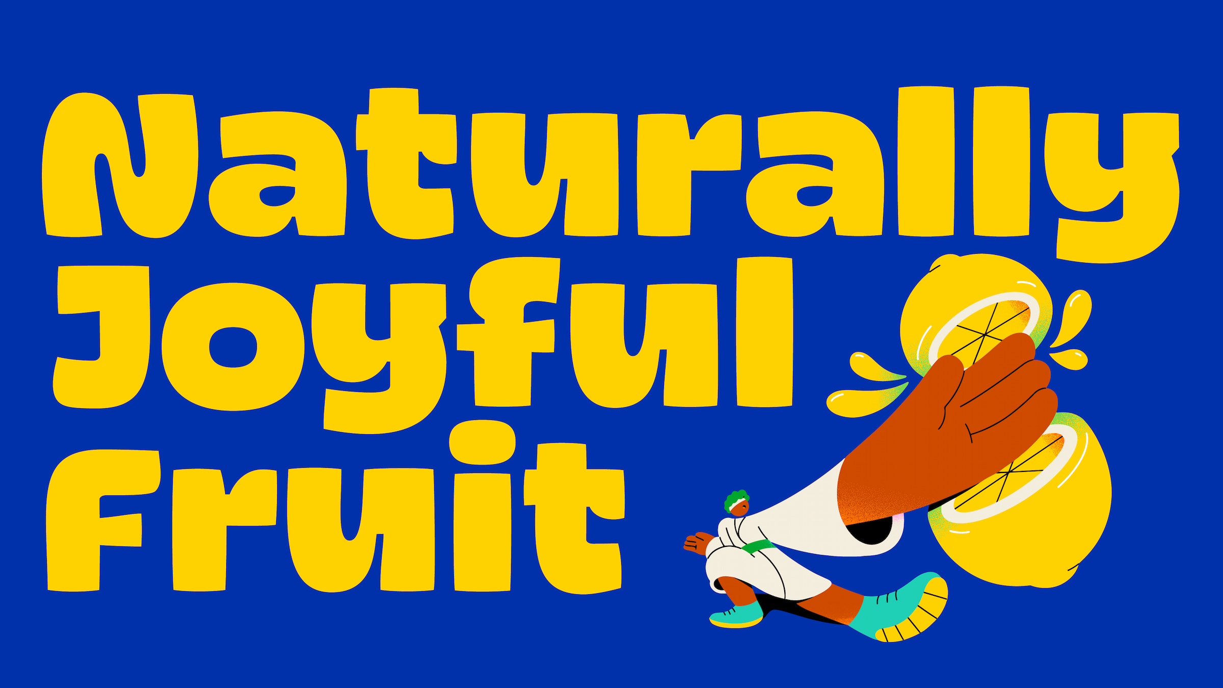
A new family of fonts has been introduced to the Jaffa brand identity inspired by the fruit itself; juicy, rounded, bold and playful. This new typography delivers an instant feeling of joy, which is further amplified when animated for use in digital applications.
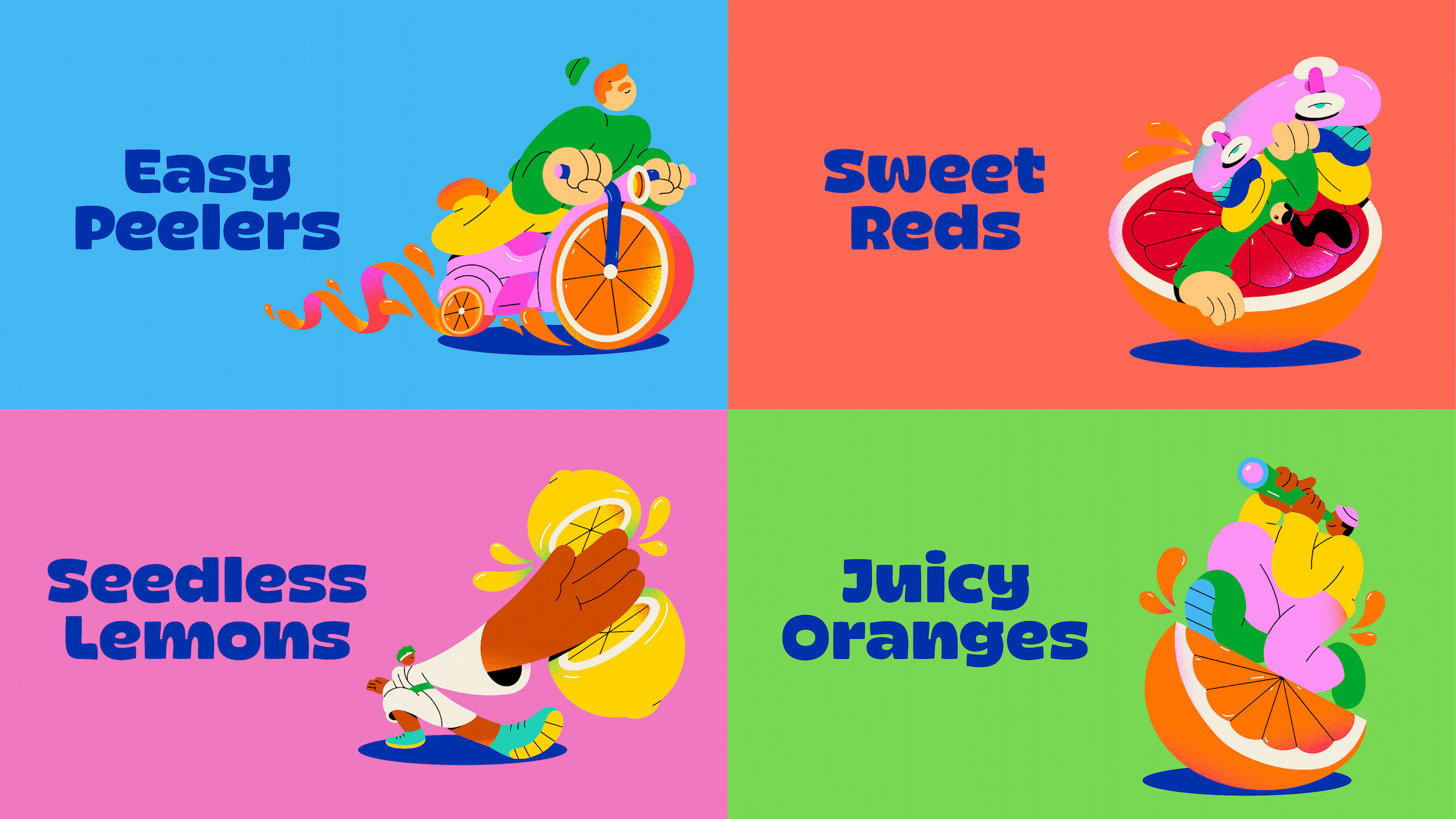
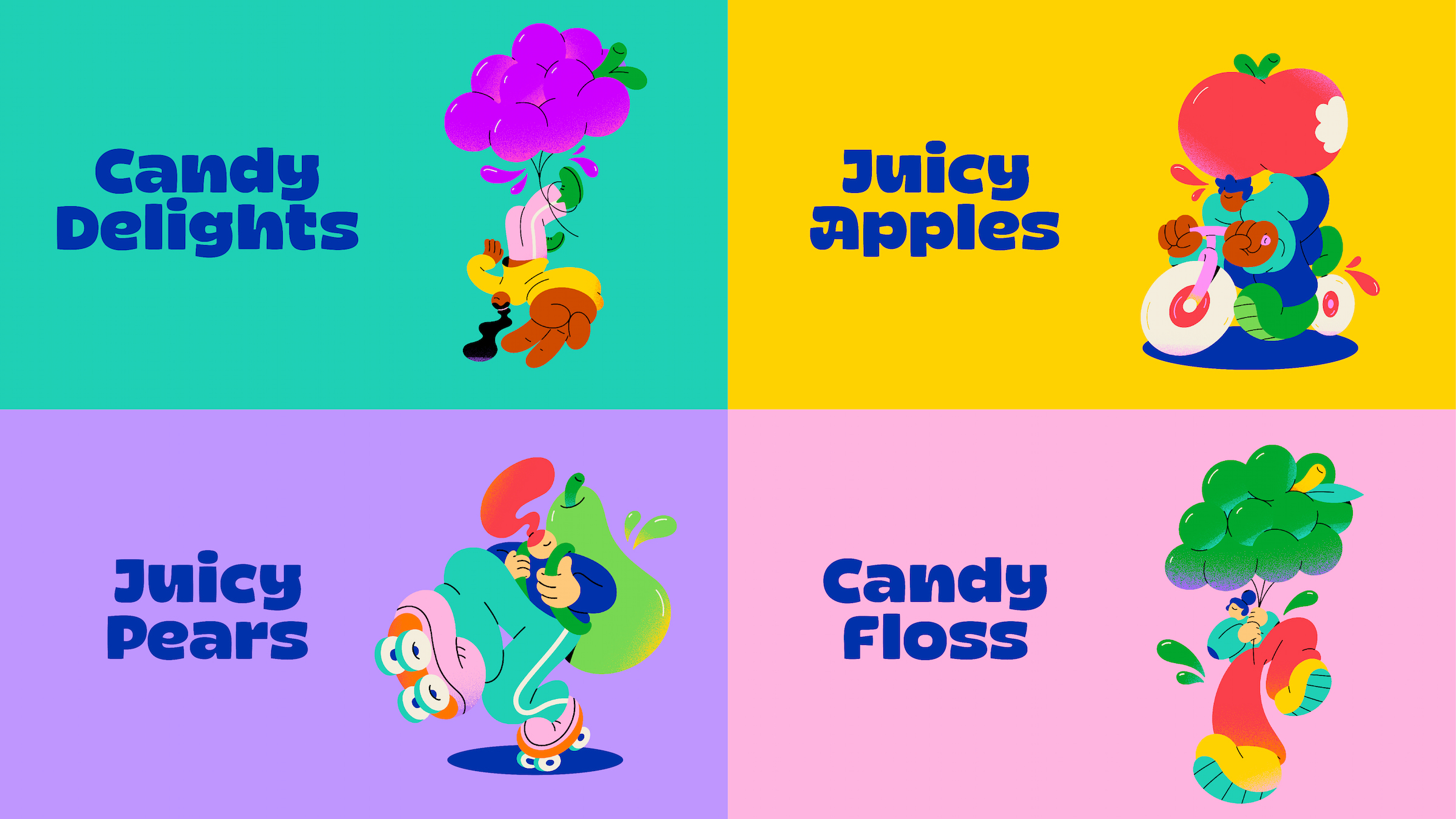
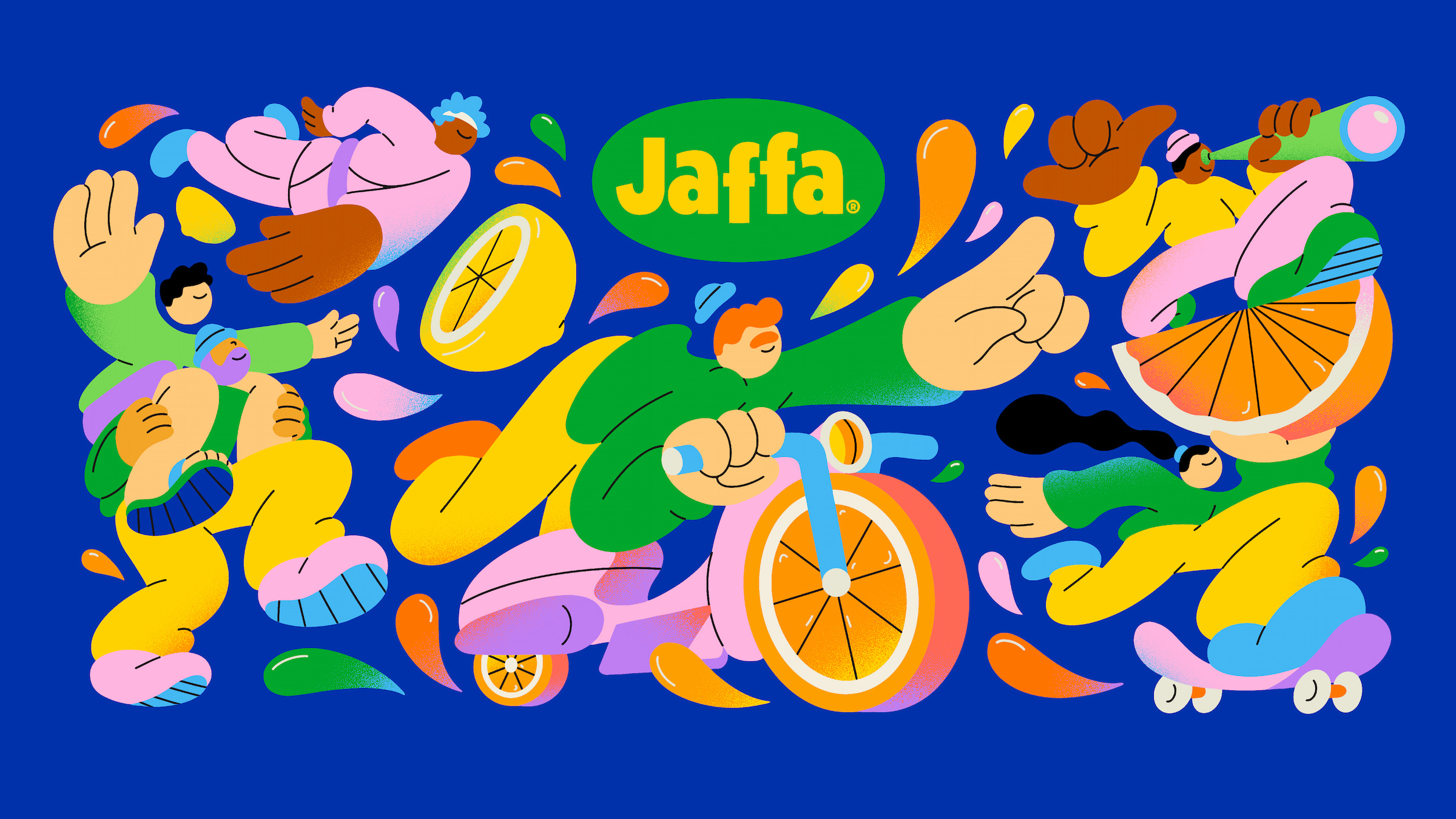
Introducing The Juice Crew
Earthling studio worked in close collaboration with Brooklyn based illustrator Spencer Gabor. A new cast of juicy characters have been created to interact with the product, with each depiction inspired by the unique product attributes of the fruit. Executions range from an easy-riding Easy Peeler, a karate inspired Seedless Lemon slice of joy, to Candy Floss Grapes as uplifting amusement park balloons.
The Jaffa brand is featured throughout Tesco stores nationwide, with the new packs hitting shelves in August 2024. The new identity covers updated packaging, merchandise, website, digital OOH and social media content.
Jaffa Spokesperson, Rachel Botha “We are incredibly excited to introduce our new branding and packaging, to Tesco stores nationwide. This rebrand is more than just a new look; it emphasises not only our dedication to quality, but ongoing innovation to sit with the ever-changing retail fixture. We believe that our new identity will strengthen our connection with consumers whilst providing a standout range of products that inspire a new generation to enjoy the fresh, natural goodness of the Jaffa offering.”
Earthling Studio Creative Partner, Stephen McDavid “Jaffa has an undisputed reputation for producing the juiciest fruit. When it comes to fruit, juice is a shortcut to quality. This single-minded insight, fuelled us to create an unquestionably juicy brand identity that’s packed with as much personality and zest as the products themselves.”

CREDIT
- Agency/Creative: Earthling Studio
- Article Title: Simply the Zest – Jaffa Unveils Transformational New Brand Identity
- Organisation/Entity: Agency
- Project Type: Packaging
- Project Status: Published
- Agency/Creative Country: United Kingdom
- Agency/Creative City: London
- Market Region: Europe
- Project Deliverables: Animation, Brand Design, Brand Identity, Brand Mark, Brand Redesign, Brand Strategy, Brand Tone of Voice, Brand World, Branding, GIF Animation, Illustration, Logo Design, Packaging Design, Packaging Guidelines, Typography
- Format: Tag
- Industry: Food/Beverage
- Keywords: Jaffa, Brand Identity, Brand Redesign, Illustration, Typography, Animation, Packaging, Fruit, Orange, Lemon, Grapes
-
Credits:
Creative Partner: Stephen McDavid
Managing Partner: Tom Bruce
Senior Designer: Tom Mitchell
Designer: Zita Nagy
Typographer: Rob Clarke


