


Strategic design agency Marks has created an ambitious redesign for Diageo-owned Serengeti to bring a modern, positive, and future-forward feel to the popular beer brand. It’s the first masterbrand refresh since its launch nearly two decades ago.
As one of the best loved bottled beer brands in East Africa, Serengeti collaborated with Marks to help re-establish the brand’s confidence, provide a flexible foundation for future innovations, and amplify Tanzanian optimism and pride in a modern way.
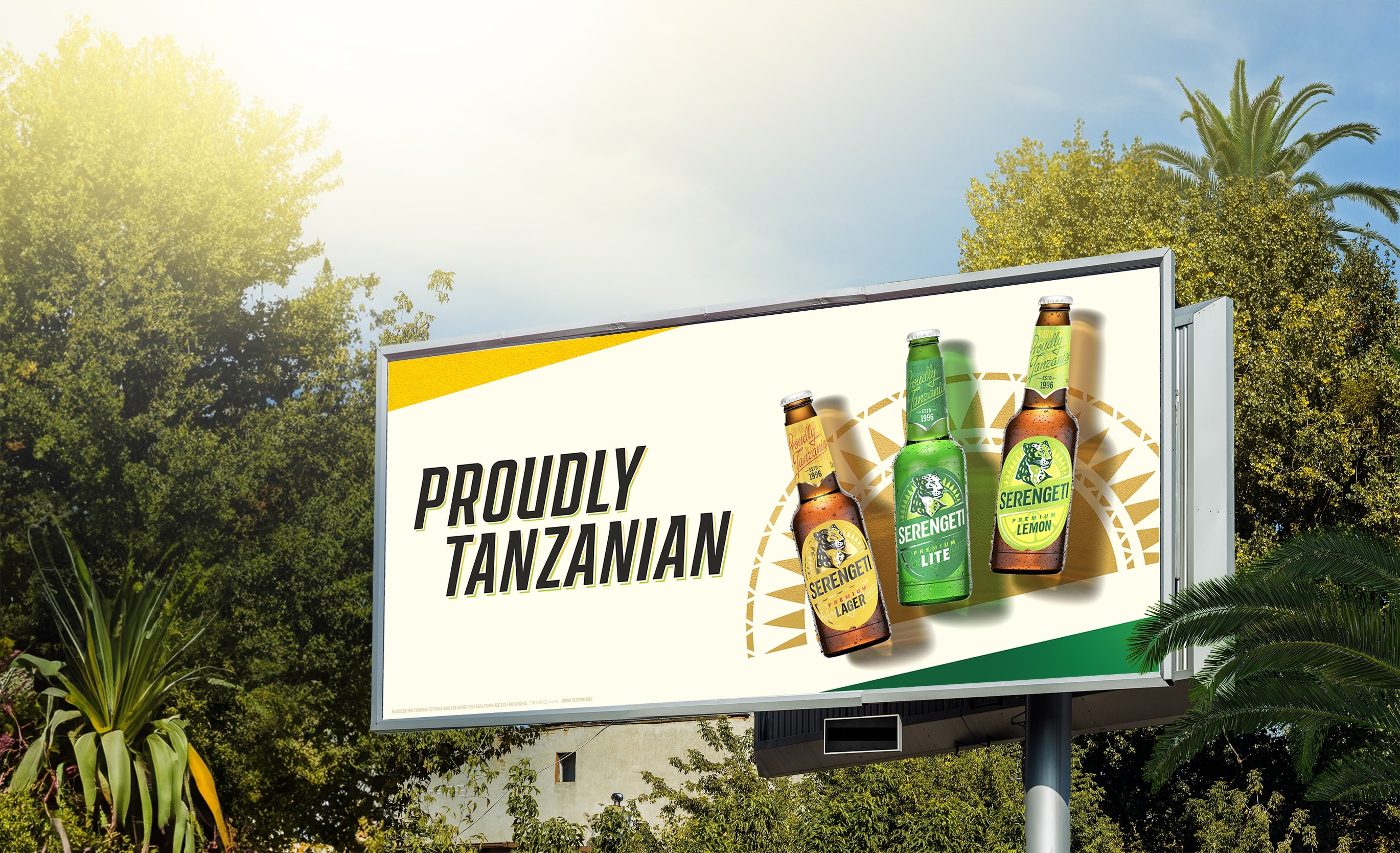
The ambition was to drive salience, distinctiveness and meaning with Serengeti’s diverse audiences at a masterbrand level, while allowing its products to sit together under one unifying direction – ‘Proudly Tanzanian’.
Proudly Tanzanian:
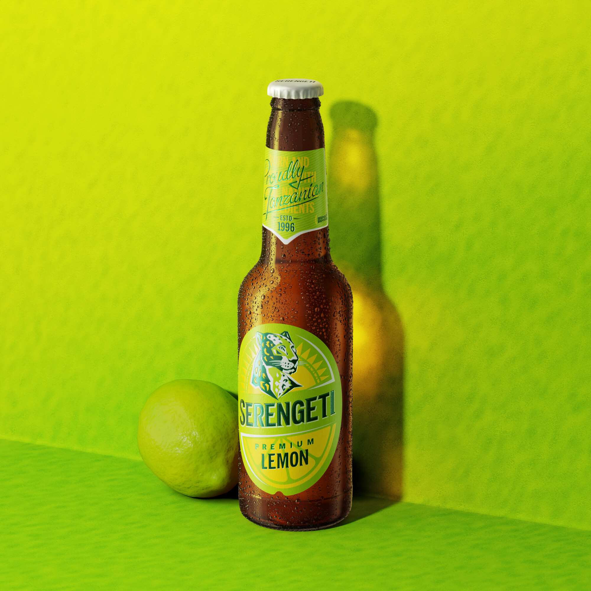
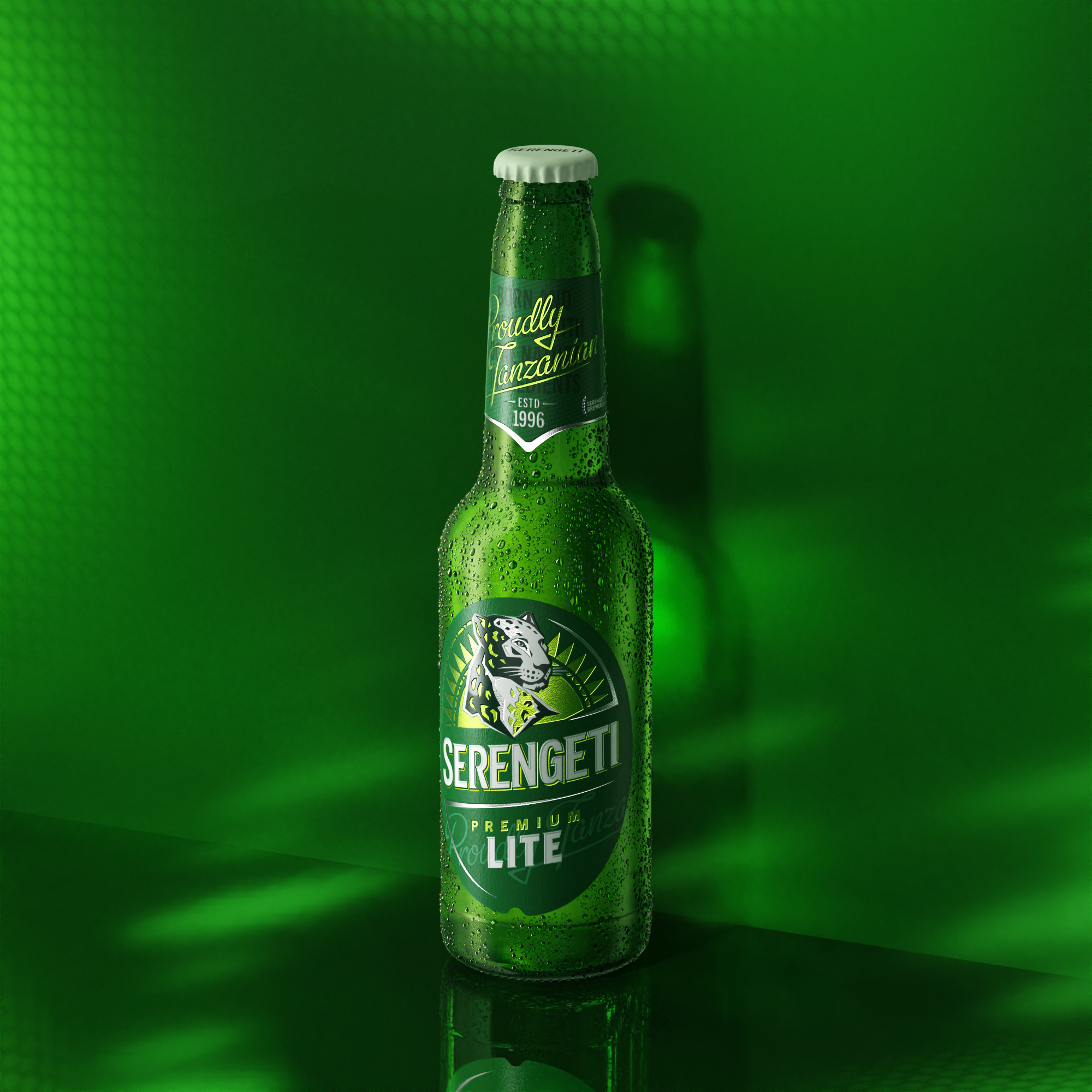
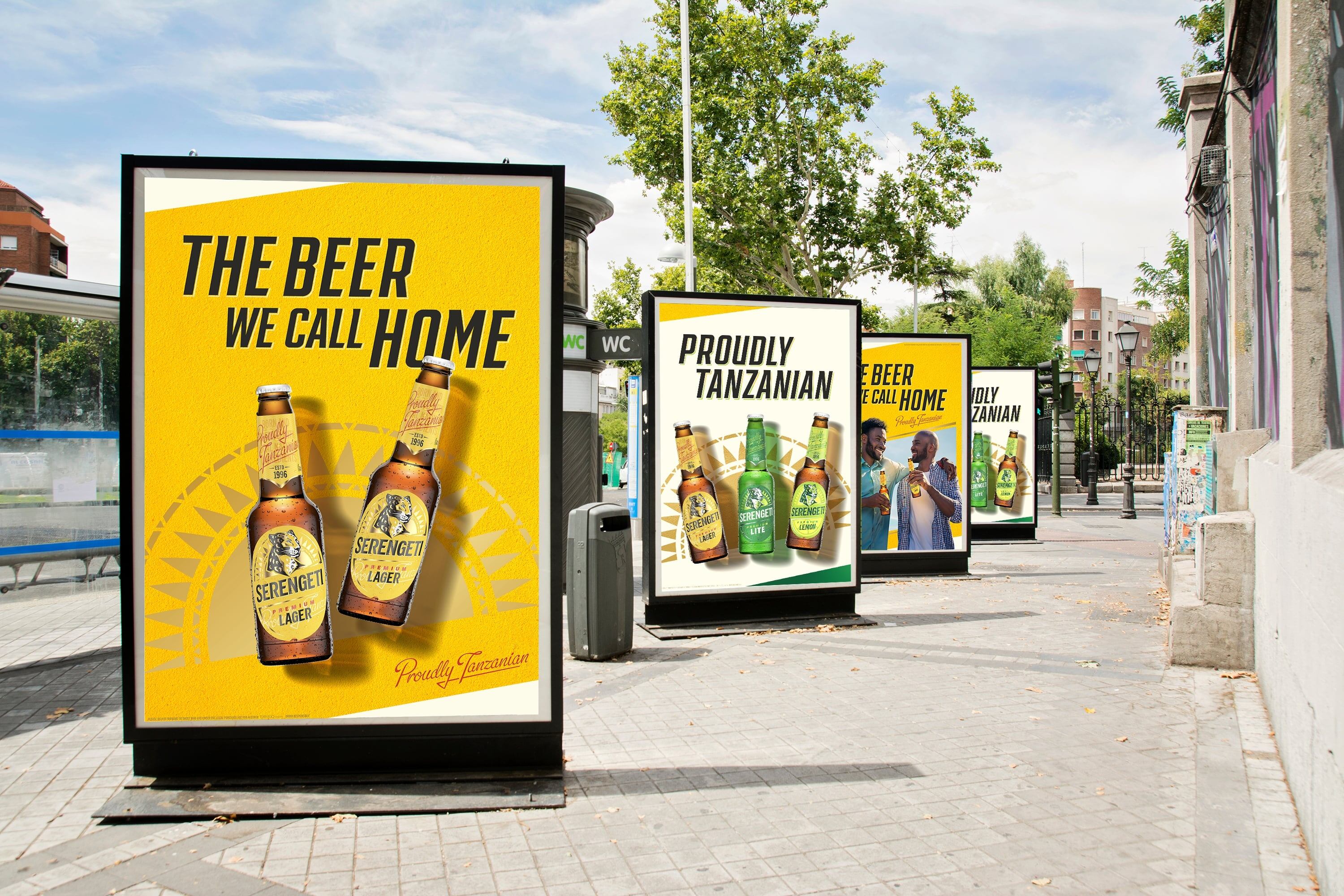
The redesign draws on the progressive energy of Tanzania and its people, encompassing a new brand identity, packaging design and communication strategy for the classic Serengeti Lager, alongside Serengeti Lite and the newly announced Serengeti Lemon.
Pippa Nordberg, Strategy Lead at Marks, says: “Serengeti is one of the most loved drinks brands in the country. It was important for us to strengthen Serengeti’s equity in the market, while reinforcing the brand’s role in culture. The brief required us to unpick the fabric of Tanzania, learn how to balance the national pride of Tanzanians with the nuance of their social and cultural heritage, and then weave it back together in a brand that exudes personality.”
Marks looked at the competitive landscape, the consumers, the brand history and noted the shifts in how national pride was being articulated to make Seregenti less clichéd and more inclusive – without compromising its authentic soul.
The new design builds on the brand’s history, modernising original pack elements to welcome a younger, more progressive and globally connected generation, while retaining the familiarity that loyal customers know and love. It acknowledges the sense of drive, determination and entrepreneurship at the heart of modern Tanzania – looking to the future in a positive way.
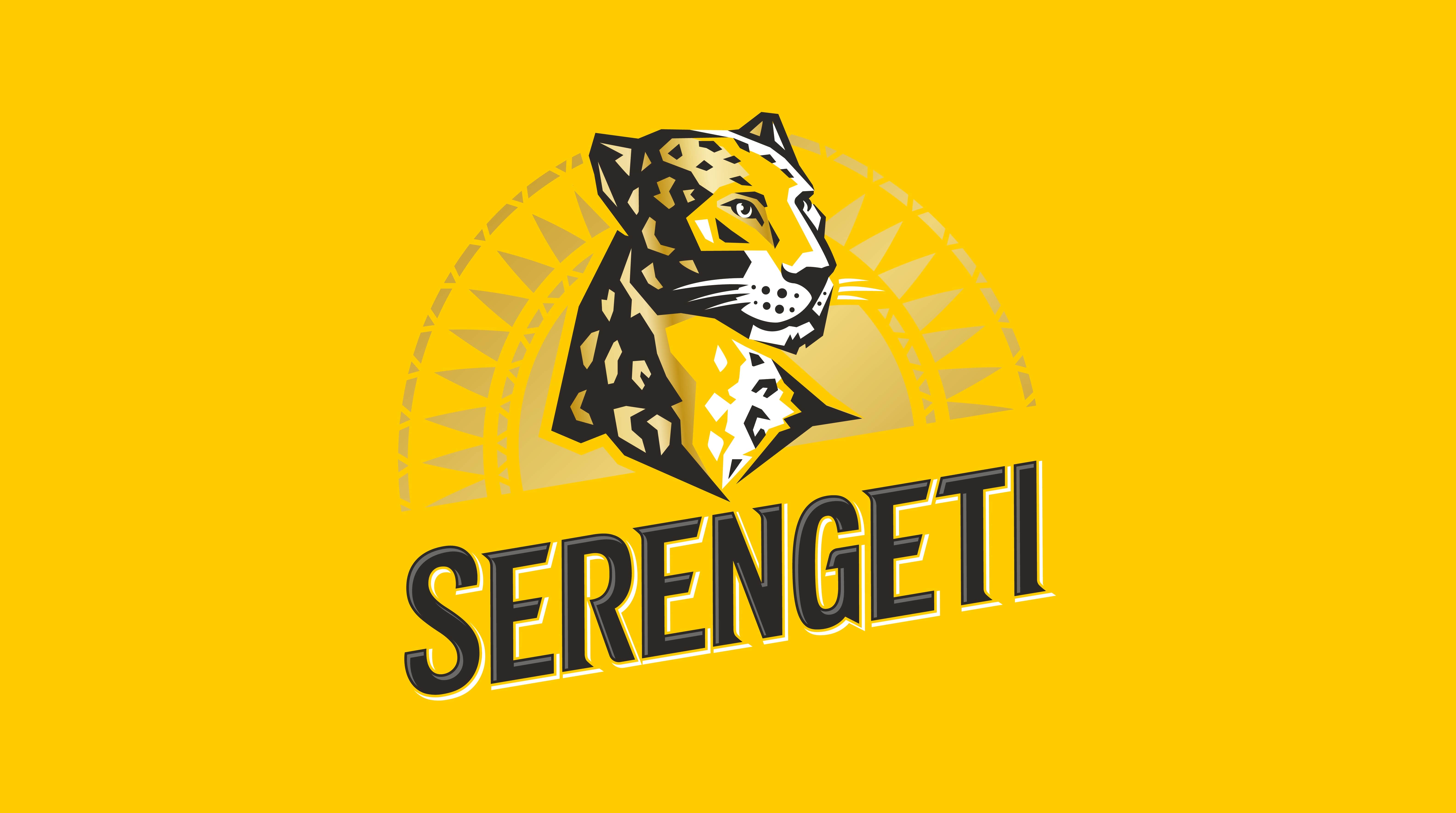
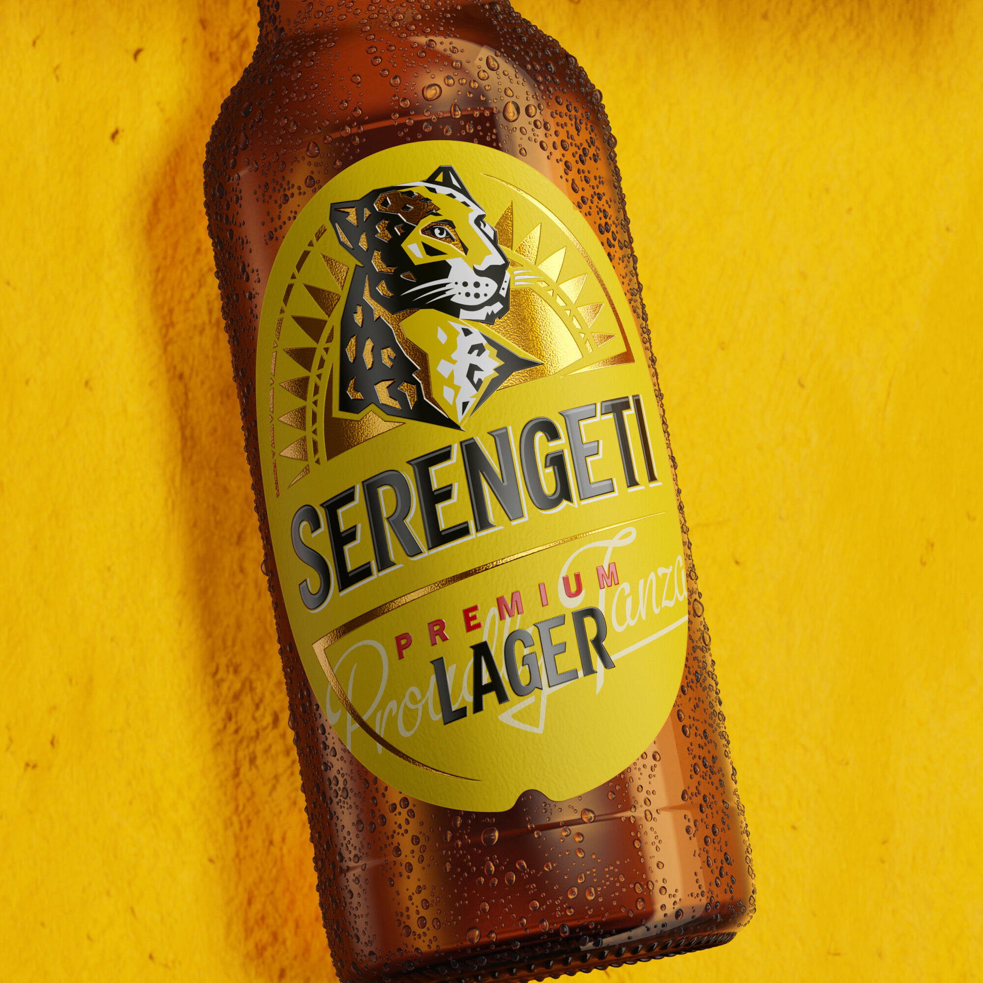
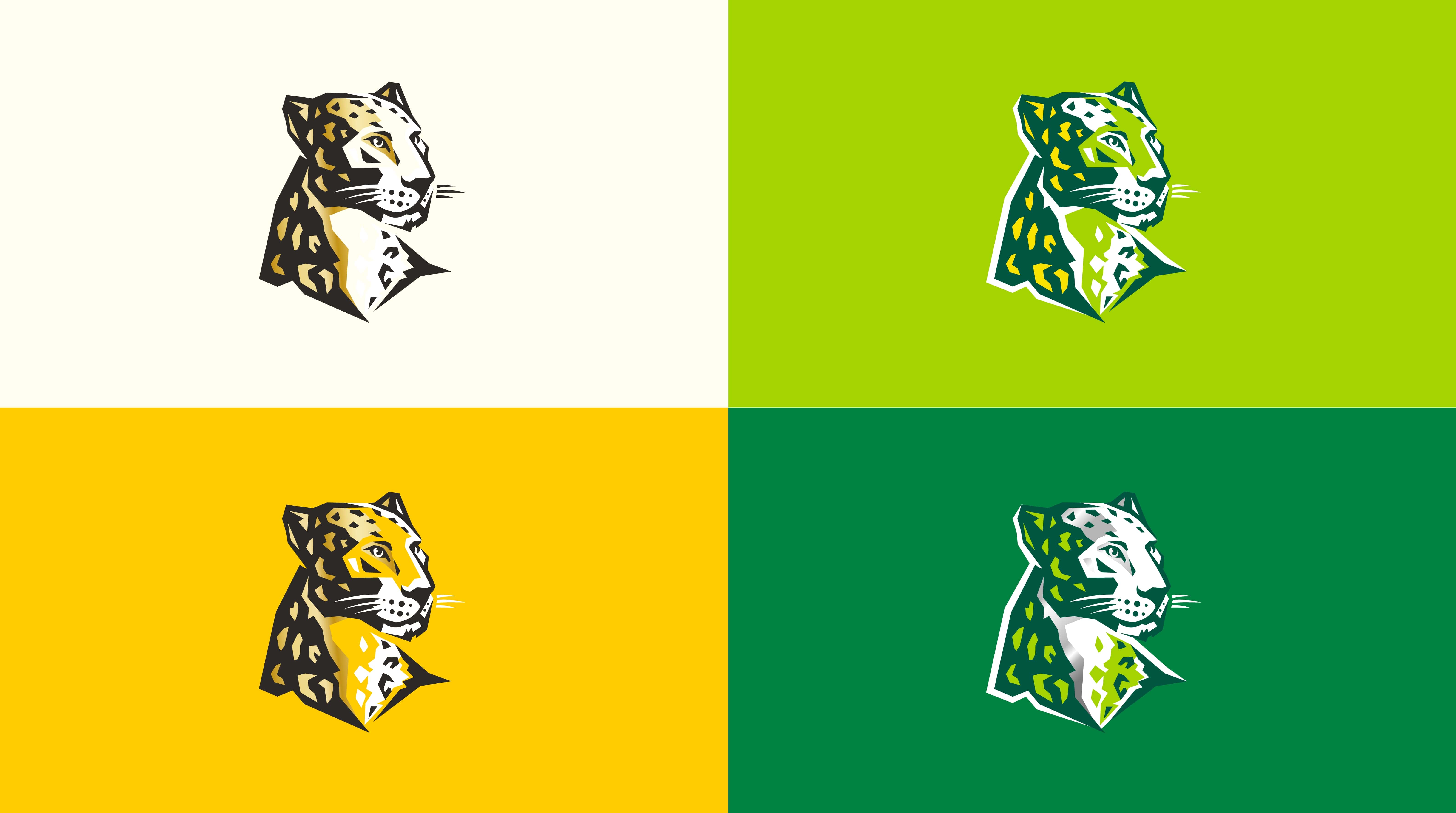
For example, its leopard ambassador, ‘Chui’, has been redrawn for modern audiences in a simplified, contemporary interpretation to amplify the impact of the marque. Instead of looking back, Chui now looks forward – a nod to the brand’s future-facing approach. Other key brand elements include the updated wordmark, a radiant sun visual representing warmth, pride and togetherness, and a disruptive diagonal graphic device to convey a consistent sense of dynamism.
Matt Kerr, Global Executive Creative Director at Marks, says: “Leopards are striking creatures. Incredibly intelligent and quick, but with an undeniable dignity and poise. We built the new brand around this concept, pulling through design features that help build energy and movement. The result is a progressive, more charismatic and livelier Serengeti.”
Creating modern appeal:
The rebrand also needed to reflect a sense of modernity to make sure Serengeti appealed to a new and more diverse audience.
Kerr explains: “When the brand first launched in 1996, the category had a very set book of codes and cues for premium beer – black label, heavy use of gold, an old school serif typeface. That has vastly changed, especially with the introduction of craft beer, so we’ve gone against these established cues. Today’s Serengeti is not about the residual category codes for beer such as flags, statues or parades, but about life, people and openness – taking inspiration from big global brands but in a distinctly Tanzanian execution. Nowadays premium is about making you feel reassured that you have something of quality, while conveying abundant personality and acting as a platform for self-expression. It was crucial to convey Serengeti’s premium offer without the brand feeling stuffy or exclusionary.”
Marks approached the brand design holistically under the overarching idea of ‘radiating Tanzania’s vibrant splendour’. It is underpinned by four creative guiding principles: ‘bold serenity’, ‘always moving’, ‘captivate with colour’, and ’unmistakable pride’. The design combines striking elements with a sense of calm to create a spirited, yet harmonious, aesthetic across the brand.
Vibrance was front of mind, with the brand’s originally muted tones swapped for pops of vivid colour unique to each SKU. Lager leans heavily into the golden tones of the sun, with its striking yellow label, while the incandescent green of Lite emphasises its crisp, lighter taste. Lemon marries the two, blending the yellow and green for a cohesive, but uniquely citrus feel. Each are supported by their own taglines, ‘The Beer We Call Home’, ‘Lite Your Imagination’ and ‘Lager with a Twist’.
While each sub-brand has its own unique attitude built into its design, they can coexist seamlessly across all communications channels against the backdrop of the new masterbrand.
Closing in on culture:
Throughout the strategy and design process, the Marks team tapped into Tanzanian culture at a deeper level, constantly engaging in conversations with locals to understand the nuances of Serengeti’s audiences.
By taking the time to unearth the contents and products of its culture, the team was able to explore Tanzania’s wider values, ideologies, and consumer rituals, but also home in on specific aesthetic tropes and conversational themes. This allowed them to build a holistic picture of the nation that nurtured the strategic approach and creative output, allowing them to build a brand with authenticity and confidence.
“By listening to the actual conversations consumers were having, we were able to gain deeper clarity on what the spirit of ‘Undugu’, or brotherhood, means in modern Tanzania – beyond sweeping generalisations or surface level research”, says Nordberg, “this informed the creative in a very special way.”
The new brand can be found on shelves now.
CREDIT
- Agency/Creative: Marks
- Article Title: Serengeti Looks to a Vibrant Future Through Energetic Brand Redesign by Marks That Builds on Tanzanian Spirit
- Organisation/Entity: Agency
- Project Type: Packaging
- Project Status: Published
- Agency/Creative Country: United Kingdom
- Agency/Creative City: London
- Market Region: Africa
- Project Deliverables: Brand Design, Brand Identity, Packaging Design, Product Design
- Format: Bottle
- Industry: Food/Beverage
- Keywords: Diageo, Marks, Serengeti, Beer, Alcohol, Brand Identity, Brand Redesign
-
Credits:
Strategy Lead at Marks: Pippa Nordberg
Global Executive Creative Director at Marks: Matt Kerr


