


“Nook Nest” is more than a mere furniture and home accessories brand; it captures the essence of merging elegant design with practical durability. The brand’s philosophy is deeply rooted in the idea of creating a perfect balance between aesthetic appeal and functional strength, ensuring each piece resonates with both beauty and resilience.
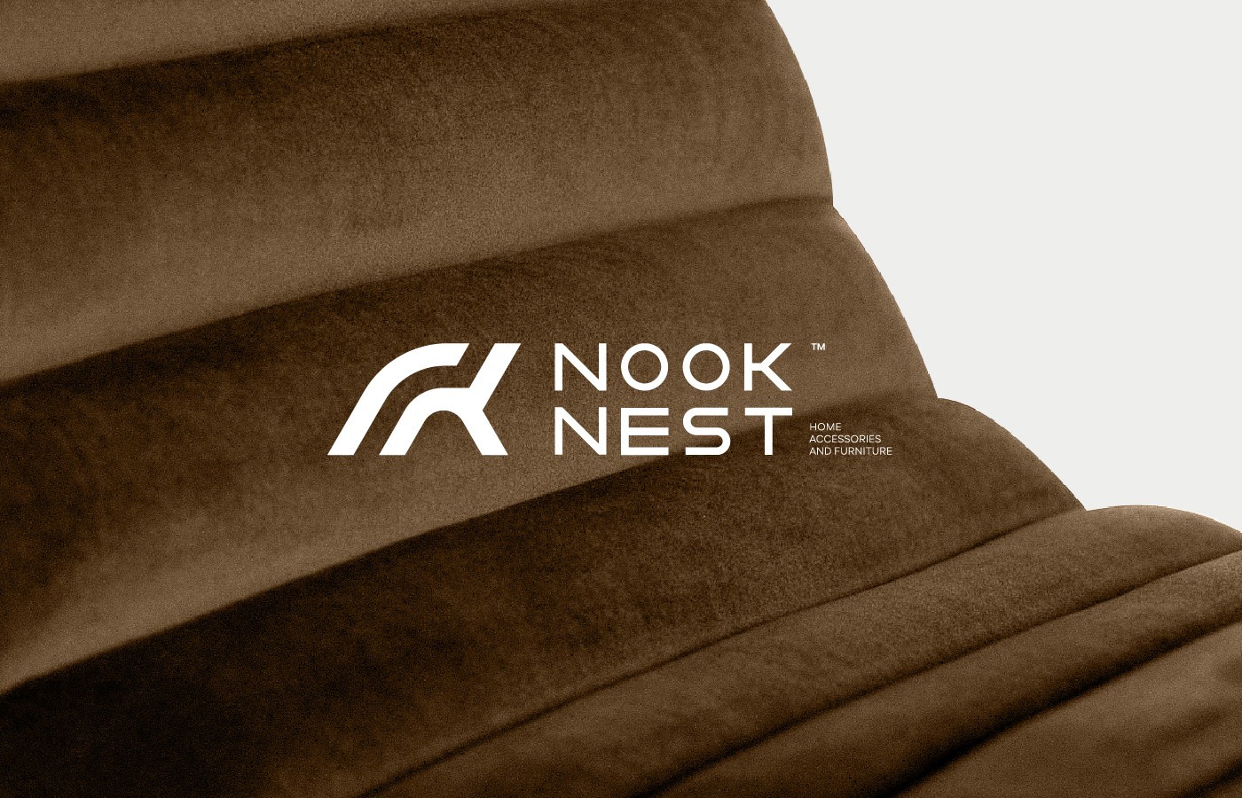
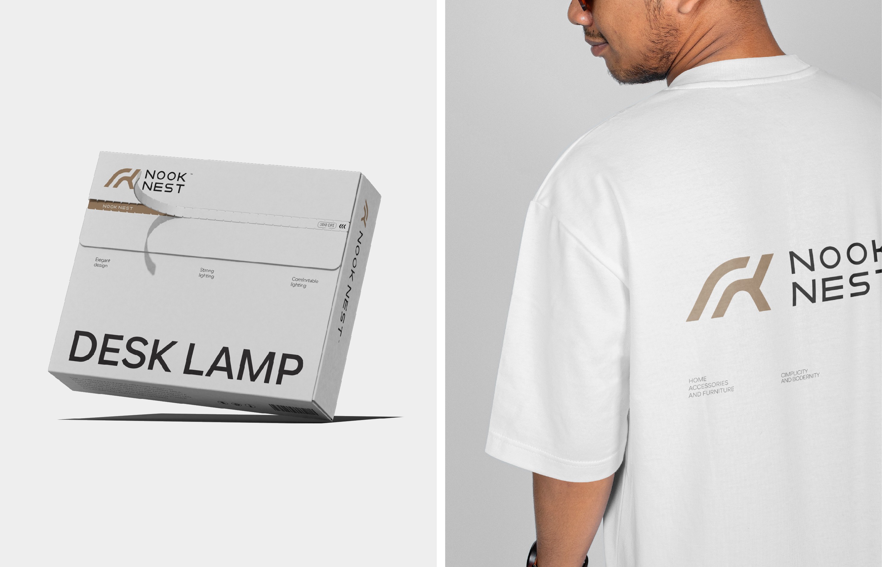
At the heart of “Nook Nest” is the logo, a thoughtfully crafted design that merges the iconic symbols of a chair and a table. These two elements are not just furniture; they are the cornerstones of comfort and life in any space. By blending them into a single, unified form, the logo speaks to the seamless integration of different aspects of the home. The choice of a thick shape further emphasizes the brand’s commitment to strength and sturdiness, reflecting the high standards of quality inherent in “Nook Nest” products.
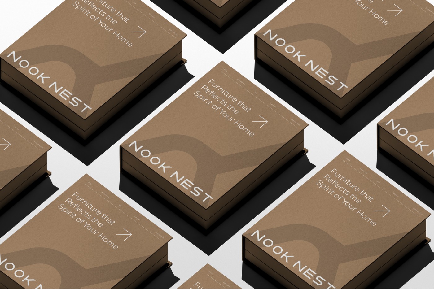
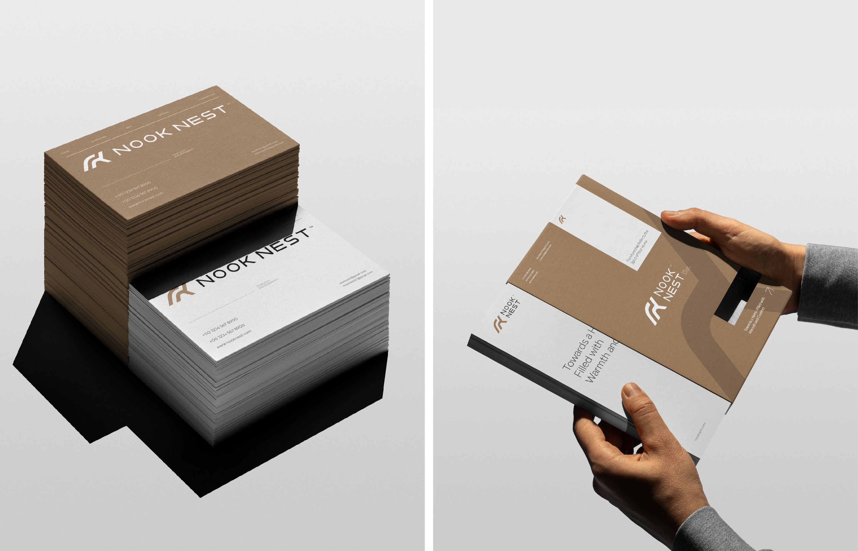
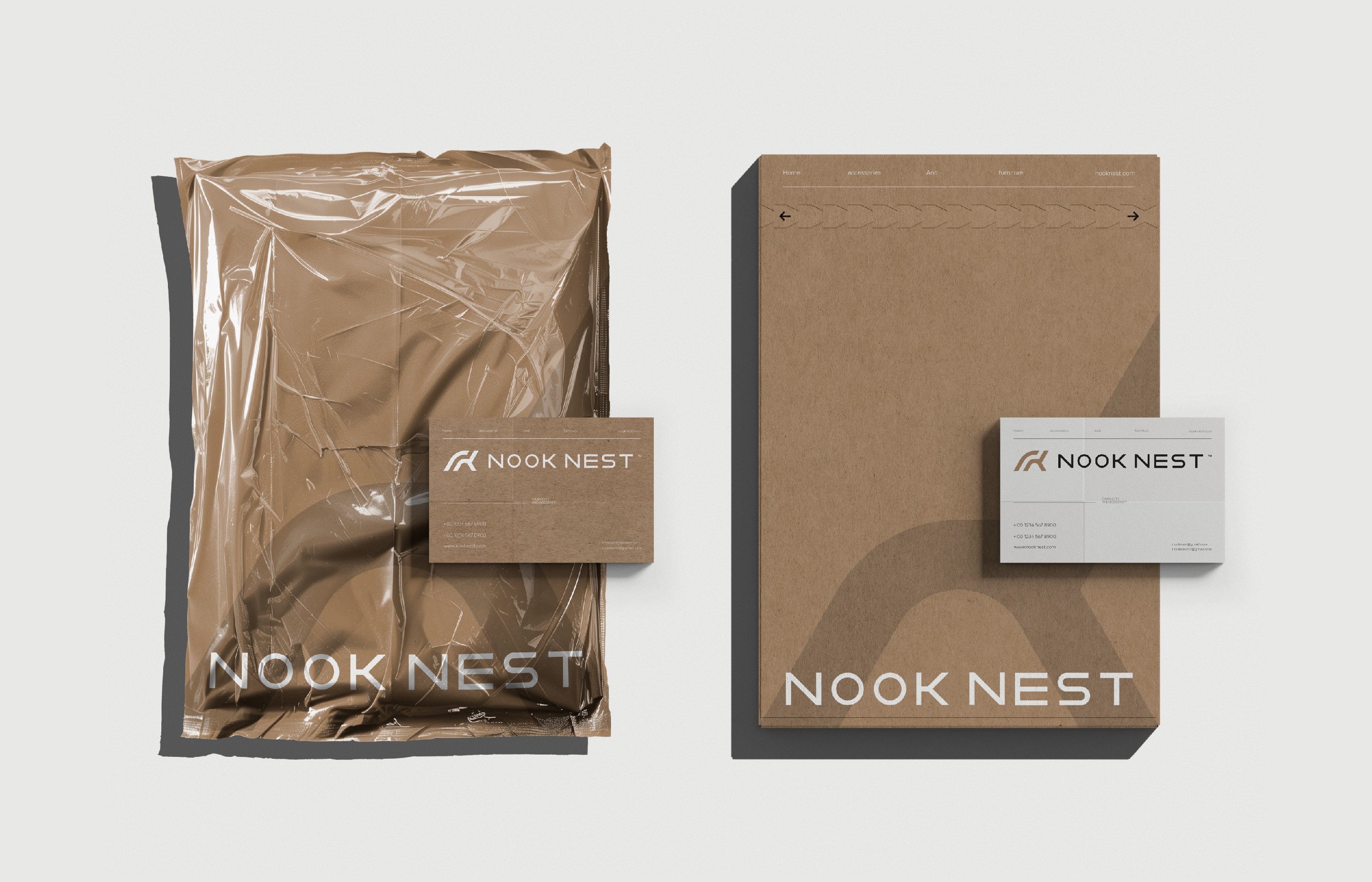
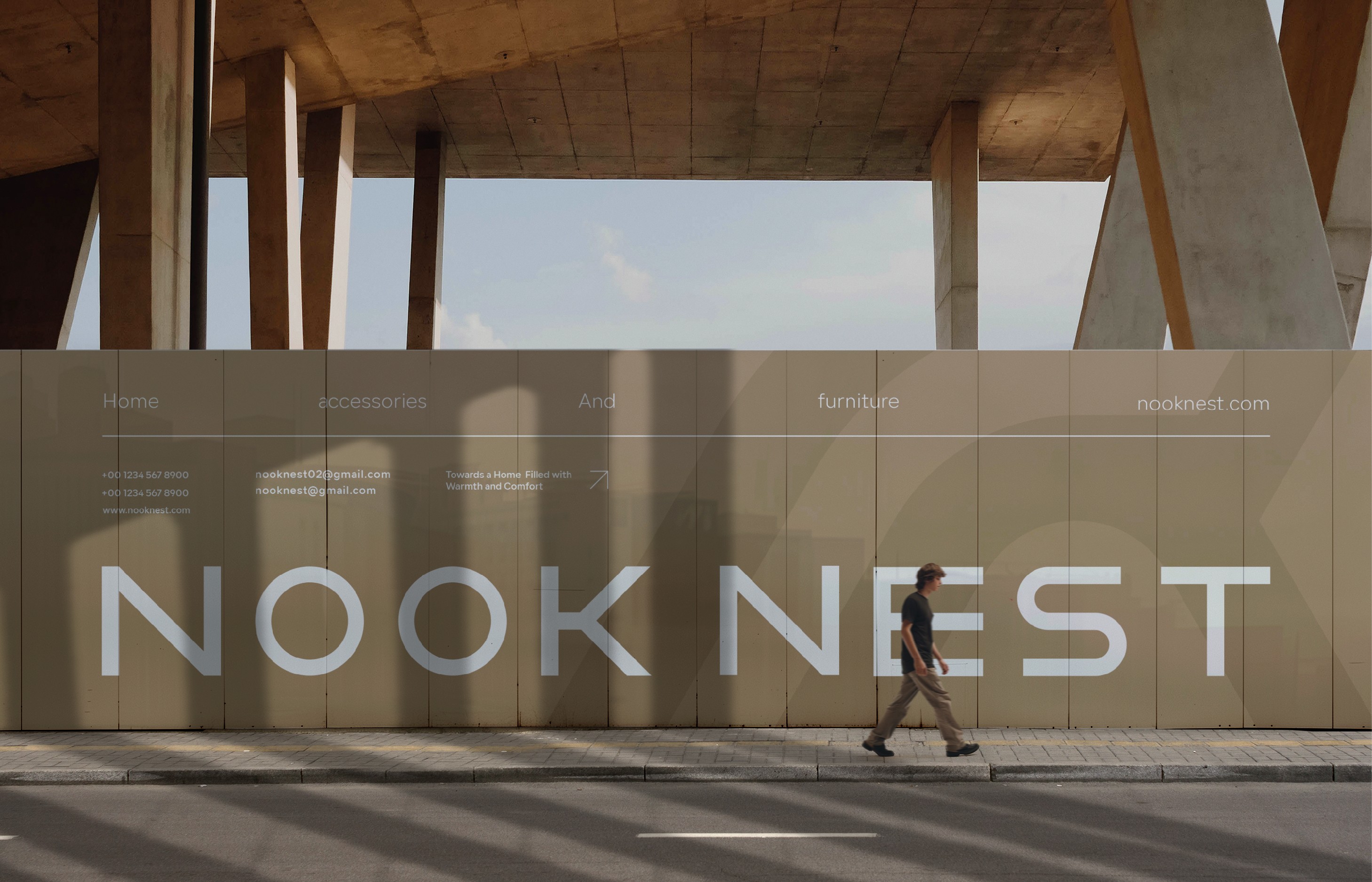
The brand’s color palette further enriches its identity, bringing depth and character to every design element. The dominant brown, inspired by the natural hues of wood, conveys a sense of warmth, authenticity, and a connection to nature. This choice symbolizes the brand’s dedication to using elements that bring a cozy, earthy feel to home interiors. In contrast, the light gray introduces a modern, sophisticated edge, balancing tradition with contemporary flair. The subtle touches of black serve to highlight details, adding an air of luxury and refinement that underscores the elegance of the brand.
“Nook Nest” extends beyond its logo and color scheme into a comprehensive visual identity that tells a story of the ideal home—one that harmoniously combines functional beauty with comfort. Each aspect of this identity, whether it be the logo, the typography, or the chosen color palette, has been meticulously selected to embody the brand’s core philosophy. It’s an invitation to customers to experience a unique blend of elegance and practicality, where every piece of furniture not only adds to the aesthetic value of a space but also contributes to its comfort and usability.
In essence, “Nook Nest” redefines what it means to create a living space, bringing together design and durability in a way that is both visually appealing and inherently functional. This brand aims to be a part of homes where every corner is thoughtfully designed, offering not just furniture, but a lifestyle that values quality, comfort, and timeless elegance.
CREDIT
- Agency/Creative: Omar Mukhtar
- Article Title: Nook Nest Visual Identity Harmonizes Strength, Elegance, and Functionality
- Organisation/Entity: Freelance
- Project Type: Identity
- Project Status: Published
- Agency/Creative Country: Libya
- Agency/Creative City: ghadames
- Market Region: Asia
- Project Deliverables: Brand Design, Brand Guidelines, Brand Identity, Brand Strategy, Branding
- Industry: Manufacturing
- Keywords: Logo, Identity, Branding, Brand Identity
-
Credits:
Branding Designer: Omar Mukhtar


