


An Australian staple for 70 years, Sorbent has held strong within the top 3 market leaders based off a great pricing strategy, quality product and some infamous communication campaigns.
Whilst undeniably funny and memorable, those comms campaigns were the only emotional linkage to the brand and easily forgotten.
Sorbent needed to pivot from a commodity product to a branded experience that reflected its Australian heritage, and a unique attitude and point of view that would resonate across all mediums, from packaging to communications.
In a category that is largely convenience based, we needed to find a solution that built both distinctiveness into the Sorbent identity to re-engage at shelf, but also a compelling reason to buy into the brand.
We had to set the foundation for a reinvigorated future, and a strong connection to the consumers who’ve loved Sorbent for decades but couldn’t tell us why.
With an undeniable connection to Australia, we saw the opportunity to convert this into an emotional resonance that distinguished Sorbent from its imported competitors.
Representing the egalitarian nature of the bathroom and the activities that occur in there was the foundation to a new tone of voice that was distinctly ‘Australian’ and distinctly Sorbent. One that was inclusive, endearing, and relatable.
A touch of larrikin and unashamedly honest, this tone shaped the visual identity and packaging design solution.
The beauty in the brand solution for Sorbent is in its interagency collaboration – working with Kantar (research) and Akkomplice (communications), we were able to unite in our efforts to challenge the Sorbent business to be brave in reclaiming its iconic cheeky brand image.
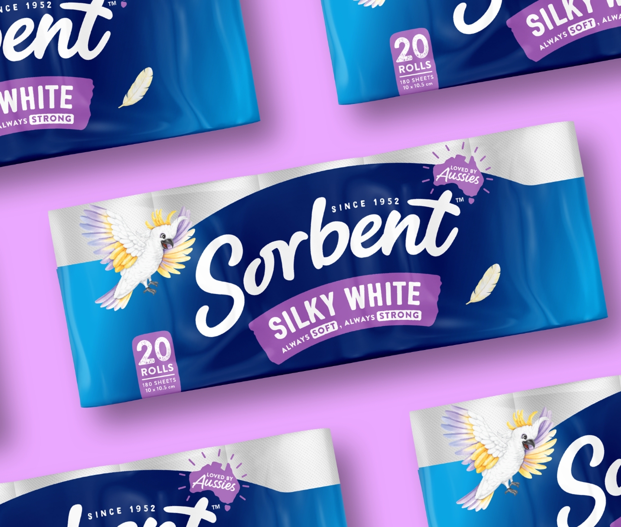
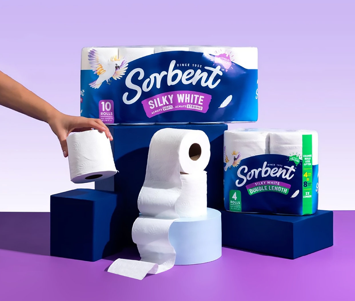
Edison was tasked with creating the brand and portfolio architecture strategy based on Sorbent’s new positioning, then developing distinctive brand assets in line with the brand strategy. Edison then implemented the new portfolio architecture and brand assets into a unique pack design that flowed across the whole Sorbent portfolio – from rolls to tissues.
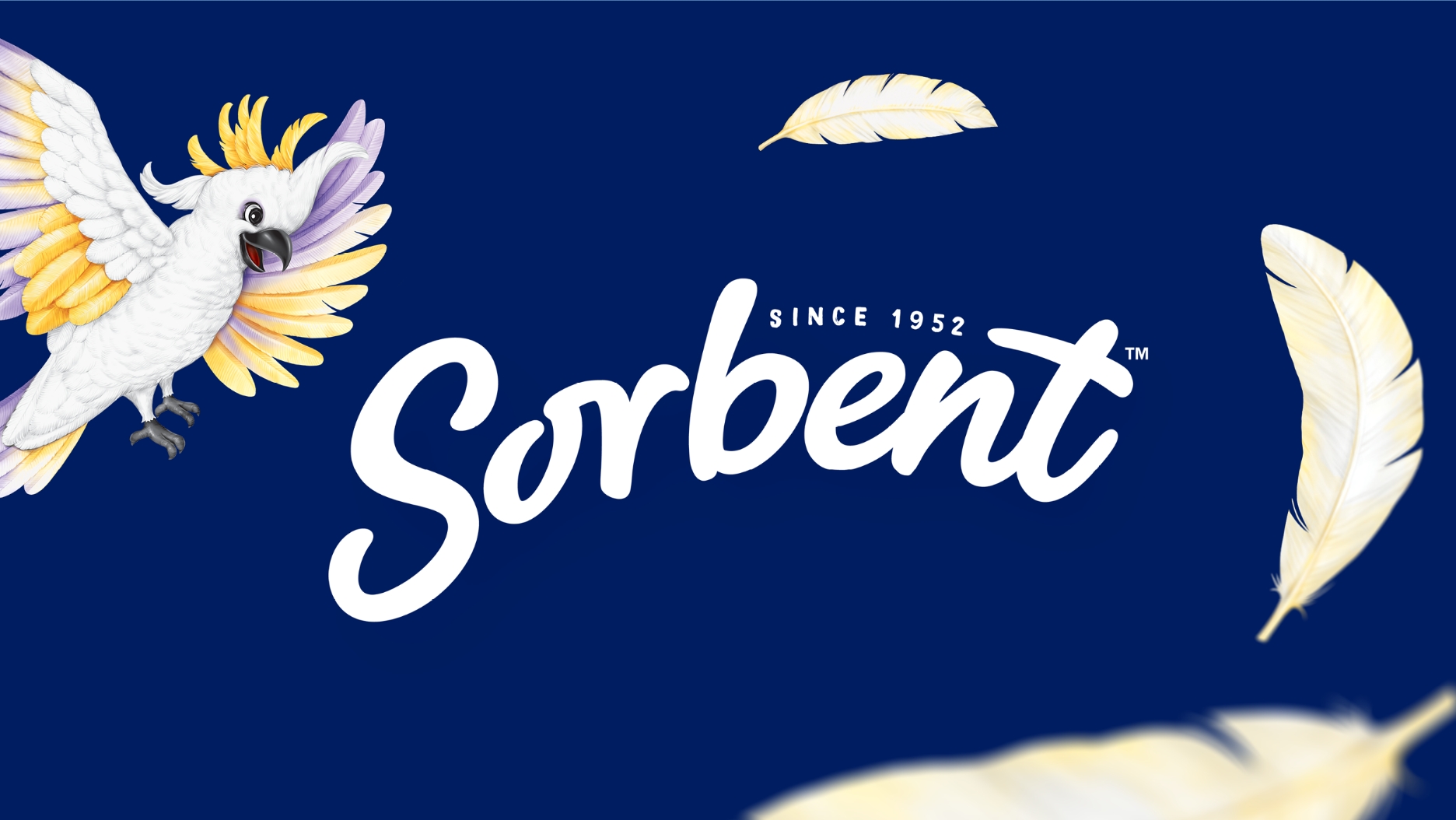
The new brand system celebrates Sorbent’s proud history in supporting Australians with the introduction of new character asset ‘Sunny’ the Cockatoo, a modernised brandmark and revitalised colour system.
CREDIT
- Agency/Creative: The Edison Agency
- Article Title: Sorbent, for All Australians From All Walks of Life, by the Edison Agency
- Organisation/Entity: Agency
- Project Type: Campaign
- Project Status: Published
- Agency/Creative Country: Australia
- Agency/Creative City: Melbourne
- Market Region: Oceania
- Project Deliverables: 2D Design, Art Direction, Brand Design, Brand Identity, Illustration, Packaging Design
- Industry: Retail
- Keywords: WBDS Agency Design Awards 2024/25 , Illustration, branding, packaging
-
Credits:
Executive Creative Director: Amber Bonney


