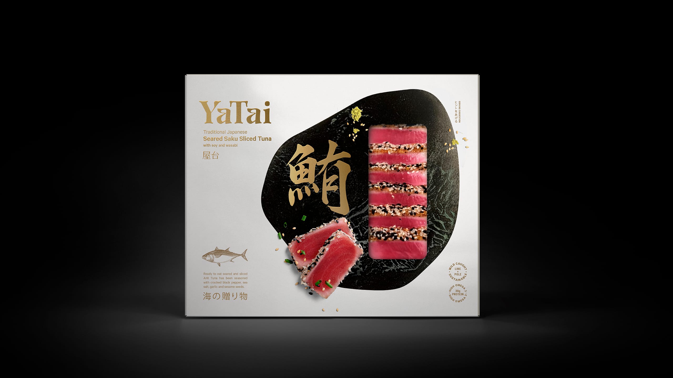
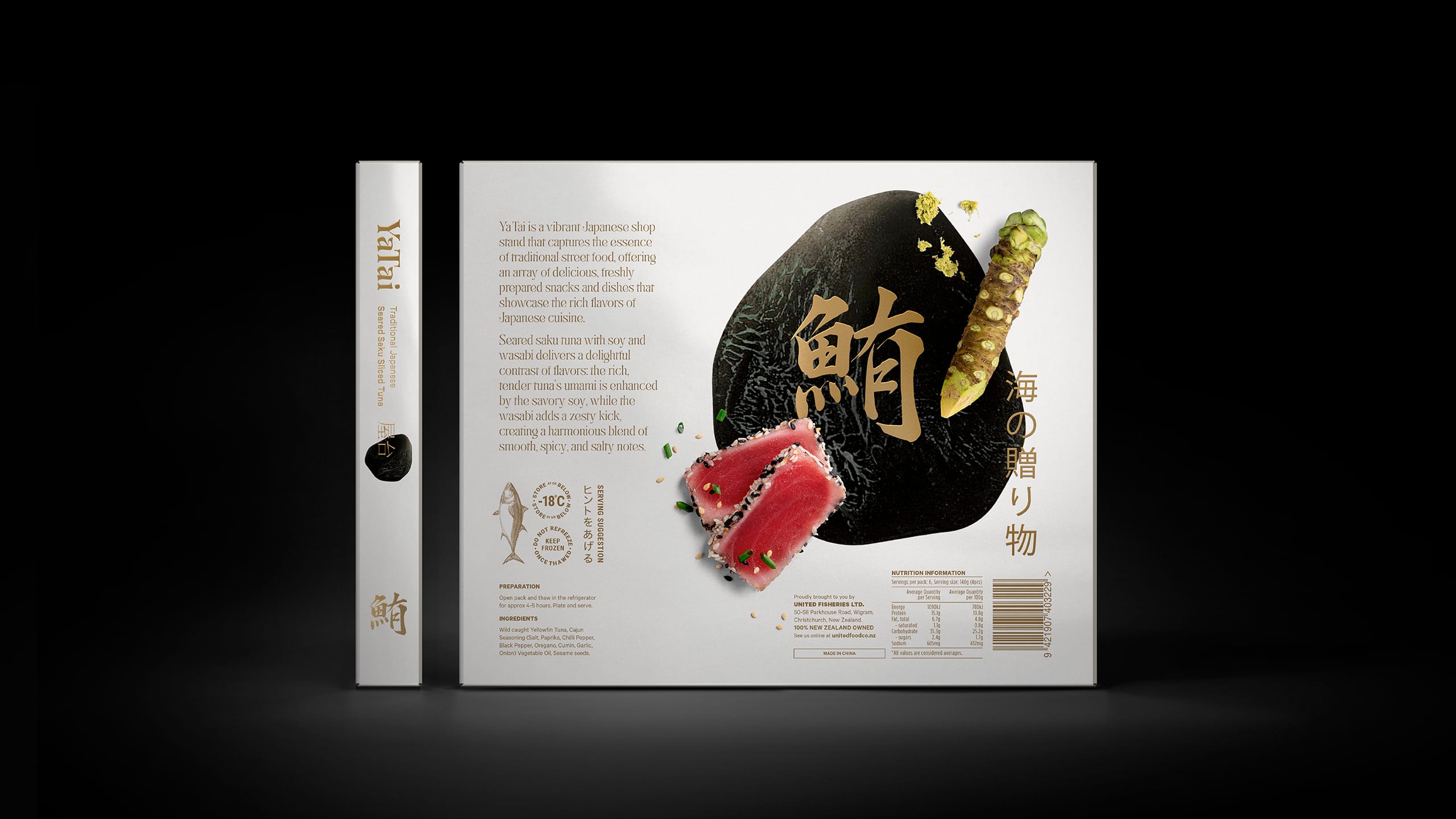
We are thrilled to unveil the innovative packaging design we’ve created for Ya Tai’s Saku Seared Sliced Tuna, developed exclusively for United Fisheries. Our team has meticulously crafted this packaging to not only highlight the premium quality of the product but also to capture the essence of Japanese culinary tradition.
The packaging for Ya Tai’s Saku Seared Sliced Tuna blends elegance with modernity. The design features a sophisticated and clean aesthetic that reflects the high standards of Japanese cuisine. With a focus on simplicity and refinement, the packaging showcases the freshness and premium quality of the seared sliced tuna, providing a visual cue to its exceptional taste and craftsmanship.
We have designed the packaging to be both practical and visually striking. It offers excellent protection for the delicate tuna while enhancing the overall consumer experience. The clear, informative labeling prominently displays key product information, making it easy for consumers to understand and appreciate the high quality of the tuna. This user-friendly approach ensures that the product is both accessible and appealing.
The vibrant yet subtle colour palette, along with the refined design elements, is intended to attract the attention of both discerning food lovers and those new to Japanese cuisine. The packaging is crafted to stand out on the shelf, drawing the eye with its sophisticated look and making a memorable impression.
Our goal with Ya Tai’s Saku Seared Sliced Tuna packaging is to provide a product that is as visually appealing as it is delicious. Every aspect of the design has been carefully considered to ensure that the consumer experience is both aesthetically pleasing and reflective of the high quality within. We are proud to offer a packaging solution that enhances the allure of this premium product, making it a standout choice for anyone seeking an exceptional Japanese culinary experience.


CREDIT
- Agency/Creative: Tried&True Design
- Article Title: Packaging Design for Ya Tai’s Saku Tuna by Tried&True Design
- Organisation/Entity: Agency
- Project Type: Packaging
- Project Status: Non Published
- Agency/Creative Country: New Zealand
- Agency/Creative City: Auckland
- Market Region: Oceania
- Project Deliverables: Brand Identity, Brand Naming, Design, Food Photography, Illustration, Logo Design, Packaging Design, Typography
- Format: Box
- Industry: Food/Beverage
- Keywords: Japanese, Design, Packaging, Tuna
-
Credits:
Creative Team: Tried&True Team


