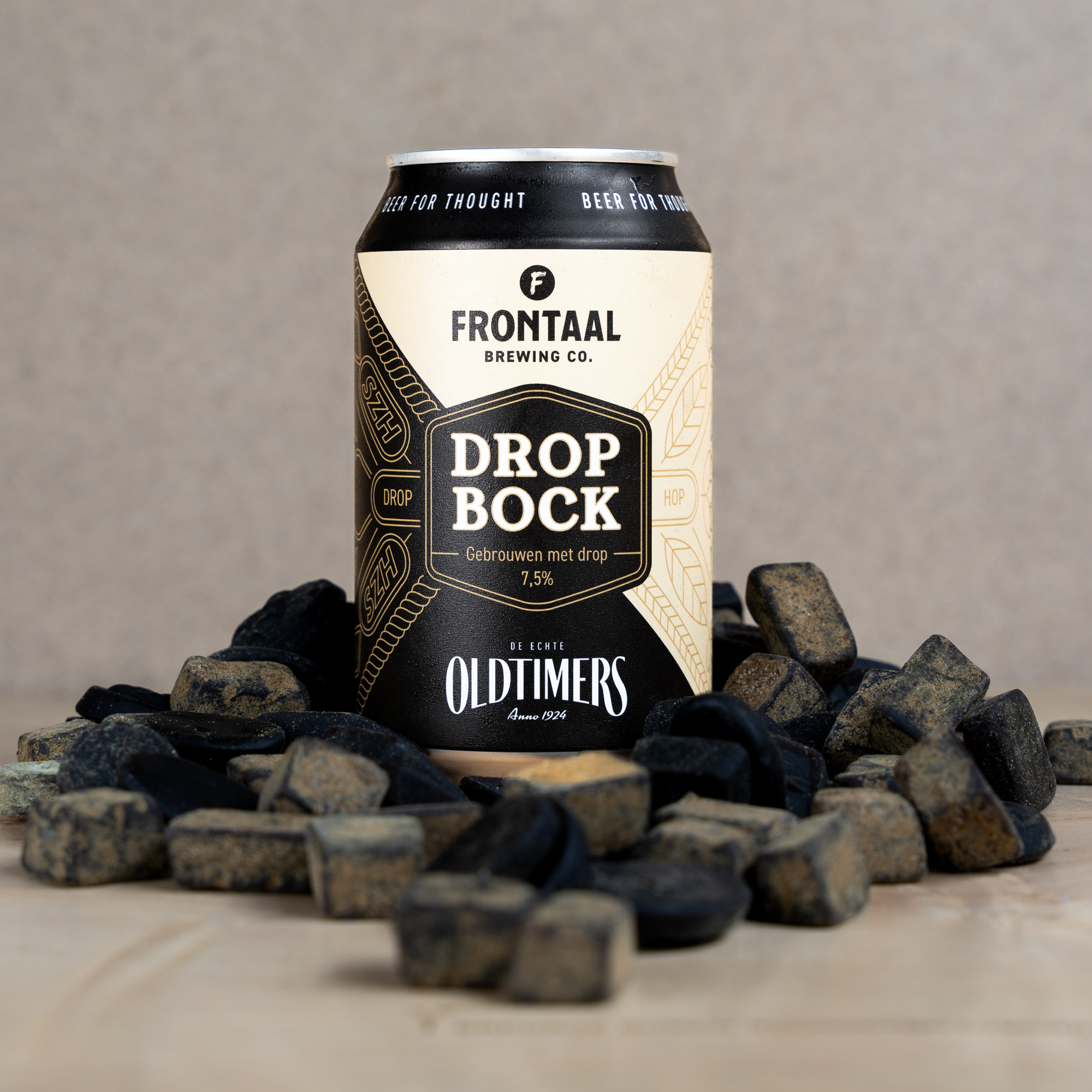
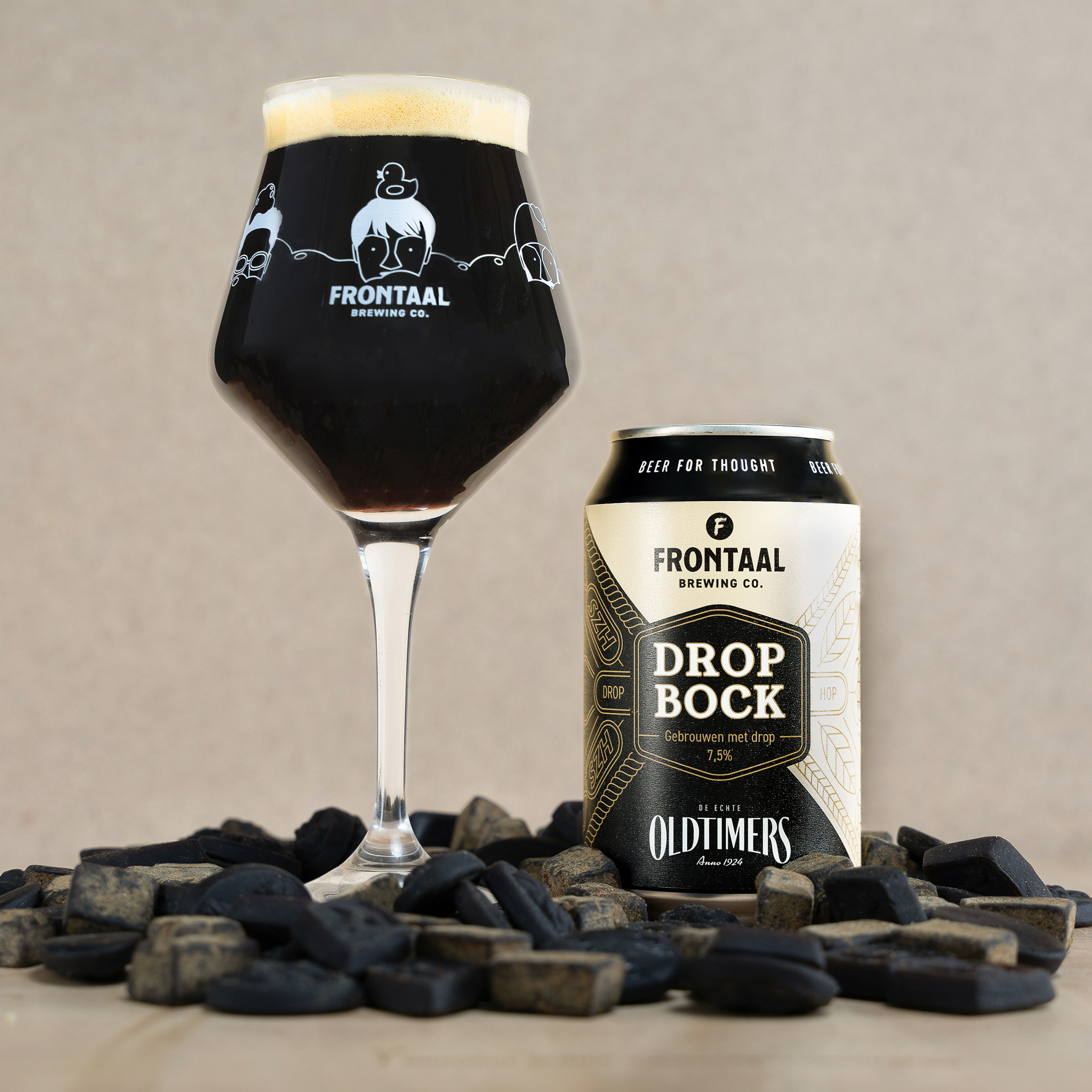
Oldtimers Licorice joined forces with Frontaal Brewing Company. Together they proudly present their new creation: Drop Bock, a unique bock (Stout) beer in which the rich flavors of licorice seamlessly merge with the idiosyncratic notes of malt and hops.
The collaboration between Frontaal and Oldtimers is a perfect illustration of what happens when passionate professionals meet each other. Oldtimers has been known for 100 years for their iconic liquorice, with distinct flavors and structures that go far beyond sweet and salty. In the preparations for their anniversary year, the licorice makers wondered what would happen if they used their knowledge to add that licorice character to other delicacies. Frontaal, known for its unique craft beers, saw a challenge in that question. The licorice makers and brewers have started experimenting and now know what happens when licorice ends up in the brewing kettle.
Drop Bock is a beer like you have never tasted before. Oldtimers and Frontaal have succeeded in interweaving licorice root and salt ammoniac – the characteristic ingredients of licorice – with the pleasant Magnum bitter hops and a selection of roasted, chocolate and caramel malts. During fermentation, the sweet malt notes gradually fade, allowing the powerful licorice flavors to emerge beautifully. The surprising mix results in a rich, sweet taste with a subtle bitterness and an aftertaste of licorice that lingers for a pleasantly long time. With an alcohol content of 7.5% and a warm, black color, Drop Bock is the ideal companion for autumn days.
Design
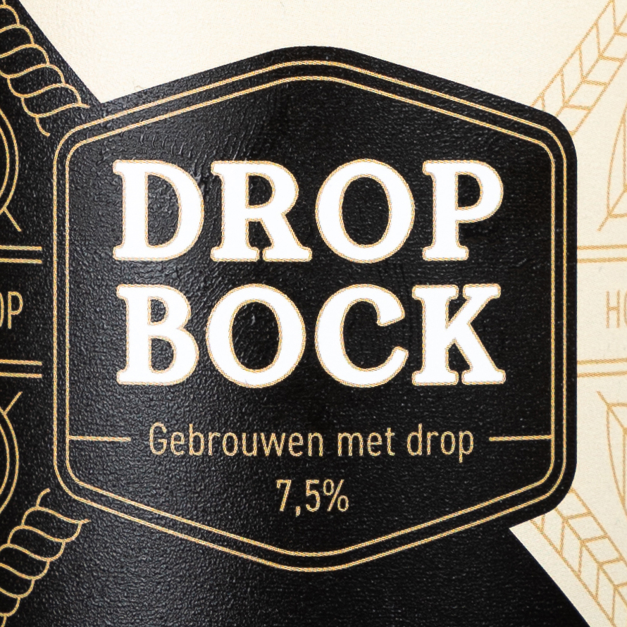
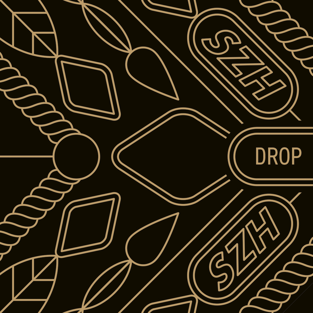
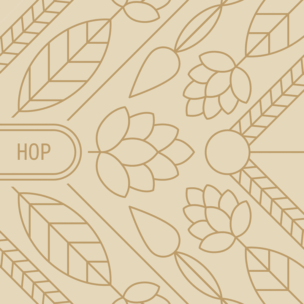
For the can design the two agencies of the two companies, Van Heertum Design (VHD) and Thunder and Bold, also joined forces and came up with a design that speaks both product languages. A clear separation of the two products is visualized on the can. A dark part symbolizing the licorice part, with illustrations of the product itself, and a light beer side with illustrations of hop. Coming together in the bold black logo, which has the same color as the beer itself. Next to this the can has a rough lacquer structure as stout is perceived as a strong beer.
CREDIT
- Agency/Creative: Van Heertum Design VHD
- Article Title: Oltimers x Frontaal Bok Beer Design
- Organisation/Entity: Agency
- Project Type: Packaging
- Project Status: Published
- Agency/Creative Country: Netherlands
- Agency/Creative City: Tilburg
- Market Region: Europe
- Project Deliverables: Illustration, Packaging Design
- Format: Can
- Industry: Food/Beverage
- Keywords: WBDS Agency Design Awards 2024/25 , beer, stout, craft beer, illustration, packaging design, can design, oldtimers, frontaal
-
Credits:
Strategy Director: Rob van Heertum


