The “Magic of Glyphs” is a personal project I’ve embarked on to create artistic and visually engaging compositions using the counterforms of Latin serif letters. Through this project, I am challenging myself to explore the expressive potential of individual letters and how they can evoke different emotions and ideas by experimenting with their arrangement and composition. My primary aim is to transform simple letterforms into a visual language that conveys depth and meaning beyond their literal use.
For this project, I chose one of my favorite fonts, Playfair Display, known for its elegant and distinctive serif characters. The font’s unique details provide the perfect foundation for experimenting with letterforms while maintaining a sense of sophistication and class.
So far, I’ve created seven distinct pages, each utilizing Adobe InDesign for layout and Adobe Firefly for additional visual effects. Each page focuses on a unique letter composition, playing with the relationships between the forms, counterforms, and the spaces they create.
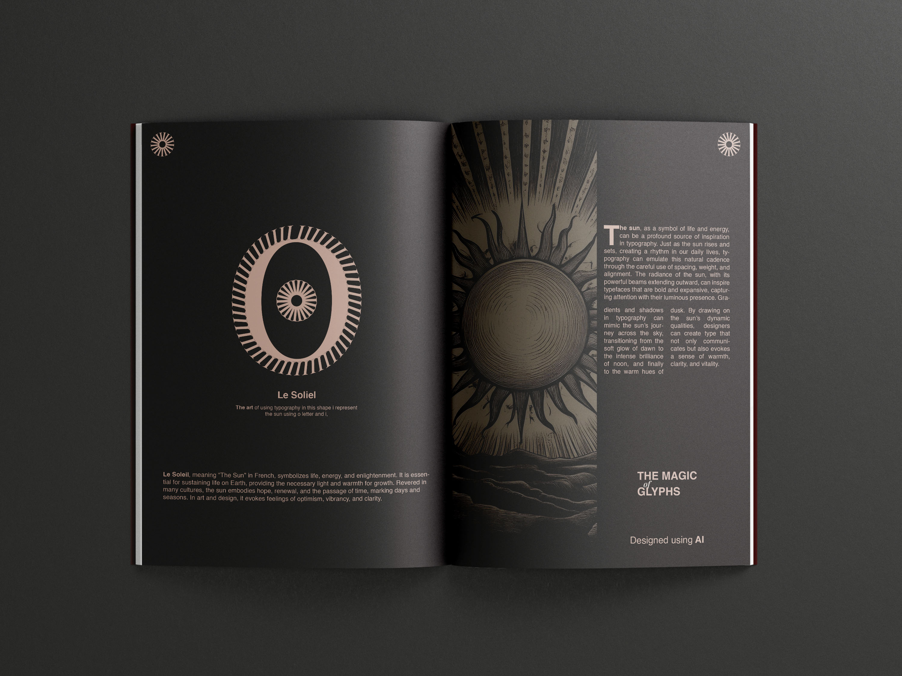
Le Soleil (The Sun): The composition uses uppercase ‘I’ and ‘O’, which are arranged to evoke the feel of a sun. The circular ‘O’ represents the sun’s shape, while the vertical ‘I’ complements the idea of radiance and strength. The accompanying image was crafted with Adobe Firefly, enhancing the page’s bright and radiant theme.
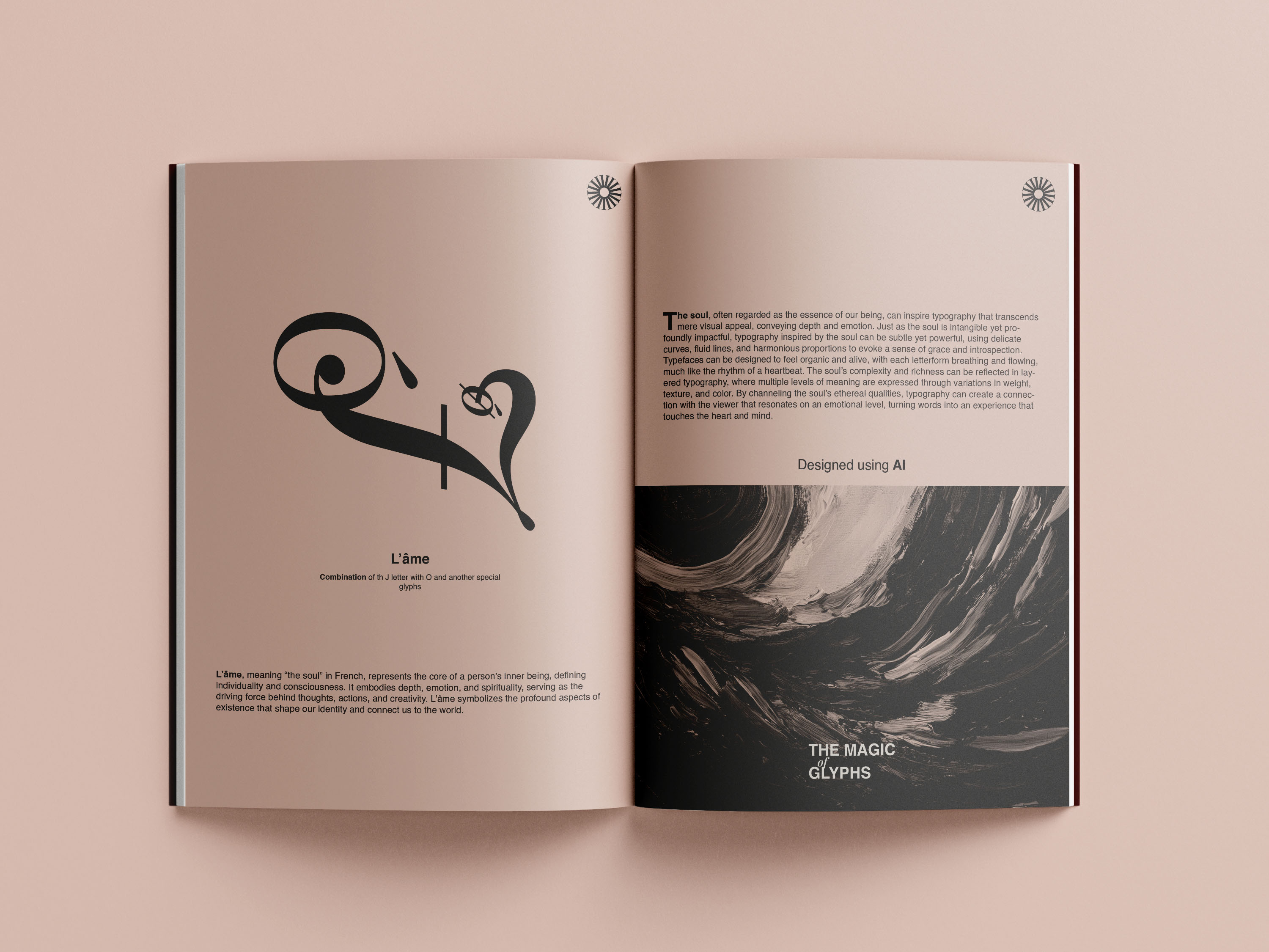
L’Âme (The Soul): Here, I composed a layout using italicized uppercase ‘J’, ‘Ó’, and ‘Ø’, aiming to convey the complexity and depth of the soul. The diacritical marks add an additional layer of nuance to the visual, suggesting emotional or spiritual depth.
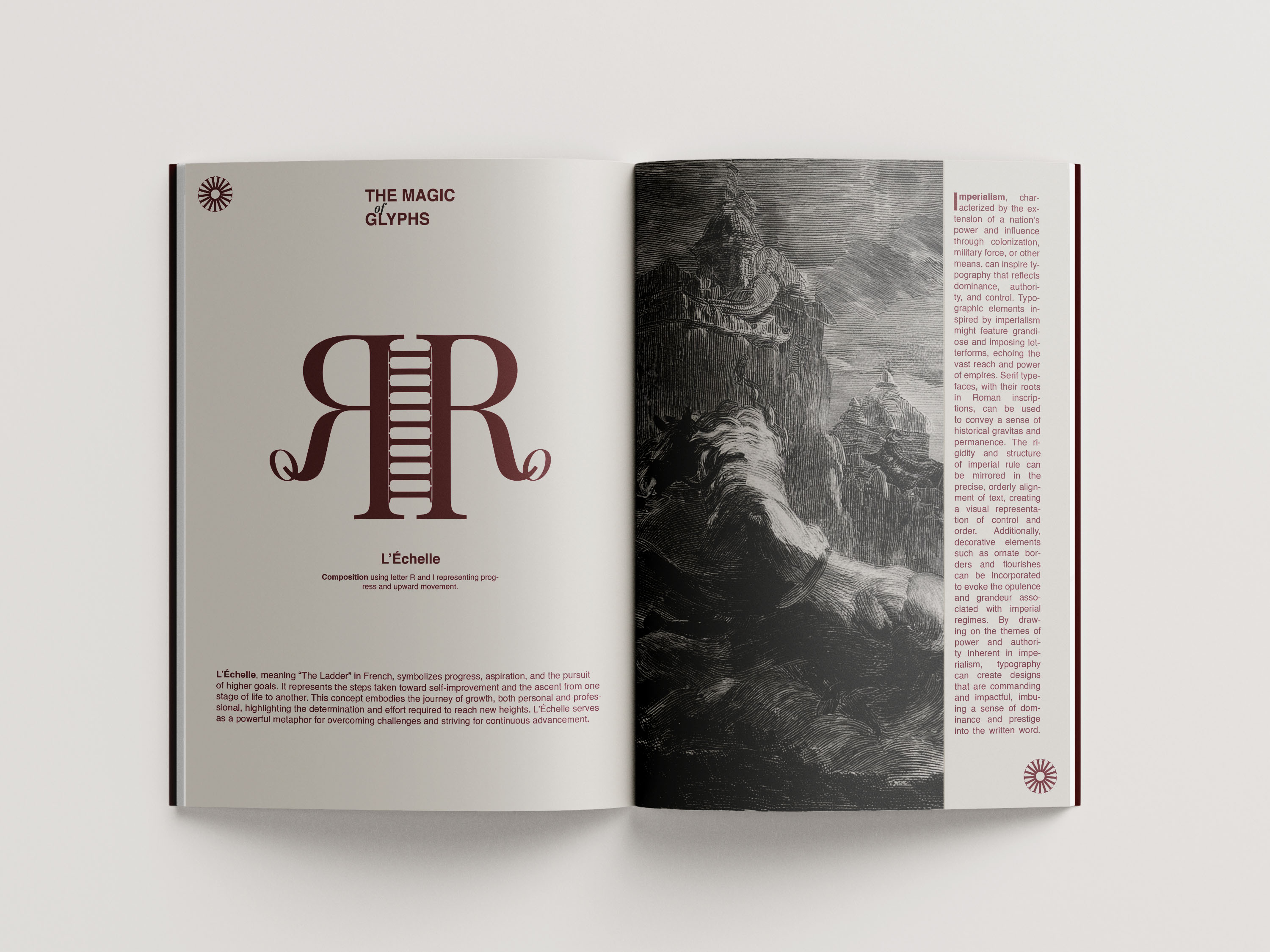
L’Échelle (The Ladder): In this page, uppercase ‘R’, ‘I’, and a lowercase ‘o’ are combined. The interplay between the vertical and circular forms gives the impression of a ladder-like structure, symbolizing growth or ascension.
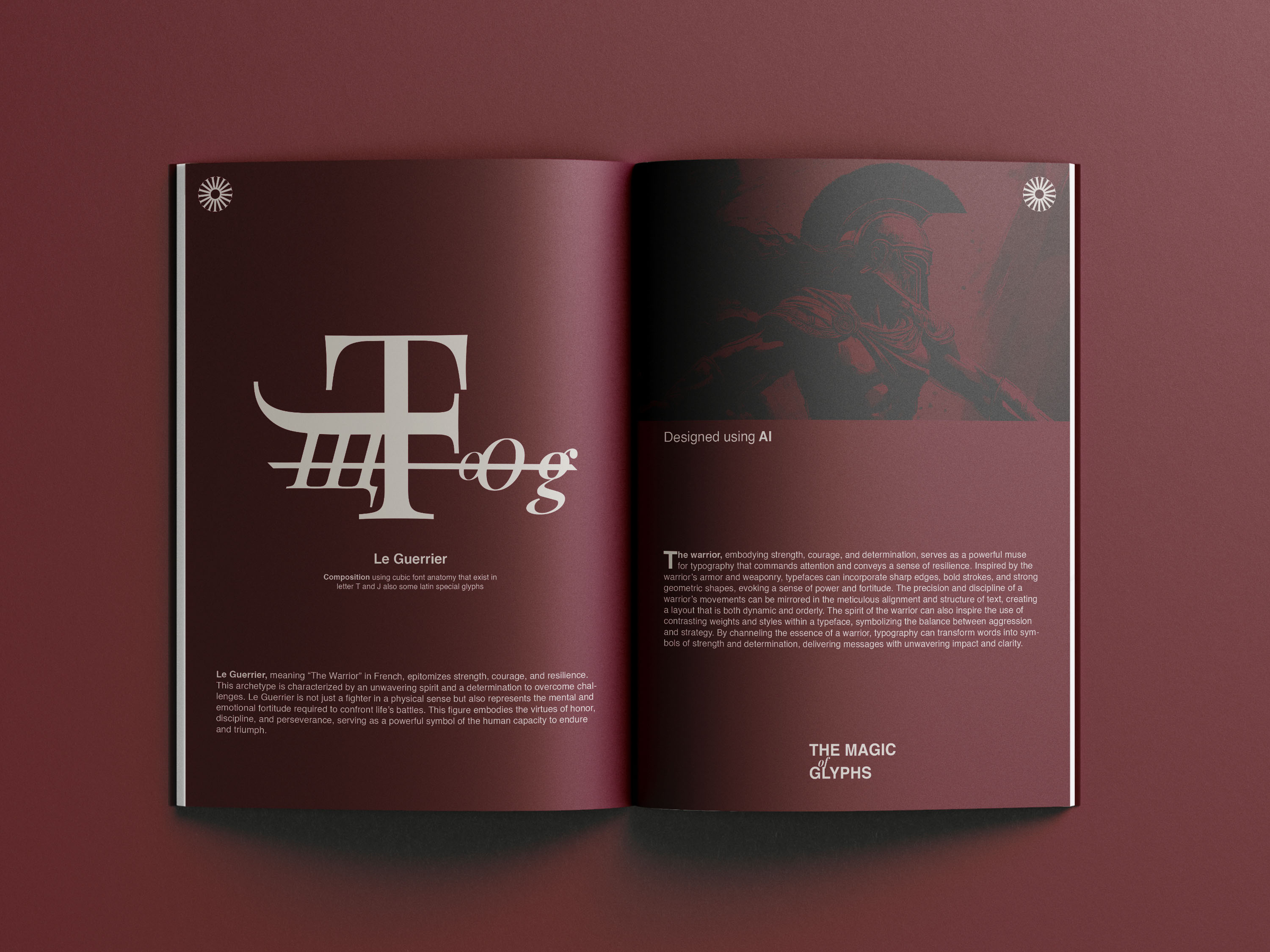
Le Guerrier (The Warrior): For this composition, I employed the characters ‘T’, ‘j’, ‘o’, ‘g’, and the Cyrillic ‘щ’. The mix of angular and curved forms represents the strength and agility of a warrior, embodying both power and grace.
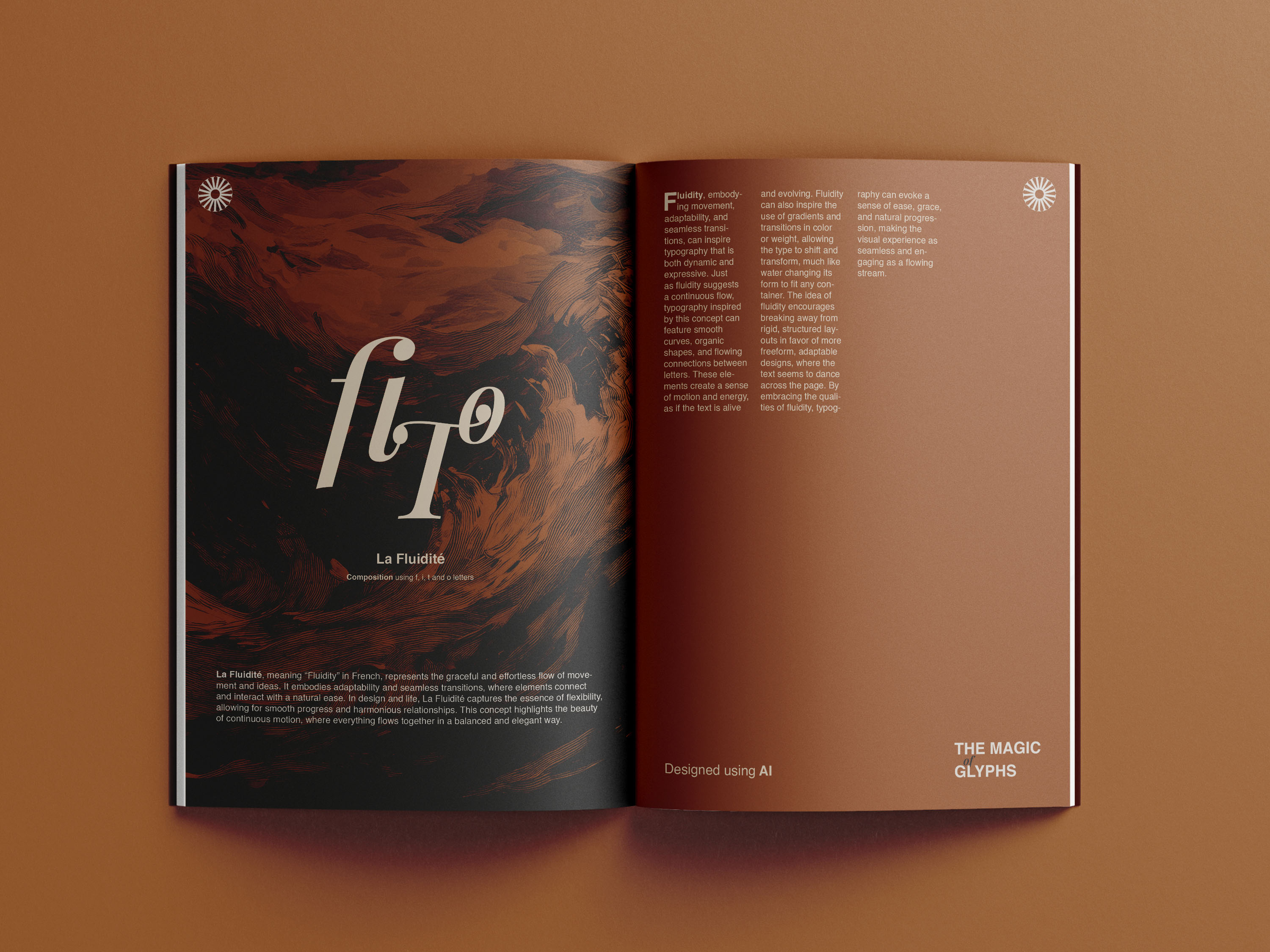
La Fluidité (Fluidity): This page uses italic ‘fi’, ‘T’, and ‘O’, where the slant of the italics and the rounded ‘O’ are meant to evoke a sense of movement and flow, suggesting fluidity and motion.
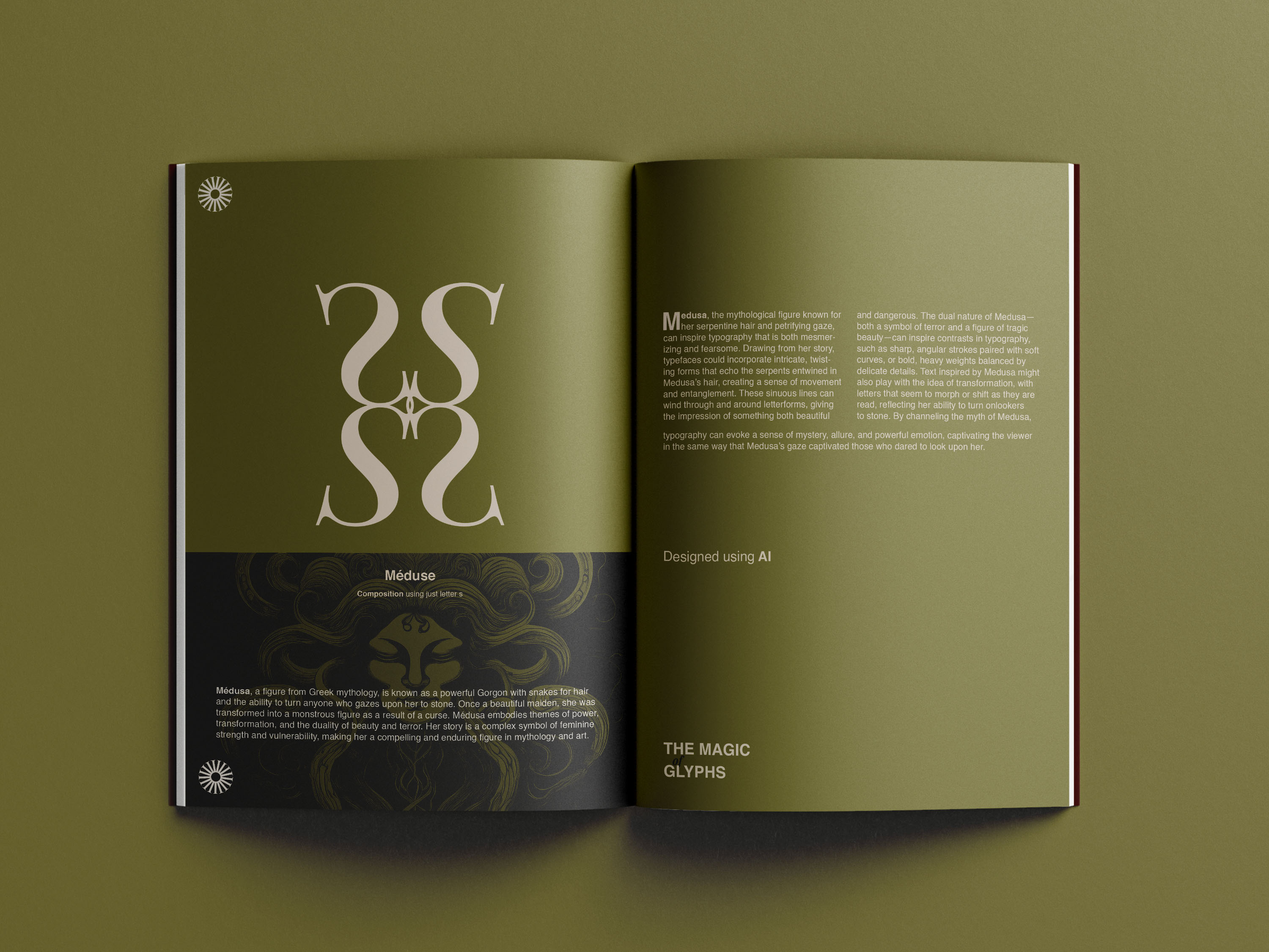
Méduse (Medusa): The uppercase ‘S’ is repeated four times to form a swirling, serpentine pattern. This represents the mythical figure Medusa, with her snake-like hair, and the overall design is intended to feel dynamic and hypnotic.
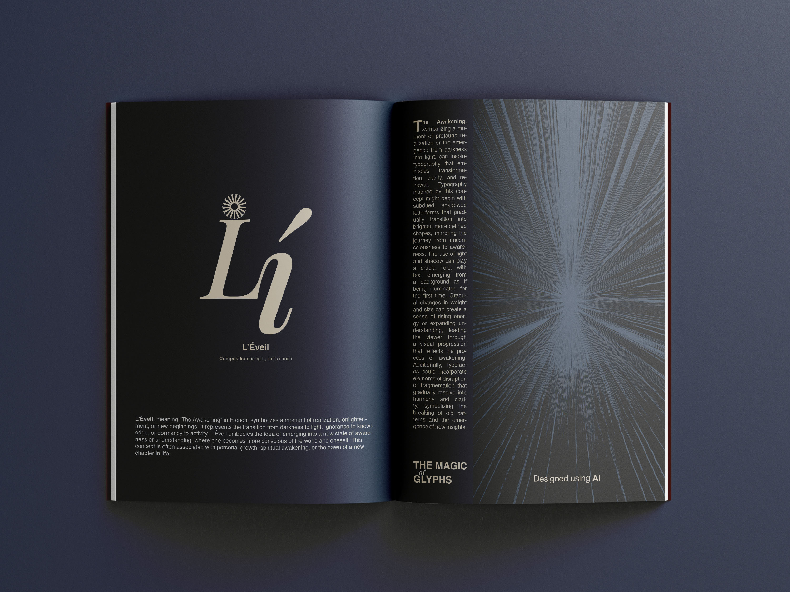
L’Éveil (The Awakening): For the final page, I combined ‘L’, ‘I’, and italicized ‘ì’ to represent awakening or enlightenment. The sharp, clean lines and slight tilt of the italic ‘ì’ suggest a moment of clarity or the dawning of a new understanding.
Each page reflects a different exploration of form, composition, and meaning, while challenging the viewer to look at letterforms as more than just symbols for language, but as expressive tools in their own right.
CREDIT
- Agency/Creative: Mahmoud Qenawy
- Article Title: The Intersection of Typography and Art: Inside the ‘Magic of Glyphs’ Project
- Organisation/Entity: Student
- Project Type: Typography
- Project Status: Non Published
- Agency/Creative Country: Egypt
- Agency/Creative City: Mahmoud Qenawy
- Market Region: Middle East, Global
- Project Deliverables: Art Direction, Editorial Design, Typography
- Industry: Information
- Keywords: Typography, Artistic , Editorial Design, Graphic Design
-
Credits:
Designer: Mahmoud Mohamed Qenawy


