


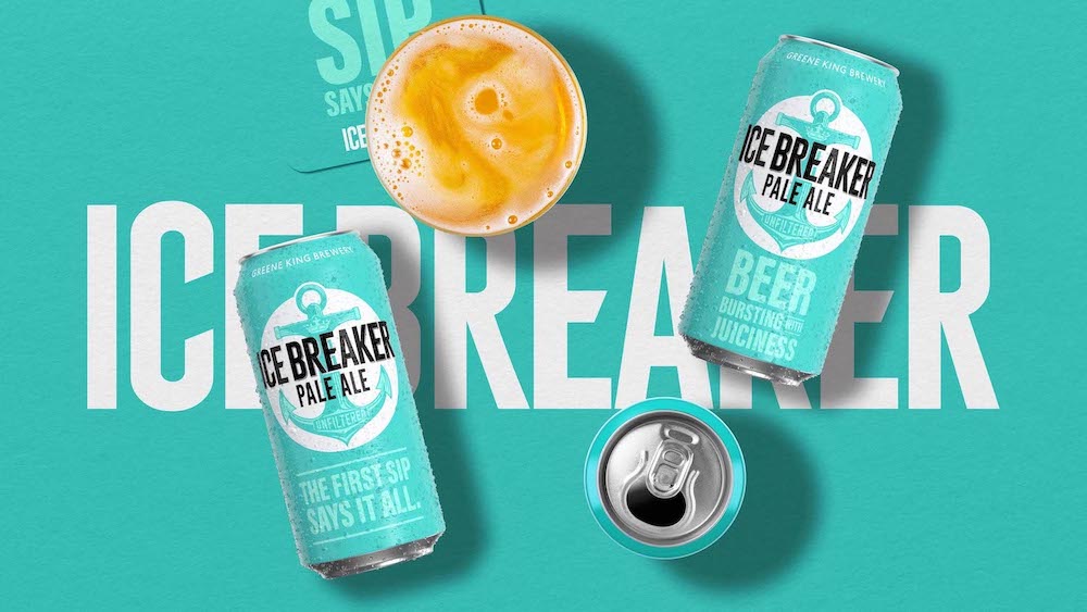
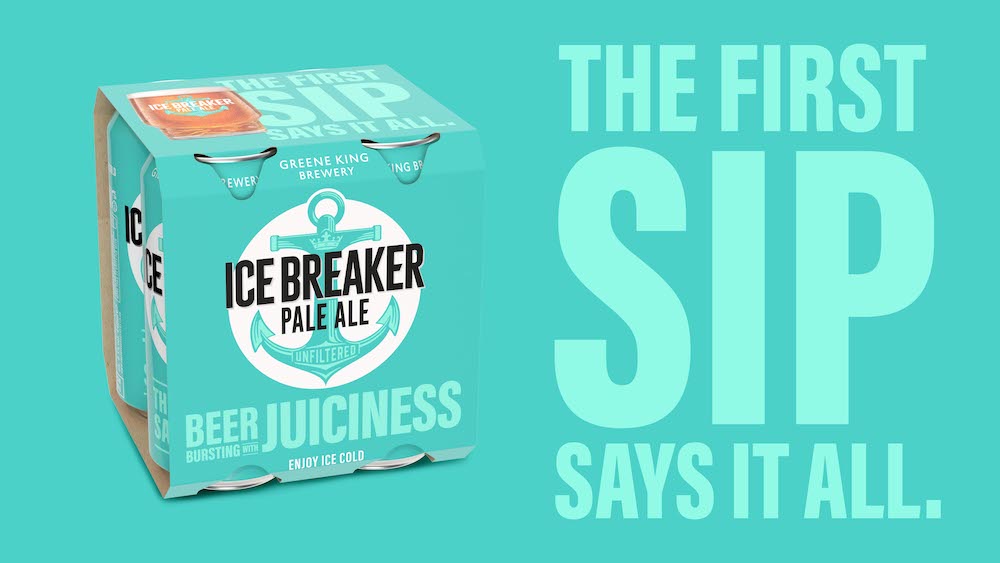
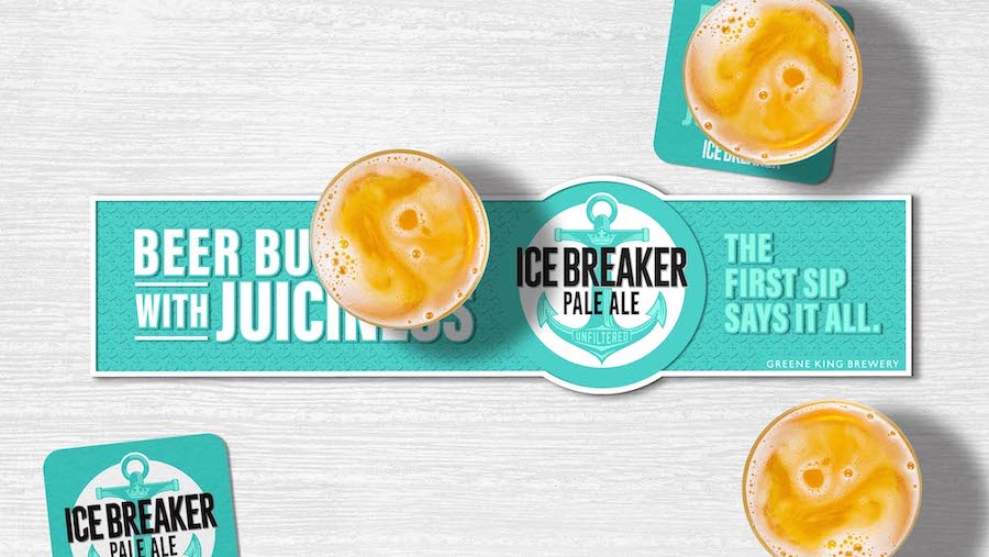
Originally just a seasonal, Ice Breaker’s popularity made Greene King introduce it as a permanent member of their beer range, launching into all pubs and retail. The original design lacked craftsmanship so needed an uplift and the client wanted to find & define their brand personality more clearly. We were curious to how this beer became so popular, so we had a workshop with the full marketing, sales and brewing teams to dig deeper. It became clear that this beer was a rebel in the pack, an unconventional brew for Greene King, and its maverick recipe had created a delicious beer – all the easy-drinking ice cold refreshment of a lager with the burst of juicy flavour expected from a modern pale ale.
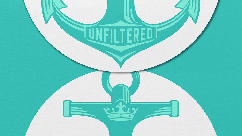
The team were keen not to break memory structures of the loyal fans who had championed this beer, so we had to be considerate in our enhancements. The current logo marque needed the craftsmanship reflected in the beer. We commissioned an illustrator to create us a bespoke illustration and a lettering artist to craft the logotype. We needed to better communicate the brand’s personality & the brilliance of the brew, so we researched options until we found the perfect punchy messaging to best reflect its rebellious nature – subvert the craft category language by saying it how it is, no nonsense, no brewing jargon, just ‘what it says on the tin.’
The result shows that precise enhancements to brand assets and TOV can keep memory structures of loyalists while doing a huge uplift to the brand world. Ice Breaker knows clearly who it is now, and can make a bold statement wherever it goes.
CREDIT
- Agency/Creative: DesignHawk
- Article Title: DesignHawk – Crafting and Communicating the Unconventional for Ice Breaker Beer
- Organisation/Entity: Agency
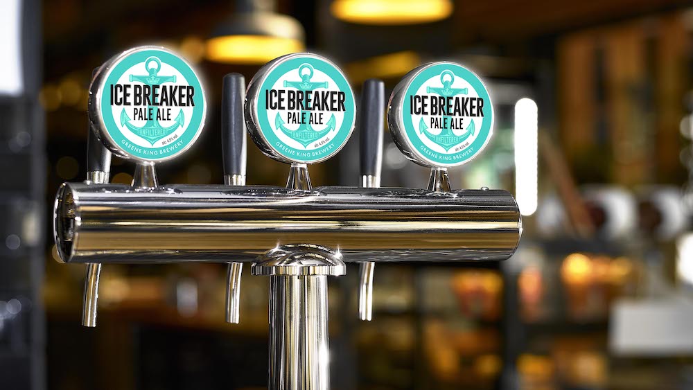
- Project Type: Packaging
- Project Status: Published
- Agency/Creative Country: United Kingdom
- Agency/Creative City: London
- Market Region: Europe
- Project Deliverables: Brand Design, Brand Identity, Brand Redesign, Brand World, Packaging Design
- Format: Bottle, Can, Keg, Sleeve
- Industry: Food/Beverage
- Keywords: Brand Design, Packaging Design, Strategy
-
Credits:
Creative Director: Chris Mettrick
Illustration: Chris Mitchell
Client Services & Strategy: Heather Black
Strategy: Brett Goldhawk


