Building Strong Foundations for a Modern Industry
The Cofer project represents more than just a visual transformation; it is a testament to the evolution of an industry. In a market where many competitors blend into a sea of similarity, Cofer stands out as a beacon of innovation and leadership in the iron and steel distribution sector. The project’s goal was to craft a brand identity that could encapsulate Cofer’s mission: to modernize and elevate the perception of working with steel—a traditionally tough, dirty, and labor-intensive field—into a sleek, organized, and technology-driven enterprise fit for today’s entrepreneurs and workers.
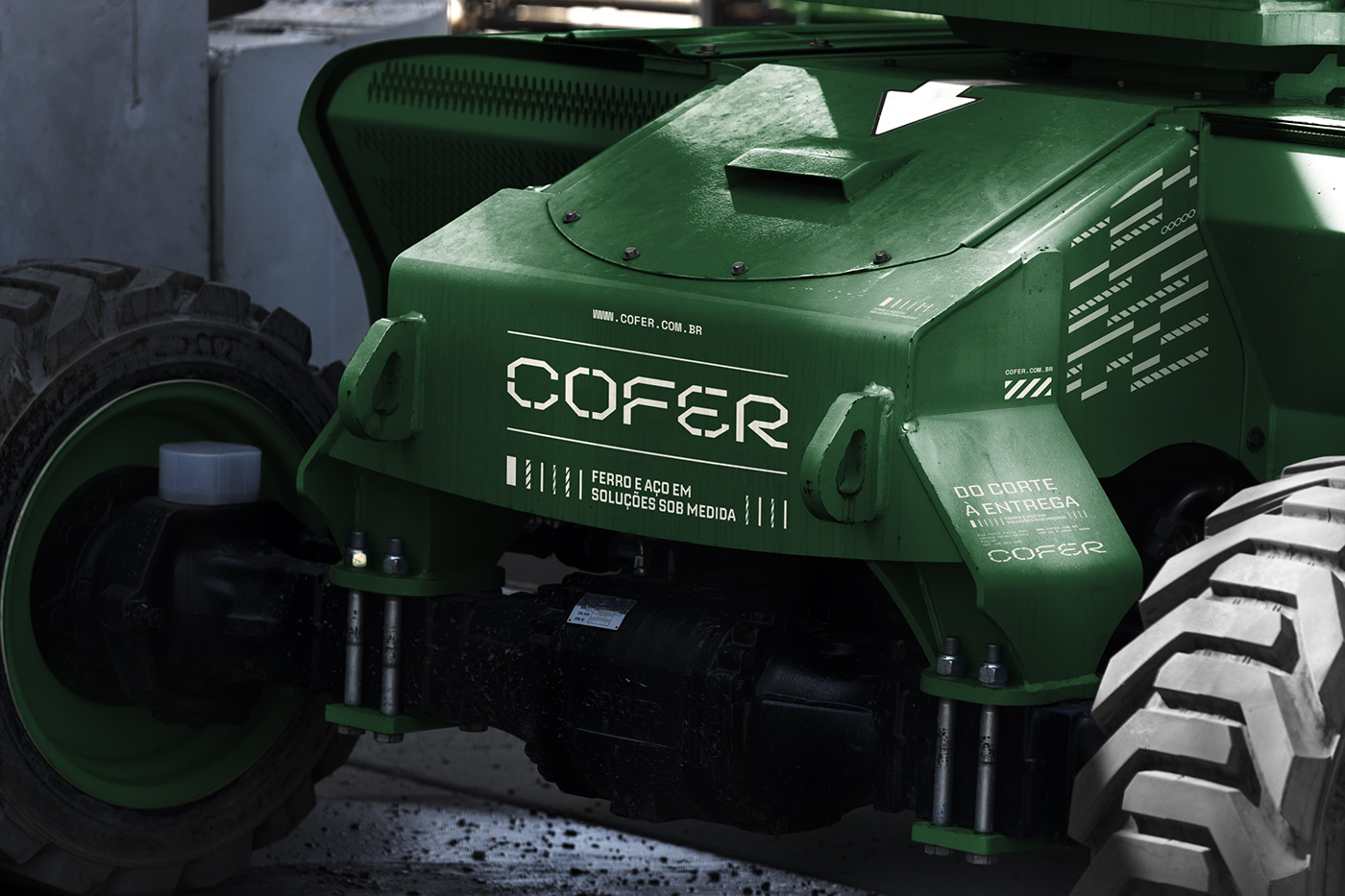
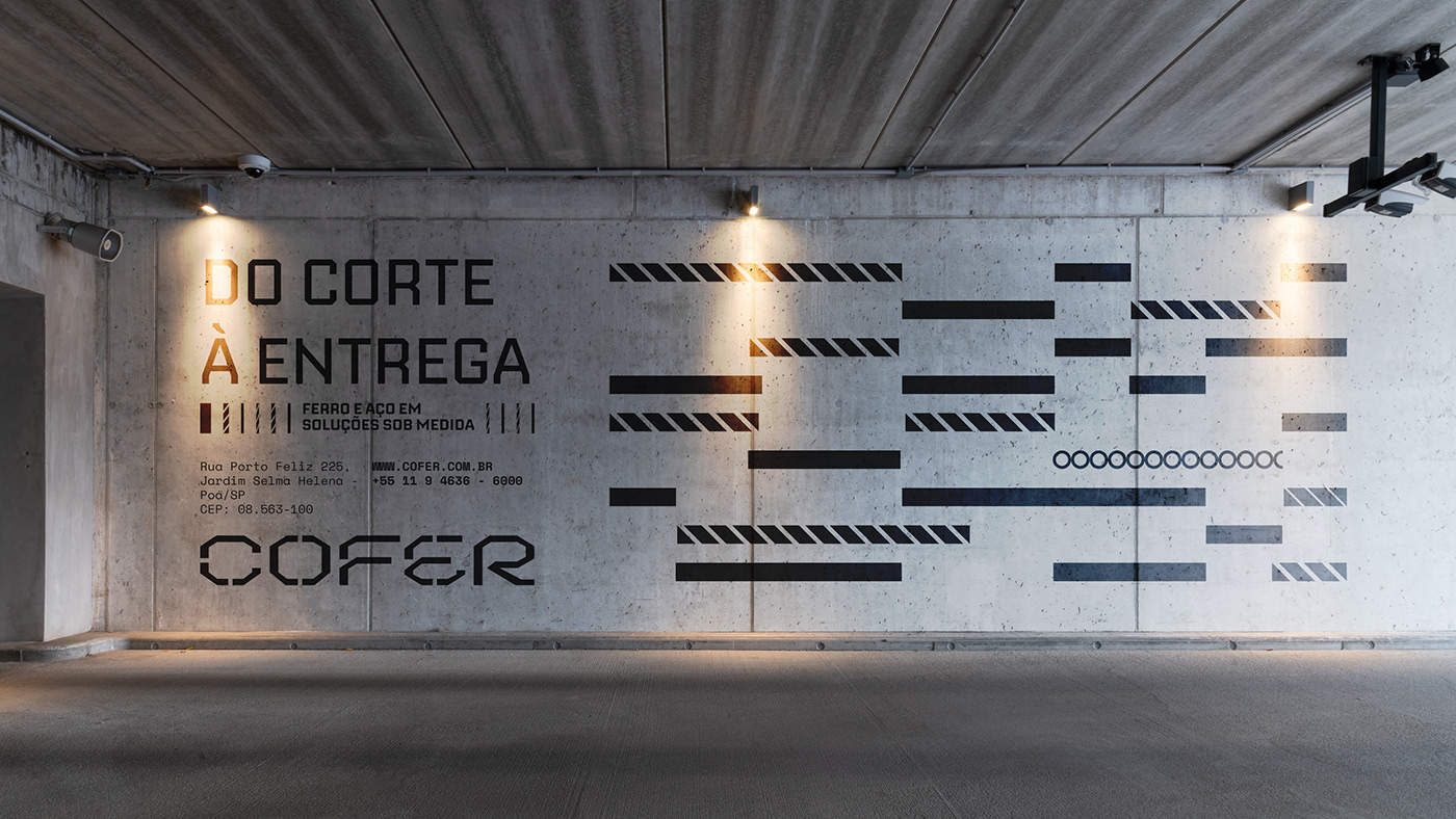
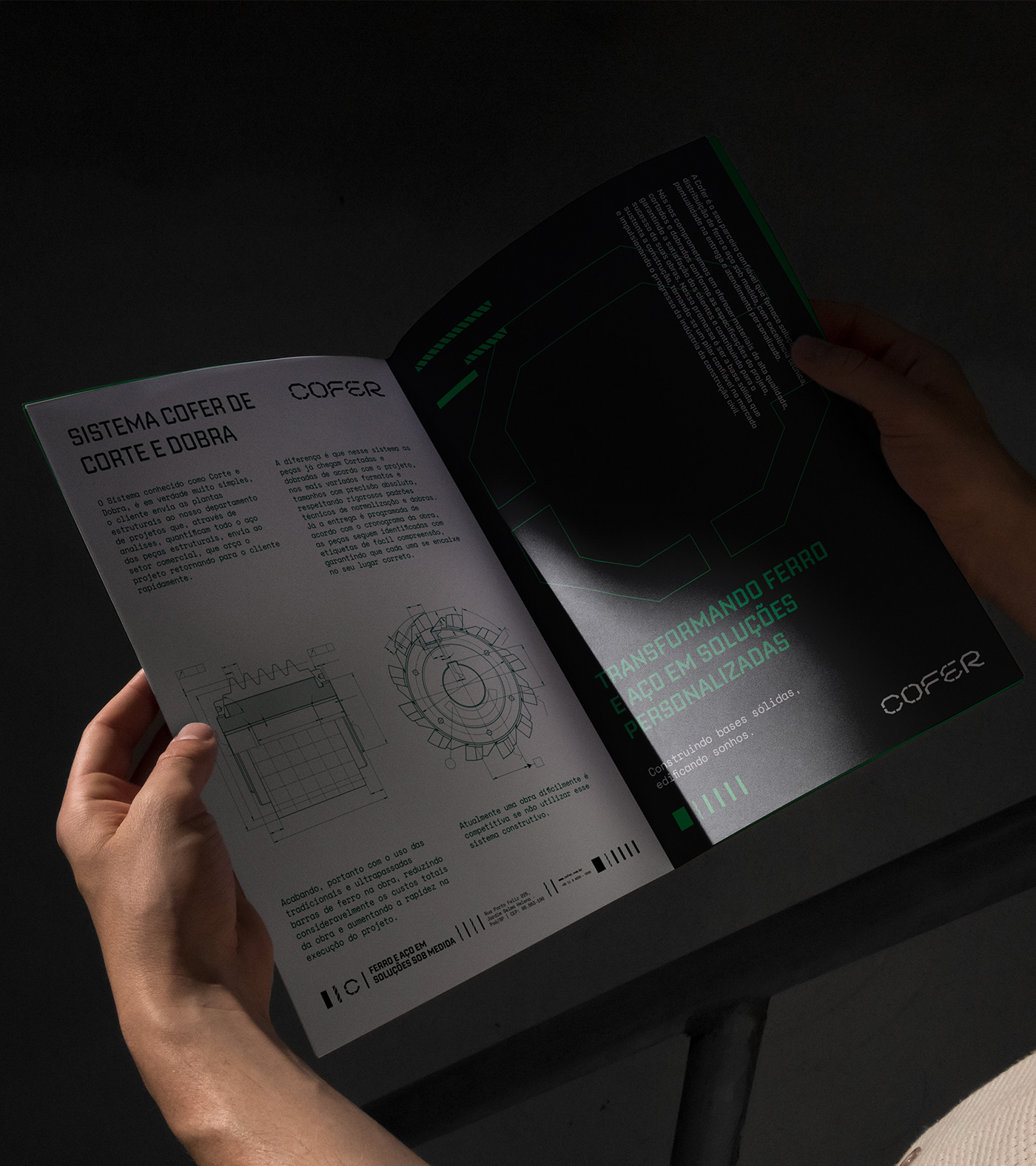
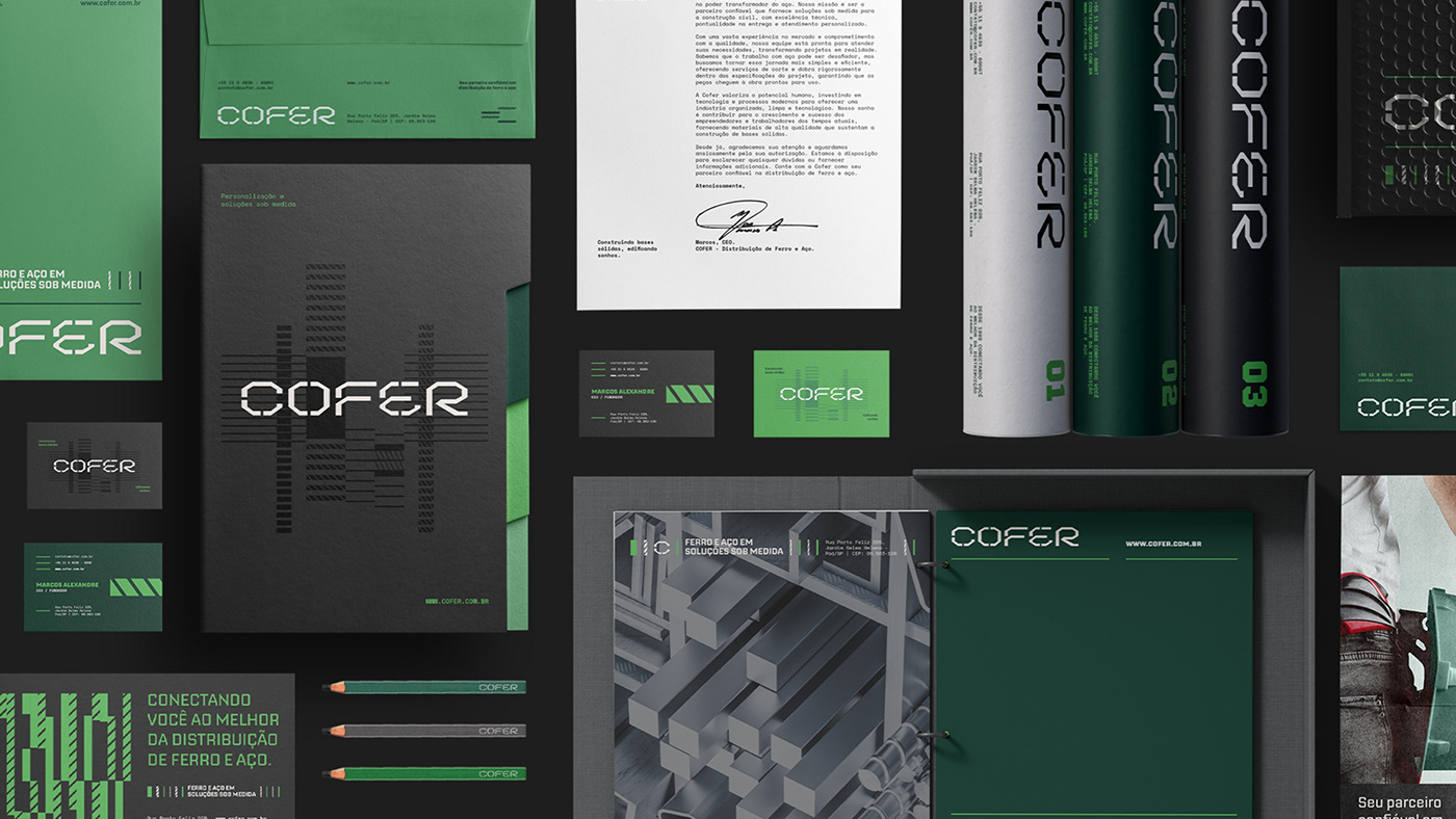
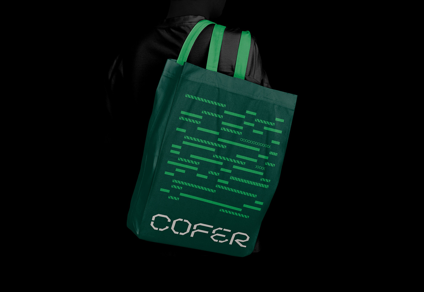
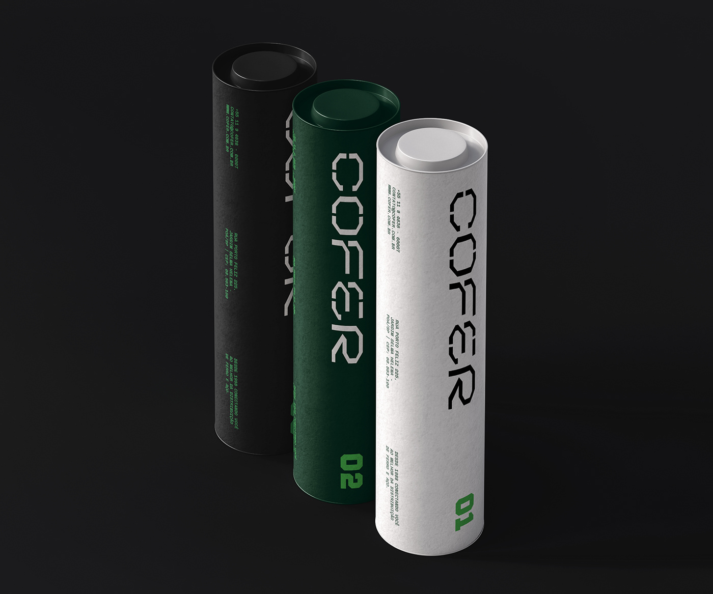
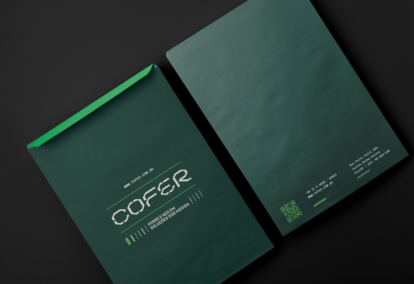
Cofer’s new identity isn’t just about aesthetics; it reflects a deep commitment to precision and excellence. The design elements, from the carefully crafted logo to the choice of color palette, all resonate with the core values of the brand. The logo itself mimics the bends and folds of the rebars—an essential product in Cofer’s portfolio—representing the precision and care that Cofer puts into every piece of steel it delivers. Every visual detail was chosen to evoke strength, durability, and reliability, all while maintaining a clean, modern look that sets Cofer apart from its competitors.
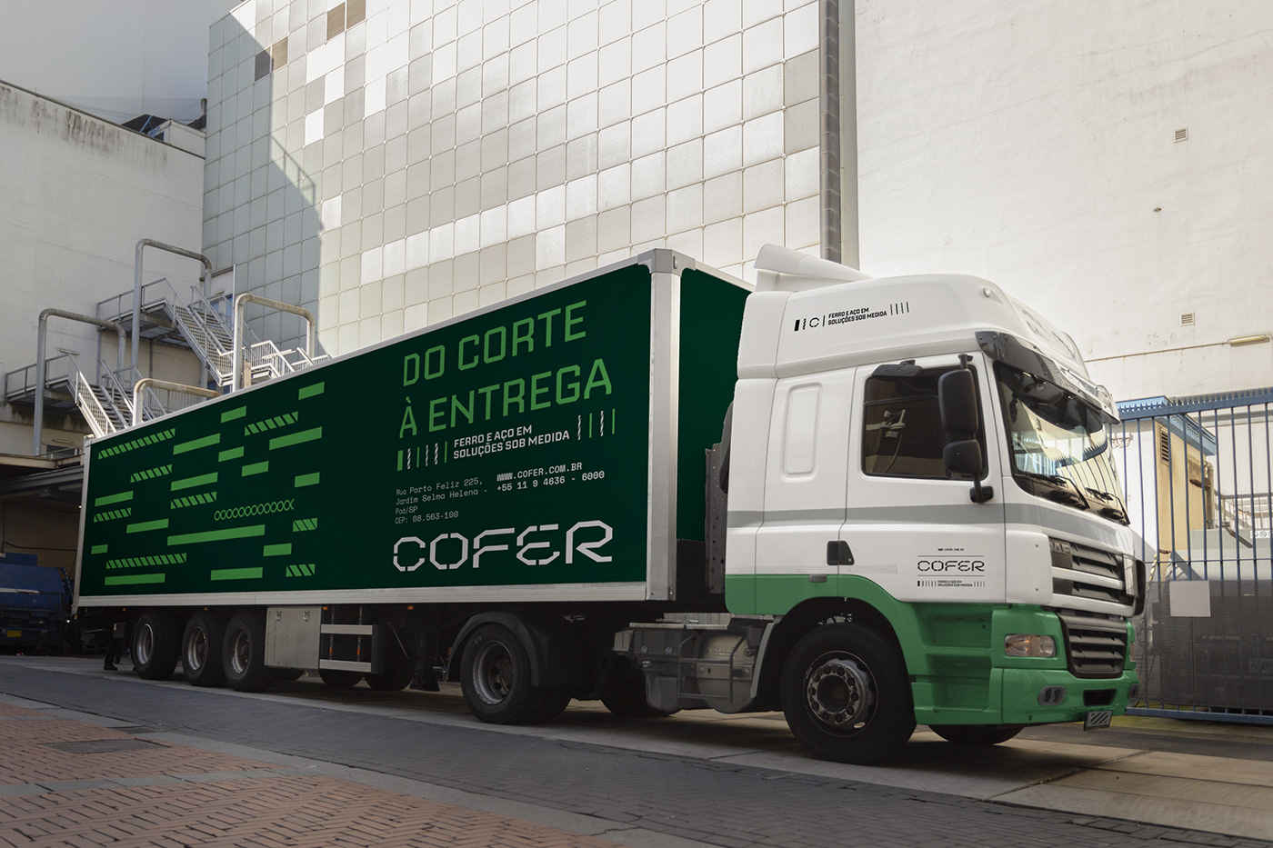
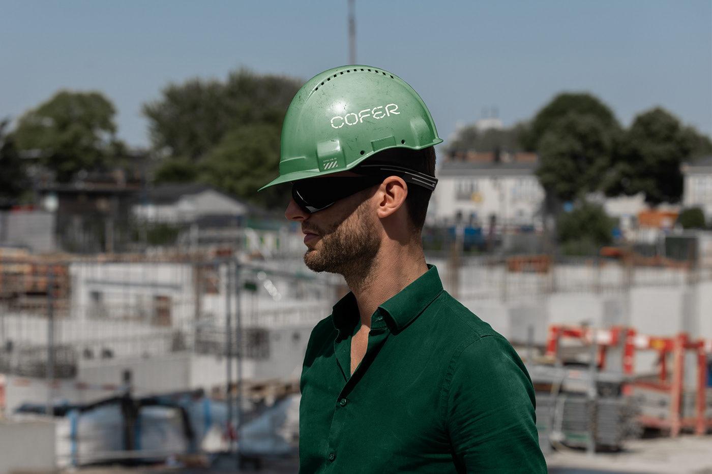
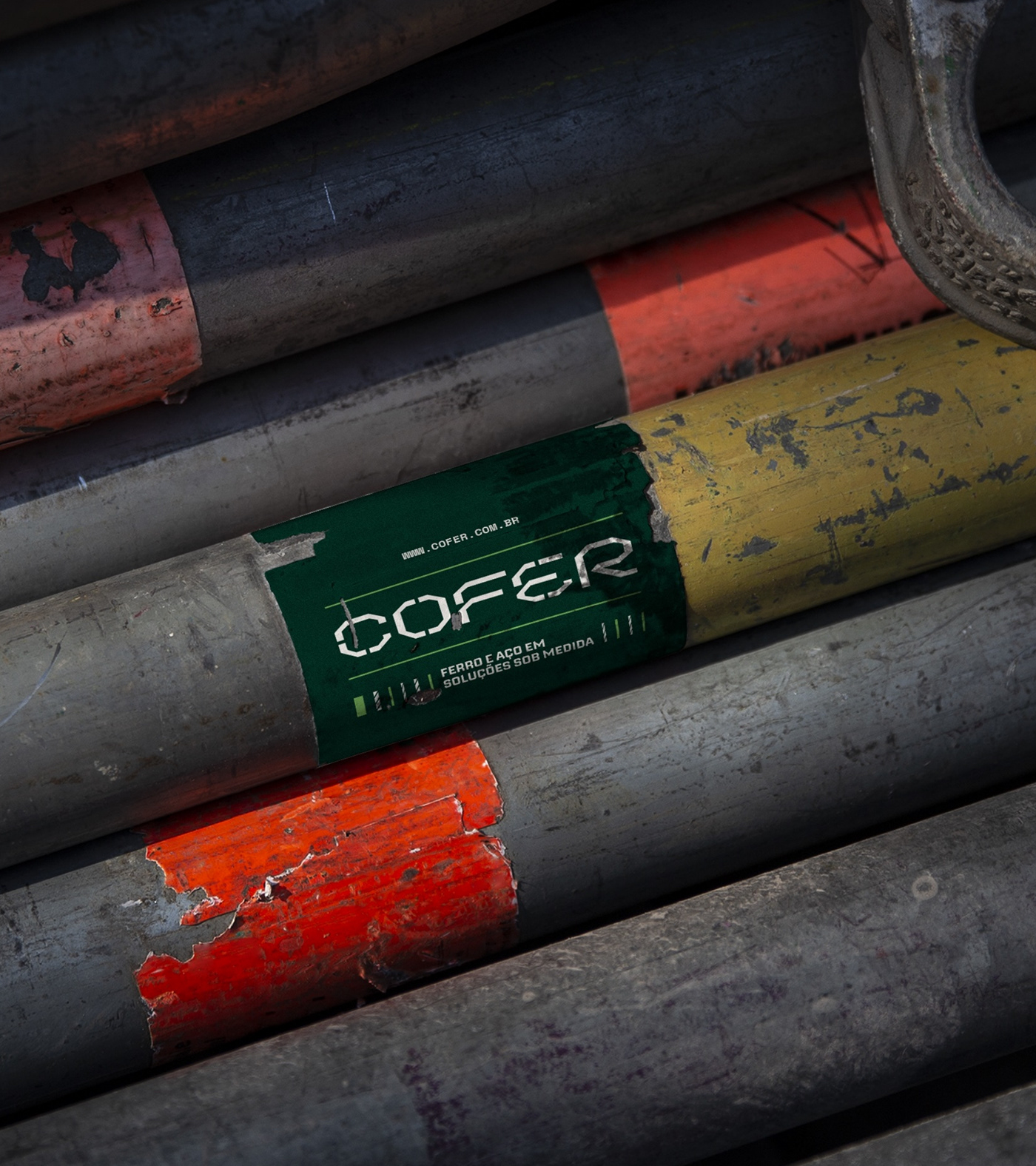
In addition to the visual identity, the Cofer project prioritized consistency across all customer touchpoints. From the branding on their vehicles to the labels on each product, every detail was aligned to create a cohesive and recognizable experience. This consistency not only reinforces the brand in the minds of customers but also simplifies their interaction with the company, making Cofer a trusted partner throughout the construction process.
Beyond just the visual transformation, Cofer’s branding also plays a crucial role in customer experience. By emphasizing precision and excellence in both the products and the branding, Cofer communicates a message of reliability and trust. Customers know that when they work with Cofer, they are not just buying steel; they are investing in a brand that stands for quality, safety, and innovation.
In the fiercely competitive world of iron and steel distribution, Cofer has become a name synonymous with innovation and quality. The branding project wasn’t just about updating the company’s look—it was about solidifying its position as a leader in the industry. By embracing modern design principles while staying true to the company’s roots, Cofer now offers more than just products; it offers peace of mind to every customer who chooses to build with them.
Through its transformation, Cofer has demonstrated that a well-thought-out brand identity can be a powerful tool for business growth. By connecting with customers on both an emotional and practical level, Cofer has successfully differentiated itself in a crowded market, ensuring that it will continue to build strong foundations—both literally and figuratively—for years to come.
CREDIT
- Agency/Creative: Moura Studio
- Article Title: Cofer Branding Building Strong Foundations for a Modern Industry
- Organisation/Entity: Agency
- Project Type: Identity
- Project Status: Published
- Agency/Creative Country: Brazil
- Agency/Creative City: Recife
- Market Region: South America
- Project Deliverables: Brand Creation, Brand Identity, Brand Mark, Type Design
- Industry: Construction
- Keywords: cofer, ferro, aço, construção,
-
Credits:
Brand Strategy: Moura Studio
Motion: Studio Madroom
Designer: Mattheus Moura


