


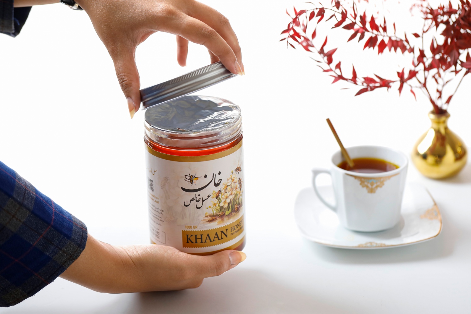
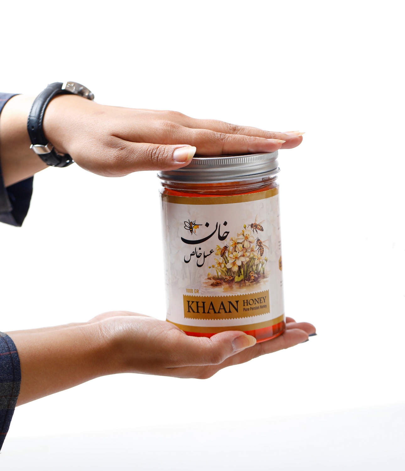
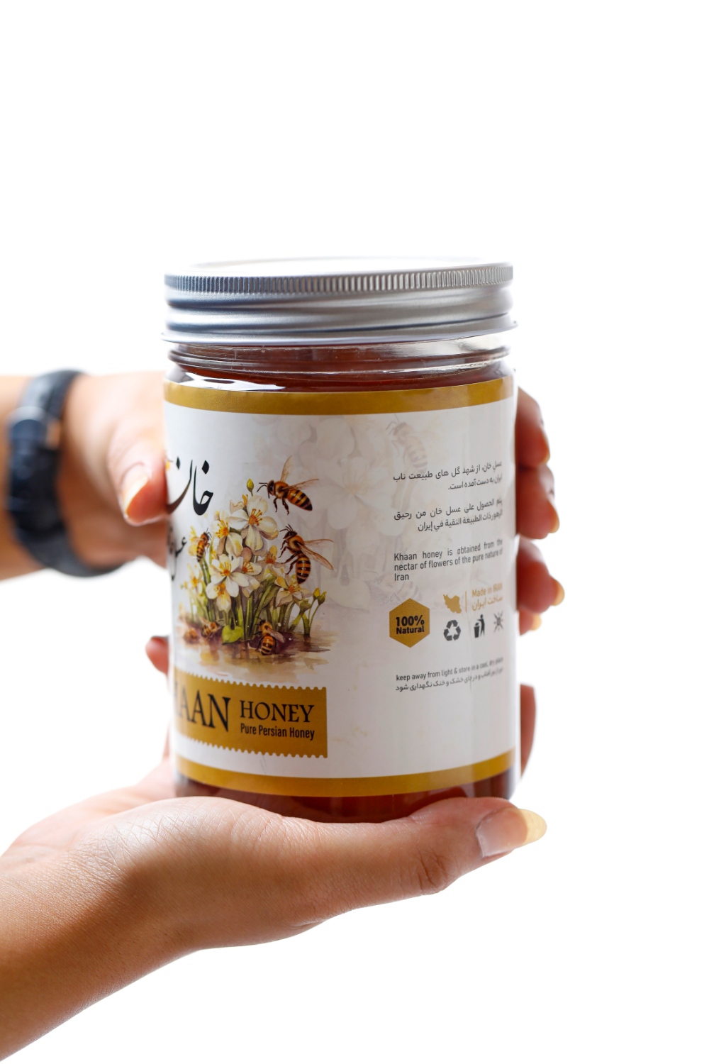
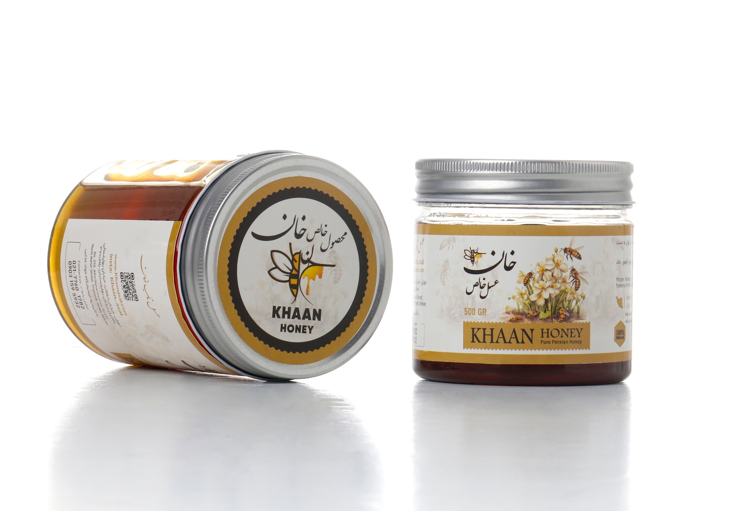
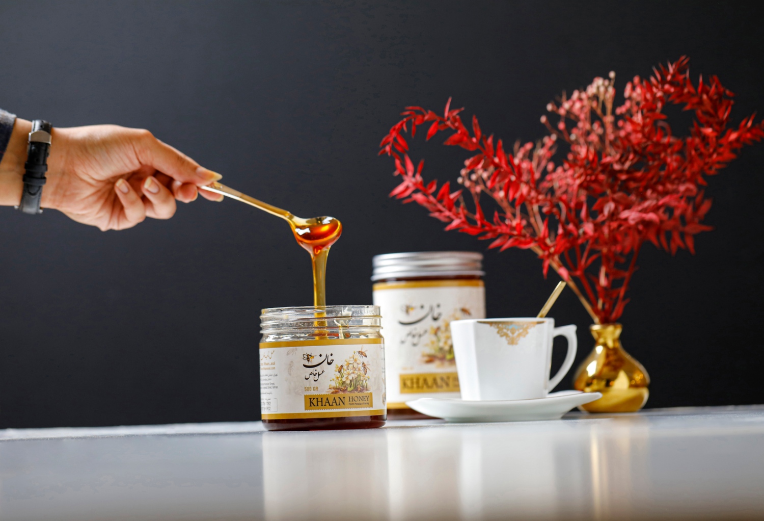
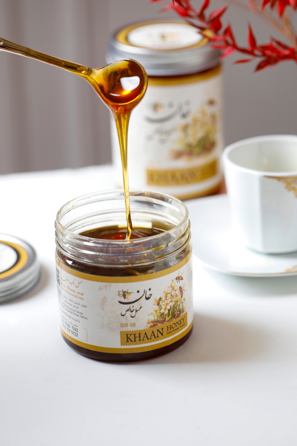
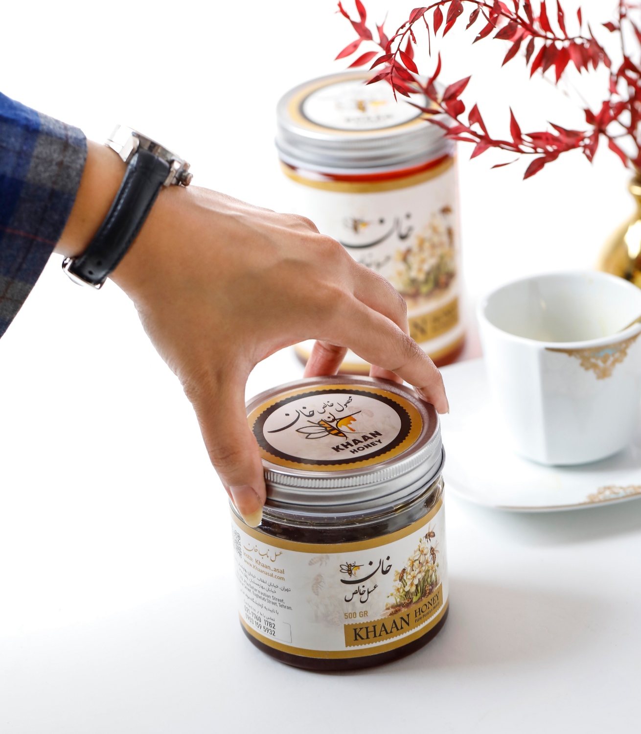
The Khan Pure Honey label design masterfully blends natural elements with minimalist aesthetics, creating a visually appealing and memorable brand identity. The centerpiece of the design is a meticulously illustrated bee in flight, hovering over delicately rendered flowers. This imagery serves a dual purpose: it instantly communicates the product’s natural origins and quality, while also establishing a strong visual connection to the Khan Pure Honey brand.
Color plays a crucial role in the label’s impact. The dominant golden hue not only reflects the natural color of honey but also evokes a sense of warmth, energy, and subtle luxury. This color choice elevates the product, distinguishing it from competitors and suggesting a premium offering.
Typography is another key element of the design. The clean, modern font choice ensures that the brand name and product information are easily readable, even from a distance. This minimalist approach to text strikes a balance between providing necessary information and maintaining an uncluttered, sophisticated look.
The label’s design shows careful consideration for practical aspects as well. It’s versatile enough to adapt to various packaging sizes, from small gift jars to larger household containers. This flexibility ensures a consistent brand presence across different product offerings, meeting the diverse needs of Khan Pure Honey’s customer base.
Beyond aesthetics, the label design functions as a silent salesperson. It effectively communicates the product’s key attributes – purity, naturalness, and quality – without relying on verbose descriptions. For consumers increasingly concerned about the provenance and quality of their food products, this label offers immediate visual reassurance.
In essence, the Khan Pure Honey label design is more than just a product identifier. It’s a carefully crafted visual story that appeals to quality-conscious consumers, promising a genuine, premium honey experience. The thoughtful integration of imagery, color, and typography results in a design that not only stands out on shelves but also resonates with the values of its target audience.
CREDIT
- Agency/Creative: ZarifGraphic
- Article Title: Khaan Honey Labeling Design
- Organisation/Entity: Agency
- Project Type: Packaging
- Project Status: Published
- Agency/Creative Country: Iran
- Agency/Creative City: Mashhad
- Market Region: Asia
- Project Deliverables: Label Design
- Format: Jar
- Industry: Food/Beverage
- Keywords: honey labeling
-
Credits:
CEO: Majeed Zarifi


