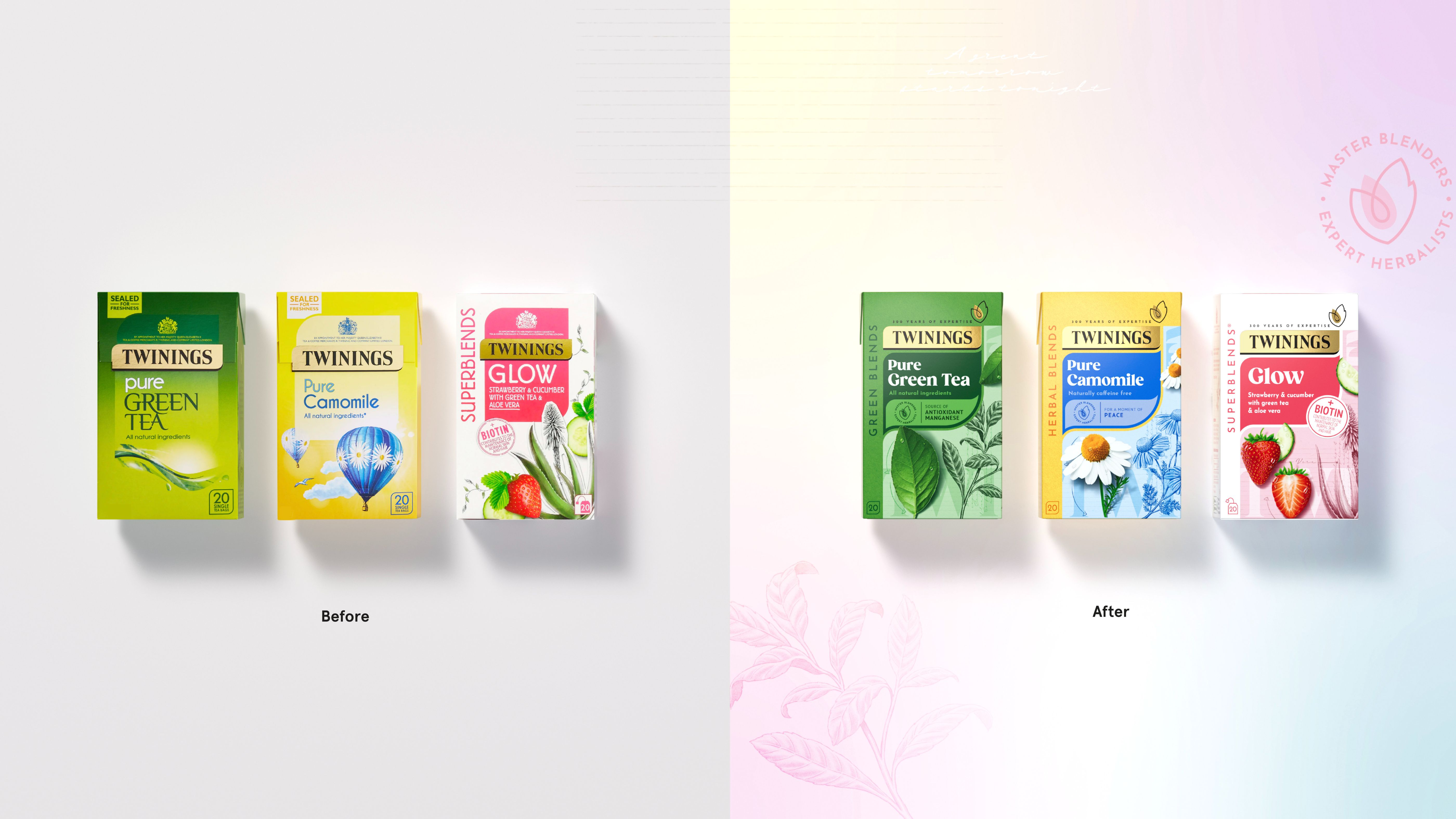
Building on over 300 years of expertise in master blending, Twinings is on a journey towards strengthening their credentials as a leading wellbeing drinks brand. As part of this strategy, they commissioned their long-term partner and global brand design agency, BrandOpus, to restage its tea and infusions portfolio.
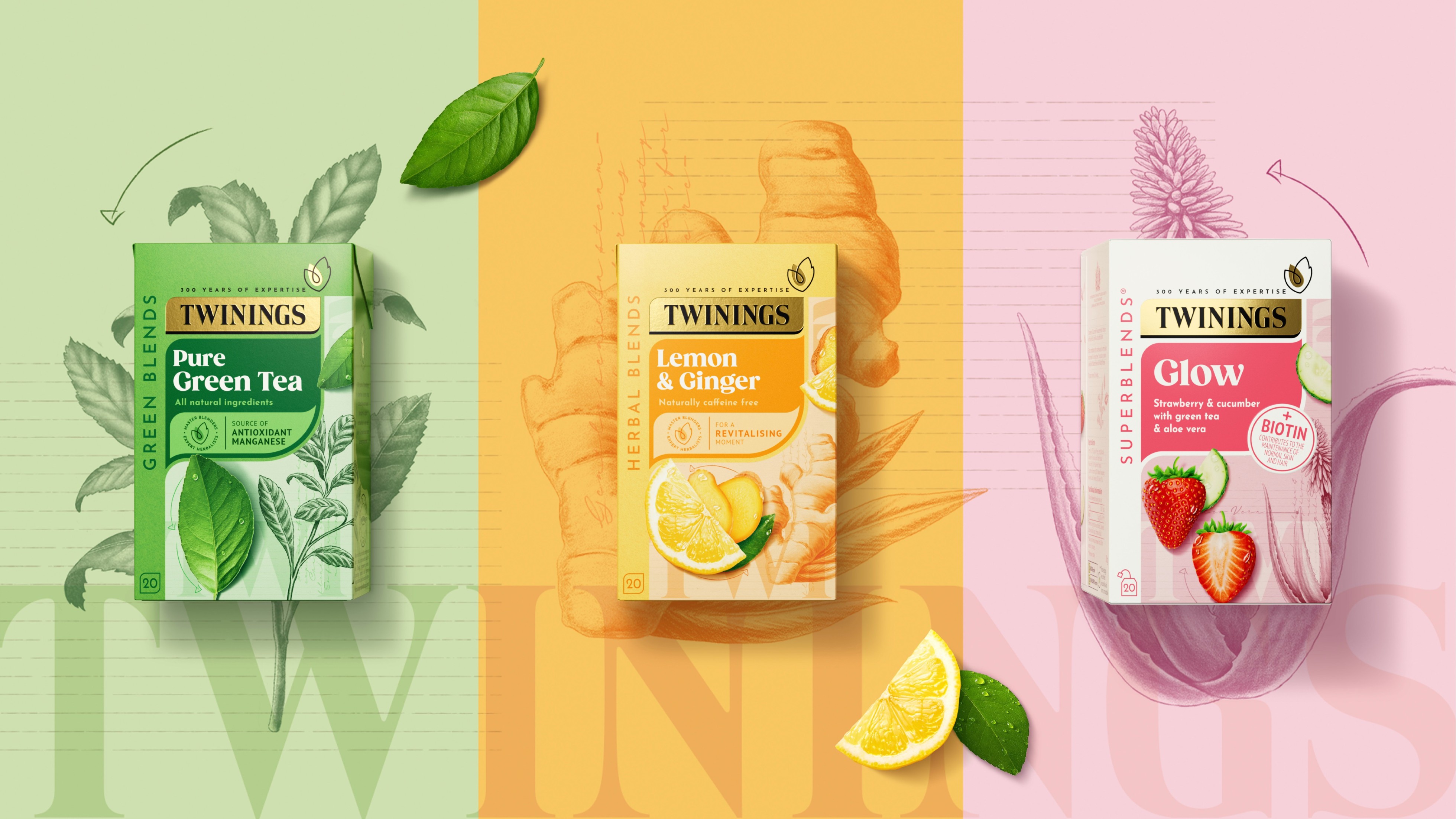
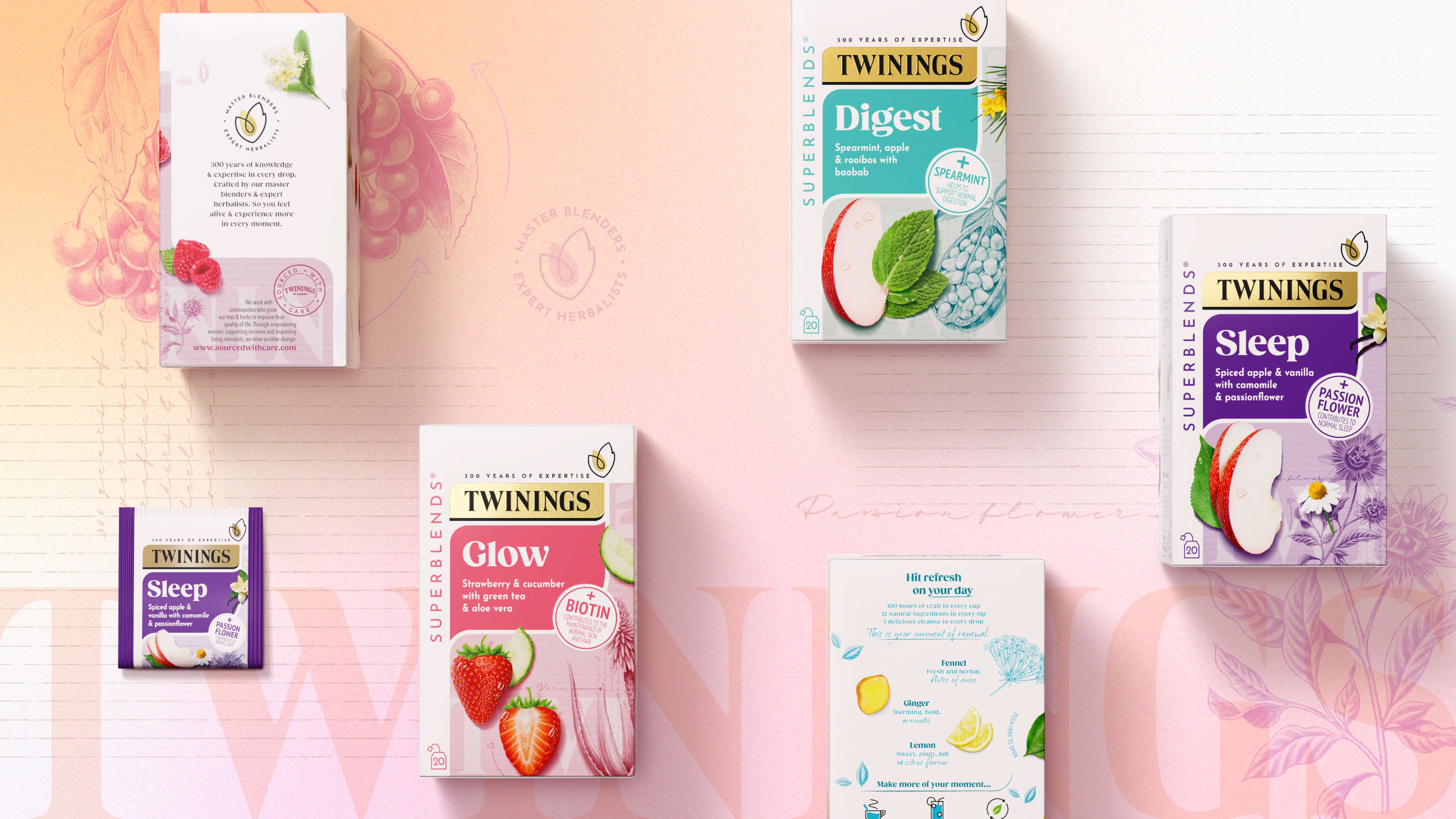
BrandOpus was tasked with redefining the portfolio architecture for Twinings’ Superblends, green teas, and infusions ranges. Striking a balance between great taste and benefits was key to the creative strategy. The new design system holds the total portfolio together, making navigation across and within ranges seamless and intuitive.
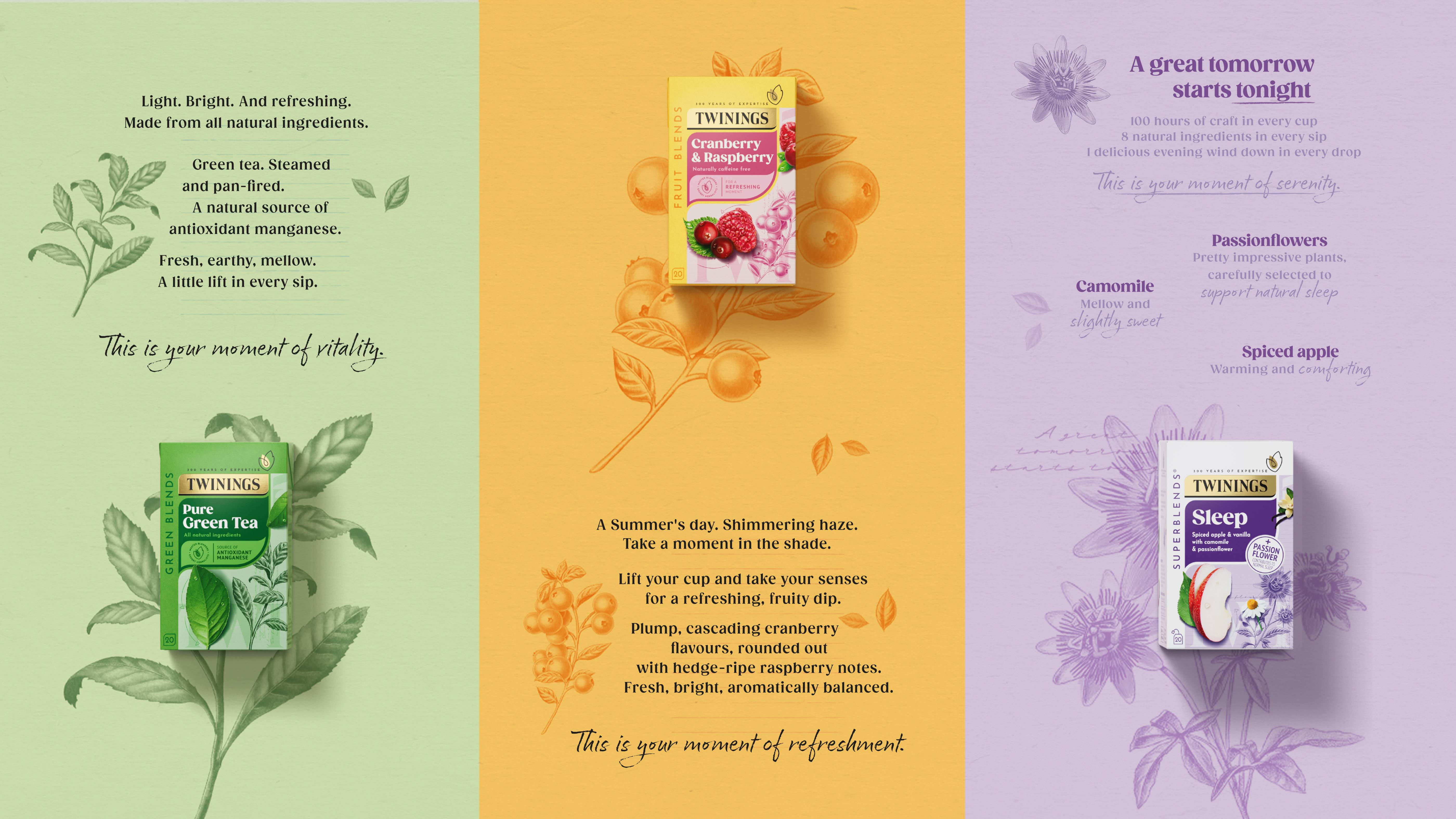
Verbal identity was also included in the project, with BrandOpus developing on-pack copy, on top of visual identity. Messaging was brought in line with Twinings’ evolving tone of voice, shifting from a functional voice to a more evocative one designed to engage and inspire new, as well as existing, drinkers to feel “Alive In Every Drop.”
As part of this work, a new brand asset, the Essence symbol, was created. Paired with the revamped design system, it delivers a cohesive and contemporary presence, helping the brand to stand out.
Wider details of the new packaging artwork include:
The Design System
Blend Identification: BrandOpus created a strong and clear pack architecture that works consistently across ranges. The design system flows down the pack as if it is being extracted from the new Essence symbol.
Blend Windows: Across each of the ranges, dedicated space has been carved out on the pack to deliver the individual blend story using photography and illustrations representative of the taste blend. The illustrations symbolize the expert herbalists, while the ingredients represent the Master blenders. Inspiration was taken from the design style of a botanist’s notebook to represent the coming together of the two.
Gill Close, Marketing Director for Twinings UK & Ireland, stated: “Our packs are a key touchpoint in our consumers’ journey and brand experience. So refreshing our portfolio strategy to better reflect what our brand represents and the role it plays in consumers’ lives every day was hugely important to us. We’re delighted with the outcome, and our consumer research says our customers are too—stating that the new designs make our products look modern, quality, and delicious.”
Leo Hadden, Head of Strategy at BrandOpus, added: “It’s an honour to be a part of Twinings’ exciting journey to strengthen their position as a leading wellbeing drinks brand. The way the portfolio and packs are structured plays a critical role in unlocking relevance and creating greater impact at the shelf and in consumers’ minds. We’re very excited to see that play out.”
The new design will transition into the market from August onwards.


CREDIT
- Agency/Creative: BrandOpus
- Article Title: Twinings Works with Long-Term Partner, BrandOpus to Redesign its Packaging to Reflect Its Wellbeing Offering
- Organisation/Entity: Agency
- Project Type: Packaging
- Project Status: Published
- Agency/Creative Country: United Kingdom
- Agency/Creative City: London
- Market Region: Europe
- Project Deliverables: Architecture, Art Direction, Brand Architecture, Brand Design, Brand Mark, Brand Rejuvenation, Brand Tone of Voice, Branding
- Format: Box
- Industry: Food/Beverage
- Keywords: Tea Twinings Health Wellbeing Branding Redesign Restage
-
Credits:
Chief Creative Office: Paul Taylor
Head of Growth: Louise de Ste. Croix
Head of Strategy: Leo Hadden
Client director: Gill Creedon
Senior Client Manager: Ellie Stringer
Design Director: Maddie Freestone
Designer: Jemima Thomas
Designer: Niamh McErlan
Senior Strategist: Amit Kumar
Creative Directions Operator: Lara Creagh
Senior Production Manager: Daryn Groom


