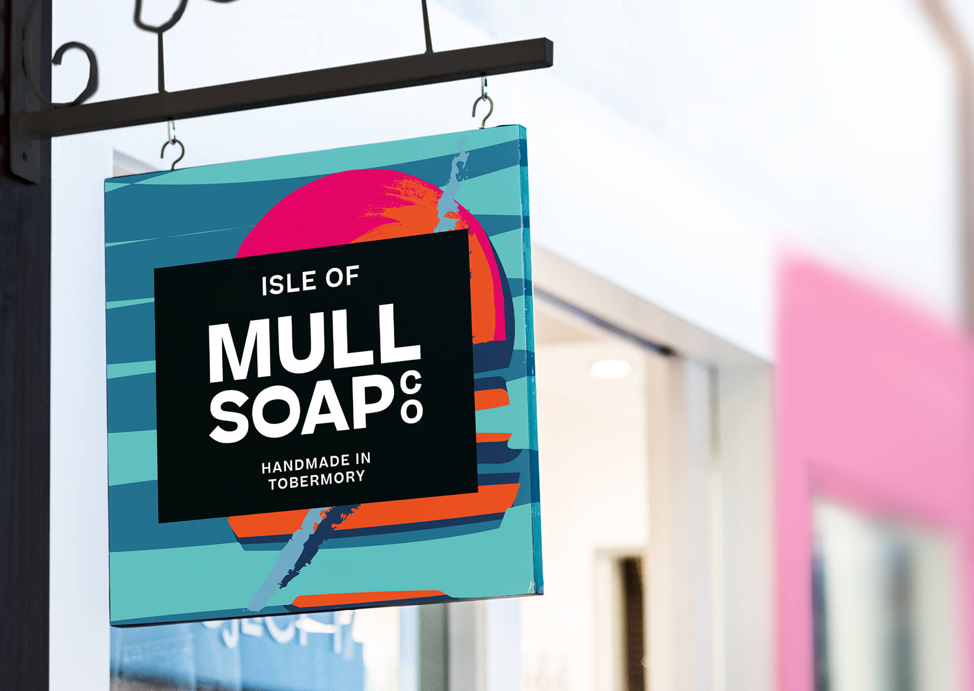
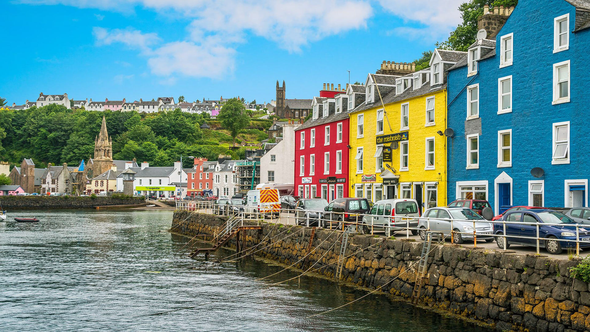
Isle Of Mull Soap has been handmade in Tobermory by local couple Stu & Sophie since 2008. The shop sits right in the middle of Tobermory’s famous colourful Main Street. And this was a major factor when they approached us for a Rebrand. The current packaging was bright and colourful but had no link to the location or source of their inspiration.
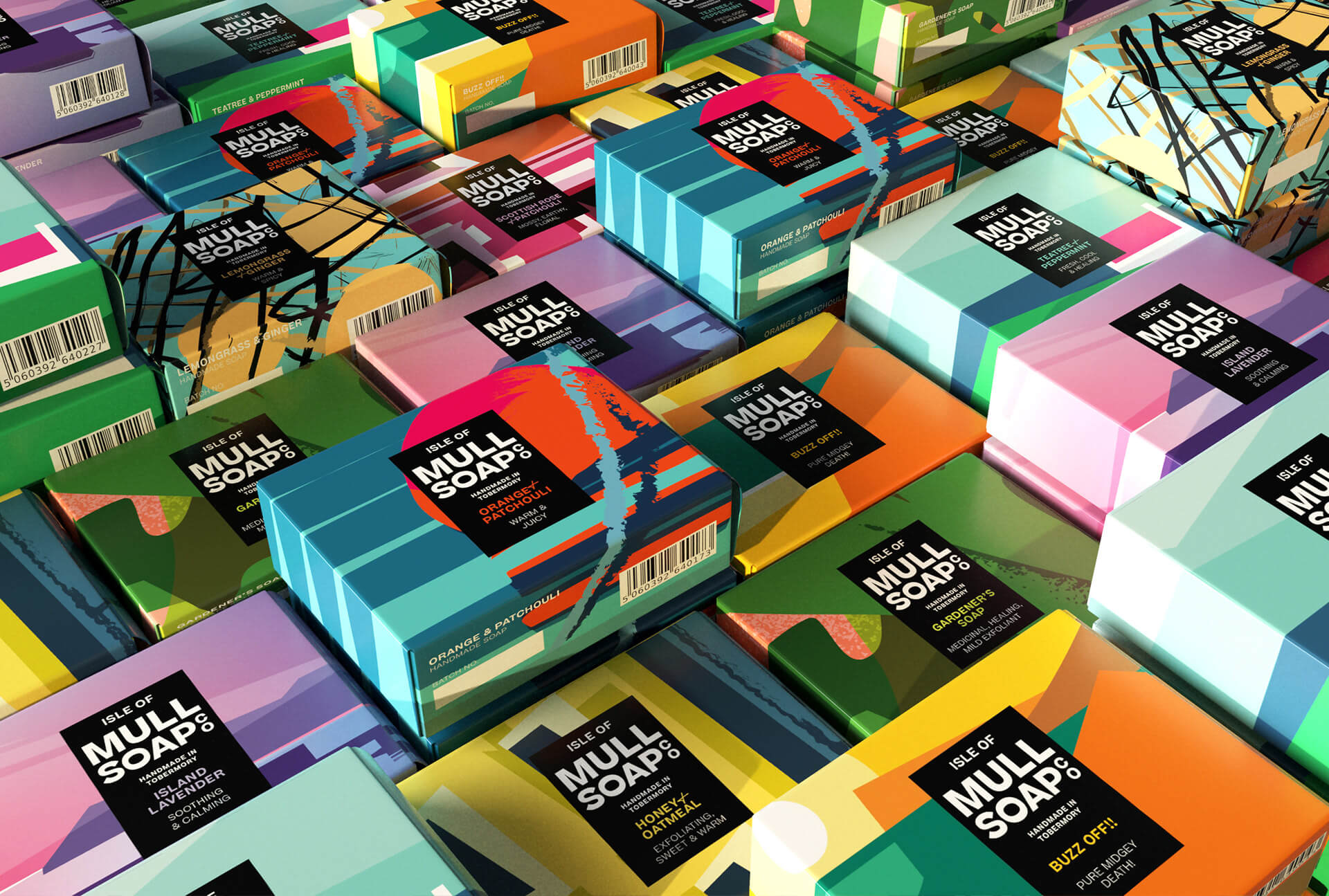
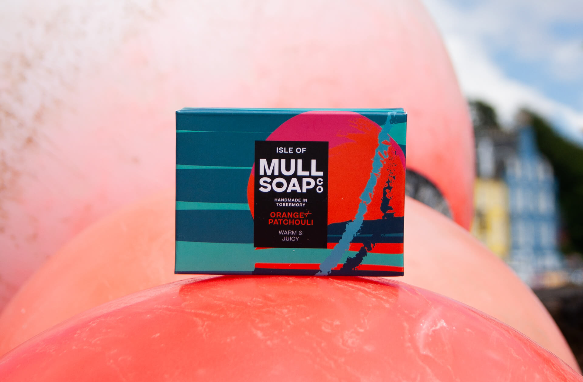
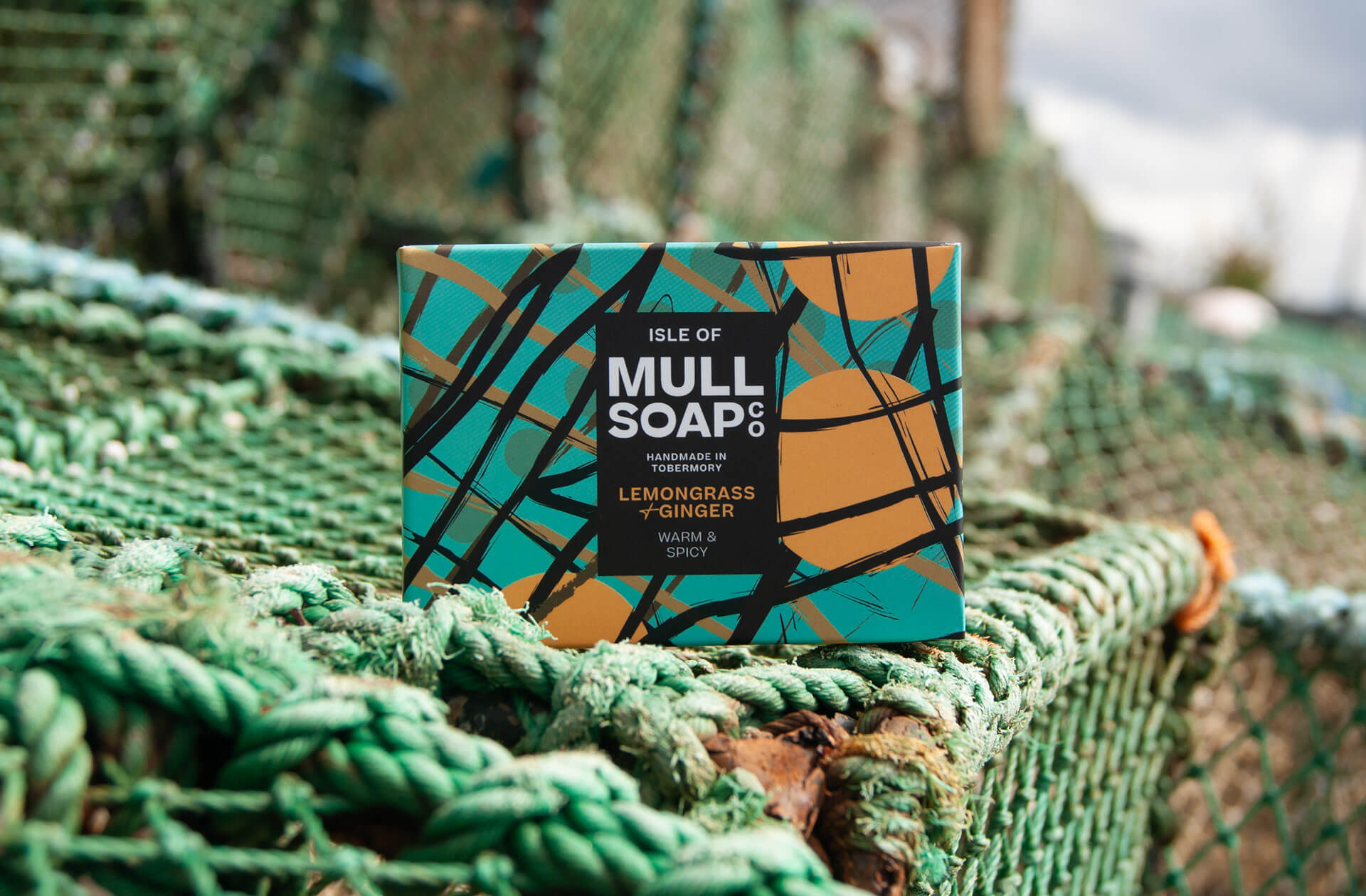
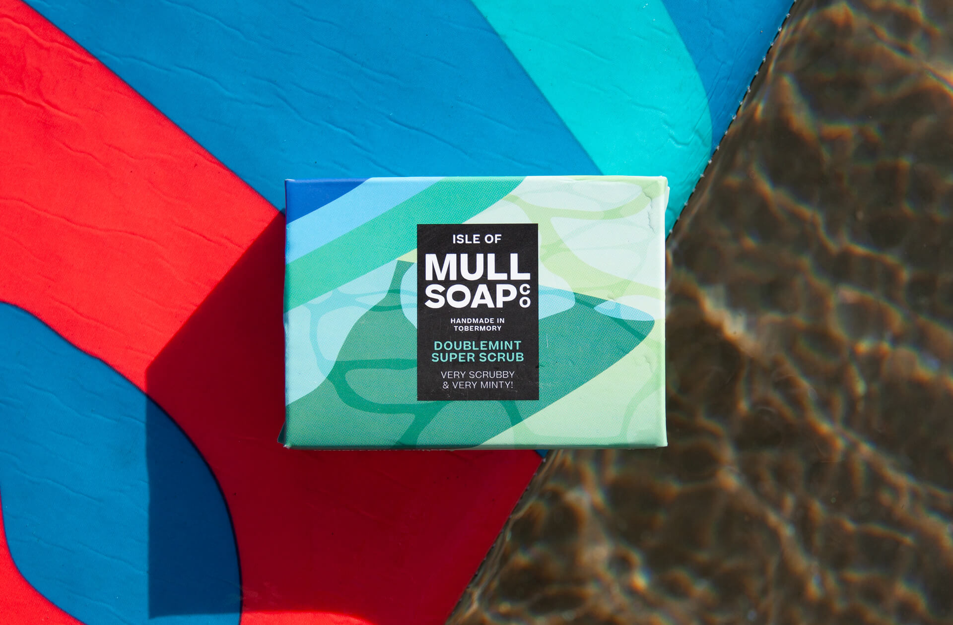
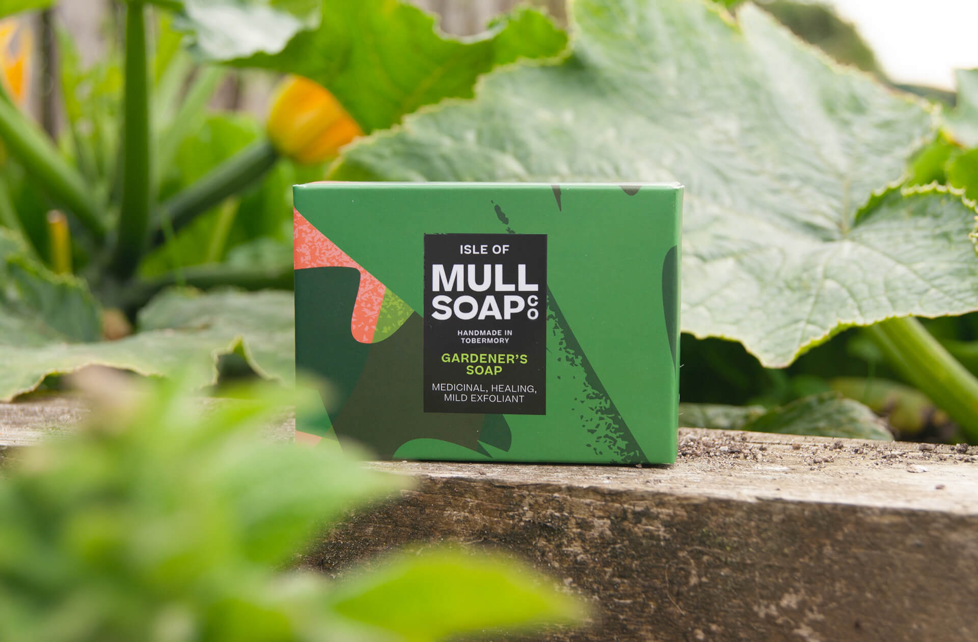
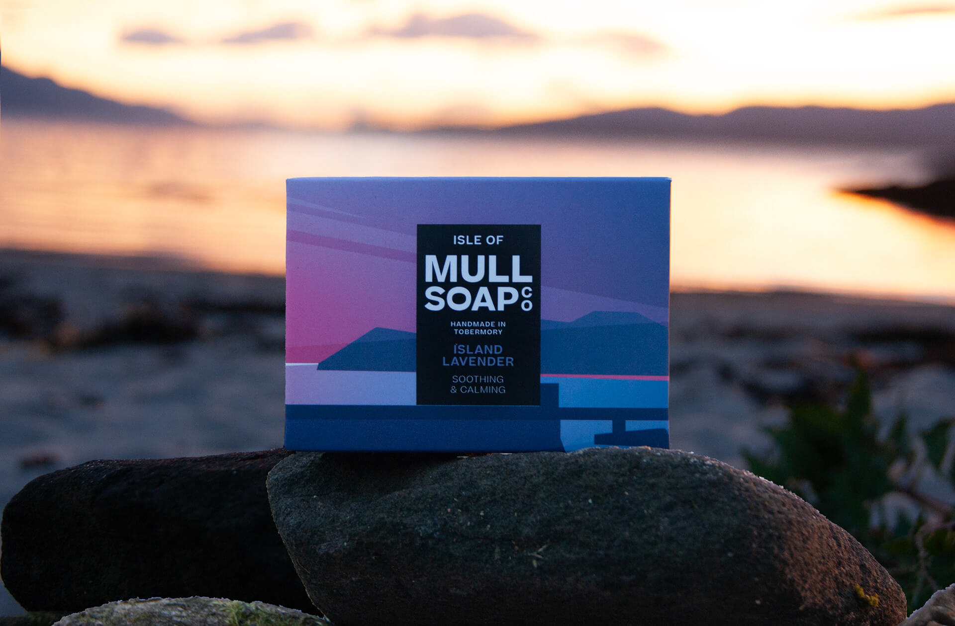
With over 100 fragrances, we decided to create individual illustrations that would depict details & landscapes of the island of Mull that had inspired the products.
Deliverables include: Research + brand identity, logo, brand elements, illustration system, packaging design for candles, diffuser & wax melts, label design and illustration.
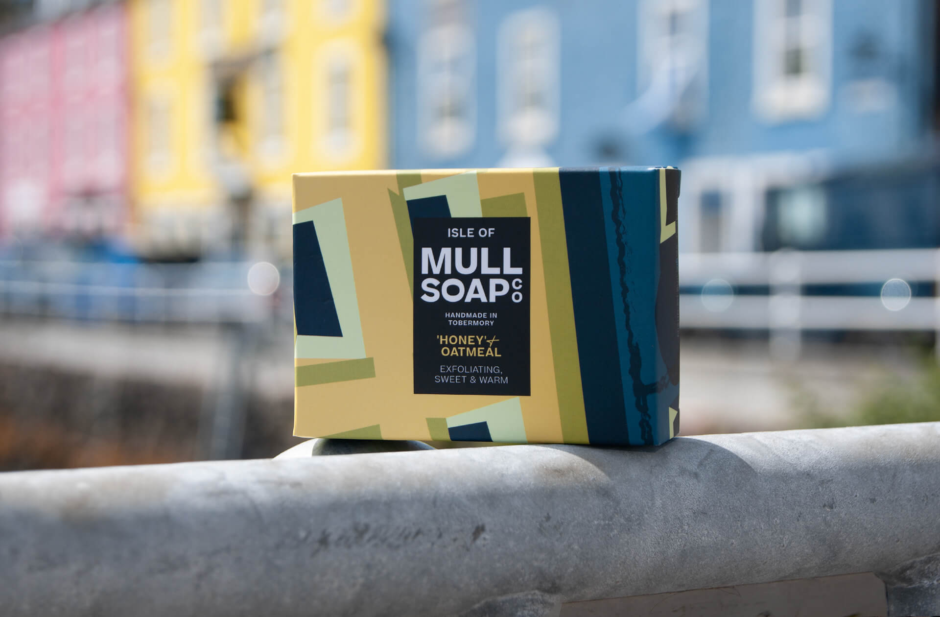
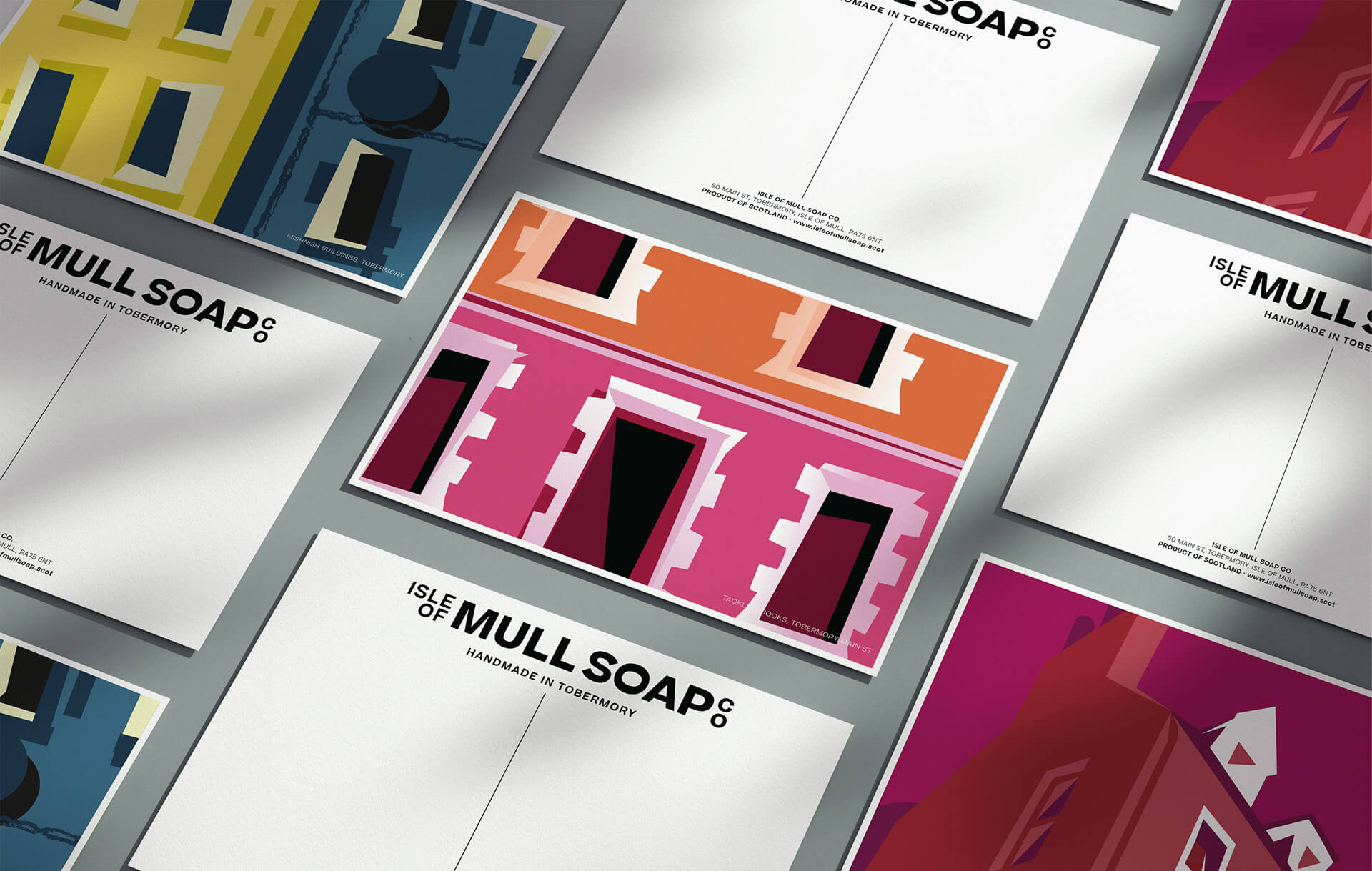
Tobermory, where the brand is based, was a massive influence on the packaging rebrand, with the coloured houses and vibrant atmosphere.
We wanted each product to hold a sense of its origin.
Illustrating over 100 locations and details found around the beautiful Isle of Mull. Abstracting the shapes and simplifying the colours into bold packaging statements. Each illustration is also part of a range of postcards for visitors to send or to be placed in order boxes and gift bags. Inspiration came not just from locations but from shared memories and feelings that would go on to influence the fragrances of their soaps.
CREDIT
- Agency/Creative: My Creative
- Article Title: My Creative Agency’s Unique Packaging Design for Isle of Mull Soap: A Tribute to Local Heritage
- Organisation/Entity: Agency
- Project Type: Packaging
- Project Status: Published
- Agency/Creative Country: United Kingdom
- Agency/Creative City: Glasgow
- Market Region: Europe
- Project Deliverables: Art Direction, Brand Creation, Brand Redesign, Packaging Design
- Format: Box, Jar, Tin
- Industry: Beauty/Cosmetics
- Keywords: Isle of Mull Soap rebrand
-
Credits:
Branding & Pakaging: Ewan Leckie
Client: Isle Of Mull Soap


