


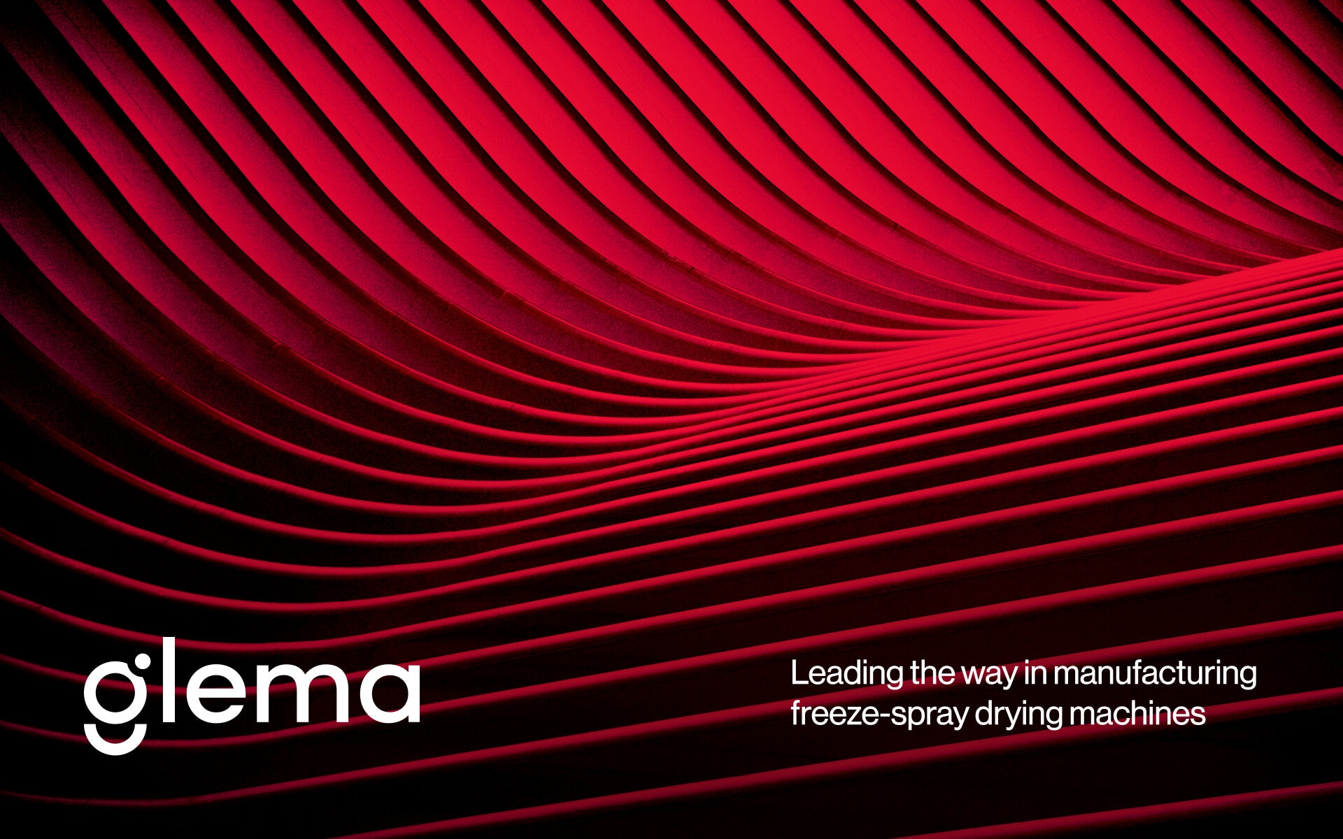
Glema is a manufacturer of freeze-spray drying machines based in Lisbon, Portugal.
It is the leading company in the industry integrating innovation and precision into the production process.
Their team reached out to our studio for logo and brand identity design. We’ve developed a cohesive visual system that is easy to use.
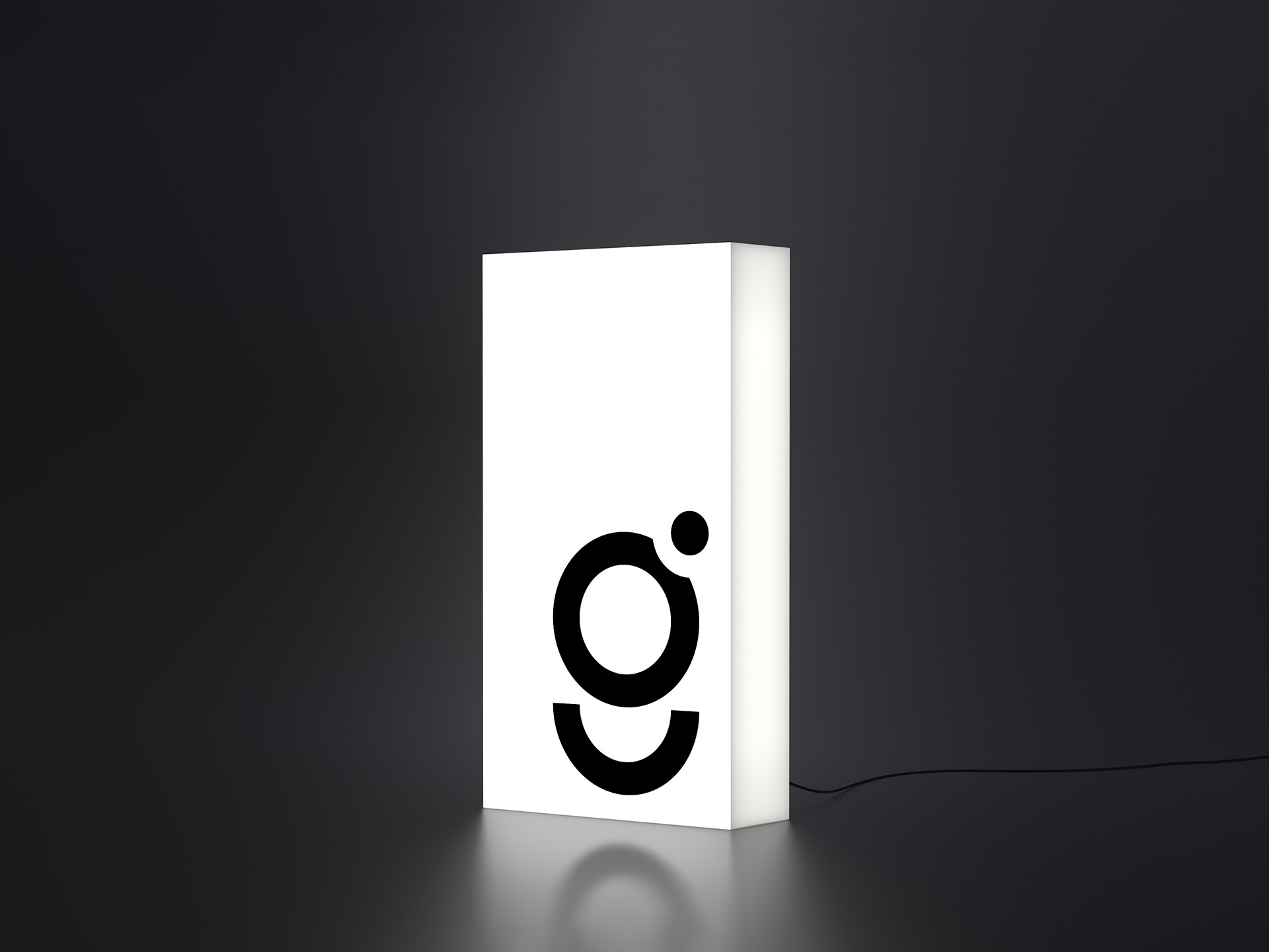
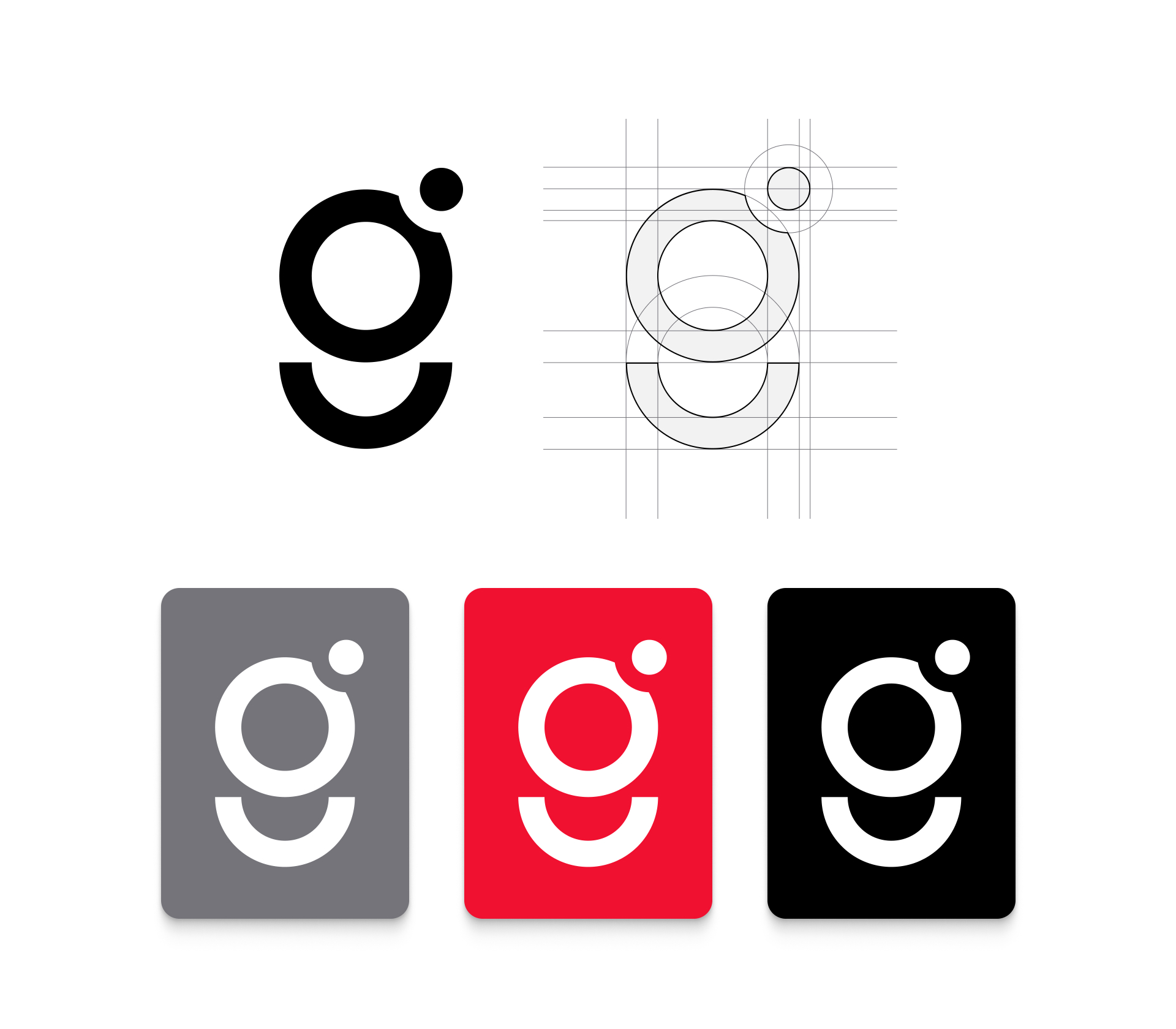
The shape of a circle was chosen as the key graphic element of the company. It adds a dynamic flow to designs and makes communicating ideas a simple task leading the viewer’s attention. The logo is composed out of circles connected.with the rest of the branding.
In addition to the primary logo, we explored various applications of the brand’s visual language. This involved creating a range of secondary graphics, patterns, and icons that all stemmed from the circular motif. These elements were designed to be versatile, ensuring that they could be used across different media without losing the brand’s identity.
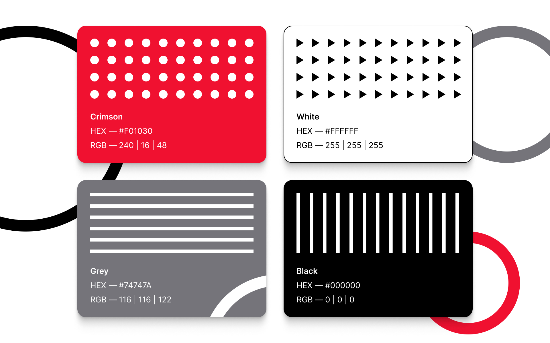
We also developed a detailed set of brand guidelines to ensure consistency across all platforms. These guidelines cover everything from logo usage to color palettes, typography, and imagery. By providing clear instructions, we helped Glema maintain a strong and cohesive brand presence, no matter where or how their materials are displayed.
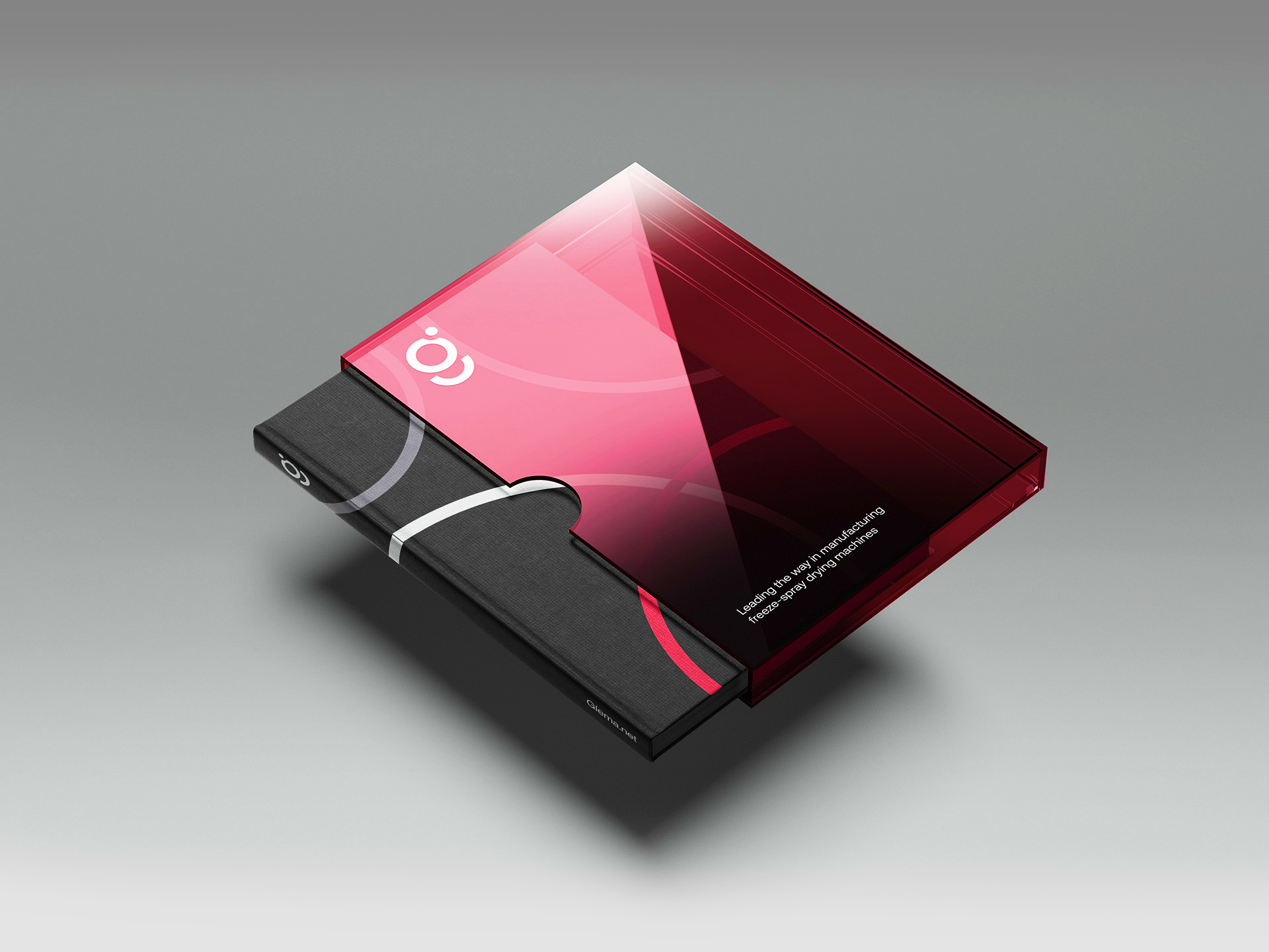
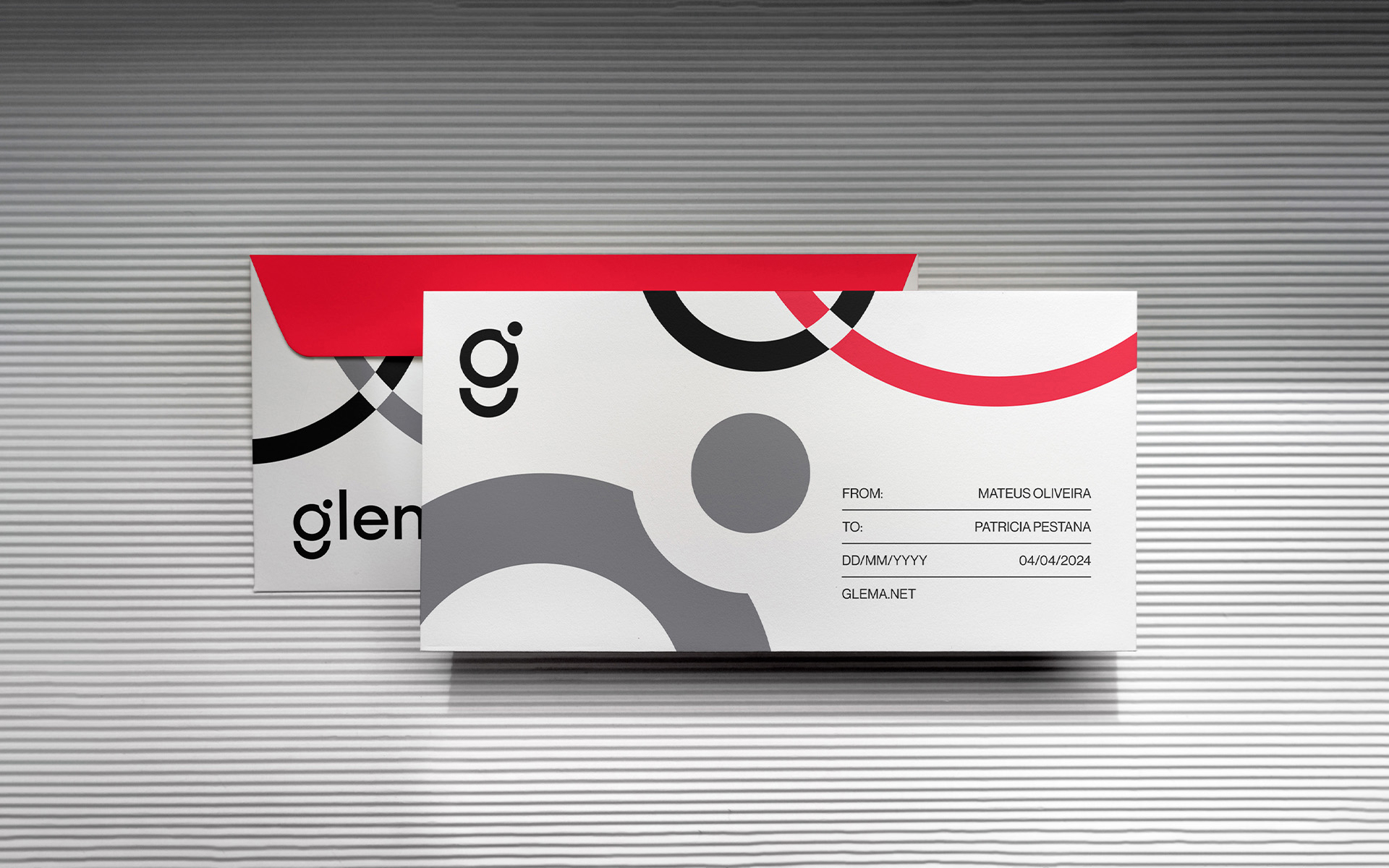
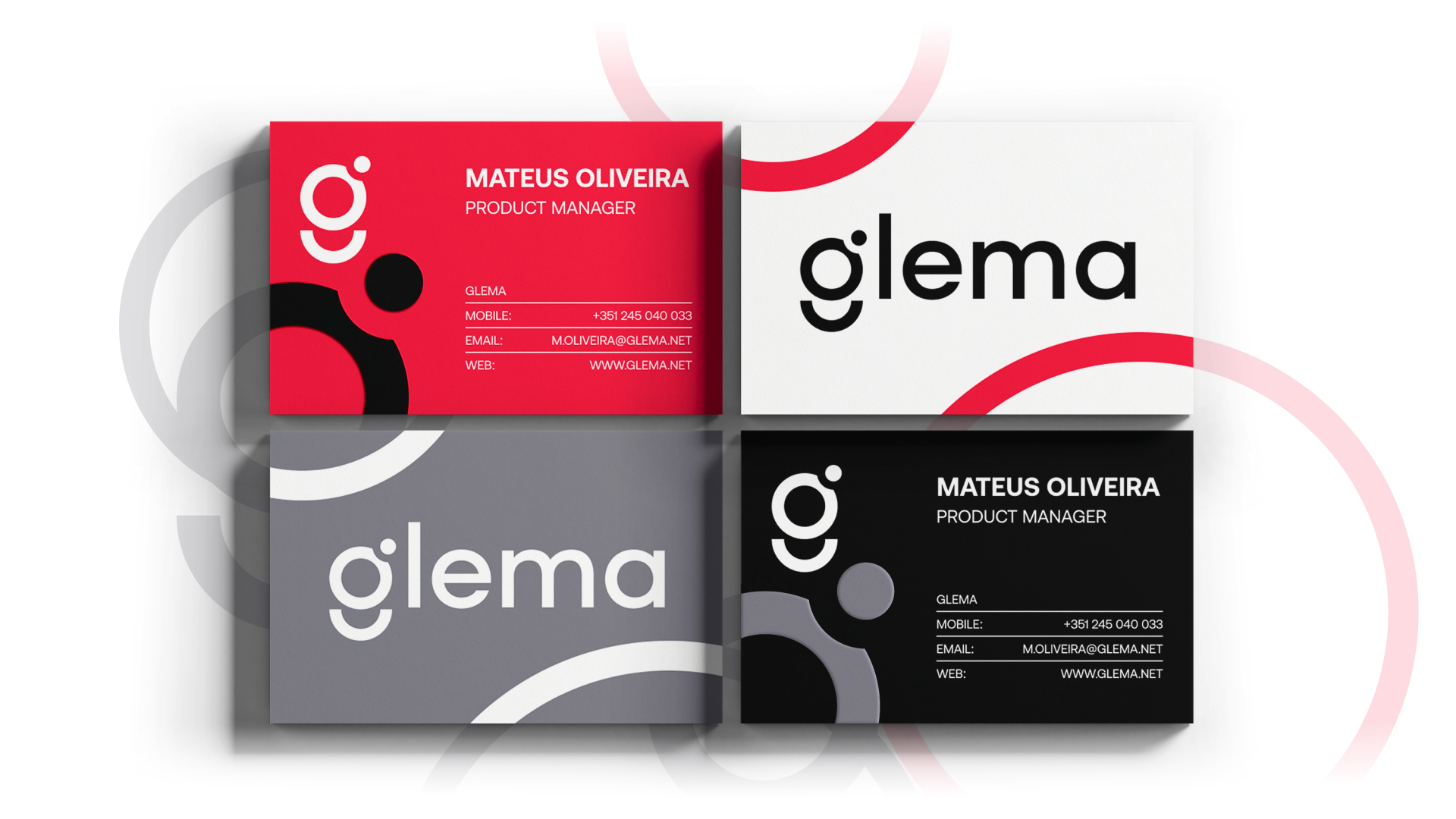
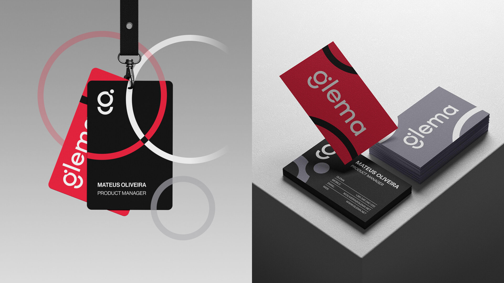
The brand identity was also extended to their corporate stationery, including business cards, letterheads, and envelopes. Each piece was designed to reflect the same professionalism and attention to detail that Glema puts into its products. The stationery serves as a subtle yet powerful extension of the brand, reinforcing its identity in every interaction.
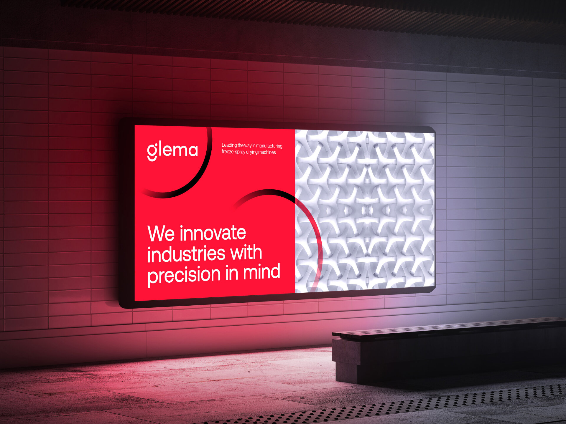
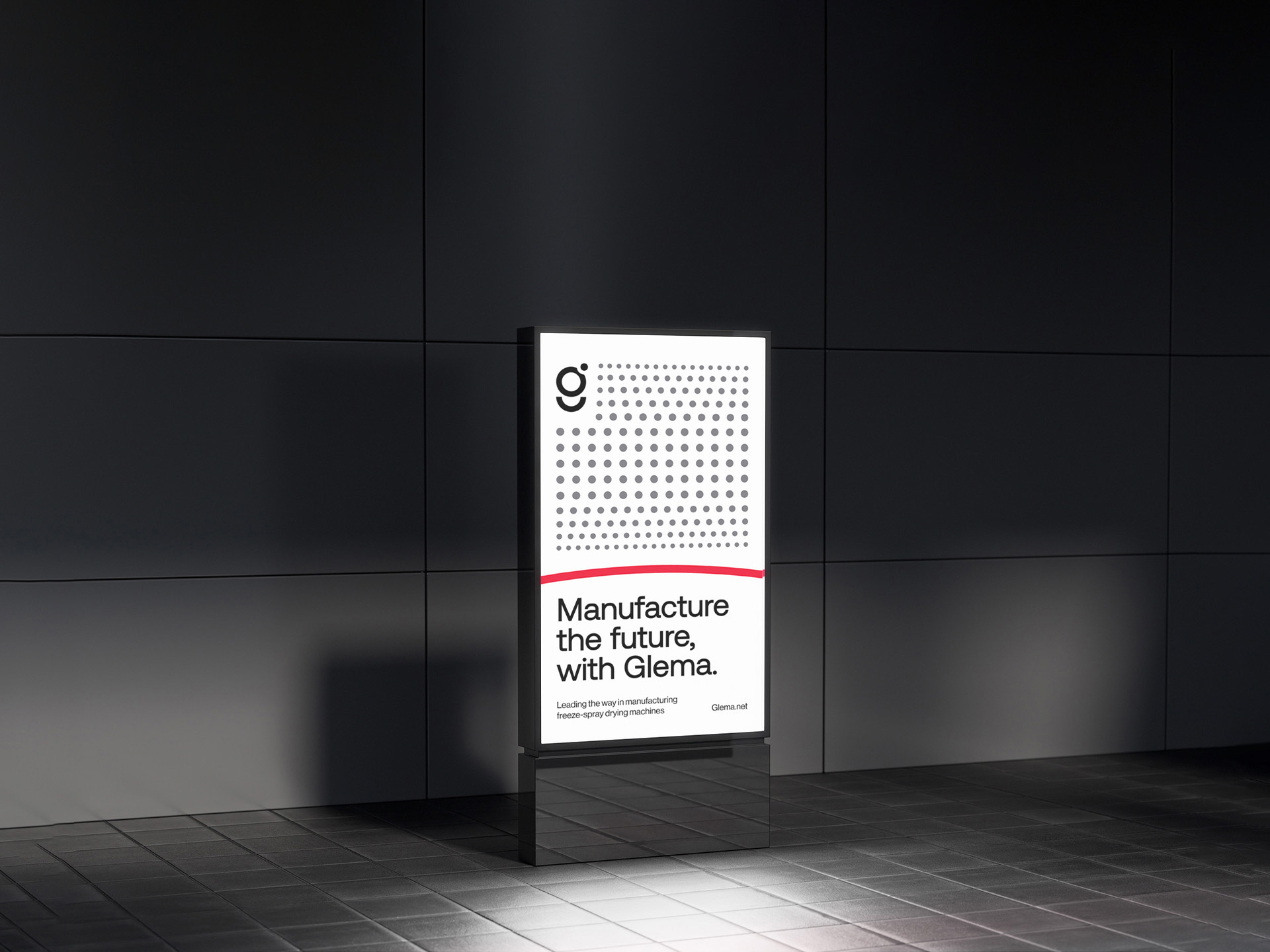
Furthermore, we worked on the design of advertisements that would effectively communicate Glema’s message to a broader audience. These ads were crafted to be visually striking while also conveying key information about Glema’s products and services. The use of the circular graphic elements helped to create a sense of continuity across all advertising materials, ensuring that each piece felt connected to the overall brand identity.
Throughout the project, our focus was on creating a brand identity that would stand the test of time. By grounding the design in simple, strong shapes like the circle, we ensured that the identity would remain relevant and adaptable, even as trends evolve. The end result is a brand identity that not only represents Glema’s current values but also leaves room for future growth and innovation.
Deliverables: Brand guidelines, logo design, stationery and advertisement design.
CREDIT
- Agency/Creative: Sora:studio
- Article Title: Sora Studio Elevates Glema’s Brand with Cohesive Visual Identity and Logo Design
- Organisation/Entity: Agency
- Project Type: Identity
- Project Status: Published
- Agency/Creative Country: Argentina
- Agency/Creative City: Buenos Aires, Argentina
- Market Region: Global
- Project Deliverables: Brand Design
- Industry: Manufacturing
- Keywords: Brand identity, logo design, stationery design, advertisement design
-
Credits:
Art Director: Georgii Poletaev


