“Cuita” meaning the last syllable of the word “biscuit” and is modified according to the pronunciation of the kid of the owner of the products, who pronounces it “Cuita”.
The product is created using the well-known Fresca dough from Alexandria, which is well regarded in Egypt. Along with his pal, the owner has worked there since he was a little child. They also sell cotton candy and homemade candies.
Cotton candy: It is a mixture of water and healthy sugar in high concentration. They updated the recipe and created a rich-tasting cream from it and filled Fresca biscuits with it.
Fresca: It is a cone biscuit for ice cream. In Egypt, it is mixed with other ingredients such as “basbousa, harissa, coconut, sesame, and peanuts.”
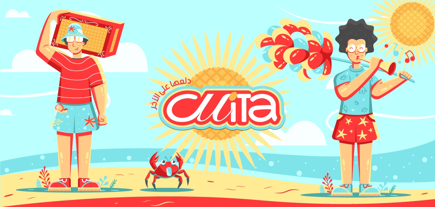
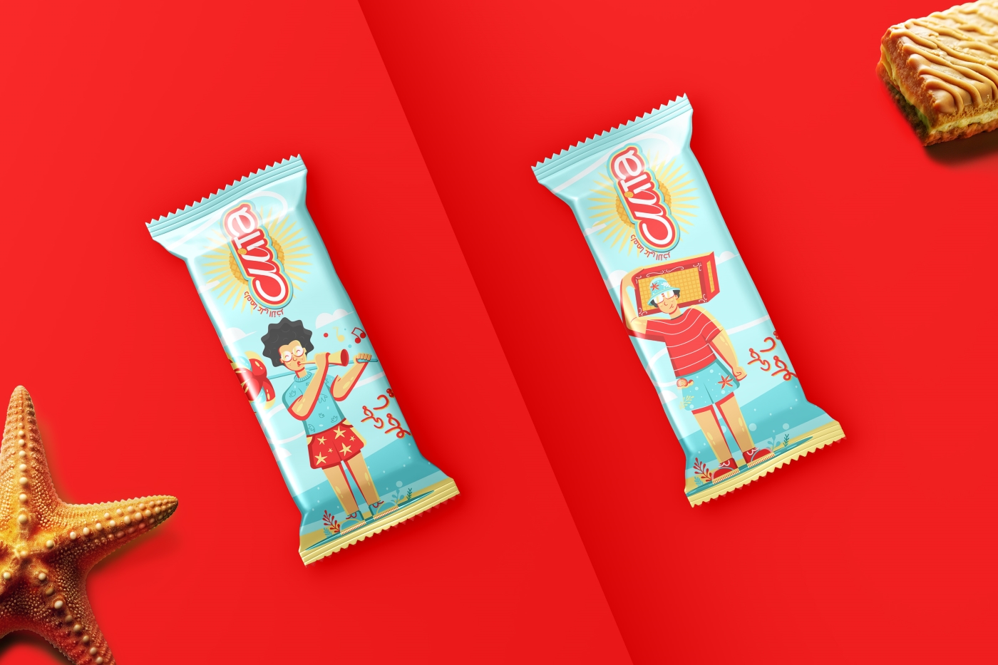
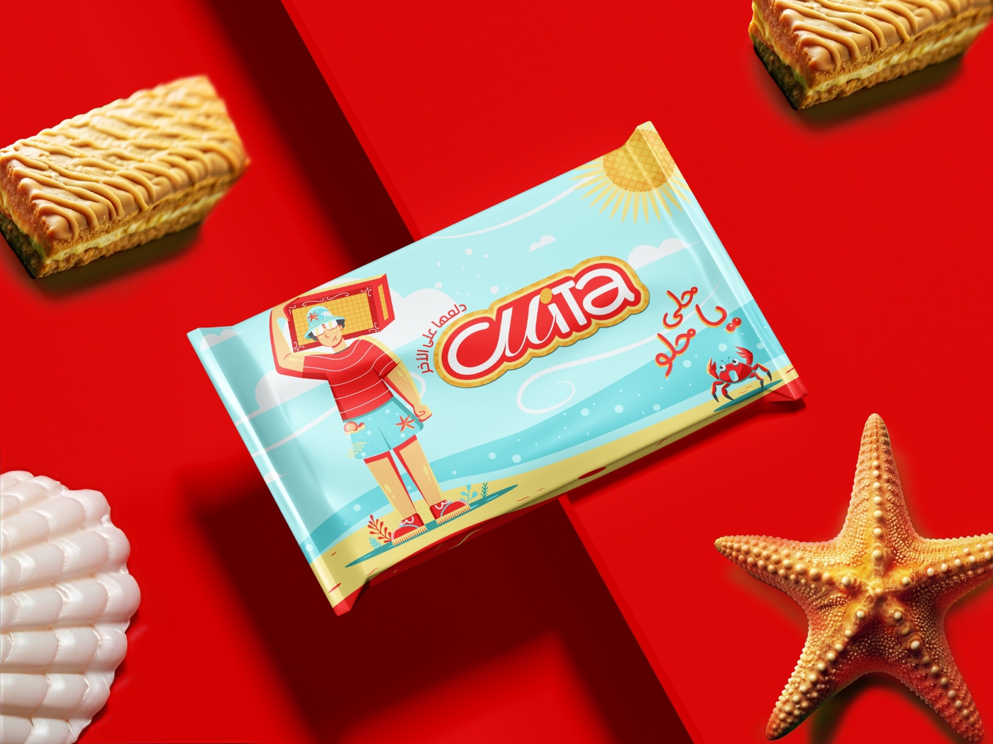
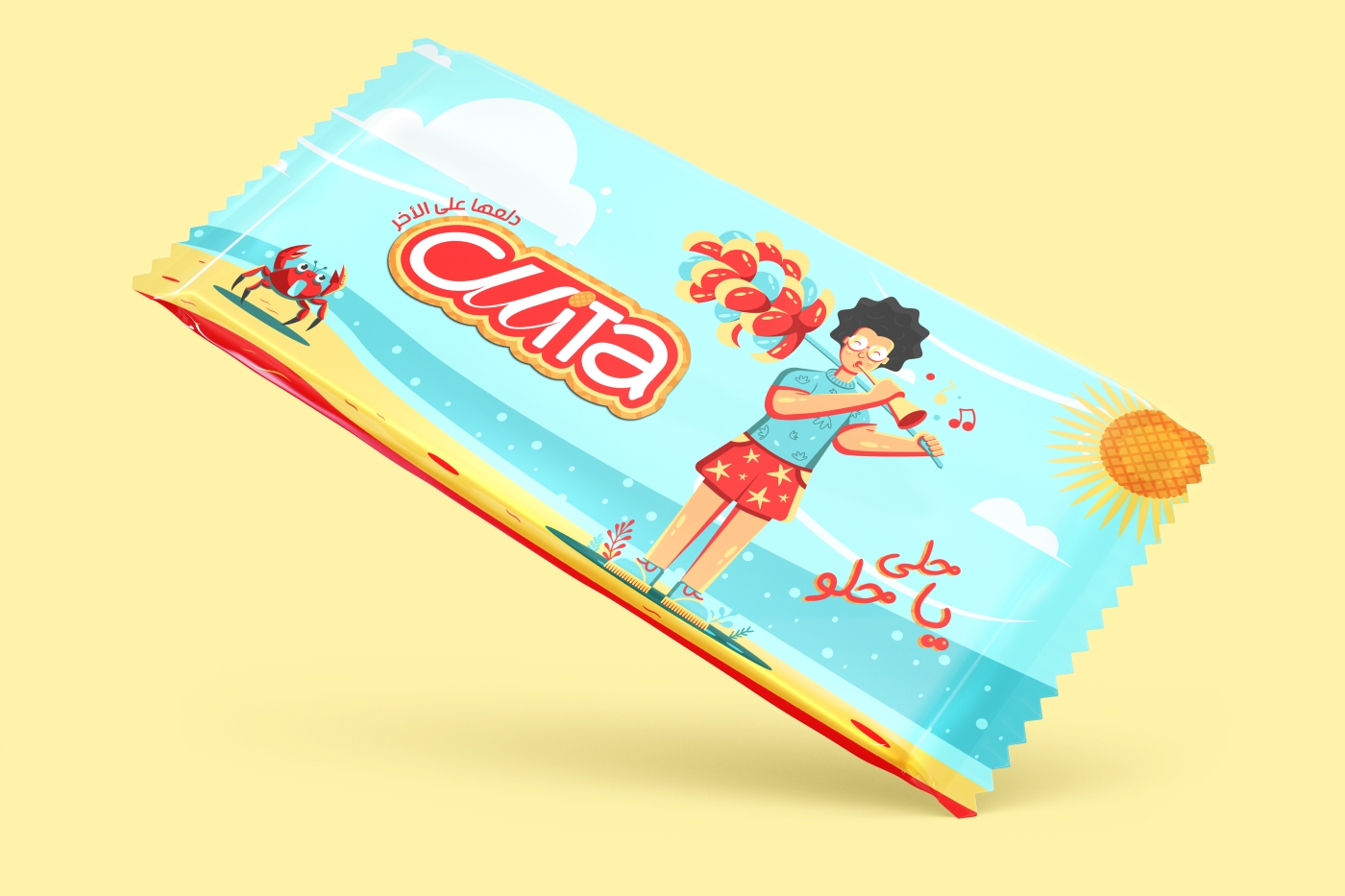
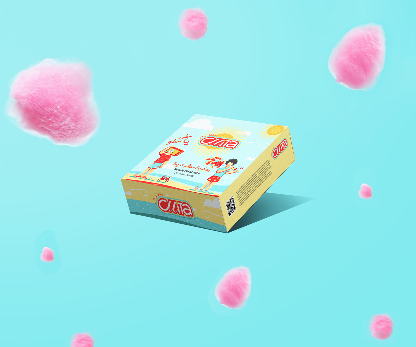
Choosing Illustrations that express the products: “a person selling cotton candy” and “a person selling Fresca on the beach,” in keeping with the start of the product owner’s conflict with his friend. Choosing warm summer climates since this is the most well-known and popular time of year for them.
The story helped us inspire a creative design that reflects the bright side of the story. In designing the logo’s typography, we used modern fonts with distinctive curves and infused them with some font script to connect the elegant past with the modern present.
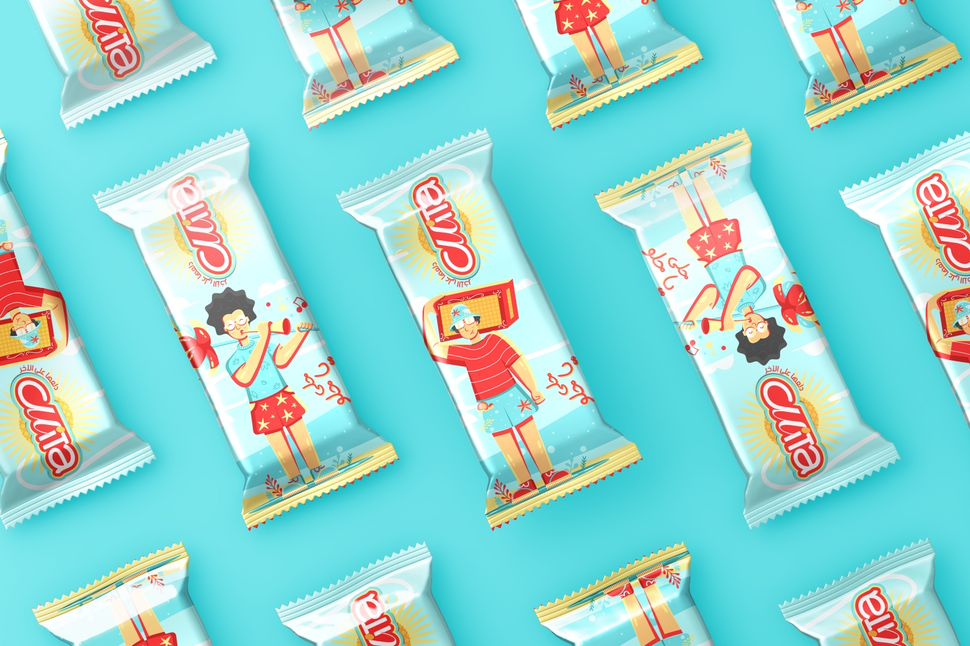
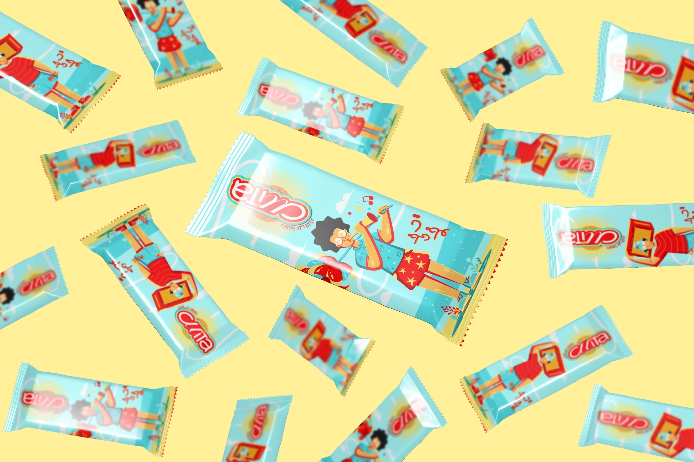
Focusing on the happiness and joy emanating from the piece hidden inside the cover and making everything meld and engage.The target audience is everyone seeking a different and sweeter taste.
CREDIT
- Agency/Creative: BDR Design
- Article Title: BDR Design Crafts Nostalgic and Joyful Brand Identity for Cuita Biscuits
- Organisation/Entity: Agency
- Project Type: Packaging
- Project Status: Published
- Agency/Creative Country: Egypt
- Agency/Creative City: Alexandria
- Market Region: Middle East
- Project Deliverables: Illustration, Packaging Design
- Format: Box, Bucket
- Industry: Food/Beverage
- Keywords: biscuit, Fresca
-
Credits:
illustration: Ahmed Badr
Art Director: BDR.Design


