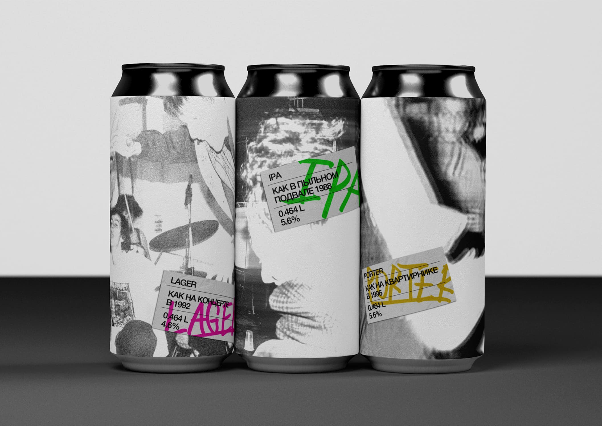
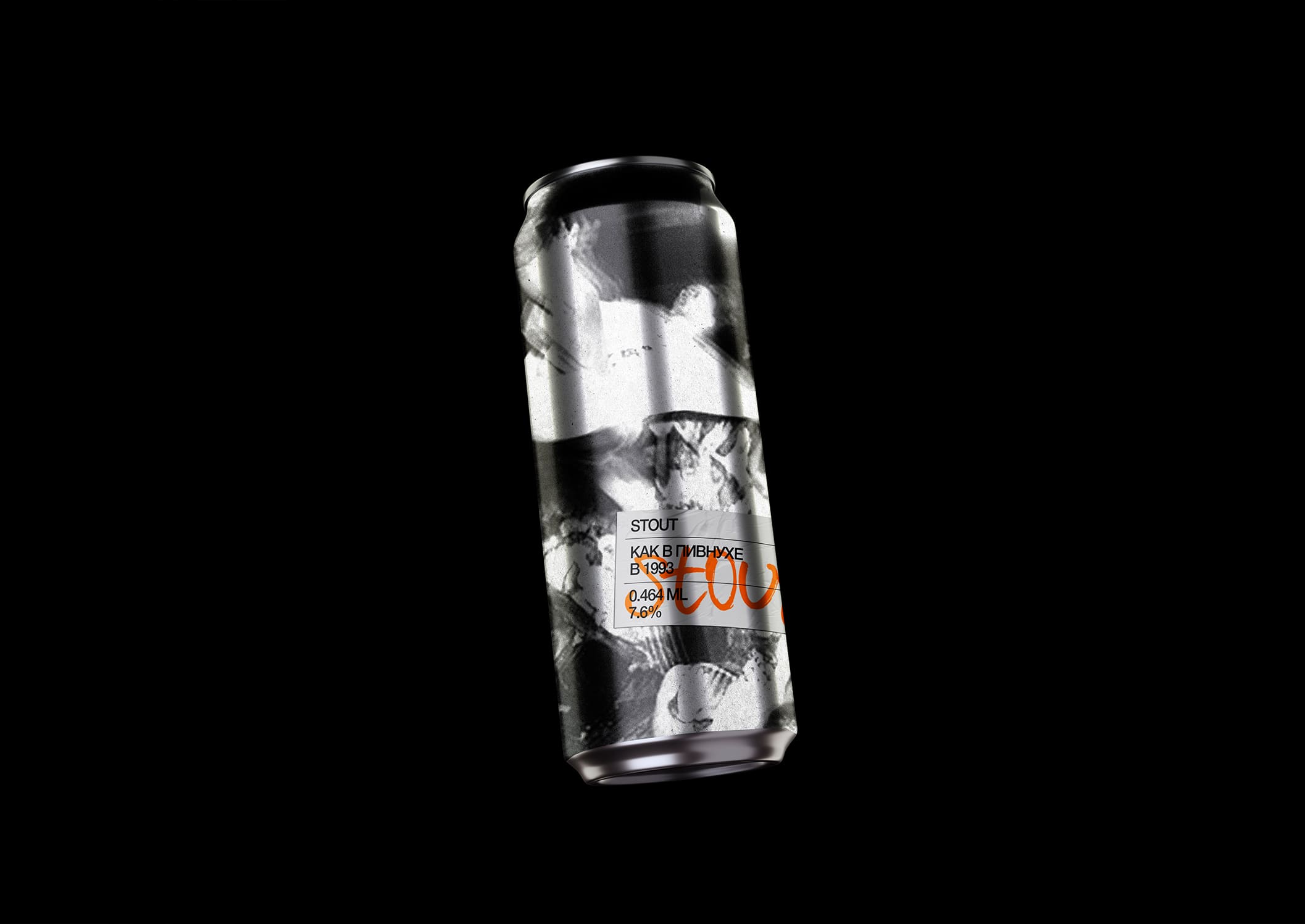
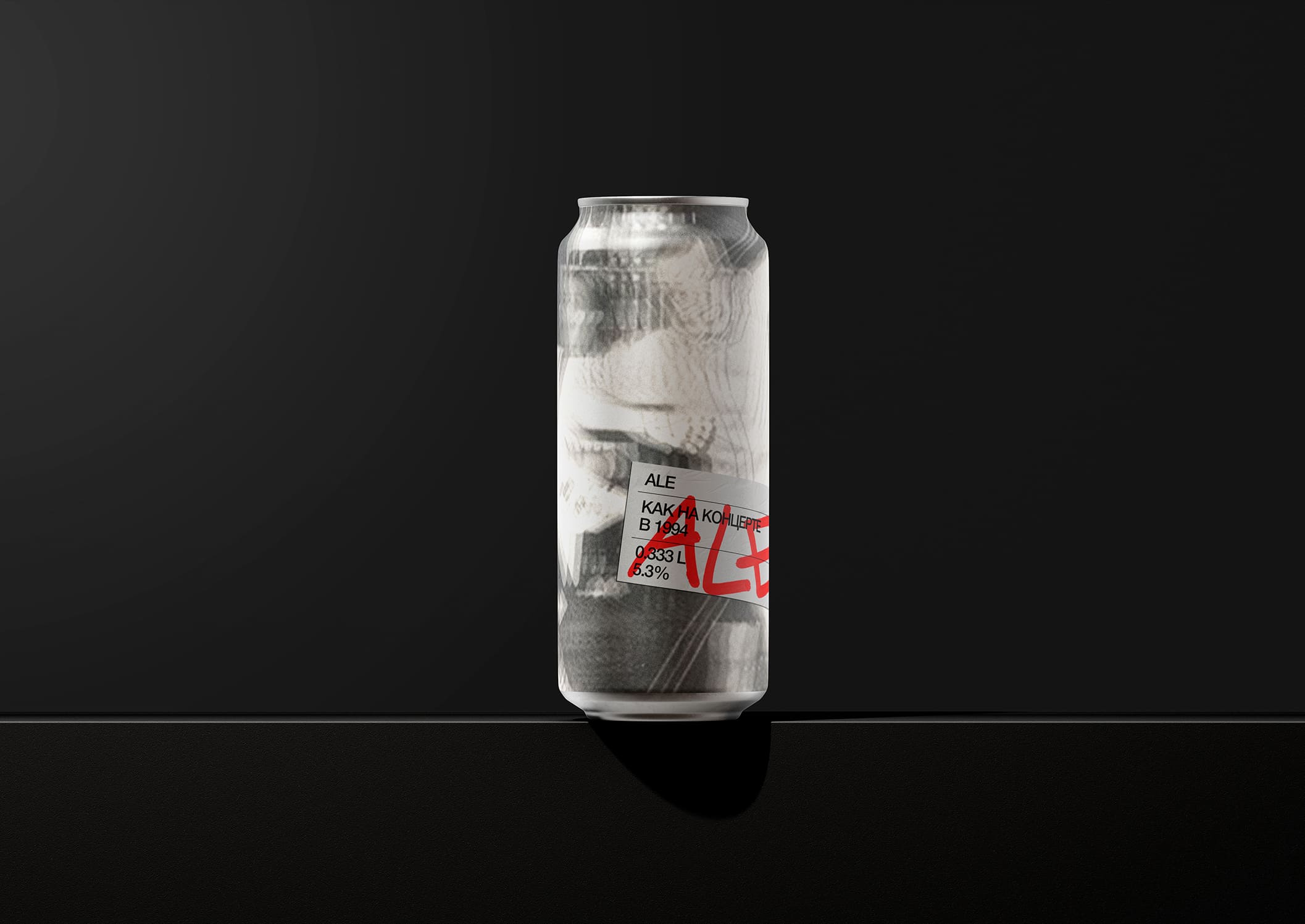
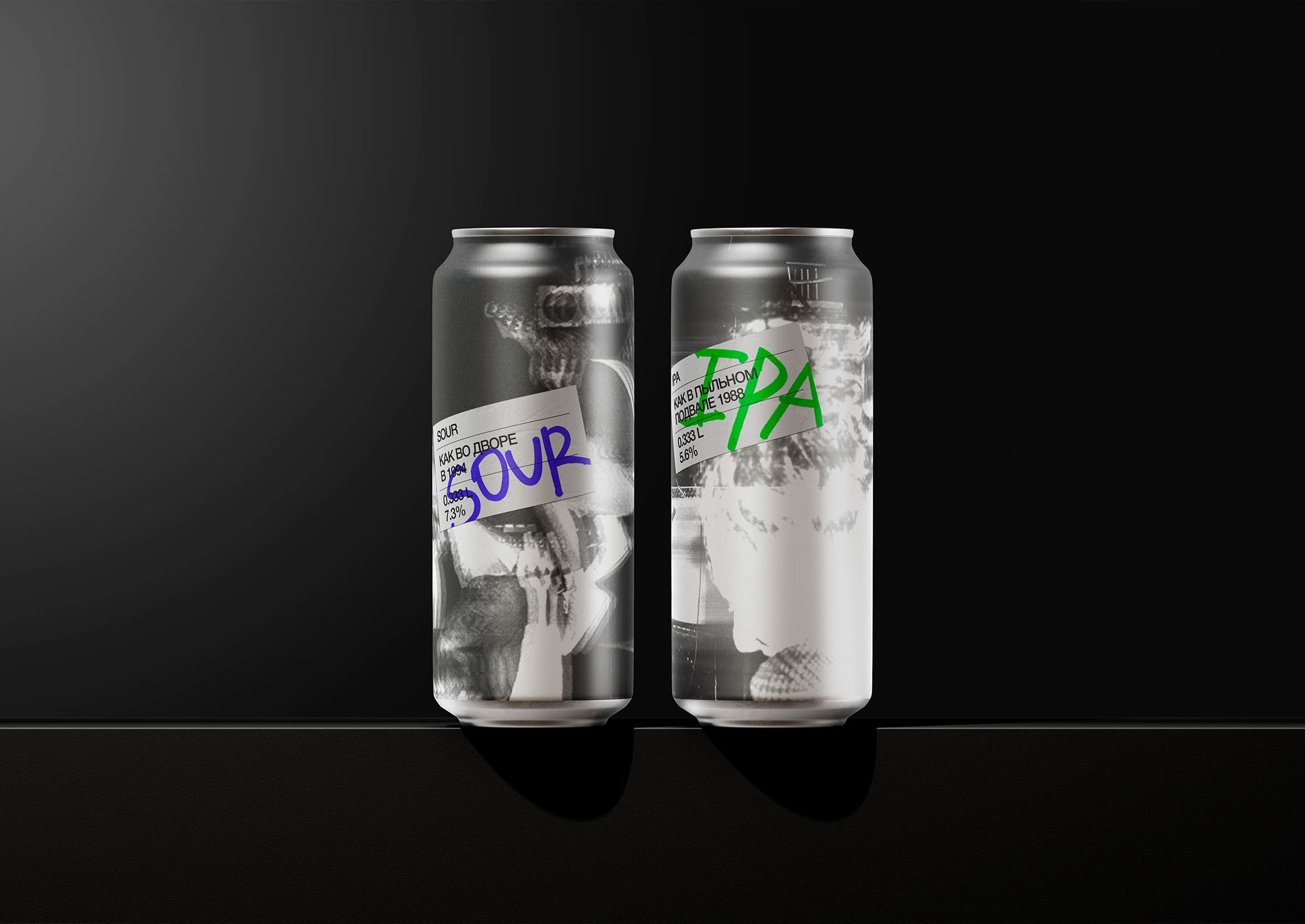
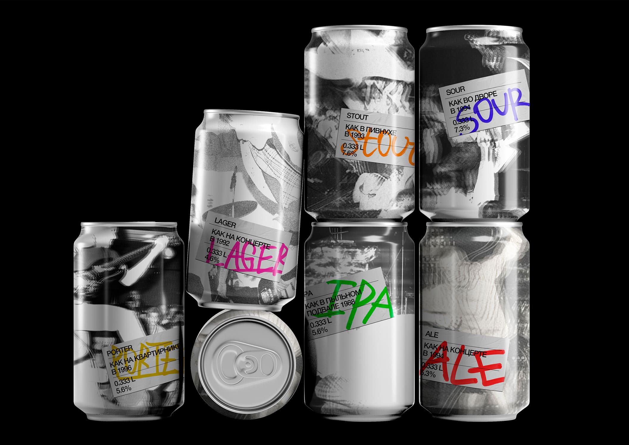
The beer line, showcased in cans, draws heavy inspiration from the raw, unapologetic aesthetics of punk concerts. The core vibe is all about embodying the spirit of punk through edgy, gritty photography. The deliberate blur in the images isn’t random; it’s a nod both to the often poor-quality photography typical of documentary shots from that rebellious era, and to the hazy, half-remembered memories of those explosive concerts more than three decades ago. This beer line is your déjà vu in a can, a sudden jolt of a flashback to punk’s heyday.
When it comes to the typography, it’s all about that DIY ethos. The typography is splashed onto stickers with phrases like “just like a concert in ’93” and other evocative throwbacks, pushing you to relive or sample the vibe of that underground scene. Each beer type’s name isn’t just printed; it’s hand-marked with diverse colored markers, amplifying the do-it-yourself approach that punk was all about. This isn’t just beer; it’s a taste of rebellion, a swig of nostalgia bringing the fierce spirit of the 90s punk era into your hand.
By embracing this aesthetic, the design taps into the chaotic, yet creative energy of punk culture. It’s not just about the drink; it’s about the experience, the raw recollection of loud guitars, crammed venues, and unfiltered expression. Every can serves as a time capsule, blurring the lines between past and present, inviting you to revisit the anarchic charm of punk rock with every sip.
CREDIT
- Agency/Creative: Burakov Vladislav
- Article Title: Student Burakov Vladislav Unveils Punk-Inspired Beer Line Design: A Raw Throwback in a Can
- Organisation/Entity: Student
- Project Type: Packaging
- Project Status: Published
- Agency/Creative Country: Russia
- Agency/Creative City: MOSCOW
- Market Region: Europe
- Project Deliverables: Art Direction, Graphic Design, Packaging Design
- Format: Can
- Industry: Food/Beverage
- Keywords: BEER, ALCOHOL, PUNK
-
Credits:
Designer: Burakov Vladislav
CURATOR: Slavin Leonid


