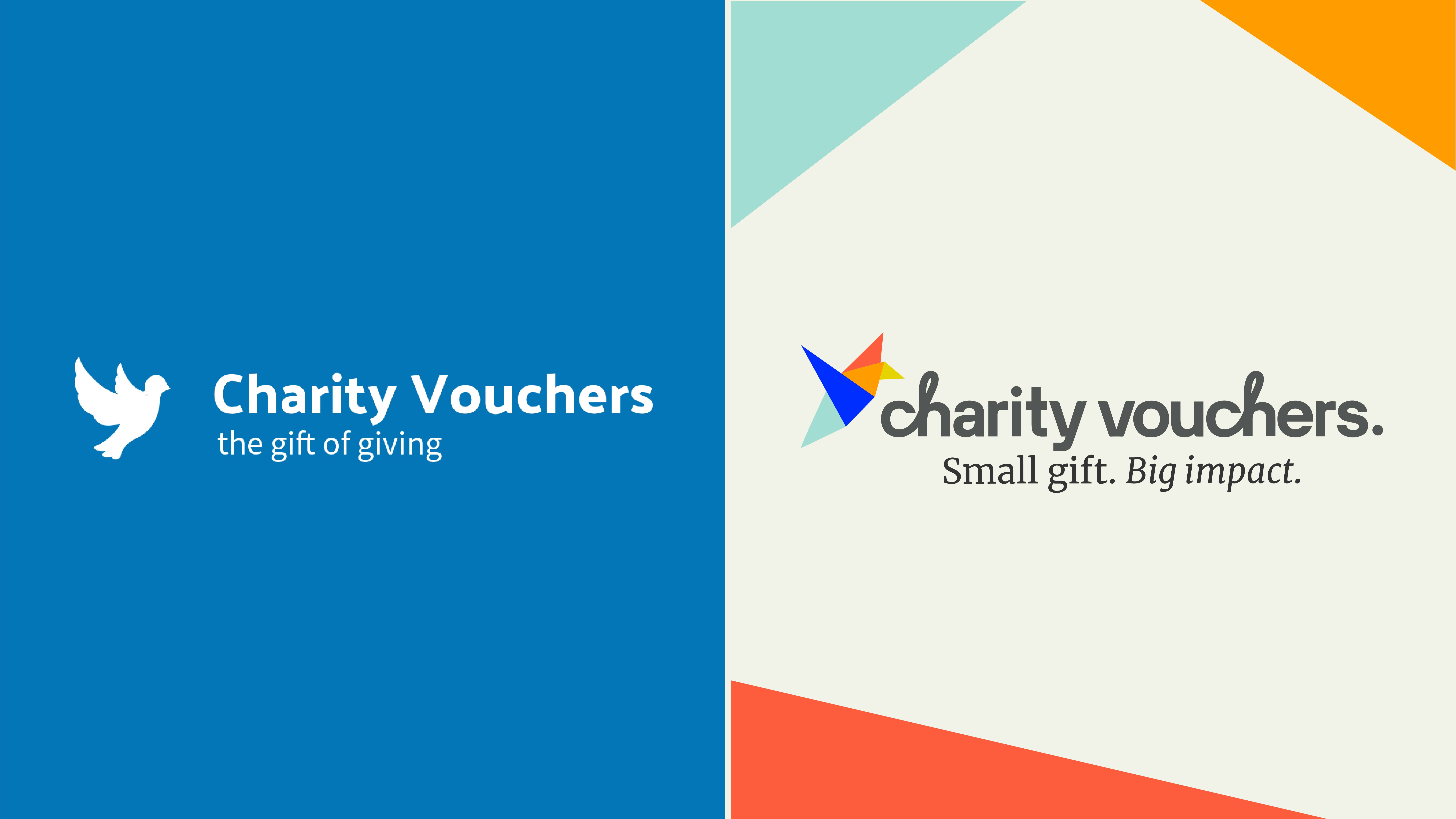
The not-for-profit company, Charity Vouchers, has collaborated with strategic brand design agency, Outlaw, to redesign their 22-year-old visual identity and breathe new life into the brand as they look to support more UK charities than ever before.
Founded in 2002, Charity Vouchers is a not-for-profit service that lets people buy and give charitable donations as gifts, with the recipient able to donate their voucher’s value to any UK Registered Charity – the only UK not-for-profit that allows people to do this.
As a unique business model with no substantial backers or start-up funding at the outset, the original branding was designed to communicate goodness and trustworthiness. However two decades later it was missing the ‘feel-good factor’ or a clearly defined point of difference for the brand vs. its competition.
In a post-pandemic era where giving has become even more important and consumers have hit peak ‘stuff’, a refreshed visual identity was also an opportunity to attract new audiences – including corporations – to this unique way of gifting. Outlaw’s mission was to revolutionise the brand identity, transforming Charity Vouchers into the number one choice for those seeking meaningful ways to give.
Charity Vouchers is committed to giving 100% of the redeemed voucher value to charity with no hidden fees, unlike many of its competitors. This insight framed the key opportunity for the brand: to create a look and feel that celebrates the exponential impact of giving.
Outlaw’s category analysis uncovered that the act of giving had become transactional, focusing on the exchange itself rather than the emotion or impact of the gift. To counter this the new design would need to dial up the emotion and feeling that comes from giving.
Further research revealed that the value of giving has been redefined. Experiences now trump material possessions, creating a unique opportunity to celebrate the emotional, altruistic and sustainable values that underpin the Charity Vouchers brand.
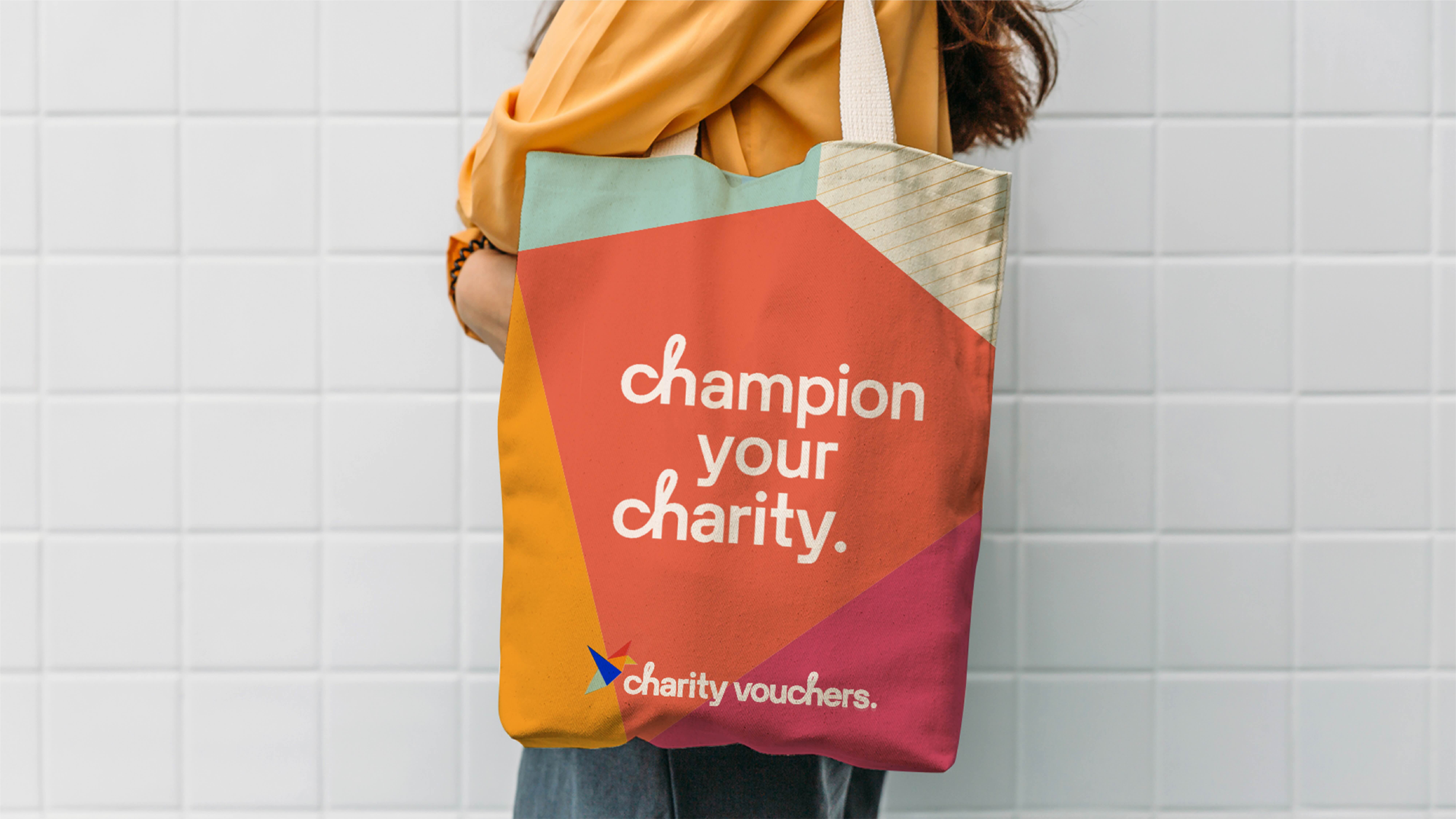
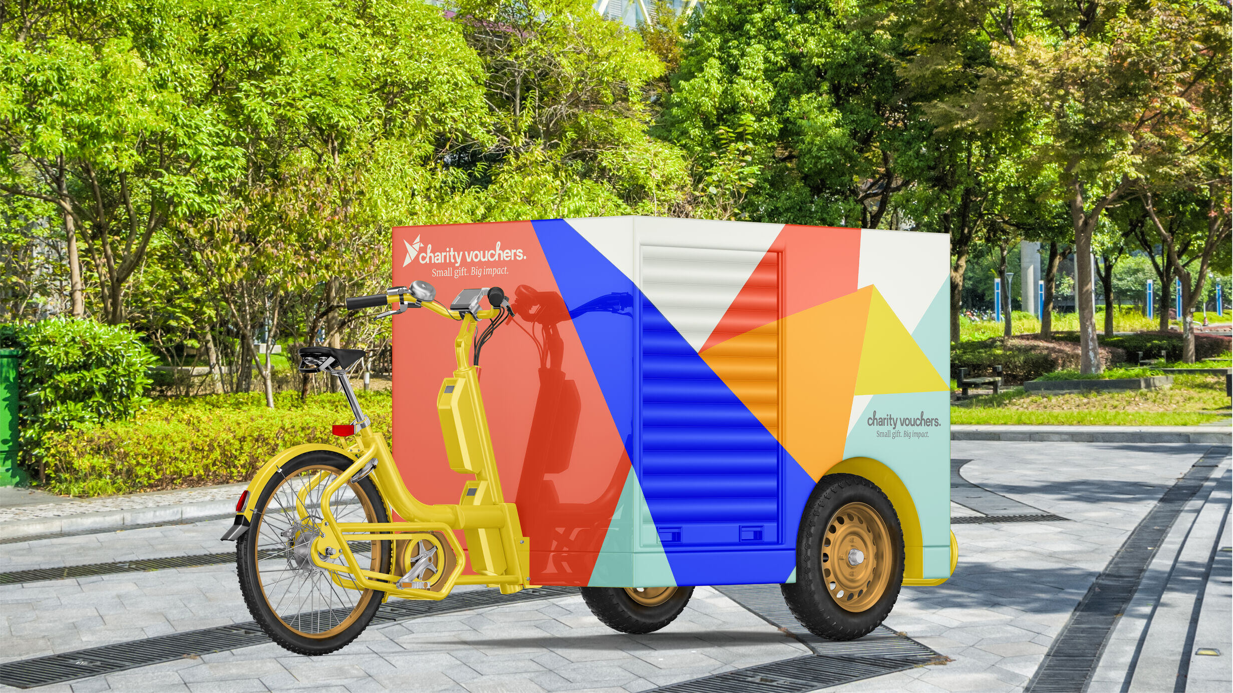
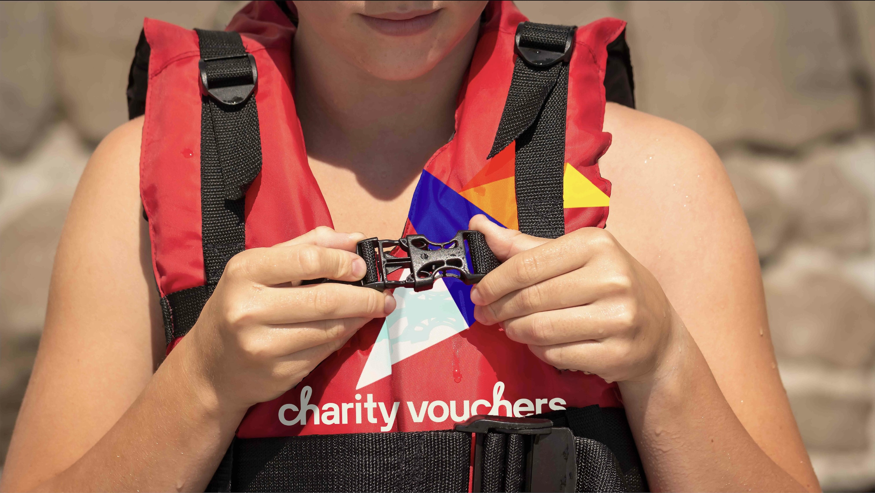
Outlaw’s new design reinvents the dove icon as a bright and joyful origami bird, blending together the dove of the previous identity with the idea of a voucher, and creating a distinctive visual asset that embodies thoughtfulness, cultural appreciation, creativity and sustainability. This bird became the start point for the new brand world, creating a system that was flexible and dynamic while being consistent enough to drive recognition across multiple touchpoints from print to digital, merchandise and corporate materials.
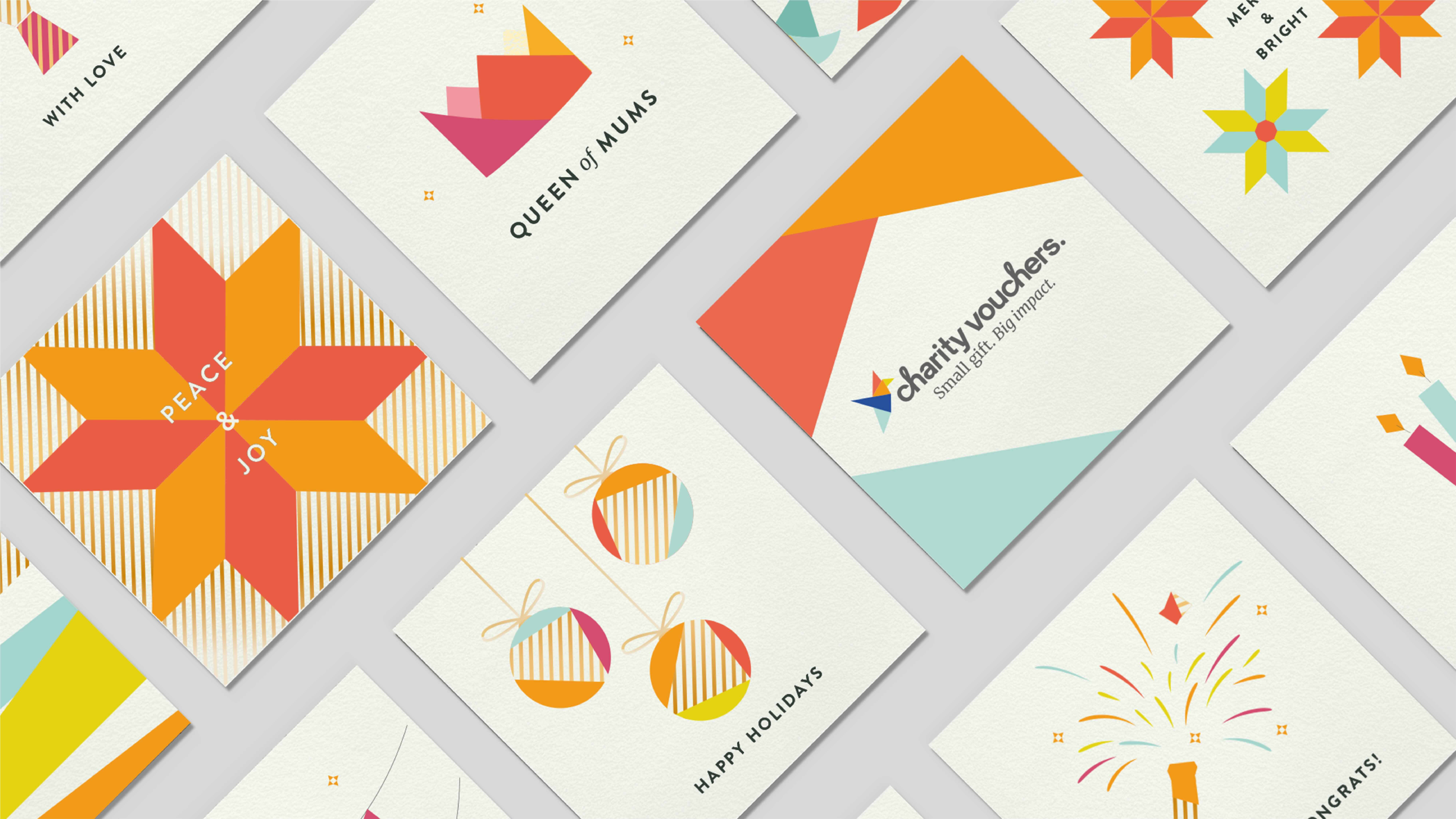
For the vouchers themselves it was important that consumers could still choose from a wide range of occasions. So each design was brought to life in a ‘house style’ born from the brand identity, across posted voucher cards, print-at-home paper vouchers and e-vouchers.
The new look and feel brings modernity and emotion to the brand and delivers on the updated brand positioning – ‘small gift, big impact’.
Feedback from UK charities has been overwhelmingly positive, with voucher sales increasing by 67% compared to the previous year following the rebrand launch. The new message is clear: if you’re looking for a gift that brings joy through sharing, caring, and fostering a better future, Charity Vouchers is the perfect choice.
Outlaw Creative Director, Brett Stabler said: “There are over 170,000 charities operating in the UK today. That’s an ocean of energy and passion to carry into our collaboration with Charity Vouchers. Blend that with the simple joy of giving and the massive freedom of choice and it’s no wonder our team conjured up a kaleidoscopic world from the humble analogue voucher. And folded a fluttering neon bird into its heart. His name is Bernard, by the way. Look at him go!”
Charity Vouchers Founder, David Black said: “Although a redesign was long overdue, Outlaw took the time to really get to grips with our business before putting pen to paper on any changes to our branding. There was great communication throughout the process and they were always keen to hear our thoughts and feedback. The end result is a rejuvenated brand image which has brought new energy to us as a team and has been very well-received by customers!”




CREDIT
- Agency/Creative: OUTLAW
- Article Title: Outlaw Inspires Joyful Giving with Redesign of 22-year-old Not-For-Profit, Charity Vouchers
- Organisation/Entity: Agency
- Project Type: Identity
- Project Status: Published
- Agency/Creative Country: United Kingdom
- Agency/Creative City: Bristol
- Market Region: Europe
- Project Deliverables: Brand Design, Brand Experience, Brand Guidelines, Brand Identity, Brand Redesign, Brand Refinement, Brand Strategy, Brand Tone of Voice, Brand World, Branding, Identity System
- Industry: Non-Profit
- Keywords: rebrand brand design redesign visual identity
-
Credits:
Business Director: Tim Dalton
Creative Dirctor: Brett Stabler
Designer: Aemelia Turton
Designer: Beth Vizard-Overbury
Senior Designer: Emma Proven
Marketing Manager: Josh Matthews
Strategist: Tom Grain


