


Concept for the Traders on Edge Brand
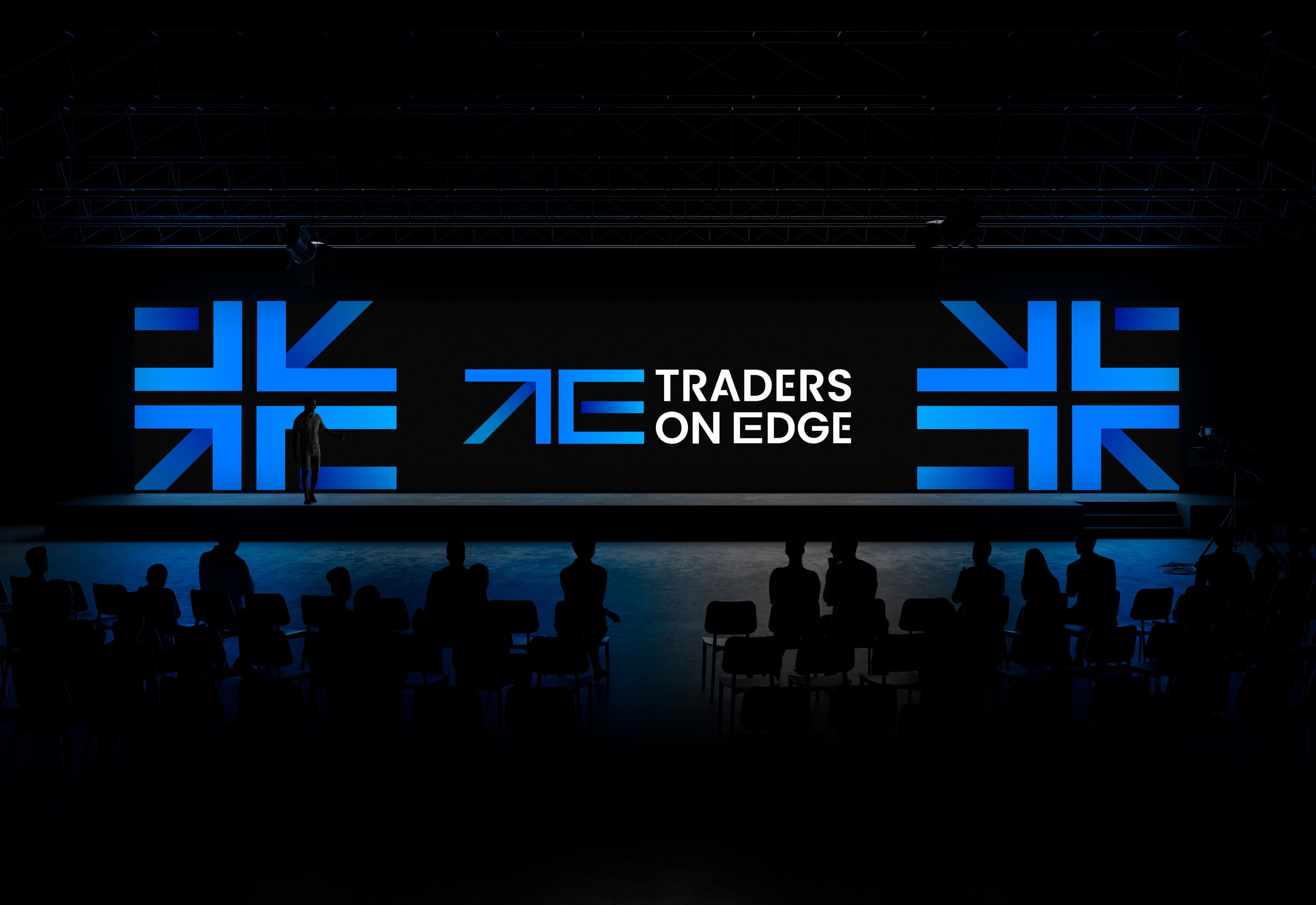
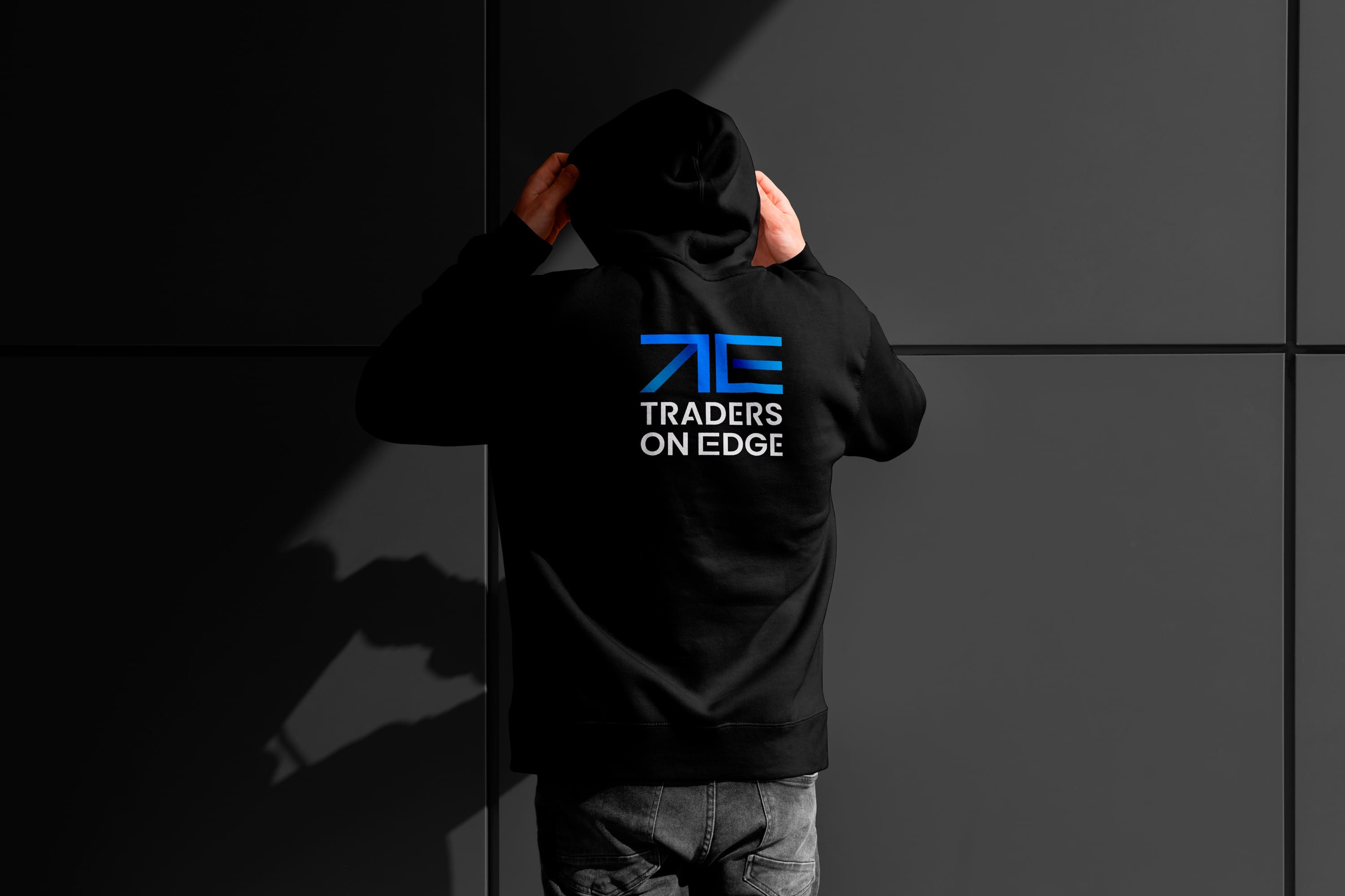
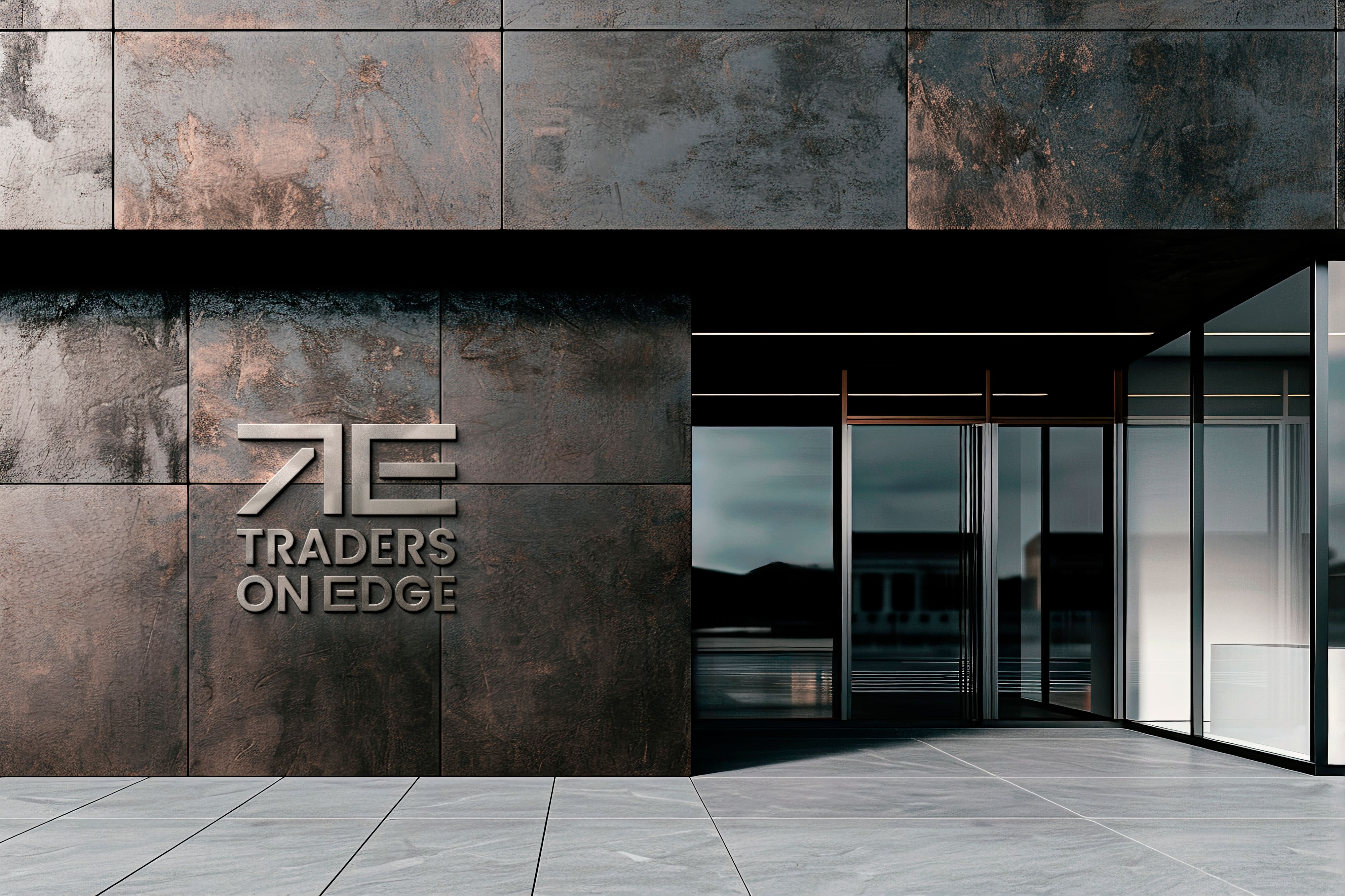
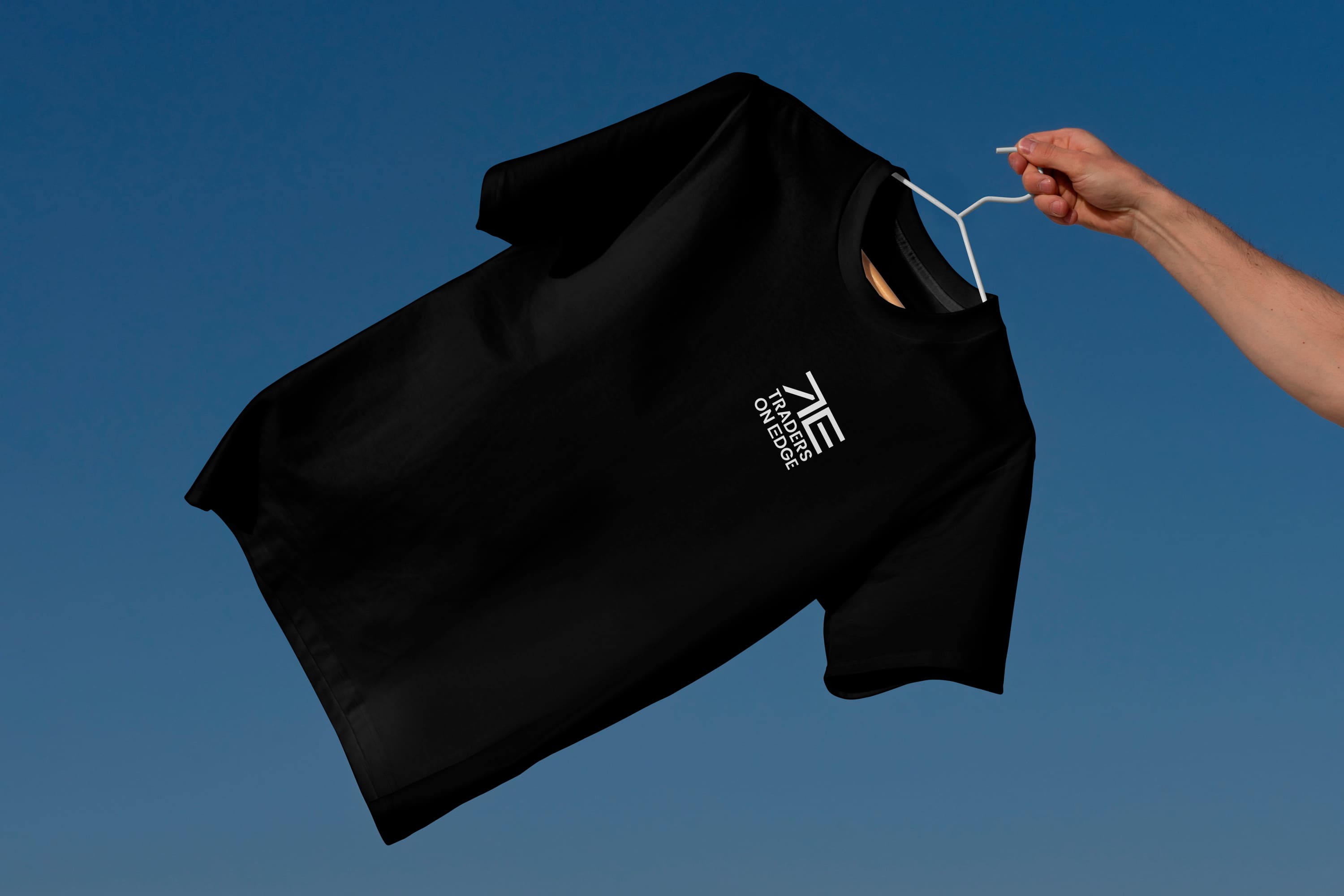
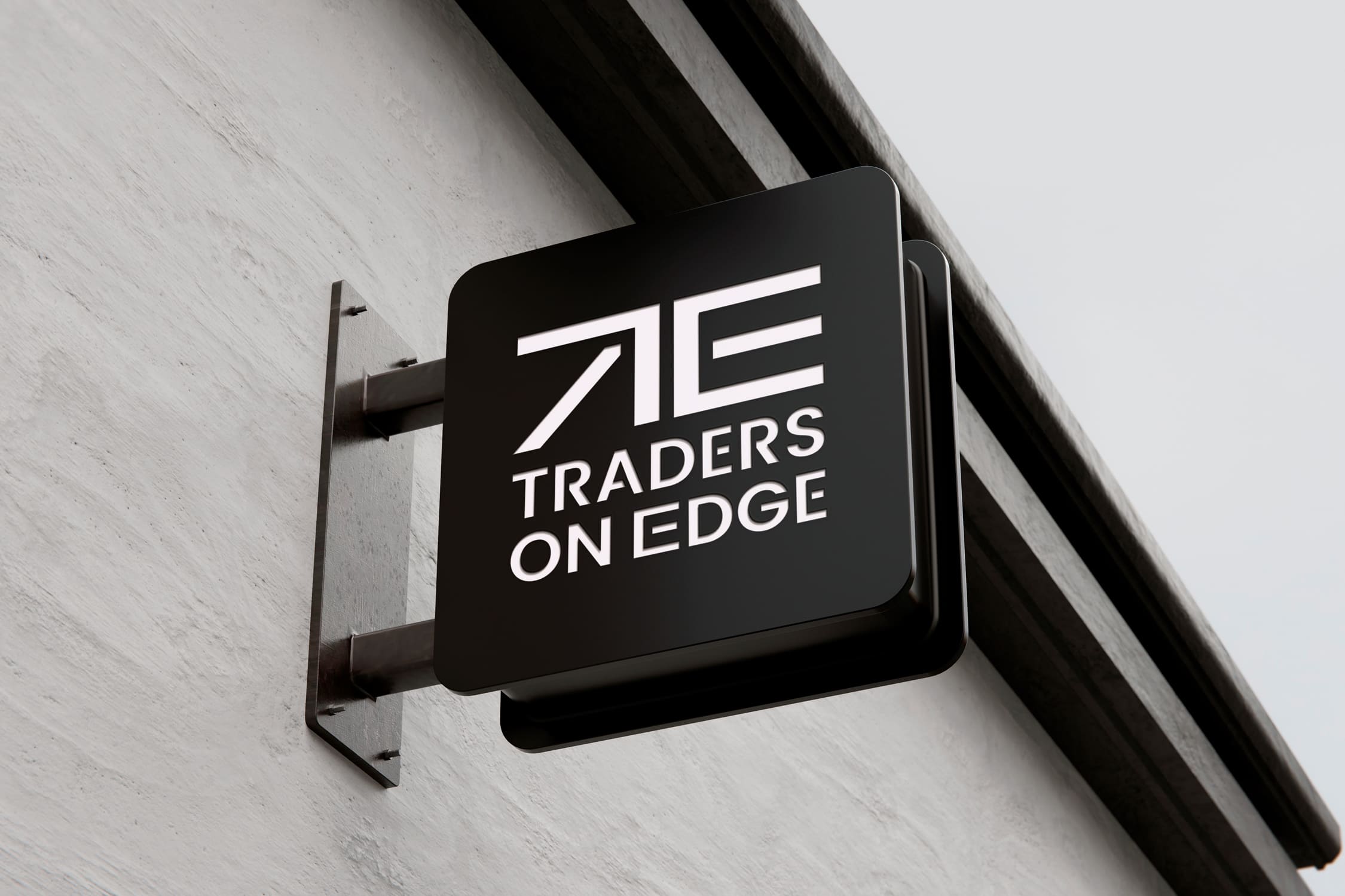
The Traders on Edge logo embodies a modern and dynamic spirit, designed to reflect the core values of progress and innovation that define the brand. At its heart, the logo is a masterpiece of subtlety and intelligence, ingeniously incorporating an arrow symbol. This arrow not only signifies forward movement and advancement but also hints at a promising future in the financial market, aligning perfectly with the aspirations and ambitions of our clients.
The visual elements of the logo are meticulously crafted to convey a sense of sophistication and forward-thinking. The clean lines and contemporary design elements work harmoniously to create an image that is both cutting-edge and timeless. This balance ensures that the Traders on Edge brand stands out in a crowded marketplace, resonating with an audience that values both tradition and innovation.
Color plays a pivotal role in the logo’s impact. The vibrant and contrasting hues were carefully selected to evoke strong emotional responses. The chosen blue, in particular, is not merely a color but a symbol. It embodies trust and stability, essential qualities in the financial sector. Additionally, blue represents innovation and growth, reinforcing the brand’s commitment to helping clients navigate and thrive in the ever-evolving financial landscape.
By combining these elements, the Traders on Edge logo achieves a bold and memorable visual identity. It captures the essence of what the brand stands for: a reliable partner in the financial market, always pushing the boundaries and leading the way towards new horizons. This visual identity is designed to leave a lasting impression, making Traders on Edge synonymous with excellence and forward momentum in the minds of its audience.
CREDIT
- Agency/Creative: david carranca
- Article Title: Traders on Edge Branding Concept by David Carranca
- Organisation/Entity: Freelance
- Project Type: Digital
- Project Status: Published
- Agency/Creative Country: Portugal
- Agency/Creative City: loule
- Market Region: Europe
- Project Deliverables: Brand Design, Brand Guidelines, Graphic Design, Logo Design
- Industry: Financial
- Keywords: #design #branding #finance #bitcoin #graphic #logo #identity
-
Credits:
Graphic designer: david carranca


