When long-standing clients of ours, Kingfisher Drinks, approached us with a cider brand that was all about taste, but didn’t have the category recognition that it deserved, we asked, why not… be more Peacock?
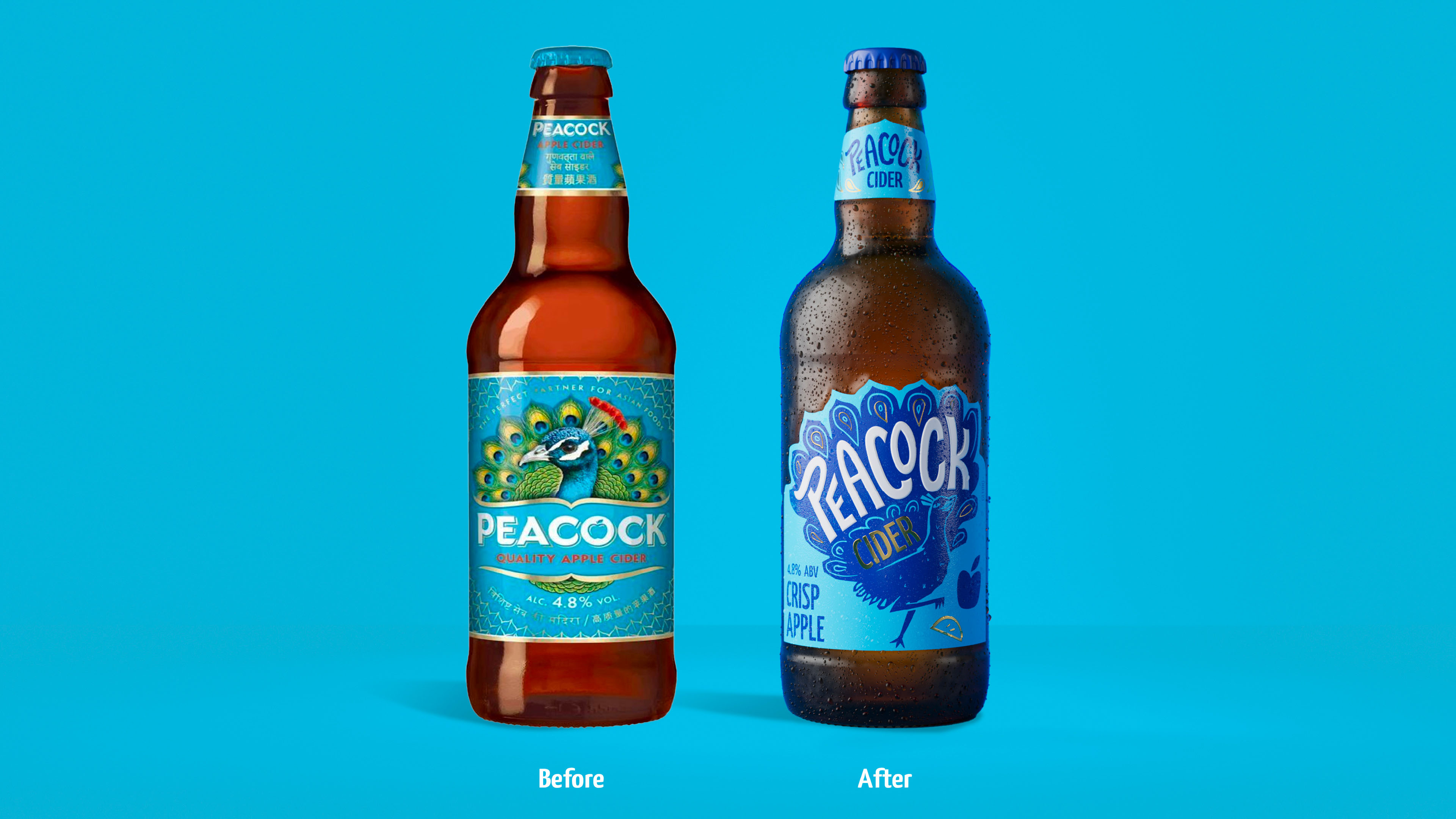
The brand faced a number of challenges; despite having some excellent UK-wide accounts, the Kingfisher Drinks name behind it, and a reputation as an excellent cider to pair with Asian flavours. Research showed that the brand didn’t have the fun-feel and personality a younger consumer expected from a liquid meant for a social occasion. With consumers drinking less and being selective about spending, it was important to create a brand that felt as unique and spirited as the consumer, reflecting that right back at them. And it goes without saying that the brand’s name and icon weren’t working cohesively. We’d have been wild not to have capitalised on the opportunity to build a brand all about the Peacock; our research demonstrating that character-led brands have a competitive advantage, gaining new consumers, market share, and increasing profit at a higher rate than those without. You might say they ruffle more feathers!
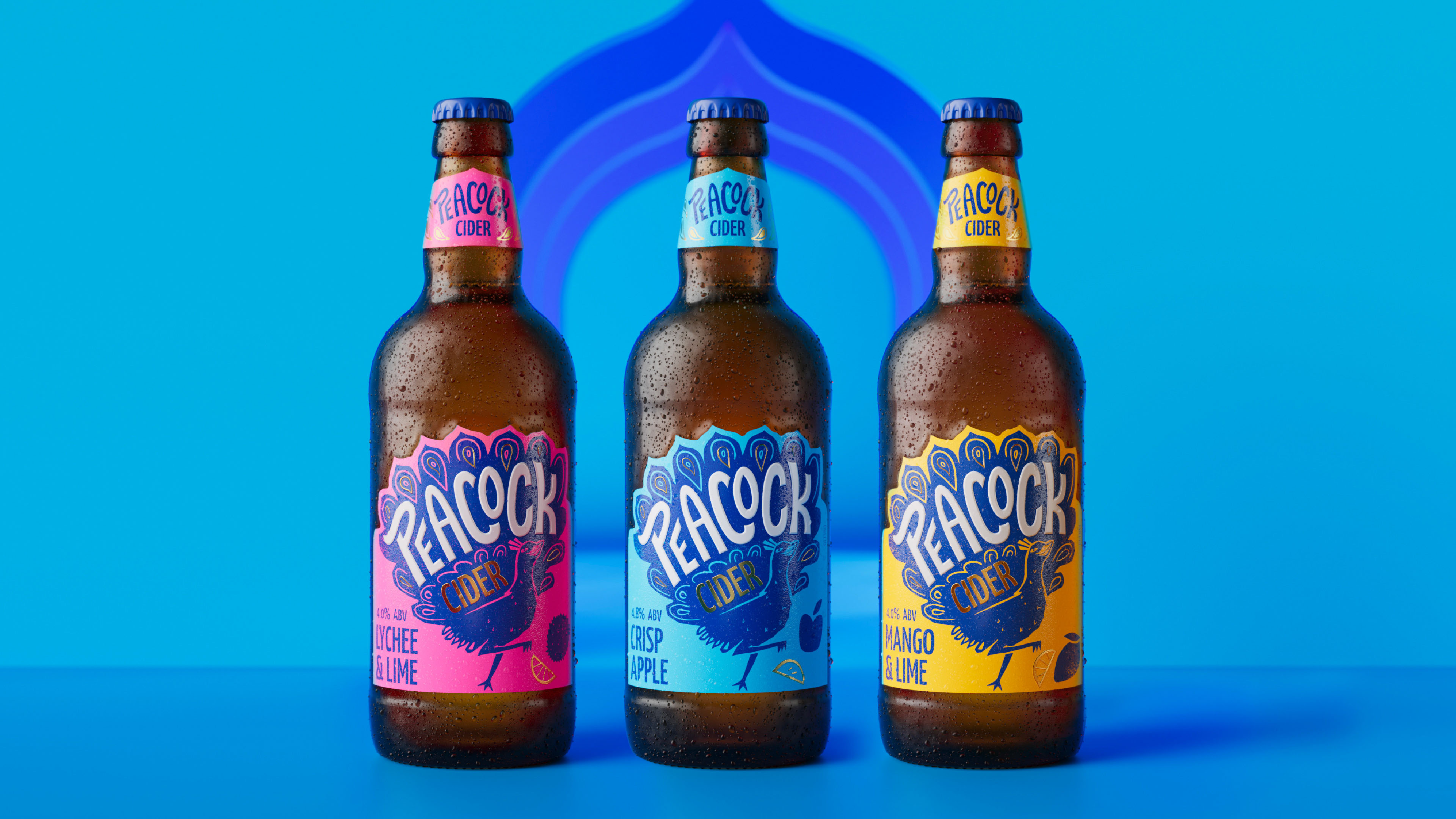
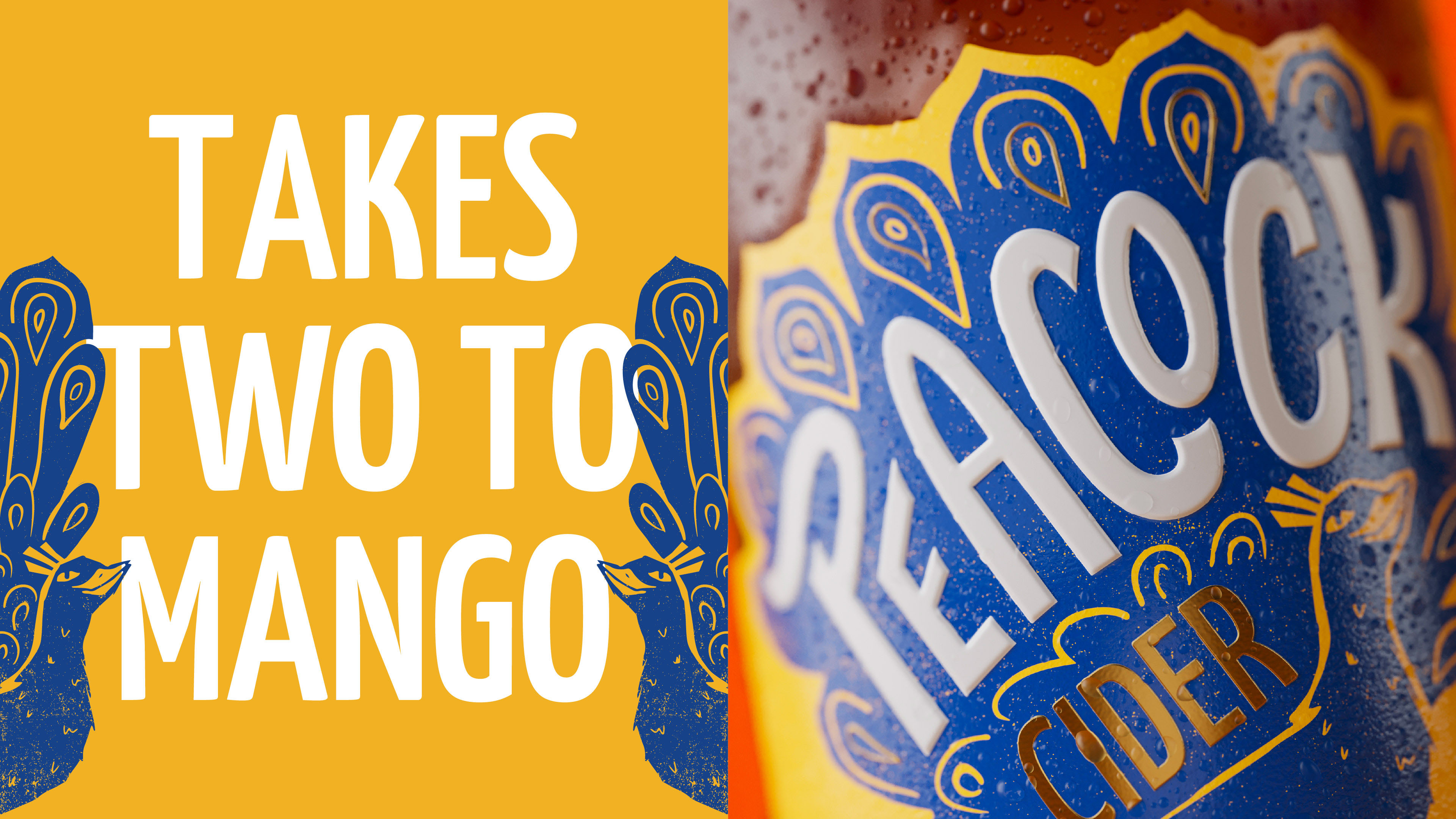
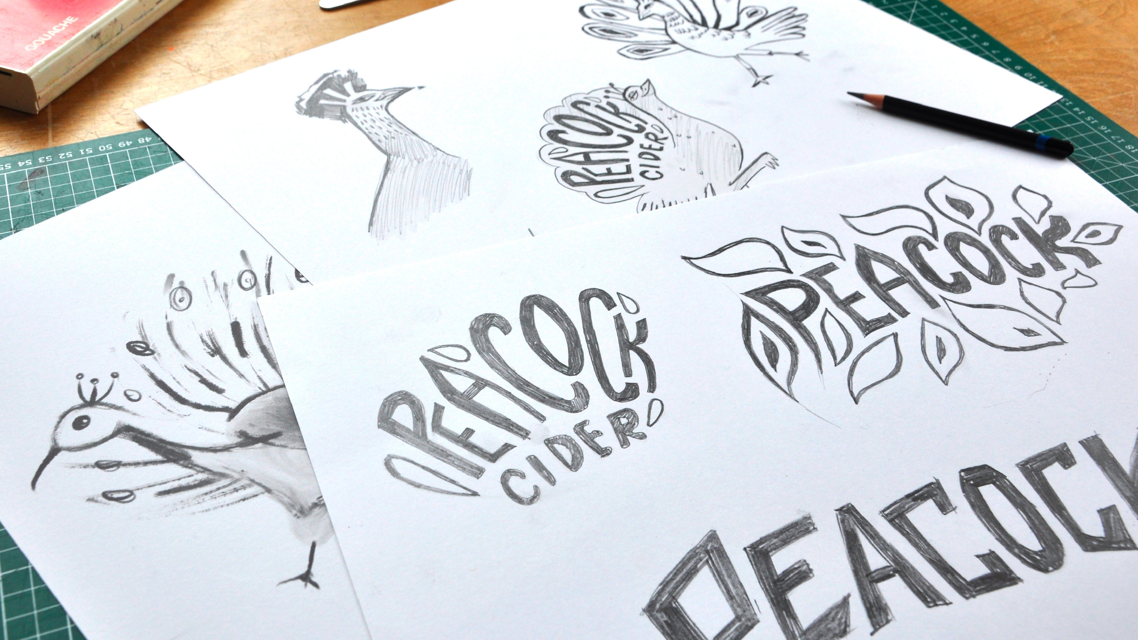
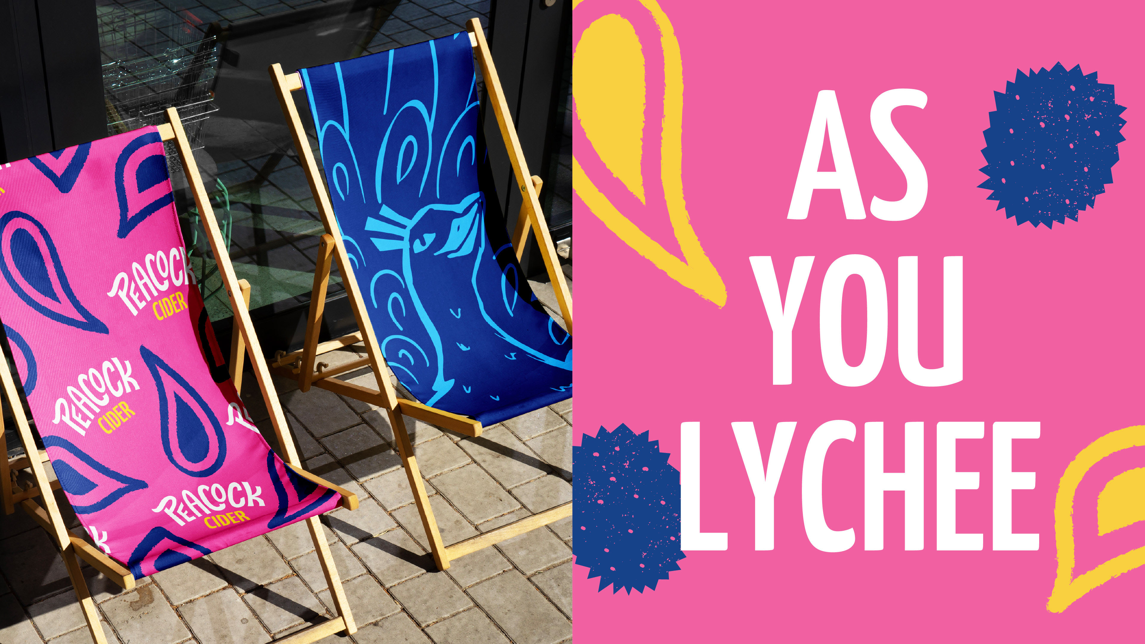
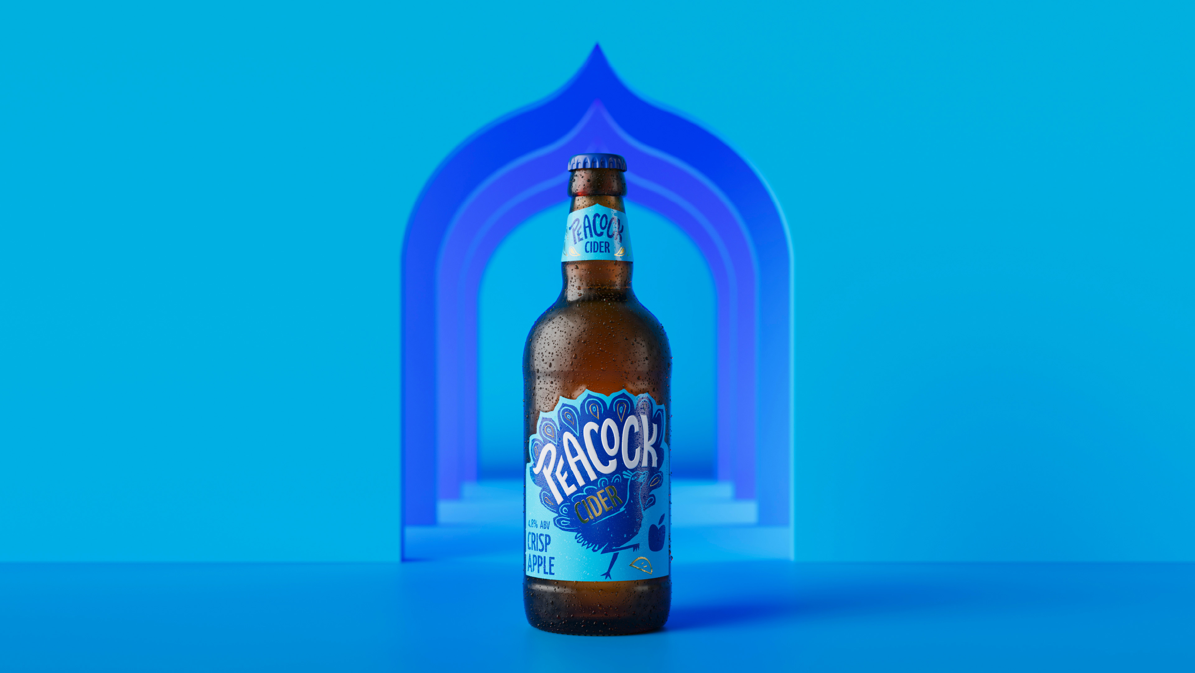
Peacock’s rebrand positions the brand as cider’s biggest personality. With a little attitude and a lot of vibrancy, it exists to grab your attention – just like its avian counterpart. Across all touchpoints, the Peacock character, drawn by hand in the Kingdom & Sparrow studio, takes the lead and invites you to discover something new. Strutting into the frame, the illustration looks the consumer in the eye, evoking the brand’s confident personality and challenging the consumer to get involved. The illustration is complemented by a bold type choice which delivers assertive, tongue-in-cheek messaging across the brand world.
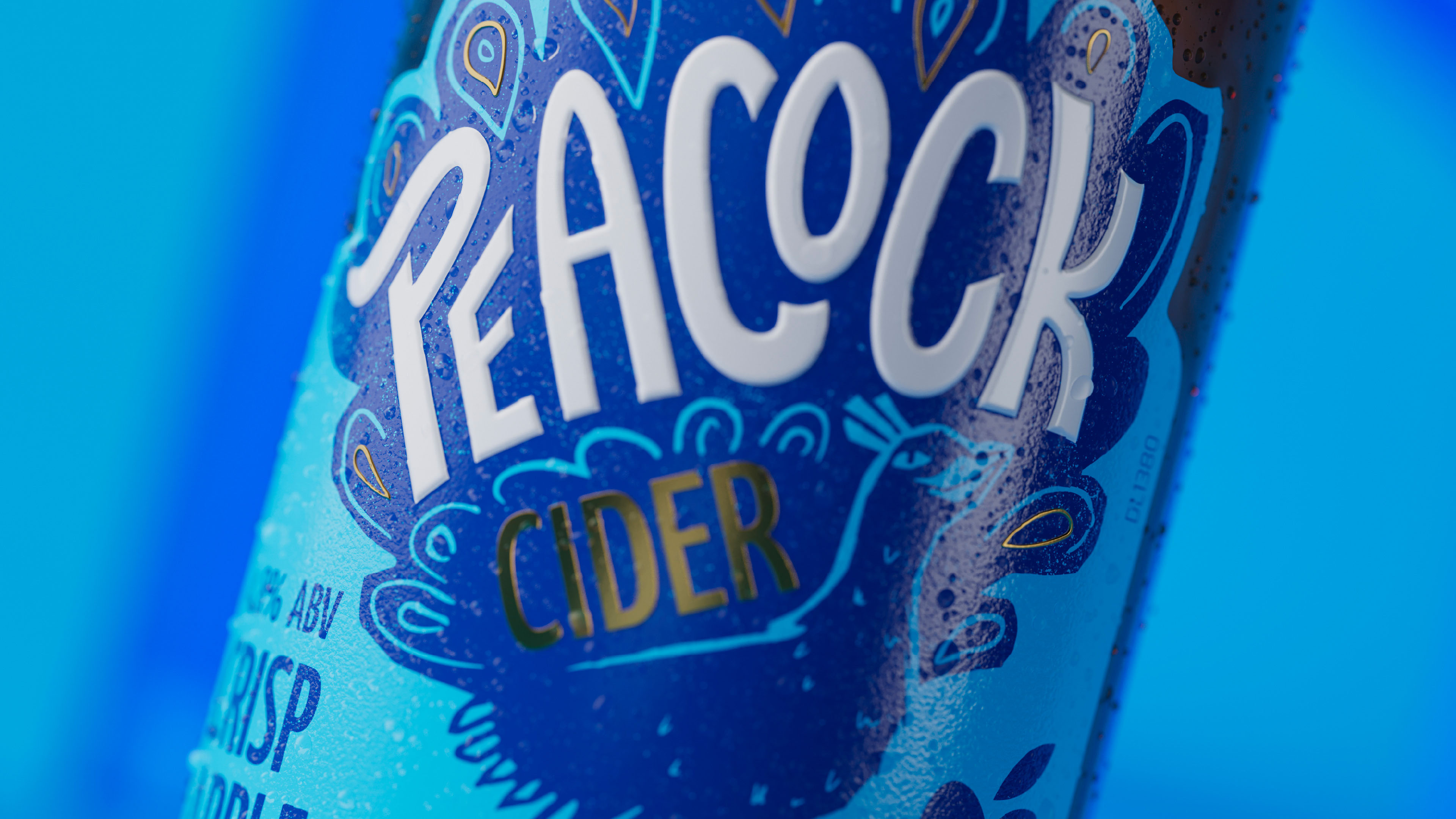
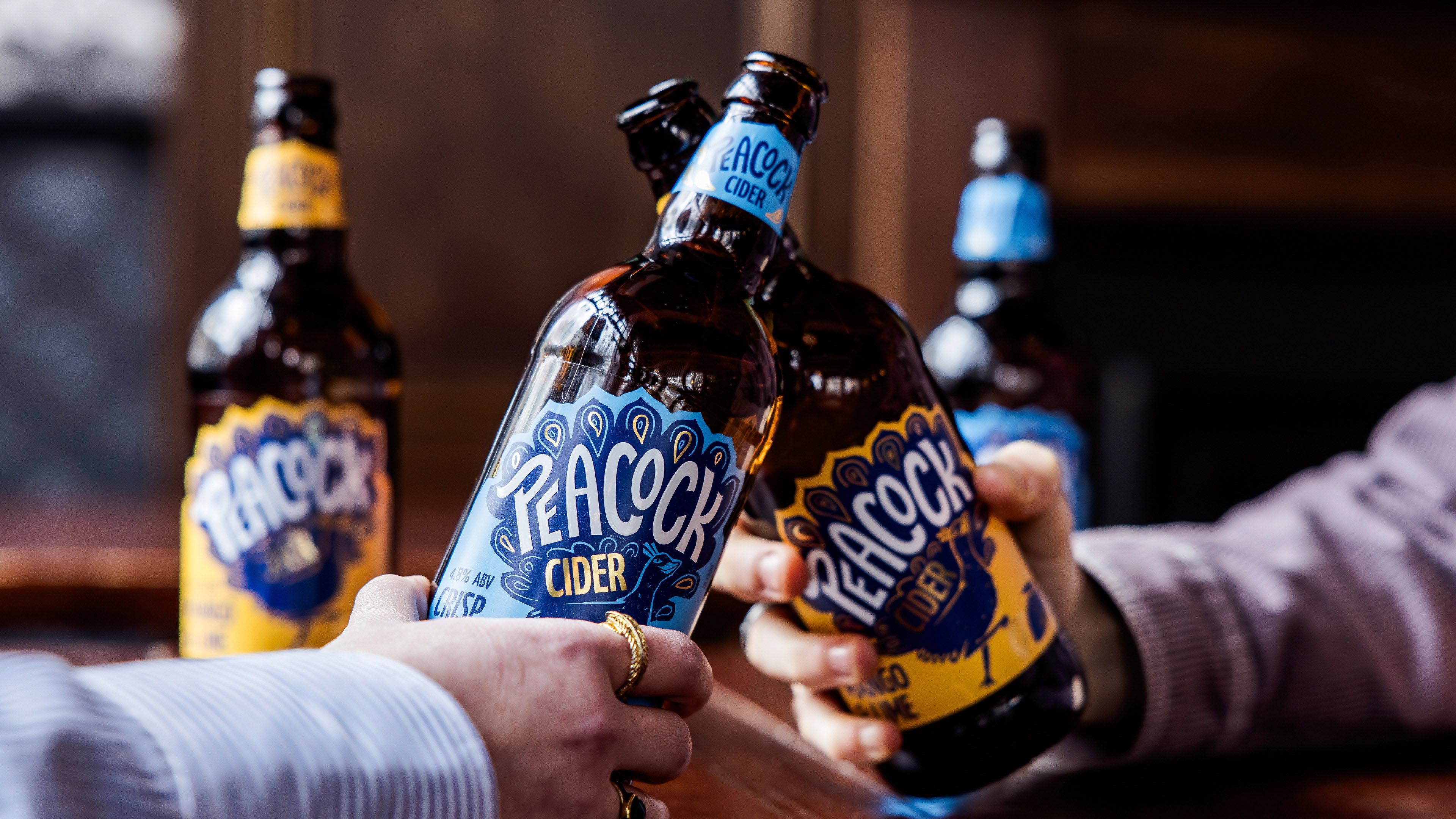
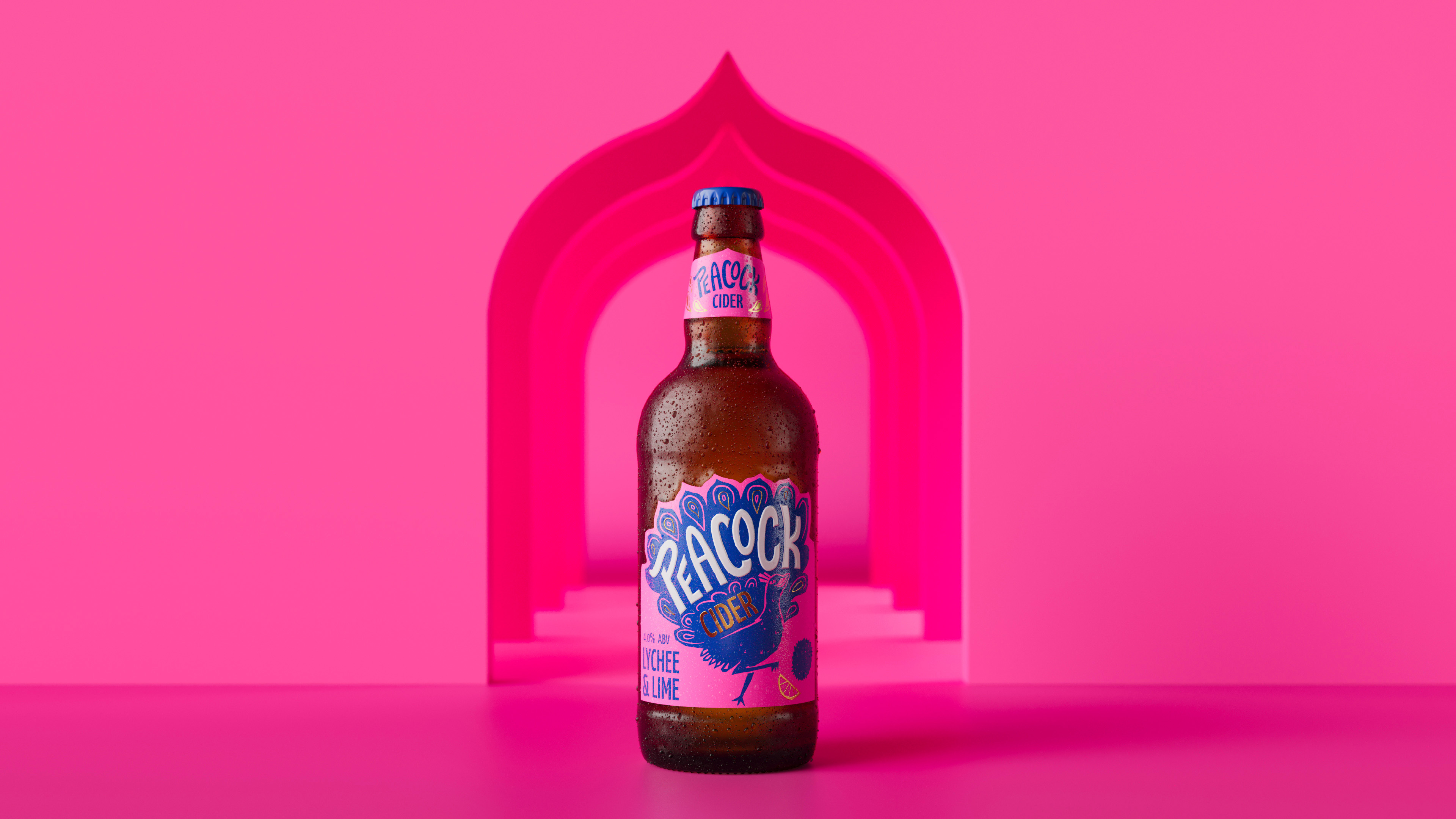
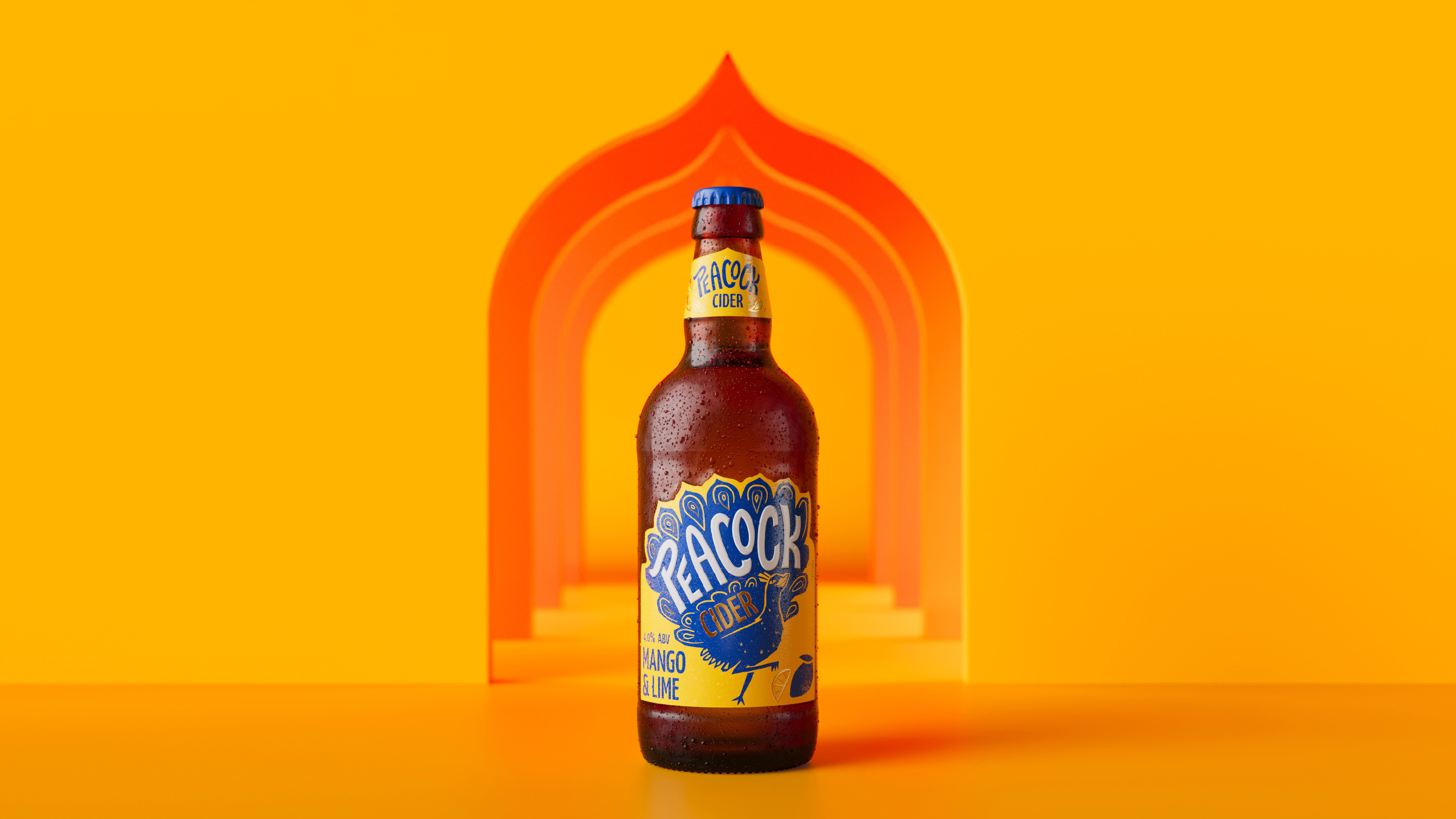
On-pack, the brand builds on its reputation in the on-trade, by retaining its striking colour palette and dialling up the zesty flavour profiles with fruity, gold, spot illustrations. The packaging now speaks better to the 60% of cider drinkers who prefer a flavoured cider, and gold foiling and embossing increases the premium feel, communicating quality to the 87% of cider drinkers who will spend more if they know the quality is second-to-none. Leaning into the liquid’s Pan-Asian character, the label features a unique die cut that references architecture and the brand’s Asian background. Also echoing the Peacock’s tail feathers, the label shape gives a point of difference to cut through in a competitive bar and restaurant environment.
The hand-crafted wordmark distinguishes itself by featuring subtle gestures to the brand’s roots, and reminds the consumer that while the brand grows a broader consumer base, it continues to be the cider of choice for pairing with Asian cuisine.
Built from a sans-serif, the wordmark is often seen nestled within the illustration, sitting among the Peacock’s feathers. The letters are locked up together with intentional and considered positioning, creating a unique and identifiable shape, with a playful nature. Featuring flourishes in the ‘K’ and ‘P’ to mimic feathers and a characterful tail-flick, the logotype appears in the brand world as a stand-alone wordmark, delivering the Peacock’s distinctive movement and attitude.
Working with Kingdom & Sparrow on the rebrand of Peacock Cider was an absolute pleasure. Their brand development expertise is exceptional, and they delivered outstanding results that exceeded our expectations. The team’s extraordinary attention to detail ensured that every aspect of our new brand identity was thoughtfully crafted and perfectly executed. From the initial brainstorming sessions to the final design, Lenny and the K&S team were delightful to work with, always bringing creativity, professionalism, and a deep understanding of our brand objectives. We couldn’t be happier with the outcome and highly recommend Kingdom & Sparrow to anyone looking for top-notch branding and marketing support.
Andy Sunnucks, Senior Brand Manager, Kingfisher Drinks
CREDIT
- Agency/Creative: Kingdom & Sparrow
- Article Title: Ruffling Feathers: Kingdom & Sparrow Rebrand Kingfisher Drinks’ Peacock Cider
- Organisation/Entity: Agency
- Project Type: Identity
- Project Status: Published
- Agency/Creative Country: United Kingdom
- Agency/Creative City: Falmouth
- Market Region: Europe
- Project Deliverables: Animation, Brand Design, Brand Guidelines, Brand Identity, Brand Mark, Brand Redesign, Brand Strategy, Brand World, Branding, Craft, Identity System, Lettering, Logo Design, Packaging Design, Product Naming, Rebranding
- Industry: Food/Beverage
- Keywords: WBDS Agency Design Awards 2024/25 - brand identity, packaging design, beverage branding, drinks branding
-
Credits:
Creative Director: Johnny Paton
Managing Director: Lenny Mounsher-Quirk
Animation: Adam Mitchell
Product Photography: Kate Darkins
Renders: Where Giants Roam


