


Elevating the everyday, the easy way, with a new brand look and feel.
Positive little steps all add up to make a big difference everyday that help us live better, feel better and leave the planet in a better place. Mr Organic is a credible, aspirational and accessible 100% organic brand & business. With a purpose to raise an organic culture for everyone, Mr Organic believe living an organic life isn’t all or nothing. Positive little steps all add up to make a difference and they are here to help with easy ways to elevate the everyday.
From a business point of view the task was to support Mr Organic’s continued growth and evolution within a challenging category and changing landscape. The aim was to create a stronger connection with all young people and families who care about good food, healthy habits, connecting with friends and family and the planet. This audience is looking for realistic and easy shortcuts to wellbeing and feel good moments to share together. Mr Organic wanted to establish a firm hold as a mainstream favourite in a niche category and ultimately aiming to shift the category to more mainstream.
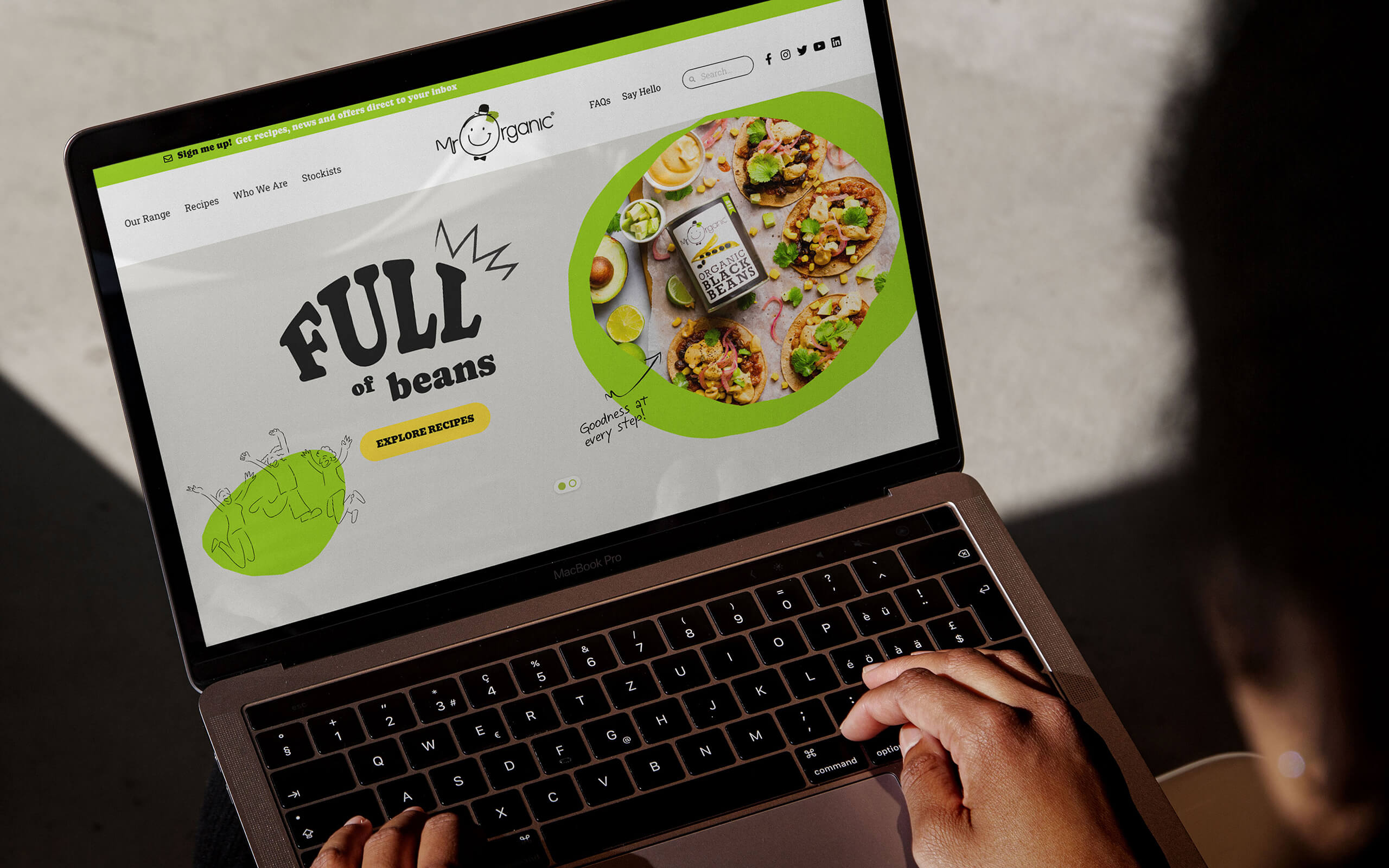
The design task was to build an enhanced, positive and playful visual and verbal language around the existing logo and packaging, working with an updated strategic platform as created by Nina Davies Consulting and The Good Crowd. This would equip Mr Organic with the visual assets required to deliver culturally relevant brand communications across their whole media mix.
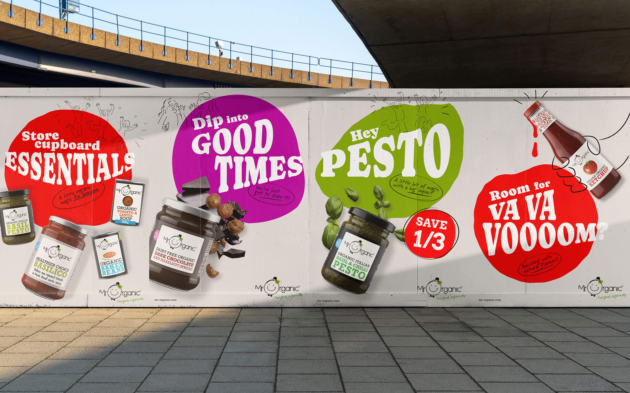
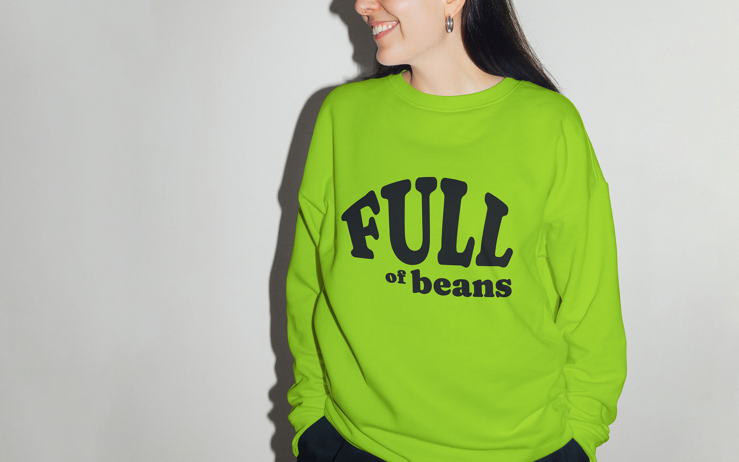
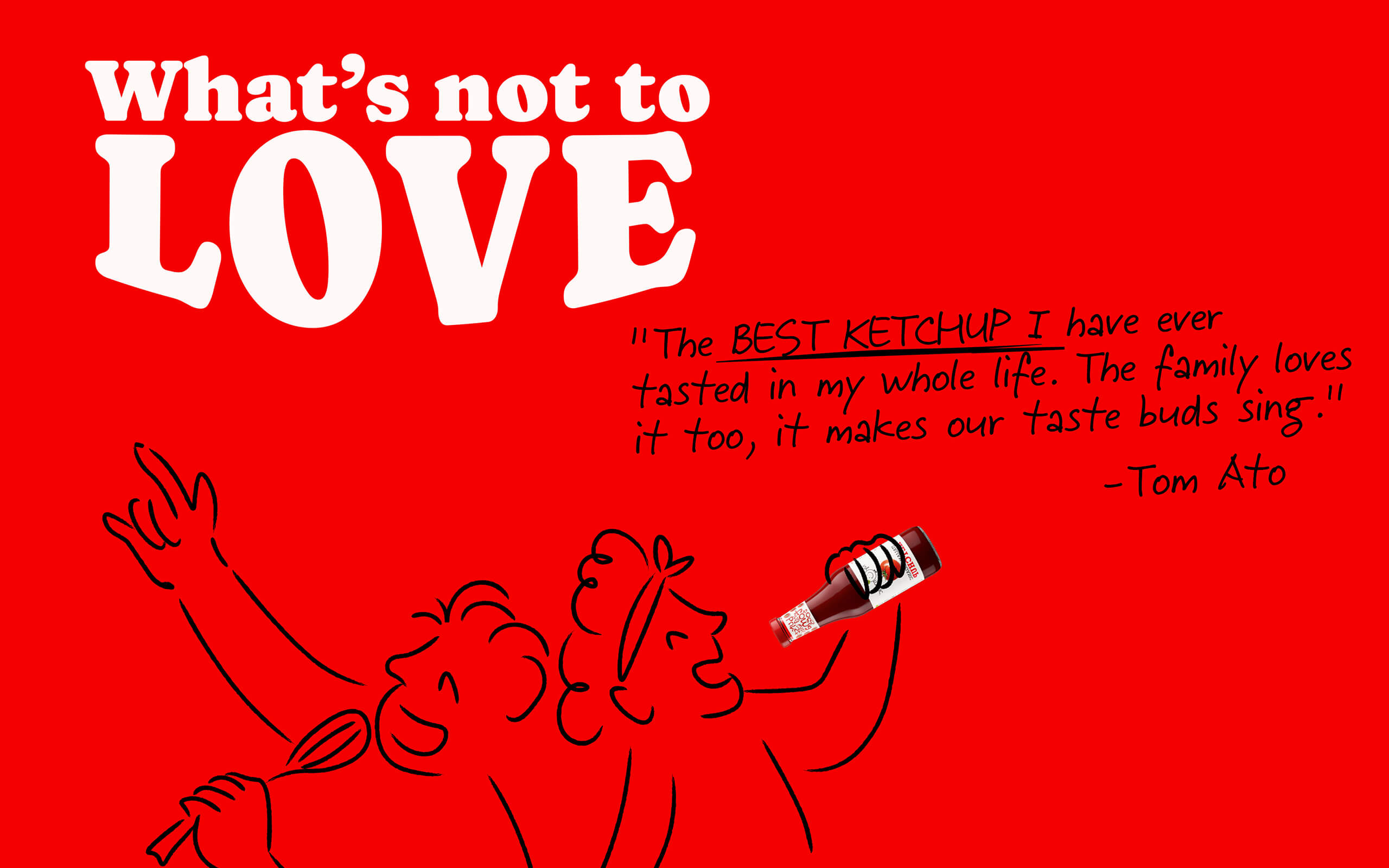
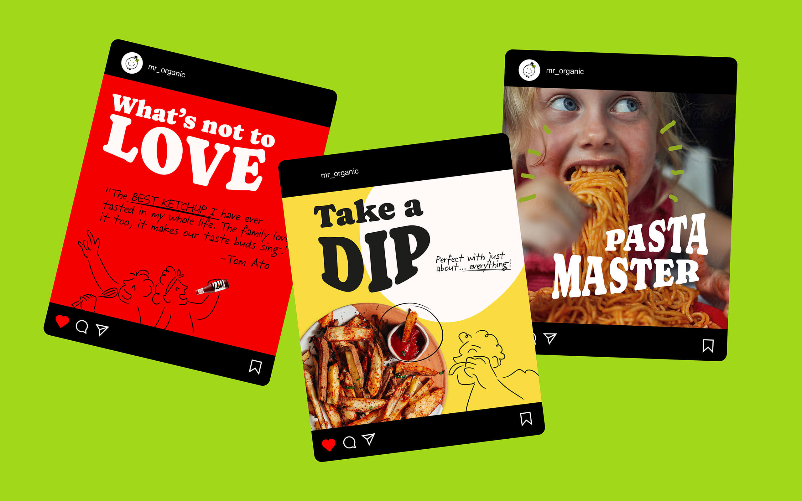
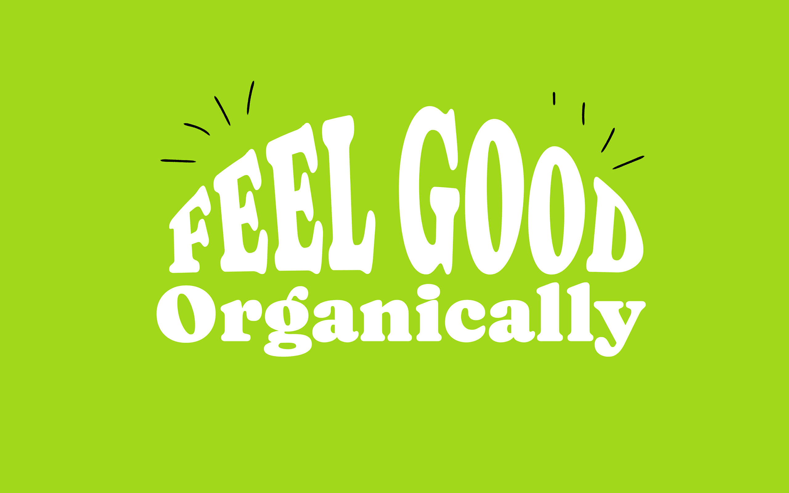
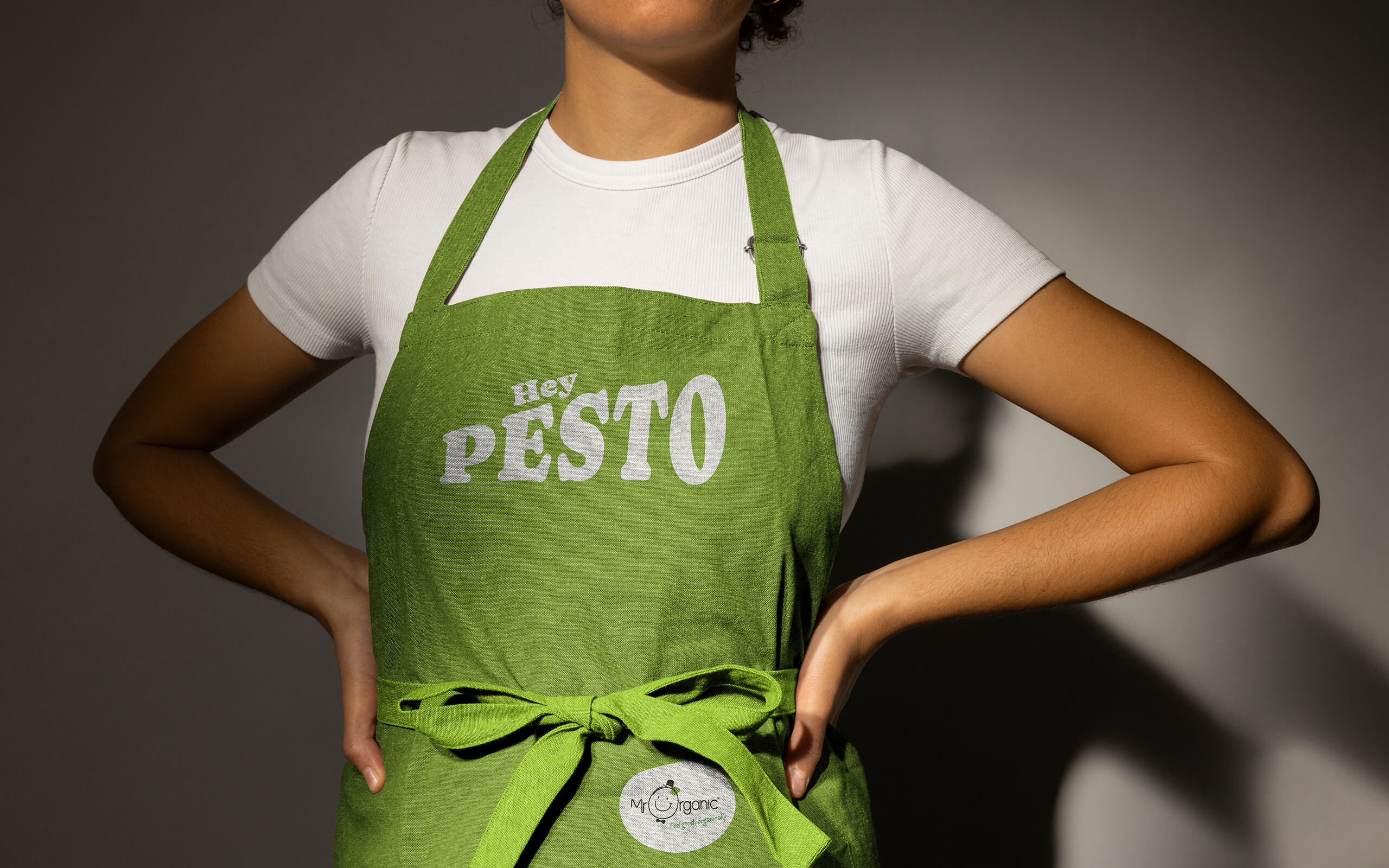
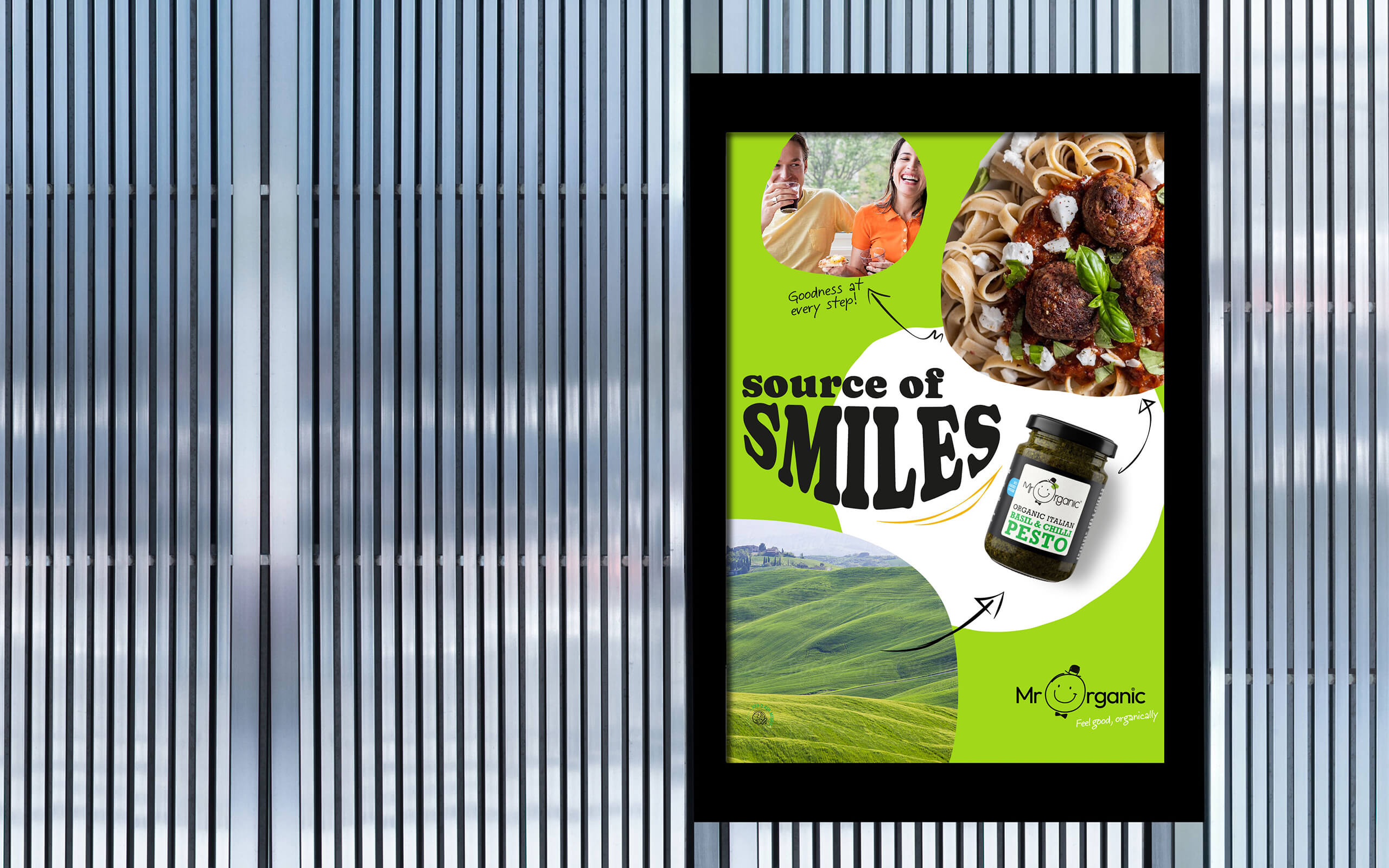
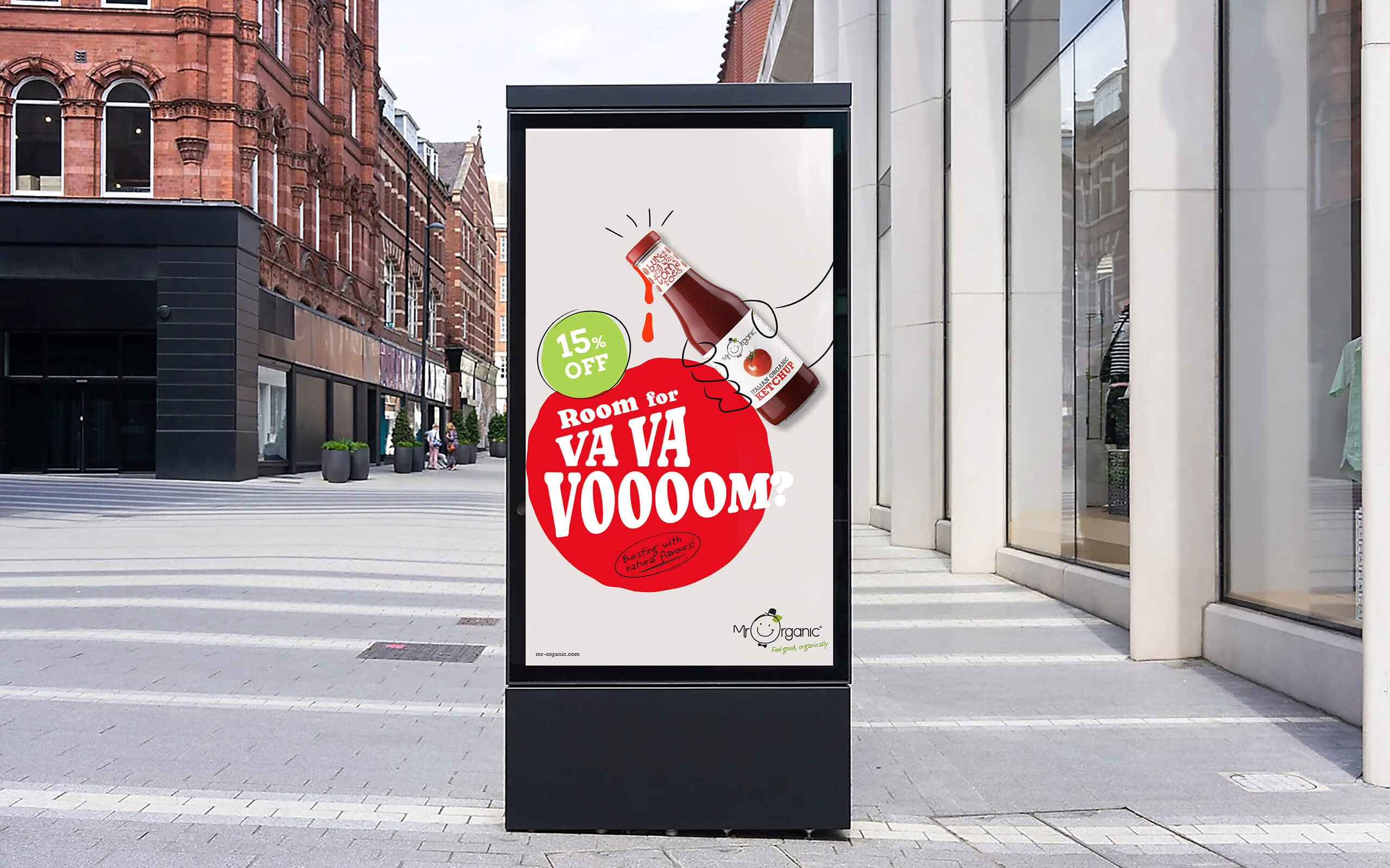
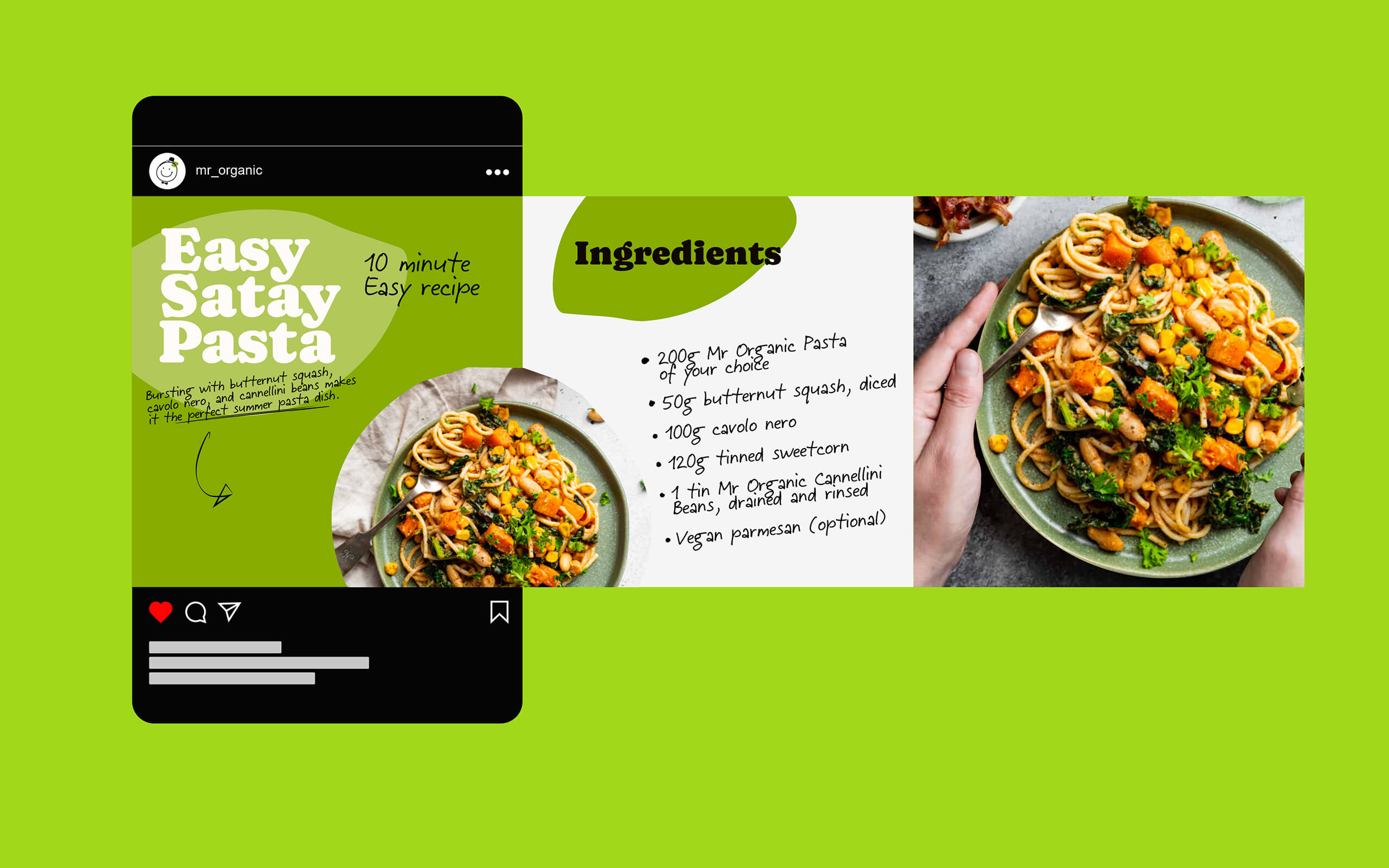
We saw Mr Organic as the charismatic facilitator of good times, the chef or creator who cares for the people he is providing for. We imagined that what really gets Mr Organic’s juices going is seeing friends and families enjoy gloriously tasty, feel good food. Good times don’t happen by accident though, and the preparatory drawings and hand written recipes of top chefs inspired the notes and doodles ‘by Mr Organic’ that became integral to the look and feel and messaging. The brand expression then brought this positive, colourful, playful, and feel good times ethos to life with a range of energetically arranged assets. Comfortably wonky playful type and organic shapes, quirky handwriting and flourishes. Vibrantly warm colour overlays, warm food photography and sociable moments illustrations.
The brand look and feel was collated into a brand guidelines, and is being rolled out by the in-house design team.
CREDIT
- Agency/Creative: Taller Design
- Article Title: Taller Design Adds Some Va-Va-Voom to Visual Branding for Mr Organic
- Organisation/Entity: Agency
- Project Type: Identity
- Project Status: Published
- Agency/Creative Country: United Kingdom
- Agency/Creative City: London
- Market Region: Europe
- Project Deliverables: Brand Identity, Brand Rejuvenation
- Industry: Food/Beverage
- Keywords: organic food
-
Credits:
Creative Director: Andrew Paterson
Designer: Ben Hogarth


