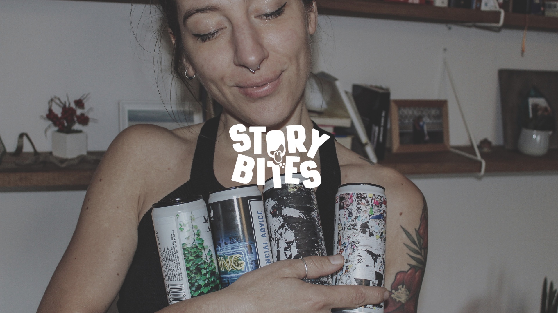
StoryBites is an exciting new snacks and beverages store based in Hong Kong, with a mission to carve out a distinctive place in the market by establishing a vibrant and dynamic brand image. Their goal is to resonate with a broad audience through innovative marketing strategies and a strong visual identity.
To kick off the process, we organized a comprehensive branding workshop. This session was pivotal in defining StoryBites’ core elements, including their brand story, mission, vision, target audience, tone, and voice, as well as their market positioning. The insights gained from this workshop served as the foundation for the brand’s identity, ensuring that every aspect of the design reflected the essence of StoryBites.
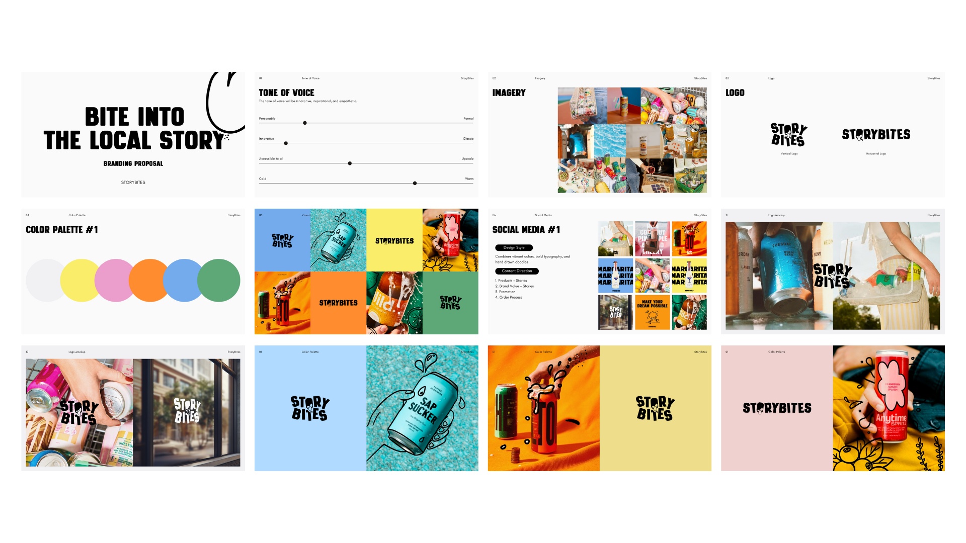
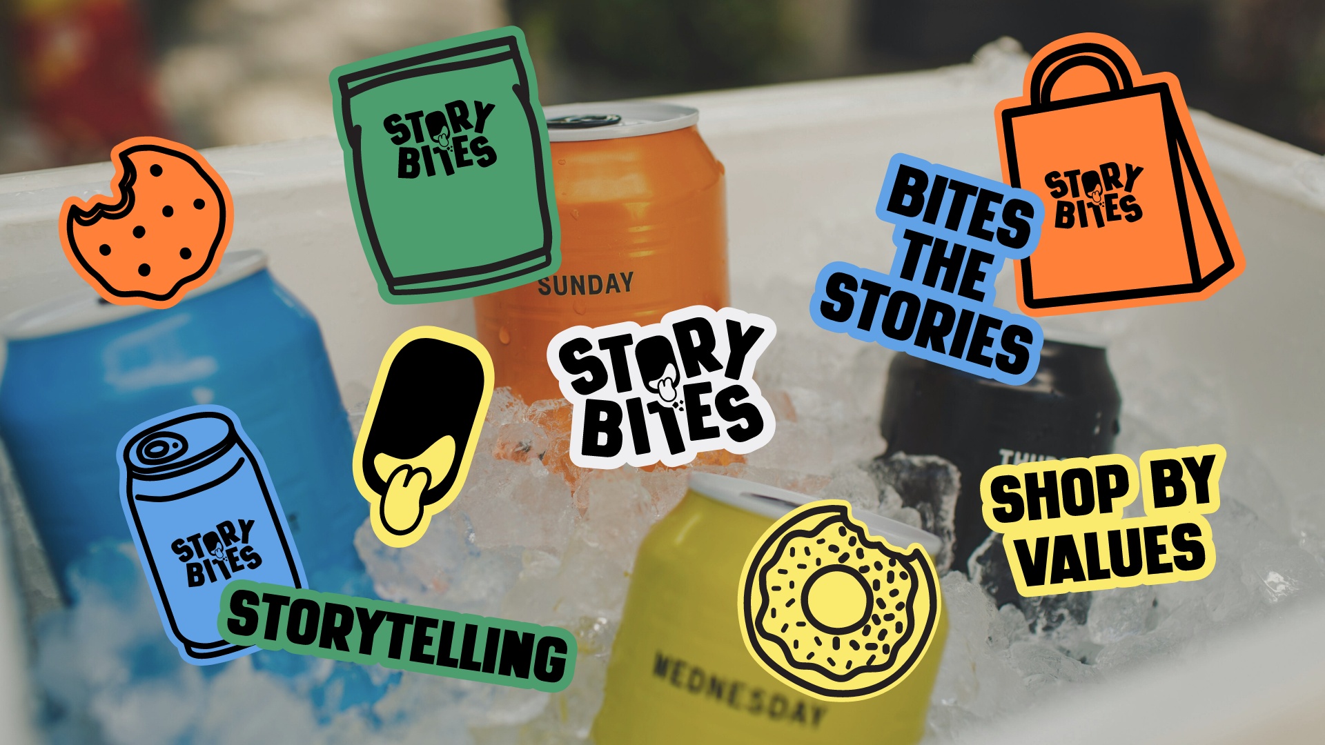
The tone of voice for StoryBites was carefully crafted to be innovative, inspirational, and empathetic. These characteristics were chosen to align with the brand’s mission to bring joy and inspiration to its customers through delightful products. To visually convey this tone, we selected a color palette that is both cheerful and vibrant, designed to catch the eye and leave a lasting impression. These colors not only help the brand stand out in a competitive market but also contribute to a lively and positive brand atmosphere.
In addition to the color scheme, we developed hand-drawn graphic visuals that play a crucial role in StoryBites’ branding. These visuals are designed to highlight key aspects of the brand, such as its playful and dynamic nature. By incorporating hand-drawn elements, we aimed to create a personal and approachable feel, which helps to humanize the brand and foster a connection with the audience. The graphics are intentionally crafted to evoke a sense of energy and movement, reflecting the lively spirit of the brand.
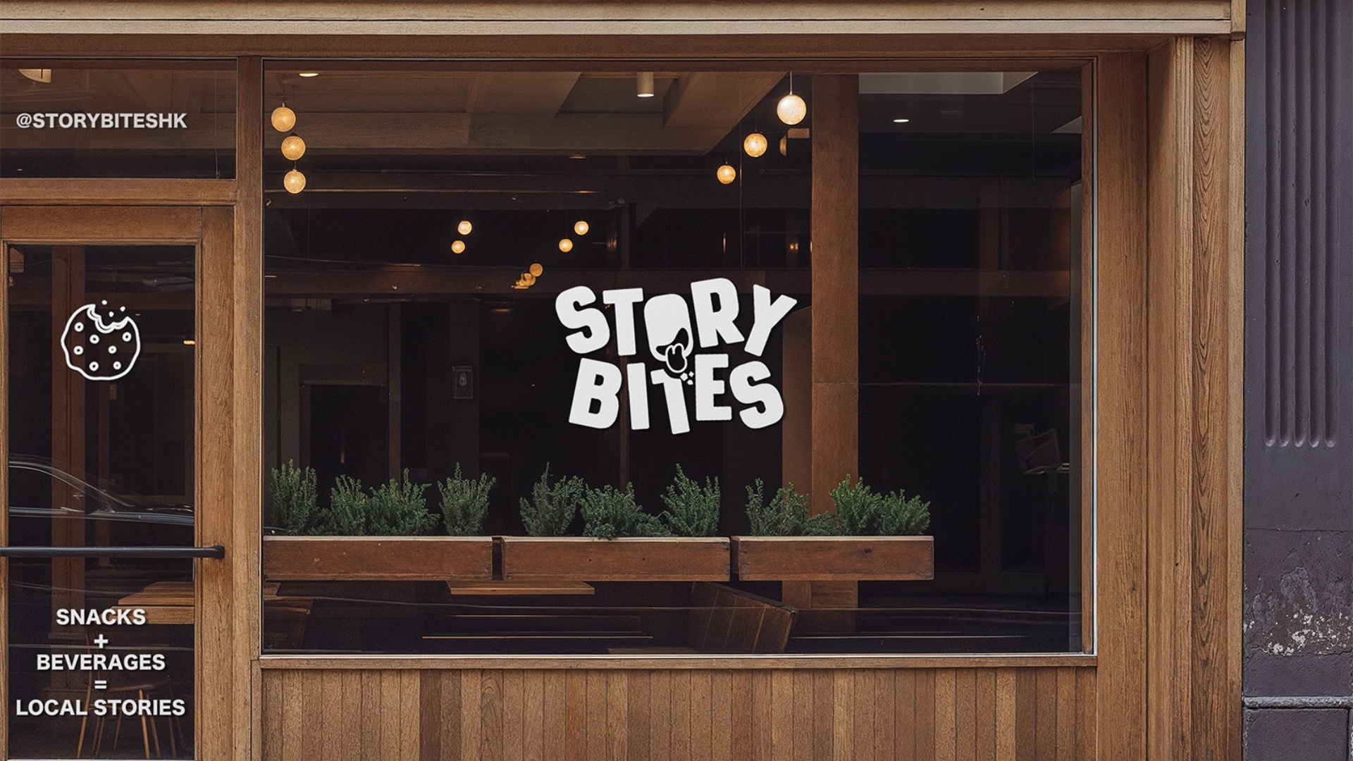
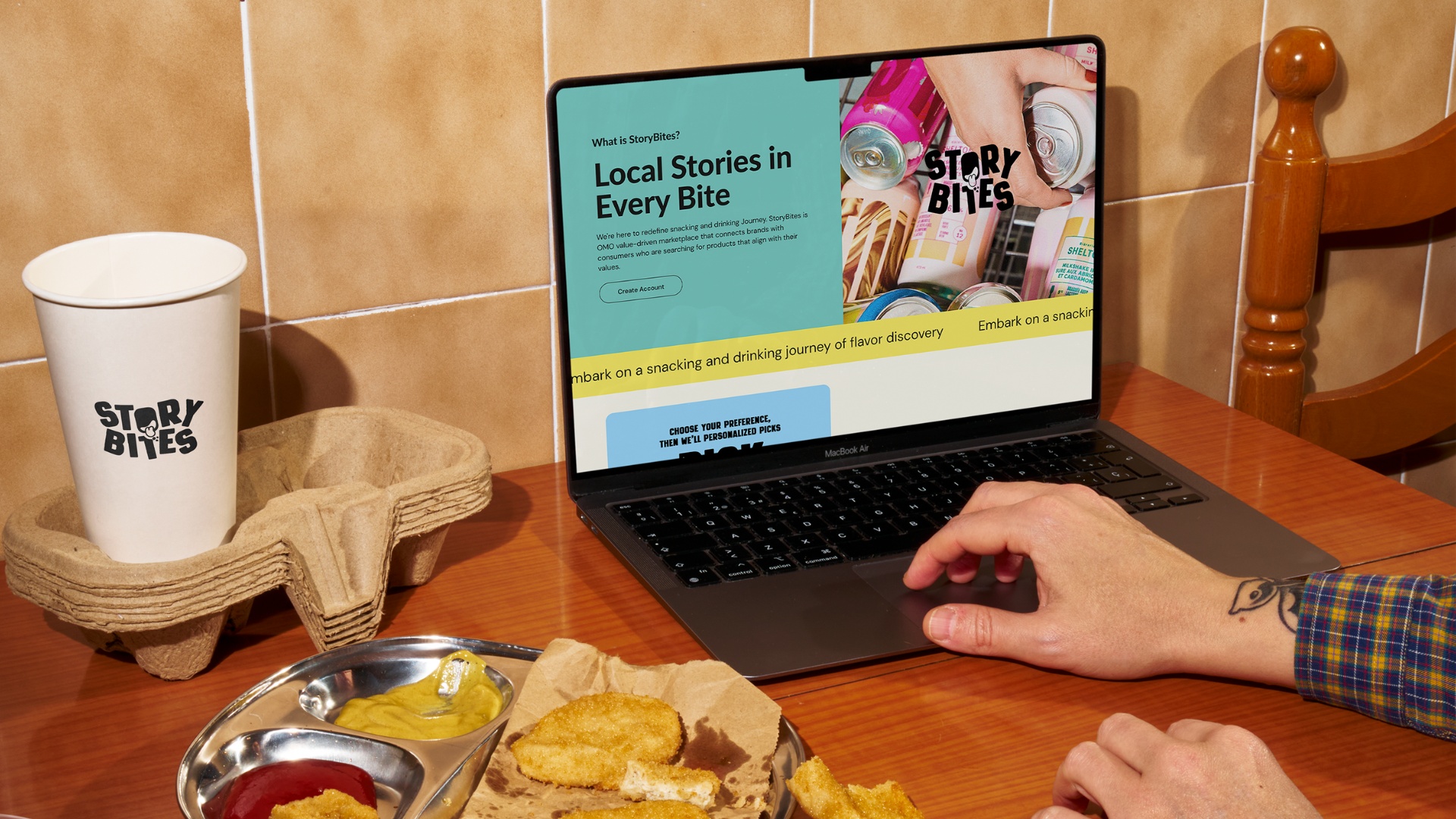
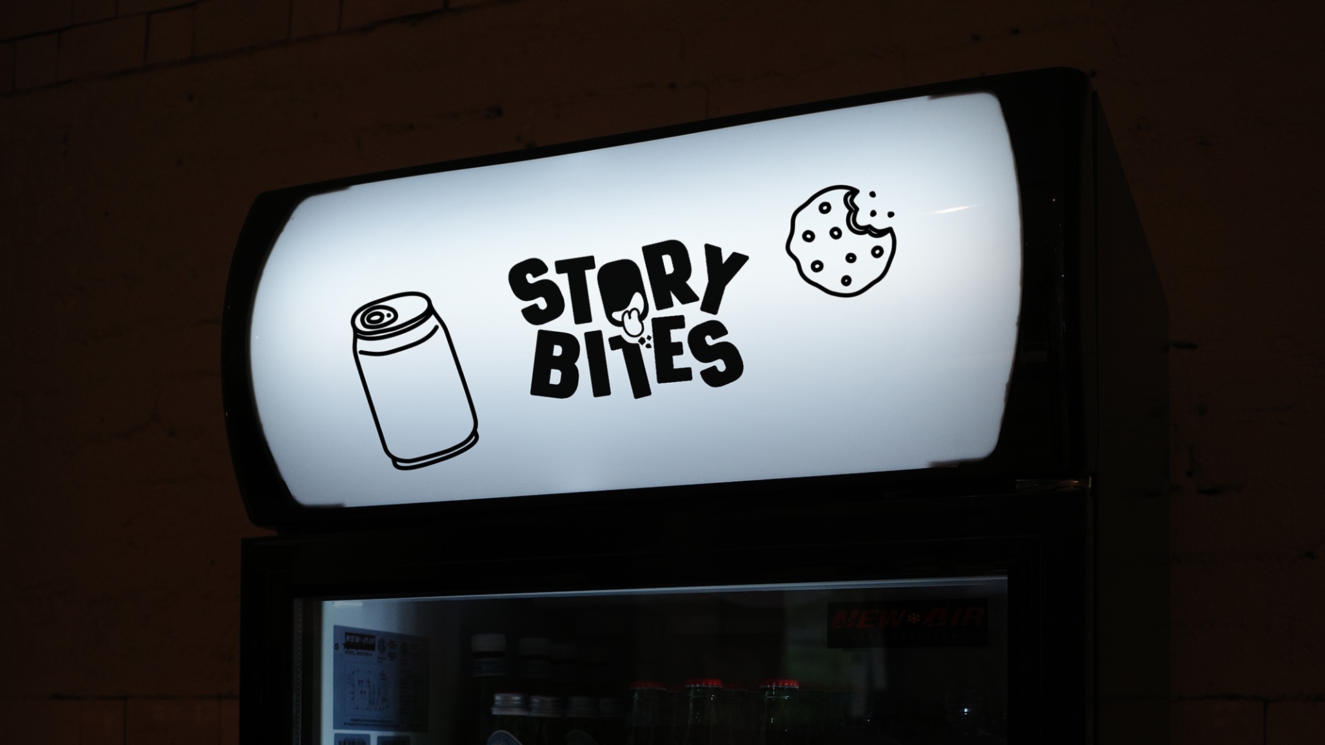
The logo design was another critical aspect of the brand identity. We wanted to create a logo that was not only visually appealing but also encapsulated the essence of the brand in a clever and memorable way. The final design features a playful concept where a mouth with a tongue forms the letter “O,” which resembles a head that is playfully biting the letter “T” underneath. This creative approach effectively conveys the ideas of “Bites” and “Tasty,” adding a fun and engaging element to the brand identity. The logo serves as a visual representation of the brand’s promise to deliver delightful and delicious experiences to its customers.
Overall, the brand identity we developed for StoryBites is a perfect blend of creativity, innovation, and approachability. Every element, from the color palette to the logo design, was meticulously crafted to ensure that the brand stands out in the market while resonating with its target audience. The result is a brand that is not only visually appealing but also deeply connected to its mission of bringing joy and inspiration to the everyday lives of its customers.
CREDIT
- Agency/Creative: Yikki.design
- Article Title: StoryBites Brand Identity Project Created by Yikki.Design
- Organisation/Entity: Freelance
- Project Type: Identity
- Project Status: Published
- Agency/Creative Country: Hong Kong
- Agency/Creative City: Hong Kong
- Market Region: Asia
- Project Deliverables: Brand Design, Brand Identity, Logo Design
- Industry: Food/Beverage
- Keywords: Food, Beverage
-
Credits:
Brand Designer: Yikki Lam


