


Breakfast was an untapped daypart for Cruz Hospitality. In an effort to capitalize on the burgeoning opportunity, they asked Bullhearted to create a new concept that would compete against national competitors. With a croissant in our mouth and coffee in our veins, we dove into a core strategy that led to the creation of a fantastically unforgettable restaurant concept.
There are many players in the breakfast space. Coffee is well covered by major brands that dominate nearly every market. Breakfast items are usually fast in a bakery format, and slow in a full sit down. Offering hot breakfast items for those on the go was a critical part of the market largely untapped.
Building from this basis, we looked to the core market of college students. They notoriously skip breakfast more often than not, and they’ve recently left a life mode where parents or grandparents cooked for them on a frequent basis.
Combining these insights led to a strategy foundation that mixes nostalgia and warmth from the home with a dash of go getter attitude.
Finding a name that captured the merging of the brand personalities was quite difficult. With so many coffee shops and bakeries in every city across the world, any plays off of morning, eggs, coffee, and other morning terms was already covered. We had to dig deep.
Our inspiration for the name came from a common saying in the morning time amongst older generations. Known to say “let’s get up and at them” to energize the wake up process is a well known statement.
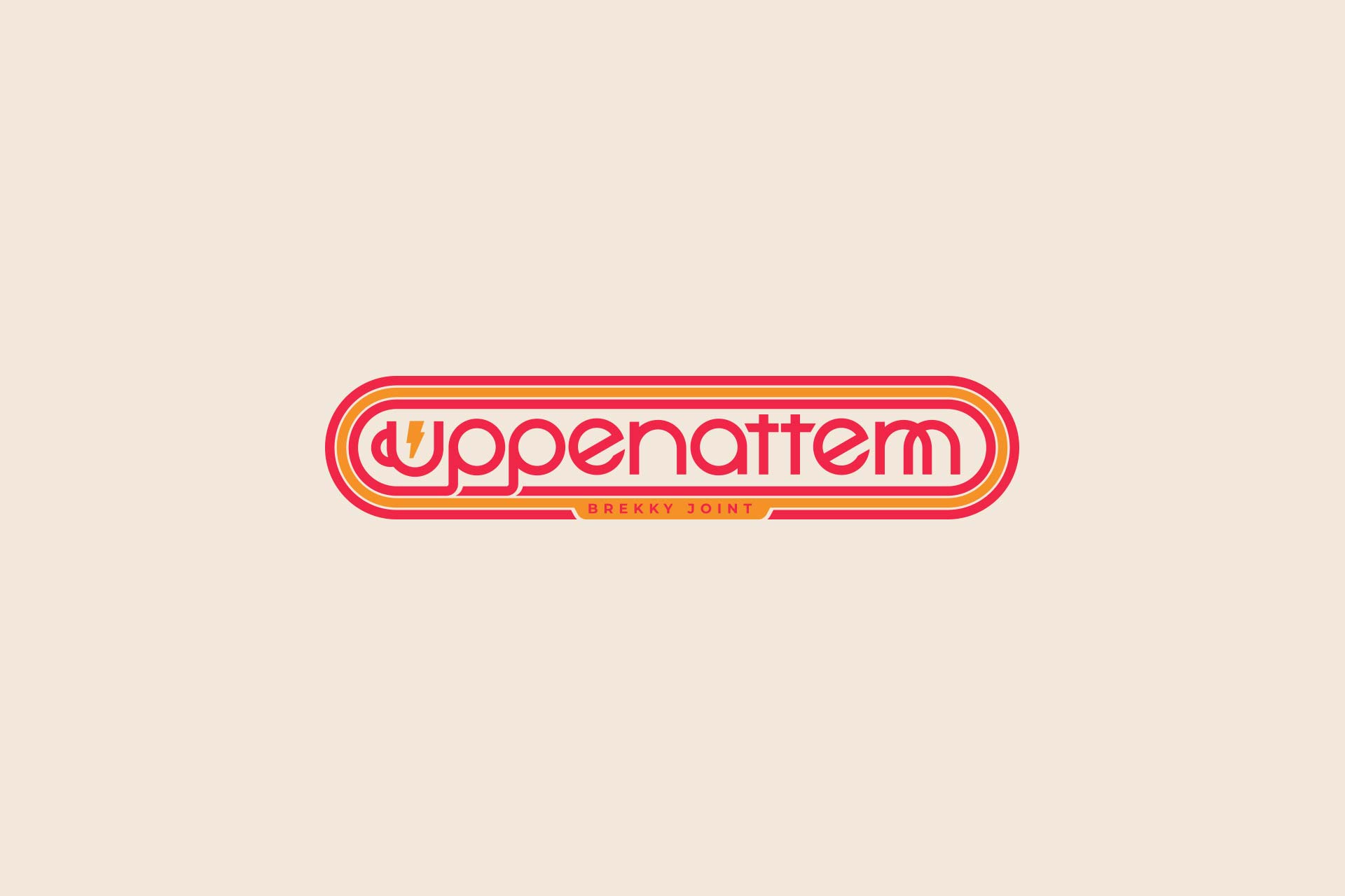
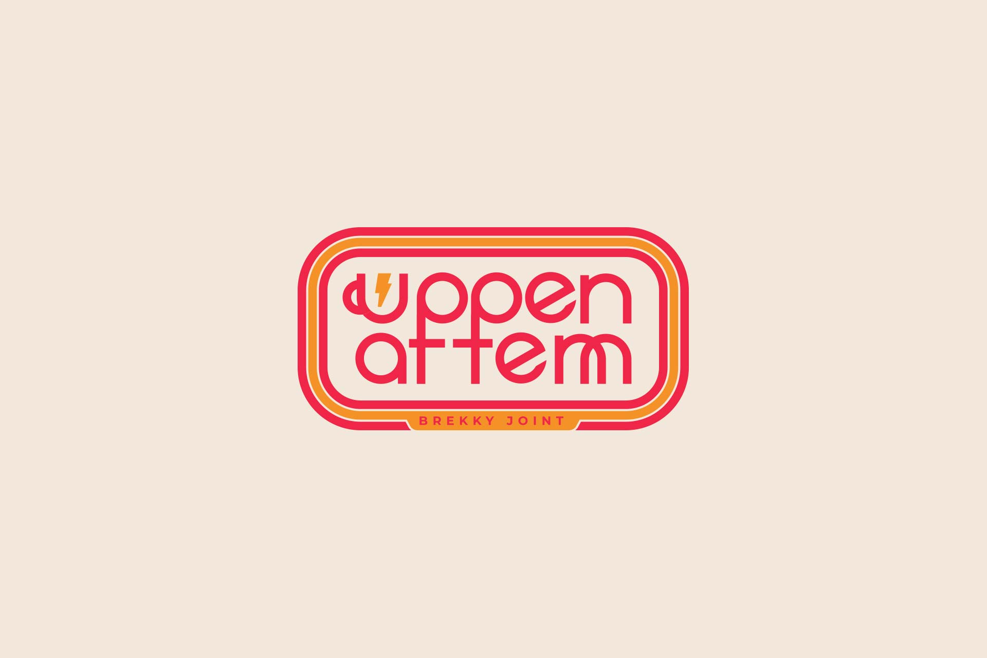
It was a phonetic and streamlined version of this statement that served as the brand name: uppenattem. While more syllables than may be comfortable for some, the colloquial commonality of the term makes it easy to read, say and remember.
Establishing the restaurant as a breakfast joint was another challenge. While there would be plenty of touchpoints to do just that, signage was a core place to communicate the day part. But a simple “breakfast food” just wouldn’t be on brand. Instead, we ran with modern slang to offset the classic slang. “Brekky Joint” became the standard perfect descriptor.
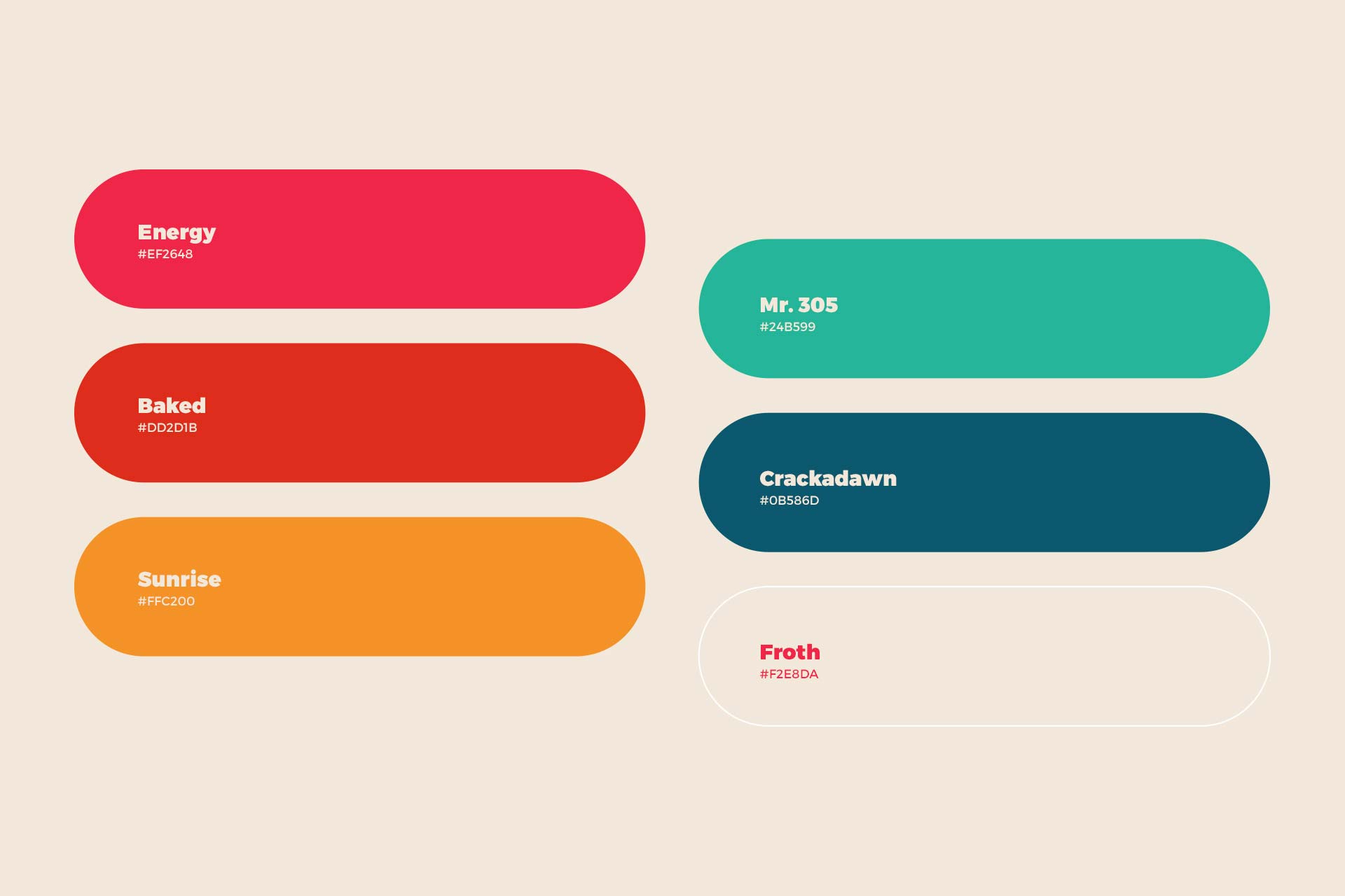
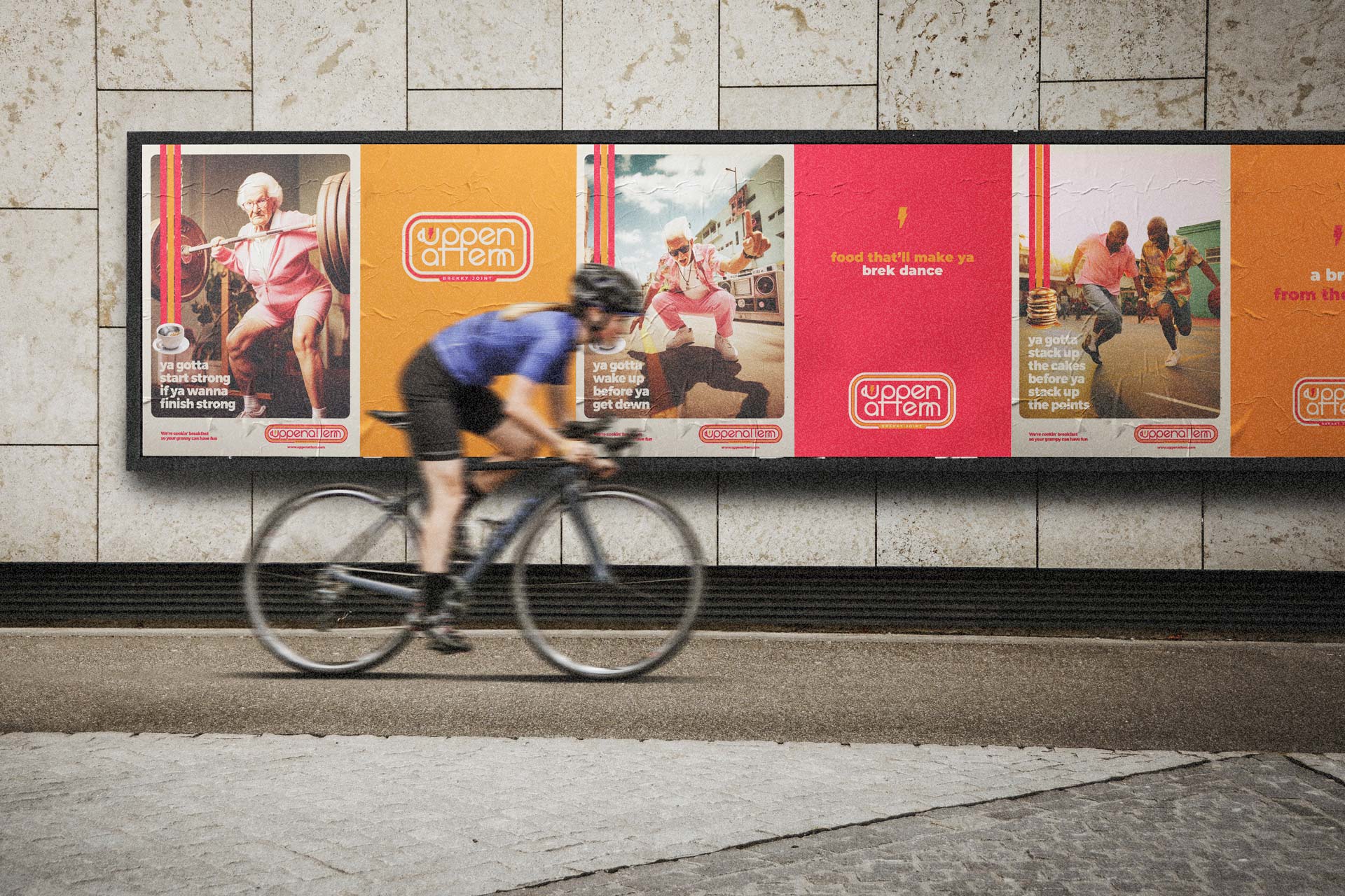
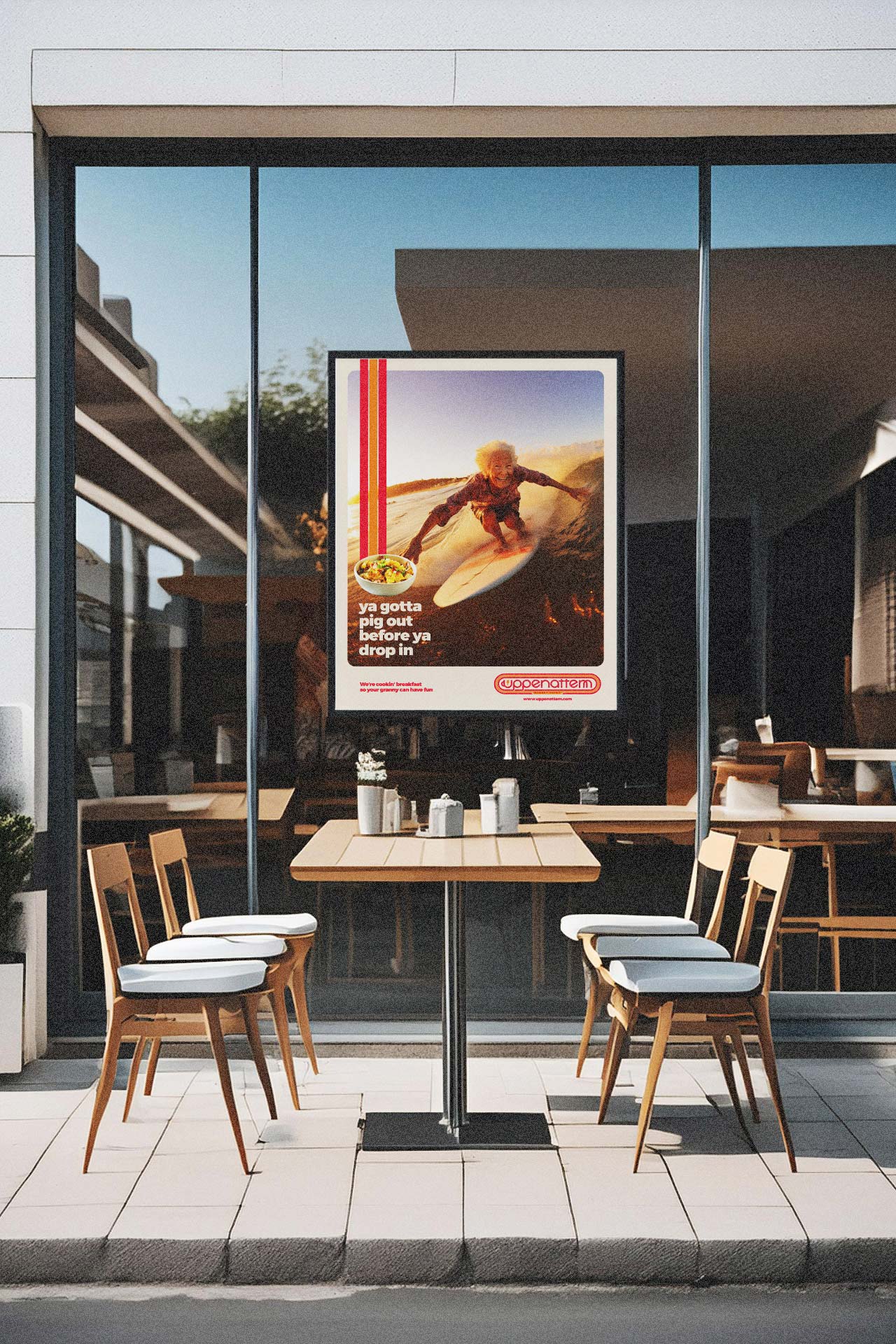
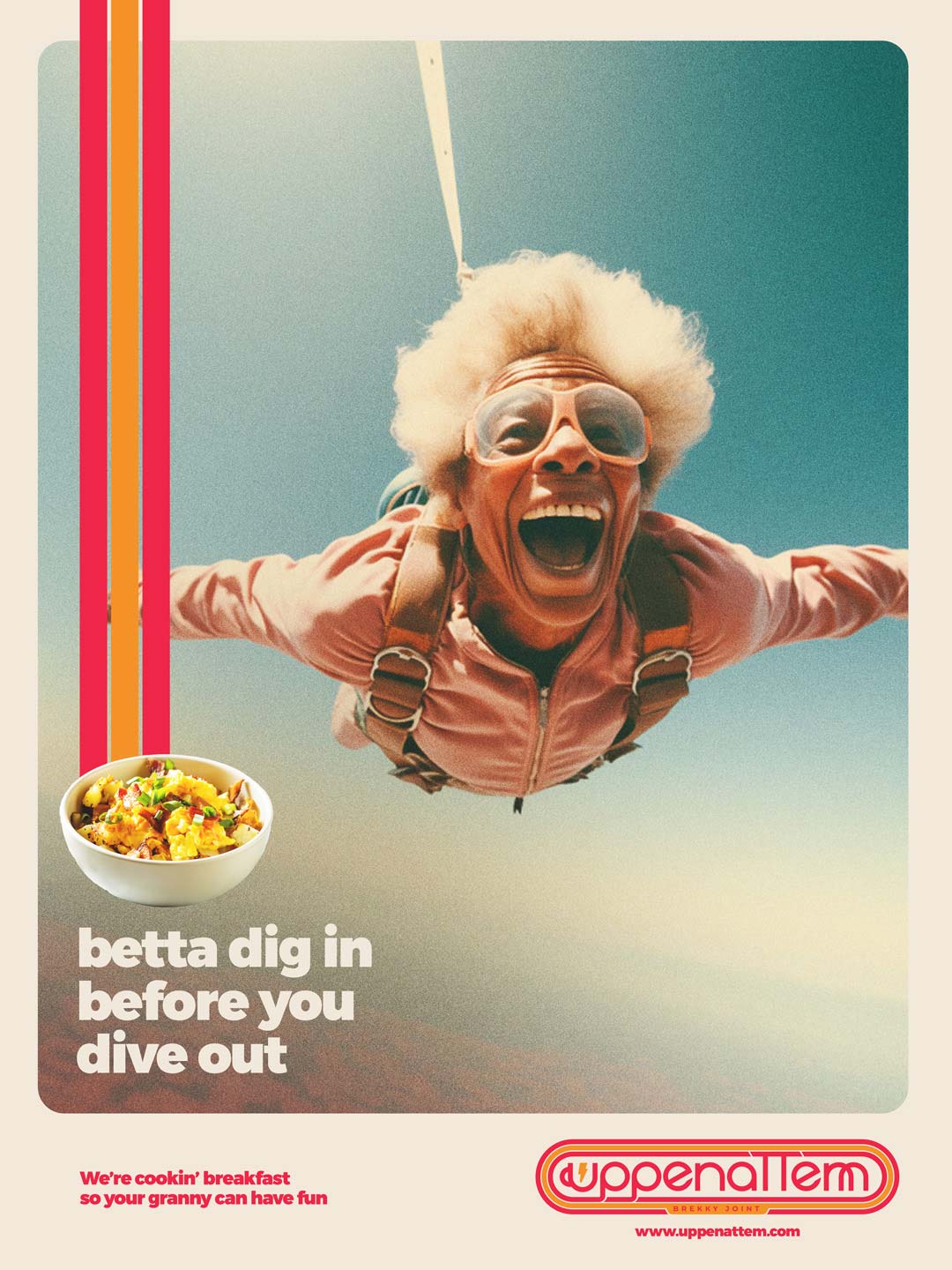
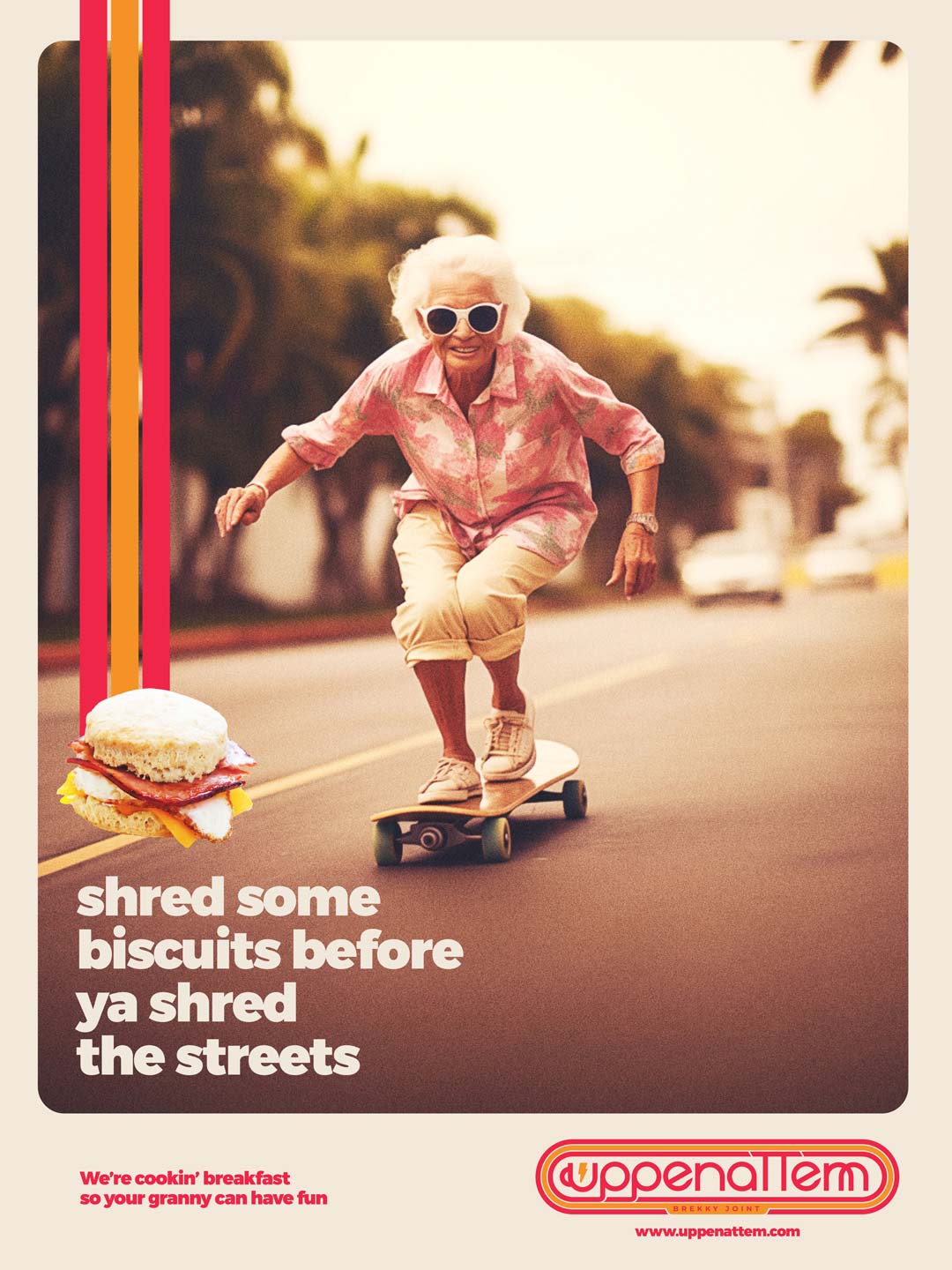
The identity for Uppenattem took on a nostalgic, warm personality. Nostalgic came into play with 1960-70’s era design elements like the parallel lines and geometric typography. The warm reds, magentas, and yellow scaled colors also pull from the era to establish a sense of post modern vibes.
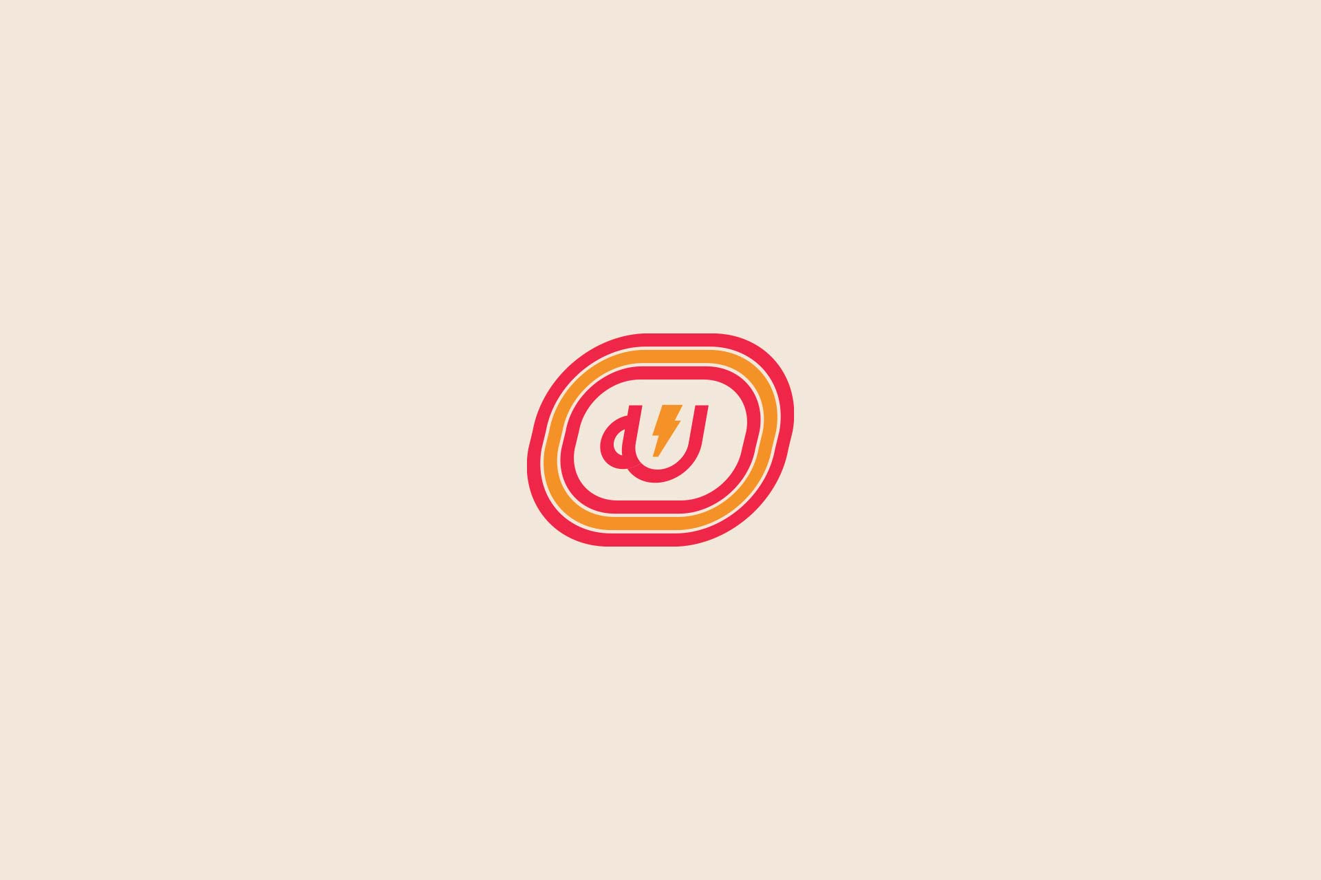
Simplifying the logo design down to an icon, the “u” letter was designed into a coffee cup with a lightning bolt. The mnemonic device creates a correlation to energy and a jolt received from the go-to morning beverage.
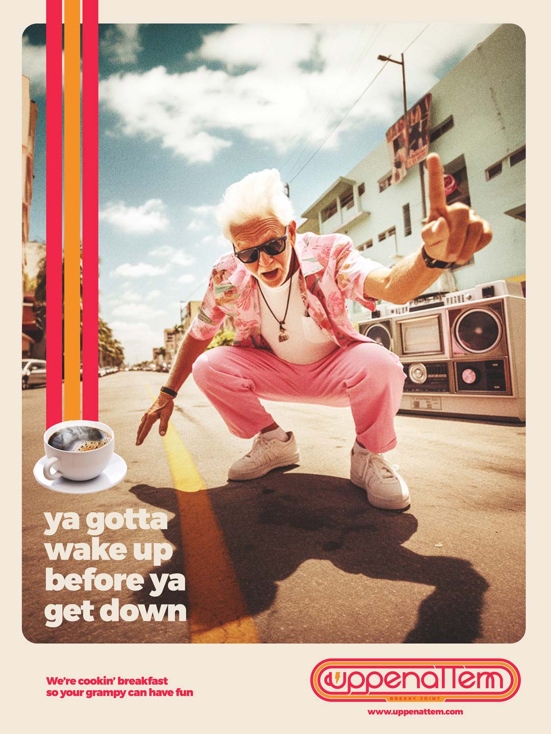
Uppenattem was set to have numerous collateral touchpoints to consider for telling the brand’s story. Inside and outside the four walls, the brand had to establish its position in market while communicating what kind of food and beverage it offered. To achieve this goal, we created a series of posters inspired by the idea, “we’re cooking breakfast so your granny/grampy doesn’t have to.”
Imagery of elderly folks enjoying sports and recreation usually seen by younger folks created a unexpected jolt for the potential guest. Whether it was a granny deadlifting some serious weight, or a grampy dancing in the street with a boombox, the imagery grabbed attention and left an unforgettable impression. Coupled with the imagery was clever headline copy and an image of a specific food item. The entire composition set a visual identity tone that reflected the throwback vibes established by the brand’s core.
Additional collateral elements like uniforms with the phrase, “Wakey, wakey, eggs & bakey” helped support the brand’s verbal identity. That identity continued on to food packaging that went beyond slapping a logo on cups and bags.

CREDIT
- Agency/Creative: Bullhearted Studio
- Article Title: Bullhearted Studio Create Uppenattem Restaurant Branding
- Organisation/Entity: Agency
- Project Type: Identity
- Project Status: Published
- Agency/Creative Country: United States
- Agency/Creative City: Atlanta, Georgia
- Market Region: North America
- Project Deliverables: Advertising, Brand Identity, Packaging Design
- Industry: Food/Beverage
- Keywords: breakfast, retro, restaurant
-
Credits:
Designer: Joseph Szala


