


GeoSoft-Surtech is a global leader in digital solutions, topographic surveying, and 3D scanning, leveraging cutting-edge international technologies and engineering solutions. Their offerings encompass geospatial services, evaluation, and subsea engineering solutions. GeoSoft’s vision is to pioneer a digitized future through innovation and excellence, while prioritizing the safety, health, and sustainability of our planet. They aim to tackle challenges with transformative solutions, fostering a culture of continuous learning and inclusivity.
At Mpire, we collaborated with GeoSoft on a comprehensive rebrand, including:
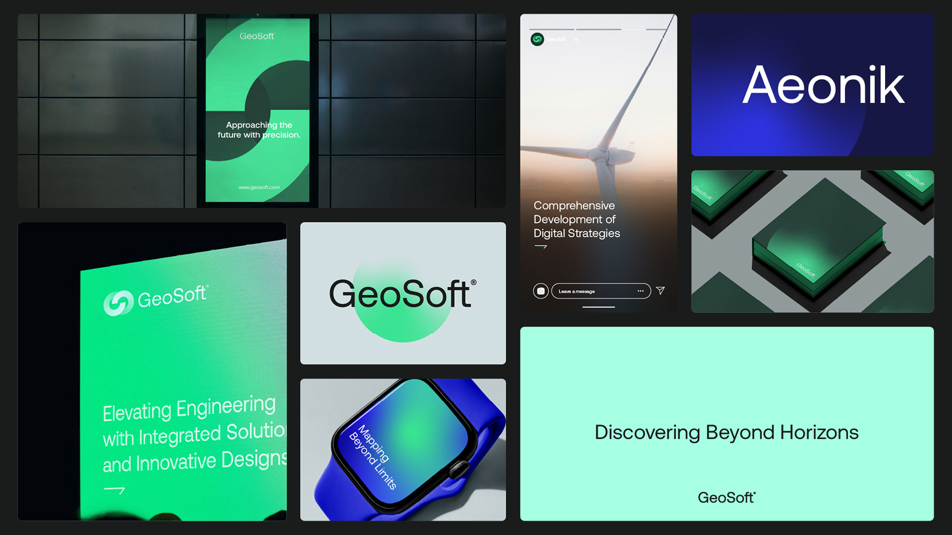
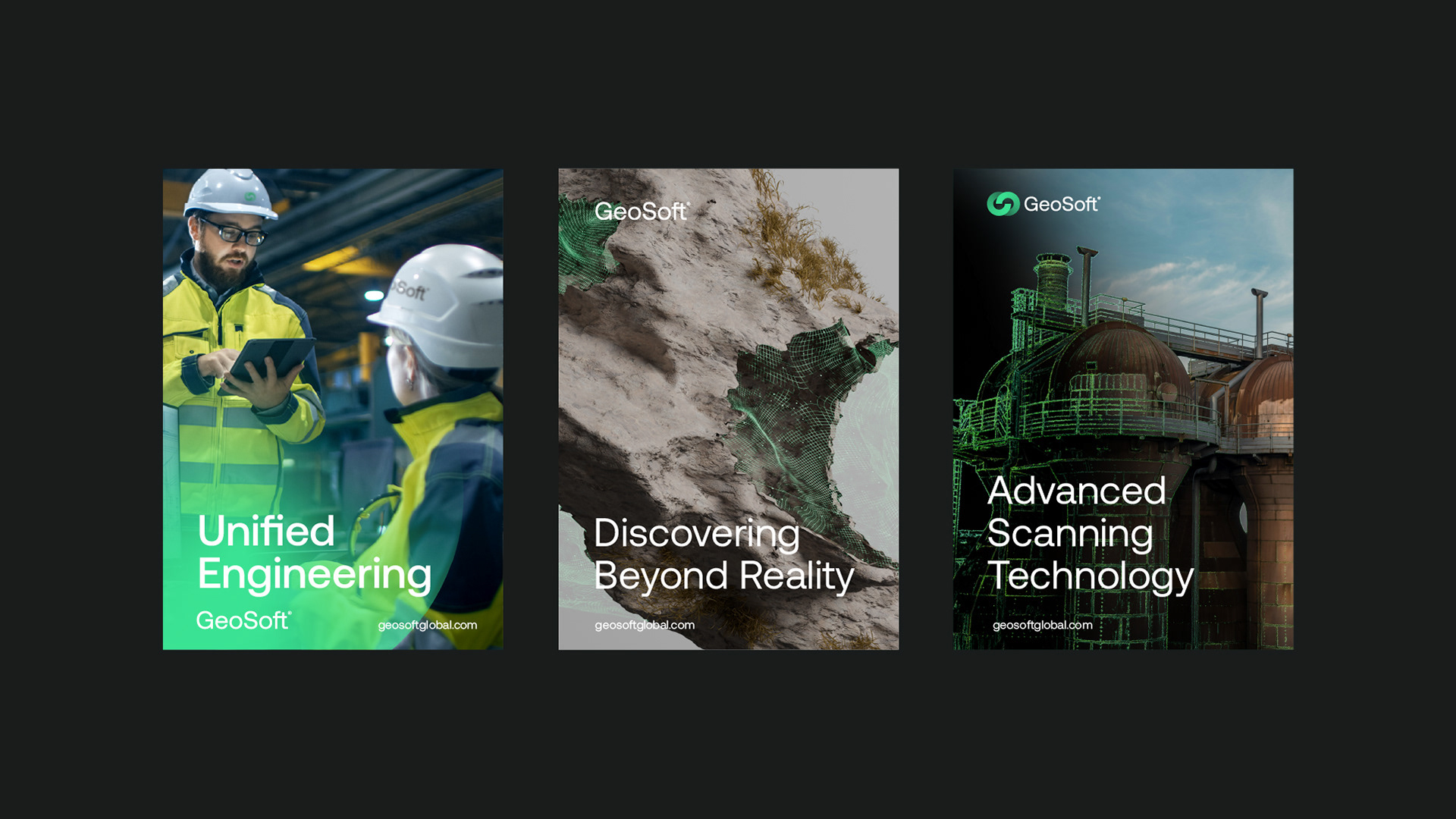
Brand Strategy: Aligning their brand with their vision and values. New Logo Design: Crafting a logo that reflects their modern and unique personality and solutions. Identity Development: Creating a modern, futuristic, and memorable brand identity and guidelines. 3D Visuals and Company Profile: Producing 3D visuals and an updated company profile to showcase their forward-thinking vision and unique services.
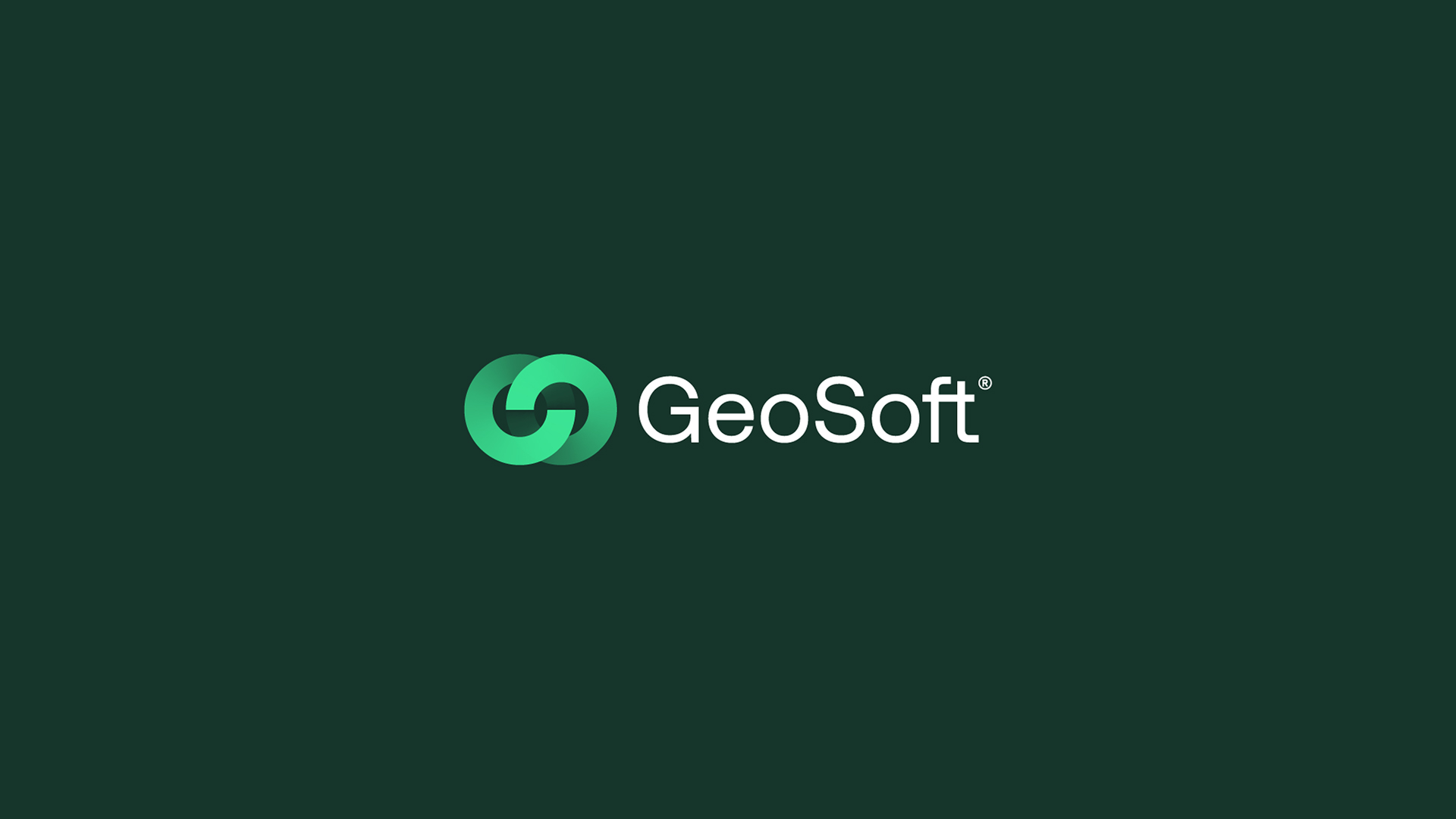
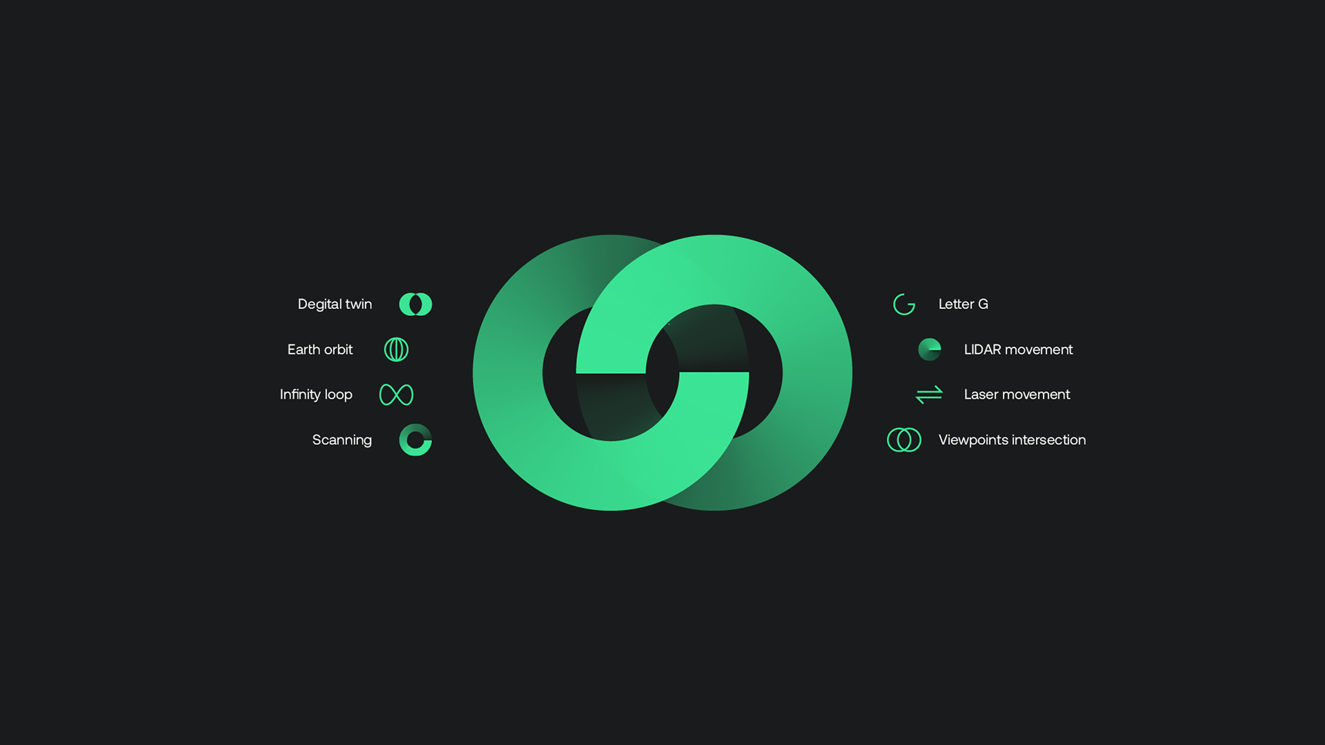
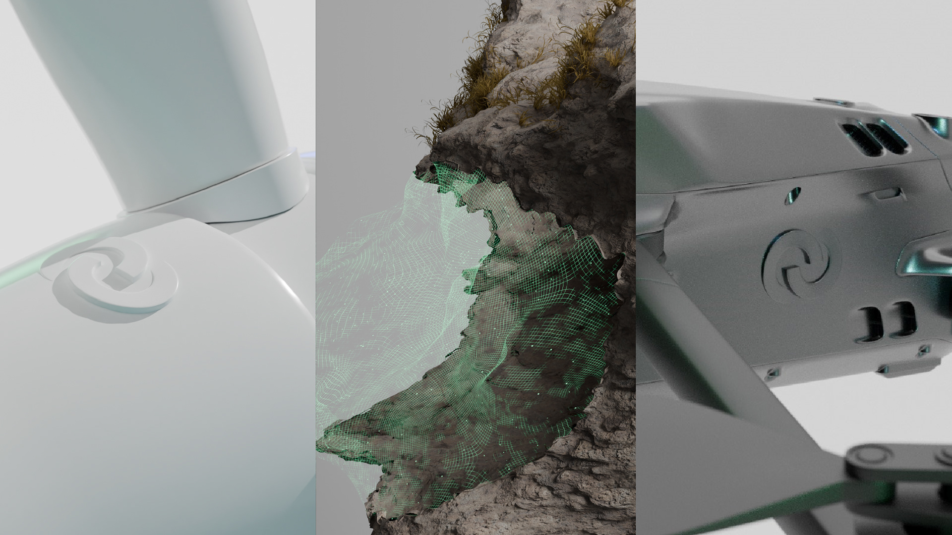
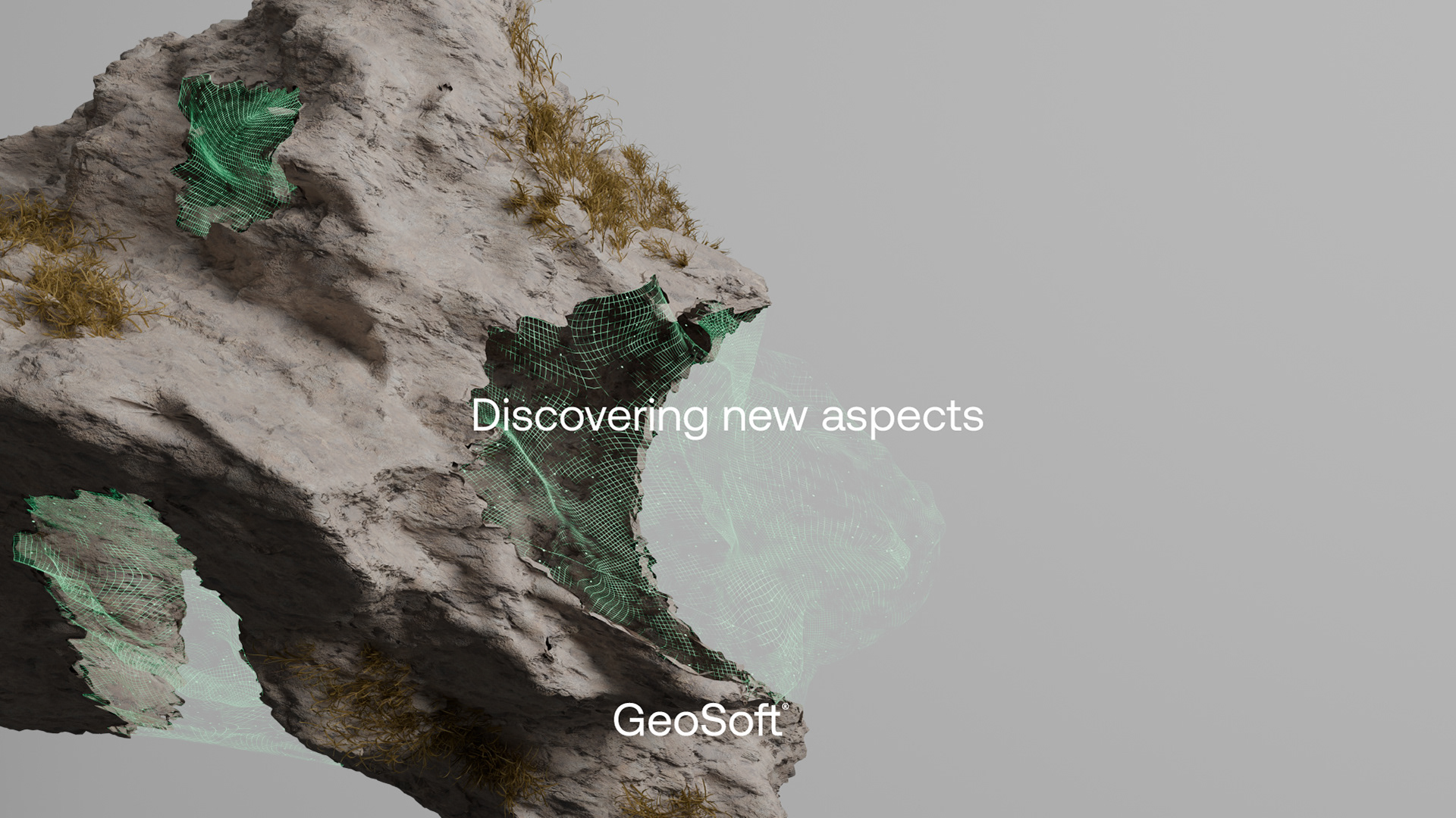
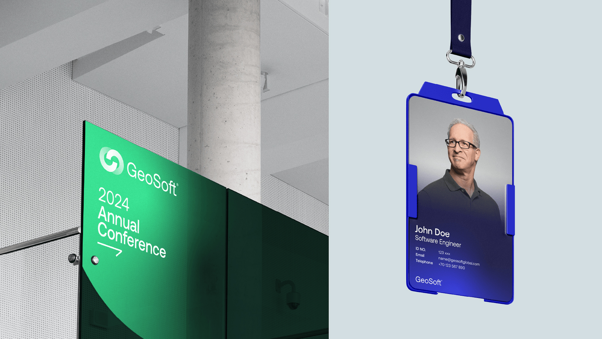
The new logo for GeoSoft is a meticulously crafted symbol that encapsulates multiple layers of meaning and functionality. At its core, the logo integrates the initials “G” and “S” of GeoSoft, forming a visually cohesive and instantly recognizable mark. This design is further enriched by elements that symbolize LIDAR and laser movement, essential technologies in GeoSoft’s operations, and an infinity loop representing the endless possibilities and continuous innovation in their field. Additionally, the logo reflects the concepts of scanning and digital twins, key aspects of GeoSoft’s services, and incorporates visual motifs reminiscent of earth orbits, emphasizing the global reach and impact of their work.
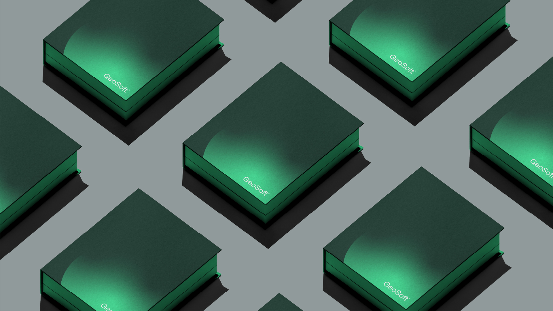
The color palette of the new logo is carefully selected to represent the sea and land, the primary environments where GeoSoft operates. The blue and green hues are not only modern but also convey a sense of trust, reliability, and connection to nature, aligning with GeoSoft’s commitment to sustainability. These colors also highlight the company’s futuristic personality and advanced technological focus.
One of the standout features of the new identity is the use of unique graphical elements and styles. The Gaussian blur effect and gradients are employed to create a dynamic and visually engaging representation of the brand. These effects symbolize the seamless integration of technology and nature, as well as the depth and complexity of GeoSoft’s solutions. The gradients add a sense of movement and progression, reflecting the company’s forward-thinking approach and continuous evolution.
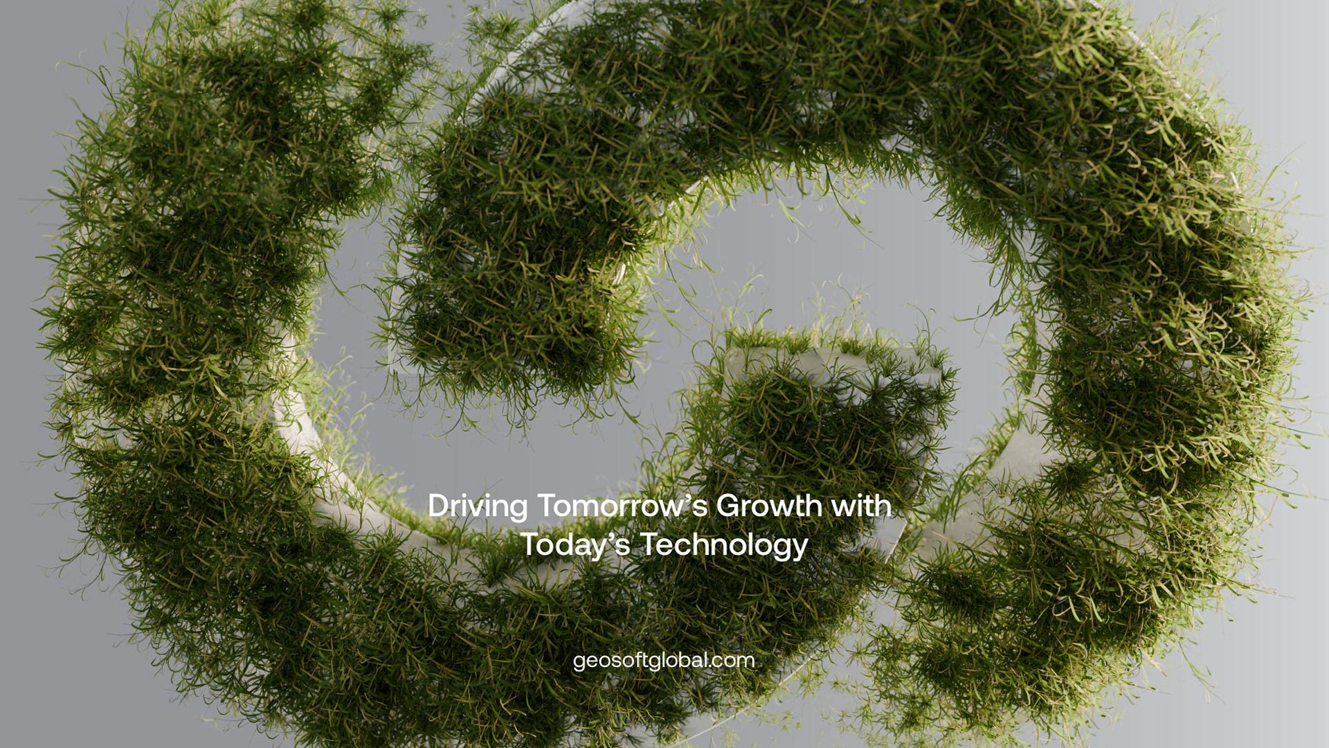
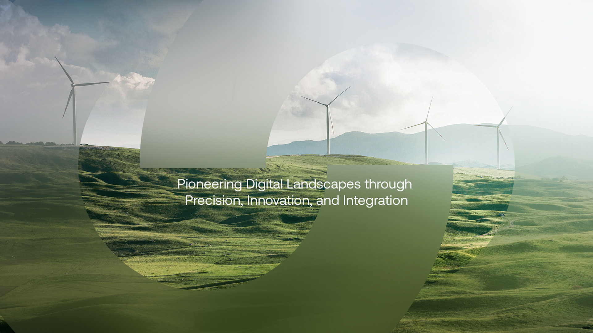
The updated brand identity is further enhanced by the addition of new 3D visuals, which bring GeoSoft’s innovative services and vision to life. These visuals provide a tangible representation of the company’s capabilities and future aspirations, making the brand more distinctive and memorable. The combination of these elements ensures that GeoSoft’s new identity not only stands out in the marketplace but also resonates deeply with their audience, effectively communicating their values, mission, and the cutting-edge nature of their work.
CREDIT
- Agency/Creative: Mpire
- Article Title: Innovative Rebranding for GeoSoft-Surtech by Mpire
- Organisation/Entity: Agency
- Project Type: Identity
- Project Status: Published
- Agency/Creative Country: Sweden
- Agency/Creative City: Borås
- Market Region: Europe, Middle East, North America, Global
- Project Deliverables: 3D Design, 3D Modelling, Brand Creation, Brand Design, Brand Guidelines, Brand Identity, Brand Mark, Brand Redesign, Brand Strategy, Branding, Creative Direction, Graphic Design, Identity System, Rebranding
- Industry: Energy
- Keywords: 3D Scanning Geospatial branding rebranding brand identity energy corporate identity geosoft mpire 3D visualization
-
Credits:
Creative Director: Mohammad Selwaye
Art Director: Anas Hasnawi
3D Designer: Abdullah Selwaye


