


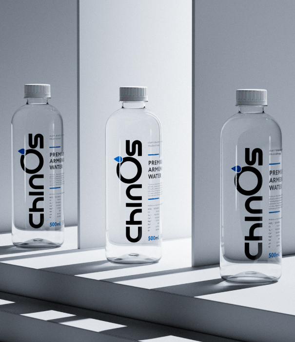
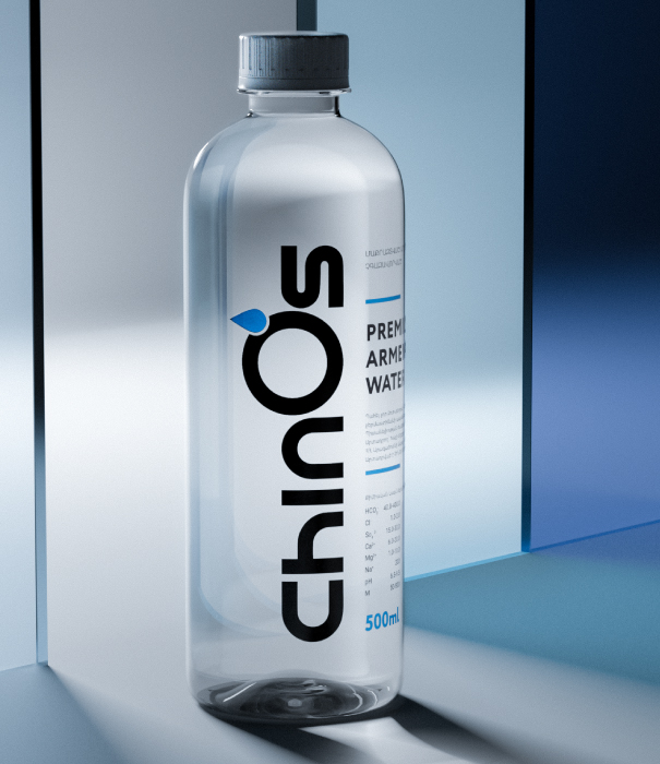
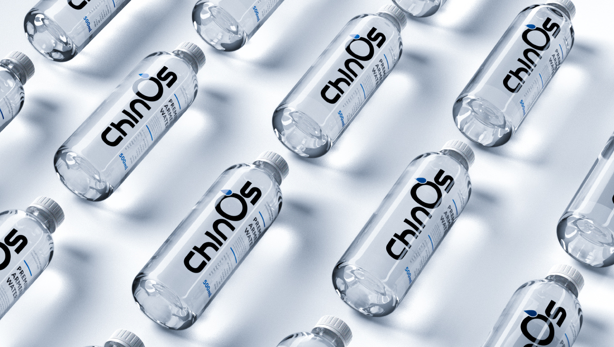
We used minimal graphics and unique typography to match the purity of the product and highlight its individuality. The design approach was carefully chosen to create a visual identity that speaks to the essence of the product, which is clean, pure, and premium. By incorporating minimal graphics, we ensured that the focus remains on the product itself, without any distractions. The unique typography was selected to add a touch of sophistication and exclusivity, further emphasizing the product’s distinctiveness.
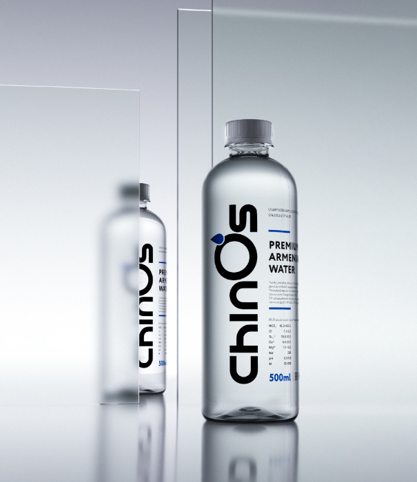
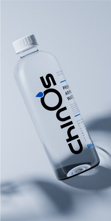
The label’s layout is intentionally simple, including only the logo and product information. This minimalist approach was chosen to convey a sense of elegance and high quality. The logo, placed prominently, serves as a focal point, reinforcing brand recognition. The product information is presented in a clear and concise manner, ensuring that consumers can easily understand the key details without being overwhelmed by unnecessary elements.
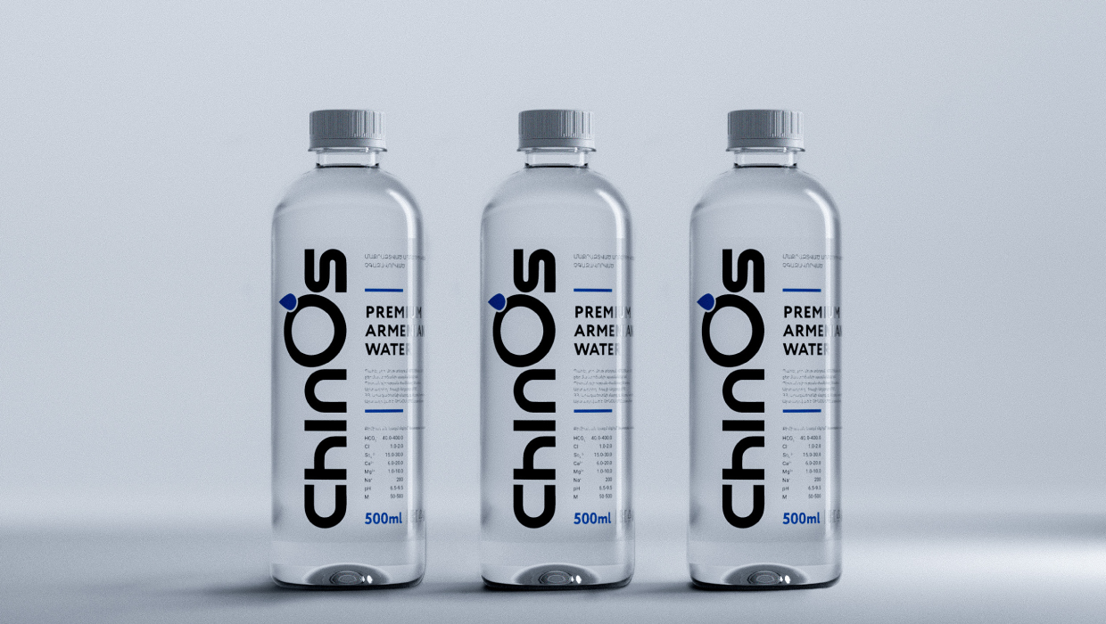
In designing the label, we aimed to create a seamless blend of form and function. The minimalistic design not only enhances the aesthetic appeal but also aligns with the product’s values of purity and simplicity. Each element on the label was thoughtfully considered to contribute to the overall impression of sophistication and premium quality.
The choice of typography plays a crucial role in the design. By selecting a unique typeface, we added an element of uniqueness that sets the product apart from others in the market. The typography complements the minimal graphics, creating a harmonious visual experience. This attention to detail in the typography ensures that the product’s individuality is highlighted, making it stand out on the shelf.
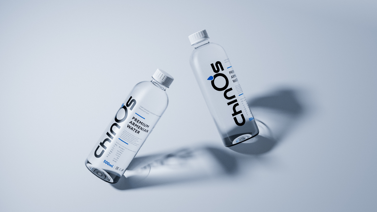
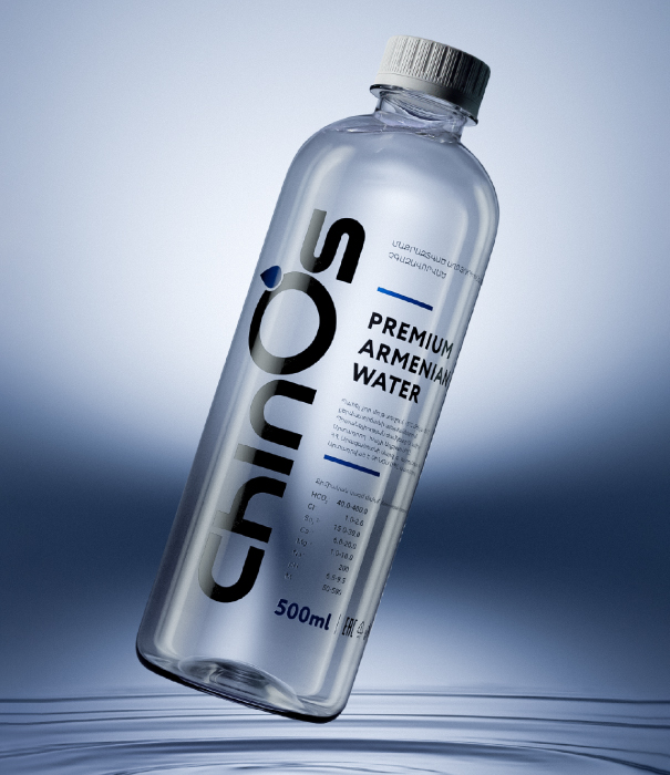
Furthermore, the use of minimal graphics and unique typography reflects a modern design sensibility. It speaks to consumers who appreciate a clean, uncluttered look and value products that embody simplicity and elegance. The design communicates a sense of luxury and exclusivity, appealing to discerning customers who seek premium products.
In conclusion, the label’s design, with its minimal graphics and unique typography, effectively captures the purity and individuality of the product. By focusing on simplicity and elegance, we created a visual identity that resonates with the product’s core values and appeals to a sophisticated audience. The minimalist layout, featuring only the logo and product information, ensures that the product’s premium quality is conveyed clearly and effectively.
CREDIT
- Agency/Creative: WEDO Creative Solutions
- Article Title: Chinos Water Packaging Design Reflecting the Purity by WEDO Creative Solutions
- Organisation/Entity: Agency
- Project Type: Packaging
- Project Status: Published
- Agency/Creative Country: Armenia
- Agency/Creative City: Yerevan
- Market Region: Europe
- Project Deliverables: Product Design
- Format: Bottle
- Industry: Food/Beverage
- Keywords: Branding, Product Design, Packaging
-
Credits:
Creative Director: Davit Hovagimyan
Graphic Designer: Davit Hovagimyan
Graphic Designer: Sargis Ghazaryan
3D Artist: Avetiq Nersisyan


